Getting your projects from the idea phase to development and then production as soon as possible while keeping them functional and beautiful can be daunting, especially when it doesn’t involve a dedicated team of developers.

Fortunately, UI libraries provide developers with pre-built sets of functions and components that can be added to and modified in an application. This can be very useful.
In this article, we will look at a new UI library for React and Next.js, NextUI. Like Material-UI (MUI), a popular UI or component library, NextUI provides many reusable components in many applications, such as a navbar, tooltip, tab, pagination components, and so on.
We’ll explore how we can use this UI library to build a simple ecommerce application. To follow along, you should have a basic understanding of JavaScript, React, and Next.js. You will also need Node.js LTS v18.13 and VS Code installed on your machine.
Jump ahead:
CartItem component
The Replay is a weekly newsletter for dev and engineering leaders.
Delivered once a week, it's your curated guide to the most important conversations around frontend dev, emerging AI tools, and the state of modern software.
A UI library, in most cases, is simply a collection of pre-built UI components and elements that can be integrated into a project and customized to some degree to facilitate product development.
These UI components and elements usually include Button, Navbar, Tooltip, Tab components, and more. Many UI libraries exist, including React Bootstrap, built on the popular Bootstrap CSS library, and Material-UI, one of the most popular UI component libraries for React.
According to the docs, NextUI is a React UI library that allows you to make beautiful, modern, and fast websites/applications regardless of your design experience. It is created with React and Stitches, based on React Aria, and inspired by Vuesax.
NextUI is a great choice for a few different reasons. NextUI is a beautifully designed UI framework with visually appealing component style defaults. NextUI also has accessible components and follows the WAI-ARIA standards offering keyboard support and logical focus management.
NextUI is built on top of the CSS-in-JS library Stitches. You can customize any component in several ways using the css prop, styled function, or native CSS selectors.
NextUI also provides a simple way to customize the default themes, change the colors, fonts, breakpoints, and more. NextUI also has a dark theme that you can apply to your application with just a few lines of code.
We’ll explore how we can use UI components from the NextUI UI library to build a simple ecommerce site. Let’s follow the steps to build a Next.js app. You can find the full code here and preview the final project here. Let’s get into it.
First, navigate to the folder of choice and run the command:
npx create-next-app@latest
# or
yarn create next-app
# or
pnpm create next-app
Once installed, navigate to the newly created directory to install the NextUI package by running either of the following:
yarn add @nextui-org/react
# or
npm i @nextui-org/react
For NextUI to work correctly, we need to set up the NextUIProvider at the root of our application. We’ll go to pages/_app.js and add the following:
// ./pages/_app.js

// import `NextUIProvider` component
import { NextUIProvider } from "@nextui-org/react";
import "../styles/globals.css";
function MyApp({ Component, pageProps }) {
  return (
    // Use at the root of our app
    <NextUIProvider>
      <Component {...pageProps} />
    </NextUIProvider>
  );
}
export default MyApp;

Next, we'll create a new file ./pages/_document.js and add the following:

// ./pages/_document.js

import Document, { Html, Head, Main, NextScript } from 'next/document';
import { CssBaseline } from '@nextui-org/react';

class MyDocument extends Document {
  static async getInitialProps(ctx) {
    const initialProps = await Document.getInitialProps(ctx);
    return {
      ...initialProps,
      styles: <>{initialProps.styles}</>
    };
  }

  render() {
    return (
      <Html>
        <Head>{CssBaseline.flush()}</Head>
        <body>
          <Main />
          <NextScript />
        </body>
      </Html>
    );
  }
}

export default MyDocument;
Now that NextUI is installed and set up, we can use any available components and build our application.
Now, we’ll build out our SiteHeader using the NextUI Navbar component. First, create a new file named ./components/SiteHeader.jsx:
// ./components/SiteHeader.jsx
import { Avatar, Button, Dropdown, Navbar, Text } from "@nextui-org/react";
import { ShoppingCartIcon, UserIcon } from "@heroicons/react/24/solid";
import Link from "next/link";
const SiteHeader = () => {
  return (
    <Navbar variant="floating" isBordered>
      <Navbar.Brand>
        <Link href="/">
          <Text weight="bold">Shoppping</Text>
        </Link>
      </Navbar.Brand>
      <Navbar.Content>
        <Navbar.Link>
          <Button as={Link} href="/cart" auto css={{ padding: "$4" }} light>
            <ShoppingCartIcon width={24} />
          </Button>
        </Navbar.Link>
        <Navbar.Item>
          <Dropdown>
            <Dropdown.Trigger>
              <Avatar squared icon={<UserIcon width={24} />} />
            </Dropdown.Trigger>
            <Dropdown.Menu>
              <Dropdown.Item key="Profile">Profile</Dropdown.Item>
              <Dropdown.Item key="Orders">Orders</Dropdown.Item>
              <Dropdown.Section>
                <Dropdown.Item key="Settings">Settings</Dropdown.Item>
                <Dropdown.Item key="Logout" color="error">
                  Logout
                </Dropdown.Item>
              </Dropdown.Section>
            </Dropdown.Menu>
          </Dropdown>
        </Navbar.Item>
      </Navbar.Content>
    </Navbar>
  );
};
export default SiteHeader;
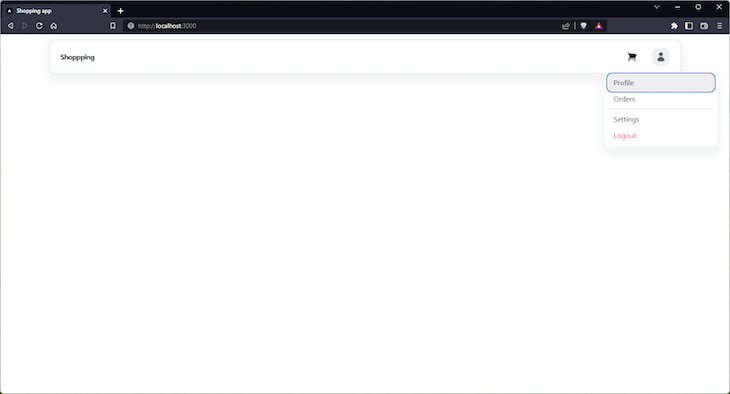
Here, we import the NextUI Navbar component that contains all our otherAvatar, Button,Dropdown, andText components.
If you look closely, you’ll notice that the main Navbar component consists of the following sub-components:
Navbar.Brand: A simple and flexible wrapper for branding contentNavbar.Content: A wrapper that provides the state and variants for the navbar content itemsNavbar.Item: Individual items that must be a direct child of Navbar.ContentNavbar.Link: A link item that must be a direct child of Navbar.ContentYou can view more on the anatomy of the Navbar component here.
For the cart button, NextUI allows us to change which tag component outputs. We use a Button component with the as attribute of Link that allows us to output the Next.js Link component.
To achieve the user account dropdown menu, we used the Dropdown component consisting of the following sub-components:
Dropdown.Trigger: Used to wrap the reference (or trigger) element. Similar to Dropdown.Button but without the chevron iconDropdown.Menu: The wrapper for the items. Must be a direct child of DropdownDropdown.Section: A wrapper to group-related itemsDropdown.Item: The individual items. Must be a direct child of Dropdown.MenuYou can view more on the anatomy of the Button here.
Here’s what our SiteHeader should look like now:
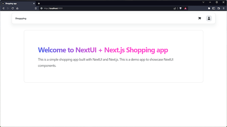
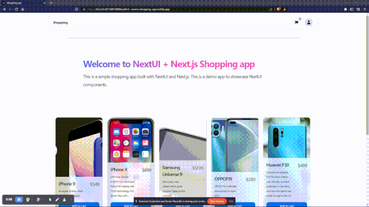
store-hero to the homepageLet’s add a store-hero/banner to the homepage, introducing us to the Container, Card, and Spacer components. Back in our ./pages/index.js page, add the following:
// ./pages/index.js

import Head from "next/head";
import {
  Card,
  Container,
  Spacer,
  Text,
} from "@nextui-org/react";

export default function Home() {
  return (
    <>
      <Head>
        <title>Shopping app</title>
      </Head>
      <main>
        <header className="store-hero">
          <Spacer y={2} />
          <Container md>
            <Card variant="bordered">
              <Card.Body css={{ padding: "$24" }}>
                <Text h1 css={{ textGradient: "45deg, $blue600 -20%, $pink600 50%" }}>
                  Welcome to NextUI + Next.js Shopping app
                </Text>
                <Text size={24}>
                  This is a simple shopping app built with NextUI and Next.js.
                  This is a demo app to showcase NextUI components.
                </Text>
              </Card.Body>
            </Card>
          </Container>
        </header>
      </main>
    </>
  );
}
Here, we use a Spacer with a y (vertical) value of 2 to give space between the SiteHeader and store-hero.
Next, we set an md breakpoint to the Container. This ensures that the container will be fluid. For example, have a width of 100% at all breakpoints (<650px and >650px) until 960px, where the width will now be fixed at 960px.
We also introduced the Card, which contains our site-hero content. The Card also consists of a few sub-components, but we’re using only Card.Body, which contains the contents of the card. You can explore the anatomy of the Card here.
We also customize Card.Body and Text styling by using the css prop. For the Card, we set the padding using a spacing token of $24.
Here’s what we should end up with:
Next, we’ll fetch product data within getServerSideProps from a demo API — https://dummyjson.com/docs/products.
In ./pages/index.js, we’ll use the Fetch API to fetch data within getServerSideProps and return the data as props:
// ./pages/index.js

// ...

export const getServerSideProps = async () => {
  try {
    const res = await fetch("https://dummyjson.com/products?limit=8");
    const { products } = await res.json();
    return {
      props: { products },
    };
  } catch (error) {
    console.error(error);
    return {
      props: { products: [] },
    };
  }
};

export default function Home({ products }) {
  return (
    <>
      {/* ... */}
      <main>
        {/* ... */}
        <ul>
          {products.map((product) => (
            <li key={product.id}>
              <h2>{product.title}</h2>
              <p>{product.description}</p>
              <p>{product.price}</p>
            </li>
          ))}
        </ul>
      </main>
    </>
  );
}
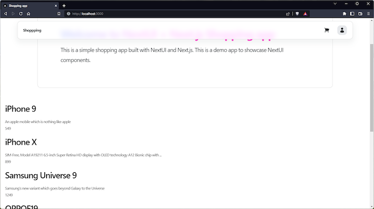
Within the Home component, we render a list of products with titles, descriptions, and prices:
Next, we’re going to improve the UI by using the Cards component and building out a grid layout with Grid to display our products.
ProductCard componentFirst, create a new file called ./components/ProductCard.jsx:
// ./components/ProductCard.jsx

import { Button, Card, Col, Row, Spacer, Text } from "@nextui-org/react";
import Link from "next/link";

const ProductCard = ({ product }) => {

  const { id, title, description, price, images } = product;

  return (
    <Card isPressable variant="bordered" css={{ w: "100%", h: "500px" }} as={Link} href={`products/${id}`}>
      <Card.Body css={{ p: 0 }}>
        <Card.Image
          src={images[0]}
          objectFit="cover"
          width="100%"
          height="100%"
          alt={title}
        />
      </Card.Body>
      <Card.Footer
        isBlurred
        css={{
          position: "absolute",
          p: "$8",
          bgBlur: "#ffffffcc",
          borderTop: "$borderWeights$light solid rgba(255, 255, 255, 0.2)",
          bottom: 0,
          zIndex: 1,
        }}
      >
        <Row>
          <Col>
            <Row justify="space-between" align="top">
              <Col>
                <Text h3>{title}</Text>
                <Text
                  size={"$sm"}
                >
                  {description}
                </Text>
              </Col>
              <Col css={{ width: "auto" }}>
                <Text
                  css={{
                    color: "$accents7",
                    fontWeight: "$semibold",
                    fontSize: "$2xl",
                    pl: "$12",
                  }}
                >
                  ${price}
                </Text>
              </Col>
            </Row>
            <Spacer y={1} />
            <Button css={{ w: "100%" }}>Add to cart</Button>
          </Col>
        </Row>
      </Card.Footer>
    </Card>
  );
};
export default ProductCard;
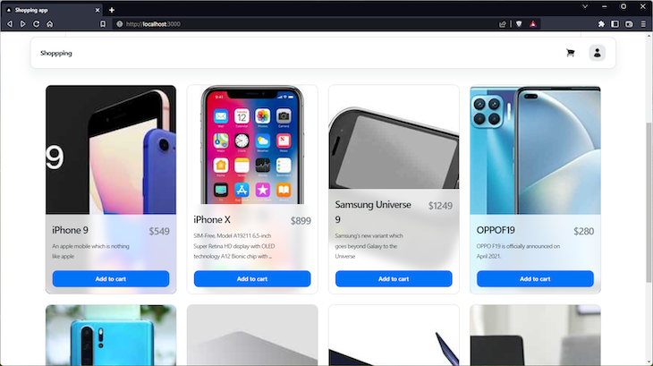
Here, we use additional Card sub-components, Card.Image with some custom CSS to display the product image and Card.Footer. This contains Row and Col components, which will contain the product title, description, and price:
Next, we’ll build out the add-to-cart functionality, and to do that, we have to quickly set up global state management in Next.js using Context API.
Context API is a state management tool bundled with the React library itself. After setting up Context in our application, we will be able to access chosen state throughout our application.
To set up, first, create a new file called ./modules/AppContext.js:
// ./modules/AppContext.js
const { createContext, useState, useContext, useReducer } = require("react");
// context data getter
const CartStateContext = createContext();
// context data setter
const CartDispatchContext = createContext();
// get item from cart
const getItem = (cart, product) => {
  return cart.find((item) => item.id === product.id);
};
const cartReducer = (state, action) => {
  // get the product object and the type of action by destructuring
  const { product, type } = action;
  const item = getItem(state, product);
  // if "add"
  // return an array of the previous state and the product object
  if (type === "add") {
    return item
      ? state.map((cartItem) =>
          cartItem.id === product.id
            ? { ...cartItem, quantity: cartItem.quantity + 1 }
            : cartItem
        )
      : [...state, { ...product, quantity: 1 }];
  }
  // if "remove"
  // remove the product object in the previous state
  // that matches the title of the current product object
  if (type === "remove") {
    return item.quantity === 1
      ? state.filter((cartItem) => cartItem.id !== product.id)
      : state.map((cartItem) =>
          cartItem.id === product.id
            ? { ...cartItem, quantity: cartItem.quantity - 1 }
            : cartItem
        );
  }
  // if "delete"
  // remove the product object from the state
  if (type === "delete") {
    return state.filter((cartItem) => cartItem.id !== product.id);
  }
  return state;
};
export const CartProvider = ({ children }) => {
  const [cart, setCart] = useReducer(cartReducer, []);
  return (
    <CartDispatchContext.Provider value={setCart}>
      <CartStateContext.Provider value={cart}>
        {children}
      </CartStateContext.Provider>
    </CartDispatchContext.Provider>
  );
};
export const useDispatchCart = () => useContext(CartDispatchContext);
export const useCart = () => useContext(CartStateContext);
Here, we have CartStateContext and CartDispatchContext, which act as the data getters and setters, respectively. The cartReducer function adds, removes, or deletes state depending on the defined type.
Within the CartProvider function, we have: const [cart, setCart] = useReducer(cartReducer, []);.
Here, using the useReducer Hook, cart gets the data, and setCart updates the data using the cartReducer function defined earlier.
We also return the DispatchContext and StateContext providers, which wraps the children prop. And, at the end of the file, the context is exported using the useContext Hook.
For the entire application to have access to the context, we need to include it in our ./pages/app.js file:
// ./pages/_app.js
// import `NextUIProvider` component
import { NextUIProvider } from "@nextui-org/react";
import DefaultLayout from "../layouts/Default";
import { CartProvider } from "../modules/AppContext";
import "../styles/globals.css";
function MyApp({ Component, pageProps }) {
  return (
    // Use at the root of our app
    <NextUIProvider>
      <CartProvider>
        <DefaultLayout>
          <Component {...pageProps} />
        </DefaultLayout>
      </CartProvider>
    </NextUIProvider>
  );
}
export default MyApp;
Great! Now, let’s add an add-to-cart function in our productcard component:
// ./components/ProductCard.jsx

import { useState, useEffect } from "react";
import { Button, Card, Col, Row, Spacer, Text } from "@nextui-org/react";
import Link from "next/link";
import { useCart, useDispatchCart } from "../modules/AppContext";
const ProductCard = ({ product }) => {

  const { id, title, description, price, images } = product;

  const cart = useCart();
  const setCart = useDispatchCart();
  const [isAdded, setIsAdded] = useState(false);
  const handleAddToCart = (product) => {
    setCart({ type: "add", product });
    setIsAdded(true);
  };

  const checkIfAdded = (product) => {
    const found = cart.find((item) => item.id === product.id);
    if (found) {
      setIsAdded(true);
    } else {
      setIsAdded(false);
    }
  };
  useEffect(() => {
    checkIfAdded(product);
  }, []);

  return (
    <Card isPressable variant="bordered" css={{ w: "100%", h: "500px" }}>
      <Card.Body css={{ p: 0 }}>
        {/* ... */}
      </Card.Body>
      <Card.Footer>
        <Row>
          <Col>
             {/* ... */}
            <Button
              disabled={isAdded}
              onClick={() => handleAddToCart(product)}
              css={{ w: "100%" }}
            >
              {isAdded ? "Added to cart" : "Add to cart"}
            </Button>
          </Col>
        </Row>
      </Card.Footer>
    </Card>
  );
};

export default ProductCard;
Here, we import useCart and useDispatchCart from our app context. We then initialize it within the ProductCard function.
The handleAddToCart function, triggered by the add to cart button, adds the selected product to the cart and the checkIfAdded function. This is triggered by useEffect(), which runs when the component is loaded and then sets the isAdded state to true or false, depending on if the product is found in the cart state.
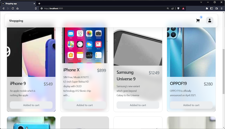
Now, that the state is global, let’s explore another useful NextUI component, Badges.
Badge to display the number of cart itemsTo do this, we go to our SiteHeader component ./components/SiteHeader.jsx:
// ./components/SiteHeader.jsx
import {
  Avatar,
  Badge,
  Button,
  Dropdown,
  Navbar,
  Text,
} from "@nextui-org/react";
import { ShoppingCartIcon, UserIcon } from "@heroicons/react/24/solid";
import Link from "next/link";
import { useCart } from "../modules/AppContext";
const SiteHeader = () => {
  const cart = useCart();
  return (
    <Navbar variant="floating" isBordered>
      {/* ... */}
      <Navbar.Content>
        <Navbar.Link>
          <Badge color={"primary"} content={cart.length} variant="flat">
            <Button as={Link} href="/cart" auto css={{ padding: "$4" }} light>
              <ShoppingCartIcon width={24} />
            </Button>
          </Badge>
        </Navbar.Link>
        {/* ... */}
      </Navbar.Content>
    </Navbar>
  );
};
export default SiteHeader;
Here, within our SiteHeader, we wrap the shopping cart button with the Badge. This allows the badge content to be positioned relative to the children, in this case, the button.
Then, we pass cart.length to the content prop of the Badge, which is displayed as seen in the image below:
Next, we’ll build out the cart page. In order to do that, we’ll create a CartItem component.
CartItem componentNow, create a new file called ./components/CartItem.jsx:
// ./components/CartItem.jsx
import { Button, Card, Col, Grid, Row, Text } from "@nextui-org/react";
import { TrashIcon } from "@heroicons/react/24/solid";
import { useDispatchCart } from "../modules/AppContext";
const CartItem = ({ item }) => {
  const setCart = useDispatchCart();
  return (
    <Grid xs={12}>
      <Card variant={"bordered"}>
        <Card.Body css={{ p: "$10" }}>
          <Row css={{ gap: "$12" }}>
            <Col css={{ width: "200px", height: "200px" }}>
              <Card.Image
                src={item.images[0]}
                objectFit="cover"
                width="100%"
                height="100%"
                alt={item.title}
              />
            </Col>
            <Col>
              <Text h2>{item.title}</Text>
              <Text size={"$xl"}>{item.description}</Text>
            </Col>
            <Col css={{ width: "auto" }}>
              <Text
                css={{
                  color: "$accents7",
                  fontWeight: "$semibold",
                }}
                size={"$2xl"}
              >
                ${item.price}
              </Text>
            </Col>
          </Row>
        </Card.Body>
        <Card.Footer>
          <Row justify={"space-between"}>
            <Col>
              <Button
                color={"error"}
                icon={<TrashIcon width={24} />}
                onClick={() => {
                  setCart({ type: "delete", product: item });
                }}
              >
                Remove
              </Button>
            </Col>
            <Col css={{ width: "auto" }}>
              <Button.Group>
                <Button
                  onClick={() => {
                    setCart({ type: "remove", product: item });
                  }}
                >
                  -
                </Button>
                <Button>{item.quantity}</Button>
                <Button
                  onClick={() => {
                    setCart({ type: "add", product: item });
                  }}
                >
                  +
                </Button>
              </Button.Group>
            </Col>
          </Row>
        </Card.Footer>
      </Card>
    </Grid>
  );
};
export default CartItem;
In this component, we import useDispatchCart in order to update the cart state from each cart item. We can use setCart() to add, remove, and delete cart items by providing the action type and product.
Carts pageTo add the Carts page, create a new file called ./pages/cart.js:
// ./pages/cart.js
import { Container, Grid, Spacer, Text } from "@nextui-org/react";
import Head from "next/head";
import { useCart } from "../modules/AppContext";
import CartItem from "../components/CartItem";
const Cart = () => {
  const cart = useCart();
  return (
    <>
      <Head>
        <title>Cart | Shopping app</title>
      </Head>
      <main>
        <Spacer y={2} />
        <Container lg>
          <header>
            <Text h1>Cart</Text>
          </header>
          <section className="cart-items">
            <Grid.Container gap={2}>
              {cart.map((item) => (
                <CartItem item={item} key={item.id} />
              ))}
            </Grid.Container>
          </section>
        </Container>
      </main>
    </>
  );
};
export default Cart;
With that, we should have this:
So far, we’ve been able to build out a simple ecommerce application with NextUI as a UI framework. We’ve covered some features, including a few important components like Navbar, Button, and more.
We also covered how to customize individual components using the css prop. Customization can also be applied globally by customizing the theme.
Having covered all that, we’ll be able to extend the features of the ecommerce app and build out other applications using NextUI. Check out the official docs to learn more about NextUI and some great examples for React and Next.js.
Debugging Next applications can be difficult, especially when users experience issues that are difficult to reproduce. If you’re interested in monitoring and tracking state, automatically surfacing JavaScript errors, and tracking slow network requests and component load time, try LogRocket.
LogRocket captures console logs, errors, network requests, and pixel-perfect DOM recordings from user sessions and lets you replay them as users saw it, eliminating guesswork around why bugs happen — compatible with all frameworks.
LogRocket's Galileo AI watches sessions for you, instantly identifying and explaining user struggles with automated monitoring of your entire product experience.
The LogRocket Redux middleware package adds an extra layer of visibility into your user sessions. LogRocket logs all actions and state from your Redux stores.
Modernize how you debug your Next.js apps — start monitoring for free.

Learn how inline props break React.memo, trigger unnecessary re-renders, and hurt React performance — plus how to fix them.

This article showcases a curated list of open source mobile applications for Flutter that will make your development learning journey faster.

Discover what’s new in The Replay, LogRocket’s newsletter for dev and engineering leaders, in the April 1st issue.

This post walks through a complete six-step image optimization strategy for React apps, demonstrating how the right combination of compression, CDN delivery, modern formats, and caching can slash LCP from 8.8 seconds to just 1.22 seconds.
Would you be interested in joining LogRocket's developer community?
Join LogRocket’s Content Advisory Board. You’ll help inform the type of content we create and get access to exclusive meetups, social accreditation, and swag.
Sign up now

 Learn more →
