Styling components using CSS-in-JS was first introduced in 2014 and continues to gain popularity. The developer community’s widespread adoption of the pattern has helped library makers determine what concepts are important to a CSS-in-JS library.

For example, Stitches is a CSS-in-JS library that takes the most recent component styling trends, such as creating variants for component reuse and server-side rendering, as its core features. It’s a fully typed CSS-in-JS library with a focus on component-based architecture and developer experience.
Stitches, like other CSS-in-JS libraries, has the usual benefits of critical CSS injection and automatic vendor prefixing. But compared to other CSS-in-JS libraries, Stitches stands out because of the following perks:
Stitches avoids unnecessary prop interpolations at runtime, making it significantly more performant than other styling libraries
Stitches supports cross-browser server-side rendering, even for responsive styles and variants
Variants have first-class support, enabling you to design composable component APIs
Define multiple themes with CSS variables, then use them in your component by defining the class name
Due to its atomic output, specificity issues are a thing of the past
It has a very helpful config file with token-aware properties, breakpoints helper, and custom utils. Stitches provides a fun and intuitive DX
While Stitches is designed to be framework-agnostic, at the time of writing, it only supports React and has support to Vue in progress.
The Replay is a weekly newsletter for dev and engineering leaders.
Delivered once a week, it's your curated guide to the most important conversations around frontend dev, emerging AI tools, and the state of modern software.
To start using Stitches with React, you need to install the library with your package manager:
# With npm
npm install @stitches/react

# With yarn
yarn add @stitches/react
Then, you need to create a configuration file and define the configuration for your design system. Create a stitches.config.ts file (or .js if you don’t use TypeScript) and import the createStyled function from the library.
The createStyled function works like a React hook function. It receives a configuration object with the following optional properties:
prefix: use a prefix for all your classnames to avoid clashestokens: special variables that you can define and apply as CSS valuesbreakpoints: create responsive breakpoints to aid you in writing responsive stylesutils: create custom functions that acts as a shorthand for writing your CSS propertiesAnd return two functions for your styling needs:
styled: a function to create React components with stylescss: a function to create themes and SSR styles// stitches.config.ts
import { createStyled } from '@stitches/react';export const { styled, css } = createStyled({
prefix: '',
tokens: {},
breakpoints: {},
utils: {},
});
We’ll review configuration properties later. For now, let’s focus on implementing Stitches and rendering a styled component.
The stitches.config file needs to be imported into your components, so if you’re using Create-React-App, don’t forget to put it inside the src/ directory.
Let’s create a styled button component to test out Stitches. Create a new component file and import styled from the config at the top:
// Change the import to where you put your stitches.config file
import { styled } from '../stitches.config';
Now write the style for your button. Instead of using template string syntax like in styled-components, Stitches opts to implement the styling pattern using plain object syntax to reduce the bundle size:
import { styled } from '../stitches.config';

const Button = styled('button', {
  color: '#fff',
  backgroundColor: '#007bff',
  borderRadius: '10px',
  fontSize: '16px',
  fontWeight: 400,
  paddingTop: '10px',
  paddingBottom: '10px',
  paddingLeft: '16px',
  paddingRight: '16px',
  '&:hover': {
    backgroundColor: '#0069d9',
  },
});

export default Button;
Now you need to import your component in order to render it:
import React from 'react';
import ReactDOM from 'react-dom';
import Button from './components/Button'

function App() {
  return (
    <Button>This button is styled using Stitches</Button>
  );
}

ReactDOM.render(
  <App />,
  document.getElementById('root')
);
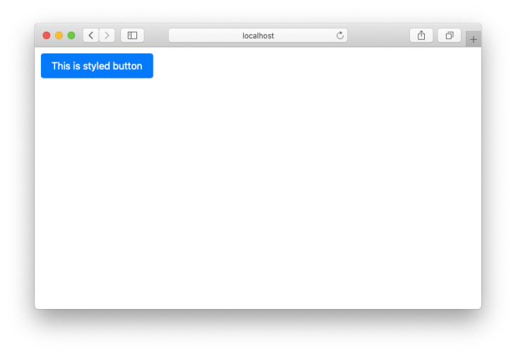
And that’s it. You now have a Stitches button component rendered on the screen:
Let’s learn about how you can create various versions of your component next.
One of the key features in Stitches is its support to write multiple variants of the same component as a first-class API. You can write variants directly inside the styling object syntax, which will be compiled as props of that component. Here is the same button component again but with color variant:
const Button = styled('button', {
  color: '#fff',
  backgroundColor: '#007bff',
  borderRadius: '10px',
  fontSize: '16px',
  fontWeight: 400,
  paddingTop: '10px',
  paddingBottom: '10px',
  paddingLeft: '16px',
  paddingRight: '16px',
  '&:hover': {
    backgroundColor: '#0069d9',
  },
  variants: {
    color: {
      violet: {
        backgroundColor: 'blueviolet',
        ':hover': {
          backgroundColor: 'darkviolet',
        },
      },
      gray: {
        color: '#000',
        backgroundColor: 'gainsboro',
        ':hover': {
          backgroundColor: 'lightgray',
        },
      },
    },
  }
});
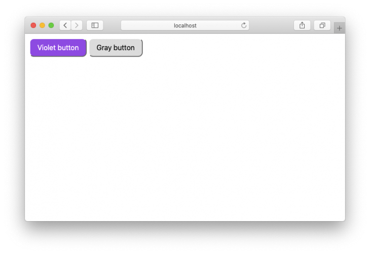
When you render the button, you just need to specify the color as its props:
<div style={{ display: 'flex', gap: '20px' }}>
  <Button color="violet">Violet button</Button>
  <Button color="gray">Gray button</Button>
</div>
And it will be rendered accordingly:
For further information, please check out Stitches’ variant documentation. Now that you know about variant support, let’s move on to configuration properties.
As we’ve seen previously, there are four configuration properties that you can set when calling on the createStyled function:
Let’s learn how these configurations can improve your developer experience.
The prefix config will simply add a prefix to each class names generated by Stitches to avoid any possible CSS collision:
export const { styled, css } = createStyled({
  prefix: 'zxc',
  tokens: {},
  breakpoints: {},
  utils: {},
});
You can view the prefix by inspecting the element in the browser. The result would look like this:
<button class="zxc__initial_bc_hiMOlA zxc__initial_bc_cfnJEG zxc__initial_c_kFTTvV zxc__initial_bblr_eEqHhd zxc__initial_btlr_fAvRqR zxc__initial_btrr_hGRUya zxc__initial_bbrr_iAiVRy zxc__initial_fs_kBiqwx zxc__initial_fw_cftqkj zxc__initial_pt_keBEHr zxc__initial_pb_ddiFNf zxc__initial_pl_frIgGZ zxc__initial_pr_eOnNpm scid-bZicNS">
  Violet button
</button>
The tokens config allows you to write reusable design tokens that acts as variables holding CSS values. Here’s an example of how to define colors and fontSizes token types:
export const { styled, css } = createStyled({
  tokens: {
    colors: {
      $gray500: 'hsl(206,10%,76%)',
      $blue500: 'hsl(206,100%,50%)',
      $purple500: 'hsl(252,78%,60%)',
      $green500: 'hsl(148,60%,60%)',
      $red500: 'hsl(352,100%,62%)',
    },
    fontSizes: {
      $1: '12px',
      $2: '13px',
      $3: '15px',
    },
  },
});
You can use the tokens directly in your component:
const Button = styled('button', {
  color: '#fff',
  backgroundColor: '$red500',
  borderRadius: '10px',
  fontSize: '$3',
  fontWeight: 400,
  paddingTop: '10px',
  paddingBottom: '10px',
  paddingLeft: '16px',
  paddingRight: '16px',
  '&:hover': {
    backgroundColor: '$blue500',
  },
});
Stitches provide 14 token types that you can define in your config file.
The breakpoints config allows you to apply style into your component during certain breakpoints. You’re free to define your own breakpoint property names. For example:
# using bp1, bp2, bp3 and bp4
export const { styled, css } = createStyled({
  breakpoints: {
    bp1: (rule) => `@media (min-width: 640px) { ${rule} }`,
    bp2: (rule) => `@media (min-width: 768px) { ${rule} }`,
    bp3: (rule) => `@media (min-width: 1024px) { ${rule} }`,
    bp4: (rule) => `@media (min-width: 1280px) { ${rule} }`,
  },
});

#or using sm, md, lg, xl
export const { styled, css } = createStyled({
  breakpoints: {
    sm: (rule) => `@media (min-width: 640px) { ${rule} }`,
    md: (rule) => `@media (min-width: 768px) { ${rule} }`,
    lg: (rule) => `@media (min-width: 1024px) { ${rule} }`,
    xl: (rule) => `@media (min-width: 1280px) { ${rule} }`,
  },
});
You can then apply your breakpoint properties as a part of your component style:
const Button = styled('button', {
  height: '35px',
  // apply styles to the `bp1` breakpoint
  bp1: {
    height: '45px'
  }
});
Or, if you want to avoid overriding style pattern, you can use the variants API combined with breakpoint properties. First write the variants into your style:
const Button = styled('button', {
  height: '35px',
  // variants for height
  variants: {
    height: {
      small: {
        height: '25px'
      },
      normal: {
        height: '45px'
      },
      large: {
        height: '75px'
      },
    }
  }
});
Next, define which variant to apply at each breakpoint. You must use initial breakpoint to declare the initial variant before any breakpoints are applied:
<Button height={{ initial: 'small', bp2: 'normal', bp3: 'large' }}>
  Responsive button
</Button>
The utils config allows you to write custom functions that acts as a shortcut when defining your style. For example, let’s write an m util function as a shortcut to writing margin properties:
export const { styled, css } = createStyled({
  utils: {
    m: (config) => (value) => ({
      marginTop: value,
      marginBottom: value,
      marginLeft: value,
      marginRight: value,
    }),
  }
});
Next, use the util inside your component:
const Button = styled('button', {
  height: '35px',
  m: '20px'
});
Note that the rendered button will have 20px margin on all sides. You can define as many util functions as you need.
Aside from its great performance and focus on component architecture, Stitches is the latest CSS-in-JS that finally provides built-in, first-class support for variants. The design of the variants API allows you to change the visual presentation of your components without overriding the style based on props, or going the traditional way by writing multiple classes.
This library also has a powerful configuration file where you can define custom tokens, breakpoints, and util functions to make styling components fun and easy. Be sure to check out Stitches documentation for further info.
Install LogRocket via npm or script tag. LogRocket.init() must be called client-side, not
server-side
$ npm i --save logrocket

// Code:

import LogRocket from 'logrocket';
LogRocket.init('app/id');
// Add to your HTML:

<script src="https://cdn.lr-ingest.com/LogRocket.min.js"></script>
<script>window.LogRocket && window.LogRocket.init('app/id');</script>

A side-by-side look at Astro and Next.js for content-heavy sites, breaking down performance, JavaScript payload, and when each framework actually makes sense.

AI-generated tests can speed up React testing, but they also create hidden risks. Here’s what broke in a real app.re

Why the future of DX might come from the web platform itself, not more tools or frameworks.

A hands-on test of Claude Code Review across real PRs, breaking down what it flagged, what slipped through, and how the pipeline actually performs in practice.
Hey there, want to help make our blog better?
Join LogRocket’s Content Advisory Board. You’ll help inform the type of content we create and get access to exclusive meetups, social accreditation, and swag.
Sign up now

 Learn more →
