Editor’s note: This article was reviewed and updated by Elijah Asoula in February 2026 to improve technical accuracy and reflect recent updates to the Shadcn UI ecosystem. Updates include coverage of Shadcn Create, blocks and Lift mode, revised use cases, and updated comparisons with other UI and component libraries.
Shadcn UI takes a different approach from traditional component libraries like Material UI and Chakra UI. Instead of importing pre-packaged components, Shadcn UI lets you copy the source code for individual components directly into your codebase.
In this guide, we’ll explore what makes Shadcn UI so popular among developers and build some UI interfaces along the way.
The Replay is a weekly newsletter for dev and engineering leaders.
Delivered once a week, it's your curated guide to the most important conversations around frontend dev, emerging AI tools, and the state of modern software.
Shadcn UI is not a component library or UI framework. It’s “a collection of reusable components that we can copy and paste into our apps.” This reusable component collection was created by Shadcn, who has also created great open source projects like Taxonomy, Next.js for Drupal, and Reflexjs.
Shadcn UI is built on top of Tailwind CSS and allows you to choose between Radix UI or Base UI as the underlying primitive. It currently supports Next.js, Remix, Astro, Laravel, and Vite. However, there is an official guide for manually integrating it with other technologies.
Shadcn UI was released in March 2023 and quickly became one of the most viral UI solutions in the web development ecosystem. As of this writing, it has over 105k stars on GitHub. The impact of the library has been so great that its creator later joined Vercel, where Shadcn UI is now used and promoted within tools like v0.
If you’ve been looking for a more flexible, developer-friendly UI toolkit, Shadcn UI checks a lot of boxes. Here are the key advantages.
That said, Shadcn UI isn’t the right fit for every project. Here are some tradeoffs to consider:
Ultimately, Shadcn UI trades convenience for control. If that aligns with how you like to work, it’s worth exploring. If not, that’s valuable to know upfront.
While Shadcn UI integrates with multiple frameworks like Vite, Remix, Astro, and Laravel, we’ll walk through the Next.js setup here. Refer to the installation guide for instructions on integrating with other frameworks.
To get started, create a new Next.js application by running the command below:
npx create-next-app@latest my-app --typescript --tailwind --eslint
Next, run the init command to initialize dependencies for a new project:
npx shadcn@latest init
The CLI will prompt you to make some configurations. Here’s a sample of the configuration questions:
Would you like to use TypeScript (recommended)? no / yes
Which style would you like to use? › Default
Which color would you like to use as base color? › Slate
Where is your global CSS file? › › app/globals.css
Do you want to use CSS variables for colors? › no / yes
Where is your tailwind.config.js located? › tailwind.config.js
Configure the import alias for components: › @/components
Configure the import alias for utils: › @/lib/utils
Are you using React Server Components? › no / yes
That’s it! Now you can start adding components to your applications using the add command as shown below:
npx shadcn@latest add [component]
For example, to add a button component to your application, run the following command:
npx shadcn@latest add button
Next, import the Button component into your application and specify the variant you want to use:
import { Button } from "@/components/ui/button"

<Button variant="outline">Button</Button>
You can then customize the button’s styles and behavior directly in your codebase.
Shadcn UI provides several features that you can leverage to enhance the development experience. Let’s take a closer look at features like its themes and theme editor, CLI, multiple components, and more.
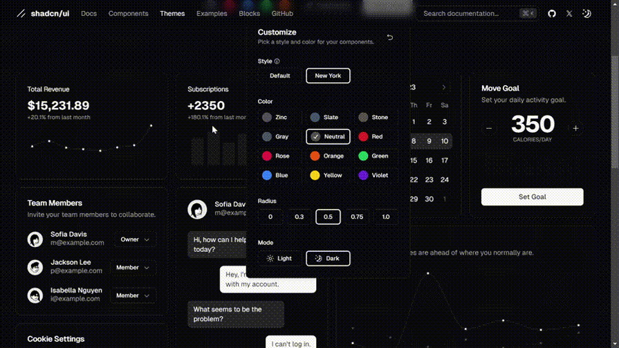
Shadcn UI provides hand-picked themes that you can copy and paste into your applications. You can manually add theme tokens through the codebase, but you can also achieve the same results using Shadcn UI’s theme editor.
The theme editor’s interface allows you to configure themes for properties such as color, border radius, and light or dark mode. You can also choose between two styles: default and new-york. The styles have unique components, animations, icons, and more.
The default style has larger input fields and uses lucide-react icons and tailwindcss-animate for animations. The new-york style has smaller buttons, cards with shadows, and uses Radix Icons.
You can also easily create custom themes via Shadcn UI’s graphical interface. The editor outputs a piece of code containing your custom style definitions. Then, you ju copy the code and paste it into your application:
Here’s a sample of the theme editor’s code output. It provides style tokens for both light mode and dark mode:
@layer base {
  :root {
    --background: 0 0% 100%;
    --foreground: 222.2 84% 4.9%;
    --card: 0 0% 100%;
    --card-foreground: 222.2 84% 4.9%;
    --popover: 0 0% 100%;
    --popover-foreground: 222.2 84% 4.9%;
    --primary: 221.2 83.2% 53.3%;
    --primary-foreground: 210 40% 98%;
    --secondary: 210 40% 96.1%;
    --secondary-foreground: 222.2 47.4% 11.2%;
    --muted: 210 40% 96.1%;
    --muted-foreground: 215.4 16.3% 46.9%;
    --accent: 210 40% 96.1%;
    --accent-foreground: 222.2 47.4% 11.2%;
    --destructive: 0 84.2% 60.2%;
    --destructive-foreground: 210 40% 98%;
    --border: 214.3 31.8% 91.4%;
    --input: 214.3 31.8% 91.4%;
    --ring: 221.2 83.2% 53.3%;
    --radius: 0.3rem;
  }

  .dark {
    --background: 222.2 84% 4.9%;
    --foreground: 210 40% 98%;
    --card: 222.2 84% 4.9%;
    --card-foreground: 210 40% 98%;
    --popover: 222.2 84% 4.9%;
    --popover-foreground: 210 40% 98%;
    --primary: 217.2 91.2% 59.8%;
    --primary-foreground: 222.2 47.4% 11.2%;
    --secondary: 217.2 32.6% 17.5%;
    --secondary-foreground: 210 40% 98%;
    --muted: 217.2 32.6% 17.5%;
    --muted-foreground: 215 20.2% 65.1%;
    --accent: 217.2 32.6% 17.5%;
    --accent-foreground: 210 40% 98%;
    --destructive: 0 62.8% 30.6%;
    --destructive-foreground: 210 40% 98%;
    --border: 217.2 32.6% 17.5%;
    --input: 217.2 32.6% 17.5%;
    --ring: 224.3 76.3% 48%;
  }
}
Shadcn UI supports dark mode for Next.js and Vite applications. For Next.js applications, Shadcn UI uses next-themes for the dark mode toggling functionality. When a user toggles between light and dark mode, the application switches between the light and dark theme tokens.
v0 is Vercel’s generative AI tool for building UI components using natural language prompts. It generates production-ready React code powered by Shadcn UI and Tailwind CSS. The Open in v0 feature integrates Shadcn UI directly with v0, allowing you to open an existing Shadcn UI component inside the v0 interface.
From there, you can use AI prompts to modify the component’s layout, styles, or structure, and then copy the updated code back into your application. A v0 account is required to use this feature. You can access Open in v0 from the documentation page of any Shadcn UI component.
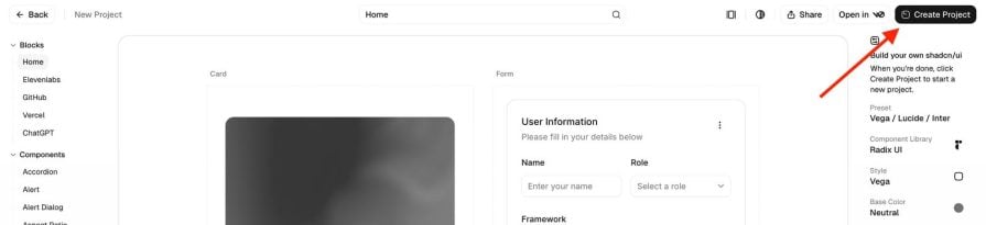
Blocks are prebuilt, page-level templates composed of multiple Shadcn UI components and layouts. Instead of assembling individual components like buttons, inputs, and forms yourself, you can add a complete block, such as a form or dashboard layout, and then customize it in your codebase. Each block is fully responsive and designed to work across desktop, tablet, and mobile screen sizes.
Integrating a block is straightforward. You simply select the block you want from the blocks page, then run the Shadcn UI CLI command for that block to add it to your project, as shown below.
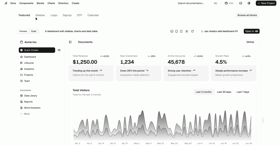
Lift mode also extends the usefulness of blocks by allowing you to extract individual components from a block. With Lift mode enabled, you can copy the code for smaller building blocks, such as cards, buttons, or form sections, without adding the entire template. This gives you more flexibility when reusing block content.
One of the most common criticisms of Shadcn UI was visual sameness. Many apps looked alike out of the box. In response, the team released Shadcn Create in late 2025, which flips the script: instead of starting generic and customizing later, you begin with a design preset that reflects your app’s personality.
Choose your colors, spacing, fonts, and icons upfront, and Shadcn Create generates a project with those preferences already configured in your theme. It’s a faster, more intentional way to build something that feels unique from line one.
Start by visiting the Create dashboard and choosing a design preset that matches the look and feel you want for your application, as shown below.
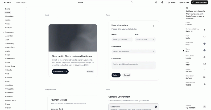
Each preset defines a different visual identity, including spacing, border radius, typography, color usage, and icon choices. You can further customize options such as base color, font, icons, and radius to better match your design preferences.
Once you’re satisfied with your selections, click the Create button at the top right corner of the page.
You’ll then be prompted to select the framework you’re using. Shadcn Create generates a framework-specific installation command tailored to your chosen preset and configuration.
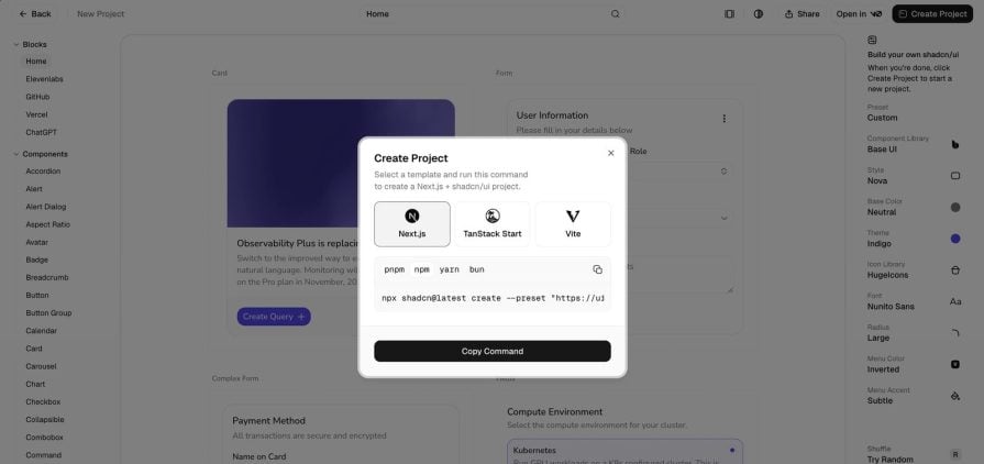
Running this command sets up your project with the selected design defaults already applied, giving you a customized starting point before you add components or blocks.
When it comes to forms, Shadcn UI goes beyond offering form components like Input, Textarea, Checkbox, and RadioGroup. It also provides a Form component, which is a wrapper around react-hook-form.
Here are some of the things the Form component provides:
<FormField /> component for building controlled form fieldsYou can access the component by running the command below:
npx shadcn@latest add form input
Next, set up the components for the form, like so:
"use client";

import { zodResolver } from "@hookform/resolvers/zod";
import { useForm } from "react-hook-form";
import * as z from "zod";

import { Button } from "@/components/ui/button";
import {
  Form,
  FormControl,
  FormField,
  FormItem,
  FormLabel,
  FormMessage,
} from "@/components/ui/form";
import { Input } from "@/components/ui/input";

const FormSchema = z.object({
  username: z.string().min(2, {
    message: "Username must be at least 2 characters.",
  }),
});

export function ComponentExample() {
  const form = useForm<z.infer<typeof FormSchema>>({
    resolver: zodResolver(FormSchema),
    defaultValues: {
      username: "",
    },
  });

  function onSubmit(data: z.infer<typeof FormSchema>) {
    console.log(data);
  }

  return (
    <div className="max-w-4xl flex items-center justify-center min-h-screen">
      <Form {...form}>
        <form
          onSubmit={form.handleSubmit(onSubmit)}
          className="w-2/3 space-y-6"
        >
          <FormField
            control={form.control}
            name="username"
            render={({ field }) => (
              <FormItem>
                <FormLabel>Username</FormLabel>
                <FormControl>
                  <Input placeholder="Input username" {...field} />
                </FormControl>
                <FormMessage />
              </FormItem>
            )}
          />

          <Button type="submit">Submit</Button>
        </form>
      </Form>
    </div>
  );
}
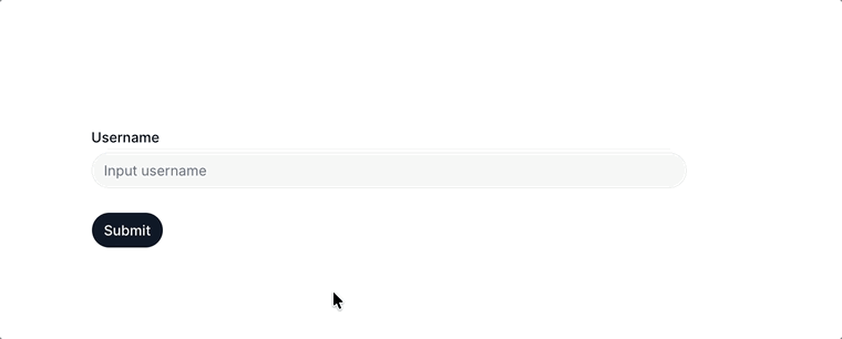
Here’s the online form built with the above code:
While this isn’t an exhaustive list, Shadcn UI works particularly well for the following use cases:
In all of these cases, Shadcn UI offers a flexible foundation that adapts well to different project requirements.
While Shadcn UI has quickly become a top choice for building websites and applications, it’s not the only option available. The table below gives a breakdown of how Shadcn UI compares against other component libraries:
| Shadcn UI | Material UI (MUI) | Chakra UI | Ant Design | |
|---|---|---|---|---|
| GitHub stars | 105k | 97k | 40k | 97k |
| Framework support | React, but there are Shadcn UI versions for other frameworks | React, but there are MUI versions for other frameworks | React, but there are Chakra UI versions for Vue and Svelte | React, but there is a Vue version of Ant Design |
| Bundle size (minified + gzipped) | Depends on usage | 93.7 kb | 89 kb | 429 kb |
| Maturity | Young and fast-growing library | Established library | Young and fast growing library | Established library |
| Best suited for | Small to large scale projects with custom UI needs | Small and large scale projects | Small to large scale projects | Small to large scale projects |
| Design system | User-defined | Google’s Material Design | Chakra’s design system | Ant Design system |
| Figma UI kit | No | Yes | Yes | Yes |
Shadcn UI flips the traditional component library model. Instead of installing a package, you copy the code directly into your project. That gives you complete ownership and makes customization straightforward, without slowing you down.
Shadcn UI is now a proven option for a wide range of projects, from small apps to large production systems. Its use within the React and Next.js ecosystem, including tools like Vercel’s v0, shows that it has reached a level of maturity and stability. For teams that value flexibility and control over their UI code, Shadcn UI is a solid choice.
LogRocket lets you replay user sessions, eliminating guesswork by showing exactly what users experienced. It captures console logs, errors, network requests, and pixel-perfect DOM recordings — compatible with all frameworks, and with plugins to log additional context from Redux, Vuex, and @ngrx/store.
With Galileo AI, you can instantly identify and explain user struggles with automated monitoring of your entire product experience.
Modernize how you understand your web and mobile apps — start monitoring for free.

A hands-on test of Claude Code Review across real PRs, breaking down what it flagged, what slipped through, and how the pipeline actually performs in practice.
CSS art once made frontend feel playful and accessible. Here’s why it faded as the web became more practical and prestige-driven.

Learn how inline props break React.memo, trigger unnecessary re-renders, and hurt React performance — plus how to fix them.

This article showcases a curated list of open source mobile applications for Flutter that will make your development learning journey faster.
Would you be interested in joining LogRocket's developer community?
Join LogRocket’s Content Advisory Board. You’ll help inform the type of content we create and get access to exclusive meetups, social accreditation, and swag.
Sign up now

