Product managers need to understand their product’s core. What makes it such a great product? How can we continue to build upon it? The most important element here is making changes to the product that considers users’ and customers’ changing needs, business goals, and tech resources.
The best way to go about this is to have a data-driven approach. It’s vital to understand the metrics and analytics behind every step of the product development process and make changes that increase the product’s success (and profitability).
Monitoring, understanding, and predicting user or customer behavior helps product teams identify creative solutions and make informed decisions about the product’s strategy — whether that’s in terms of development, UI/UI, copywriting, onboarding flows, marketing, performance, conversion, customer engagement, customer happiness, and more.
In this post, we’ll discuss behavior analytics and how they can inform product teams to make their best product possible.
It’s easy to confuse user behavior analytics with customer behavior analytics. While the idea is similar, user behavior analytics concentrates on understanding user actions and behavior within the app, while customer behavior analytics represents the touchpoints across the entire customer journey.
Whether you analyze by segmentation, funnel, or cohort analysis, the data will outline the pros and cons of your app and the customer journey.
There are four insightful ways to use behavioral analytics that will give you essential insight into your users and customers.
Understand how your users interact with a new feature on the website or within the app by using heatmaps, click maps, and scroll maps! Though similar in nature, the three features are slightly different.
The below image shows a heatmap. Its name is pretty telling — these will show you which parts of the feature users engage with the most. By visualizing the hot spots (and cold spots, I suppose) of your product, you will be able to make data-driven improvements and optimize the user experience in such a way that will increase engagement and/or conversion:
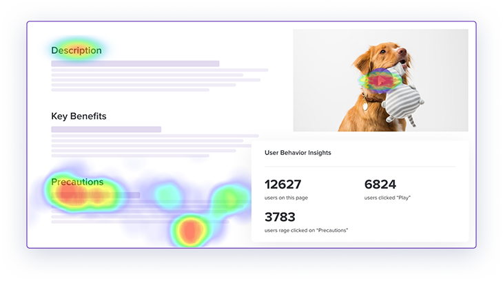
Heatmaps are a really telling feature — they can provide data to help you modify your product or page in the most optimal way. Imagine that you have a content section that is of high interest to your audience, but you emphasized a completely different area on the page instead to grab readers’ attention.
After checking your heatmaps, you see that most of your users’ mouse movements are on the left side of the screen, always hovering or clicking on a specific type of content (e.g., Precautions in the photo above) that isn’t the one you initially emphasized.
A good action point for you is to either make that area the highlight of your page, transform the content into something to keep the user engaged and educated on the topic, or, of course, experiment with placing the most engaging content in strategic areas, such as near a CTA.
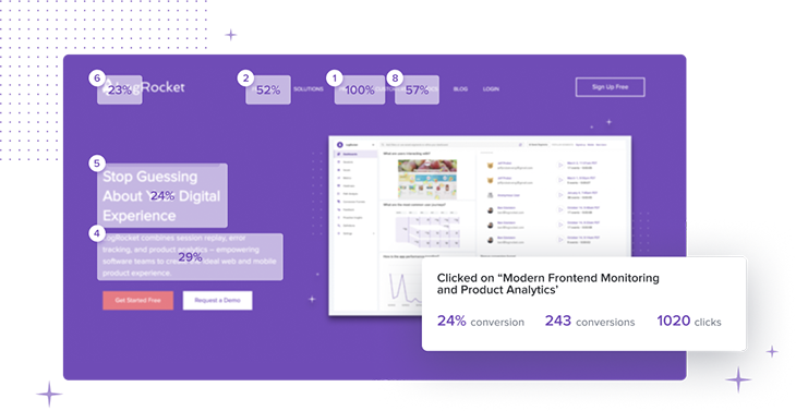
Similarly to a heatmap, a click map shows you where users or customers click or tap. Instead of providing a colorful visualization, a click map provides specific data that tells you clicks vs. conversions:
Finally, scroll maps demonstrate how far your platform’s visitors scroll down the page and where they are getting stuck or not engaging:
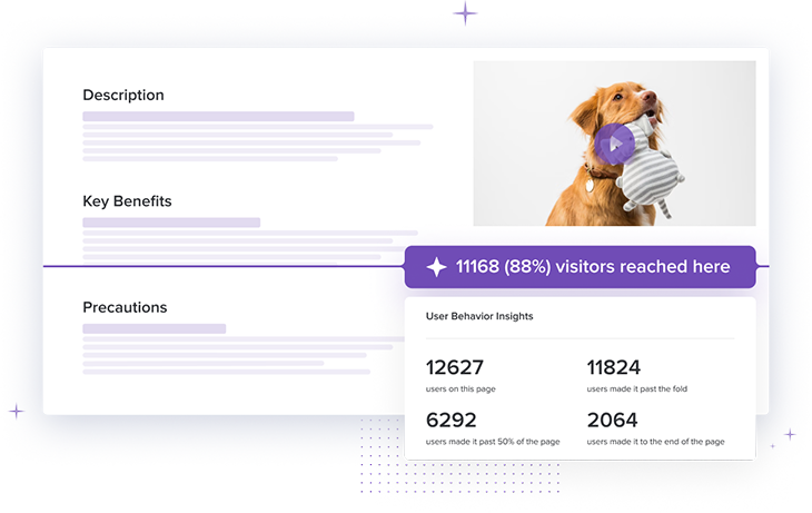
All are similar in nature; heatmaps, click maps and scroll maps can show you specific data and visual insights into how people interact with your platform.
Identify usability timelines and possible issues — you may want to know what distracts users when they abandon their cart before purchase or how they browse through certain features.
By using session replay, you can watch user session recordings and see what users are doing and if there are any confusing navigation or technical errors:
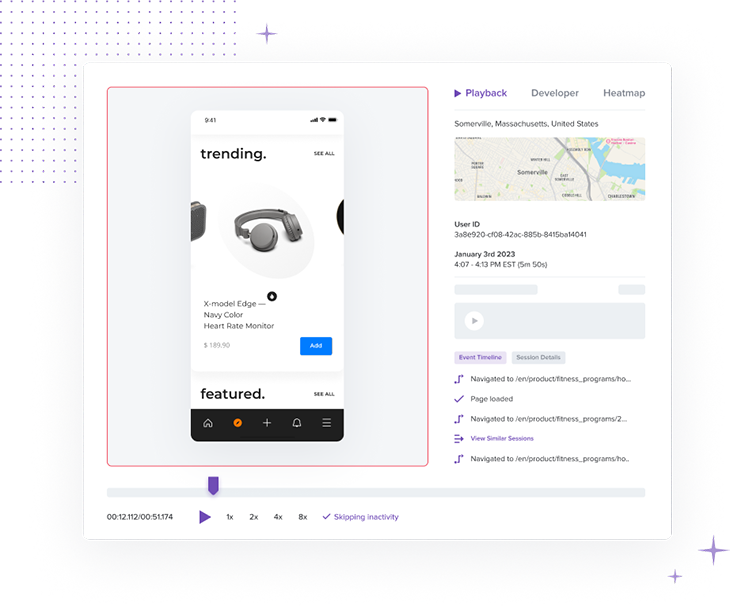
The image above showcases a platform for a company that makes headphones and other devices, but let’s give a more specific example.
Say you have a component showcasing an interactive, scrollable (from left to right) product photo gallery, and the conversion rate is not as high as expected — even given the amazing product pictures you’ve added! How can session replay help here?
After watching some user sessions, you see that some people scroll to the right (as it is designed) and some just scroll down on the page, completely skipping the gallery. Yet, you could see some behavioral patterns.
After segmenting your analysis by device and OS, you see that users have entirely different behavior and usability patterns based on the device they use. This can be broken down geographically as well, as you’ve even seen differences based on locations (different cultures engage with different types of visuals and UX/UI!).
This data helps you iterate the buyer journey differently based on your users’ behavior within your platform while considering many qualitative aspects.
See which pages or features users access most frequently, the exit pages and drop-off rates per page, and visualize which paths lead to the most conversions:
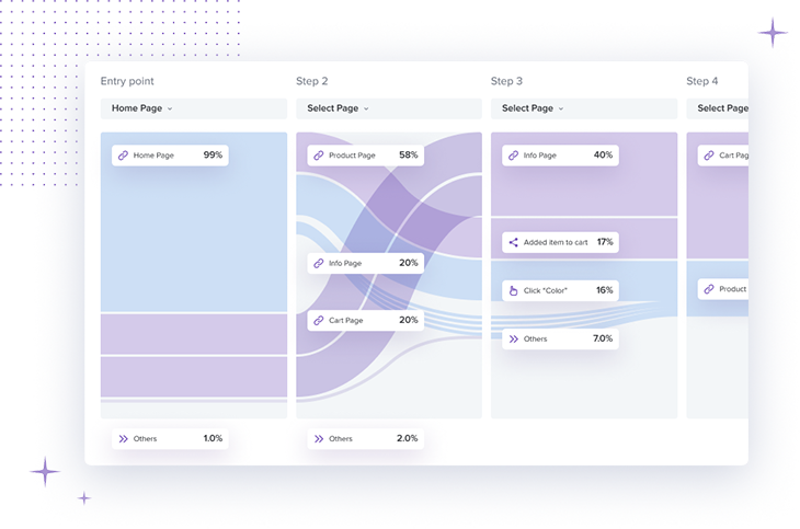
As a product manager, you can use this data to identify the app functions, paths, or pages with the most friction for your users.
For example, say you run a path analysis for an e-commerce website and identify areas where users may get stuck or drop off. For instance, if the path analysis shows that many users from a certain country are dropping off between the product page and the shopping cart page, you may consider some improvements in the checkout process or unexpected shipping costs for that specific country.
Frustration mapping, also known as frustration analysis, is a method in behavioral analytics that helps product managers understand where users are experiencing frustration or confusion within a website or app.
It consists of multiple data points, often in coexistence with other behavioral analytics techniques that showcase areas where users repeatedly encounter difficulties or error messages:
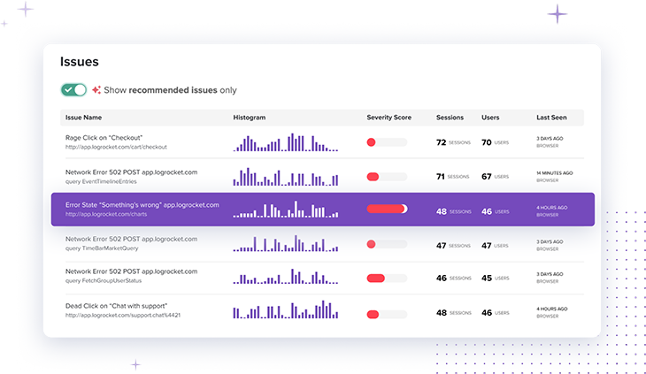
There are a few examples that come to mind, many of which may be familiar to you in your daily lives. The first is onboarding drop-off — within your app or website, you will see that many users abandon the app during the onboarding process. This is a sign of a confusing or overwhelming process.
Another example is with navigation and gestures: is it swipe up or swipe left? Sometimes, even if the button is right in front of them, users may repeatedly click on the wrong button or be unable to find a specific feature due to their different gestures. Based on different segments or cohorts, the behavior analyses will showcase that the navigation needs to be improved for better conversion or engagement within the app.
Finally, the dreaded error messages. If users are encountering error messages within the app, frustration analysis can be used to determine the frequency and type of errors. This information can be used to fix any technical issues and improve the user experience.
No matter the use case (growth, engagement, conversion, performance, etc.), with this behavioral analysis, you will be able to:
There are many behavioral analytics tools available, and, of course, the best tool for your product team will depend on your specific needs and goals. LogRocket offers session replay, issues and error tracking, and analytics to give you a full view of user and customer behavior.
LogRocket and other behavioral analytics tools provide both qualitative and quantitative data that, often used together, help you gain a comprehensive understanding of user and customer behavior:
There are 10 great features that behavioral analytics offer, some of which we talked about above:
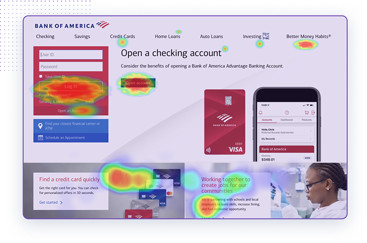
Say you have a general website for your business, just like Bank of America has here. This heatmap shows fictive data of the site and the areas of interest, hotspots, and clicks that the product team can look into.
Here are a few action points as a product manager or product team member you could take based on this data:
A data-driven approach is essential for product teams (product managers, product marketers, UX/UI, etc.) to understand the users’ changing needs. Behavioral analytics are a powerful way to identify and build creative solutions, make informed decisions, and optimize your user experience.
No matter the tool you will go for, there are many features to help you visualize users’ behavior patterns, so you can improve conversion, engagement, and retention rates and achieve success and profitability for a product.
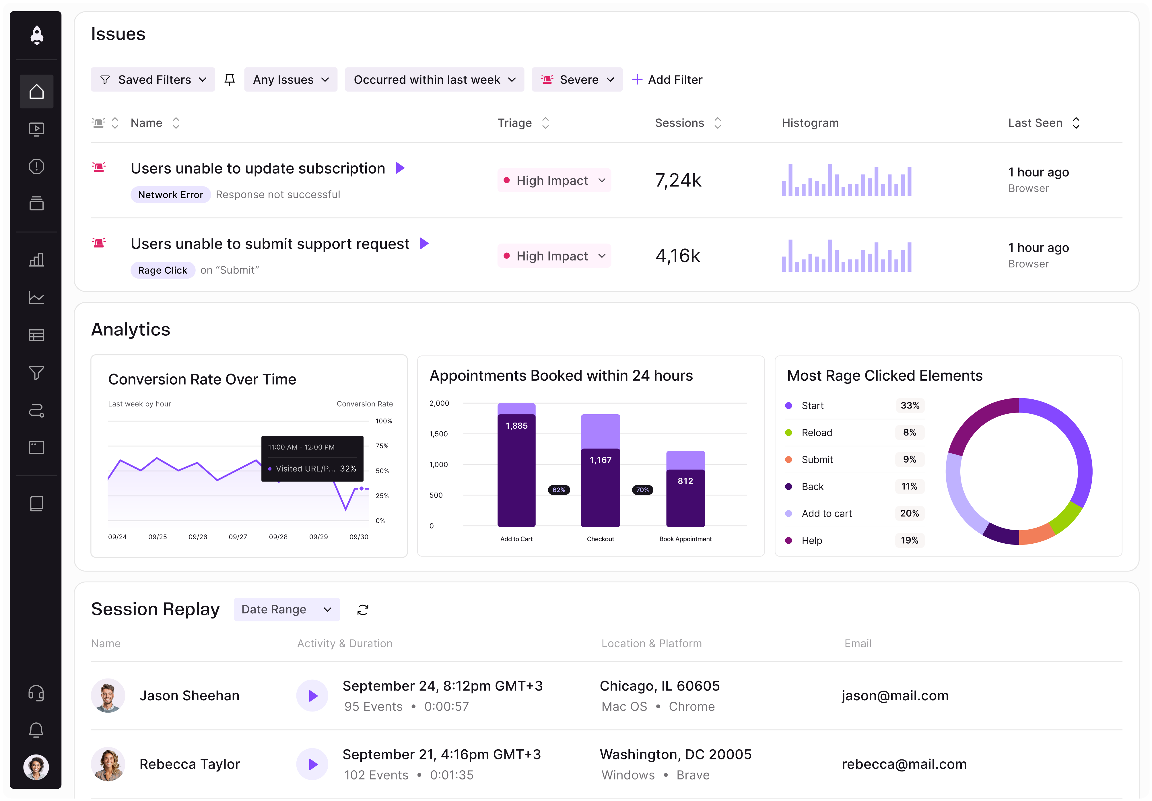
LogRocket identifies friction points in the user experience so you can make informed decisions about product and design changes that must happen to hit your goals.
With LogRocket, you can understand the scope of the issues affecting your product and prioritize the changes that need to be made. LogRocket simplifies workflows by allowing Engineering, Product, UX, and Design teams to work from the same data as you, eliminating any confusion about what needs to be done.
Get your teams on the same page — try LogRocket today.

Controlled scope creep can help PMs use capacity buffers, AI tools, and clear guardrails to turn new ideas into better outcomes.

According to SVP Julia Dalton, managing humans at scale and managing AI agents have a lot more in common than most people realize.

AI can make PM thinking generic. Learn how to use it without losing judgment, user nuance, or product differentiation.

Learn a 3-lens framework that helps product managers shift stakeholder requests from feature ideas to real problems and outcomes.