Heatmaps help product managers discover why users are behaving the way they do when they visit your website or use your product. It’s a powerful way to see how users respond to your application and why they may or may not be converting.

In this comprehensive guide, you’ll learn about the different types of heatmaps and what they are used for in data visualization. You’ll also discover how to create and use heatmaps and get practical examples of how they can be used in the real world.
A heatmap is a data visualization tool that displays the frequency of user actions on a website or app. It’s color-coded by hue intensity or by using hot or cold colors to represent popularity:
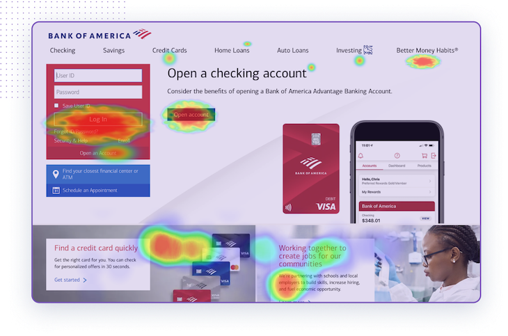
Product managers can use heatmaps to determine how well the user experience (UX) performs and make necessary corrections to improve usability.
Product managers use heatmaps to understand how users interact with their website or app. Heatmaps can reveal why users aren’t converting and what important CTAs or other information they may not be seeing or clicking on.
By visually representing user behavior, heatmaps offer an intuitive snapshot of where users focus, click, scroll, or ignore. This color-coded representation provides immediate insights into which parts of a product are engaging users and which parts are falling short:
When a you can directly observe the areas of a website or app where users linger or drop off, you can pinpoint specific design elements, content, or features that might be contributing to these patterns. For example, if users frequently abandon a checkout process at a specific step, the heatmap might reveal a design flaw or a piece of missing information at that step.
Having such clear evidence of user interactions at a glance helps you determine what needs to be fixed and make informed decisions about the best way to do so.
The main benefit of heatmaps is that it helps to visualize user behavior and identify patterns. How else can you discover exactly why users aren’t converting and any UX issues they may be encountering?
Data from heatmaps can set you up to redesign elements to maximize optimization or implement A/B testing. Without heatmaps, it can be hard to visualize complex data sets and understand what’s happening with users.
Heatmaps can help you discover UX issues in your app like:
Once you’ve identified these issues, then you can implement a solution and stop poor performance. What’s more, due to their visual and easy-to-digest nature, heatmaps lend themselves well to advocating and obtaining stakeholder approval for proposed UX and feature redesigns.
There are a few different types of heatmaps, all with their own specialized areas to help you monitor various aspects of your product performance. Four of the most common types are:
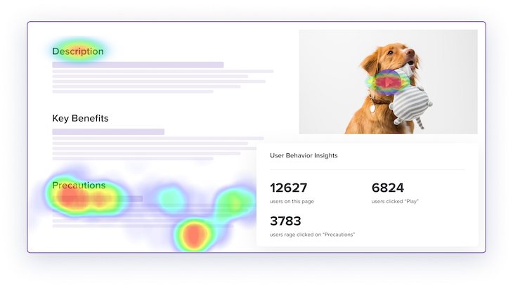
Clickmaps track what elements on your application are being clicked on by users. Hot colors signify popular clicks while cool colors reveal fewer clicks.
Clickmaps are valuable data revealing whether users are clicking on the CTA or getting distracted by other elements. Discovering these navigational issues are crucial for ensuring product performance:
Clickmaps can find dead-clicked elements that aren’t functioning like they should on a website. This type of heatmap can also find rage clicks or elements where a user repeatedly clicks on them, which can reveal more dead elements or other areas causing user frustration.
Scrollmaps are another popular type of heatmap that monitors how far a user scrolls on an application. This can help you determine whether users are seeing crucial information or not. It’s also valuable to view scrollmaps on various devices, such as tablets and smartphones, to ensure it’s optimized for all of them:
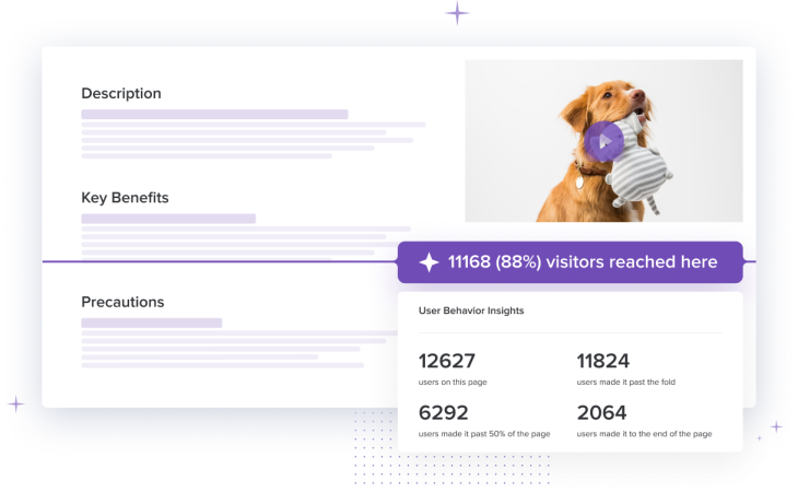
For example, let’s say your landing page only has one CTA at the bottom, but users aren’t scrolling far enough to see it before they exit. This could signal issues with the landing page like it’s too long or users think they have reached the end when they haven’t. You may need to redesign the application to maximize its impact.
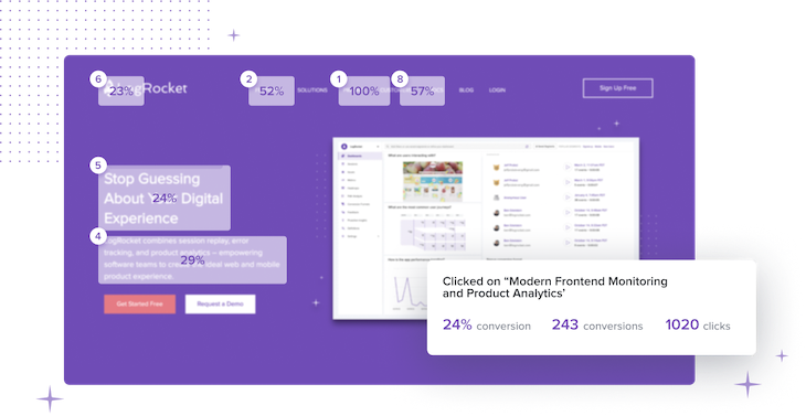
Conversion rate heatmaps can show you what elements led to higher conversion rates among users. You can discover the exact clicks that led to higher chances of a user converting, which helps you pinpoint what is working (and what’s not) in your application:
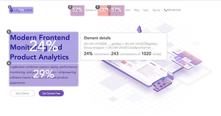
For example, you may notice clicks on a specific element are correlated with a high conversion rate. Since this element is working for you, you may want to find other ways to ensure a user sees it.
Hovermaps, also known as mouse-tracking heatmaps or movemaps, are used to track where a mouse hovers on an application. It gives you an idea of what users are interacting with when they aren’t clicking:
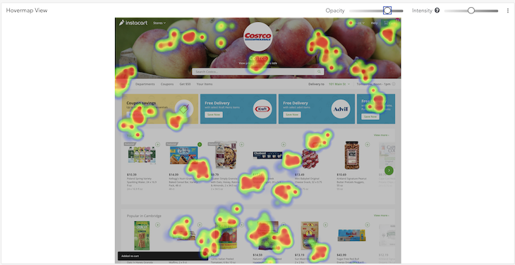
While there usually is a connection between mouse-tracking and where users are actually looking, it’s not always accurate. It’s easy to gain misled information with hovermaps. To minimize faulty insights, it’s crucial to combine hovermap data with other heatmap types and analytics tools. This way, you get a more holistic understanding of user behavior.
Creating a heatmap involves the following six steps:
The following case studies showcase how real-world companies have effectively utilized heatmaps in conjunction with other tools to gain invaluable insights, optimize user experience, and achieve specific business goals:
Cushman & Wakefield, a global real estate firm, faced challenges understanding app user experiences due to their Angular-based front-end architecture. In response, its product teams began leveraging heatmaps to gauge application and feature adoption, see which features users engaged with most, and pinpoint areas of high interaction and those needing enhancement.
These insights played a pivotal role in refining Cushman & Wakefield’s digital strategy, enabling the firm to optimize both internal and external applications, ensuring more efficient user interactions and understanding silent struggles clients might be encountering.
A new law requiring electronic tax and payroll systems led Siigo to reconsider their call-center based business model. As a solution, the product team at Siigo launched an online storefront and employed detailed heatmaps and user behavior analysis to help them identify and rectify the barriers customers faced.
As a result of using heatmaps, Siigo boosted their online conversion rate from 10 percent to 30 percent, streamlining its customer acquisition process and understanding the nuances of its customers’ online interactions.
Dojo, a fintech company, wanted to improve customer service and gain insights into product usage on the web. Using heatmaps, Dojo gained a real-time overview of customer interactions, from issue identification to resolution. This insightful visualization revealed crucial user behavior patterns, including areas of their website that were confusing or misleading.
Proactively identifying and addressing user issues enabled the product team at Dojo to improve the overall user experience and establish a common language for cross-functional teams to discuss what’s happening to customers. The integration of heatmaps and analytics into their workflows led to more informed decision-making across teams, from customer service to engineering.
Heatmaps are invaluable tools for product managers, marketers, and UX designers. They offer a visual representation of user behavior, allowing teams to pinpoint issues, test solutions, and optimize applications for better performance.
When used correctly and in combination with other analytical tools, heatmaps can drive significant improvements in user experience and conversion rates.
To make the most of heatmaps:
Remember, the ultimate goal is to enhance the user experience and increase conversions. With heatmaps, you’re equipped with a tool that makes this task much more manageable.
Featured image source: IconScout
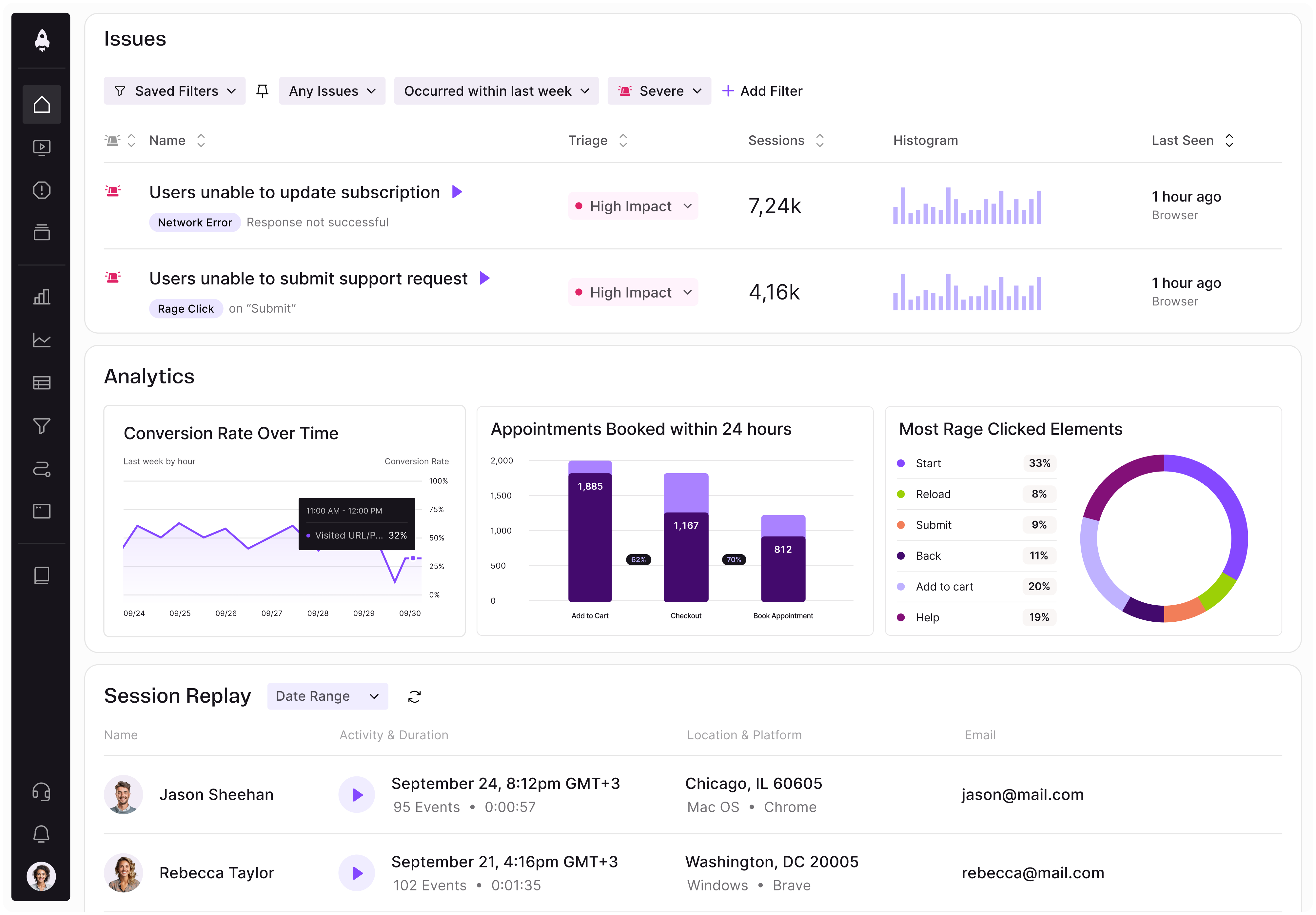
LogRocket identifies friction points in the user experience so you can make informed decisions about product and design changes that must happen to hit your goals.
With LogRocket, you can understand the scope of the issues affecting your product and prioritize the changes that need to be made. LogRocket simplifies workflows by allowing Engineering, Product, UX, and Design teams to work from the same data as you, eliminating any confusion about what needs to be done.
Get your teams on the same page — try LogRocket today.

Learn a 3-lens framework that helps product managers shift stakeholder requests from feature ideas to real problems and outcomes.

CPO and PhD Jen Wang covers “The Zone of Absorption” and why product teams are struggling to build when AI is shifting faster than anyone can keep up.

Explore four product team structures, when each works best, and how to choose the right model for speed, ownership, and clarity.

Learn how code-style reasoning helps product managers make sharper decisions, surface edge cases, and write clearer requirements.