Some ideas simply work better when they emerge from the product team, not finance. And it might surprise you, but I strongly believe cost management is one of those ideas.

Many teams keep costs on the sidelines — tracked, reviewed, and tolerated. But cost carries signals. It reflects decisions, trade-offs, priorities, and structure.
Cost, when surfaced early and paired with product intent, reveals what the team values. And when teams begin to manage cost with the same curiosity they give to growth, the results last longer and reach further.
I helped build this mindset within a SaaS team I was on during three business cycles. The results speak for themselves:
What began as a simple dashboard grew into a playbook. This article unpacks that playbook, breaking it down step-by-step for you to adapt and use to transform your own team.
With the SaaS team where I eventually helped build this product-led cost management mindset, the product served mid-sized teams managing live data and multi-environment workflows. Our challenges included:
So, how did we build that connection? Every product delivers value. Every product consumes resources. These two forces shape the contour of your business:
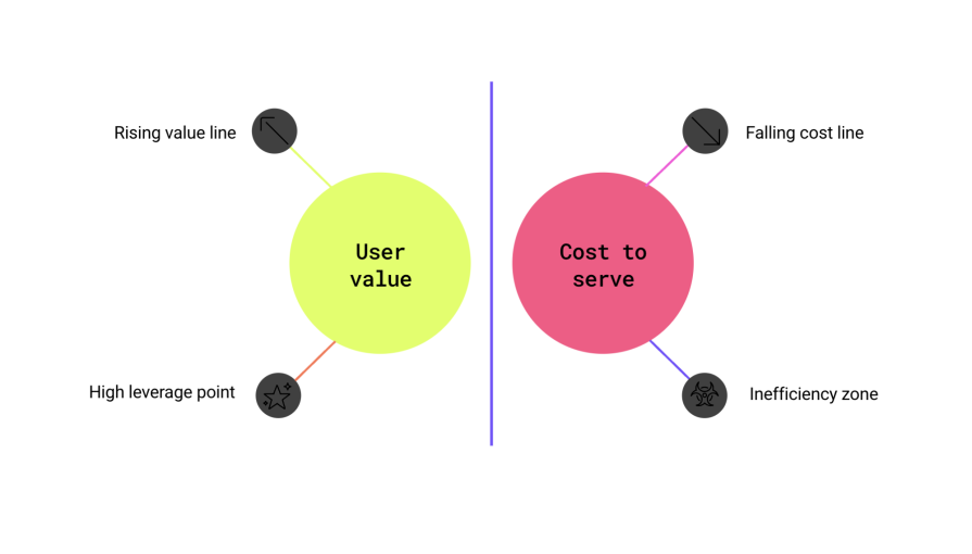
We started by tracking the cost to serve each cohort. Instead of leaving this critical information in a spreadsheet that we never used or only checking it during quarterly reviews, we built it as a real-time, living dashboard and posted it where decisions happen.
We built this cost-to-serve dashboard from three systems already in place:
The goal was clarity. We asked questions like: What does it cost to support this user? Which flows create support minutes? Which features show depth but drive little spend? Where do performance outliers live?
Each Monday, the dashboard appeared in Slack. It came with a chart and three bullets:
The habit formed quickly. Product leads began referencing cost in planning. Engineers raised performance discussions before anyone prompted them. Design began surfacing rough areas where friction generated expensive handoffs.
The conversation shifted. Instead of viewing cost as a distant concept handled by accounting, teams began to see it as a tangible thing that shaped the product.
An anomaly appeared during a routine review. A legacy export API showed increased egress costs, even as feature usage declined. The pattern felt unusual, so we explored it further.
We discovered that a small number of large customers continued using the export flow to power downstream processes that no longer aligned with our data model. Just three percent of workspaces created 11 percent of our data egress. The cost came from one place, and that place had a path forward.
We built an async CSV export alternative and offered a migration path. Failures dropped. Exports completed four times faster. Support volume fell. Billing aligned with usage.
And just like that, the cost-to-serve dashboard we bought paid for itself. A single insight created margin room and led to the first visible win.
Once cost signals become visible, action follows. But without structure, action can feel scattered or emotional. To stay grounded, we introduced a decision rubric.
Each feature received a score from 0-5 across four lenses:
| Cost signal lens | Key question(s) | Scoring guide |
|---|---|---|
| Margin contribution | Does this feature contribute to gross margin when accounting for its fully loaded delivery costs (infra, support, maintenance, etc.)? |
|
| User loyalty | Do users interact consistently and deeply with this feature? What is the general sentiment around it based on support feedback? |
|
| Moat strength | Does this feature contribute to defensibility via network effects, usage flywheels, or strategic investment? How hard or easy would it be for a competitor product to copy or replace this feature? |
|
| Strategic alignment | Does this feature align with our current product narrative and the key jobs we help customers solve? |
|
Every fortnight, we reviewed features and calculated the total score for each out of 20:
The rubric shaped discussions and invited shared ownership of decisions. Conversations grew more focused. Teams brought evidence instead of assumptions. Priorities sharpened.
We used the rubric to guide real changes:
We adjusted the rubric based on context. Compliance-heavy products added a fifth lens. Some tools gave more weight to moat or strategic fit. The framework adapted. The benefits remained.
Each decision came with structure. For deprecations, we created a migration guide, a one-click toggle, and an incentive. Early switchers received two months of equivalent credits. The transition felt like progress, not loss.
Using this kill rubric also helped us establish and execute a clear plan for sunsetting features without disrupting users. We communicated changes to users in three steps:
Customer-facing teams received a briefing pack: rationale, timeline, talking points, support macros, and risk map. The handoff created alignment across functions.
The dashboard showed where the cost appeared. The rubric helped us decide where and how to act. The next step gave energy to the system: we created a save-to-invest ledger.
Once the finance team verified a cost reduction, the product team allocated 50 percent of the gain to improvements in the following sprint. These investments made cost work feel expansive. Instead of removing, we reinvested. Instead of waiting for approvals, we acted.
Here are examples of what this created:
Each win came with charts, alerts, and a story. Engineers shared their work in demo meetings. PMs wrote learning notes. Cost wins became part of the culture.
Cultural change followed visibility. We also created a few rituals to reinforce the loop:
As product leaders, we heard teams say things like “this cohort burns margin” or “we’re shipping value, not just features.” These shifts reflected deep alignment. Cost became a shared conversation, not just a responsibility handed off to finance.
With margin improving and experience deepening, we reframed pricing. The old story listed features. The new story promised outcomes.
Instead of: “Pro includes features A, B, and C.”
We shifted to: “Pro delivers 300ms page loads under peak traffic, less than 0.5 percent error rate, and continuous visibility into your customer journey.”
These promises reflected real performance, supported by data. We also:
The message resonated. Buyers valued clarity. Champions referenced our heatmap during procurement reviews. Conversations moved around shared performance, not price alone.
Sales enablement adjusted, too. The team used new scripts that framed pricing through delivered outcomes: faster checkout, higher conversion, fewer errors.
Pricing became part of the product’s truth.
Each part of the system worked together:
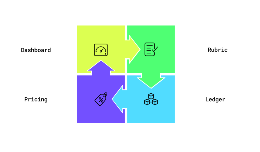
The dashboard surfaced signals, the rubric translated signals into decisions, the ledger converted savings into velocity, and pricing turned performance into revenue.
By doing so, we created habits. Each sprint delivered:
This pace built momentum. Teams stopped waiting for permission. Each change linked past choices to future possibilities.
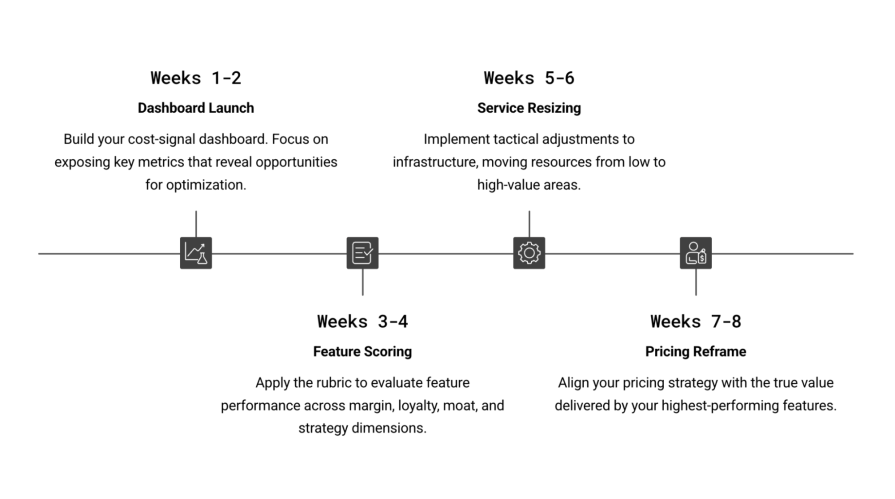
For teams looking to adopt this loop, we found early success by following this sequence:
| Week | Move | Confirmation signal |
|---|---|---|
| 1-2 | Launch dashboard with past month’s data | Execs quote CPAW or support minutes |
| 3-4 | Score top 10 low-margin features with rubric | Two deprecations approved |
| 5-6 | Right-size one service and verify a saving | Spend drops, performance stays in range |
| 7-8 | Reframe one pricing page with a benchmark | Conversion improves in a measurable test |
The structure helps teams build rhythm and compound progress with each cycle:
Obviously, this playbook didn’t work perfectly from the start. We met challenges — but we responded with clarity:
These small adjustments allowed the system to stay in motion.
Product-led cost management rewards teams who stay present. When cost becomes visible, it supports better design. When features follow a shared rubric, choices become lighter. And when savings create reinvestment, product velocity gains energy.
Each part reflects product craft and grows stronger with repetition. The loop invites momentum.
So, how can you take this playbook and make it yours?
Then repeat. I’m excited for you to build this mindset within your team.
Featured image source: IconScout
LogRocket identifies friction points in the user experience so you can make informed decisions about product and design changes that must happen to hit your goals.
With LogRocket, you can understand the scope of the issues affecting your product and prioritize the changes that need to be made. LogRocket simplifies workflows by allowing Engineering, Product, UX, and Design teams to work from the same data as you, eliminating any confusion about what needs to be done.
Get your teams on the same page — try LogRocket today.

Explore how urban planning helps product managers think in systems, strengthen foundations, and build products that scale well.
Learn how product managers can move from output tracking to outcome-driven product management with metrics tied to user impact.
Learn how to spot PMF erosion early, diagnose the cause, and help your product recover before decline turns into panic.
Introducing Ask Galileo: AI that answers any question about your users’ experience in seconds by unifying session replays, support tickets, and product data.


