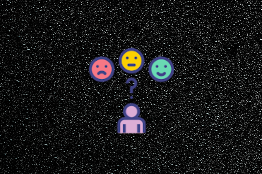
There’s a reason why your product’s loudest users seem a little… much. You know the ones I’m talking about…

Think of the users who submit long bug reports at 2 a.m., email support with three-part feature requests, and rig together hacks you never imagined; they frustrate your roadmap, confuse your support team, and stretch your architecture in all the wrong places.
But they might be building your next breakthrough.
While most product teams optimize for the average user, the most valuable insights often come from the edges or, in this case, the outliers — the people who don’t just use your product, they push it. And in that push, they reveal friction, uncover greenfield use cases, and pressure-test assumptions you didn’t realize you were making.
This marks a practical shift in product strategy: designing for the few can illuminate opportunities for the many.
Most product thinking starts with a bell curve — a distribution where the middle is wide and safe, and the tails are thin and expensive. The logic is simple: Why build for 3 percent of users when 70 percent are satisfied?
But that logic breaks down in a world where product-led growth dominates. In a competitive ecosystem, the differentiators aren’t built in the middle — they’re forged in the cracks.
These users are the friction that reveals opportunity. And that friction is where great product work begins.
You’ve probably heard of the Pareto Principle: 80 percent of outcomes come from 20 percent of causes.
In product development, it manifests in many forms like:
Edge users are that 20 percent. They aren’t representative, but they’re instructive; they don’t scale, but they reveal what might.
When they struggle, you’re seeing tomorrow’s bottleneck. When they hack, you’re watching unmet demand in real time.
Ignoring them doesn’t just leave value on the table, it leaves blind spots in your roadmap.
Let’s be clear: “edge users” aren’t one homogenous group. They’re a spectrum, and understanding who’s at the edge of your product helps define how you learn from them. To that end, there are four common types of outlier users:
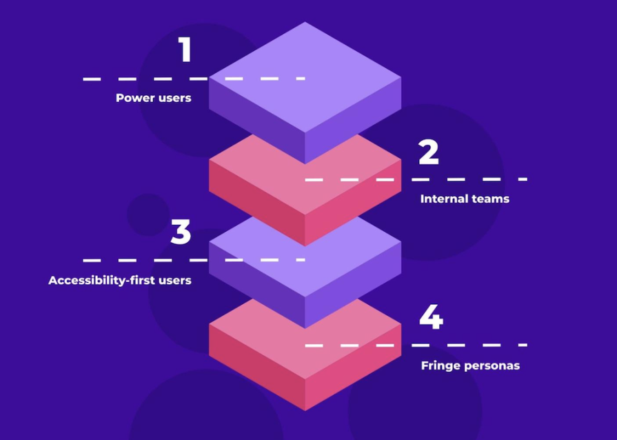
These are the users who know your shortcuts better than your own team. They multitask across tabs, automate workflows, and chain together APIs like second nature. Often, they’re 10x users of a 1x product.
They test scale, speed, and edge-case interactions. Building for them often unlocks extensibility and performance improvements for everyone.
PMs often forget that their first customers are inside the house. Think of your sales, support, legal, and marketing teams. These users may not pay for the product, but they work in it daily and know where it breaks.
They simulate pressure from volume, scale, and integration that external users may not yet reach. Their constraints often foreshadow real-world bottlenecks.
Users navigating your product with screen readers, voice commands, or non-traditional inputs aren’t “edge” because they’re rare, they’re “edge” because most products don’t build with them in mind.
Designing with accessibility in mind forces clearer structure, better semantics, and more resilient UI patterns, often improving the experience for everyone else.
These are users who contort your product into unexpected use cases, the people using Slack as a CRM, Figma as a knowledge base, or Notion as a hiring tracker.
They stretch your product’s metaphor, helping you see adjacency opportunities you’d otherwise miss.
Now, let’s zoom in on three well-known product moments that began with outlier feedback, and eventually went on to redefine the product itself:
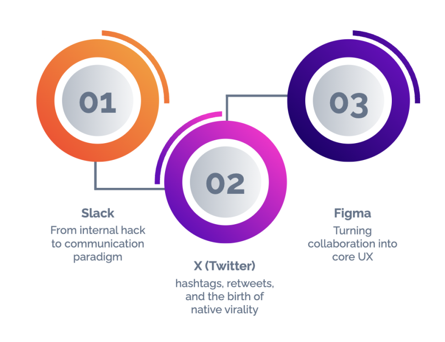
Slack wasn’t designed to be Slack.
It was born inside a failing online game startup called Glitch, where the team needed a better way to communicate asynchronously across time zones and roles. What they created wasn’t a polished tool — it was messy, internal, and duct-taped to their workflow. However, unlike email, it mimicked the way teams naturally communicate.
The real inflection point wasn’t the product, it was the behavior. Slack’s internal power users began building channels not just for departments, but for decisions, microprojects, and even jokes. They repurposed search to recall design threads and used integrations to automate status updates.
What made this a breakthrough was Slack’s willingness to observe, not override, this edge behavior. The team didn’t impose a structure. They watched how people bent the product and then made a product out of the bending.
Sometimes, your most chaotic users are your most creative ones. And remember, if it breaks under your roof, it’ll break even louder in the wild.
The hashtag wasn’t invented by X.
It was proposed by Chris Messina, a user and open web advocate, as a simple way to group conversations using the # symbol. X’s response at the time? Lukewarm. It didn’t see the need, but users did.
Grassroots usage grew, especially during events and emergencies. The same thing happened with the retweet. It started as a manual convention: copying someone’s tweet and prefixing it with “RT @username.” X didn’t build it, users did.
Eventually, X embedded both as first-class features. Hashtags gained search support and became clickable. Retweets became a button. These weren’t just usability upgrades, they were UX crystallizations of organic behavior.
But what’s easy to miss here is the risk X took in institutionalizing something born in chaos. Hashtags could have cluttered the feed. Retweets could have gamed virality. Instead, X leaned in, layering moderation, threading, and abuse reporting to contain the fire while still fanning the flame.
The most valuable feature requests aren’t always requests, they’re behaviors you didn’t anticipate. When users teach you how they want to use the product, the smartest move might be to follow.
Before Figma, collaborative design was something people talked about more than an actual method. Designers worked solo, shared static files via Dropbox or email, and waited for feedback in threaded comments or meetings.
Enter Figma. Its foundational bet wasn’t just a technical shift (browser-native design) — it was a user behavior shift that showed how design could become multiplayer.
But this insight didn’t emerge from traditional feedback forms. It emerged from edge personas: design leads managing distributed teams, educators running live workshops, or engineers trying to peek into progress without pinging designers. .
Figma saw the friction and built toward it. The multiplayer canvas, cursor presence, and comment threading were all inspired by these outlier workarounds. More importantly, Figma turned these features into a UX philosophy. Cursor labels weren’t an afterthought — they were a UX commitment to shared space.
Today, “multiplayer” is a product category. But it started with just a few scrappy users doing weird things to make design more fluid.
When users stretch your product to fit a broken workflow, don’t just fix the break, question the workflow.
Listening to edge users without veering off-course requires structure. Here’s a three-part framework to help you harness, not be hijacked by the edges:
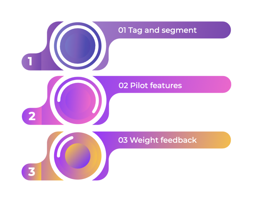
Don’t treat all feedback as flat. Categorize requests by workflow intensity, integrations used, accessibility needs, or edge complexity. For example:
This helps you track patterns beyond mere volume.
When testing early features or changes, roll them out to your most demanding users first. Their response is often indicative of failure or success.
If they can’t break it, most others won’t either.
Instead of prioritizing the most repeated request, ask:
A single insight-rich piece of feedback may outweigh a hundred thumbs-up on a minor tweak.
Here’s the danger: If you build too much for edge cases, you risk bloat. You confuse the median user with features they’ll never touch, or you spend precious cycles solving for 1 percent at the cost of 80 percent.
This is where product intuition and constraint come in. Just because an edge user wants it doesn’t mean it makes sense. But ignoring the edges altogether leaves you stale and reactive.
So how do you balance?
There’s another layer to designing for edge users that isn’t just strategic, it’s ethical.
Accessibility isn’t a “nice to have” for some future roadmap — it’s fundamental. So is building for underrepresented users, emerging markets, and those without high-end devices or stable connections.
By designing for constraints, you unlock scale. By designing for diversity, you build resilience. And by designing for those who’ve historically been excluded, you create products that don’t just work, they endure.
The next wave of product growth might not come from another A/B test on button color. It might come from a customer using your tool in the “wrong” way. This could be a developer automating a use case you didn’t plan for or a support agent rerouting a bug with a workaround that becomes a feature.
Outliers aren’t distractions, they’re discovery agents.
They show you where your product is brittle, where your assumptions break, and where your next act might be hiding. So listen to them and build with them.
Remember, it’s not always the majority that leads; sometimes, it’s the fringe that changes everything.
Featured image source: IconScout
LogRocket identifies friction points in the user experience so you can make informed decisions about product and design changes that must happen to hit your goals.
With LogRocket, you can understand the scope of the issues affecting your product and prioritize the changes that need to be made. LogRocket simplifies workflows by allowing Engineering, Product, UX, and Design teams to work from the same data as you, eliminating any confusion about what needs to be done.
Get your teams on the same page — try LogRocket today.

Learn how to choose and adapt product management frameworks based on your product stage, constraints, problem type, and business context.
Learn when streaks improve retention, when they create fragile engagement, and how PMs can design healthier systems around user progress.

A technical debt register brings transparency and clarity as to what type and how much debt you have and can be used to monitor and review your debt ratio.

Memos don’t have to be complicated. Just keep them clear, concise, and focused on actionable items. More on that in this blog.


