You’ve probably heard the word “outcomes” echo in almost every product meeting you’ve been in. But for many, it remains a fuzzy aspiration, a distant star you squint at while prioritizing features based on popular demand.
The good news for you is that I’ve made this problem my bread and butter. Over the past five years, I’ve helped eight startups move from feature- to outcome-driven ways of working.
The hardest parts of this transition include:
In this article, I’ll unpack how I use Michael Karpov’s concept of metrics trees to tackle all three of these challenges. I’ll walk you through the real tree I’m currently using at Outrig.run (my ninth startup) and dive into how you measure each of the branch metrics, as well as how to use a tree to prioritize product changes.
When it comes to product metrics, there’s an overarching line of thinking that goes something like this:
But how does the metrics tree pull it all together?
For context, Outrig is a developer tool focused on local Go development. It allows Go developers to “look inside” their project in a visual way, enabling continuous debugging (instead of “stop the world debugging”). It comes packed with useful features that solve proven pain points for Go devs including: a GoRoutine inspector, a log searcher, a visual view of runtime statistics, and variable watches that allow developers to check how variable states change in real-time.
When I set out to build Outrig’s metrics tree, I bumped into three complications:
We’re currently relying purely on qualitative data. We haven’t publicly launched Outrig yet, but we’ve conducted approximately 50 landing page tests and 1:1 MVP tests, closely observing users’ initial interactions.
A small subset (around 10 percent) of these test users are still actively engaging with a core debugging feature weekly. We know the sample size is limited, but it’s what we have to work with.
We’re not sure yet what the “core-feature” or “main unit of value” is. For a company like Airbnb, choosing a North Star metric like “nights booked” is relatively obvious. But Outrig has four big features: the log searcher, the goroutine inspector, the variable watches, and runtime statistics.
Our 50 MVP tests showed us that different users get excited about different things. This means users could be getting value out of using any of our four features. A proxy for “user value” can be how often the UI is actively being used (rather than “accidentally” being left open but idle), or session length.
However, simply spending time using a tool doesn’t necessarily mean a user is enjoying it or finding value.
Some features might be delivering value even if a user isn’t triggering events. “Runtime statistics,” for example, is a dashboard view that users could get value out of just by looking at it.
Now that you know our complications, let’s turn our attention to how we went about crafting the metrics tree.
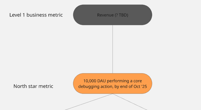
Outrig’s “play” is to achieve a large, happy, word-of-mouth-sparking user base first, raise funds based on that, and consider paths to monetization later. The #1 business metric will likely, at some point in the future, be “revenue,” but for the next six months, our end game is the North Star metric.
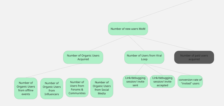
Our #1 product metric is our North Star metric: 10k DAU performing a core debugging action by the end of October 2025:
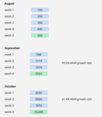
A large, distant goal like 10,000 DAU by Q3 ’25 is too big to work with. Because of that, we broke it down into smaller, more immediate targets so that we can monitor progress weekly or monthly and identify early if we’re falling behind:
For Outrig’s KPI tree, we chose our two main growth levers to be our level two metrics:
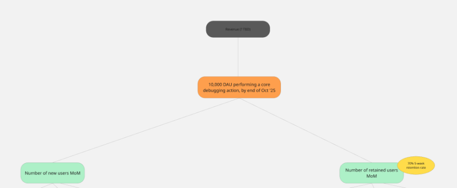
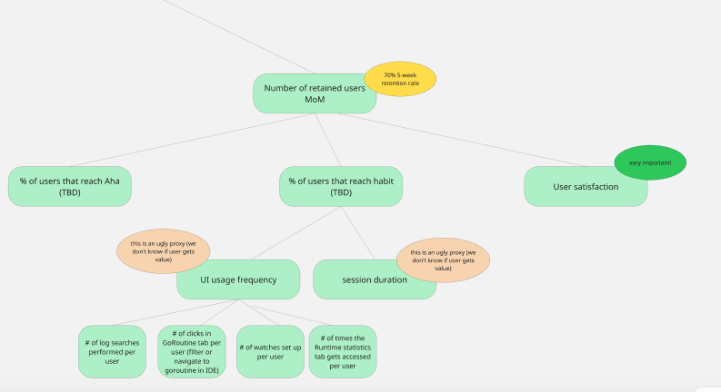
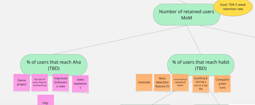
Outrig’s current five week retention rate is about 20 percent (only from the 50 user testers, certainly not statistically significant!). We’ve set our five week retention rate goal to 70 percent.
We then break our three into two level three metrics:
New users should come in from two big “buckets”
We broke down “retention” into aha (“experience value for the first time”) and habit (incorporates Outrig into their workflow, repeated “aha”) moments. These engagement metrics are notoriously difficult to define, made even more difficult by the fact that different users find value in different features.
We rely on our learnings from our 50 qualitative MVP tests to define “aha:”
We learned that many new users are nervous about adding the SDK to their code base. Therefore, they quickly spin up a “hello world” (or “hello Outrig”) project to try Outrig.
This is problematic, because this “hello world” Outrig doesn’t have enough loglines or goroutines to give a meaningful Outrig experience. That’s why we built a demo project into Outrig (with lots and lots of GoRoutines, loglines, pre-installed variables, and interesting runtime statistics).
We know that users are only using Outrig for a real debugging workflow (and therefore getting value) when they’re using it on their own project, which isn’t a “hello world” or “hello Outrig” project.
Our current definitions are as follows:
Aha
Habit
These definitions of aha and habit are a starting point; we’ll sharpen them as we learn more.
User satisfaction
We broke down habit under “UI usage frequency” (listing every individual feature in its own metric) and “session duration.” We know that “session duration” is a flawed proxy for a user getting value. For instance, a user might stare at our runtime statistics tab (a visual representation of data) without gaining any real value.
Including user satisfaction as a level three metric mitigates this problem. We’ll pop up five star ratings for each of the four core features and a more generic “Does Outrig make debugging Go code significantly easier or faster?” to gauge user satisfaction levels.
Beyond aligning on which outcomes we’re driving, crafting goals, and setting ourselves up to measure, the metrics tree helps us prioritize product changes and features.
Our engagement metrics can be translated into a loop, from new user acquisition → aha → habit → referral. This allows us to identify areas with significant drop-offs. If, for instance, we observe a strong influx of new users but a poor “aha” rate, we shift our immediate focus to improving that initial value experience. This helps us direct our efforts to the most impactful lever at any given time.
As Michael Karpov suggests, features most likely to influence metrics closer to the top of the tree — like our North Star metric or its direct growth levers — are generally prioritized. This isn’t a rigid rule, as a substantial impact on a lower level metric can sometimes outweigh a minor tweak to a higher level one.
We often use the level two and level three metrics as a starting point for brainstorming sessions, asking: “What features could significantly boost these key areas?”
Quantitative data only tells us what users are doing; it rarely tells us why. To truly understand user behavior and motivations, we constantly supplement our metric analysis with qualitative feedback.
For Outrig, we maintain an active Discord channel, engage in Go communities, attend developer events, actively solicit in-app feedback, and aim to conduct at least three shadowing sessions and user interviews each week.
Here are some tips and tricks before you get cracking on your own tree:
Collaborating in a workshop session can be notoriously bad for limiting diverse views. And jamming the metrics tree that you created by yourself down everybody’s throat will likely not lead to a lot of buy-in.
Here’s a better way:
The hardest part is defining each metric and ensuring that the connections between them are clear and actionable. But don’t fret, it doesn’t have to be perfect right out of the gate.
Your metrics tree is a living document. As you gather more data and user feedback, you’ll refine your definitions and potentially even your North Star metric.
Building an outcome-driven product organization hinges on clear alignment on the most important goals and growth levers, measuring what matters, and strategic prioritization. A metrics tree provides a robust framework to connect overarching business goals to daily product decisions.
By using this structured approach, continuously refining your metrics, and leveraging both quantitative and qualitative insights, you can move beyond simply shipping features to truly driving impactful, measurable value for your users and your business.
For Outrig, this is just the start. I’ll keep you posted on how we progress and how our metrics tree changes over time.
Featured image source: IconScout
LogRocket identifies friction points in the user experience so you can make informed decisions about product and design changes that must happen to hit your goals.
With LogRocket, you can understand the scope of the issues affecting your product and prioritize the changes that need to be made. LogRocket simplifies workflows by allowing Engineering, Product, UX, and Design teams to work from the same data as you, eliminating any confusion about what needs to be done.
Get your teams on the same page — try LogRocket today.

PMs don’t need fake authority to lead well. Learn how shared context, clearer trade-offs, and better decision-making build stronger teams.
Learn how PMs can spot novelty effects in A/B tests, validate wins over time, and avoid mistaking short-term lifts for impact.

Map AI data risks, vet vendors, run safer pilots, and build legal buy-in for AI tools without creating security gaps.
SVP of Product Sriram Iyer visits to chat about how he uses AI to launch the “thinnest slice of pizza” product and shift mindsets around AI.


