Michael Liss is Vice President, Product at New York Post and has been at the company for the last 10 years. He has worked in several angles of media throughout his career, including book publishing, digital marketing, journalism, and media production. In his current position, Michael plays a leading role in all digital initiatives for New York Post, Page Six, and Decider.

In our conversation, Michael talks about the rapid iteration of digital products, particularly those in the media industry. He discusses several digital transformations he’s witnessed over his tenure, including the newsroom structure, technology and consumer trends, media consumption methods, and, most recently, AI. Michael also explains how a “win” doesn’t always come from big upticks in engagement; maintaining consistent engagement through good content and user experience is just as important.
The strategy comes from many different stakeholders and departments. That part of the challenge is just keeping all of those things aligned — figuring out how they work together or don’t and how to prioritize all of the things that enter the queue from different places. They ultimately go to the same set of resources and limited capacity to actually execute against.
That’s always a lot to juggle because there are ways in which product is reactionary to the other business units — reactionary to the needs of editorial, to the needs of the various revenue-generating streams and departments, etc. Sometimes it feels like you’re playing tennis with 75 other people on the other side of the court, all lobbing tennis balls at you at the same time. A lot of it is trying to digest all of that and trying to figure out key priorities and strategies. But also then being the voice of the product both in product leadership and the user experience sense.
I don’t have great insight into other verticals, but it’s probably more so in the media. Because when you think about product and media, for me, the product’s really the container and not the thing itself. The thing itself is the storytelling, the shopping content, and the other revenue-making streams. We aren’t selling the New York Post website or the New York Post app to consumers. The product in media is the container or vessel through which that’s all served and experienced by the user.
I do a lecture every summer at Columbia University called, “Digital product: The nexus of the universe.” And that’s because, to me, digital products in the media are where the content strategy and business strategy come together with the user — where all of those three points meet in the middle.
I’ve been doing that lecture since around 2017. It’s interesting how much I need to change it every year because certain trends and concerns change so much. There was one year when I had a GIF of Ross from Friends with a couch in the stairwell going, “Pivot. Pivot.” Because it felt like that was when literally every single headline in Digiday was “Pivot to this,” or “Pivot to that.” This year, the big thing I had to add was AI. It had to become its own thing.
It is really interesting to see how trends and the topics du jour have changed because it’s this time capsule once per summer. A year goes by and a lot has changed so I need to make the adjustments. That part of it’s interesting from within the industry. My favorite part is just the questions and engagement with the students. I’m always fascinated to hear to what extent the material I’m talking about is brand new to them versus what they already understand as consumers. Even if they’ve never thought about it in those terms, it’s stuff that they interact with every single day, so that leads to some really interesting conversations.
Generally speaking, the challenge is understanding scope, velocity, how resources get divided, and how long a single track can take among all the other tracks that are going on. Business initiatives, including editorial, are still only a percent of what we’re working on at any given time. There’s always so much necessary maintenance work and technical work.
One of the biggest things that I’ve worked on socializing is the importance of all of those different things. When we’re with some of the leaders of the various other parts of the business and we’re talking about prioritizing a certain amount of things, we still only mean X percent of our total bandwidth. It’s like a big mixing board with all sorts of dials — you can push those dials up and down, but you still need to attune the entire board at every point.
I started at New York Post 10 years ago. We were at the very early stage of a major digital transformation that involved changing how the newsroom was structured, what the different teams were, and what the workflow was. We launched a brand-new website on WordPress. It was really the beginning of that process of going from a newspaper with a website to a modern media company.
That’s gone through many phases over 10 years — changes to the landscape, how media works, to technology and consumer trends, where page views and revenue are and aren’t coming from, and just within the business itself. It was very interesting to be here for those early days and to see how that shift was happening and to be a part of that. There’s certainly a level to which the digital transformation never ends because digital itself is always transforming. I think of the 10 years as having discreet eras within it, and it’s interesting to see how much things have changed throughout those different periods.
There’s how ads might be presented and targeted, and that’s going to mean better revenue for some and a loss of revenue for others. Many of us are less focused on that and more focused on the fact that AI is eating its own tail when it comes to issues with content generation. Media companies are potentially giving up the information that they’re publishing. Users might not ever need to click back through to their website again and just use AI. That means it’s going to eventually eat its own tail. Then, what’s left to create that content that feeds the beast?
That’s more of the existential questions around AI that my colleagues are looking at as opposed to the view you’re taking on how to better match an ad experience and ad targeting. That also gets into privacy. That’s the same privacy concerns that you see with Google deprecating first-party cookies. In a way, that changing landscape has been happening for a long time. Can AI make up for some of that? That’s going to be really interesting to see.
Another thing is to go back to some of these major threats we’re having. If referral traffic is going away, whether it’s from Google, Facebook, etc., how are you able to get more out of your own direct audience? And how can AI help with the personalization and recommendation aspects of putting the right piece of content in front of the right person at the right time?
It’s an ongoing thing — it always shifts around and we certainly have teams that we’re working with on AI stuff. But, again, that AI stuff can range from frontend-facing things for the user to stuff that just goes into the publishing process, where AI can make that faster and more efficient. I’m not talking about writing the story for you at all, but there are certain AI tools that can help you make sure you’ve got things like the right tag, alt text, etc.
Certainly, AI tools can help achieve certain things, but you still will always need the editorial hand there. Nothing should be outsourced to the AI tool by itself without editorial checks. It’s supposed to be enhancing, not replacing what humans are doing.
A lot of that has to do with just your basic things like page views and sessions. The app is very different from the website in scale and in who that user is. By definition, the app is for someone who wants to read The Post enough that they’ve gone to download it to their phone. Our web audience is much larger but features a lot of different user segments, some of which overlap very much with that type of profile.
The interesting thing about the app is that, luckily, within that audience, it’s very sticky and all the engagement metrics are very high. When I look at my weekly report, it is a flat horizon of engagement. Very rarely does it have huge changes, plus or minus. It’s very consistent. That means we’ve got a group that’s highly engaged and keeps coming back. The content has to be what they’re looking for and they find the user experience to be a positive one.
While it would be great for interactions to go up — and, certainly, that’s the goal — it seems like, with this particular audience, they’re getting what they want. They’re giving the amount of time they’re going to give it, and you want to make sure they’re having the best experience and finding what they need while they’re in there. I don’t know how easy it is to increase the app users’ engagement, but I do know how easy it is to decrease engagement by doing bad things.
Yes. We found that, unsurprisingly, people aren’t going to the hamburger menu to navigate to the sections menu of the app. They tend to get content more through the full fire hose, whether that’s a top-stories-into-latest-stories fire hose, which was the old app, or a more curated landing page.
The primary experiences of the app went from being 11 curated top stories followed by everything else in reverse chronology, to being fully curated top-down so that it matched the new website homepage we’d launched. This is a scary change to make because we know users are resistant to change. So, how did we go about it?
Top stories were more curated top-down and were not an infinite scroll anymore. We introduced a tab at the bottom of the app so that the user could still have both experiences. We launched users to the top stories, which is mirroring the curation they’re getting on the homepage, but that latest-stories feed is still there if that’s how the user prefers to consume their content.
Unsurprisingly and interestingly, people stayed with the new, curated top stories tab. Maybe it’s just because that’s what the app launches to, maybe it’s because that is what they preferred. We found that the tab that just has the latest stories in reverse chronology, like the previous main experience of the app, doesn’t get used very much. It’s great to still have that there, but it’s no longer the primary experience. The new experience did not cause a reduction in consumption and allowed us to better position and tell our stories for the user to go further into.
You want to make things easier for your users to get to where they want to go. If that doesn’t result in a huge uptick, but it just makes things easier for users to continue to engage at a high level, that’s still a win. It was really interesting to go through that and see how those different things at the bottom of this new tab are going to affect engagement or not and keep going from there.
It’s something we have always tried to increase. Again, it’s tricky because you can’t increase the audience from inside of the app itself, so it’s about all of these other things. There’s a finite audience of people that are going to consume that amount of content of any brand and are going to choose to consume it in that manner, as opposed to on-mobile web, desktop, etc.
I’ve mentioned how it’s a flat line, but it’s a good flat line. We did see that line jump quite a bit and it went from maintaining a steady line at one level to maintaining a steady line at another level. I never really fully unpacked what caused that shift, but it was interesting to see that and that is holding on. That did hold on once it happened.
One of the real challenges of being in the media space compared to others is the amount of third-party technologies you use on your sites. You need to harmonize how those are all working. One thing being slow can have a negative effect on the speed of everything else behind it.
At any given time, as you’re identifying performance opportunities, it’s a combination of your own first-party code, third-party code that you can positively affect in your own implementation, and third-party code that you truly don’t have control over and need to work with that third party to optimize. You’re always dealing with how to handle any of those three examples, where some things are very much in your control and some things are very much not in your control.
It’s this fascinating waterfall of things that are happening and lots of different ways that it’s getting onto your page. It becomes a really big, interesting challenge to figure out how you can best optimize across those three different types of examples.

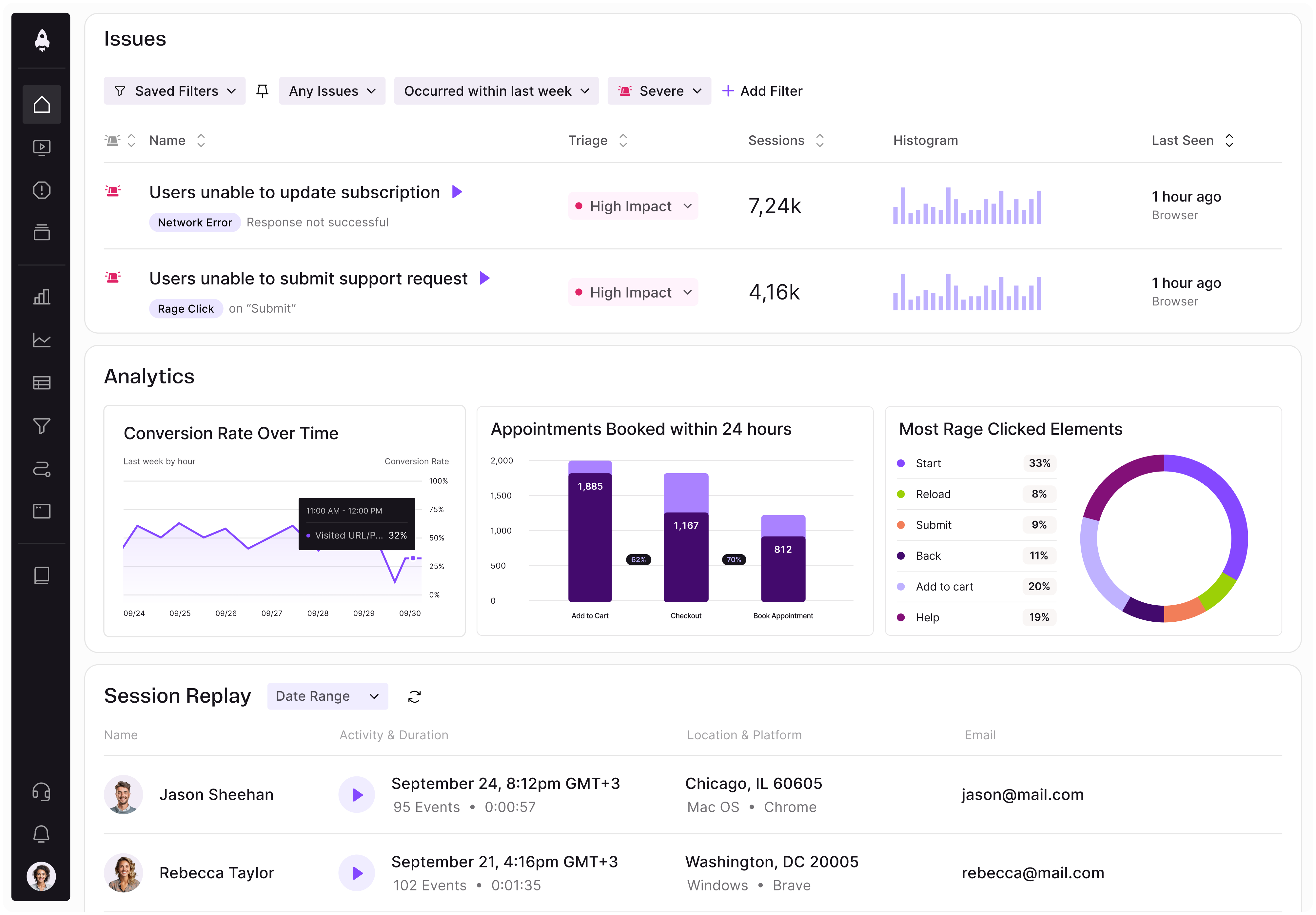
LogRocket identifies friction points in the user experience so you can make informed decisions about product and design changes that must happen to hit your goals.
With LogRocket, you can understand the scope of the issues affecting your product and prioritize the changes that need to be made. LogRocket simplifies workflows by allowing Engineering, Product, UX, and Design teams to work from the same data as you, eliminating any confusion about what needs to be done.
Get your teams on the same page — try LogRocket today.

Controlled scope creep can help PMs use capacity buffers, AI tools, and clear guardrails to turn new ideas into better outcomes.

According to SVP Julia Dalton, managing humans at scale and managing AI agents have a lot more in common than most people realize.

AI can make PM thinking generic. Learn how to use it without losing judgment, user nuance, or product differentiation.

Learn a 3-lens framework that helps product managers shift stakeholder requests from feature ideas to real problems and outcomes.