A while back, I inherited a freemium model with more than 50 conversion entry points. There were banners on the content page, popups, tooltips, in-product placements, you name it. Most of them drove around one percent of the total conversion. It looked tiny in percentage terms, but with 100M+ monthly active users, it was real money.

In theory, every single one of these entry points was validated. Whenever I proposed to remove some entry points to start cleaning up the page, I was met with a hard no or “we tested it, it works, it’s worth $100K+, so we can’t remove it.”
The data looked strong, but nobody ever asked what 50 conversion prompts felt like from a UX perspective, or how they affected long-term revenue. As a result, we ended up with a product that was technically optimized but experientially awful for our users.
Freemium conversion clutter rarely comes from one bad decision. Our 50 entry points built up as teams kept adding prompts that each looked successful in isolation.
Let’s assume you add a banner in year one and it works. Another PM adds a tooltip a year later, which also works. Someone else adds an extra winning pop-up.
In this scenario, each decision is rational and each test is clean. But after a few “winners” like that, you end up with dozens of placements layered on top of each other.
The problem is that each placement we did was evaluated against a control of “everything else stays the same, plus this one new thing.” The baseline kept getting messier with each winner, but the changes were so gradual that nobody noticed the product slowly turning into a wall of “please upgrade now!”
Old test results can also become unreliable. The novelty effect, for example, can inflate early performance because new things often work simply because they’re new.
Finally, it’s important to remember that, over time, your product evolves and your users change. That banner that was a winner three years ago might be a complete miss in a different context.
I started using the term “conversion pollution” internally because it described our product precisely: so many upgrade prompts that the monetization layer started damaging the user experience.
When you bombard users with conversion prompts, three things break down:
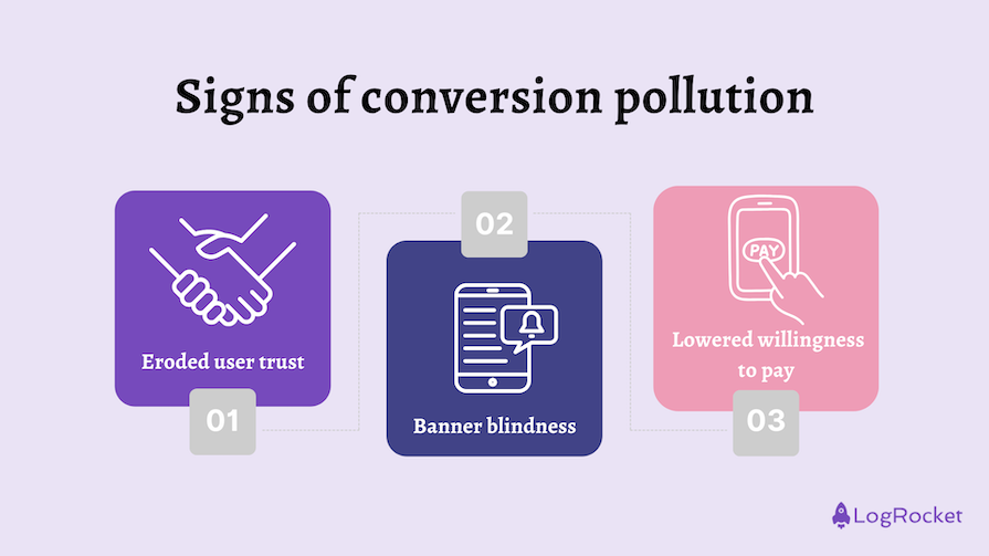
A product that shows “buy me, I’m worth it!” five times on a single page doesn’t make users think, “Oh, this is premium value.” It shouts, “Scam.”
Users develop banner blindness quickly. The more conversion prompts you expose the user to, the sooner they unconsciously start ignoring them. Our brains simply tune the noise out.
That might sound counterintuitive. More upgrade prompts should create more chances to convert, right? Not if they make users feel pressured.
People hate to feel forced to do things. More conversion points equals more pressure equals more resistance to “obey.”
My breakthrough didn’t come from removing placements randomly, although trust me, I tried. I just never got the approval due to “it earns us a lot of money.” Instead, it required changing how we looked at the data.
We used to evaluate individual entry points like “this banner drives X dollars, that tooltip drives Y.” It makes sense on a small scale, but when you have a double-digit number of conversion entry points, it quickly starts creating noise. Try these strategies instead.
The key part was to start grouping entry points by use case. If someone converts from this entry point, why are they converting? The answer is rarely “oh, because I was asked to.”
In our case, the main flows were:
That painted a brand new picture.
The marketing and special offer flows accounted for 70 percent of our conversion points and contributed 30 percent of our total revenue.
For comparison, access points accounted for 15 percent of our conversion points and 60 percent of the revenue.
You might think, “Okay, but if those marketing banners still bring X percent revenue, then it’s free money!” Sure, that was our default thinking, but let’s look at it from a different perspective.
We had so many of those “marketing” entry points that updating, maintaining, and managing those took half of our team capacity.
We couldn’t focus on three entry points driving 60 percent of our revenue because we had to maintain 30 micro conversion points for 30 percent of the revenue.
See the problem now?
No one questioned “spending some resources for that single banner that drove $100k a month.” But when you look at it as “putting 70 percent of effort into 30 percent of revenue,” it’s a completely different story.
Another thing to keep in mind is that people don’t convert because of a single entry point. They convert for a reason like:
As long as you have a conversion point for each key reason, they’ll attract conversions from eligible users.
Or, to put it another way, say that you have three warning messages about limitations:
Now, what happens when you remove the warning of 10 uses left?
People fear it means losing five percent of all conversions. But if someone’s willing to convert to have more uses, they will, maybe just a little later.
Instead of disappearing, many of those conversions will be redistributed to the “six uses” or “three uses” prompts. If someone was willing to convert at “10 uses left,” they may still convert a little later.
Yes, some conversions will be lost, especially from users who panic at “10 uses left” but never reach the later prompts. In the long run, though, it’s a price you pay for better UX and maintainability, which will pay you back with even more conversions.
Don’t look at conversion points in isolation. Group them by use case, then compare the effort each group requires against the revenue it actually drives.
From there, test whether removing duplicate prompts causes conversions to disappear or redistribute across remaining entry points. Sometimes you’ll lose conversions, so always test. However, oftentimes users still convert because the underlying need remains.
The payoff is enormous for two key benefits:
To wrap up the story, we went down from 50 entry points to around 16, which was still too many if you ask me. Conversion rates in general increased by around eight percent, not to mention a positive impact on other metrics. Most importantly, it gave us a better playground to further experiment and optimize conversions.
It’s the Pareto principle at its best:
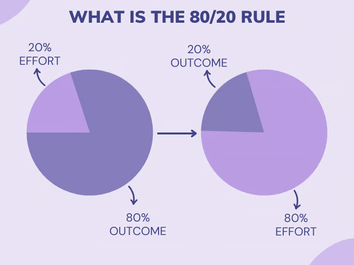
Focus on the 20 percent of entry points that give you 80 percent of the revenue. The rest is noise.
Featured image source: IconScout
LogRocket identifies friction points in the user experience so you can make informed decisions about product and design changes that must happen to hit your goals.
With LogRocket, you can understand the scope of the issues affecting your product and prioritize the changes that need to be made. LogRocket simplifies workflows by allowing Engineering, Product, UX, and Design teams to work from the same data as you, eliminating any confusion about what needs to be done.
Get your teams on the same page — try LogRocket today.

Learn when streaks improve retention, when they create fragile engagement, and how PMs can design healthier systems around user progress.

A technical debt register brings transparency and clarity as to what type and how much debt you have and can be used to monitor and review your debt ratio.

Memos don’t have to be complicated. Just keep them clear, concise, and focused on actionable items. More on that in this blog.

Learn how tech PMs can take over inherited products, gather context, clean up backlogs, find quick wins, and make smarter decisions.


