Color plays an important role in web design, but creating a color palette can be a daunting task for designers and developers. There are many factors that come into play when designing a color palette: branding, the information you’re trying to convey, maintaining a consistent luminosity among different colors, achieving sufficient contrast between different shades, and how the colors display in light and dark mode.

CSS offers several color functions, but many are difficult to use or create inconsistent results. In this article, we’ll explore a newer CSS color model, oklch(), designed to offer an intuitive and consistent way to create colors for the web. We’ll demonstrate how to use the oklch() color model to create consistent, accessible color palettes.
Jump ahead:
When CSS Color Module Level 4 became a candidate recommendation in 2022, it added new color spaces. Color spaces are basically graphic representations of groups of colors available on a device that supports a particular color gamut. For example, the sRGB color space has been available on most devices for some time; color functions like RGB and HSL create colors with this color space in mind.
Today, some devices accept the Display P3 color space, designed by Apple, which offers around 50% more colors than sRBG:
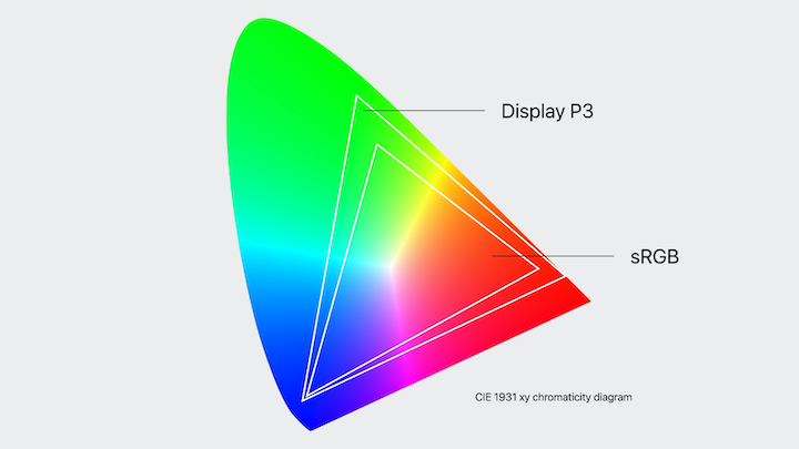
CSS Color Module Level 4 offers new color functions that work with the Display P3 color space: LCH, OKLCH, LAB, and OKLAB. To see the greater range of colors offered by the Display P3, you’ll need a device that can display those colors. However, you can still take advantage of the new CSS Color Module 4 color functions even if your device uses the sRGB model. If your device isn’t able to render a particular color, the browser will choose the closest alternative.
The oklch() color function has three required (and one optional) parameters:
L: Lightness defines how close the color is to white or black, where 0% is pure black and 100% is pure whiteC: Chroma represents the amount of color that is applied. At the minimum value of 0, the color is closer to gray, while higher values are associated with a more saturated color. In theory, chroma’s value is infinite, but in practice, it’s rarely higher than 0.5H: Hue defines the color itself, and ranges from 0 and 360. H is similar in concept to a color wheel. In the the sRGB color model, 0 represents red, but in the Display P3 color model, the 0 value is a deep pinkalpha: This optional value represents the opacity of the color; it ranges from 0 to 1Here’s an example of a color written with the oklch() color function:
.color {
  color: oklch(70% 0.3 150) /* This would be a bright green color */
}

.color.alpha {
  color: oklch(70% 0.3 150 / 0.5) /* This green color would have some transparency */
}
The oklch() color function is pretty intuitive. You only need to consider the amount of luminosity you’d like, the intensity of the shade, and the color itself.
Th oklch() color model is more intuitive and offers more consistent results than many other color functions, like rbg(), hex, hsl(), and lch().
Let’s take a closer look.
The rbg() and hex color functions use the same approach, they just vary in notation. Both functions create a color in the sRGB color space by modifying three values: red, green, and blue. rbg() and hex are probably two of the most widely used color functions on the web.
Here’s an example of an rbg() color and a hex color:
.rgb-square{
  background-color: rgb(145, 230, 200);
}

.hex-square {
  background-color: #78f25b;
}
Can you discern the colors just by looking at the above code?
The rbg() color in this example is predominately green and blue with some red. Because the values are quite high, it will have a high luminosity. But, how does this information translate to an actual color? The hex color in the above example is even more difficult to translate because that requires knowing how to read hexadecimal values.
With these models, it’s difficult to determine a color from the formula, and it’s also challenging to know what values to modify to create particular shades or tones.
Here are the mysterious colors from the above example:
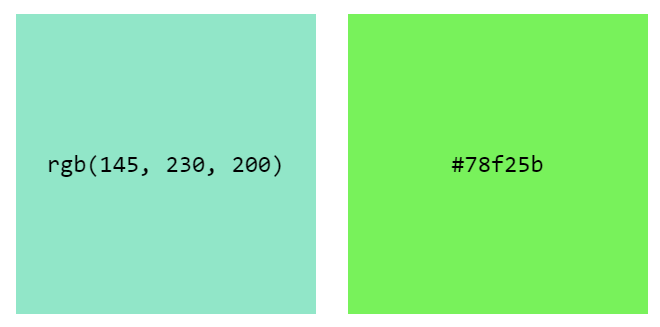
rgb() and hex color functions, respectively.Now, let’s look at a color written using the oklch() color function:
.oklch-square {
  background-color: oklch(45% 0.2 200);
}
This color has a luminosity value of 45%, so we can assume that the color isn’t very bright. The chroma value is 0.2, meaning it isn’t very saturated. A hue value of 200 corresponds to a turquoise color, so we can deduce that the color is a darker, slightly muted variant of turquoise.
Here’s the color from this example:
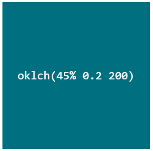
oklch() color function.With this color function, it’s much easier to deduce the color and understand what values to modify to create lighter or darker variants. This is where the benefits of oklch() really start showing up.
Now, let’s compare oklch() with another color model that works with a similar principle, but is not that consistent.
Before CSS Color Module 4, hsl() was the best option we had for creating a color palette more intuitively. This color function has three parameters: hue, saturation, and lightness. We’ve already talked about hue and lightness. You may think that saturation and chroma are the same, but that’s not the case! Saturation refers to the strength or intensity of a color; chroma refers to the purity of the color (how much black, white, or gray has been added).
As Andrey Sitnik and Travis Turner mention in their article “OKLCH in CSS: Why we moved from RGB and HSL,” HSL is a color space distributed in a cylinder. That means if we put this space in a two-dimensional graph, you’ll notice that every color has the same saturation, from 0% to 100%. But, that’s not how our eyes perceive saturation. In reality, each hue has different saturation values.
Notice the difference when we compare the HSL and OKLCH color spaces and remove the hue:
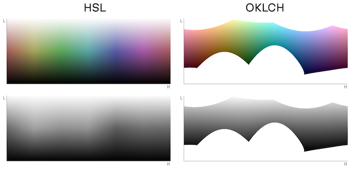
You’ll notice how OKLCH offers a more uniform hue than HSL. This is what affects the latter’s output consistency when we start manipulating colors.
To better understand this, let’s look at an example. Let’s create two buttons with the hsl() and oklch() color models using the following values:
90 for the first button and 270 for the second button100% for hsl0.5 for oklch50%Here are the buttons:

hsl() color model; the bottom buttons were created with the oklch() color model.The colors are not the same because the HSL and OKLCH color wheels are different. You’ll notice that the buttons created with hsl() color function don’t offer the same level of contrast; the green button is almost unreadable! However, the buttons created with oklch() color function have a very similar perceived lightness, providing a very similar experience in terms of readability.
The hsl() color model is not reliable for manipulating and creating color palettes because it can lead to accessibility issues. oklch() offers the same intuitive approach as HSL, but provides much more consistency in its output.
The lch() color model is very similar to oklch(), and it generally provides very consistent results. The one caveat, as Andrey Sitnik and Travis Turner mentioned in their article, is that lch() has a bug that shifts the chroma and lightness values of blue (i.e., lch() hues between 270 and 330).
oklch() was created as a version of lch() that would be easier for devices to understand and could provide more consistent results. This was achieved by resolving the previously mentioned bug, improving gamut correction, and adding some additional features.
By now, it should be clear that oklch() is intuitive, accessible, and generally the best option for creating colors on the web. Let’s apply it to a practical example.
Here comes the fun part! We’re going to use oklch() to create four message windows.
Each window will have a different color palette to convey particular messaging. Here’s a list of the color palettes and the messages that they will be used to convey:
For each type of messaging (or “state”), we’ll create nine shades of the same color, ranging from very light to dark. We’ll also create a neutral color palette for the window text, and we’ll provide support for light and dark modes, based on user preferences.
All right, let’s get started!
The key to creating neutral colors is to use a very low chroma value. Chroma defines the color’s purity, so a chroma value that’s closer to 0 will result in a color that’s closer to gray. Since pure black (or pure white) can cause user eye strain, we’ll add a tiny bit of tint by selecting a chroma value of 0.01.
Next, we’ll define our brand color’s hue. This can be any value. For this example, I’ve selected 280 because I happen to like that particular shade of blue.
Now, we’ll need to start modifying the lightness value. The key here is to start with a pretty high value for the first color, and gradually reduce it to a fairly low value for the final color.
I started with a lightness value of 97% and ended with a final value of 12%. Here are the final custom properties I ended up with after following this exercise:
:root {
  --clr-neutral-100: oklch(97% 0.01 280);
  --clr-neutral-200: oklch(89% 0.01 280);
  --clr-neutral-300: oklch(80% 0.01 280);
  --clr-neutral-400: oklch(71% 0.01 280);
  --clr-neutral-500: oklch(60% 0.01 280);
  --clr-neutral-600: oklch(49% 0.01 280);
  --clr-neutral-700: oklch(38% 0.01 280);
  --clr-neutral-800: oklch(25% 0.01 280);
  --clr-neutral-900: oklch(12% 0.01 280);
}
Here’s the resulting neutral color palette:

I created this color palette by simply eyeballing the values, and got pretty good results! There are probably more precise approaches to achieve a smoother shade transition, but one of the oklch() color model’s best features is that it enables users to create a color palette intuitively and with pretty consistent results.
Before we start creating color palettes for the different states, let’s take a look at the design of our message window from an accessibility standpoint.
Two important aspects of color with regard to accessibility are ensuring sufficient contrast and providing additional ways (besides color) to convey information.
According to WCAG 2.1 Success Criterion 1.4.3 – Contrast (Minimum), the minimum contrast for normal and large text is 4.5:1 and 3:1, respectively. We’ll need to select color combinations that we can use to achieve those contrast ratios. I waited to discuss this until after we created our neutral color palette so that we can use it to make a prototype.
When we create the color palettes for our different states, we’ll use the same oklch() lightness values for each state. If we have a good contrast ratio with our prototype (our neutral color palette), then we’ll certainly have a good contrast ratio for the different color shades that we’ll use for each state.
For this project, I’ll create three shades: accent (used for the card border and buttons), background, and text. Here are the color shades I selected after testing the contrast ratio with Google DevTools:
| Item | Shade |
|---|---|
| Accent | 700 |
| Background | 200 |
| Text | 800 |
Here’s how the message window looks:
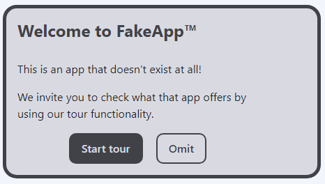
The WCAG 2.1 Success Criterion 1.4.1 – Use of Color, specifies that color should not be “…used as the only visual means of conveying information, indicating an action, prompting a response, or distinguishing a visual element.” In keeping with the techniques that WGAB suggests for addressing this, we‘ve included clarifying information in the text content itself. We’ve also added an easily recognizable icon to each card to provide an extra hint about its content:

We’ve covered the relevant accessibility considerations; let’s create a color palette for our different states.
Now that we have a proper lightness scale, it’s time to use it to create our brand color palette. For this, we have to start modifying the chroma value, but how do we know which values to use? Once again, the best idea here is trusting your eyes, but in my experience, there’s a method you can use to get good results most of the time.
My approach is to start modifying the values so that the most extreme shades (the 100 and 900 values) have low chroma values and the medium shades (values closer to 500) have higher chroma values. If I had to graph this approach, it would look something like this:
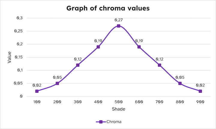
This will create a group of shades that will range from almost white to almost black with more vibrant colors in the middle. We’ll have to add those chroma values to our custom properties.
If you recall, we selected 280 as the base hue and we’re using it for our neutral color palette. Now, we have to copy the values, modify them, and add them to new custom properties:
:root {
  --clr-brand-100: oklch(97% 0.02 280);
  --clr-brand-200: oklch(89% 0.05 280);
  --clr-brand-300: oklch(80% 0.12 280);
  --clr-brand-400: oklch(71% 0.19 280);
  --clr-brand-500: oklch(60% 0.27 280);
  --clr-brand-600: oklch(49% 0.19 280);
  --clr-brand-700: oklch(38% 0.12 280);
  --clr-brand-800: oklch(25% 0.05 280);
  --clr-brand-900: oklch(12% 0.02 280);
}
Here’s our brand color palette:

Now it’s time to create the color palettes for the success, warning, and error message cards. All we need to do is copy the lightness and chroma values used for our brand colors and modify the hue values.
The OKLCH color wheel is a bit different, so I’ll just set the corresponding values for green (success), yellow (warning), and red (error):
| State | Hue |
|---|---|
| Success | 150 |
| Warning | 80 |
| Error | 20 |
Here’s how our new custom properties will look:
:root {
  --clr-success-100: oklch(97% 0.02 150);
  --clr-success-200: oklch(89% 0.05 150);
  --clr-success-300: oklch(80% 0.12 150);
  --clr-success-400: oklch(71% 0.19 150);
  --clr-success-500: oklch(60% 0.27 150);
  --clr-success-600: oklch(49% 0.19 150);
  --clr-success-700: oklch(38% 0.12 150);
  --clr-success-800: oklch(25% 0.05 150);
  --clr-success-900: oklch(12% 0.02 150);

  --clr-warning-100: oklch(97% 0.02 80);
  --clr-warning-200: oklch(89% 0.05 80);
  --clr-warning-300: oklch(80% 0.12 80);
  --clr-warning-400: oklch(71% 0.19 80);
  --clr-warning-500: oklch(60% 0.27 80);
  --clr-warning-600: oklch(49% 0.19 80);
  --clr-warning-700: oklch(38% 0.12 80);
  --clr-warning-800: oklch(25% 0.05 80);
  --clr-warning-900: oklch(12% 0.02 80);

  --clr-error-100: oklch(97% 0.02 20);
  --clr-error-200: oklch(89% 0.05 20);
  --clr-error-300: oklch(80% 0.12 20);
  --clr-error-400: oklch(71% 0.19 20);
  --clr-error-500: oklch(60% 0.27 20);
  --clr-error-600: oklch(49% 0.19 20);
  --clr-error-700: oklch(38% 0.12 20);
  --clr-error-800: oklch(25% 0.05 20);
  --clr-error-900: oklch(12% 0.02 20);
}
And finally, here are our color palettes for the success, warning, and error message states:
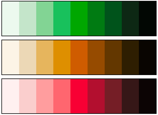
There you have it! With OKLCH you can create the colors you need quickly by just modifying some values consistently and intuitively.
Next, we’ll apply these colors to our message window components and make them compatible with user preferences to create a dark and light mode. To do this, we’ll need to use those custom properties to create another set of custom properties for this component and its variants.
For this project, we created three shades: accent (used for the card border and buttons), background, and text. These will be used throughout the card design, except for the top-left icon and the text of the primary button; those elements will use the neutral color palette.
We’ll need to modify two shades: 200 (background) and 700 (accent elements) and create some custom properties to define the design tokens corresponding to each state.
We’ll also create a couple of design tokens for the elements that use colors from the neutral color palette:
:root {
  /* Neutral color design tokens */
  --clr-text: var(--clr-neutral-800);
  --clr-text-invert: var(--clr-neutral-200);

  /* Non-neutral color design tokens */
  --clr-brand-accent: var(--clr-brand-700);
  --clr-brand-background: var(--clr-brand-200);
  --clr-success-accent: var(--clr-success-700);
  --clr-success-background: var(--clr-success-200);
  --clr-warning-accent: var(--clr-warning-700);
  --clr-warning-background: var(--clr-warning-200);
  --clr-error-accent: var(--clr-error-700);
  --clr-error-background: var(--clr-error-200);
}
Here, we’re defining color tokens instead of using the colors directly in our windows because it will make it easier for us to later create variants for dark mode. We can add styling to the windows by defining some colors using custom properties.
For simplicity’s sake, I’ll only add styling related to colors. I’ll also add the HTML structure I used for the windows:
<div class="card" data-type="brand"> <!-- This dataset will be used to define colors later -->
  <div class="card__icon-container">
    <svg width="24" height="24" viewBox="0 0 24 24" fill="none" xmlns="http://www.w3.org/2000/svg" aria-hidden="true">
      <!-- SVG path -->
    </svg>
  </div>
  <div class="card__text-container">
    <h2>Welcome to FakeApp™</h2>
    <p>This is an app that doesn't exist at all!</p>
    <p>We invite you to check what that app offers by using our tour functionality.</p>
    <div class="button__container">
      <button class="button__primary">Start tour</button>
      <button class="button__secondary">Omit</button>
    </div>
  </div>
</div>
.card {
  border: 5px solid var(--window-accent);
  background-color: var(--window-background);
}

.card__icon-container {
  background-color: var(--window-accent);
  color: var(--clr-text-invert);
}

.card__icon-container svg {
  stroke: currentColor;
}

.card h2 {
  color: var(--window-accent);
}

.button__primary {
  background-color: var(--window-accent);
  color: var(--clr-text-invert);
  border-color: transparent;
}

.button__secondary {
  background-color: transparent;
  color: var(--window-accent);
  border-color: currentColor;
}
As you can see, I created two variables for each window: --window-accent and --window-background. I’ll use a data- attribute to define the window’s custom properties using our design tokens:
.card[data-type="brand"] {
  --card-accent: var(--clr-brand-accent);
  --card-background: var(--clr-brand-background);
}

.card[data-type="success"] {
  --card-accent: var(--clr-success-accent);
  --card-background: var(--clr-success-background);
}

.card[data-type="warning"] {
  --card-accent: var(--clr-warning-accent);
  --card-background: var(--clr-warning-background);
}

.card[data-type="error"] {
  --card-accent: var(--clr-error-accent);
  --card-background: var(--clr-error-background);
}
Here’s the result:
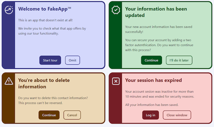
We just saw how easy it is to create variants using design tokens, but what about the contrast? Thanks to the oklch() color model, if we keep the lightness values consistent the same across different color palettes, the contrast will remain unchanged. To prove this, here’s a comparison between the contrast of the sample window with the neutral color palette and the error state window with the red color palette:
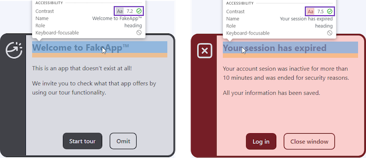
Modifying the chroma values could have some influence on contrast, but unless you create a color palette consisting of really saturated colors, you should not have inconsistency issues. Now, the only thing we need to work on is creating a dark-mode version.
We can add the dark variants of our design tokens inside the CSS prefers-color-scheme media query and it will create the respective variant when the user has dark mode enabled in their operative system or browser:
@media screen and (prefers-color-scheme: dark) {
  :root {
    --clr-background: var(--clr-neutral-900);
    --clr-text: var(--clr-neutral-200);
    --clr-text-invert: var(--clr-neutral-900);
    --clr-brand-accent: var(--clr-brand-300);
    --clr-brand-background: var(--clr-brand-800);
    --clr-success-accent: var(--clr-success-300);
    --clr-success-background: var(--clr-success-800);
    --clr-warning-accent: var(--clr-warning-300);
    --clr-warning-background: var(--clr-warning-800);
    --clr-error-accent: var(--clr-error-300);
    --clr-error-background: var(--clr-error-800);
  }
}
Here’s the result, showing how our message cards will display in dark mode:
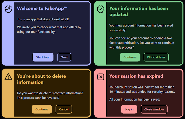
And there you have it! You can use the oklch() color function to create a color palette that creates consistent results, and you can use it to create different states and themes with ease.
According to CanIUse results, the oklch() color function is supported by all desktop browsers. However, if you look at the details you’ll see that Firefox just implemented it in June 2023 and Samsung Internet still does not support it as of this writing, Also, you can’t rely on a user having the latest browser version, so it’s worth taking a moment and create a fallback if you’re going to use this color model in production.
Fortunately, there’s a tool that can help us with this task. We can use the Huetone website to easily create a color palette using the oklch() color function and export the result in hexadecimal format, ready to use as custom properties in CSS. We can even copy the palette as design tokens and use them in Figma with the Design Tokens Plugin!
This article is not a Huetone tutorial, mostly because it’s not necessary! Huetone has clear instructions and a list of hotkeys. After you add each color to the site, Huetone lets you copy a link to the color tokens you created. Here are the project’s color tokens that I created.
Be sure to name your colors properly. I used the following naming convention for my custom properties: --clr-[state]-[shade]. It’s important to respect the same name structure when you create your colors.
N.B., if the color created by oklch() color model generates a color not supported by sRGB color space, Huetone will choose the closest option possible. It won’t be an exact replication, especially with colors that have a high chroma value, but it will still provide a good experience and most importantly it will maintain a similar contrast rate, so accessibility will not be affected
Now that we have our colors, we need a way to add them as a fallback. This is where the CSS @supports feature query comes in. We can use it to detect if the browser does not support a feature, and use that to add our fallback custom properties.
The syntax for the @supports rule is quite simple, we simply need to add the property we want to detect within the parenthesis. In our case, we want to detect when oklch() is not supported, so we’ll add the not prefix right before the parenthesis, like so:
@supports not (background-color: oklch(0%, 0, 0)) {
  :root {
    --clr-neutral-100: #f3f4fc;
    --clr-neutral-200: #d9dae1;
    --clr-neutral-300: #bcbdc4;
    --clr-neutral-400: #a0a1a8;
    --clr-neutral-500: #7f8086;
    --clr-neutral-600: #5f6066;
    --clr-neutral-700: #414248;
    --clr-neutral-800: #212126;
    --clr-neutral-900: #050509;

    --clr-brand-100: #f3f4ff;
    --clr-brand-200: #d4d8fa;
    --clr-brand-300: #b0b7ff;
    --clr-brand-400: #9094ff;
    --clr-brand-500: #6d64ff;
    --clr-brand-600: #5147c9;
    --clr-brand-700: #383681;
    --clr-brand-800: #1d1e3a;
    --clr-brand-900: #05050e;

    --clr-success-100: #edf9ef;
    --clr-success-200: #c6e4cb;
    --clr-success-300: #83d494;
    --clr-success-400: #1dc15d;
    --clr-success-500: #009a46;
    --clr-success-600: #007433;
    --clr-success-700: #005121;
    --clr-success-800: #0b2813;
    --clr-success-900: #020703;

    --clr-warning-100: #fdf4e7;
    --clr-warning-200: #edd8b6;
    --clr-warning-300: #e5b562;
    --clr-warning-400: #d19500;
    --clr-warning-500: #a67600;
    --clr-warning-600: #7e5900;
    --clr-warning-700: #583d00;
    --clr-warning-800: #2e1e00;
    --clr-warning-900: #0a0500;

    --clr-error-100: #fff2f1;
    --clr-error-200: #fccecc;
    --clr-error-300: #ff9f9f;
    --clr-error-400: #ff6970;
    --clr-error-500: #ee003f;
    --clr-error-600: #b31030;
    --clr-error-700: #742028;
    --clr-error-800: #371617;
    --clr-error-900: #0c0303;
  }
}
You could use any property that supports the oklch() color model. For example, color: oklch(0% 0 0) or border-color: oklch(0% 0 0); it just needs to be a valid set of property and value. In this case, the fallback would be to update our custom properties from oklch() to hexadecimal when the browser doesn’t know what oklch() means.
You can check out the project, with the fallback, in this CodePen:
See the Pen
Message windows with oklch() by Cristian Diaz(@ItsCrisDiaz)
on CodePen.
CSS is in a constant state of evolution. The oklch() color model enables us to use the greater variety of colors available in the Display P3 color space. It’s also intuitive to use and, unlike most of the earlier color functions, delivers consistent results.
In this article, we explored the CSS OKLCH color model and compared it to RBG, HEX, HSL, and LCH. We demonstrated how to create different color palettes with oklch() and how to address accessibility considerations. Lastly, we looked at browser support for oklch() and showed how to create fallback values.
As web frontends get increasingly complex, resource-greedy features demand more and more from the browser. If you’re interested in monitoring and tracking client-side CPU usage, memory usage, and more for all of your users in production, try LogRocket.

LogRocket is like a DVR for web and mobile apps, recording everything that happens in your web app, mobile app, or website. Instead of guessing why problems happen, you can aggregate and report on key frontend performance metrics, replay user sessions along with application state, log network requests, and automatically surface all errors.
Modernize how you debug web and mobile apps — start monitoring for free.
Would you be interested in joining LogRocket's developer community?
Join LogRocket’s Content Advisory Board. You’ll help inform the type of content we create and get access to exclusive meetups, social accreditation, and swag.
Sign up now
Get to know RxJS features, benefits, and more to help you understand what it is, how it works, and why you should use it.

Explore how to effectively break down a monolithic application into microservices using feature flags and Flagsmith.

Native dialog and popover elements have their own well-defined roles in modern-day frontend web development. Dialog elements are known to […]

LlamaIndex provides tools for ingesting, processing, and implementing complex query workflows that combine data access with LLM prompting.