A good scrolling experience is very important on mobile devices. You have limited space and have to display a large amount of information, all while your app remains responsive and fast.

As a developer, you often need to implement complex scrolling mechanics in your app. This often involves multiple scrolling views. A typical example of this is an app bar with tabbed pages.
In this tutorial, we will learn about NestedScrollView and how you can use it in Flutter. We’ll discuss when to use it, give an example use case, talk about what’s happening under the hood, and overview a few limitations and restrictions of this function.
NestedScrollView?NestedScrollViewNestedScrollView
You have different options to scroll your content in Flutter. The simplest one is to use the SingleChildScrollView widget that automatically scrolls its child when needed.
You have other options as well, like ListView or GridView to display multiple elements. Both widgets provide constructors that require a builder method to build their children on demand. This is important because they only create those widgets that are visible or will soon become visible. Using them makes your app responsive and performant when you need to display a huge amount of data.
When you’re working with Flutter, you’ll hear about slivers — especially when you are building a scrolling UI. Slivers are the basic building blocks of a scrolling UI in Flutter. A sliver is a portion of a scrollable area that displays the content based on its configuration.
Slivers manage the display of their children when they become visible and apply the scrolling effects on them. ListView, GridView, and other scrolling widgets are built on top of slivers for easier use.
When you want to build a fancy scrolling UI, you can use CustomScrollView with sliver widgets, like SliverList, SliverGrid, or SliverAppBar. These provide the same functionality as their non-sliver version, but you can customize their scrolling behavior. For example, you can add a list and a grid after it in the same list and they will scroll together.
A CustomScrollView can scroll only in one direction, so if you need to scroll vertically and horizontally, you will need to nest the scroll views into each other. But that could cause strange scrolling behavior…
This is where NestedScrollView can help you.
NestedScrollView?The Flutter documentation defines NestedScrollView as “A scrolling view inside of which can be nested other scrolling views, with their scroll positions being intrinsically linked.”
This means that with NestedScrollView, you get two scrolling areas. One is the header part and the other is its body part.
NestedScrollView connects these two parts so they behave like one consistent scrollable area. The two parts will scroll together and their scroll position will be linked.
Typically, NestedScrollView is used with a SliverAppBar that has a TabBar in the header and a TabView in the body. Usually, the TabView scrolls horizontally and can have scrollable content that scrolls vertically.
NestedScrollView connects the scrolling behavior of the content in the body, so when you scroll its content and reach the top, it will forward the remaining scrolling to the header. If you have a flexible app bar, it will open it.
NestedScrollViewYou should use NestedScrollView when you have nested scroll views that you want to link together so they behave like one consistent scrollable area. This means that you can only control them together programmatically.
Let’s see a simple example where you have a flexible app bar and a list of items. First, without the NestedScrollView:
class MyHomePage extends StatelessWidget {
  const MyHomePage({Key? key}) : super(key: key);

  @override
  Widget build(BuildContext context) {
    return CustomScrollView(
      slivers: [
        // A flexible app bar
        const SliverAppBar(
          title: Text('App Bar'),
          expandedHeight: 200,
          pinned: true,
        ),
        // Uses the remaining space
        SliverFillRemaining(
          // Renders a scrollable list
          child: ListView.builder(
            itemBuilder: (context, index) => ListTile(
              title: Text(
                'Text $index',
              ),
            ),
          ),
        ),
      ],
    );
  }
}
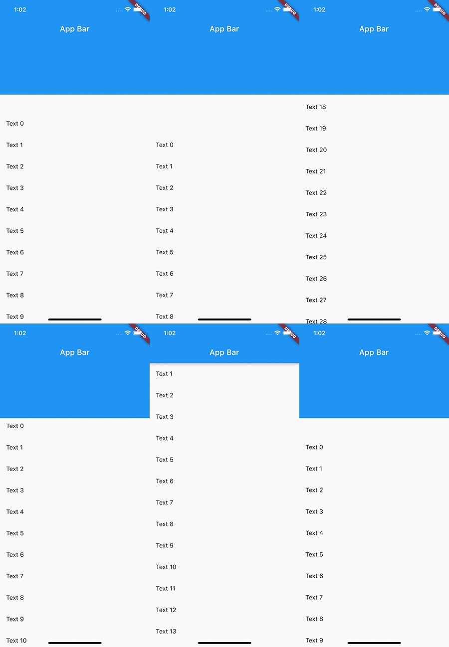
The problem with this is the ListView and SliverAppBar work independently of each other. If you scroll through the list, the flexible app bar will not collapse or expand. That does not make a consistent scrolling effect, and the NestedScrollView can help in this case.
Let’s see the same example but with NestedScrollView now:
class MyHomePageWithNestedScrollView extends StatelessWidget {
  const MyHomePageWithNestedScrollView({Key? key}) : super(key: key);

  @override
  Widget build(BuildContext context) {
    return NestedScrollView(
      // This builds the scrollable content above the body
      headerSliverBuilder: (context, innerBoxIsScrolled) => [
        SliverAppBar(
          title: const Text('App Bar'),
          expandedHeight: 200,
          pinned: true,
          forceElevated: innerBoxIsScrolled,
        ),
      ],
      // The content of the scroll view
      body: ListView.builder(
        itemBuilder: (context, index) => ListTile(
          title: Text(
            'Text $index',
          ),
        ),
      ),
    );
  }
}

We replaced the CustomScrollView with the NestedScrollView widget and separated the header and content parts.
The headerSliverBuilder is responsible for building the content in the outer scrollable area and the body contains the rest of the content. NestedScrollView connects these two, so when you scroll, it scrolls the outer and inner scrollable areas together.
The result of this is that when you scroll through the list, the app bar will collapse or expand. When you scroll through the app bar, the list will scroll as well.
NestedScrollViewUsually, NestedScrollView is used with a TabBar in the app bar and a TabView in the body:
class MyTabbedPage extends StatelessWidget {
  const MyTabbedPage({Key? key}) : super(key: key);

  @override
  Widget build(BuildContext context) {
    // Provides a TabController for TabBar and TabBarView
    return DefaultTabController(
      length: 2,
      child: NestedScrollView(
        headerSliverBuilder: (context, innerBoxIsScrolled) => [
          // The flexible app bar with the tabs
          SliverAppBar(
            title: const Text('App Bar'),
            expandedHeight: 200,
            pinned: true,
            forceElevated: innerBoxIsScrolled,
            bottom: const TabBar(tabs: [
              Tab(text: 'Tab 1'),
              Tab(text: 'Tab 2'),
            ]),
          )
        ],
        // The content of each tab
        body: TabBarView(
          children: [
            ListView.builder(
              itemBuilder: (context, index) => ListTile(
                title: Text(
                  'Tab 1 content $index',
                ),
              ),
            ),
            ListView.builder(
              itemBuilder: (context, index) => ListTile(
                title: Text(
                  'Tab 2 content $index',
                ),
              ),
            ),
          ],
        ),
      ),
    );
  }
}
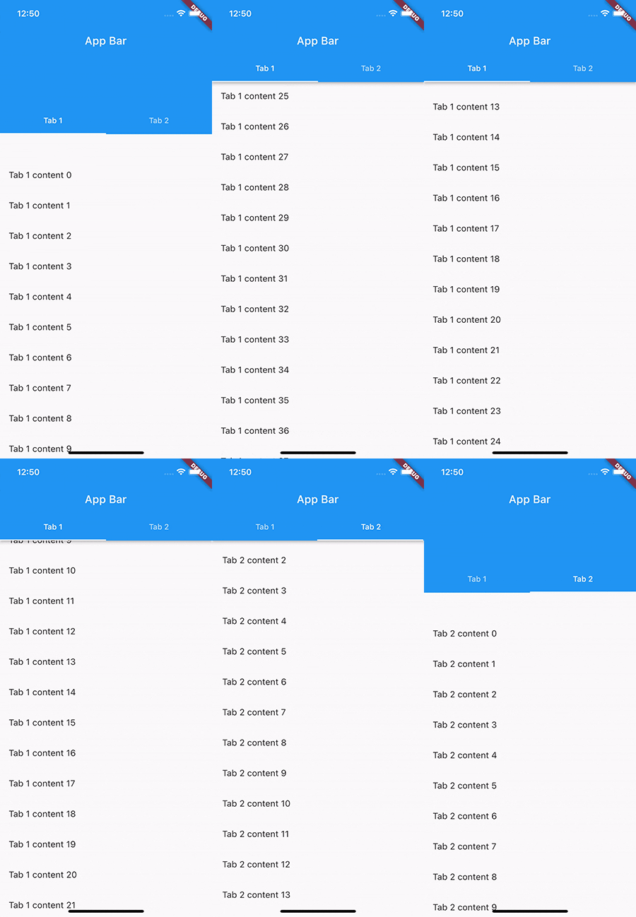
The widget above has tabbed navigation with two pages. Each page contains a list of items.
When you scroll on a page, it will collapse/expand the app bar according to the scroll position and give you a consistent scrolling effect.
You can configure the SliverAppBar to appear whenever the user scrolls towards it by setting its floating property to true. However, the default behavior of NestedScrollView is to forward the scroll to the header area once the body reaches its boundaries.
The result is that you will not get the floating effect of the app bar. To solve this, you have to set the floatHeaderSlivers property to true. It changes how NestedScrollView links the outer and inner scroll areas.
When its value is true, floatHeaderSlivers forwards the scroll to the outer scrollable area — this is where the app bar lives — and the inner area will get only the remaining.
This is how our app looks without the floatHeaderSlivers property:

And this is the expected behavior:
class MyHomePageWithNestedScrollViewAndFloatingAppBar extends StatelessWidget {
  const MyHomePageWithNestedScrollViewAndFloatingAppBar({Key? key})
      : super(key: key);

  @override
  Widget build(BuildContext context) {
    return NestedScrollView(
      // Changes the way the inner and outer scroll are linked together
      floatHeaderSlivers: true,
      // This builds the scrollable content above the body
      headerSliverBuilder: (context, innerBoxIsScrolled) => [
        SliverAppBar(
          title: const Text('App Bar'),
          expandedHeight: 200,
          floating: true,
          forceElevated: innerBoxIsScrolled,
        ),
      ],
      // The content of the scroll view
      body: ListView.builder(
        itemBuilder: (context, index) => ListTile(
          title: Text(
            'Text $index',
          ),
        ),
      ),
    );
  }
}

SliverAppBar can animate itself into view when floating. It can be enabled by setting its snap property to true. This animation inside of NestedScrollView does not push down the content of the nested inner scroll view, so the app bar overlaps the body.
Let’s start with the following example with the snapping enabled:
class MyHomePageWithNestedScrollViewAndSnappingAppBar extends StatelessWidget {
  const MyHomePageWithNestedScrollViewAndSnappingAppBar({Key? key})
      : super(key: key);

  @override
  Widget build(BuildContext context) {
    return NestedScrollView(
      // Changes the way the inner and outer scroll are linked together
      floatHeaderSlivers: true,
      // This builds the scrollable content above the body
      headerSliverBuilder: (context, innerBoxIsScrolled) => [
        SliverAppBar(
          title: const Text('App Bar'),
          expandedHeight: 200,
          floating: true,
          snap: true,
          forceElevated: innerBoxIsScrolled,
        ),
      ],
      // The content of the scroll view
      body: Builder(builder: (context) {
        return CustomScrollView(
          slivers: [
            SliverList(
              delegate: SliverChildBuilderDelegate(
                (context, index) => ListTile(
                  title: Text(
                    'Text $index',
                  ),
                ),
              ),
            ),
          ],
        );
      }),
    );
  }
}
You can see how the app looks with the overlaps:
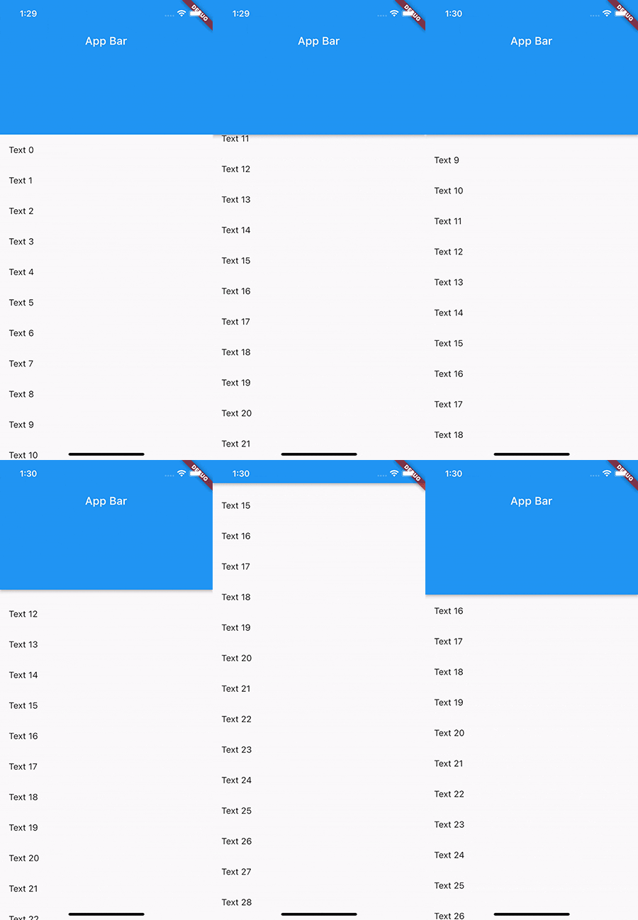
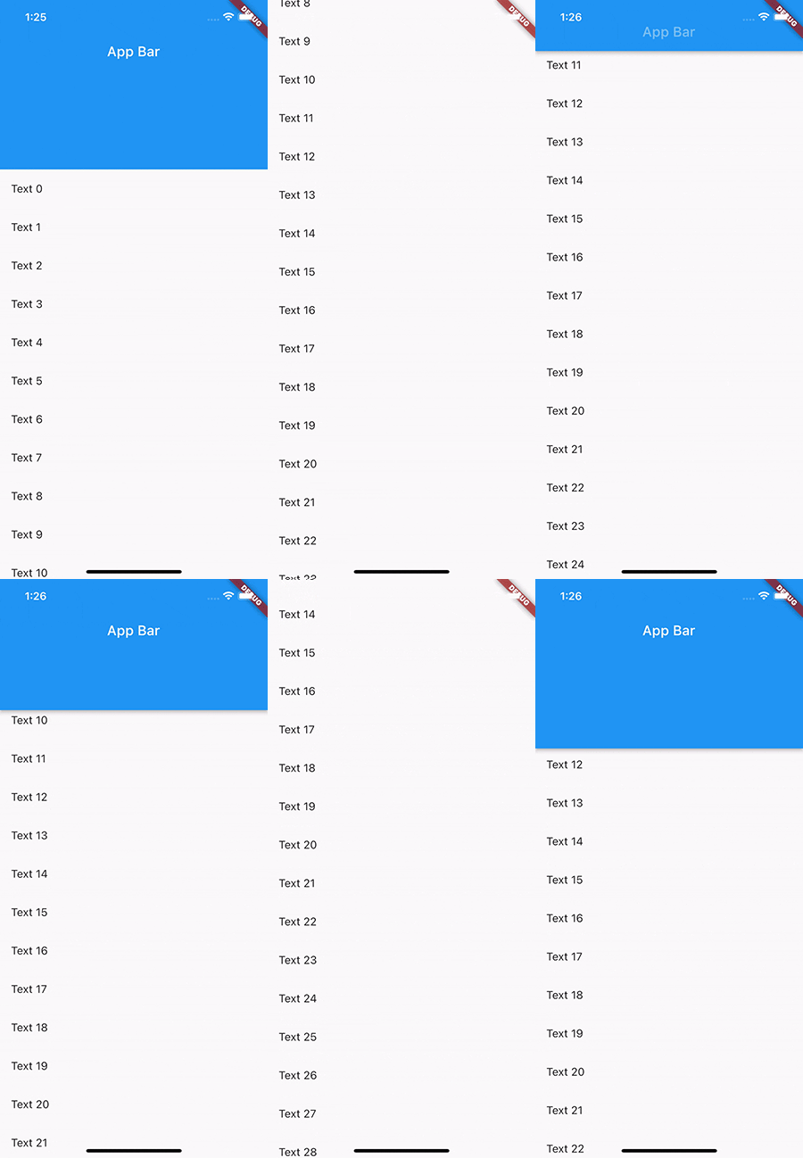
Fortunately, Flutter provides widgets to fix this behavior via SliverOverlapAbsorber and SliverOverlapInjector. The former is responsible for detecting when the snap animation happens and redirects the amount of overlap to the SliverOverlapInjector, which injects that amount into the nested inner scroll area.
class MyHomePageWithNestedScrollViewAndSnappingAppBar extends StatelessWidget {
  const MyHomePageWithNestedScrollViewAndSnappingAppBar({Key? key})
      : super(key: key);

  @override
  Widget build(BuildContext context) {
    return NestedScrollView(
      // Changes the way the inner and outer scroll are linked together
      floatHeaderSlivers: true,
      // This builds the scrollable content above the body
      headerSliverBuilder: (context, innerBoxIsScrolled) => [
        // This redirects the amount of the overlap to the injector
        SliverOverlapAbsorber(
          handle: NestedScrollView.sliverOverlapAbsorberHandleFor(context),
          sliver: SliverAppBar(
            title: const Text('App Bar'),
            expandedHeight: 200,
            floating: true,
            snap: true,
            forceElevated: innerBoxIsScrolled,
          ),
        ),
      ],
      // The content of the scroll view
      body: Builder(builder: (context) {
        return CustomScrollView(
          slivers: [
            // Injects the overlapped amount into the scrollable area
            SliverOverlapInjector(
              handle: NestedScrollView.sliverOverlapAbsorberHandleFor(context),
            ),
            SliverList(
              delegate: SliverChildBuilderDelegate(
                (context, index) => ListTile(
                  title: Text(
                    'Text $index',
                  ),
                ),
              ),
            ),
          ],
        );
      }),
    );
  }
}
You can see the correct behavior below. The content is pushed down when the snap animation is running:
To simplify it, NestedScrollView does two things: it creates two scroll controllers, one for the outer scroll area and one for the nested inner scroll view, and links them together. This linking is the result of calculations based on the scroll positions and the drag made by the user.
Once the controllers are linked, the widgets have to use them by providing the inner controller to the widgets in the body, all with the help of the PrimaryScrollController widget. Its job is to provide a scroll controller to a subtree.
If a scrollable widget like ListView does not have a scroll controller associated, it will use the one provided by the PrimaryScrollController. This implies that you can not assign your own instance of ScrollController to any of the scrollable widgets inside the body of NestedScrollView.
NestedScrollViewWhen you are using the NestedScrollView, you can not provide a ScrollController to the nested inner scrollable widget. That’s because NestedScrollView will provide its own inner scroll controller to its body.
The SliverAppbar.stretch property is not supported inside the NestedScrollView.
NestedScrollView is a powerful widget when you need to nest multiple scroll views inside each other. It links the two scrollable areas so they seem like one consistent scroll view.
Its typical use case is to have a SliverAppBar with tabs in the header and a TabView in its body. SliverAppBar has multiple effects and some of them need special handling when they are used in a NestedScrollView.
Install LogRocket via npm or script tag. LogRocket.init() must be called client-side, not
server-side
$ npm i --save logrocket

// Code:

import LogRocket from 'logrocket';
LogRocket.init('app/id');
// Add to your HTML:

<script src="https://cdn.lr-ingest.com/LogRocket.min.js"></script>
<script>window.LogRocket && window.LogRocket.init('app/id');</script>
Would you be interested in joining LogRocket's developer community?
Join LogRocket’s Content Advisory Board. You’ll help inform the type of content we create and get access to exclusive meetups, social accreditation, and swag.
Sign up now
This guide walks you through creating a web UI for an AI agent that browses, clicks, and extracts info from websites powered by Stagehand and Gemini.

This guide explores how to use Anthropic’s Claude 4 models, including Opus 4 and Sonnet 4, to build AI-powered applications.

Which AI frontend dev tool reigns supreme in July 2025? Check out our power rankings and use our interactive comparison tool to find out.

Learn how OpenAPI can automate API client generation to save time, reduce bugs, and streamline how your frontend app talks to backend APIs.