Historically, creating sliders or carousels meant wrestling with JavaScript, struggling with accessibility, and trying to minimize layout shifts. External libraries helped, but they also came with worse performance, limited customizability, and slower load times. Even with all the right plugins, you’d still be managing focus states, screen reader support, and snapping behavior manually.
In this article, we’ll walk through the new CSS features that make it possible to build fully functional CSS-only carousels and the accessibility improvements of this approach.
The Replay is a weekly newsletter for dev and engineering leaders.
Delivered once a week, it's your curated guide to the most important conversations around frontend dev, emerging AI tools, and the state of modern software.
CSS already had features to create a scrollable area through the use of overflow and scroll snapping with scroll-snap-type and scroll-snap-align. However, these functions didn’t provide a way for users to actively navigate the scroller.
Chrome 135 introduces two new pseudo-elements: ::scroll-button and ::scroll-marker()and a new pseudo-class, :target-current, that apply specifically to scroll marker elements.
::scroll-button() pseudo-element::scroll-button() allows for the creation of interactive scroll buttons as pseudo-elements. They are generated inside a scroll container only when their computed content value is set to something other than none, and they appear as <button> elements positioned as siblings to its child nodes. As such, they inherit the default behavior and styling properties of a native button element and can be freely styled and positioned.
These scroll buttons let users move through the scrollable area in a certain direction — left, right, up, or down. By default, each click scrolls about 85% of the visible area. You can change how this works using scroll snapping and defined snap targets. A scroll container can have up to four distinct scroll buttons, each linked to a specific scroll direction.
Here’s the basic syntax:
::scroll-button(<scroll-button-direction>) {
}
The <scroll-button-direction> argument can be:
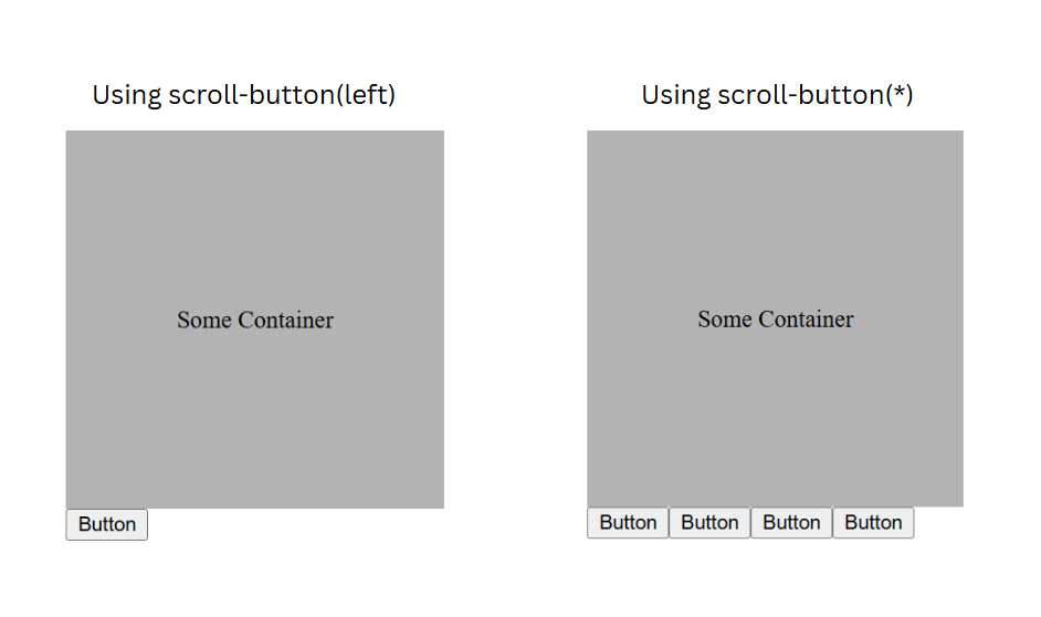
*: Targets all the elements scroll buttonsup, down, left, right: Physical directionsblock-start, block-end, inline-start, inline-end: Logical directionsThe pseudo-element only becomes visible if you explicitly set its content. Here’s how to add a scroll button that scrolls to the left:
div::scroll-button(left) {
  content: "Button";
}
If you want to show scroll buttons for all directions:
div::scroll-button(*) {
  content: "Button";
}
This will create four buttons, each for a different direction:
For styling, you can use the usual enabled/disabled pseudo-classes. When you hit the end of the scroll area in any direction, the button automatically disables. And just like regular buttons, you can style scroll buttons however you want — colors, hover effects, etc.
::scroll-marker() pseudo-elementThe ::scroll-marker pseudo-element represents a visual marker tied to a slide/scrollable item within a scroll container. You can click on a marker to navigate to the corresponding item or simply view the scroll progress, sort of like a progress bar. All markers are grouped together in a container represented by the ::scroll-marker-group pseudo-element.
Scroll markers are only generated when their content property is set to a value other than none, similar to how scroll buttons work. The number of markers corresponds to the number of children in the scroll container. The group appears either before or after the scroll container content, based on the scroll-marker-group property.
The syntax is as follows:
::scroll-marker {
  content: <marker-content>;
}
The <marker-content> can be anything like text, counters, or icons, as long as it’s not none. This gives you a lot of flexibility to build things like carousels with tabs, thumbnails, or whatever fits your design. For example, you can pair content: "" with an image background to create a thumbnail marker for your carousel.
Here’s a basic example with a scroll container and some markers:
<div>
  <div class="slide">Slide 1</div>
  <div class="slide">Slide 2</div>
  <div class="slide">Slide 3</div>
</div>


div {
  display: flex;
  gap: 10px;
  padding: 10px;
  overflow-x: auto;
  scroll-marker-group: after;
}
.slide {
  background-color: #e2e2e2;
  height: 250px;
  min-width: 90%;
  padding-top: 20px;
}

.slide::scroll-marker {
  content: "";
  border: 1px solid red;
  height: 1em;
  width: 1em;
}

div::scroll-marker-group {
  display: flex;
  gap: 10px;
  margin-left: 10px;
}
This would look something like this:
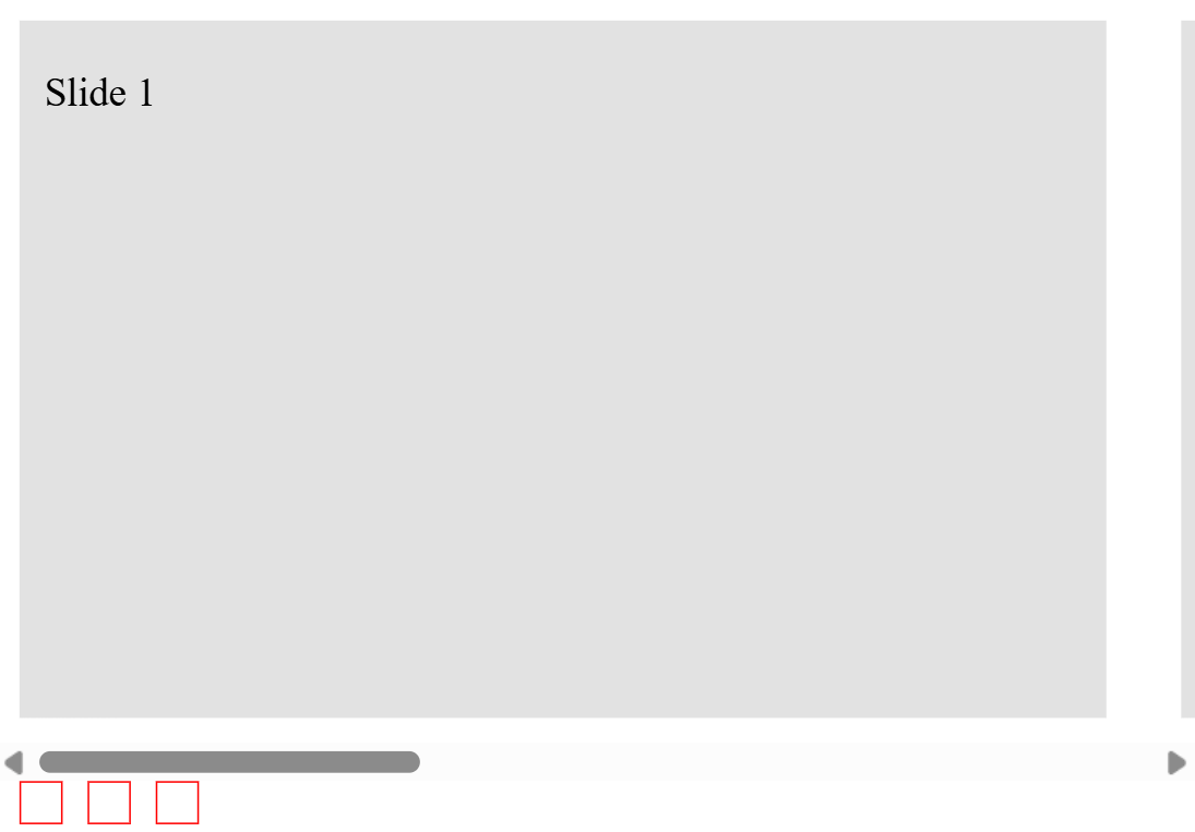
It’s a very basic UI, but it works. You can improve it quite a bit by adding scroll snapping and enabling smooth scrolling, but we’ll discuss these later on. The only real downside right now? There’s no way to tell which marker is currently active. That’s what we’ll look at next.
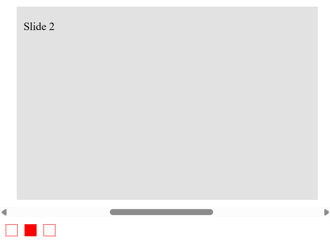
:target-current pseudo-classThe :target-current pseudo-class lets you style the active scroll marker. This is the ::scroll-marker that’s currently aligned with the scroll position inside a scroll-marker-group. It only works on ::scroll-marker, and it’s great for showing which item is currently in view.
In our case, this one-liner does the job:
::scroll-marker:target-current {
  background-color: red;
}
Our example would look like this now:
Now that we’ve discussed the new features, we will combine them all to create a complete carousel. We’ll focus more on styling and user experience here, since the core button and marker functionality have already been covered.
We’ll start by creating a scrollable container with horizontal overflow. We’ll use scroll-snap-type to ensure the slides snap into place as you navigate, and hide the scrollbar to make the interface look cleaner:
.carousel {
  width: 80%;
  display: flex;
  gap: 10px;
  overflow-x: auto;
  scroll-snap-type: x mandatory;
  scroll-marker-group: after;
  position: relative;
}

.carousel::-webkit-scrollbar {
   display: none;
   scrollbar-width: none;
}
You can also enable smooth scrolling on the container, although it’s important to keep user preferences in mind here:
@media (prefers-reduced-motion: no-preference) {
  .carousel {
    scroll-behavior: smooth;
  }
}
Next, we’ll define some basic slide elements. Using scroll-snap-align: center helps keep each slide centered when it is scrolled into view.
N.B., if you want the scroll buttons to scroll a single slide at a time, add
scroll-snap-stop: alwayson the slide alongsidescroll-snap-type: x mandatory(which is already applied in our example):
.slide {
  scroll-snap-align: center;
  height: 250px;
  min-width: 400px;
}
Now, let’s add scroll buttons to navigate the carousel. We’ll use icons for the content this time and place the buttons on the horizontal edges. A useful CSS feature that helps with things like this is CSS anchor positioning. However, it’s still very new and has poor browser compatibility, so we’ll stick to absolute and relative positioning for this guide:
.carousel::scroll-button(left) {
  content: "<" / "Prev";
  left: 5%;
}

.carousel::scroll-button(right) {
  content: "˃" / "Next";
  right: 5%;
}

.carousel::scroll-button(*){
  position: absolute;
  top: 160px;
  cursor: pointer;
}
We can also customize button states like hover and disabled. The :disabled pseudo-class automatically disables the button when you’re at the start or end of the scroll container:
.carousel::scroll-button(*):hover{
  background-color: #e1e1e1;
}
.carousel::scroll-button(*):disabled{
  opacity: 0.2;
  color: #000;
}
Lastly, let’s add some markers by enabling the marker group and styling the individual markers. We’ll use absolute positioning to center the marker group, but once again, anchor positioning may be something you might be interested in as well:
.carousel::scroll-marker-group {
  display: flex;
  gap: 10px;
  position: absolute;
  left: 50%;
  margin-top: 25px;
  transform: translateX(-50%);
}

.slide::scroll-marker {
  content: "";
  border: 1px solid #424242;
  border-radius: 50%;
  height: 20px;
  width: 20px;
  transition: 0.1s all ease-in-out;
}
We can then style the active marker as well as marker states like hover:
.slide::scroll-marker:hover {
  background-color: #e3e3e3;
}
.slide::scroll-marker:target-current {
  background-color: #424242;
}
Here’s a working example of everything put together:
See the Pen
CSS Only Carousel by Saleh-Mubashar (@saleh-mubashar)
on CodePen.
The great thing about features like these is that they not only reduce the need for JavaScript, but they also come with accessibility built into them.
Scroll buttons function just like regular <button> elements, except they’re rendered as pseudo-elements. That means they’re focusable, and you don’t need to manually add accessible names because they’re generated automatically.
For example, the following code will be announced by screen readers as “Scroll right,” regardless of what the visual content is:
.scroll-container::scroll-button(right) {
  content: "Button"; /* Announces "Scroll right" */
}
However, if you want screen readers to announce something specific, you’ll need to include it as alternative text, even if it’s the same as the visual label:
.scroll-container::scroll-button(right) {
  content: "⮕" / "Scrolls to the right"; /* Announces the text we have given*/
}
Scroll markers are also fully accessible. If no alt text is given to the content, screen readers will announce something like “selected, tab, 1 of 5.” You can, of course, override this just like with scroll buttons, by providing an alt text value via the second part of the content property:
::scroll-marker {
  content: "" / "Slide 1 thumbnail";
}
The scroll marker group is treated as a single focusable group using tablist semantics with a tabindex of -1. When a user tabs to the marker group, they can navigate between individual markers using the arrow keys.
As of now, ::scroll-button() and ::scroll-marker are only supported in Chrome 135+ and Edge 135+. That makes the feature somewhat experimental at the moment, but support is expected to expand.
You can check detailed compatibilities here:
Besides these, all other features discussed in this section are widely available.
Thanks for reading! CSS is rolling out cool new features all the time, and tools like ::scroll-button and ::scroll-marker show just how far native styling has come.
As web frontends get increasingly complex, resource-greedy features demand more and more from the browser. If you’re interested in monitoring and tracking client-side CPU usage, memory usage, and more for all of your users in production, try LogRocket.

LogRocket lets you replay user sessions, eliminating guesswork around why bugs happen by showing exactly what users experienced. It captures console logs, errors, network requests, and pixel-perfect DOM recordings — compatible with all frameworks.
LogRocket's Galileo AI watches sessions for you, instantly identifying and explaining user struggles with automated monitoring of your entire product experience.
Modernize how you debug web and mobile apps — start monitoring for free.

I tested the Speculation Rules API in a real project to see if it actually improves navigation speed. Here’s what worked, what didn’t, and where it’s worth using.
How AGENTS.md and agent skills improve coding agents, reduce mistakes, and make AI IDE workflows more reliable and project-aware.

Build a simple, framework-free Node.js app, and then deploy it to three different services that offer a free tier, Render, Railway, and Fly.io.

Understand best practices for structuring Node.js projects, such as separating roles using folder structures and practicing modular code.
Would you be interested in joining LogRocket's developer community?
Join LogRocket’s Content Advisory Board. You’ll help inform the type of content we create and get access to exclusive meetups, social accreditation, and swag.
Sign up now

 Learn more →
