The word has not gotten out, and accessibility is often an addendum to months or even years of web development. Webaim claims in this report that 97.8% of home pages have WCAG 2 failures. Webaim does make tools to audit a website for accessibility problems, so they do have a vested interest in these figures, but there is some truth.

I do not care about the various WCAG 2.x standards. People use these standards as an excuse to do the bare minimum to make a site accessible. What I do care about is that real users of assistive technologies can verify what we have developed is accessible. If we test with real users of assistive technologies, then they can tell us what is working and what is not. The current automated accessibility tool offerings are not able to do this just yet.
Single-page applications created with modern du jour JavaScript frameworks like React added a whole host of complexities to making a website accessible. A request to the server for new HTML does not happen when the user clicks a link. Instead, sleight of hand JavaScript trickery replaces old content with new as well as changing the address bar URL. Assistive technologies can be blissfully unaware of this change unless you take the appropriate action.
The Replay is a weekly newsletter for dev and engineering leaders.
Delivered once a week, it's your curated guide to the most important conversations around frontend dev, emerging AI tools, and the state of modern software.
I am now going to outline some simple steps that you can do to make your React website more accessible.
BREAKING! It does not take any longer to write semantic HTML than a flat collection of
divelements.
Hold the front page. You can make your website more accessible to assistive technologies by using the correct HTML elements and attributes! Who knew?
Who on Earth is not using the correct HTML and attributes? It seems crazy but it happens a lot, and maybe even more than once, I have in my dark past, created a clickable div element instead of using a button or maybe had a rogue input that is unchaperoned by a describing label element. Let us all make a point of doing the right thing now.
One of the best pieces of advice I have ever received when it comes to accessibility is to layout your HTML as if CSS does not exist. The leading screen readers stand a fighting chance of allowing easy navigation through your markup if your main layout is something like this:
<html>
   <body>
     <header role="banner">
       <p>Put company logo, etc. here.</p>
     </header>
     <nav role="navigation">
       <ul>
         <li>Put navigation here</li>
       </ul>
     </nav>
     <main role="main">
       <p>Put main content here.</p>
     </main>
     <footer role="contentinfo">
       <p>Put copyright, etc. here.</p>
     </footer>
  </body>
</html>
The combination of the correct HTML landmark elements and role attributes allows users of screen readers to navigate through the landmark regions such as header, main, and footer. Screen readers recognize these marked-up regions and provide shortcut keys for finding them…..that is if they exist. Here is a video showing how a screen reader picks up the landmark regions.
I am a huge fan of layout components in React for consistency, and I have created this CodeSandbox that shows a Layout component wrapping all components in the application:
const Layout = ({ children }) => (
  <React.Fragment>
    <header role="banner">
      <Logo />
    </header>
    <nav role="navigation">
      <Link to="/">Home</Link> <Link to="dashboard">Dashboard</Link>
    </nav>
    <main role="main">{children}</main>
    <footer role="contentinfo">
      <p>Put copyright, etc. here.</p>
    </footer>
  </React.Fragment>
);

const App = ({ children }) => (
  <React.Fragment>
    <Layout>
      <Router>
        <Home path="/" />
        <Dashboard path="dashboard" />
      </Router>
    </Layout>
  </React.Fragment>
);

const Home = () => (
  <div>
    <h2>Welcome</h2>
  </div>
);

const Dashboard = () => (
  <div>
    <h2>Dashboard</h2>
  </div>
);
The Layout component wraps the App component. You don’t need to add the semantic markup to any other components.
Headings are yet another thing that falls under the category of using correct HTML elements and attributes. Headings tell screen readers how the content on a page is organized, giving users an overview of the content. Avoid skipping headers as this can confuse screen readers.
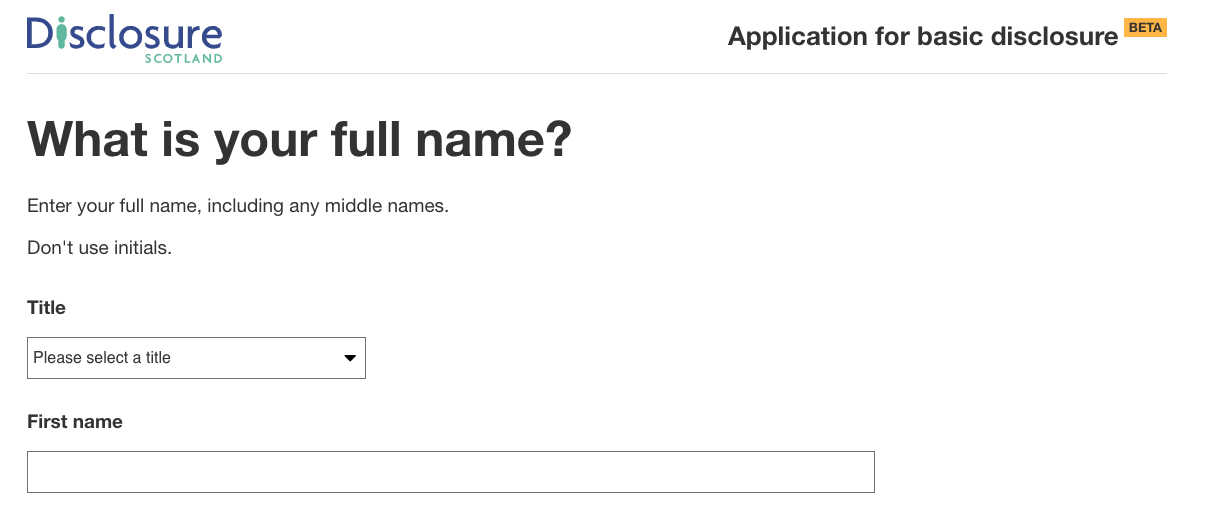
I worked on the Disclosure Scotland website, which is a wizard-like form of multiple steps. Each step of the form has one <h1> element that clearly states the intention of that step.

On each page transition or route change, the focus is moved to the top of the new content and the screen reader reads the h1 element describing the step’s purpose, which brings me swiftly on to how a router should behave in a React application.
The initial appeal of the SPA (single page application) was that it negated the need to go to the server to render new content. The problem is that a newly server-rendered page works great with a screen reader, but when you change routes in a SPA, the screen reader does not know that there is new content.
Luckily in the react ecosystem, there is Reach Router that takes care of this problem for us.
If you are using react-router then I have created this Hook that will place the focus on each page transition.
import { usePrevious } from "./usePrevious";
import { useLayoutEffect } from "react";
import { useLocation } from "react-router-dom";

export const useScrollToTop = ({ ref }:{
  ref
}) => {
  const { pathname } = useLocation();
  const previousPathname = usePrevious(pathname);

  useLayoutEffect(() => {
    if (pathname === previousPathname || !ref?.current) {
      return;
    }

    window.scrollTo(0, 0);

    const clearTimer = setTimeout(() => {
      ref.current.focus();
    }, 100);

    return () => {
      clearTimeout(clearTimer);
    };
  }, [pathname, previousPathname, ref]);
};
I have created a CodeSandbox that shows the Hook in action. Each page has a link at the bottom of the page that when clicked will invoke the Hook. The Hook keeps track of the current URL and then checks against a new navigation change and if they do not match, the Hook scrolls to the top of the page and sets focus on an HTML element that is stored in a React ref.
As we now have semantic HTML, a router and a container component that detects route changes, we should ensure that we can tab up and down the page on all elements that require focus.
There is not a lot to this if you use sensible HTML element choices for buttons and links. You should not make a span tag or a div a button or a link, for example. This a further reaffirming of the crazy suggestion that we should be using the correct HTML elements and attributes. I am pushing the envelope with this insane suggestion.
Another thing I see a lot is anchors or <a /> tags with no href, there is no need to do this. An anchor without an href does not make any sense, so don’t do it. You can style a button to look like an anchor by simply setting the background to transparent and no border, e.g:
.link__button {
  background: transparent;
  border: none;
  padding: 0;
  margin: 0;
  color: #2096f3;
}
More stating the obvious here, a.k.a using the correct HTML elements and attributes. One way of ensuring that all your form controls have not only labels but the correctly marked up accompanying error message is to have a higher component like this:
export function FormControl<T>(
  Comp: Component<T>
): React.Component<T> {
  return class FormControlWrapper extends React.Component<T> {
    id: string;
    constructor(props) {
      super(props);

      this.id = this.props.id || this.props.name || prefixId();
    }

    render() {
      const {
        invalid,
        name,
        label,
        errorMessage,
        className,
        required,
        ...rest
      } = this.props as any;

      const errorId = `${this.id}-error`;

      return (
        <div>
          <Label
            id={`${this.id}-label`}
            htmlFor={this.id}
            required={required}
          >
            {label}
          </Label>
          <div>
            <Comp
              id={this.id}
              name={name}
              invalid={invalid}
              aria-invalid={invalid}
              required={required}
              aria-describedby={errorId}
              {...rest}
            />
          </div>
          <div
            id={errorId}
            aria-hidden={!invalid}
            role="alert"
          >
            {invalid &&
              errorMessage &&
              <Error
                errorMessage={errorMessage}
              />}
          </div>
        </div>
      );
    }
  };
}
With this higher-order component in place, I can now add the correct labeling to any component such as an Input component:
export const FormInput = FormControl(Input)
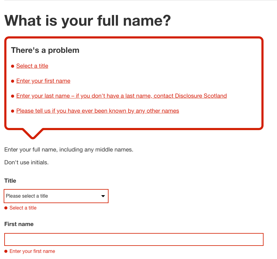
The error message is highlighted to all users with this approach:

The higher-order component above takes care of displaying an error below each invalid field if it is invalid. Unfortunately, users of a screen reader will not know about these errors unless they tab onto the field, so we need to supply a validation summary that describes each error and give navigation links from the validation summary to each error.

At first glance, this is complete overkill for two fields, but in the context of a screen reader, this is a great practice. In the event of an error, the focus will be placed on the h2 element in the ValidationSummary component. There is a link to each validation error. The link’s href is a bookmark link to the invalid form element. When the user presses tab, focus changes to each validation error link and the user can jump to the correct control to fix the error by clicking the link. A validation summary like this can ensure that all users have a pleasant experience.
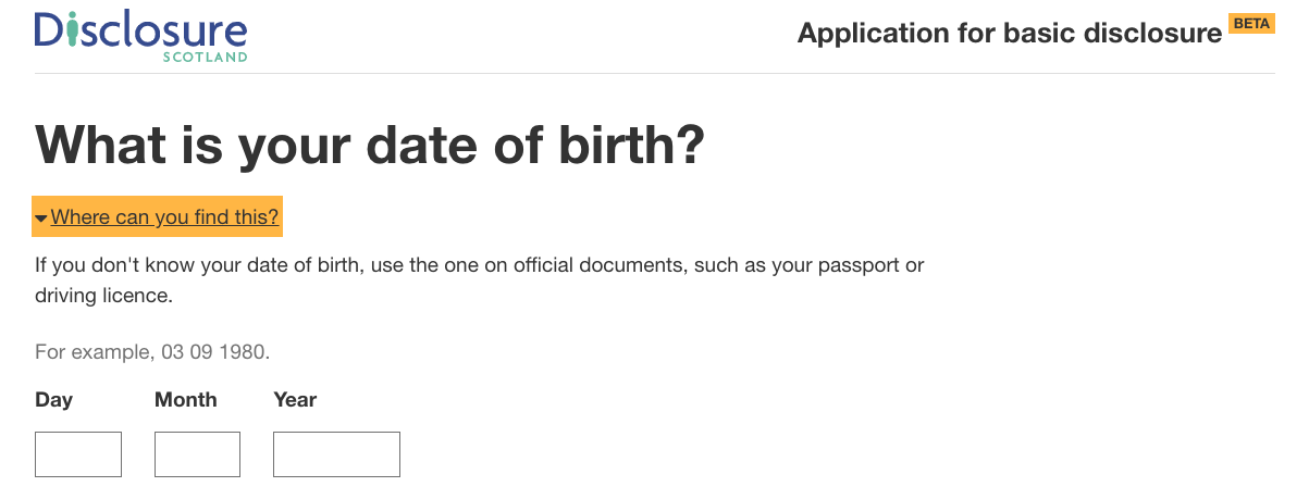
When links are focused, they should have a different colour to express their different state:

The first rule of aria attributes is not to use them. Please do not take this rule literally, and it is to enforce the fact that they should be used sparingly.
The aria-live attribute is one such exception. aria-live tells a screen reader that new content is on the page, and the user should be told this.
Below is a HelpLink expander component that expands and contracts when a link is clicked:
export const HelpLink = ({
  collapsibleId,
  linkText,
  helpText,
  open,
  onClick,
  children,
}) => (
  <div className={styles.container}>
    <Button
      buttonStyle={ButtonStyles.link}
      onClick={onClick}
      aria-expanded={open}
      aria-controls={collapsibleId}
      tabIndex={0}
    >
      <span
        className={cs(
          styles['link__title'],
          open && styles['link__title__open']
        )}
      >
        <span>{linkText}</span>
      </span>
    </Button>
    <div
      id={collapsibleId}
      aria-hidden={!open}
      aria-live="polite"
      className={cs(styles['closed'], open && styles['open'])}
      role="region"
      tabIndex={-1}
    >
      {helpText}
      {open && children}
    </div>
  </div>
)

You should make sure you:
display:none to hide content that screen readers need to announceSome users customize the appearance of web pages to suit their needs. To support these users, you should make sure:
If possible, you should avoid using CSS to reorder content on a page as this could cause issues for keyboard and screen reader users.
I’ve seen this a lot, and development teams think they are toeing the line by running a tool or linter that checks the rendered HTML of a website for incorrect HTML and wrong or missing attributes. Although this is worthwhile, this is no guarantee your website is accessible for users of assistive technologies. Testing with real users is the only guarantee that your website is accessible to all.
It is pretty depressing that the overriding theme of this post is to use the correct HTML elements and attributes. I will hold my hand up and say I have not always done this in the past. What I have described in this post is not a drastic change or adding any time to the development process. By just doing what I have outlined here, we can make our React sites available to all users.
More action needs to happen, and with a little thought and application, change can happen.
Install LogRocket via npm or script tag. LogRocket.init() must be called client-side, not
server-side
$ npm i --save logrocket

// Code:

import LogRocket from 'logrocket';
LogRocket.init('app/id');
// Add to your HTML:

<script src="https://cdn.lr-ingest.com/LogRocket.min.js"></script>
<script>window.LogRocket && window.LogRocket.init('app/id');</script>

Learn about TypeScript v6’s breaking changes, new ES2025 features, and deprecated options. A complete migration guide from v5 to prepare for v7.

Learn how Vite+ unifies Vite, Vitest, Oxlint, Oxfmt, Rolldown, and Node.js management in one CLI.

AI companies are buying developer tools as coding agents turn runtimes, package managers, and linters into strategic infrastructure.

Learn how AI-assisted development governance uses rules, agents, hooks, and protocols to help AI coding tools produce safer, more consistent code.
Hey there, want to help make our blog better?
Join LogRocket’s Content Advisory Board. You’ll help inform the type of content we create and get access to exclusive meetups, social accreditation, and swag.
Sign up now