
Editor’s note: This React Portals tutorial was last updated on 1 November 2022 to include information on React Portals and an example of using React Hooks with React Portals. For more information about React Hooks, check out our React Hooks reference guide and cheat sheet.

Modal windows are incredibly suitable when it comes to grabbing user attention. Furthermore, they are also helpful in collecting user information or asking for user input. However, in the React world, they are incredibly complicated to build. This is because it involves writing complex CSS code and tracking the DOM hierarchy. In large apps, this won’t be a small endeavor. Luckily, React introduced a concept called React Portals for this use case.
In this article, we’ll look at a real-world example of React Portals and explain how it can help solve the overflow: a hidden problem on a tooltip example:
Jump ahead:
The Replay is a weekly newsletter for dev and engineering leaders.
Delivered once a week, it's your curated guide to the most important conversations around frontend dev, emerging AI tools, and the state of modern software.
React Portals are an advanced concept that allows developers to render their elements outside the React hierarchy tree without comprising the parent-child relationship between components.
Usually, typical React components are located within the DOM. This means that it might be tricky for you to render modals or pop-up windows.
For example, look at the following code:
export default function App() {
  const [visibility, setVisibility] = useState("hidden");
  const handleClick = () => {
    if (visibility === "hidden") {
      //if the visibility state is 'hidden'
      setVisibility("visible"); //then set it to 'visible'
    } else {
      setVisibility("hidden"); //otherwise, make it 'hidden'
    }
  };
  return (
    <div className="App">
      <button onClick={() => handleClick()}>Show/Hide</button>
      {/*The visibility of the modal*/}
      <div style={{ visibility }}>
        <p>This is a modal</p>
      </div>
    </div>
  );
}
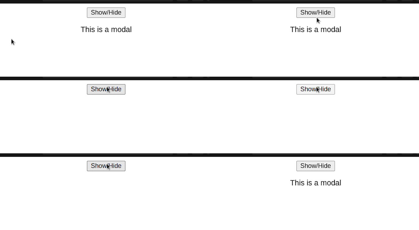
As you can see, our code works. However, this doesn’t look like a modal window at all. We want our component to pop out rather than blend in with the rest of the webpage.
This is a widespread problem that arises all the time in web development: you want to build some tooltip or dropdown, but it’s cut by the parent element overflow: hidden styling:
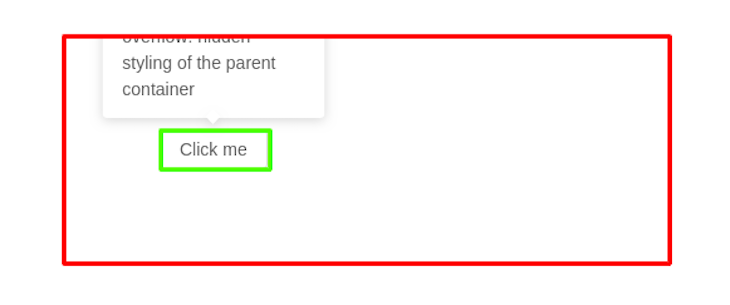
In the screenshot above, the parent container with the overflow:hidden style is marked with red, and the element used for positioning is marked with green. Because of this style property, rendering modal windows won’t be an easy task. So how do we solve this problem?
This is where React Portals comes in. This concept allows developers to render an element outside its parent’s DOM node. Despite this, React still preserves the component’s position in the component hierarchy.
In other words, the component can still maintain the properties and behaviors it inherits in the React tree. You will learn more about this in the code sample later in this article.
Portals are great for places where you want to render elements on top of each other. I’ve included some common examples below:
Earlier, we discussed that React usually displays elements within the DOM. We can prove this with the following code:
return (
  <div className="App">
    {/*Display within DOM node*/}
    <div className="exists">
      <p>This is within the DOM node</p>
    </div>
  </div>
);

As you can see, our component is showing up within the root div element. However, when it comes to modals and dialog windows, we want our component to render out of the root component.
We can solve this by creating a React Portal element:
function App() {
  return (
    <div className="App">
      {/*Render a modal*/}
      <MyModal />
    </div>
  );
}
//create a modal
function MyModal() {
  //to create a portal, use the createPortal function:
  return ReactDOM.createPortal(
    <div className="modal">
      <p>This is part of the modal</p>
    </div>,
    document.body
  );
}
This time, notice that React will not render this function within the DOM:
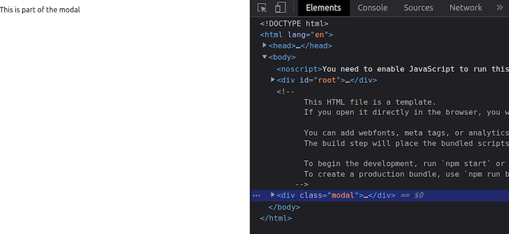
As you can see, this proves that Portals can be crucial in use cases where the developer wants to render certain elements to grab user attention.
The simplest way to solve this issue is by simply removing the overflow styling:
div {
  /*'Hidden' hides the element*/
  overflow: hidden; /* remove this line of code */
  /*When 'overflow' is set to 'visible', CSS will render this to the UI*/
  /* Further styles.. */
}
This tells the program to modal our modal onto the screen:
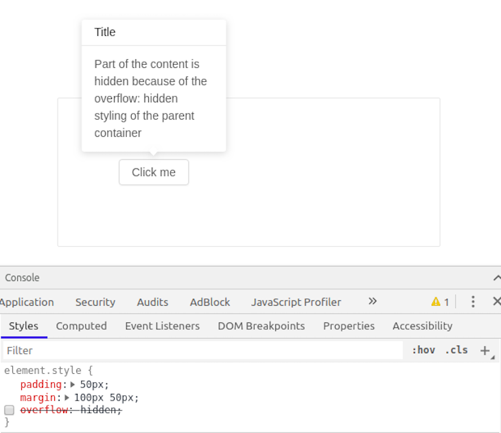
The tooltip is now fully visible, and everything looks good, but it becomes a very fragile solution when any of the following scenarios arise:
Here’s an example of an unwanted side effect of disabling overflow: hidden:

After (image has expanded far outside of the card marked with green):
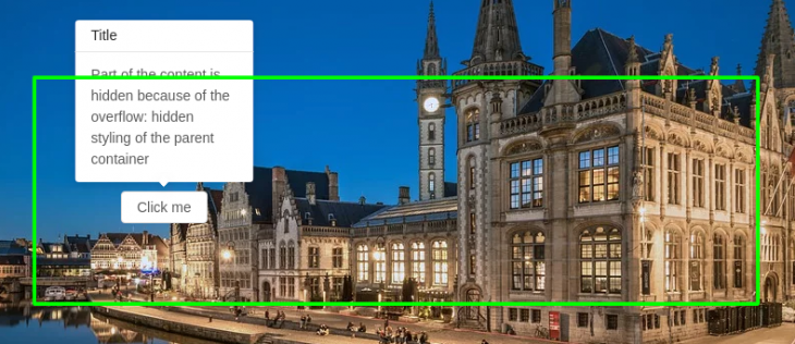
There’s a way to solve all the problems with tooltip/dropdown cut off by overflow for the entire application and reuse the code without needing to spend developer time on trying and testing.
The solution is to append tooltip or dropdown directly to the body of the document, set position: fixed style, and provide screenX and screenY coordinates where the tooltip/dropdown should appear.
Now, there are two things we need to do:
tooltip/dropdown to the body of the document outside of the React mount roottooltip/dropdown (for example, using useRef React Hook)Let’s start with mounting outside of React. That’s an easy task for a JQuery/Vanilla JS codebase. Still, it might sound challenging to a React developer because React applications usually have only one mount point to the DOM. For example, some div with id = "root".
Luckily, the React team introduced another way to mount components: React Portal. Using React Portal, developers can access the tooltip/dropdown component from JSX in a convenient way: all of the props pass and handle events, but at the same time, Portal is mounted to the body of the document outside of the React mount root.
The final JSX we are going to use is as follows:
<Portal>
           <TooltipPopover coords={coords}>
              Awesome content that will never be cut off again!
           </TooltipPopover>
        </Portal>
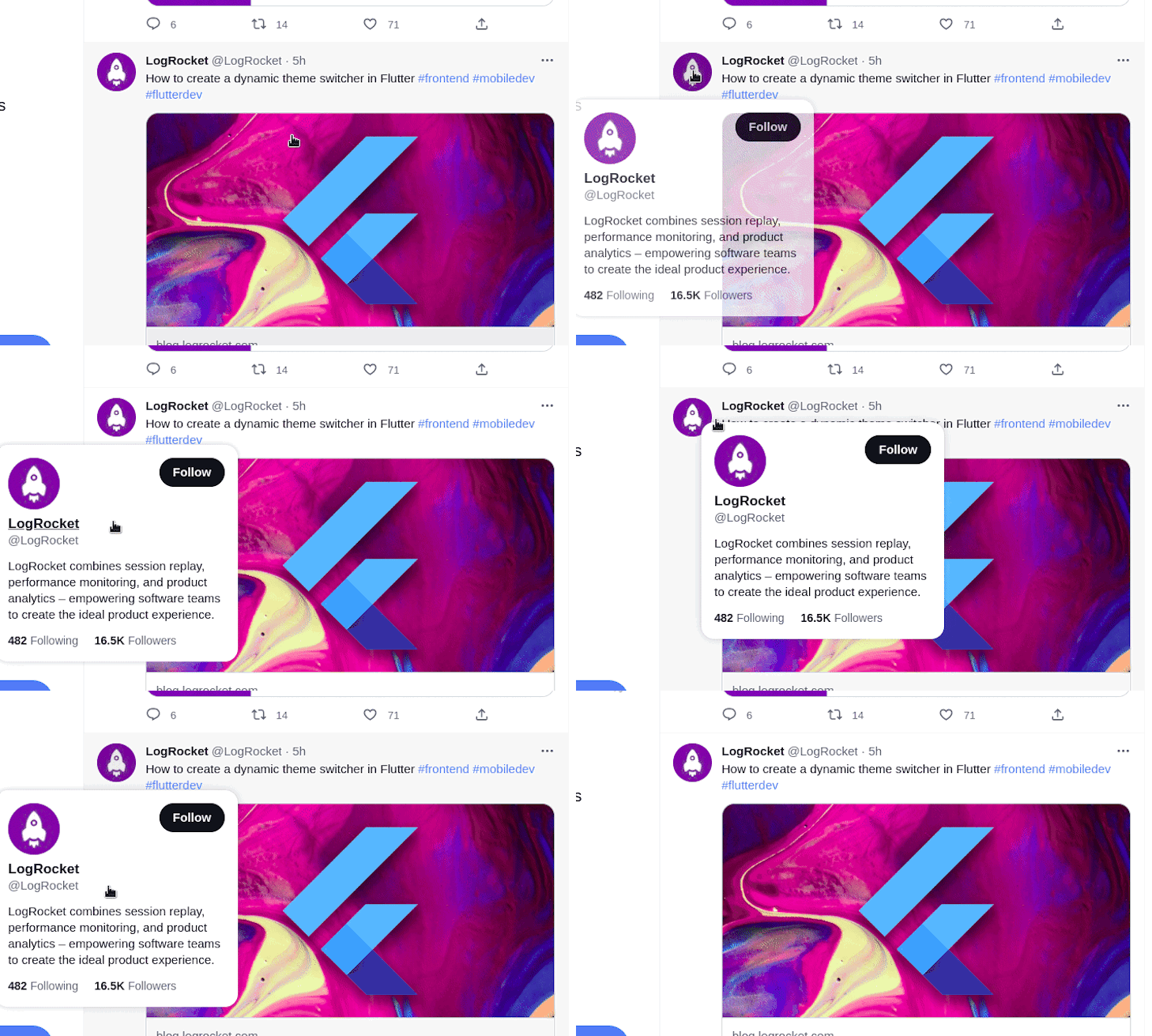
In the code snippet above, the <Portal /> wrapper component takes care of mounting outside of React, and <TooltipPopover/> is placed according to the coordinates passed to it. The final look is as follows:
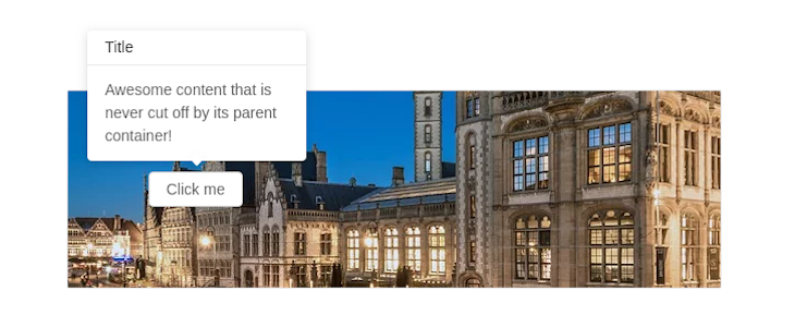
And that’s it! You have a universal solution for any content that should pop up outside of the parent without being cut off. But the <Portal/> wrapper component is a “black box” for us, so let’s change that and look at what’s under the hood.
By following React docs for Portal, we can build our own custom <Portal/> wrapper component from scratch in a few steps:
DOM outside of react-root<html>
<body>
<div id="react-root"></div> // [ 1 ]
<div id="portal-root"></div>
</body>
</html>
In this code snippet, I have named the React mount point element ID "react-root", and all of the tooltips/dropdowns should be mounted using React Portal inside of "portal-root".
createPortal in ReactHere is a simplified <Portal/> wrapper component code written with React Hooks:
import { useEffect } from "react";
import { createPortal } from "react-dom";

const Portal = ({children}) => {
  const mount = document.getElementById("portal-root");
  const el = document.createElement("div");

  useEffect(() => {
    mount.appendChild(el);
    return () => mount.removeChild(el);
  }, [el, mount]);

  return createPortal(children, el)
};

export default Portal;
As you can see, mount needs a DOM element with id = "portal-root" from the previous code snippet with HTML to append an element inside. The core thing this wrapper component does is create a Portal for any React children passed into a component.
The useEffect React Hook is used here to take care of mounting the element at the right time and to clean up on component unmount.
The last thing we need to do to get the fully-functional tooltip component is pass button coordinates to the tooltip for positioning. That is not a hard task, thanks to React Hooks, and it can be implemented with something like this:
const App = () => {
  const [coords, setCoords] = useState({}); // takes current button coordinates
  const [isOn, setOn] = useState(false); // toggles button visibility

  return <Card style={{...styles.card, overflow: "hidden"}}> // [ 2 ]
      <Button
        onClick={e => {
          const rect = e.target.getBoundingClientRect();
          setCoords({
            left: rect.x + rect.width / 2,
            top: rect.y + window.scrollY
          });
          setOn(!isOn); // [ 3 ]
        }}
      >
        Click me
      </Button>
      {
        isOn &&
        <Portal>
          <TooltipPopover coords={coords}>
            <div>Awesome content that is never cut off by its parent container!</div>
          </TooltipPopover>
        </Portal>
      }
  </Card>
}
In this code, the button component has an onClick event handler that takes current on-screen coordinates of the button from an e.target object using the standard getBoundingClientRect() method of a DOM element.
Additionally, a toggler for button visibility is in place that helps us to toggle the tooltip.
Please note that I intentionally left on the Card component to showcase that the Portal solution is working fine.
Feel free to check the live demo and full code on codesandbox.
There is one thing that refers to the tooltip positioning more than to Portals, but it’s worth mentioning. If the button position depends on the window’s right edge (for example, display: flex; margin-left: auto styling), its positioning could be affected by the window scroll appearing (for example, when new content is loaded at the bottom of the page). Let’s take a look at an example:
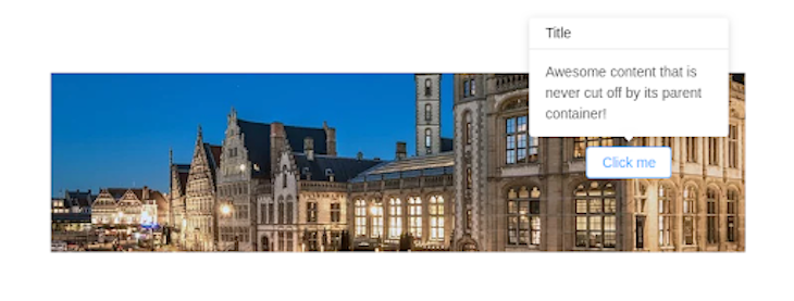
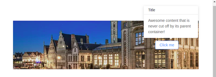
There are a few ways to solve this issue. You could use some resize detection package applied to the whole page, like react-resize-detector, which will fire some event on content height change.
Then, we can measure the scroll width and correct the tooltip’s position.
Luckily, in our case, there is a much simpler pure CSS solution:
html {
    overflow-x: hidden;
    width: 100vw;
}
Adding this little code snippet to the page prevents the page’s content from unexpected jumps on window scroll appear/hide because the <html/> width is set to be equal to 100vw (window width), which is constant and unaffected by the window scroll.
Meanwhile, the 100% <html/> width doesn’t include the scroll, so the app no longer cares about the scroll being on or off. Tooltip will be centered all the time.
You can test the result on the demo by playing with the window height size. Doing the same thing but with better-looking cross-browser scrollbars is also possible using a package called react-custom-scrollbars.
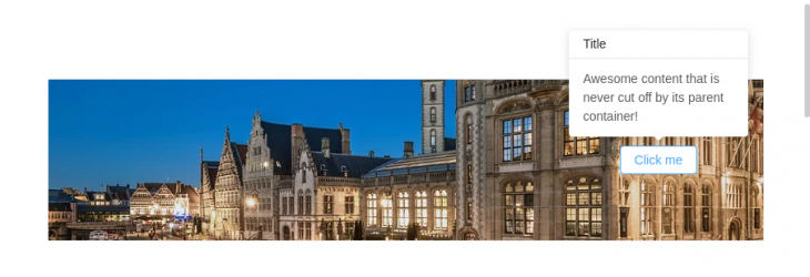
To make it work, you need to install the package and wrap the whole app into a Scrollbars component like this:
import { Scrollbars } from 'react-custom-scrollbars';

ReactDOM.render(
  <Scrollbars style={{ width: "100vw", height: "100vh" }}>
    <App />
  </Scrollbars>,
  document.getElementById("react-root")
);
Here is a quick preview (note the scrollbar appearance):
In this section, we will dive deeper into combining React Hooks with Portals. React Hooks are great when you want to write reusable code. This means we can create a custom Hook that would allow us to render our modal relatively easily. Consequently, this brings cleaner, more readable, and robust code to the table.
We can even create a custom React Hook to allow us to build a Portal:
//file name: usePortal.js
// The complete breakdown of this code is in the comments
import { useState, useCallback, useEffect } from "react";
import ReactDOM from "react-dom";
const usePortal = (el) => {
  const [portal, setPortal] = useState({
    render: () => null,
    remove: () => null,
  });

  const createPortal = useCallback((el) => {
    //render a portal at the given DOM node:
    const Portal = ({ children }) => ReactDOM.createPortal(children, el);
    //delete the portal from memory:
    const remove = () => ReactDOM.unmountComponentAtNode(el);
    return { render: Portal, remove };
  }, []);

  useEffect(() => {
    //if there is an existing portal, remove the new instance.
    //is prevents memory leaks
    if (el) portal.remove();
    //otherwise, create a new portal and render it
    const newPortal = createPortal(el);
    setPortal(newPortal);
    //when the user exits the page, delete the portal from memory.
    return () => newPortal.remove(el);
  }, [el]);

  return portal.render;
};
export default usePortal; //link this Hook with the project
In this code, we defined a usePortal Hook, which allows the user to display a Portal element at a given HTML selector.
In order to see this Hook in action, write the following block of code within your App.js module:
//import our custom Hook into the project.
import usePortal from "./usePortal";
function App() {
  //render our portal within the element which has the class of 'me'
  const Portal = usePortal(document.querySelector(".me"));
  return (
    <div className="App">
      <Portal>Hi, world</Portal>
    </div>
  );
}
This will be the outcome:
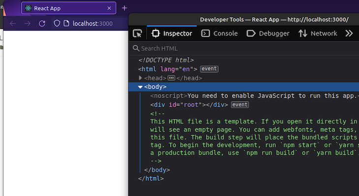
Notice that React didn’t render our Portal. This is because, in our code, we told the compiler to draw our component into a node named me. However, in our index.html file, we haven’t created a me element.
To fix this, add this line of code to index.html:
<!-- Create a div with a className of 'me'. Our portal will be rendered here --->
<div class="me"></div>
<!-- Further code.... -->
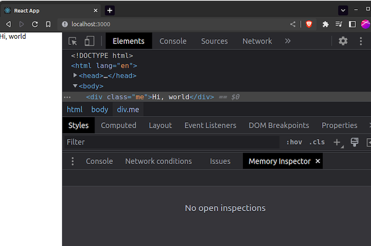
We have gone through the most common use case for React Portal step by step, explaining how it works on a real-life example with tooltip component development from scratch. Furthermore, we also covered using React Hooks and Portals to help us build custom hooks.
Of course, generalization can’t come without its tradeoffs. The complexity of Portal tooltip is bigger than the pure CSS/HTML solution, and it’s up to the developer to choose the right approach at the right time.
Install LogRocket via npm or script tag. LogRocket.init() must be called client-side, not
server-side
$ npm i --save logrocket

// Code:

import LogRocket from 'logrocket';
LogRocket.init('app/id');
// Add to your HTML:

<script src="https://cdn.lr-ingest.com/LogRocket.min.js"></script>
<script>window.LogRocket && window.LogRocket.init('app/id');</script>
Within roughly the same six-month window, Anthropic shipped Agent Teams for Claude Code, OpenAI published Swarm and the production-ready Agents […]

Compare the top AI development tools and models of March 2026. View updated rankings, feature breakdowns, and find the best fit for you.

Discover what’s new in The Replay, LogRocket’s newsletter for dev and engineering leaders, in the March 11th issue.

Buying AI tools isn’t enough. Engineering teams need AI literacy programs to unlock real productivity gains and avoid uneven adoption.
Hey there, want to help make our blog better?
Join LogRocket’s Content Advisory Board. You’ll help inform the type of content we create and get access to exclusive meetups, social accreditation, and swag.
Sign up now
8 Replies to "Learn React Portals by example"
Easy to follow walkthrough with a understandable example made in modern React. Good info, and great work!
I observed a problem in this and I thought it’s important to notify, else a lot of other people might make the same mistake.
In the `Portal` component, you are using `useEffect` with `el` and `mount` as dependencies and that actually causes unnecessary re-renders even if the prop(children in this case) of the Portal component hasn’t changed. Meaning if there is any change in the parent component which isn’t related to the Portal also, the Portal gets re-rendered.
example:Try adding say a state variable `count` in the parent component and change the value when the modal is shown, although there is no change in portal, it would still re-render the portal which is bad.
One Solution is to move the `mount` and `el` outside the Portal component. This still re-renders the Portal but it doesn’t mount the portal content again which would trigger useEffect otherwise as its not a new instance of either `el` or `mount`.
Other solution would be to use the class component. But please be careful when you are demonstrating something with hooks. I think we underestimate the complexity of the hooks in most cases, and in the end we shoot in our own foot.
@Brihaspati thanks for feedback. Yes, I confirm that my implementation of Portal is naive and could be improved for performance.
Instead of just moving the el and mount outside of the component there is also an option to use some of the React hooks that keep variables between renders, for example, useRef:
“`
import { useEffect, useRef, memo } from “react”;
import { createPortal } from “react-dom”;
const Portal = ({ children }) => {
/**
* keeps ref between renders
*/
const el = useRef(null);
/**
* create element if empty (for the first time render only)
*/
if (!el.current) el.current = document.createElement(“div”);
useEffect(() => {
const mount = document.getElementById(“portal-root”);
const { current } = el;
mount.appendChild(current);
return () => mount.removeChild(current);
}, []); // no dependencies to avoid rerenders
return createPortal(children, el.current);
};
export default memo(Portal);
“`
here is a live demo for it https://codesandbox.io/s/portal-with-hooks-70pyc
You could also check other possible implementations of React Portal with hooks in this stackoverflow thread: https://stackoverflow.com/questions/53595935/how-can-i-make-react-portal-work-with-react-hook
Hi! I was curious why we need the “el” to be appended? I tried with directly appending to the mount point in the DOM and it works as well. Does the “el” pattern help with something I am not seeing?
Hi Muhammad, the el pattern is used for enabling the option of multiple portal items on the page: each portal appends its own element to the portal mount point. That might be helpful, for example, if there are multiple small popups on the page that should be kept open at the same time
Really appreciate this succinct and relevant tutorial. I was loathing having to use a Portal solution but this really did the trick!
There’s an issue when the portal rerenders because the portal element is removed and rappended inside the useEffect hook, there’s no portal element to render to so the portal’s children content is absent. I fixed this by replacing the useEffect hook with useLayoutEffect to block react until the portal is rendered. Fortunately this is unnecessary if you instead store the portal element between rerenders like what is done above.
I found a flaw following this implementation approach, which is that when the button is in the local scrolling area, clicking the button opens the tips. When scrolling, the tips will not follow. Using global scrolling does not have this problem because the tips do not scroll relative to the body