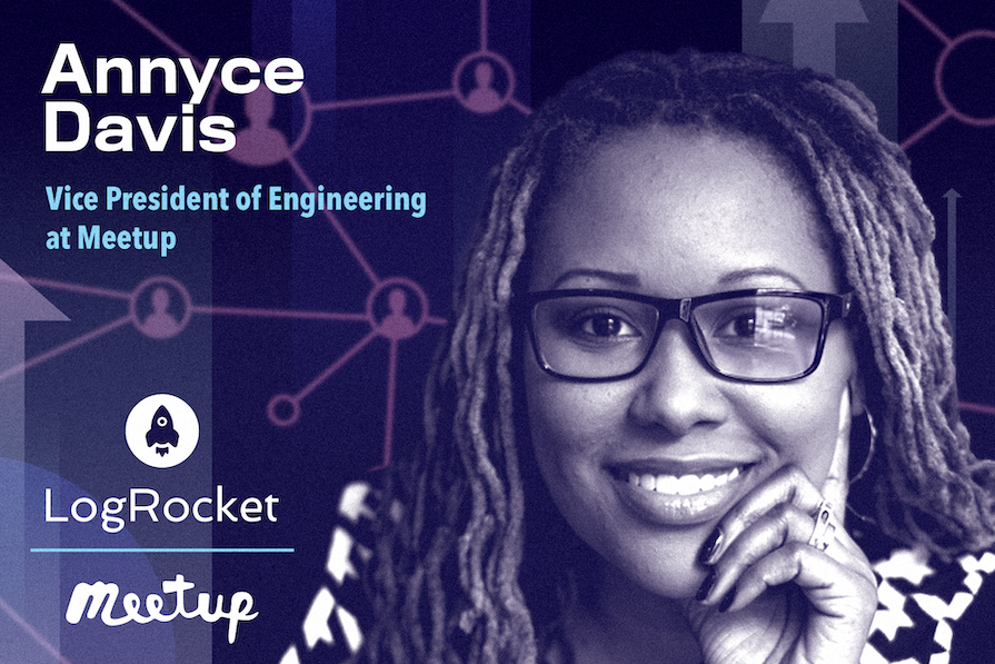
Annyce Davis is Vice President of Engineering at Meetup. She previously held software and application development roles at companies such as The Washington Post and ZOLA Electric. Annyce has 10-plus years of mobile app development experience and is an Android Google Developer Expert.

In our conversation, Annyce talks about how localization testing and user surveys help to optimize UX and shares tips for building mobile apps that provide a delightful user experience. She also discusses an internal innovation that was driven by a mission to accelerate friendships among Meetup members.
The Replay is a weekly newsletter for dev and engineering leaders.
Delivered once a week, it's your curated guide to the most important conversations around frontend dev, emerging AI tools, and the state of modern software.
I strongly believe that the best way to learn is to teach. In addition to my role at Meetup, I teach Android development and general programming courses through LinkedIn Learning. I think the best way to encourage continuous learning is to get people on board with teaching others.
At Meetup, we use the concept of collectives — groups of engineers who specialize or are interested in a particular area. We have collectives for frontend, backend, and native apps. I encourage engineers on my team to spend five or 10 minutes teaching their collective about something new that they’ve discovered, a tool they’ve started using, or something really cool that they developed.
Most of us became engineers because we’re curious and we like to tinker. Being open to sharing what you’ve learned with others is the best way to continue learning.
I spend a lot of time observing and talking to engineers to understand their pain points and to try to figure out what’s causing some of the issues or friction they may be experiencing in their day-to-day.
I helped introduce a process for how we catalog and triage production incidents. Bugs are not created equal. With this new process, the severity of a particular issue determines how many people get involved and what happens next. This project has brought more visibility to the production issues that we’re experiencing as well as the categories of issues.
Here’s an example that illustrates the project’s impact. Let’s say a Meetup user can’t create an event. Instead of assuming that the event creation functionality is broken for everyone, we give the user issue to the on-call person. They may determine that the issue only affects online events with a certain attendee limit. Now, we can better allocate engineering resources. Maybe only two people are needed to investigate and address the issue.
On the other hand, if our website isn’t loading, then that’s a real problem. We’d need all hands on deck to help resolve that quickly. At that point, we get everyone into a huddle, pull in all the engineers, get everyone talking, and have the QA team test potential solutions.
This new process helps us match the response with the scale of the problem and use engineering resources more efficiently.
Mobile apps should be fast, so it’s important to spend some time digging into performance. Check the cold start time. When a user clicks the icon on their phone, they are not expecting a slow loader; they want to be immediately immersed in the experience.
A lot of what makes an app feel delightful is related to it being very performant, reliable, and consistent. So if you’re adding something new, make sure you’re testing the performance and be sure to consider edge cases.
The other part of providing a delightful experience is adding just a bit of whimsy. I’m a big fan of whimsy, and I feel like there’s a way to incorporate it into mobile apps without it being overwhelming.
Consider adding a little haptic feedback, a simple sound that lets the user know when they’ve completed a task, or maybe an unexpected surprise, like some really cool loading when the user does have to wait. Users appreciate a touch of whimsy, even from something that’s more of a utility.
True. Let’s say every time a certain element is clicked, the phone shakes. Actual users could find that very annoying.
Our design team works closely with our engineers, and we leverage UserTesting.com to get feedback from random users. We also survey and interview members to get their input before we launch something. That feedback is really helpful.
Sure. I’m responsible for a team that works on our member subscription product. Our mission is to help accelerate friendships among members.
I’ve been working on something called Member Plus. What’s really cool about this product is that it helps people become less fearful. How many times have you seen an event and thought, “Should I go? Will I be welcome? Do all these people know each other? Am I going to be the only person who’s coming for the first time? Is there going to be anyone else there who shares my interests?”
My team introduced a new feature to provide Meetup users with some attendee insights. So now, a user can see things like the number of first-time attendees and attendee age range and interests. Seeing that there are other attendees that they have things in common with helps people feel more comfortable and results in a higher RSVP rate.
This feature has been very well received by our member base. Meetup has always been about helping people make friends, but now we’re being even more intentional about this by putting members first and trying to put ourselves in our member’s shoes.
Loneliness is real, and also a lot of people are just plain shy. This is a big initiative that I’ve personally been focused on during the past year.
The event topic obviously makes a difference. Tech is the most popular category for Meetup events, and next is probably hiking. There are also some “up and comers” that are rapidly gaining in popularity, like pickleball.
To measure engagement, we survey general members and also those who are subscribed to this advanced functionality that we’re offering towards building friendships. Those survey results show that the No. 1 thing people appreciate is feeling more comfortable going to an event if they believe they will feel welcomed or will be able to fit in.
The idea for this feature came directly from user research and interviews. I sat in on several of the interviews, and time and time again would hear similar comments, like, “I moved to this new city and I’m recently divorced. I don’t really have any friends here. I joined Meetup, but I don’t really know what’s next.” Our goal at Meetup is to help people get to the “what’s next.”
Before Meetup, I was working at a company called ZOLA Electric, a solar energy provider that started in Africa. When sellers identified a prospective buyer, we wanted them to use our new Android field app to drop a pin or marker, add some information about the household, and then save it as a lead.
At this time, I was working out of Amsterdam. I would look at the data and wonder, “How come more people aren’t dropping pins? Why aren’t they using the map?”
I had the opportunity to go to Tanzania and spend a field day with some sellers. I noticed they weren’t dropping the pin to mark the prospect locations. When I asked why, they opened the map on their phones. The glare from the sun was so intense that it was nearly impossible to see the map. Also, in these very rural areas, there were no real landmarks; on the map, it looked like a big tan field.
From our perspective, the map was going to be a great solution. We didn’t understand why there was unexpected user behavior. Our analytics confirmed that things weren’t going as planned, but we didn’t understand why until we got actual user feedback from the field.
We noticed that the sellers were capturing the latitude and longitude of the location on a separate device. So we added a field in the app where they could paste that information. I often reflect on this experience when I’m thinking about features in different corner cases or edge cases.
We use a service called Testlio that does a lot of regression testing for us. Also, through Testlio, we have QA testers throughout the world using different languages and different devices. This gives us a true sense of how our app behaves and how it looks depending on a user’s location.
Localization testing has helped us catch and fix a lot of issues that we wouldn’t have experienced firsthand. A user may be on 3G, or an issue may be specific to a particular language or geographic area. Testlio provides detailed reports so that we can address open issues.
Testio also does exploratory testing for us before we put out a new release. They’re familiar with our app, but because they aren’t developing it, they have a different perspective.
Your users think so differently from you. It’s helpful to have many types of users in different locations, using different languages. This will help push you to see usability issues that you might otherwise miss.
I work closely with our designers. If I see text that looks very wordy, I’ll ask to see how it looks with a larger font size or in a language that’s more verbose than English. We want all of our users to have an enjoyable, delightful experience. It’s important to think about accessibility and language, especially early in the design phase.
I feel like there’s a closer relationship right now between tech leaders and finance than ever before. As a tech leader, I never knew anything about EBITDA (earnings before interest, taxes, depreciation, and amortization) and CAC (customer acquisition cost), but now I’m very familiar with those financial terms. We’re going to see more of that: more business-savvy tech leaders.
I’m also noticing a bigger push for cross-platform solutions. Kotlin Multiplatform just went stable. That’s a product that allows us to develop applications across iOS, Android, and web. I think a lot of companies will start to consider if they really need individual development teams for each platform or if they should consolidate for cost savings. Cross-platform solutions will enable us to have leaner development teams that can deliver real business value.
If you’re working in the tech space, you need to make sure that you’re invaluable. This means keeping your skills up to date and being able to define and speak to your impact in an economic way.

AI companies are buying developer tools as coding agents turn runtimes, package managers, and linters into strategic infrastructure.

Learn how AI-assisted development governance uses rules, agents, hooks, and protocols to help AI coding tools produce safer, more consistent code.

A step-by-step guide to building your first MCP server using Node.js, covering core concepts, tool design, and upgrading from file storage to MySQL.

Using security headers in your Next.js apps is a highly effective way to secure websites from common security threats.
Would you be interested in joining LogRocket's developer community?
Join LogRocket’s Content Advisory Board. You’ll help inform the type of content we create and get access to exclusive meetups, social accreditation, and swag.
Sign up now