Media queries, first introduced in CSS3, form a core component of responsive web design. Applications should be tailored to fit the constraints of each type of device (e.g., mobile phones, tablets, laptops, desktop computers), and media queries provide an easy way to set viewport dimensions based on the size of the device that the application is being viewed on.
Media queries allow you to not only vary viewport dimensions based on screen size, but they can also help you set different style properties for different devices, including color schemes, font styles, motion settings and animations, borders and spacing, and almost any other CSS property you can think of.
A fact some frontend developers miss at first glance is that media queries are also supported by JavaScript. While not as popular as CSS media queries, JavaScript media queries provide flexibility and a number of advantages that can make them a better choice for certain use cases.
At this point, you might be thinking: why on earth would a developer opt for JS media queries when the CSS3 route would do?
There are two primary advantages offered by JavaScript media queries.
Consider this: what if you wanted to dynamically alter properties for different screen sizes? You still might be scratching your head, insisting something like this would work just fine:
// A function we want executed based on changes in screen size
function foo() {
   if (window.innerWidth < 1024) {
               /* whatever you want to do here */
     }
}
// Set up a listener
window.addEventListener('changesize', foo);
In the block of code above, we have an “if” statement predicated on window.innerWidth being less than 1024 (i.e., the standard screen size for desktop displays). Presumably, the method is supposed to run any time the application is running on a device smaller than a desktop computer.
Unfortunately, this method is a costly one because it will be triggered on every single resize, not just when the user opens the app up on their mobile phone or tablet. That’s right — this method will run any time the user manually resizes the screen on a desktop computer. An excessive number of such operations can eventually cause the application to lag.
Thankfully, we have the perfect API to handle dynamic situations and response designs: say hello to the matchMedia API.
Instead of attaching listeners to a resize event as we did in the example above, we can use the matchMedia API.
The Window interface’s matchMedia() method essentially attaches listeners to media queries, but doesn’t respond to every change in window or screen size, leading to significantly better performance. If we take advantage of this method, we’re only responsible for developing the logic we want executed for a screen resize without having to worry about other conditions, validations, and code optimizations.
To use this API, we call window.matchMedia() and pass in a media query string specifying the screen size we want to respond to.
// This media query targets viewports that have a minimum width of 320px
const mQuery = window.matchMedia('(min-width: 320px)')
The matchMedia() method returns a new MediaQueryList object, which we have named mQuery in the above example. This object stores information about a media query applied to a particular document as well as supporting methods for event-driven and immediate matching. This allows us to trigger custom logic at the onset of a resize event.
To execute the necessary resizing logic, we need to check window.matches, a Boolean property that returns “true” if the media query was matched and “false” if it was not. In our example, this property tells us whether there was an actual match to the condition specified (i.e., the minimum width of the screen is 320px).
// Check whether the media query has been matched
if (mQuery.matches) {
    // Print a message to the console
    console.log('Media query matched!')
}
Easy, right? There’s just one catch: window.matches is only able to carry out this check once. To facilitate a responsive web design, we want to continuously check for any changes that are occurring. Thankfully, there’s another tool that we can pair with windows.matches to help us achieve this: the addListener() method.
The matchMedia API provides an addListener() method as well as a corresponding removeListener() method. When we call addListener(), we pass in a callback function that runs whenever it detects a change in the media query match status. This callback function is the function we want triggered on the resize event:
// This media query targets viewports that have a minimum width of 320px
const mQuery = window.matchMedia('(min-width: 320px)')

function handleMobilePhoneResize(e) {
   // Check if the media query is true
   if (e.matches) {
        // Then log the following message to the console
        console.log('Media Query Matched!')
   }
}

// Set up event listener
mQuery.addListener(handleMobilePhoneResize)
This technique allows us to be responsive to media query changes and dynamically invoke additional methods as needed. These dynamically invoked methods can then alter various document properties, like font styles, borders and spacing, animations, and more.
For example, if you want to incorporate dynamic font styling, you can achieve that with something like this:
function changeFontStyleMobile(e) {
   // Check whether the media query has been matched
   if (e.matches) {
      // Change font size
      document.getElementById("p2").style.color="blue";
      var span = document.document.getElementById("span");
      span.style.fontSize = "25px";
      span.style.fontcolor = "white"; span.style.fontSize = "36px";
   }
}

// Set up event listener
mQuery.addListener(changeFontStyleMobile)
You should now have a basic understanding of media queries in JavaScript and how they enable efficient, adaptive design. The matchMedia API can help you create a media query in JavaScript, and addListener() can enable you to build responsive cross-platform experiences by invoking callback functions.
Periodic polling for document state changes is an inefficient and resource-intensive approach that will eventually cause the application to lag. Using matchMedia() enables us to observe a particular document, detect changes in media query conditions, and programmatically alter document properties based on media query status.
Debugging code is always a tedious task. But the more you understand your errors, the easier it is to fix them.
LogRocket allows you to understand these errors in new and unique ways. Our frontend monitoring solution tracks user engagement with your JavaScript frontends to give you the ability to see exactly what the user did that led to an error.
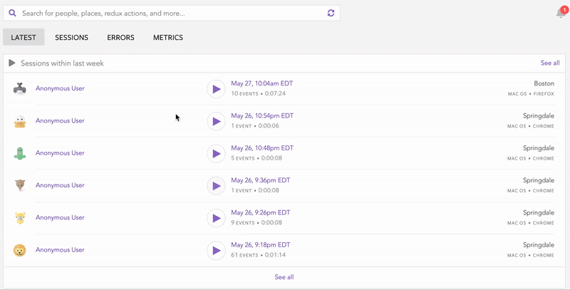
LogRocket records console logs, page load times, stack traces, slow network requests/responses with headers + bodies, browser metadata, and custom logs. Understanding the impact of your JavaScript code will never be easier!
Would you be interested in joining LogRocket's developer community?
Join LogRocket’s Content Advisory Board. You’ll help inform the type of content we create and get access to exclusive meetups, social accreditation, and swag.
Sign up now
Discover how the Interface Segregation Principle (ISP) keeps your code lean, modular, and maintainable using real-world analogies and practical examples.

<selectedcontent> element improves dropdowns
Learn how to implement an advanced caching layer in a Node.js app using Valkey, a high-performance, Redis-compatible in-memory datastore.

Learn how to properly handle rejected promises in TypeScript using Angular, with tips for retry logic, typed results, and avoiding unhandled exceptions.

 Learn more →
