The Replay is a weekly newsletter for dev and engineering leaders.
Delivered once a week, it's your curated guide to the most important conversations around frontend dev, emerging AI tools, and the state of modern software.
If there’s one thing Flutter is known for, it’s creating beautiful user interfaces. By combining various top-level widgets and an appropriate layout, we can create a UI that blows the minds of our users. Flutter takes it even further by providing widgets that enable us to add interactive animations to user interfaces, which helps create a unique experience for our users.

There are a lot of top-level widgets that come together to form the basis for the UIs we see and interact with: from columns and rows for layouts, SingleChildScrollView for vertical and horizontal scrolling, the GestureDetector for interactivity, the various implicit animation widgets, and a whole lot more. Identifying the appropriate combination from the sea of top-level widgets that Flutter provides us can grant us access to a wide range of combinations and functionalities, and helps achieve our desired UI.
In this article, we’ll be looking at one of such widget: the Chip widget.
We’ll see how it is used as a component for building and improving user interfaces in Flutter. Shall we?
The Chip widget is a top-level widget that provides a rounded box with text and custom interactions. Through its properties, we have access to a range of actions that can be used to beautify our user interfaces and make them interactive.
A popular use case is for category tiles. Using Chip widgets, we can customize the category tile, as well as easily add and remove categories in our UI smoothly and easily, enhancing UX within our mobile apps.
The Chip widget exposes a range of properties that allow you to add different styles and perform diverse actions.
const Chip(
    {Key? key,
    Widget? avatar,
    required Widget label,
    TextStyle? labelStyle,
    EdgeInsetsGeometry? labelPadding,
    Widget? deleteIcon,
    VoidCallback? onDeleted,
    Color? deleteIconColor,
    String? deleteButtonTooltipMessage,
    BorderSide? side,
    OutlinedBorder? shape,
    Clip clipBehavior = Clip.none,
    FocusNode? focusNode,
    bool autofocus = false,
    Color? backgroundColor,
    EdgeInsetsGeometry? padding,
    VisualDensity? visualDensity,
    MaterialTapTargetSize? materialTapTargetSize,
    double? elevation,
    Color? shadowColor,
)
Let’s take a look at some of these properties:
label: Takes center stage in the Chip widget because it’s a required property. Many times, it’s used to display a Text widget to provide information on the ChiplabelStyle: Applies styling to the labelavatar: Displays an icon, image, etc., before the label propdeleteIcon: Takes in the icon that is to be displayed when the onDeleted property is calledonDeleted: Called when the user clicks the deleteIcon property in order to delete the chipelevation: Takes in a double value that defines the amount of elevated height of the Chippadding: Applies padding between the contents of the chip and the outsideInputChip: Used to represent a complex piece of information in a compact formChoiceChip: Allows a user make a selection from a set of options providedFilterChip: Makes use of tags/words to filter contentActionChip: Used to represent an action related to the Chip’s primary purpose, i.e., to add a filterAny of these Chip widgets can be combined with other widgets in Flutter to create a beautiful, interactive UI. In the next section, we’ll dive into a sample implementation and see how we can spice up our user interfaces using Chip widgets.
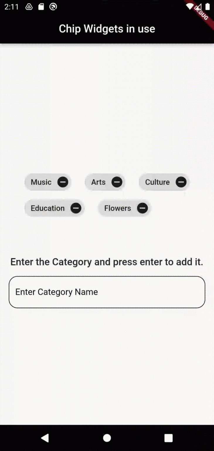
Finally, time to get down to it. We’ll be building a sample application that makes use of the Chip widget to display a list of categories. Users will be able to add and remove categories without affecting the user interface.
First, create a project by running the command below.
flutter create chip_project
This creates the codebase, along with the various files needed to run our application.
Next, remove the default generated code in the main.dart file and replace it with a stateless widget that returns MaterialApp. Name the Stateless widget MyApp.
void main() => runApp(const MyApp());

class MyApp extends StatelessWidget {
  const MyApp({Key? key}) : super(key: key);
  @override
  Widget build(BuildContext context) {
    return const MaterialApp(
      title: 'Material App',
      home: Scaffold(),
    );
  }
}
Next, create a new stateful widget and call it HomeView. We‘ll use this widget to create a simple user interface that shows us a way of displaying, adding, and removing Chip widgets.
class HomeView extends StatefulWidget {
  const HomeView({Key? key}) : super(key: key);
  @override
  State<HomeView> createState() => _HomeViewState();
}
class _HomeViewState extends State<HomeView> {
  @override
  Widget build(BuildContext context) {
    return Container();
  }
}
Before we proceed, link the HomeView widget to the MyApp widget created in the last step.
....
@override
  Widget build(BuildContext context) {
    return const MaterialApp(
      title: 'Material App',
      home: HomeView(),
    );
  }
....
Now we can start filling out the HomeView widget and display the Chips on the screen. In order to dynamically layout the Chips in our user interface, we’ll use a Wrap widget and pass the chips to it as children.
What happens next is that, based on screen width, the Chips automatically lay themselves out in the best possible way, avoiding overflow or clumping of the user interface. Practically, this means that remaining Chips go the next line and layout smoothly if the width of the screen cannot fit all of them on the same line.
For the purpose of this article, we’ll create a static list of categories that will display using the Chip widgets. This list can represent data coming from anywhere, so in your case, it could be a list of information coming from an API endpoint.
....
  List<String> categories = [
    'Music',
    'Arts',
    'Culture',
    'Education',
    'Flowers',
  ];
 ....
Next, we’ll create the two functions, which we’ll be using to add and remove data from the list. This also means adding and removing Chips, as the Chips render based on the data in the list, i.e., categories.
  void addCategories(String categoryName) {
    categories.add(categoryName);
    setState(() {});
  }
  void removeCategories(String categoryName) {
    categories.remove(categoryName);
    setState(() {});
  }
Add a Scaffold widget with an Appbar and padding to make the user interface look better. At this point, this is what the code for our HomeView Stateful widget looks like:
class HomeView extends StatefulWidget {
  const HomeView({Key? key}) : super(key: key);
  @override
  State<HomeView> createState() => _HomeViewState();
}
class _HomeViewState extends State<HomeView> {
  List<String> categories = [
    'Music',
    'Arts',
    'Culture',
    'Education',
    'Flowers',
  ];

  void addCategories(String categoryName) {
    categories.add(categoryName);
    setState(() {});
  }
  void removeCategories(String categoryName) {
    categories.remove(categoryName);
    setState(() {});
  }
  @override
  Widget build(BuildContext context) {
    return Scaffold(
      appBar: AppBar(
        title: const Text('Chip Widgets in use'),
        centerTitle: true,
        backgroundColor: Colors.black,
      ),
      body: SafeArea(
        child: Padding(
          padding: const EdgeInsets.all(16.0),
          child: Center(
            child: Column(
              mainAxisAlignment: MainAxisAlignment.center,
              children: [
               // ....
              ],
            ),
          ),
        ),
      ),
    );
  }
}
We can now move ahead to add the Wrap and Chip widgets. We’ll display the Chips based on the data in the list, which means that there’ll be a Chip on the screen if there is an item in our categories list. To achieve this, we map every item in the list to a Chip widget and display the item name as the label on the Chip.
In order to remove a Chip from the list, we’ll pass the removeCategories function created earlier to the onDeleted callback that the Chip widget provides.
If the categories list is empty, we display a Text to the user informing them of the empty state, i.e., No categories available.
....
  [
    const SizedBox(height: 16),
    Wrap(
      spacing: 24,
      children: categories.map(
        (category) {
          return Chip(
            onDeleted: () {
              removeCategories(category);
            },
            deleteIcon: const Icon(Icons.remove_circle),
            label: Text(category),
          );
        },
      ).toList(),
    ),
    if (categories.isEmpty)
      const Center(
        child: Text('No Categories available!'),
      ),
  ],
....
Next, we add a TextField. The TextField allows us to manually add a new category to the list of categories, thereby adding to the number of Chip widgets on the screen.
In the onSubmitted callback for the TextField, call the addCategories function and pass in the category from the text input retrieved from the user. You can add a bit of styling to the TextField widget to make it look better on the screen.
....
    const SizedBox(height: 64),
    const Text(
      'Enter the Category and press enter to add it.',
      style: TextStyle(
        fontSize: 18,
        fontWeight: FontWeight.w500,
      ),
    ),
    const SizedBox(height: 16),
    TextField(
        onSubmitted: (category) {
            addCategories(category);
          },
        cursorColor: Colors.black,
        decoration: InputDecoration(
          labelText: 'Enter Category Name',
          hintText: 'Enter Category Name',
          labelStyle: TextStyle(color: Colors.black),
          enabledBorder: OutlineInputBorder(
          borderRadius: BorderRadius.circular(16),
          ),
          focusedBorder: OutlineInputBorder(
            borderRadius: BorderRadius.circular(16),
          ),
        ),
      ),
....
With these added, we’re good to go! Let’s test run our application. Run the command below to run the app.
flutter run
Here is the result below:

Check out the full code for the sample application here.
Hurray! You’ve done well reaching this section. You’ve learned what the Chip widget is, the various types of Chip widgets, the various properties it exposes and how, together, we’ve built a sample application that shows the Chip widget in use and how it can greatly aid in our development. Now you can confidently make use of it in your applications.
If you have any questions, feel free to reach out to me via any of my social media platforms. I’ll be glad to assist and answer any questions. Till I write to you again, happy Fluttering.
Install LogRocket via npm or script tag. LogRocket.init() must be called client-side, not
server-side
$ npm i --save logrocket

// Code:

import LogRocket from 'logrocket';
LogRocket.init('app/id');
// Add to your HTML:

<script src="https://cdn.lr-ingest.com/LogRocket.min.js"></script>
<script>window.LogRocket && window.LogRocket.init('app/id');</script>

A step-by-step guide to building your first MCP server using Node.js, covering core concepts, tool design, and upgrading from file storage to MySQL.

Using security headers in your Next.js apps is a highly effective way to secure websites from common security threats.

A deep dive into April 2026’s AI model and tool rankings. We break down performance, usability, pricing, and real-world capabilities across 50+ features to help you pick the right tools for your development workflow.

A practical guide to Agent Browser CLI. Learn how AI agents navigate, snapshot, and interact with web pages using stable references, enabling efficient automation and exploratory testing.
Hey there, want to help make our blog better?
Join LogRocket’s Content Advisory Board. You’ll help inform the type of content we create and get access to exclusive meetups, social accreditation, and swag.
Sign up now