In the age of information, the use of modals can significantly improve the UX of websites and web applications. We see them everywhere, from sites like Twitter, which uses modals to create a new tweet, to complex management systems that run in the background of almost every enterprise.

The main advantage of modals is that they are independent of the active page, meaning they can be used to add, update, delete, or view the information, they are easy to open and close, they do not require changing the current URL, and the background information is often fully or partially visible.
In this tutorial, we will explore nice-modal-react, which is a useful modal utility for React created by the developer team of eBay. They have been kind enough to make it accessible for the public after testing and using the utility internally for a year.
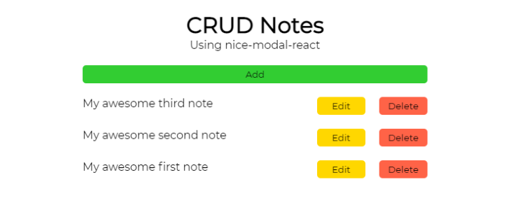
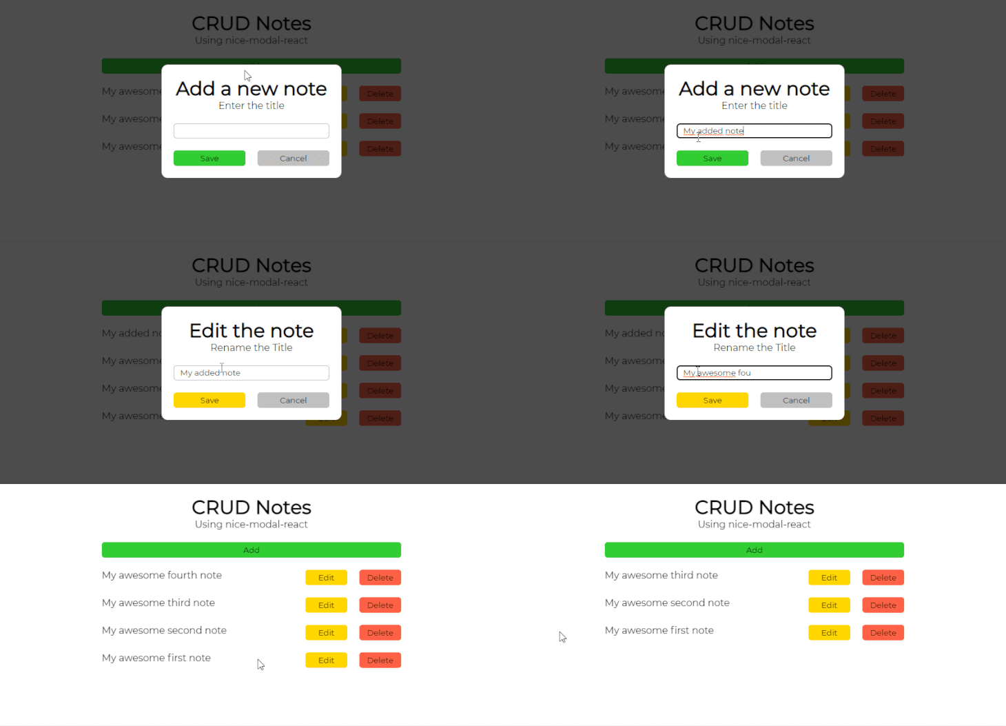
We will also build a demo app to apply all the reviewed features in practice. It is expected that we will be able to use modals to create new data, as well as edit and delete existing data:

For reference, here is the source code of the final project.
The Replay is a weekly newsletter for dev and engineering leaders.
Delivered once a week, it's your curated guide to the most important conversations around frontend dev, emerging AI tools, and the state of modern software.
The nice-modal-react package is a zero-dependency utility written in TypeScript and uses context to control the state of the modals throughout the entire app.
The main advantage of the utility is promise-based modal handling. This means instead of using props to interact with the component, you can use promises to update the state.
You can easily import the modal components throughout the app or use the specific id of the component, so you do not have to import the component at all.
Closing modals is independent of the rest of the code, so you can close the component from the component itself, no matter where in the application it is shown.
It is crucial to understand that nice-modal-react is not the modal component itself. You will need to create the actual modals yourself (or use pre-built components from UI libraries like Material UI, Ant design, or Chakra).
We will first create a React app by using Create React App. Run the following command in your terminal: npx create-react-app crud-notes.
Let the setup complete and you will see a new project folder created in your current working directory.
Next, change the directory by running cd crud-notes, then start the application by running npm start. The command should open your default browser and display the React app.
If it does not open automatically, enter http://localhost:3000 in the browser’s URL bar and execute.
Back in the project, navigate to the src folder, find the files App.js, App.css, index.js, and remove the content from them because we will write everything from scratch.
Also, rename App.css to styles.css and remove the index.css file.
In the newly renamed styles.css file, include the following style rules:
css
@import url("https://fonts.googleapis.com/css2?family=Montserrat&display=swap");

* {
  margin: 0;
  padding: 0;
  box-sizing: border-box;
  font-family: "Montserrat", sans-serif;
}

body {
  padding: 20px;
}

.App {
  max-width: 500px;
  margin: 0 auto;
  text-align: center;
}
First, we declared some reset rules to margin, padding, and border-box, so all the elements are displayed equally in all browsers. We also made sure the app uses the Montserrat font.
Then, we added some padding to the body, set the app wrapper to never exceed 500px, centered it in the viewport, and centered the text inside it.
Installing the nice-modal-react package itself is as simple as running npm install @ebay/nice-modal-react. It will add a small (~2KB after gzip) and dependency-free package to your node modules.
In order to use it throughout the app, we’ll set up a separate provider that will use React Context to control the state globally.
To do that, open the index.js root file, import the NiceModal component, and wrap it around the App component:
javascript
import ReactDOM from "react-dom";
import NiceModal from "@ebay/nice-modal-react";
import App from "./App";

const rootElement = document.getElementById("root");

ReactDOM.render(
  <NiceModal.Provider>
    <App />
  </NiceModal.Provider>,
  rootElement
);
At this point, we have set up the project to work with nice-modal-react, so we can start building individual components for the app.
First, we need to create the individual files for the necessary components: Modal, Button, and Note. To keep everything organized we will create a separate components folder and create a separate .js file and .css file for each component.
You can create the files manually, but I would recommend using the following command to save time:
bash
mkdir components && cd components && touch Modal.js Modal.css Button.js Button.css Note.js Note.css
Open Modal.js and include the following code:
javascript
import { useState } from "react";
import NiceModal, { useModal } from "@ebay/nice-modal-react";
import "./Modal.css";
import Button from "./Button";

const Modal = NiceModal.create(
  ({ title, subtitle, action, bgColor, note = "" }) => {
    const [input, setInput] = useState(note);
    const modal = useModal();
    return (
      <div className="background">
        <div className="modal">
          <h1>{title}</h1>
          <p className="subtitle">{subtitle}</p>
          {action === "Save" && (
            <input
              className="input"
              type="text"
              value={input}
              onChange={(e) => {
                setInput(e.target.value);
              }}
            />
          )}
          <div className="actions">
            <Button
              name={action}
              backgroundColor={bgColor}
              onClick={() => {
                if (action === "Save") {
                  if (input) {
                    modal.resolve(input);
                    modal.remove();
                    console.log("Note saved");
                  } else {
                    console.log("Note is empty");
                  }
                } else {
                  modal.resolve();
                  modal.remove();
                  console.log("Note removed");
                }
              }}
            />
            <Button
              name="Cancel"
              backgroundColor="silver"
              onClick={() => {
                modal.remove();
              }}
            />
          </div>
        </div>
      </div>
    );
  }
);

export default Modal;
First, we imported useState to track the state of the input for add and edit actions and the NiceModal component that will be the wrapper of our modal. We also imported the external stylesheet and the Button component for the cancel action to close the modal.
We used NiceModal.create as a modal wrapper. You can think of this as creating a basic component and wrapping it into a higher-order function. It will receive the title, subtitle, action, bgColor, and note props once we import the Modal component into App.js.
The add and edit modals will have an input field where users will be able to add the note title from scratch or edit an existing note title.
The state of the input will be stored in the state variable and passed for usage in App.js. I also added a simple validation so that users cannot add empty notes.
The add and edit modals will include the save option, while the delete modal will have a delete button instead. Every modal will have a cancel button next to the save/delete to close the modal.
Open Modal.css and include the following style rules:
css
.background {
  width: 100vw;
  height: 100vh;
  position: absolute;
  left: 0;
  top: 0;
  display: grid;
  place-items: center;
  background-color: rgba(0, 0, 0, 0.7);
}

.modal {
  padding: 20px;
  width: 300px;
  border-radius: 10px;
  text-align: center;
  background-color: white;
  word-break: break-all;
}

.subtitle {
  margin-bottom: 20px;
}

.input {
  width: 100%;
  height: 25px;
  border: 1px solid silver;
  border-radius: 5px;
  padding: 0px 10px;
}

.actions {
  display: grid;
  grid-template-columns: 1fr 1fr;
  gap: 20px;
  margin-top: 20px;
}
We set the modal background to fill all the viewport, use a black background-color with a 0.7 opacity, and center the children element, which will be the modal wrapper.
For the actual modal, we set padding, specific width, border-radius, centered the text, set the background-color to be white, as well as added a word-break to split words exceeding the wrapper width.
We set a margin below the subtitle to separate it from the input and action areas.
The input will use the entire available width, have a specific height, a border with rounded corners, and some padding on the left and right sides.
The actions area will hold a couple of Button components for the edit and delete functionality and is set to divide the available width into two columns, some gap between, and margin on top.
Open Button.js and include the following code:
javascript
import "./Button.css";

const Button = ({ name, backgroundColor, onClick }) => {
  return (
    <button className="button" onClick={onClick} style={{ backgroundColor }}>
      {name}
    </button>
  );
};

export default Button;
First, we imported the stylesheet to style the component. Then, we created a simple button component that will receive the name, backgroundColor, and onClick props once imported and used in App.js.
Open the Button.css file and include the following style rules:
css
.button {
  border: none;
  padding: 5px 10px;
  cursor: pointer;
  border-radius: 5px;
  width: 100%;
}
We removed the default button border, added some padding, set the cursor to be a pointer, added some border-radius for smooth corners, and set the button to fill the available width.
Open the Note.js file and include the following:
javascript
import "./Note.css";
import Button from "./Button";

const Note = ({ title, onClickEdit, onClickDelete }) => {
  return (
    <div className="note">
      <p>{title}</p>
      <Button name="Edit" backgroundColor="gold" onClick={onClickEdit} />
      <Button name="Delete" backgroundColor="tomato" onClick={onClickDelete} />
    </div>
  );
};

export default Note;
We imported the stylesheet to style the component, as well as the external Button component, so we can re-use it for edit and delete functionality.
The Note component includes the title of the note, as well as the onClickEdit and onClickDelete props for the Button components we will pass in when we import and use the Note component in App.js.
Open Note.css and include the following:
css
.note {
  display: grid;
  grid-template-columns: auto 70px 70px;
  gap: 20px;
  margin: 20px auto;
  text-align: left;
  word-break: break-all;
}

@media screen and (max-width: 400px) {
  .note {
    grid-template-columns: 1fr;
  }
}
We set the note to use a three-column layout with a 20px gap between, while the edit and delete buttons would use the fixed width, and the rest of the available width would be for the note title. We also set the margin to the top, centered the text to be positioned on the left, and added a word-break so the longer words are automatically split.
We also created some media rules for responsiveness. For the screen widths 400px and smaller, the note will switch to the one-column layout, meaning that all the included elements (title, edit button, and delete button) will be shown directly below each other.
Now, let’s put everything together and create logic for our app. Open App.js and include this code:
javascript
import { useState } from "react";
import NiceModal from "@ebay/nice-modal-react";
import Modal from "../components/Modal";
import Note from "../components/Note";
import Button from "../components/Button";
import "./styles.css";

const noteList = [
  "My awesome third note",
  "My awesome second note",
  "My awesome first note"
];

const getNoteIndex = (e) =>
  Array.from(e.target.parentElement.parentNode.children).indexOf(
    e.target.parentElement
  );

export default function App() {
  const [notes, setNotes] = useState(noteList);

  const showAddModal = () => {
    NiceModal.show(Modal, {
      title: "Add a new note",
      subtitle: "Enter the title",
      action: "Save",
      bgColor: "lime green"
    }).then((note) => {
      setNotes([note, ...notes]);
    });
  };

  const showEditModal = (e) => {
    NiceModal.show(Modal, {
      title: "Edit the note",
      subtitle: "Rename the Title",
      action: "Save",
      bgColor: "gold",
      note: notes[getNoteIndex(e)]
    }).then((note) => {
      const notesArr = [...notes];
      notesArr[getNoteIndex(e)] = note;
      setNotes(notesArr);
    });
  };

  const showDeleteModal = (e) => {
    NiceModal.show(Modal, {
      title: "Confirm Delete",
      subtitle: `The "${notes[getNoteIndex(e)]}" will be permanently removed`,
      action: "Delete",
      bgColor: "tomato",
      note: notes[getNoteIndex(e)]
    }).then(() => {
      const notesArr = [...notes];
      notesArr.splice(getNoteIndex(e), 1);
      setNotes(notesArr);
    });
  };

  return (
    <div className="App">
      <h1>CRUD Notes</h1>
      <p style={{ marginBottom: "20px" }}>Using nice-modal-react</p>
      <Button
        name="Add"
        backgroundColor="lime green"
        onClick={() => {
          showAddModal();
        }}
      />
      <div>
        {notes.map((note, index) => {
          return (
            <Note
              key={index}
              note={note}
              onClickEdit={showEditModal}
              onClickDelete={showDeleteModal}
            />
          );
        })}
      </div>
    </div>
  );
}
First, we imported the useState hook to keep track of the notes object once we update it when using the app. We also imported the NiceModal component and every individual component we created in the previous phase.
To style the component, we’ll use an external stylesheet we created.
Then we created a noteList array that will hold the sample notes for the application. We also created the getNoteIndex function so we are able to identify the index of the particular note the user clicks in the list.
Inside the App function, we first set the sample notes list to the notes variable. Then we created three different functions to handle the add, edit, and delete button clicks.
Each function opens up the modal and passes in the necessary props we defined in the Modal component. Once the save or delete button is pressed, the notes list gets updated accordingly.
Finally, we rendered the title, subtitle of the application, added the Add button with the necessary props, and looped through the notes variable to display all the notes.
Everything is organized and there is not a single state variable for the modal itself, yet we are successfully handling three different modals.
At this point, you should have a working demo. Let’s test it out!
Make sure your React app is still running in the terminal. If not, run npm start again. Now, open the browser and navigate to http://localhost:3000. You should be presented with a fully functional CRUD Notes demo app.

Although this might first seem like a basic notes app, we implemented all the functionality you would need to build a real-life CRUD application. We focused on the behavior and states, so make sure to adjust the content of modals based on your specific needs in the project.
Also, feel free to add some advanced input validation to the forms or write some backend so all the values are stored on the database and you do not lose your data. Currently, there are only console.log statements for the empty inputs and the data is stored in the state.
Because it is open-source, check out this GitHub repository and feel free to contribute any ideas or feature requests to the project to make it even better!
Install LogRocket via npm or script tag. LogRocket.init() must be called client-side, not
server-side
$ npm i --save logrocket

// Code:

import LogRocket from 'logrocket';
LogRocket.init('app/id');
// Add to your HTML:

<script src="https://cdn.lr-ingest.com/LogRocket.min.js"></script>
<script>window.LogRocket && window.LogRocket.init('app/id');</script>

A real-world debugging session using Claude to solve a tricky Next.js UI bug, exploring how AI helps, where it struggles, and what actually fixed the issue.

CSS wasn’t built for dynamic UIs. Pretext flips the model by measuring text before rendering, enabling accurate layouts, faster performance, and better control in React apps.

Why do real-time frontends break at scale? Learn how event-driven patterns reduce drift, race conditions, and inconsistent UI state.

Test out Auth.js, Clerk, WorkOS, and Better Auth in Next.js 16 to see which auth library fits your app in 2026.
Would you be interested in joining LogRocket's developer community?
Join LogRocket’s Content Advisory Board. You’ll help inform the type of content we create and get access to exclusive meetups, social accreditation, and swag.
Sign up now