In this tutorial, we’ll learn about the HTML 5 drag and drop API. The drag and drop API brings draggable elements to HTML, enabling developers to build applications that contain rich UI elements that can be dragged from one place to another.

To learn about HTML 5’s drag and drop functionality, we will build a simple Kanban board using Vue.js.
A Kanban board is a project management tool that allows users to visually manage a project from start to finish. Tools like Trello, Pivotal Tracker, and Jira are Kanban boards.
For this tutorial, you need the following:
The Kanban board will be a Vue CLI application. To create a new application, run the following command:
vue create kanban-board
When prompted to pick a preset, choose the default preset containing only Babel and ESlint.
After completing the installation, delete the default component HelloWorld, which was created by Vue during the installation process. Also, modify the App component to be empty, only containing the bare component template:
<template> <div></div> </template>
<script>
export default {
  name: 'App',
  components: {},
};
</script>
<style></style>
We will use Bootstrap for styling, but we’ll only need the Bootstrap CSS CDN. Add it to the head section of public/index.html.
<head>
    <meta charset="utf-8">
    <meta http-equiv="X-UA-Compatible" content="IE=edge">
    <meta name="viewport" content="width=device-width,initial-scale=1.0">
    <link rel="icon" href="<%= BASE_URL %>favicon.ico">
    <link rel="stylesheet" href="https://stackpath.bootstrapcdn.com/bootstrap/4.5.2/css/bootstrap.min.css"
    integrity="sha384-JcKb8q3iqJ61gNV9KGb8thSsNjpSL0n8PARn9HuZOnIxN0hoP+VmmDGMN5t9UJ0Z" crossorigin="anonymous">
    <title><%= htmlWebpackPlugin.options.title %></title>
  </head>
Here’s what the Kanban board will look like after building it:
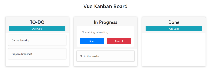
Typically, a Kanban board has columns and cards. A card is a single item or task to be performed, and columns show the state of a particular card.
We will be creating three Vue components: one for the column, one for the cards, and another to create new cards.
The first component we’ll create is the card component. To begin, create a new file, Card.vue, in the /component directory.
Add the following to the newly created component:
<template>
  <div class="card">
    <div class="card-body">A Sample Card</div>
  </div>
</template>
<script>
export default {};
</script>
<style scoped>
div.card {
  margin-bottom: 15px;
  box-shadow: 0 0 5px #cccccc;
  transition: all ease 300ms;
  background: #fdfdfd;
}
div.card:hover {
  box-shadow: 0 0 10px #aaaaaa;
  background: #ffffff;
}
</style>
This creates and styles the card component. We have not yet added any draggable functionality to this component, as this is just the skeleton of the component.
As the name implies, this component will have the responsibility of creating new cards and adding them to columns.
Create an AddCard.vue file in the /components directory and add the following to it:
<template>
  <div class="">
    <button
      class="btn btn-sm btn-info w-100"
      v-if="!inAddMode"
      @click="inAddMode = true"
    >
      Add Card
    </button>
    <form action="#" class="card p-3" ref="form" v-else>
      <div class="form-group">
        <input
          type="text"
          name="title"
          id="title"
          class="form-control"
          placeholder="Something interesting..."
          v-model="cardData"
        />
      </div>
      <div class="d-flex justify-content-center">
        <button type="submit" class="btn w-50 btn-primary mr-3">Save</button>
        <button type="reset" class="btn w-50 btn-danger">
          Cancel
        </button>
      </div>
    </form>
  </div>
</template>
<script>
export default {
  data() {
    return {
      inAddMode: false,
      cardData: '',
    };
  },
  methods: {},
};
</script>
<style></style>
The functionality for this will be built in the coming section.
This is the last component we’ll create. This component will show a list of cards and will also contain the “add card component” so that new cards can be created directly into a column.
Create a Column.vue file in the components directory and add the following code:
<template>
  <div class="col-md-3 card column" ref="column">
    <header class="card-header">
      <h3 class="col">Column Name</h3>
    </header>
    <div class="card-list"></div>
  </div>
</template>
<script>
export default {};
</script>
<style scoped>
div.column {
  padding: 0;
  padding-bottom: 15px;
  margin: 0 15px;
  box-shadow: 0 0 10px #cccccc;
}
div.card-list {
  padding: 0 15px;
}
header {
  margin-bottom: 10px;
}
header h3 {
  text-align: center;
}
</style>
Before adding the functionalities and composing the components to work, here’s an overview of how drag and drop functionality works in browsers.
A drag operation starts when a user moves their mouse over a draggable element, then moves the element over to a drop-enabled element.
By default, the only HTML elements that are draggable are images and links. To make other elements draggable, you need to create the functionality explicitly either by adding the draggable attribute to the element, or by selecting the element in JavaScript and setting the draggable property to true.
After setting draggable to
trueon the element, you’ll notice that the draggable attribute has been added to the element.
<!-- Making an element draggable in HTML -->
<div draggable="true">This is a draggable div in HTML</div>

<script>
// Making an element draggable in javascript
const div = document.querySelector('div');
div.draggable = true;
</script>
The goal of dragging an element is to transfer a piece of data from one section of the page to another.
For images, the data being transferred is the image URL or a base 64 representation of the image. For links, the data being transferred is the URL. Links can be moved to the URL bar of a browser for the browser to navigate to that URL.
In the same vein, dragging elements would be useless without the ability to transfer data. Data that will be transferred through a drag operation is stored in the drag data store. It can be accessed via the DataTransfer API, which provides a way to store and access data during a drag and drop operation.
The DataTransfer object is used for this purpose, as it provides a place to add items to be transferred via drag and drop.
Data can be added to the drag data store when a drag operation is starting (when the dragstart event gets dispatched), and the data can only be received after the drop operation is completed (when the drop event gets dispatched).
From the time an element is dragged to when it gets dropped, two events will be triggered on the element being dragged: dragstart and dragend, after the element has been dropped.
A draggable element can’t be dropped just anywhere. Just as we need to explicitly make an element draggable, to allow an element to be dropped, it needs to be drop-enabled.
To make an element drop-enabled, we need to listen on the dragover event and prevent the default browser action.
<!-- Make a section drop-enabled -->
<section class="section"></section>
<script>
const section = document.querySelector('.section');
section.addEventListener('dragover', (e) => {
  e.preventDefault();
});
</script>
When an element is dragged over a drop-enabled element, the following events get triggered on the drop-enabled element:
Dragenter: This is triggered once, when an element gets dragged over the drop-enabled element
Dragover: This is triggered continuously, as long as an element remains over a drop-enabled element
Drop: This is triggered after the dragged element has been dropped on the drop-enabled element.
It is important to note that the data stored in the
DataTransferobject can only be accessed when the drop event is triggered, and not ondragenterordragover. More information on this can be found here.
Before adding the drag and drop functionality to the components, let’s discuss app state.
The application state here will be stored in the App component and can then be passed down to the Column component as props. The Column component, on the other hand, will pass the required props to the Card component when rendering it.
Modify App.vue to reflect the state and the component composition:
// App.vue
<template>
  <div class="container-fluid">
    <h2 class="m-5">
      Vue Kanban Board
    </h2>
    <div class="row justify-content-center">
      <Column
        v-for="(column, index) in columns"
        :column="column"
        :key="index"
      />
    </div>
  </div>
</template>
<script>
import Column from './components/Column';
export default {
  name: 'App',
  components: {
    Column,
  },
  data() {
    return {
      columns: [
        {
          name: 'TO-DO',
          cards: [
            {
              value: 'Prepare breakfast',
            },
            {
              value: 'Go to the market',
            },
            {
              value: 'Do the laundry',
            },
          ],
        },
        {
          name: 'In Progress',
          cards: [],
        },
        {
          name: 'Done',
          cards: [],
        },
      ],
    };
  },
};
</script>
<style>
h2 {
  text-align: center;
}
</style>
Here, we import the Column component, and, while looping over it with the data stored in state as columns, we pass the data for each column to the column component. In this case, there are only three columns: “To-Do,” “In Progress,” and “Done,” with each column having an array of cards.
Next, update the Column component to receive the props and display it appropriately:
// Column.vue
<template>
  <div class="col-md-3 card column" ref="column">
    <header class="card-header">
      <h3 class="col">{{ column.name }}</h3>
      <AddCard />
    </header>
    <div class="card-list">
      <Card v-for="(card, index) in column.cards" :key="index" :card="card" />
    </div>
  </div>
</template>
<script>
import Card from './Card';
import AddCard from './AddCard';
export default {
  name: 'Column',
  components: {
    Card,
    AddCard,
  },
  props: {
    column: {
      type: Object,
      required: true,
    },
  },
};
</script>

...
The Column component receives props from the App component, and renders a list of Card components with the prop. We also use the AddCard component here because a new card should be able to be directly added to a column.
Finally, we update the Card component to display the data received from Column.
// Card.vue
<template>
  <div class="card" ref="card">
    <div class="card-body">{{ card.value }}</div>
  </div>
</template>
<script>
export default {
  name: 'Card',
  props: {
    card: {
      type: Object,
      required: true,
    },
  },
};
</script>
The Card component just receives all the data it will need from the Column and displays it. We are also adding a reference to the card element here. This will be useful when accessing the card element via JavaScript.
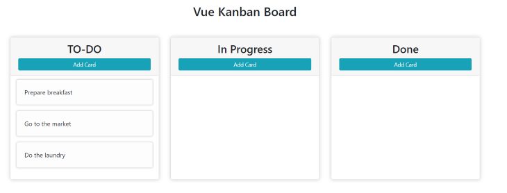
After completing the above, your application should look this:
The first step to adding the drag and drop functionality is to identify the draggable component and the drop targets.
A user should be able to drag a card from one column to another, following the progress of the activity in the card. Hence, the draggable component here should be the Card component, while the drop target here is the Column component.
To make the card component draggable, we need to do the following:
draggable attribute to trueDataTransfer objectSetting draggable to true should happen as early as possible, and, according to the Vue lifecylce hook, a safe place to do this is in the mounted hook. Add the following to the mounted hook of the Card component:
// Card.vue
<script>
export default {
  name: 'Card',
  props: {...},

  mounted() {
    this.setDraggable();
  },

  methods: {
    setDraggable() {
      // Get Card element.
      const card = this.$refs.card;
      card.draggable = true;
      // Setup event listeners.
      card.addEventListener('dragstart', this.handleDragStart);
      card.addEventListener('dragend', this.handleDragEnd);
    },
  },
</script>
Above, we created a method setDraggable to handle making the card component draggable.
In setDraggable, we get the card from the reference, which was added in the previous section, and set the draggable attribute to true.
We are also setting up the event listeners, which will be useful for adding data to the drag data store using the DataTransfer object.
Let’s create the event listeners to do just that.
// Card.vue
<script>
export const CardDataType = 'text/x-kanban-card';

export default {
...
  methods: {
    setDraggable() {...},
    handleDragStart(event) {
      const dataTransfer = event.dataTransfer;
      // Set the data to the value of the card which is gotten from props.
      dataTransfer.setData(CardDataType, this.card.value);
      dataTransfer.effectAllowed = 'move';
      // Add visual cues to show that the card is no longer in it's position.
      event.target.style.opacity = 0.2;
    },
    handleDragEnd(event) {
      // Return the opacity to normal when the card is dropped.
      event.target.style.opacity = 1;
    }
  }
}
</script>
Recall from the Drag and Drop API overview section that data can only be added to the drag data store when the dragstart event gets dispatched. Hence, we need to add the data in the handleDragStart method.
The dataTransfer object is received from the drag event which was dispatched, and, using setData, we are setting the data to be moved during this drag operation to the value of the card which is received from props.
An important piece of information that’s required when setting the data is the format. This is can be any string. In our case, it is set to text/x-kanban-card. We are storing this data format and exporting it because it will be needed in the Column component when we are getting the data after the card has been dropped.
Finally, reduce the opacity of the card to 0.2 so as to give the user some feedback that the card is actually being dragged out of its original position. After the drag has been completed, we return the opacity to 1.
The cards are now draggable. However, they can not be dropped anywhere because we have not added a drop target. Let us do just that.
From the overview of the drag and drop API, we need to listen on the dragover event to make the columns drop-enabled. The dragover event will be triggered when a card is dragged over a column.
The dragenter event gets triggered immediately when the card enters the column component, and the drop event will be triggered after the card is dropped into the column.
Hence, to enable card drops into the columns, we need to listen on these events.
First, update the Column component to enable drop.
// Column.vue
<template>...</template>
<script>
import Card { CardDataType } from './Card';
import AddCard from './AddCard';
export default {
  name: 'Column',
  components: {...},
  props: {...},
  mounted() {
    this.enableDrop();
  },
  methods: {
    enableDrop() {
      const column = this.$refs.column;
      column.addEventListener('dragenter', this.handleDragEnter);
      column.addEventListener('dragover', this.handleDragOver);
      column.addEventListener('drop', this.handleDrop);
    },
    /**
     * @param {DragEvent} event
     */
    handleDragEnter(event) {
      if (event.dataTransfer.types.includes[CardDataType]) {
        // Only handle cards.
        event.preventDefault();
      }
    },
    handleDragOver(event) {
      // Create a move effect.
      event.dataTransfer.dropEffect = 'move';
      event.preventDefault();
    },
    /**
     * @param {DragEvent} event
     */
    handleDrop(event) {
      const data = event.dataTransfer.getData(CardDataType);
      // Emit a card moved event.
      this.$emit('cardMoved', data);
    },
  },
};
</script>
Here, we are setting up all the event listeners required for a drop to be enabled after the Column component gets mounted.
Among these three events, the first to get triggered is dragenter, which is triggered immediately when any draggable element is dragged into the column. For our application, we only want cards to be dropped into a column, so, in the dragenter event, we only prevent default for data type, which includes the card data type that was defined in the card component.
In the dragover event, we set the drop effect to be move.
Move shows that an item (a card) is being moved from one place to another (one column to another). Other effects include copy, link, and none. More information about these can be found from MDN.
On the drop event, we get the data that was transferred from the dataTransfer object. If we did not check for the data type on the dragenter event, the data here could be any random thing, depending on what got dragged.
But here, we are sure that the data being transferred is the content of the card as specified in the dragstart event of the Card component.
Next, we need to update the state and move the card to the current column. Because our application state resides in the App component, we emit a cardMoved event in the drop listener, passing the data that was transferred and listen for the cardMoved event in the App component.
To learn about dispatching custom events in Vue, check the official Vue docs.
Now, update the App.vue to listen for the cardMoved event:
// App.vue

<template>
  <div class="container-fluid">
    ...
    <div class="row justify-content-center">
      <Column
        v-for="(column, index) in columns"
        :column="column"
        :key="index"
        @cardMoved="moveCardToColumn($event, column)"
      />
    </div>
  </div>
</template>

<script>
import Column from './components/Column';
export default {
  name: 'App',
  components: {...},
  data() {
    return {...}
  },
  methods: {
    moveCardToColumn(data, newColumn) {
      const formerColumn = this.columns.find(column => {
        // Get all the card values in a column.
        const cardValues = column.cards.map((card) => card.value);
        return cardValues.includes(data);
      })
      // Remove card from former column.
      formerColumn.cards = formerColumn.cards.filter(
        (card) => card.value !== data
      );
      // Add card to the new column.
      newColumn.cards.push({ value: data });
    },
  },
}
</script>
Here, we are listening on the cardMoved event via @cardMoved, and calling the moveCardToColumn method. The cardMoved event emits a value (the card data), which can be accessed via $event, and we are also passing the current column where the card was dropped (this is where the event got dispatched).
The moveCardToColumn function does three things: find the column where the card was previously, remove the card from that column, and add the card to the new column.
Congratulations on getting to this point in the tutorial! Now that the drag and drop functionality has been added, the only task left is to make the “add card” functionality.
Update AddCard.vue to look like the following:
<template>
  <div class="">
    <button
      class="btn btn-sm btn-info w-100"
      v-if="!inAddMode"
      @click="inAddMode = true"
    >
      Add Card
    </button>
    <form
      action="#"
      class="card p-3"
      @submit.prevent="handleSubmit"
      @reset="handleReset"
      ref="form"
      v-else
    >
      ...
    </form>
  </div>
</template>
<script>
export default {
  data() {
    return {...};
  },
  methods: {
    handleSubmit() {
      if (this.cardData.trim()) {
        this.cardData = '';
        this.inAddMode = false;
        this.$emit('newcard', this.cardData.trim());
      }
    },
    handleReset() {
      this.cardData = '';
      this.inAddMode = false;
    },
  },
};
</script>
We created functions to be run when the “add card” form gets submitted or reset.
When it’s reset, we clear cardData (current data typed in the input field), and set inAddMode to false.
When the form is submitted, we also clear the cardData, so that when new items get added, the previous data won’t be present, and we also set inAddMode to false and emit a newcard event.
Remember that state is stored in the App component, and somehow, we need to inform the App component of the card addition; hence, we need to emit an event that would get to the App component.
The AddCard component is used in the Column component, so we need to listen for the newcard event in the Column component.
Update the Column component to listen on the newcard event.
<template>
  <div class="col-md-3 card column" ref="column">
    <header class="card-header">
      <h3 class="col">{{ column.name }}</h3>
      <AddCard @newcard="$emit('newcard', $event)"></AddCard>
    </header>
    ...
</template>
...
Here, we are re-emitting the newcard event so it can get up to the App component, where the actual action is going to happen.
Custom Vue events are not bubbled, hence the
Appcomponent won’t be able to listen on thenewcardevent emitted in theAddCardcomponent, as it is not a direct child component.
Now, update the App component to handle the newcard event:
// App.vue

<template>
  <div class="container-fluid">
    ...
    <div class="row justify-content-center">
      <Column
        v-for="(column, index) in columns"
        :column="column"
        :key="index"
        @cardMoved="moveCardToColumn($event, column)"
        @newcard="handleNewCard($event, column)"
      />
    </div>
  </div>
</template>

<script>
import Column from './components/Column';
export default {
  name: 'App',
  components: {...},
  data() {
    return {...}
  },
  methods: {
    moveCardToColumn(data, newColumn) {...},
    handleNewCard(data, column) {
      // Add new card to column.
      column.cards.unshift({ value: data });
    },
  },
};
</script>
Here, we listen on the newcard event that was dispatched from the Column component, and, getting the data, we create a new card and add it to the column in which it was created.
In this article, we covered what the HTML 5 drag and drop API is, how to use it, and how to implement it in a Vue.js application.
However, both the drag and drop functionality and this tutorial can be used in any other frontend framework, and in vanilla JavaScript.
You can find the code for this article here.
Debugging Vue.js applications can be difficult, especially when users experience issues that are difficult to reproduce. If you’re interested in monitoring and tracking Vue mutations and actions for all of your users in production, try LogRocket.
LogRocket lets you replay user sessions, eliminating guesswork by showing exactly what users experienced. It captures console logs, errors, network requests, and pixel-perfect DOM recordings — compatible with all frameworks.
With Galileo AI, you can instantly identify and explain user struggles with automated monitoring of your entire product experience.
Modernize how you debug your Vue apps — start monitoring for free.

Learn how to protect full-stack projects from NPM supply chain attacks with a practical security checklist.

Explore 15 essential MCP servers for web developers to enhance AI workflows with tools, data, and automation.

Learn how contrast-color() automatically picks accessible text colors using native CSS, without JavaScript.

Learn how to build a harness-style AI workflow using Claude Code with specialized Dev, QE, and Ops subagents, gated handoffs, MCP telemetry, and LEARNING.md.
Hey there, want to help make our blog better?
Join LogRocket’s Content Advisory Board. You’ll help inform the type of content we create and get access to exclusive meetups, social accreditation, and swag.
Sign up now

 Learn more →
