calc(): Tutorial with examples
Have you heard of or used the CSS calc() function? Perhaps you have heard about it but never tried it, or have tried using it but ran into some issues along the way. This guide can help you out.

CSS calc() is a great tool to help you optimize your web pages. In this tutorial, we’ll look at the CSS calc() function, why it’s useful, and how to use it in your projects. We’ll cover the following:
calc() function?calc()calc()calc() functioncalc()calc() in a sample blog
calc() function with CSS variablescalc() for animations?calc()calc() function?Let’s get started.
The Replay is a weekly newsletter for dev and engineering leaders.
Delivered once a week, it's your curated guide to the most important conversations around frontend dev, emerging AI tools, and the state of modern software.
calc() function?The calc() function allows you to perform computations when specifying CSS property values. It’s especially useful for calculating length, percentage, time, numbers, integers, frequencies, and angles, among other things.
One of the CSS calc() function’s superpowers is the ability to combine different units. This function can perform math calculations that the preprocessor cannot.
Preprocessors in CSS can only combine units that have a fixed relationship, such as angular units, time units, frequency units, resolution units, and specific length units.
Let us now examine the CSS calc() syntax:
calc( Expression)
The calc() function takes a single expression as its parameter. The result of the expression is then used as the value. It can take any form and employ any of the following operators, following standard operator precedence rules.
The calc() function makes use of four basic operators:
Addition +:
calc(50px + 50px)
Subtraction –:
calc(100% - 30px)
Division /:
calc(100% / 2)
Multiplication *:
calc(100vh * 2)
Let’s look at some basic examples of using the CSS calc() function. Then, we will explore some things to note about this function, after which we will dive into some more complicated examples.
calc()With the CSS calc() function, we can convert a value with no units into a value with units by multiplying the value by the unit type you want to convert to. This can be useful with CSS variables, as in the example below:
.class {
  --fav-num: 3;
  width: calc(var(--fav-num) * 1px); // 3px
}
In this example, we assigned the number 3 — which has no unit attached to it — the CSS variable --fav-num. We then used it to get a new width value with a unit by multiplying it by 1px to become 3px.
calc()Let’s say we have a scenario in which we want our paragraph’s font to be large on a desktop screen but small on a mobile screen. Of course, CSS media queries can help, but the calc() function is also equal to the task, so we won’t need to use media queries.
Let’s see how it goes:
p {
    font-family: Arial, Helvetica, sans-serif;
    font-size: calc(10px + 5vw);
}
This will allow our fonts to be smaller in a mobile view and return to normal when we increase the screen size or in a desktop view.
Please note that this approach shouldn’t be used if your font size is already small for the desktop view; in that case, it wouldn’t make sense to make the font size even smaller for the mobile view.
calc() functionLet’s now take a look at a few things to note when using the CSS calc() function.
First, when writing the calc() function syntax, we must include a space between each operation — especially when using the + and – operators — or our expression will be invalid. Consider the following example:
calc(50% -4px)
The expression above is invalid because we did not include a space between the operator and the length, making the length appear negative. To correct the expression, we would need to write it as follows:
calc(50% - 4px)
Note that although the * and / operators do not require whitespace, including spaces is permissible. It is therefore recommended to include spaces for consistency.
Here are a few more things to note about the CSS calc() function:
calc() functionLet’s dive into some more examples.
calc()To understand how to adjust positioning and length using the CSS calc() function, let’s start by making a few cards and placing them inside a container.
You will need the following for the HTML:
 <div class="container">
       <div class="card"><p>card 1</p></div>
       <div class="card"><p>card2</p></div>
       <div class="card"><p>card3</p></div>
       <div class="card"><p>card4</p></div>
       <div class="card"><p>card4</p></div>
    </div>
Your CSS code should look like this:
*{
    margin: 0;
   padding: 0;
   box-sizing: border-box;
}
body{
    display: flex;
    justify-content: center;
    align-items: center;
    min-height: 100vh;
}
.container{
    position: relative;
    display: flex;
    width: 1000px;
    height: 200px;
    background:#ccc
}
 .card{
    position: relative;
    min-width: 200px;
    height: 200px;
    background:#FF0000;
    margin: 10px 10px 10px 10px;
    color: white;
    font-family: 'Franklin Gothic Medium', 'Arial Narrow', Arial, sans-serif;
}
The result:
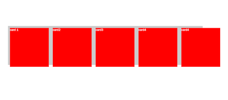
Do you notice how our red cards do not align with the gray container? Let’s now introduce the CSS calc() function by using it on our min-width and height inside our cards:
 min-width: calc(calc(100% / 5) - 20px);
 height: calc(100% - 20px);
For our min-width, we nested a calc() function inside another calc() function. The nested CSS function was used to divide the full width of the screen (100%) by 5, and the result was then multiplied by 20px to get the final value for our min-width.
For our height, we subtracted the total value of the top and bottom margins (which is 20px) from 100 percent of the height, resulting in a perfectly aligned box.
The result:
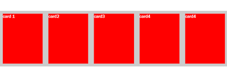
As you can see, the red cards are now positioned inside our container perfectly!
We can also use the CSS calc() function in a sneaky kind of way. Let’s see how in the next example, where we will explore two cases of using this function in a sample blog.
calc() in a sample blogFor our next example, I created a simple sample blog with a scroll bar, some dummy paragraphs, and an image. We’ll use this sample blog to explain cases where we can use the CSS calc() function.
To set up our sample blog, our HTML should look like this:
<header>
      <nav>
        <span>home</span>
        <span>about</span>
        <span>contact</span>
      </nav>
    </header>
    <div class="container">
      <div class="blog-container">
        <section class="section">
          Sed ut perspiciatis unde omnis iste natus error sit voluptate
          accusantium doloremque laudantium, totam rem aperiam, eaque
          ab illo inventore veritatis et quasi architecto beatae vitae
          dsunt explicabo. Nemo enim ipsam voluptatem quia voluptas sit
          aspernatur aut odit aut fugit, sed quia consequuntur magni do
          qui ratione voluptatem sequi nesciunt. Neque porro quisquam e
          dolorem ipsum quia dolor sit amet, consectetur, adipisci veli
          quia non numquam eius modi tempora incidunt ut labore et dolo
          aliquam quaerat voluptatem. Ut enim ad minima veniam, quis n
          exercitationem ullam corporis suscipit laboriosam, nisi ut al
          ea commodi consequatur? Quis autem vel eum iure reprehenderit
          ea voluptate velit esse quam nihil molestiae c onsequatur, ve
          qui dolorem eum fugiat quo voluptas nulla pariatur?
          <img src="https://picsum.photos/200" class="my-image" />
        </section>
        <section>
          Sed ut perspiciatis unde omnis iste natus error sit voluptat
          accusantium doloremque laudantium, totam rem aperiam, eaque i
          ab illo inventore veritatis et quasi architecto beatae vitae
          sunt explicabo. Nemo enim ipsam voluptatem quia voluptas sit
          aspernatur aut odit aut fugit, sed quia consequuntur magni do
          qui ratione voluptatem sequi nesciunt. Neque porro quisquam e
          dolorem ipsum quia dolor sit amet, consectetur, adipisci veli
          quia non numquam eius modi tempora incidunt ut labore et dolo
          aliquam quaerat voluptatem. Ut enim ad minima veniam, quis n
          exercitationem ullam corporis suscipit laboriosam, nisi ut a
          ea commodi consequatur? Quis autem vel eum iure reprehenderit
          ea voluptate velit esse quam nihil molestiae consequatur, vel
          qui dolorem eum fugiat quo voluptas nulla pariatur? Sed ut
        </section>
      </div>
    </div>
Our CSS code should look like this:
*,
*::before,
*::after{
  margin: 0;
  padding: 0;
    box-sizing: border-box;
}
header{
  width: 100%;
  height: 60px;
  padding: 20px;
  background: #CBC3E3;
  color: white;
  font-family: Arial, Helvetica, sans-serif;
  display: flex;
  align-items: center;
  box-sizing: border-box;
}
.blog-container{
 font-size: 1.5rem;
  max-width: 1000px;
  width: calc(90vw -20px) ;
margin: 20px auto;
}

  img{
    display: block;
    max-width: 100%;
  padding-top:30px;
  }
Now that our sample blog is set up, we can begin exploring use cases for the CSS calc() function.
calc() to fix our navbar positionWe have a navbar on the blog, but as you can see below, the scroll bar on the right overlaps with it:

What if we wanted the navbar’s position to be fixed so that the scroll bar does not overlap with it? There are various ways to achieve this, including using the CSS calc() function:
.container{
  height: calc(100vh - 60px) ;
overflow-y: auto;
}
The result:

In the code above, we created a container selector in our CSS and gave it a view height of 100 — the viewport of our entire window — and then subtracted the height of our header from it. Our changes would not work unless we set an overflow value.
calc() to add a full-width imageLet’s say we want the image in our blog to fill up the spaces on both sides of our blog’s content instead of staying within the blog container’s margins. Again, we can use the CSS calc() function for that:
.my-image{
  max-width: 100vw;
  width: 100vw;
  margin: 0 calc(-50vw + 50%);
  height: 70vh;
}
The result:

In the code above, we set the margins to 0 for the top and bottom. However, on the left and right, we did something unusual: we used the calc() function to give it a negative viewport width (- 50vw) and then added 50 percent back in.
As a result, we have our image that fills the entire viewport. Regardless of the fact that it is housed in the same container as our section, our image is now taking the full width of the screen.
calc() function with CSS variablesUsing calc() with CSS variables, we can define a value once and modify it using math in order to get a new value which will be useful for us. Let’s take a look at an example.
Suppose we have two buttons, each with its own class, like so:
 <div class="container">
   <button class="success">button 1</button>
   <button class="danger">button2</button>
   </div>
We can use a CSS variable to define one color and then use the CSS calc() function to derive another color. Let’s create a color variable for our button. We’ll be using hsl notation, which takes the variables (hue, saturation, lightness) to specify a color value:
:root{
    --hue:180;
}
.success{
 background-color: hsl(calc(var(--hue)), 100%, 50%);
}
.danger{
    background-color: hsl(calc(var(--hue) - 180), 100%, 50%);
}
Result:
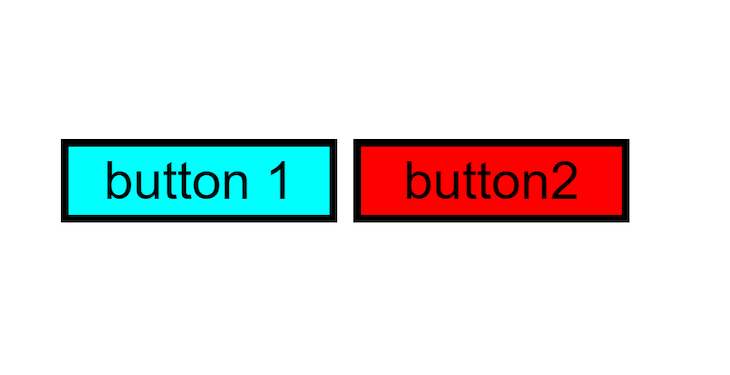
By giving our root hue a specific value, you can see that we can use the calc() function inside our hsl notation to derive another color for the second button. If we change the value of our root hue, another color is derived for the second button.
calc() for animations?We can of course use the CSS calc() function to make animations. Let’s create an example! Start with the following HTML:
<section>
      <div class="animate-loading">
        <div class="block" style="--i: 1"></div>
        <div class="block" style="--i: 2"></div>
        <div class="block" style="--i: 3"></div>
        <div class="block" style="--i: 4"></div>
        <div class="block" style="--i: 5"></div>
        <div class="block" style="--i: 6"></div>
        <div class="block" style="--i: 7"></div>
        <div class="block" style="--i: 8"></div>
        <div class="block" style="--i: 9"></div>
        <div class="block" style="--i: 10"></div>
        <div class="block" style="--i: 11"></div>
        <div class="block" style="--i: 12"></div>
        <div class="block" style="--i: 13"></div>
        <div class="block" style="--i: 14"></div>
        <div class="block" style="--i: 15"></div>
        <div class="block" style="--i: 16"></div>
        <div class="block" style="--i: 17"></div>
        <div class="block" style="--i: 18"></div>
        <div class="block" style="--i: 19"></div>
        <div class="block" style="--i: 20"></div>
      </div>
    </section>
Our CSS should look like this:
root
*{
    margin: 0;
    padding: 0;
    box-sizing: border-box;
    font-family: 'Courier New', Courier, monospace;
}
section{
    display: flex;
    justify-content: center;
    align-items: center;
    min-height: 100vh;
    background: #001d10;
}
.animate-loading{
     position: relative;
     width: 250px;
     height: 250px;
}
.animate-loading .block{
    position: absolute;
    width: 8px;
    height: 25px;
    background: #050c09;
    left: 50%;
    border-radius: 8px;
    transform: rotate(calc(18deg * var(--i)));
    transform-origin: 0 125px ;
    animation: animate 1.9s ease-in-out infinite;
    animation-delay: calc(0.05s * var(--i));
}
@keyframes animate {
    0%,50%{
         background: #050c09;
         box-shadow: none;
    }
    50.1%,100%{
        background: #38d2dd;
        box-shadow: 0 0 5px #38d2dd,
                    0 0 15px #38d2dd,
                    0 0 30px #38d2dd,
                    0 0 60px #38d2dd,
                    0 0 90px #38d2dd;

    }
}
The result:

As we can see in the code, the CSS calc() function came in handy in two areas: to animate our rotation, and also for our animation delay. Let’s take a closer look at these two areas.
transform: rotate(calc(18deg * var(--i)));
The value of 18deg comes from dividing 360 degrees by the number of blocks we created in our HTML. We then got the rotation value for our transform by multiplying 18deg by the value of our variable.
animation-delay: calc(0.05s * var(--i));
We also used the CSS calc() function in our animation-delay by multiplying 0.05s by our variable. This was used to specify the delay before the start of our animation.
CSS calc()While calc() is a useful function in CSS, it’s only useful when it is compatible with our browser. Take a look at the chart below to see browser compatibility for this function:

You can check out CanIUse for more details on browser compatibility for the CSS calc() function.
calc() function?There are a lot of times we’ll be needing the CSS calc() function to save us. They include:
Most of the examples we covered in this article fall under the categories stated above.
There are tons of ways we could use the CSS calc() function. You could even come up with your use cases, too. The CSS calc() function is really something that you should try out. It is an essential tool in the web developer’s toolbox.
If you found this article helpful, please share it!
As web frontends get increasingly complex, resource-greedy features demand more and more from the browser. If you’re interested in monitoring and tracking client-side CPU usage, memory usage, and more for all of your users in production, try LogRocket.

LogRocket lets you replay user sessions, eliminating guesswork around why bugs happen by showing exactly what users experienced. It captures console logs, errors, network requests, and pixel-perfect DOM recordings — compatible with all frameworks.
LogRocket's Galileo AI watches sessions for you, instantly identifying and explaining user struggles with automated monitoring of your entire product experience.
Modernize how you debug web and mobile apps — start monitoring for free.

useEffect breaks AI streaming responses in ReactSee why useEffect breaks AI streaming in React, and how moving stream state outside React fixes flicker and stale updates.

A real-world debugging session using Claude to solve a tricky Next.js UI bug, exploring how AI helps, where it struggles, and what actually fixed the issue.

CSS wasn’t built for dynamic UIs. Pretext flips the model by measuring text before rendering, enabling accurate layouts, faster performance, and better control in React apps.

Why do real-time frontends break at scale? Learn how event-driven patterns reduce drift, race conditions, and inconsistent UI state.
Hey there, want to help make our blog better?
Join LogRocket’s Content Advisory Board. You’ll help inform the type of content we create and get access to exclusive meetups, social accreditation, and swag.
Sign up now