
When developing apps in Flutter, you may encounter the need to display a list of items as a grid. You can show data in a grid format — i.e., with rows and columns — using the GridView class in Flutter.

Using GridView is the best way to combine the Row and Column classes and create a scrollable grid list. A common use case is showing a list of photos, such as in the Google and Apple native photo apps.
In this tutorial, we’ll demonstrate how to implement GridView in your Flutter app. We’ll also walk through some practical examples so you can see GridView in action.
We’ll cover the following in detail:
If you’re a visual learner, check out this quick video tutorial:
GridView (Flutter Widget of the Week)
Need to put items in a grid without having to use complex Row and Column combinations? GridView let’s you do just that! Learn how to set up your grid and add spacing between items with the GridView.count constructor. Learn more about GridView.count constructor → https://goo.gle/3lkDCzX Learn more abou GridView class→ https://goo.gle/3kDRi7W Learn everything about Flutter at → https://goo.gle/2WAhEN1 Get more tips!
The Replay is a weekly newsletter for dev and engineering leaders.
Delivered once a week, it's your curated guide to the most important conversations around frontend dev, emerging AI tools, and the state of modern software.
In Flutter, GridView is a widget that displays a list of items as a 2D array. In simple terms, the items are shown in a table format.
Unlike a normal list, in which items are rendered only in one direction, GridView renders items both horizontally and vertically. The figure below represents how GridView is different from a normal list in a Flutter app:
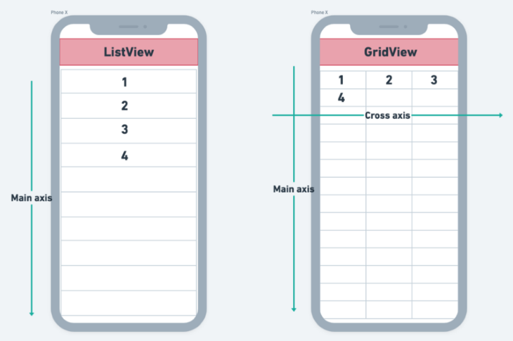
Here is the minimal code to get GridView up and running:
GridView(
  gridDelegate: SliverGridDelegateWithFixedCrossAxisCount(
    crossAxisCount: 3,
  ),
  children: [
    Image.network('https://picsum.photos/250?image=1'),
    Image.network('https://picsum.photos/250?image=2'),
    Image.network('https://picsum.photos/250?image=3'),
    Image.network('https://picsum.photos/250?image=4'),
  ],
)
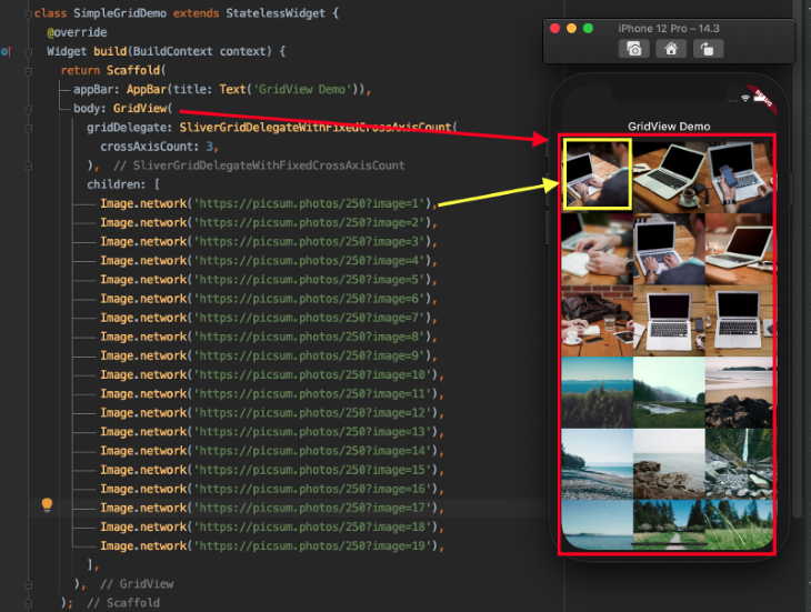
gridDelegate is a property that controls how items are shown in a list. In our example, it is given a SliverGridDelegateWithFixedCrossAxisCount() with crossAxisCount set to 3. That means we want to display three items horizontally if the scroll direction is vertical and three items vertically if the scroll direction is horizontal. The default scroll direction for any list is vertical only, so the items are shown horizontally.
children refers to the list of items given here. It accepts a list of any widgets so you can show anything you would like to appear on the screen.
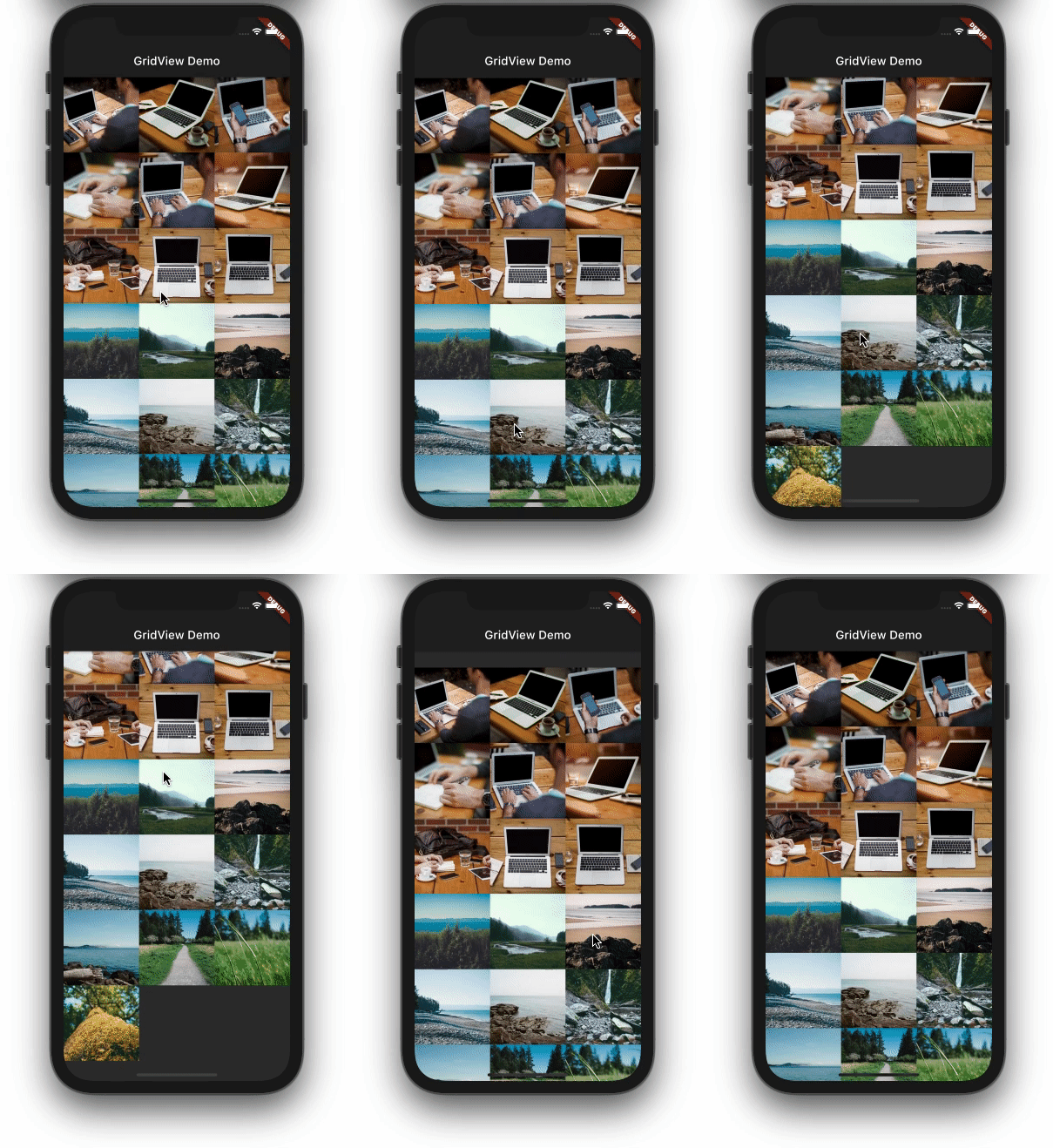
Here is the output:
Here’s how the code is translated into the UI:
Let’s have look at some properties of the GridView.
crossAxisSpacingSetting a value for this property allows you to place a space between items on the cross axis. That means space will appear horizontally if the scroll direction is vertical.
GridView(
  gridDelegate: SliverGridDelegateWithFixedCrossAxisCount(
      crossAxisCount: 3,
      crossAxisSpacing: 16),
  children: [
    Image.network('https://picsum.photos/250?image=1'),
    Image.network('https://picsum.photos/250?image=2'),
    Image.network('https://picsum.photos/250?image=3'),
)
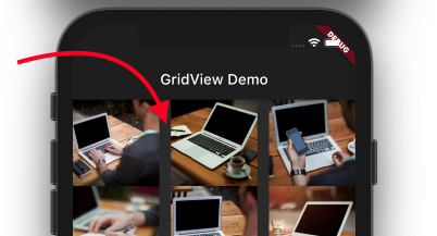
mainAxisSpacingThe main axis refers to the axis in which the list scrolls. The space between the items in the scrolling direction is given using the mainAxisSpacing property.
GridView(
  gridDelegate: SliverGridDelegateWithFixedCrossAxisCount(
      crossAxisCount: 3,
      mainAxisSpacing: 16),
  children: [
    Image.network('https://picsum.photos/250?image=1'),
    Image.network('https://picsum.photos/250?image=2'),
    Image.network('https://picsum.photos/250?image=3'),
)
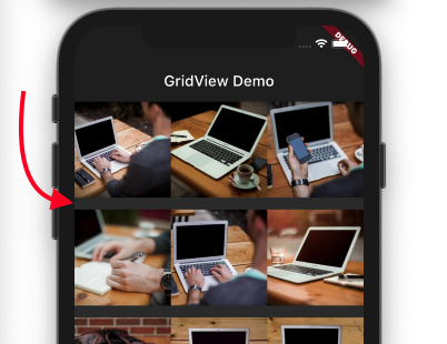
scrollDirectionYou may want to change the scroll direction when the GridView is displayed in landscape mode. Setting scrollDirection to Axis.horizontal will do just that.
GridView(
  gridDelegate: SliverGridDelegateWithFixedCrossAxisCount(
    crossAxisCount: 3,
  ),
  scrollDirection: Axis.horizontal,
  children: [
    ...
  ],
)

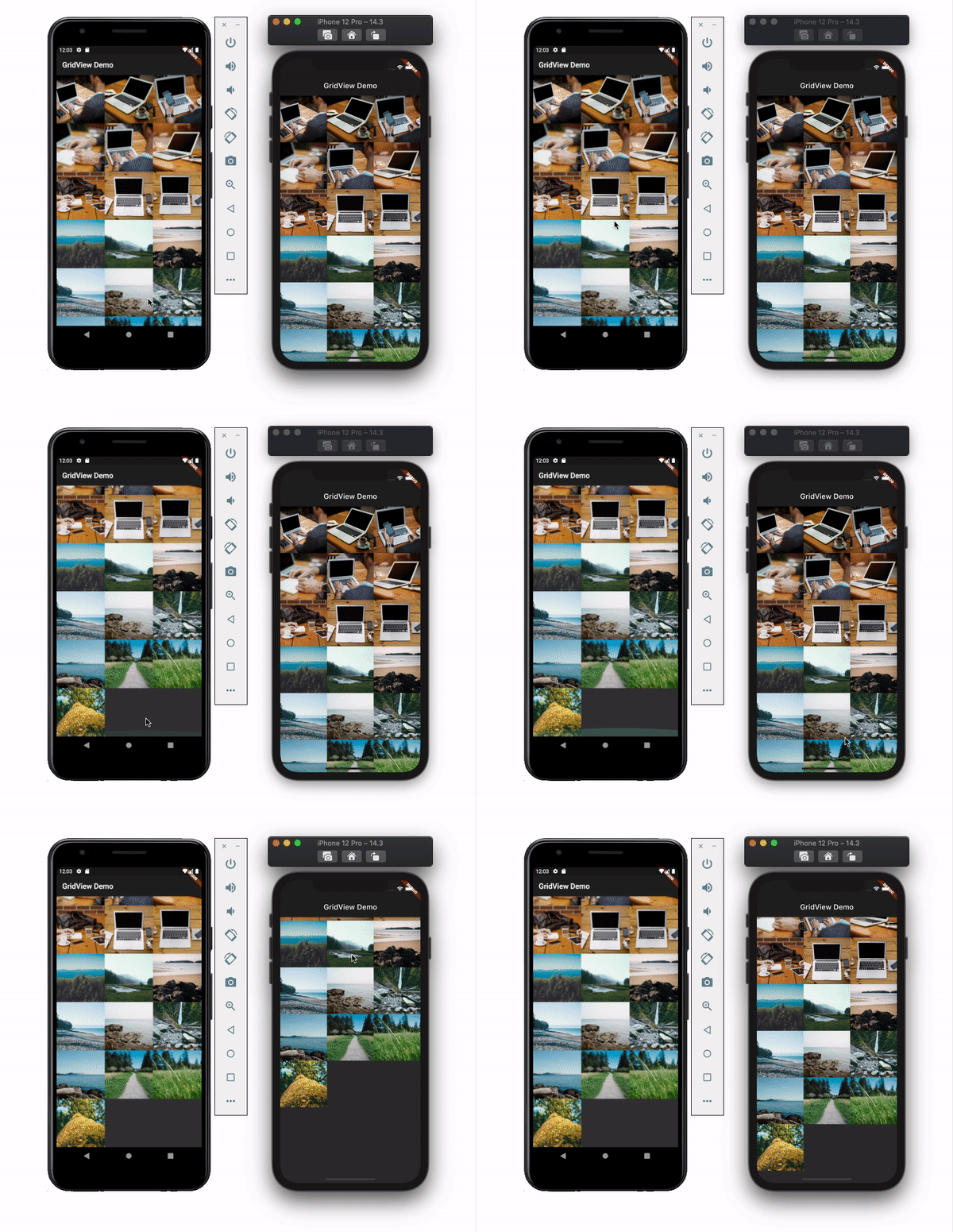
physicsThis property allows you to set the scroll behavior for the list. You may not want the list to scroll at all. Let’s say you’re showing a picture collage, for example. You can disable the scroll by setting the physics value to NeverScrollableScrollPhysics(). By default, it uses the ClampingScrollPhysics() for Android and BouncingScrollPhysics() for iOS and looks like this:
shrinkWrapSetting the shrinkWrap value to true causes GridView to take only the required space to fill items in the scroll direction. This defaults to false and reserves the entire screen even if the items are not in the list:
/////shrinkWrap: false,
Column(
  children: [
    Expanded(
      child: GridView(
        gridDelegate: SliverGridDelegateWithFixedCrossAxisCount(
          crossAxisCount: 3,
        ),
        shrinkWrap: false,
        children: [... ],
      ),
    ),
    ElevatedButton(onPressed: () {}, child: Text('Close'))
  ],
)
/////shrinkWrap: true,
Column(
  children: [
    GridView(
      gridDelegate: SliverGridDelegateWithFixedCrossAxisCount(
        crossAxisCount: 3,
      ),
      shrinkWrap: true,
      children: [...],
    ),
    ElevatedButton(onPressed: () {}, child: Text('Close'))
  ],
)
When shrinkWrap is false, we need to wrap the GridView inside the Expanded widget so that it takes all available space. Otherwise, it will throw an error.
Flutter has a constructor for showing only a few items in a GridView called GridView.count(). This constructor enables you to create a GridView with a fixed number of items. It also simplifies the method of specifying a number of items on the cross-axis.
The sample code looks like this:
GridView.count(
  crossAxisCount: 3,
  children: [
    ...
  ],
)
The number of items to show in the cross-axis is assigned to the crossAxisCount property. If you look carefully, you’ll notice that we don’t need SliverGridDelegateWith FixedCrossAxisCount() anymore.
GridView.count() can be used to create a keypad UI like this:
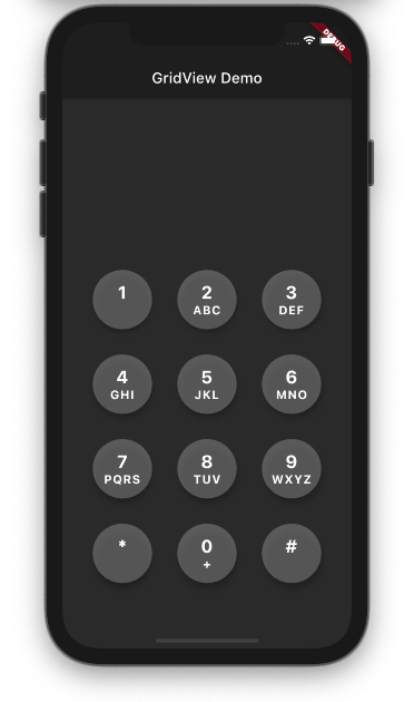
Here is the code for the above design:
GridView.count(
  crossAxisCount: 3,
  shrinkWrap: true,
  padding: EdgeInsets.only(left: 24, right: 24),
  children: [
    DialKey(
      number: '1',
      letters: '',
    ),
...
  ],
)
The shrinkWrap property is set to true, which causes GridView to free up some space on the screen.
DialKey() is a custom widget to display a single key. It looks like this:
// DialKey widget
class DialKey extends StatelessWidget {
  final String number;
  final String letters;

  DialKey({this.number, this.letters});

  @override
  Widget build(BuildContext context) {
    return Center(
      child: Container(
        width: 80,
        height: 80,
        child: FloatingActionButton(
          onPressed: () {},
          backgroundColor: Colors.grey.withOpacity(0.5),
          child: Column(
            mainAxisAlignment: MainAxisAlignment.center,
            children: [
              Text(
                '$number',
                style: TextStyle(
                    color: Colors.white,
                    fontSize: 24,
                    fontWeight: FontWeight.bold),
              ),
              Text(
                '$letters',
                style: TextStyle(
                    color: Colors.white,
                    fontSize: 16,
                    fontWeight: FontWeight.bold),
              )
            ],
          ),
        ),
      ),
    );
  }
}
To show a long list or an infinite number of items that may come from the database, you need GridView.builder() constructor.
Here is the sample code:
GridView.builder(
  itemCount: 100,
  itemBuilder: (context, index) => ItemTile(index),
  gridDelegate: SliverGridDelegateWithFixedCrossAxisCount(
    crossAxisCount: 2,
  ),
)
itemCount represents the number of items. This helps GridView to estimate the maximum scroll extent.
itemBuilder creates the given widget based on the current index.
Let’s try to build a product listing like this:
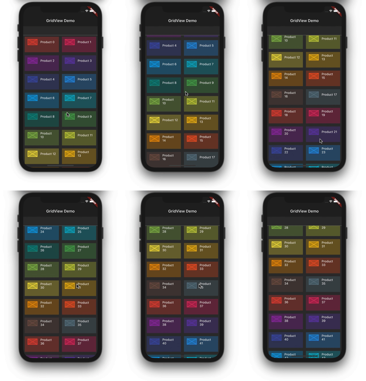
The code is as follows:
GridView.builder(
  itemCount: 100,
  itemBuilder: (context, index) => ItemTile(index),
  gridDelegate: SliverGridDelegateWithFixedCrossAxisCount(
    crossAxisCount: 2,
    childAspectRatio: 2,
  ),
)
class ItemTile extends StatelessWidget {
  final int itemNo;

  const ItemTile(
    this.itemNo,
  );

  @override
  Widget build(BuildContext context) {
    final Color color = Colors.primaries[itemNo % Colors.primaries.length];
    return Padding(
      padding: const EdgeInsets.all(8.0),
      child: ListTile(
        tileColor: color.withOpacity(0.3),
        onTap: () {},
        leading: Container(
          width: 50,
          height: 30,
          color: color.withOpacity(0.5),
          child: Placeholder(
            color: color,
          ),
        ),
        title: Text(
          'Product $itemNo',
          key: Key('text_$itemNo'),
        ),
      ),
    );
  }
}
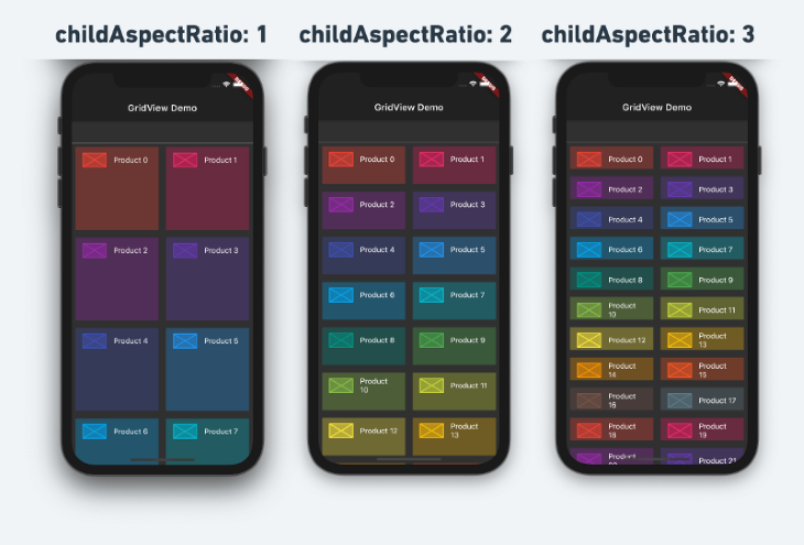
One important thing to note in the above code is the childAspectRatio property. This can be used to adjust the height of the items, as shown below:
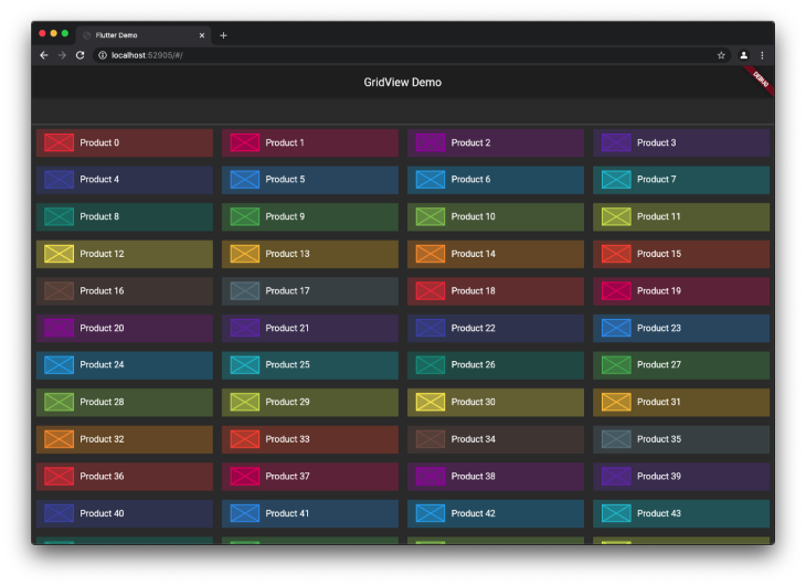
With the release of Flutter 2.0, you can now develop apps for the web and desktop in addition to mobile. When building cross-platform apps, you want to make sure you cater to web users by creating the best possible user experience. In this case, showing more items on the grid when it is displayed on a larger screen can go a long way toward improving the UX for web users.
Let’s modify the previous code to show more items on the cross-axis when displayed on a larger screen:
//Before
GridView.builder(
  itemCount: 100,
  itemBuilder: (context, index) => ItemTile(index),
  gridDelegate: SliverGridDelegateWithFixedCrossAxisCount(
    crossAxisCount: 2,
    childAspectRatio: 2,
  ),
)
//After
LayoutBuilder(builder: (context, constraints) {
  return GridView.builder(
    itemCount: 100,
    itemBuilder: (context, index) => ItemTile(index),
    gridDelegate: SliverGridDelegateWithFixedCrossAxisCount(
      crossAxisCount: constraints.maxWidth > 700 ? 4 : 1,
      childAspectRatio: 5,
    ),
  );
})
Wrap the GridView inside the LayoutBuilder. The LayoutBuilder provides the constraints, which can be used to determine the width and height. Using the constraints, we can build various user interfaces.
For our example, whenever the screen resolution changes to 700 or greater in width, we will show four items on the cross-axis.
Here is the output:
If you’ve made it this far, you should have all the requisite skills and foundational knowledge to create complex and engaging grid lists in Flutter using GridView.
The full code used for this example is available on GitHub.
Install LogRocket via npm or script tag. LogRocket.init() must be called client-side, not
server-side
$ npm i --save logrocket

// Code:

import LogRocket from 'logrocket';
LogRocket.init('app/id');
// Add to your HTML:

<script src="https://cdn.lr-ingest.com/LogRocket.min.js"></script>
<script>window.LogRocket && window.LogRocket.init('app/id');</script>

Learn how AI-assisted development governance uses rules, agents, hooks, and protocols to help AI coding tools produce safer, more consistent code.

A step-by-step guide to building your first MCP server using Node.js, covering core concepts, tool design, and upgrading from file storage to MySQL.

Using security headers in your Next.js apps is a highly effective way to secure websites from common security threats.

A deep dive into May 2026’s AI model and tool rankings. We break down performance, usability, pricing, and real-world capabilities across 50+ features to help you pick the right tools for your development workflow.
Would you be interested in joining LogRocket's developer community?
Join LogRocket’s Content Advisory Board. You’ll help inform the type of content we create and get access to exclusive meetups, social accreditation, and swag.
Sign up now