Editor’s note: This article was last updated by Rahul Chhodde on 9 May 2024 to remove outdated information, cover the structure of basic tab components, and discuss using React Bootstrap to style tab components.

Tabs are a prevalent UI pattern that saves a lot of screen space by arranging content into tabbed categories. The tabbed arrangement encourages a cleaner overall UI and also simplifies access to content categories.
A frontend developer must know the implementation of tabs, not only from a coding standpoint but also to enhance UX. This article delves into how to build an accessible and good-looking tab component in React from scratch without using additional packages.
To follow along with this tutorial, you’ll need to have Node.js and a package manager compatible with Node installed on your machine, e.g., npm, Yarn, pnpm, etc.
You should also have a working knowledge of:
The first thing that comes to mind when thinking about components of any sort is the wrapper element that contains the component overalls:
<div class="tabs">...</div>
Our tab component must have a navigation area where tabs are aligned horizontally or vertically using an unordered list. This conventional approach to creating menus and tab lists is excellent from a semantic perspective:
<div class="tabs">
  <nav class="tab-nav">
    <ul class="tab-list">
      <li><button>Tab #1</button></li>
      <li><button>Tab #2</button></li>
      <li><button>Tab #3</button></li>
    </ul>
  </nav>
</div>
It’s crucial to consider accessibility when planning the structure of a component for both general and assistive uses. Considering the ARIA standards, the list should carry a tablist role to clearly define its purpose within the web app so that assistive technologies can interpret it like a list of tabs.
It should also define its orientation on the screen using the aria-orientation attribute, which is horizontal in our case:
<div class="tabs">
  <nav class="tab-nav">
    <ul class="tab-list" role="tablist" aria-orientation="horizontal">
      <!-- List-items -->
    </ul>
  </nav>
</div>
The buttons inside the list items need to be assigned a tab role and a unique ID. Using the aria-controls attribute, they should point to the ID values of the respective panels they switch to. Each of these buttons should carry the aria-selected attribute, which changes to true only when the button gets clicked, or in other words, when the tab is active:
<div class="tabs">
  <nav class="tab-nav">
    <ul class="tab-list" role="tablist" aria-orientation="horizontal">
      <li>
        <button role="tab" id="tab-1" aria-controls="panel-1" aria-selected="false" class="tab-btn">Tab #1</button>
      </li>
      <li>
        <button role="tab" id="tab-2" aria-controls="panel-2" aria-selected="false" class="tab-btn">Tab #2</button>
      </li>
      <li>
        <button role="tab" id="tab-3" aria-controls="panel-3" aria-selected="true" class="tab-btn tab-btn--active">Tab #3</button>
      </li>
    </ul>
  </nav>
</div>
Each panel or element responsible for displaying the tab content should be assigned the role of tabpanel. It must have a unique ID that tab buttons point to through the aria-controls attribute, and it should also be provided with an aria-labelledby attribute containing the ID value of the triggering button:
<div class="tabs">
  <nav class="tab-nav">
    <ul class="tab-list" role="tablist" aria-orientation="horizontal">
      <!-- List-items -->
    </ul>
  </nav>
  <div role="tabpanel" id="panel-1" aria-labelledby="tab-1" class="tab-panel">
    <p>Content of Tab #1</p>
  </div>
  <div role="tabpanel" id="panel-1" aria-labelledby="tab-2" class="tab-panel">
    <p>Content of Tab #2</p>
  </div>
  <div role="tabpanel" id="panel-3" aria-labelledby="tab-3" class="tab-panel">
    <p>Content of Tab #3</p>
  </div>
</div>
In our React implementation, the tab panel will remain a single element, with only its ID attribute and contents changing dynamically:
See the Pen
The basic markup for a tab component by Rahul (@_rahul)
on CodePen.
The demo above contains all the bits of markup we discussed above, which, at the moment, doesn’t look like a tab component at all. In the next few segments, we’ll work all the way from nothing to build a simple yet effective React tabbed component.
You may choose from multiple methods to create a React app, such as using CRA, Vite, or installing React and React DOM directly without any wrapper. I prefer using Vite to create React apps, as it offers better speed and flexibility than other tools.
Run the following command in your terminal and then follow the subsequent instructions to set up a TypeScript-based React app with Vite:
npm create vite@latest react-tabs
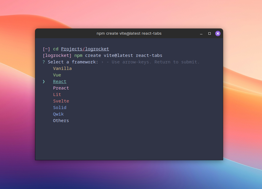
Note that “react-tabs” is the name of our project in the command above. The command generates all the files and configurations required for a starter React app with the default Vite-React template.
Next, change your working directory to the newly created app directory, “react-tabs” in this case, and install the required dependencies with the following commands:
cd react-tabs
npm install
Finally, run the following command to start the local development server and use the URL logged in the terminal to launch the app:
npm run dev
Let’s first clean up the project by removing the Vite-React template boilerplate.
Locate the App.css and index.css files in the source (src) folder and remove the existing styles. We will add our own custom styles to these files later.
Next, open the App.tsx file and remove everything from the return statement. Also remove any unnecessary imports, like SVG logos and hooks, if there are any.
The App.tsx file should look something like this after the cleanup:
// src/App.tsx
import './App.css';

function App() {
  return (
    <>{ /* Returning a blank fragment for now */ }</>
  );
}

export default App;
For better organization of the components, add a new subdirectory inside the src directory and name it “components.” Add a subdirectory to components named “Tabs,” which will house our tab component and its counterparts.
Next, create two additional subdirectories in src, “types” and “utils,” to better organize component type definitions and global utilities:
.
└── react-tabs
    ├── node_modules
    ├── public
    ├── src
    │   ├── assets
    │   ├── components
    │   │   └── Tabs
    │   │       ├── TabItem.tsx
    │   │       └── TabList.tsx
    │   ├── types
    │   │   └── TabsProps.ts
    │   ├── utils
    │   │   └── stringUtils.ts
    │   ├── App.css
    │   ├── App.tsx
    │   ├── index.css
    │   ├── main.tsx
    │   └── ...
    └── ...
As illustrated in the project structure above, the goal is to establish a tab UI using two interrelated components in a parent-child hierarchy. The TabList component will serve as the container, housing multiple TabItem sub-components to build a tab UI collectively.
Let’s declare prop types for the components we will be adding later. Navigate to the types folder and create a TypeScript file to contain the types for both components.
The TabItem component represents an element containing the content associated with the tab. It should have two props: the label prop representing the tab label and the children prop representing the tab contents:
// src/types/TabTypes.ts
export interface TabProps {
  label: string;
  children: ReactNode;
}
The TabList component represents a list of TabItem components. It could have a single TabItem or an array of multiple TabItem components as children, which will be managed using the children prop. It should also allow the developer to set the currently active tab by providing the tab index, which the activeTabIndex will handle:
// src/types/TabTypes.ts
export interface TabProps { ... }

export interface TabsProps {
  activeTabIndex: number;
  children: ReactElement<TabItemProps> | ReactElement<TabItemProps>[];
}
As mentioned earlier, the tab components and their children will use ARIA attributes for better accessibility. Some of these ARIA attributes will depend on the value of the ID attributes of certain elements to function. Instead of relying on an additional package to generate dynamic IDs, we will use the label value of each TabItem to formulate ID values.
Note that the value of the label prop should be meaningful and clear, as it will represent the corresponding tab in the frontend. Also, the IDs shouldn’t contain spaces and certain special characters. Generating compatible ID values from the label will require additional logic, which the following code snippet tries to solve:
// src/utils/stringUtils.ts
const sanitizeForId = (label: string) => {
  return label
    .toLowerCase()
    .replace(/[^\w\s]|(\s+)/g, (_match: string, group1: string) =>
      group1 ? "-" : ""
    );
}

export { sanitizeForId };
In the code above, the label is first converted to lowercase, and then a regex pattern replaces all special characters and spaces with hyphens, which are allowed in the ID attributes.
You may tweak this utility function later and add your own logic to suit your needs.
TabItem componentThe TabItem component represents the content of a tab in the TabList. As already discussed, it accepts and uses a label and HTML nodes as props to construct a container or panel for tab content.
As planned before, the tab content should be assigned the tabpanel role. The tab and tablist roles will be added to the elements of the TabList component:
// src/components/Tabs/TabItem.tsx
import { TabItemProps } from "@/types/TabsProps";
import { sanitizeForID } from "@/utils/stringUtils";

const TabItem: React.FC<TabItemProps> = ({ label, children }) => (
  <div
    className="tab-panel"
    role="tabpanel"
    aria-labelledby={`tab-${sanitizeForID(label)}`}
    id={`panel-${sanitizeForId(label)}`}
  >
    {children}
  </div>
);

export default TabItem;
To enhance the context for the tab panels, we have utilized the aria-labelledby attribute and assigned it an optimized value generated with label and the sanitizeForId utility function. A similar approach will be applied to different tab attributes in the next section, effectively linking them to their respective tab panels.
TabList componentThe TabList component serves as a parent to one or more TabItem components. It uses two key props: one for the selected tab’s index and another for its child nodes. To switch between tab panels based on the tab index, the useState Hook is ideal for maintaining the currently selected tab’s index:
// src/components/Tabs/Tablist.tsx

const TabList: React.FC<TabListProps> = ({ children, activeTabIndex = 0 }) => {
  const [activeTab, setActiveTab] = useState(activeTabIndex);
  const handleTabClick = (index: number) => {
    setActiveTab(index);
  };
};
Using the children prop, we can generate an array of TabList’s children, ensuring each child is a valid React element of type TabItem. This array can then be looped through to populate a navigation area with trigger points that reveal the corresponding tab content:
const TabList: React.FC<TabListProps> = ({ children, activeTabIndex = 0 }) => {
  // ...
  const tabs = React.Children.toArray(children).filter(
    (child): child is ReactElement<TabItemProps> =>
      React.isValidElement(child) && child.type === TabItem
  );
};
As previously discussed, providing optimized ID values for the ID and ARIA attributes is crucial to ensure accessibility. The final TSX for the TabList component should include the correct implementation of the tablist role for the list of tabbed navigation triggers and the tab role for each individual tab trigger.
The tab content is already assigned the tab-panel role in the TabItem component. Let’s apply the appropriate roles and ARIA attributes to the TabList component and its main child elements:
const TabList: React.FC<TabListProps> = ({ children, activeTabIndex = 0 }) => {
  // ...

  return (
    <div className="tabs">
      <nav className="tab-list-wrapper">
        <ul className="tab-list" role="tablist" aria-orientation="horizontal">
          {tabs.map((tab, index) => (
            <li key={`tab-${index}`}>
              <button
                key={`tab-btn-${index}`}
                role="tab"
                id={`tab-${sanitizeForId(tab.props.label)}`}
                aria-controls={`panel-${sanitizeForId(tab.props.label)}`}
                aria-selected={activeTab === index}
                onClick={() => handleTabClick(index)}
                className={`tab-btn ${
                  activeTab === index && "tab-btn--active"
                }`}
              >{tab.props.label}</button>
            </li>
          ))}
        </ul>
      </nav>
      {tabs[activeTab]}
    </div>
  );
};

export default TabList;
In the code above, we are constructing the tabbed navigation by looping over the tabs array and using the props of each individual tab (which is basically TabItem) for different purposes such as generating the ID from the label and providing the label text to the action button.
The button element inside the navigation list items is responsible for handling the clicking of tabs. When clicked, it triggers the handleTabClick function, which saves the index of the currently active tab to the activeTab state variable. This element also includes the aria-controls and aria-selected attributes that determine the panels they control and whether they are currently selected.
We can use the activeTab state variable to style the currently selected tab by adding the CSS styles directly to the component or applying a conditional CSS class as already shown in the code.
Using activeTab again, we can display the content of TabItem below the tab navigation by accessing it from the tabs array using activeTab‘s value as the array key.
And that wraps up the TabList component. We can now use both the TabList and TabItem components together to implement a tabbed UI in our app.
As established before, TabList and TabItem share a parent-child relationship, with TabList serving as the parent and TabItem as the child. The tabbed UI implemented using these two components is effective only when the TabList includes more than one TabItems.
Here’s an example demonstrating how to use these components in App.tsx:
import TabItem from "@/components/Tabs/TabItem";
import TabList from "@/components/Tabs/TabList";
import "./App.css";

function App() {
  return (
    <div className="App">
      <TabList activeTabIndex={1}>
        <TabItem label="Tab #1">
          <p>This is Tab #1</p>
        </TabItem>
        <TabItem label="Tab #2">
          <p>Selected by default, this is tab #2.</p>
        </TabItem>
        <TabItem label="Tab #3">
          <p>Tab #3, the last tab.</p>
        </TabItem>
      </TabList>
    </div>
  );
}

export default App;
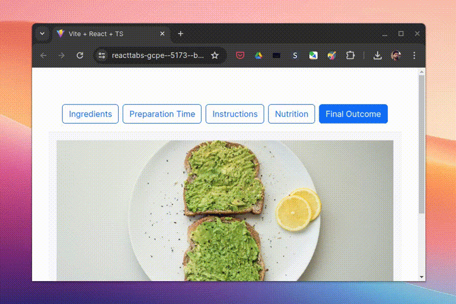
You can add as many TabItems to this setup as you like and import other components to use them inside the TabItem. Upon running the app, we can see our tab components in action, as demonstrated by the following screen capture:
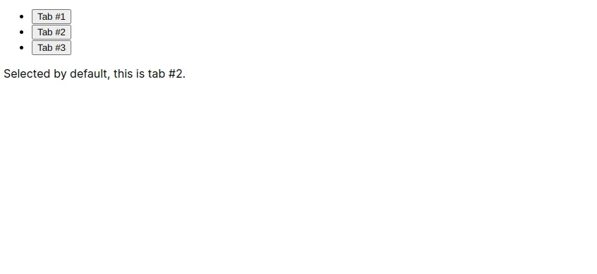
This doesn’t quite look like a tab component yet. In the next segment, we will style the components using the CSS classes we added to them and their children, and improve the overall look and feel of the feature.
We removed all the default styles for the app early on when restructuring the project. To enhance the visual appeal and functionality of the tab components, we need to apply some styling to what we have created so far.
I have kept these styles minimal, which you may expand on later based on the requirements of your project.
Let’s start by resetting the default browser styles for all the HTML elements with the help of the universal (*) selector in CSS.
Instead of writing a full-fledged reset, we’ll settle with changing the box-sizing of every element to border-box and setting the margin to zero for the body element. Because these settings will be applied globally, the following CSS blocks should go right into the index.css file inside the src folder:
*,
*::before,
*::after {
  box-sizing: border-box;
}

body {
  margin: 0;
  font: 1em/1.6 sans-serif;
}
App containerThe app will look better with the main containing block aligned to the middle of the screen, which can be achieved by fixing the container width and setting automatic inline margins. Because this relates to the App component or the App.tsx file, it should placed directly in the App.css file:
.App {
  max-width: 15em;
  margin: 2.5em auto;
}
Now, navigate to the components directory and add a Tabs.css file to the Tabs subdirectory to organize and contain all the tab-related styles.
Go back to the TabList component and import the Tabs.css into it:
// Other imports...
import "./Tabs.css";

const TabList: React.FC<TabListProps> = ({ children, activeTabIndex = 0 }) => {
  // ...
}
Coming back to the styling part; the number of tabs we add to our component may look good on a big screen, but they will break the UI on smaller screens if they don’t find enough space to adjust. In that case, we can use the CSS overflow property to make the tabbed navigation container horizontally scrollable when necessary, while hiding the scrollbar:
.tab-nav {
  overflow-x: scroll;
  scrollbar-width: none;
  -webkit-overflow-scrolling: touch;
  overflow-scrolling: touch;
}

.tab-list::-webkit-scrollbar {
  display: none;
}
The .tab-list element should have its children aligned horizontally, and because it’s a list, it shouldn’t have the usual margin and padding around it. We can use Flexbox properties for alignment and the gap property to add spacing between the tabs.
To create a modern, minimalistic tab UI style, add a 2px-wide bottom border to the list and use a slightly faded color to its text. Making the li elements block-level will eliminate their default list-item behavior.
The .tab-list should extend beyond 100% to contain its children. This is crucial for displaying the list border even when the child items create an overflow to .tab-list, which is one part of the effect we have chosen for our tabs. To achieve that, we need to set the width property to fit-content.
We should also set the min-width property to 100% so that it doesn’t shrink to contain just a few tabs on bigger screens.
The list items inside .tab-list should have a negative margin of two pixels to ensure visibility of the fancy button border when the tab is active:
.tab-list {
  width: fit-content;
  min-width: 100%;
  display: flex;
  gap: .5em;
  margin: 0;
  padding: 0;
  border-bottom: 2px solid #eee;
  color: #888;
}
.tab-list li {
  display: block;
  margin-bottom: -2px;
}
The button inside the .tab-list gets its size through the padding, has a transparent background, and a 2px-wide bottom border. Let’s also add the white-space property with a nowrap value to the button to prevent unnecessary text-wrapping on smaller screens.
The hover and active states of .tab-btn carry different colors, as shown in the snippet below. These variations will be triggered when the tab is hovered or marked active by the TabList component:
.tab-btn {
  font: inherit;
  padding: 0.75em 1em;
  background-color: transparent;
  border: 2px solid var(--tab-border-color);
  border-width: 0 0 2px;
  cursor: pointer;
  color: inherit;
  white-space: nowrap;
}
.tab-btn:not(.tab-btn--active):hover {
  color: var(--site-text-color);
}
.tab-btn--active {
  color: var(--tab-text-color--highlight);
  border-color: var(--tab-text-color--highlight);
}
Finally, we can enhance the tab content by providing it with some color, size, and spacing, which is pretty straightforward:
.tab-panel {
  margin-top: 1em;
  padding: 1em;
  background-color: var(--tab-panel-bg-color);
  border-radius: .5em;
}
After adding some cosmetics and dummy contents, the final product will look somewhat like the following. You can find all the code involved in this project in this GitHub repo:
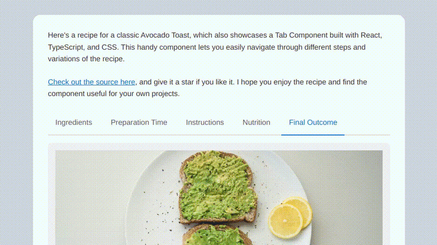
As you can see, the tabs are not only usable in desktop mode but can also be accessed by tapping and scrolling on mobile devices. As an assignment, consider adding scroll indicators to the tabs to enhance their general accessibility.
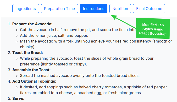
The React Bootstrap component library offers a wide range of components, including a Tab component that can be easily implemented by following their documentation. Instead of using the built-in Tab component of this library, we will add Bootstrap styles and features to the components we just finished building.
If you are using a library such as React Bootstrap, you might want to consider leveraging the pre-built styles and animations it provides. Let’s experiment with our Tab components and incorporate some Bootstrap-style designs and animations.
Let’s modify the button and navigation styles in the TabList component, and utilize container components provided by Bootstrap. The plan is to incorporate bordered buttons for the unselected state of the tab and solid-colored buttons for the selected state:
// Previous imports...
import Button from "react-bootstrap/Button";
import { Nav } from "react-bootstrap";

const TabList: React.FC<TabListProps> = ({ children, activeTabIndex = 0 }) => {
  // ...
  return (
    <div className="custom-tabs">
      <Nav
        className="border-bottom pb-3 gap-2 justify-content-center"
        role="tablist" aria-orientation="horizontal"
        as="ul">
        {tabs.map((tab, index) => (
          <Nav.Item key={index} as="li">
            <Button
              variant={activeTab === index ? "primary" : "outline-primary"}
                key={`tab-btn-${index}`}
                ...
            >
              {tab.props.label}
            </Button>
          </Nav.Item>
        ))}
      </Nav>
      // ...
    </div>
  );
};
As you can see in the code above, some Bootstrap-specific CSS classes are applied to the Nav component, and a padding class has also been added to the tab content, which would result in something like the following:
React Bootstrap provides a transition utility that allows you to add an expanding and collapsing transition effect to elements. Let’s add one more prop to our TabItem component that can communicate the state of the tab content to the Collapse component provided by the library.
Here’s how you should modify it to include the Collapse component:
// Previous imports...
import { Collapse } from "react-bootstrap";

interface TabItemPropsAnimated extends TabItemProps {
  isActive: boolean;
}

const TabItem: React.FC<TabItemPropsAnimated> = ({ label, children, isActive = false }) => (
  <Collapse in={isActive}>
    <div
      className={`tab-panel p-3 bg-light`}
      role="tabpanel"
      aria-labelledby={`tab-${sanitizeForId(label)}`}
      id={`panel-${sanitizeForId(label)}`}
    >
      {children}
    </div>
  </Collapse>
);

export default TabItem;
The only modification needed in the TabList component is looping over the tabs array to add the TabItem component with the isActive prop, which we can handle using the activeTab and index values as shown below:
/ Previous imports ...

const TabList: React.FC<TabListProps> = ({ children, activeTabIndex = 0 }) => {
  // ...
  return (
    <div className="custom-tabs">
      <Nav
        className="..."
        role="tablist" aria-orientation="horizontal"
      </Nav>

      {tabs.map((tab, index) => (
        <TabItem
          key={index}
          label={tab.props.label}
          isActive={activeTab === index}
        >
          {tab.props.children}
        </TabItem>
      ))}
    </div>
  );
};

export default TabList;
The final outcome of the above implementation should look like the below screen capture:
You may grab the code for these Bootstrap-specific modifications on the same repo, in the react-bootstrap branch.
Congratulations for getting this far! In this guide, we built two React tab components working together to construct a functional tabbed UI. We used the useState React Hook to manage our active tab state and created some simple utility functions to control and handle tab switching.
We also styled the tab components to give them a minimalistic touch, made them usable on the smaller screens, and used them alongside a component library. I hope this was a good starting point for learning about tabs and the UX they provide. Feel free to experiment with the code, add your own personal touch and style, and share your thoughts in the comment section below.
Install LogRocket via npm or script tag. LogRocket.init() must be called client-side, not
server-side
$ npm i --save logrocket

// Code:

import LogRocket from 'logrocket';
LogRocket.init('app/id');
// Add to your HTML:

<script src="https://cdn.lr-ingest.com/LogRocket.min.js"></script>
<script>window.LogRocket && window.LogRocket.init('app/id');</script>

Learn how to protect full-stack projects from NPM supply chain attacks with a practical security checklist.

Explore 15 essential MCP servers for web developers to enhance AI workflows with tools, data, and automation.

Learn how contrast-color() automatically picks accessible text colors using native CSS, without JavaScript.

Learn how to build a harness-style AI workflow using Claude Code with specialized Dev, QE, and Ops subagents, gated handoffs, MCP telemetry, and LEARNING.md.
Would you be interested in joining LogRocket's developer community?
Join LogRocket’s Content Advisory Board. You’ll help inform the type of content we create and get access to exclusive meetups, social accreditation, and swag.
Sign up now

 Learn more →
