
Before the advent of flexbox, the preferred method of laying out DOM elements in a document was to use float. The float attribute described how and where a container would be placed in the DOM, like so:

.container {
  float: left | right
}
When it was first introduced way back in 2009, the CSS Flexible Box Module, or flexbox, made it much simpler for developers to place and organize elements in responsive webpages and applications. It has only gained popularity since then. Today, flexbox still serves as the main layout system for most modern webpages.
In this tutorial, we’ll show you how to align elements and distribute space within a flexbox layout. To demonstrate how flexbox works, we’ll walk through the process of building and manipulating elements in a calculator UI.
Here’s what we’ll cover:
The Replay is a weekly newsletter for dev and engineering leaders.
Delivered once a week, it's your curated guide to the most important conversations around frontend dev, emerging AI tools, and the state of modern software.
Flexbox enables you to lay out web components and elements in a document without affecting the underlying markup. It starts with a flex container; from there, you can set how the content is laid out horizontally and vertically. The contents of the flex container are called flex items, which can become flex containers themselves.
To make an element a flex container, declare display: flex; or flex: 1; on the element:
.flex-container {
  display: flex;
}
We can then tell the system how the flex container’s children should be laid out: from left to right, right to left, top to bottom, or even bottom to top:
.flex-container {
  display: flex;
  flex-direction: row | column | row-reversed | column-reversed
}
To specify how and where the layering of flex items will start from the flex-container main axis:
.flex-container {
  justify-content: center | end | start | flex-end | flex-start | ...
}
We can also specify how and where the flex items layering will start from the flex-container cross-axis:
.flex-container {
  align-items: center | end | start | flex-end | flex-start | ...
}
Flexbox has many properties we can use to set the exact layout we want. In this tutorial, we’ll show you how to use the basic properties described above to design a simple calculator interface.
Our finished product will look like this:
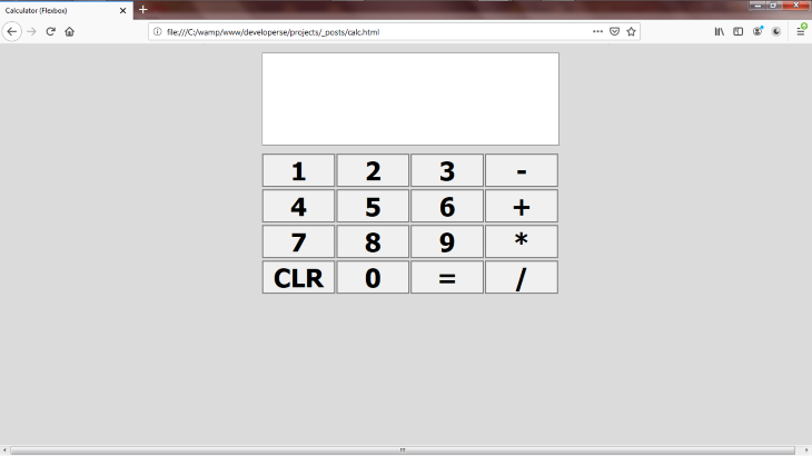
We’ll start by creating an HTML file. I called mine calc.html. Open the HTML file in your favorite code editor.
Begin by adding some basic HTML tags:
<html>
    <head>
        <title>Calculator (Flexbox)</title>
        <meta name="viewport" content="width=device-width,initial-scale=1">
    </head>
    <body>
    </body>
</html>
We set the title of the page to Calculator (Flexbox). Next, we set the viewport width of the page to take the width size of the device it is loaded on. If viewed on a desktop, the width of the page will take the width of the desktop. The same applies when the page is viewed on a phone.
Let’s make the background color of the body gray. We’ll also set the width to occupy the full width of the device. To do that, we have to add the style tag and put our CSS code there.
<html>
    <head>
        <title>Calculator (Flexbox)</title>
    <meta name="viewport" content="width=device-width, initial-scale=1">
    <style>
        body {
            width:100%;
            background-color: #dbdbdb;
        }
    </style>
    </head>
    <body>
    </body>
</html>
We used the percentage unit to set the body width and specified the gray background color using the hex value. Here’s the result:

The next step is to add a container. Our flex container will stretch the width of the body and place its item in the center.
<html>
    <head>
        <title>Calculator (Flexbox)</title>
    <meta name="viewport" content="width=device-width, initial-scale=1">
    <style>
        body {
            width:100%;
            background-color: #dbdbdb;
        }
        .container {
            display:flex;
            width: inherit;
            flex-direction: column;
            justify-content: center;
            margin-top: 15px;
            align-items: center;
        }
    </style>
    </head>
    <body>
        <div class="container">
        </div>
    </body>
</html>
We set the container to be a flex container. We then set the width to inherit the size from its parent. This will be the body and since the body has its width set to 100 percent, the container will inherit the value and set its width to be 100 percent, taking up the entire width of the device.
The flex-direction: column sets its contents to be laid out from top to bottom. The justify-content: center; distributes the elements along the center of the main axis of the container.
The margin-top: 15px; sets the thickness of the container’s top margin to 15px. This makes the container adjust 15 pixels downwards. The align-items: center; defines that its flex items are aligned along the center of the container’s flex line’s cross-axis. This will cause the calculator to start in the middle of the page.
Let’s place a wrapper, div, inside the div#container.
<html>
    <head>
        <title>Calculator (Flexbox)</title>
        <meta name="viewport" content="width=device-width, initial-scale=1">
        <style>
            body {
                width:100%;
                background-color: #dbdbdb;
            }
            .container {
                display: flex;
                width: inherit;
                flex-direction: column;
                justify-content: center;
                margin-top: 15px;
                align-items: center;
            }
            .wrapper {
                width:500px;
            }
        </style>
    </head>
    <body>
        <div class="container">
            <div class="wrapper">
            </div>
        </div>
    </body>
</html>

This wrapper is where the calculator elements will be placed. We set the width to expand 500px wide. The wrapper will hold the screen of the calculator and the buttons from top to bottom.
Our calculator will be divided into columns. Each column will be a flex container that will display flex items in a row. This first column will hold the calculator input screen and the next will hold the calculator result screen. Subsequent columns will hold the buttons (four buttons to a column).
Let’s add styling for the .col class:
<html>
    <head>
        <title>Calculator (Flexbox)</title>
    <meta name="viewport" content="width=device-width, initial-scale=1">
    <style>
        body {
            width:100%;
            background-color: #dbdbdb;
        }
        .container {
            display:flex;
            width: inherit;
            flex-direction: column;
            justify-content: center;
            margin-top: 15px;
            align-items: center;
        }
        .wrapper {
            width:500px;
        }
        .col {
            width:500px;
            display: flex;
            flex-direction: row;
            justify-content: center;
            align-items: center;
        }
    </style>
    </head>
    <body>
        <div class="container">
        <div class="wrapper">
        </div>
        </div>
    </body>
</html>
We set the width to 500px, which is the size we want our calculator to be. We set the display: flex;, which sets the row class to be a flex container.
We set the flex items to be laid out from left to right: flex-direction: row;. We also laid the flex items out starting from the center, both from the cross-axis and main axis, by declaring justify-content: center; and align-items: center;.
Now it’s time to lay out the screens and buttons inside the wrapper#div. We’ll start with two screens: the input screen and the result screen.
<html>
    <head>
        <title>Calculator (Flexbox)</title>
        <meta name="viewport" content="width=device-width, initial-scale=1">
    <style>
        body {
            width:100%;
            background-color: #dbdbdb;
        }
        .container {
            display:flex;
            width: inherit;
            flex-direction: column;
            justify-content: center;
            margin-top: 15px;
            align-items: center;
        }
        .wrapper {
            width:500px;
        }
        .col {
            width:500px;
            display: flex;
            flex-direction: row;
            justify-content: center;
            align-items: center;
        }
    </style>
    </head>
    <body>
        <div class="container">
        <div class="wrapper">
            <div class="col">
                <div class="expression" id="expression">
                </div>
            </div>
            <div class="col">
                <div class="result" id="result"></div>
            </div>
        </div>
        </div>
    </body>
</html>
The result screen is the div#result and the input screen is the div#expression. Each is rendered in a separate div#col.
Next, we’ll style the div#expression and div#result:
.expression {
  background-color: white;
  width: inherit;
  height: 100px;
  font-size: 50px;
  border-top: 1px solid gray;
  border-right: 1px solid gray;
  border-left: 1px solid gray;
}
.result {
  width: inherit;
  margin-bottom: 12px;
  height: 54px;
  background-color: white;
  border-bottom: 1px solid gray;
  border-right: 1px solid gray;
  border-left: 1px solid gray;
}
We set the background color to be white and the width to take its value from the parent. In our case, this is the div#wrapper, the width of which is 500px. So the width takes 500 pixels to span the width of the parent. The height of div#expression is 100px and div#result is 54px.
We laid it out this way because the input screen should have a higher height than the result screen and both should take 154px units together. We set the font size of div#expression to 50px because it should be bolder and bigger than the result screen.
Next, we marked out the screens borders. div#expression‘s top-right and top-left borders are marked to be 1px and have color: solid gray. For div#result, the bottom-right-left border is marked to be 1px and has a color of solid gray. We omitted the bottom-border on div#expression and the top border on the div#result so that both would appear as one.
Here is the result:
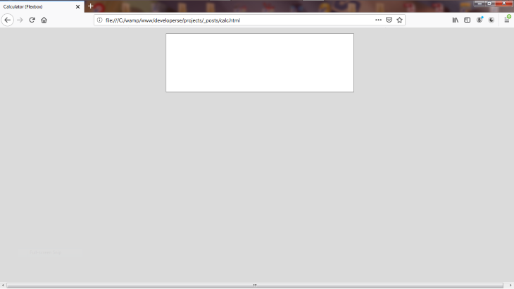
For this step, we’ll set the buttons in our flexbox layout.
Our calculator UI will have buttons for the following characters: 1, 2, 3, 4, 5, 6, 7, 8, 9, 0, *, -, +, /, CLR, and =.
We’ll set the buttons as follows in our flexbox layout:
div#coldiv#coldiv#coldiv#col<html>
<head>
<title>Calculator (Flexbox)</title>
<meta name="viewport" content="width=device-width, initial-scale=1" />
<style>
body {
width: 100%;
background-color: #dbdbdb;
}
.container {
display: flex;
width: inherit;
flex-direction: column;
justify-content: center;
margin-top: 15px;
align-items: center;
}
.wrapper {
width: 500px;
}
.col {
width: 500px;
display: flex;
flex-direction: row;
justify-content: center;
align-items: center;
}
.expression {
background-color: white;
width: inherit;
height: 100px;
font-size: 50px;
border-top: 1px solid gray;
border-right: 1px solid gray;
border-left: 1px solid gray;
}
.result {
width: inherit;
margin-bottom: 12px;
height: 54px;
background-color: white;
border-bottom: 1px solid gray;
border-right: 1px solid gray;
border-left: 1px solid gray;
}
</style>
</head>
<body>
<div class="container">
<div class="wrapper">
<div class="col">
<div class="expression" id="expression"></div>
</div>
<div class="col">
<div class="result" id="result"></div>
</div>
<div class="col">
<button>1</button>
<button>2</button>
<button>3</button>
<button>-</button>
</div>
<div class="col">
<button>4</button>
<button>5</button>
<button>6</button>
<button>+</button>
</div>
<div class="col">
<button>7</button>
<button>8</button>
<button>9</button>
<button>*</button>
</div>
<div class="col">
<button>CLR</button>
<button>0</button>
<button>=</button>
<button>/</button>
</div>
</div>
</div>
</body>
</html>
Here is the result:
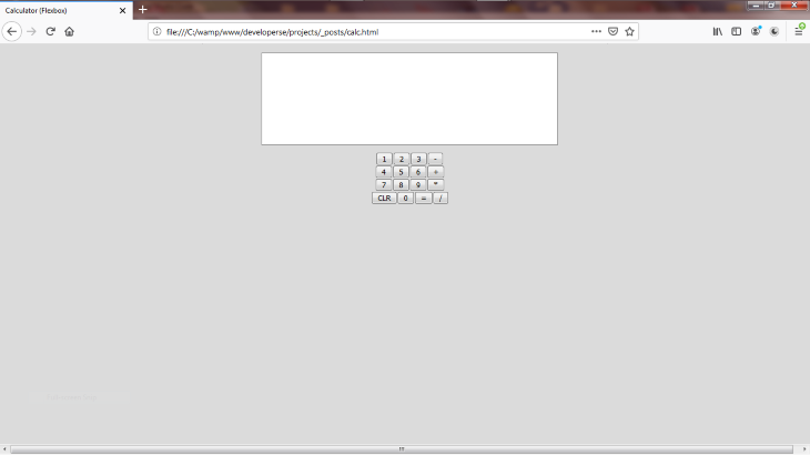
This looks great except that our buttons are tiny. Nothing we can’t fix with a little styling.
Let’s add some styling to our button elements:
button {
  margin-right: 2px;
  margin-top: 2px;
  width: inherit;
  font-weight: 700;
  border: 2px solid gray;
  margin-bottom: 2px;
  font-size: 43px;
  text-align: center;
}
The above CSS code will affect all buttons on the page.
In the button area, we set the bottom, top, and right thickness values to be 2px each. That way they are not so compacted. We set their width to inherit their values from their parent. The parent is div#col, which has a width 500px inherited from its parent to div#wrapper.
Because there are four buttons in a div#col, each button won’t have width value of 500px despite even though each button inherits 500px. Rather, the width of 500 pixels will be shared among the four buttons equally.
According to my math, that means each button will be 123 pixels wide (after subtracting 2 pixels for the right margin).
We set the font-weight to 700 and font-size to 43px, which makes the buttons appear larger and the text bolder. We defined the width of the borders as 2px and applied a solid gray color. Lastly, we set the text to align at the center of the button.
The result will look like this:

Tada!!!
We’re almost done, but as of now, our calculator is not responsive. Let’s make it so.
Open the DevTools and click on the mobile icon toggle on the right:
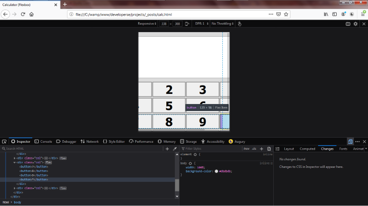
As you can see, our calculator is far thinner than the device width and some elements are cut off to the left.
To make our flexbox layout responsive, we’ll use the @media query CSS code. We’ll add a @media query and set the query code to activate when the device width is 500px wide:
@media (max-width: 500px) {
}
500 pixels should cover the available width of both tablets and mobile phones.
We don’t want the div#wrapper class to be 500px wide because it will stretch out within the invisible parts of the screen when viewed on mobile. Instead, we’ll set it to take 100 percent of the device width:
@media (max-width: 500px) {
  .wrapper {
    width: 100%;
  }
}
If the device width is 322px, then the div#wrapper width will be 322px. In other words, setting the width to 100% tells the CSS to assign the width px value according to the device width.
We also set the div#container width to 100%:
@media (max-width: 500px) {
  .wrapper {
    width: 100%;
  }
  .container {
    width: 100%;
  }
}
The div#col that contains the buttons and screens should be set to have a width of 100 percent of the device width. Previously, we set it to take 500px; this would cause the buttons to stretch out of view on a mobile device.
@media (max-width: 500px) {
  .wrapper {
    width: 100%;
  }
  .container {
    width: 100%;
  }
  .col {
    width: 100%;
  }
}
Next, set the body to inherit its width from the device:
@media (max-width: 500px) {
  .wrapper {
    width: 100%;
  }
  .container {
    width: 100%;
  }
  .col {
    width: 100%;
  }
  body {
    width: inherit;
  }
}
Here’s the final, finished product:
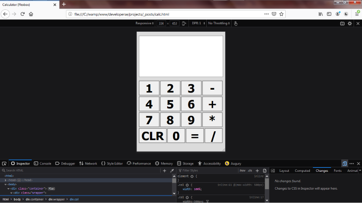
Now our calculator UI renders well on mobile. It’s currently set for a phone with display dimensions of 334 x 453px. You can adjust the width to see the calculator adjust to fit your desired screen size.
The full code for our flexbox example is below:
<html>
  <head>
    <title>Calculator (Flexbox)</title>
    <meta name="viewport" content="width=device-width, initial-scale=1" />
    <style>
      body {
        width: 100%;
        background-color: #dbdbdb;
      }
      .container {
        display: flex;
        width: inherit;
        flex-direction: column;
        justify-content: center;
        margin-top: 15px;
        align-items: center;
      }
      .wrapper {
        width: 500px;
      }
      .col {
        width: 500px;
        display: flex;
        flex-direction: row;
        justify-content: center;
        align-items: center;
      }
      .expression {
        background-color: white;
        width: inherit;
        height: 100px;
        font-size: 50px;
        border-top: 1px solid gray;
        border-right: 1px solid gray;
        border-left: 1px solid gray;
      }
      .result {
        width: inherit;
        margin-bottom: 12px;
        height: 54px;
        background-color: white;
        border-bottom: 1px solid gray;
        border-right: 1px solid gray;
        border-left: 1px solid gray;
      }
      button {
        margin-right: 2px;
        margin-top: 2px;
        width: inherit;
        font-weight: 700;
        border: 2px solid gray;
        margin-bottom: 2px;
        font-size: 43px;
        text-align: center;
      }
      @media (max-width: 500px) {
        .wrapper {
          width: 100%;
        }
        .container {
          width: 100%;
        }
        .col {
          width: 100%;
        }
        body {
          width: inherit;
        }
      }
    </style>
  </head>
  <body>
    <div class="container">
      <div class="wrapper">
        <div class="col">
          <div class="expression" id="expression"></div>
        </div>
        <div class="col">
          <div class="result" id="result"></div>
        </div>
        <div class="col">
          <button>1</button>
          <button>2</button>
          <button>3</button>
          <button>-</button>
        </div>
        <div class="col">
          <button>4</button>
          <button>5</button>
          <button>6</button>
          <button>+</button>
        </div>
        <div class="col">
          <button>7</button>
          <button>8</button>
          <button>9</button>
          <button>*</button>
        </div>
        <div class="col">
          <button>CLR</button>
          <button>0</button>
          <button>=</button>
          <button>/</button>
        </div>
      </div>
    </div>
  </body>
</html>
Flexbox saves developers a ton of stress and time associated with all that layering work. If not for flexbox, we would have had to write an extraordinary amount of CSS code just to lay out the .container, .wrapper, and .col classes. Flexbox did all that work for us so we could focus on the buttons and screens styling.
As web frontends get increasingly complex, resource-greedy features demand more and more from the browser. If you’re interested in monitoring and tracking client-side CPU usage, memory usage, and more for all of your users in production, try LogRocket.

LogRocket lets you replay user sessions, eliminating guesswork around why bugs happen by showing exactly what users experienced. It captures console logs, errors, network requests, and pixel-perfect DOM recordings — compatible with all frameworks.
LogRocket's Galileo AI watches sessions for you, instantly identifying and explaining user struggles with automated monitoring of your entire product experience.
Modernize how you debug web and mobile apps — start monitoring for free.

A step-by-step guide to building your first MCP server using Node.js, covering core concepts, tool design, and upgrading from file storage to MySQL.

Using security headers in your Next.js apps is a highly effective way to secure websites from common security threats.

A deep dive into April 2026’s AI model and tool rankings. We break down performance, usability, pricing, and real-world capabilities across 50+ features to help you pick the right tools for your development workflow.
A practical guide to Agent Browser CLI. Learn how AI agents navigate, snapshot, and interact with web pages using stable references, enabling efficient automation and exploratory testing.
Hey there, want to help make our blog better?
Join LogRocket’s Content Advisory Board. You’ll help inform the type of content we create and get access to exclusive meetups, social accreditation, and swag.
Sign up now