While most UI libraries and frameworks come with some predefined styles and components, some are lacking when it comes to customization. This is usually because they impose styles, design decisions, and patterns on the developer. Dynamic customization is important if you want to be able to quickly redefine the styles, design decisions, and patterns provided by default.

In this tutorial, we’ll introduce you to Halfmoon and demonstrate how to build customizable, dynamic user interfaces with this versatile framework.
To show Halfmoon in action, we’ll build a simple form that contains the default styles that come predefined with Halfmoon for both light and dark modes. Then, we’ll customize the UI to contain our custom styles and design decisions.
Our example project will be a static webpage void of any frontend framework except the Halfmoon framework.
The Replay is a weekly newsletter for dev and engineering leaders.
Delivered once a week, it's your curated guide to the most important conversations around frontend dev, emerging AI tools, and the state of modern software.
Halfmoon is a frontend framework for building website user interfaces. Among its highlighted features is a built-in dark mode, which enables you to create switchable themes with ease. The framework provides every single element with a different set of styles in dark mode.
Halfmoon comes with many prestyled, responsive, mobile-first components that possess a definite UI kit like Bootstrap. Still, it can easily be customized because the framework is built entirely using CSS variables (also known as CSS custom properties). There are close to 1,500 CSS variables that provide the customization feature in Halfmoon. This means almost everything can be customized just by overriding a property in the CSS file, making it very easy to re-theme Halfmoon for your website or product.
The dark mode feature is applied to every child element when the class attribute of the parent element contains the .dark-mode class name. Halfmoon implements and provides the toggleDarkMode interface on the halfmoon object to trigger the transition from light mode to dark mode. This built-in function, halfmoon.toggleDarkMode(), facilitates a clean, simple workflow for adding the .dark-mode class to the parent elements.
Halfmoon can be used to create almost any type of website. In addition to the dark mode feature, Halfmoon also provides highly standardized components that are snappy and reusable across different admin panels, dashboards, navbars, and dropdowns. Best of all, these components are customizable.
Let’s set up the development environment for our demo project by first creating the index.html file within a folder. This file will serve as the entry point for our static webpage.
mkdir halfmoon-project
touch index.html
After creating the above folder and HTML file, let update the index.html file with the following boilerplate code:
<!DOCTYPE html>
<html lang="en">
  <head>
    <meta charset="utf-8" />
    <meta http-equiv="X-UA-Compatible" content="IE=edge,chrome=1" />
    <meta content="width=device-width, initial-scale=1.0, maximum-scale=1.0, user-scalable=0" name="viewport" />
    <meta name="viewport" content="width=device-width" />
    <link rel="icon" href="path/to/fav.png">
    <title>Static Webpage | Halfmoon</title>
  </head>
  <body>
  </body>
</html>
Now that we have the starter HTML code, let’s download the Halfmoon framework and build the remaining part of our webpage.
Navigate to the download page on the Halfmoon official website. For this tutorial, we’ll download the ready-to-use compiled code.
This is a zipped folder, so you will need to unzip it. Once unzipped, copy and paste into the project folder only the files we’ll use within our project: ./css/halfmoon-variables.css and ./js/halfmoon.js. Create the CSS and JS folders within the project folder and paste the ./css/halfmoon-variables.css and ./js/halfmoon.js files, respectively, inside them.
Now let’s update index.html by linking the styles and the logic files provided by Halfmoon:
 <!DOCTYPE html>
<html lang="en">
  <head>
    ...
    <title>Static Webpage | Halfmoon</title>
    <link href="css/halfmoon-variables.css" rel="stylesheet" />
  </head>
  <body>
    <script src="js/halfmoon.js"></script>
  </body>
</html>
The JS file should be placed at the end of the <body> tag; if not, some things may not work as expected.
For example, using the onclick="..." event to call one of Halfmoon’s built-in methods in the js/halfmoon.js file will not work unless the JS file is placed at the end of the <body> tag.
As for the CSS file, it can be placed inside the <head> tag, which is the usual convention in most projects.
Now let’s update the index.html file with the card and form components and add the class names for the various styles we want on the elements. These class names are intuitive to understand.
<!DOCTYPE html>
<html lang="en">
  <head>
    ...
    <title>Static Webpage | Halfmoon</title>
    <link href="css/halfmoon-variables.css" rel="stylesheet" />
  </head>
  <body class="with-custom-webkit-scrollbars with-custom-css-scrollbars" data-dm-shortcut-enabled="true" data-sidebar-shortcut-enabled="true" data-set-preferred-theme-onload="true">
    <div id="home" class="card w-400 mw-full m-0 position-relative">
      <div class="position-absolute top-0 right-0 z-10 p-10">
        <button
          class="btn btn-square"
          type="button"
          onclick={halfmoon.toggleDarkMode()}
        >
          <i class="fa fa-moon-o" aria-hidden="true">🌙</i>
          <span class="sr-only">Toggle dark mode</span>
        </button>
      </div>
      <h2 class="card-title">Please fill up this form</h2>
      <form action="..." method="...">
        <div class="form-group">
          <label for="full-name" class="required">
            Name
          </label>
          <input
            type="text"
            id="full-name"
            class="form-control"
            placeholder="Your full name"
            required="required"
          />
        </div>
        <div class="form-group">
          <label for="profession" class="required">
            Profession
          </label>
          <input
            type="text"
            id="profession"
            class="form-control"
            placeholder="Your profession"
            required="required"
          />
        </div>
        <input class="btn btn-primary btn-block" type="submit" value="Submit" />
        <div class="text-right mt-10">
          <a href="#home">Need help?</a>
        </div>
      </form>
    </div>
    <script src="js/halfmoon.js"></script>
  </body>
</html>
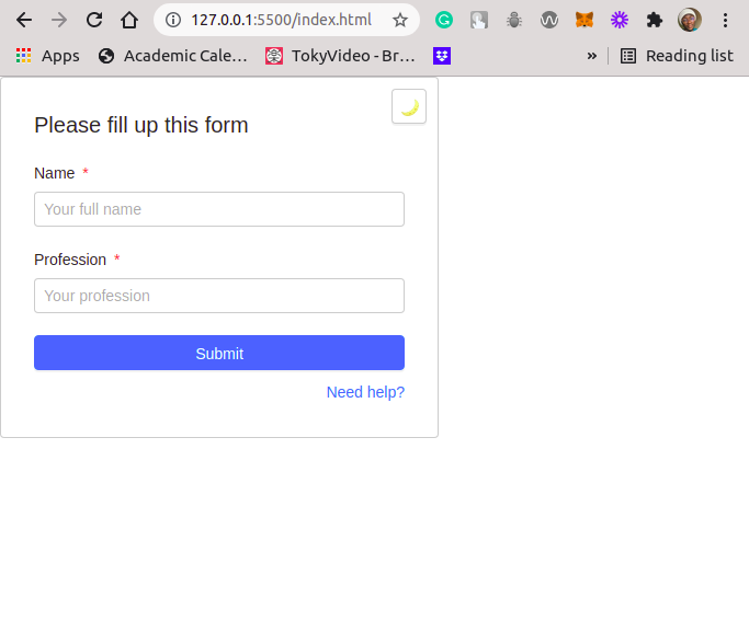
The above markup code contains a form inside a card. This form contains three inputs. Two of them have the text type, while the last one is an input with a submit type.
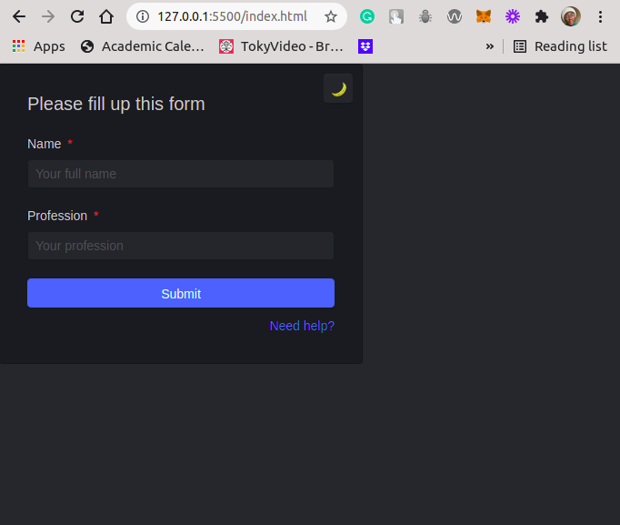
Then, inside the card component, we defined a button element with an onclick event handler. This event handler calls the halfmoon.toggleDarkmode() method. The UI results for both the light mode and dark mode are as follows:
Light mode:
 Dark mode:

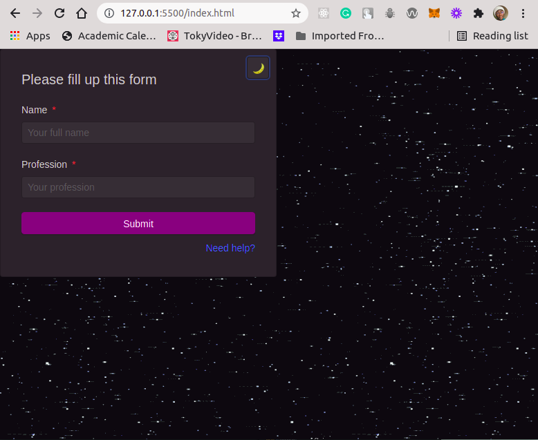
To customize the above dark mode UI, we’ll change the background-color of the Submit button and the background-image of the webpage’s body. We’ll also change the Submit button’s border-color and the background-color of the card component.
These examples will guide you to make further customization to the predefined styles in Halfmoon.
Let’s define our custom styles below in the :root scope of the CSS styles within the ./css/halfmoon-variables.css file.
...
:root {
  --cm-btn-bg-color: rgb(128, 0, 128);
  --cm-btn-bg-color-hover: rgb(201, 12, 201);
  --body-bg-gif: url("https://media.giphy.com/media/aRZ4vTsHnyW6A/giphy.gif");
  ...
}
...
Now search for the first occurrence of the below CSS variable and replace it with the custom-defined styles as below:
...
: root {
  ...
  --dm-button-primary-bg-color: var(--cm-btn-bg-color);
  --dm-button-primary-border-color: var(--cm-btn-bg-color);
  --dm-button-primary-bg-color-hover: var(--cm-btn-bg-color-hover);
  ...
}
...
Next, let’s define a new background for the body element when we’re in dark mode. The body element has the class name, .dark-mode, when in dark mode.
Let’s look for this class name in the CSS file and update it with our custom background-image:
...
.dark-mode {
  ...
  background-image: var(--body-bg-gif);
  ...
}
...
The above style adds a GIF image as the background image to the body element.
The last customization we’ll make will be on the card component. We’ll directly update the background-color without defining a custom style variable. The card component has a .dark-mode .card as the class name when in dark mode.
Let’s update the class as shown below:
...
:root {
  ...
  --dm-card-bg-color: rgb(43, 36, 43);
}
...

.dark-mode .card {
  ...
  background-color: var(--dm-card-bg-color);
  ...
}
Once we’ve successfully updated our CSS file with these custom styles, the UI for the light mode will remain the same. That said, we’ve customized our dark mode and it will definitely look different, as shown below:
Dark mode:

In this tutorial, we explored the Halfmoon framework, demonstrated some use cases, and walked through the steps to download and include Halfmoon within your webpage development quickly.
We also dove deeper and showed hpw to override predefined styles with our own defined custom styles. We focused on overriding dark mode styles, but you can extend the knowledge gained from this tutorial to override styles in the light mode too.
As a rule of thumb, the styles defined for the light mode begin with the --lm prefix and those meant for the dark mode begin with the --dm prefix. A lot of styles can be customized for both light and dark modes, which opens up a world of possible of customizations for your webpages.
You can find the complete code used in this tutorial on GitHub.
As web frontends get increasingly complex, resource-greedy features demand more and more from the browser. If you’re interested in monitoring and tracking client-side CPU usage, memory usage, and more for all of your users in production, try LogRocket.

LogRocket lets you replay user sessions, eliminating guesswork around why bugs happen by showing exactly what users experienced. It captures console logs, errors, network requests, and pixel-perfect DOM recordings — compatible with all frameworks.
LogRocket's Galileo AI watches sessions for you, instantly identifying and explaining user struggles with automated monitoring of your entire product experience.
Modernize how you debug web and mobile apps — start monitoring for free.

When should you move API logic out of Next.js? Learn when Route Handlers stop scaling and how ElysiaJS helps.

Explore how Dokploy streamlines app deployment with Docker, automated builds, and simpler infrastructure compared to traditional CI/CD workflows.

A side-by-side look at Astro and Next.js for content-heavy sites, breaking down performance, JavaScript payload, and when each framework actually makes sense.

AI-generated tests can speed up React testing, but they also create hidden risks. Here’s what broke in a real app.re
Would you be interested in joining LogRocket's developer community?
Join LogRocket’s Content Advisory Board. You’ll help inform the type of content we create and get access to exclusive meetups, social accreditation, and swag.
Sign up now