
Your application’s user experience is a crucial feature that distinguishes your application from other applications that provide the same services, and may help convince users to prefer your app over those others.
One of the approaches to improving your user experience is through custom, advanced animations, and this article is here to guide you through creating them. Here, you’ll learn about some of the advanced animations available in Flutter and how you can implement them in your applications, such as:
Tween classThis article assumes that you are familiar with how to add basic animations to your Flutter apps. You’ll also need:
The Replay is a weekly newsletter for dev and engineering leaders.
Delivered once a week, it's your curated guide to the most important conversations around frontend dev, emerging AI tools, and the state of modern software.
Tween class[Tween] is a generic Flutter class that can animate a Flutter widget by specifying its beginning and ending values. It is one of the fundamental components at the core of many animations you can build in your application.
Tween comes from the word “between” and implies the state of a widget as it transitions through a specified range of values. With Tween, you can animate different properties of a widget, such as its size or color, by specifying the initial and final values of the property.
For example, let’s say you want to proportionally increase the height and width of a container from 50px to 200px, and you don’t want the change in size to have an abrupt effect on the layout. Instead, you want the user to see the growth of the container across the specified range of values.
Here’s how you can achieve this desired result:
 AnimationController _controller;
  Animation<double> _sizeAnimation;

  @override
  void initState() {
    super.initState();
    _controller = AnimationController(vsync: this, duration: Duration(seconds: 3));
    _sizeAnimation = Tween<double>(begin: 50.0, end: 200.0).animate(_controller);
    _controller.forward();
    _controller.addListener(() {
      setState(() {});
    });
  }
In the initState method, the animation is configured to run for three seconds via the AnimationController. The instantiated Tween returns an object to invoke the animate method with _controller.
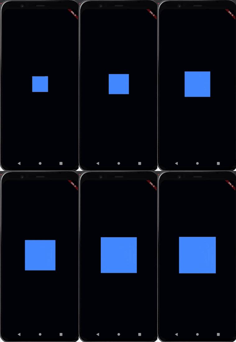
At runtime, Tween provides the values between 50px and 200px, and the controller invokes setState through its listener that monitors the change in values.
There may be instances in which you’ll want to animate a widget so that there are many things happening to it at the same time, such as increasing the size of a container, changing its color, and sliding some text into the container, either each word consecutively or all of them at the same time.
To achieve this, you’d most likely approach it by creating a controller for each of the desired animations such that each configured animation would have its own, corresponding controller that you could trigger these controllers sequentially.
While this solution could work, there is a problem: it’s not easily reconfigured. Suppose you want to change the configuration of one of the animations or its respective controller. This would require that you account for the other animations that are dependent on the animation or controller that you want to reconfigure. Managing all of these individual animation controllers — and how they interact with one another — could be more painful than it’s worth to achieve your desired overall animation.
Staggered animation solves this by connecting all the animations to one controller who coordinates the functionalities of the animations. Of course, simply connecting the animations to a controller is not the whole hack because the animations could start all at once, rather than in the desired order. Let’s consider the sample animation below:
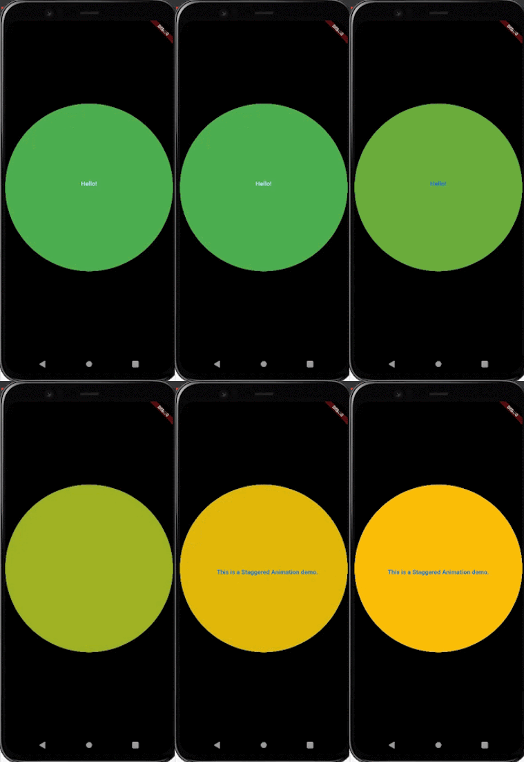
The order of the overall animation is as follows:
Here’s the code snippet for the above implementation:
class _MyHomePageState extends State<MyHomePage>
    with SingleTickerProviderStateMixin {
  AnimationController _controller;

  Animation<double> sizeAnimation;
  Animation<Color> colorAnimation;
  Animation<double> helloAnimation;
  Animation<Offset> messageAnimation;
Now, here’s where the magic happens. As I mentioned earlier, we have a controller managing multiple animations.
Configure the order in which the animations should flow: the controller is initialized to run for 5 seconds, as specified in the Duration object at the point of instantiating _controller.
 @override
  void initState() {
    super.initState();
    _controller =
        AnimationController(vsync: this, duration: Duration(seconds: 5));

    sizeAnimation = Tween(begin: 50.0, end: 200.0).animate(CurvedAnimation(parent: _controller, curve: Interval(0.0, 0.5, curve: Curves.decelerate)));
    colorAnimation = ColorTween(begin: Colors.green, end: Colors.amber).animate(CurvedAnimation(parent: _controller, curve: Interval(0.5, 1.0)));
    helloAnimation = Tween<double>(begin: 20.0, end: 0.0,).animate(CurvedAnimation(parent: _controller, curve: Interval(0.5, 0.7, curve: Curves.easeIn,),),);
    messageAnimation = Tween<Offset>(begin: Offset(16.0, 0.0), end: Offset.zero,).animate(CurvedAnimation(parent: _controller, curve: Interval(0.7, 1.0, curve: Curves.ease,),),);
    _controller.forward();
    _controller.addListener(() {
      setState(() {});
    });
  }
The sizeAnimation controller is responsible for increasing the size of the circle from 50.0px to 200.0px. It also has a CurvedAnimation configuration that ensures the size increases occur during the first half of the animation duration, as specified in the Interval widget.
0.0 indicates the beginning of the duration, and 0.5, half the duration (with the maximum value being 1.0).
The colorAnimation is responsible for changing the circle’s color from green to amber, and runs for the remaining half of the duration.
The helloAnimation changes the size of the “Hello!” text and runs from the 50 percent duration mark to 70 percent.
The messageAnimation, responsible for the sliding text, then runs for the remaining 30 percent of the duration.
Notice that the same controller is assigned to each of the animations at the initiation point.
 @override
  Widget build(BuildContext context) {
    return Scaffold(
      backgroundColor: Colors.white,
      appBar:AppBar(
        brightness: Brightness.light,
        backgroundColor: Colors.white,
        elevation: 3.0,
      ),
      body: Center(
        child: CircleAvatar(

          radius: sizeAnimation.value,
          backgroundColor: colorAnimation.value,
          child: Column(
            mainAxisAlignment: MainAxisAlignment.center,
            children: <Widget>[
              FadeTransition(
                opacity: helloAnimation,
                child: Text(
                  "Hello!",
                  style: TextStyle(
                      fontSize: 15,
                      fontWeight: FontWeight.bold
                  ),
                ),

              ),

              SlideTransition(
                position: messageAnimation,
                child: Text("This is a Staggered Animation demo.",
                  style: TextStyle(
                      fontSize: 15,
                      fontWeight: FontWeight.bold
                  ),
                ),
              ),

            ],
          ),
        ),
      ),
    );
  }
In the build method above, the “Hello” text widget is wrapped around a FadeTransition widget that performs the fade out animation of the text, and the SlideTransition widget wraps around the text that slides into the circle.
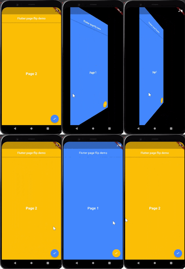
The above demo is an example of a pageflip animation that you can implement to route across screens. The [page_flip_builder package] is an interactive widget flipper that flips screens, cards, containers, images, and any other kind of widget with a fixed size. You can also drag the screen from left to right (or vice versa) for an even more interactive transition.
Run the below commands in your terminal to install the package.
flutter pub add page_flip_builder
flutter pub get
class _MyHomePageState extends State<MyHomePage> with SingleTickerProviderStateMixin {
  final pageFlipKey = GlobalKey<PageFlipBuilderState>();

  @override
  Widget build(BuildContext context) {

    return PageFlipBuilder(
          key: pageFlipKey,

          frontBuilder: (_) => PageOne(
            onFlip: () => pageFlipKey.currentState.flip(),
          ),
          backBuilder: (_) => PageTwo(
            onFlip: () => pageFlipKey.currentState.flip(),
          ),
          maxTilt: 0.005,
          maxScale: 0.6,
    );
  }
}
The PageFlipBuilder API accepts two widgets that will serve as the front and rear views through the frontBuilder and backBuilder, respectively. You can configure the maxTilt and maxScale property values to suit your preference.
The onFlip property is an optional parameter of each screen that can receive a function that triggers the transition programmatically.
class PageOne extends StatelessWidget {
  const PageOne({Key key, this.onFlip}) : super(key: key);
  final VoidCallback onFlip;

  @override
  Widget build(BuildContext context) {
    return Scaffold(
      backgroundColor: Colors.blueAccent,
      appBar: AppBar(
        centerTitle: true,
        backgroundColor: Colors.blueAccent,
        title: Text('Flutter page flip demo'),
      ),
        body: Center(
            child: Text("Page 1",
            style: TextStyle(
              fontSize: 25,
              fontWeight: FontWeight.bold,
              color: Colors.white
            ),)
        ),
      floatingActionButton: FloatingActionButton(
        backgroundColor: Colors.amber,
        child: Icon(Icons.compare_arrows_rounded),
        onPressed: onFlip,
      ),

    );
  }
}


class PageTwo extends StatelessWidget {
  const PageTwo({Key key, this.onFlip}) : super(key: key);
  final VoidCallback onFlip;
  @override
  Widget build(BuildContext context) {
    return Scaffold(
      backgroundColor: Colors.amber,
      appBar: AppBar(
        centerTitle: true,
        backgroundColor: Colors.amber,
        title: Text('Flutter page flip demo'),
      ),
        body: Center(
          child: Text("Page 2",
            style: TextStyle(
                fontSize: 25,
                fontWeight: FontWeight.bold,
                color: Colors.white
            ),
          )
        ),
      floatingActionButton: FloatingActionButton(
        backgroundColor: Colors.blueAccent,
        child: Icon(Icons.compare_arrows_rounded),
        onPressed: onFlip,
      ),

    );
  }
}
Each of the screens receives a function that is passed to the onPressed property of the floatingActionButton. This function triggers the pageflip transition and the left-right or right-left drag feature.
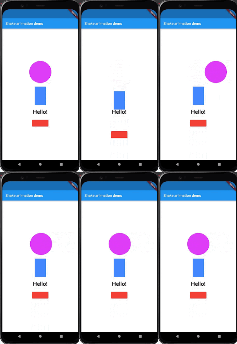
The shake animation is another common animation you may be familiar with. As illustrated in the demo below, you can shake the desired widget, either vertically or horizontally.
@override
  Widget build(BuildContext context) {

     return Scaffold(
        appBar: AppBar(
          title: Text("Shake animation demo"),
       ),
       body: Center(
         child: Column(
           mainAxisAlignment: MainAxisAlignment.center,
           children: [

             TweenAnimationBuilder(
               child: CircleAvatar(
                 radius: 60,
                 backgroundColor: Colors.purpleAccent,
                ),
                duration: Duration(milliseconds: 3000),
                curve: Curves.bounceOut,
                tween: Tween(begin: 1.0, end: 0.0),
                builder: (context, value, child){
                // horizontal disposition of the widget.
                 return Transform.translate(
                     offset:  Offset(
                       value * 500,
                        0.0
                     ),
                     child: child,
                   );
                 },
               ),
               SizedBox(height: 20,),
The above snippet illustrates the animated circular widget in the demo. The [Transform.translate constructor] with its corresponding offset value is responsible for the change in position of the widget from left to right and vice versa. The shake/bounce effect is achieved through the Curves.bounceOut class, the duration we set, and our offset values.
Below is the code snippet for the other two widgets in the demo. Notice the values assigned to the dy and dx properties of the offset for the widgets that have horizontal and vertical shake animations. Offsets with a dx value of 0 and a dy value ≥ 0 have a vertical shake; if you flip them around, the values produce a horizontal shake animation.
TweenAnimationBuilder(
                child: Container(
                  width: 60,
                  height: 100,
                  color: Colors.blueAccent,
                ),
                duration: Duration(milliseconds: 1000),
                curve: Curves.bounceOut,
                tween: Tween(begin: 1.0, end: 0.0),
                builder: (context, value, child){
                  return Transform.translate(
                    offset:  Offset(
                        0.0,
                      value * 100
                    ),
                    child: child,
                  );
                },
              ),
              SizedBox(height: 20,),

              TweenAnimationBuilder(
                child: Text("Hello!",
                  style: TextStyle(
                      fontSize: 30,
                      fontWeight: FontWeight.bold
                  ),
                ),
                duration: Duration(milliseconds: 500),
                curve: Curves.bounceOut,
                tween: Tween(begin: 1.0, end: 0.0),
                builder: (context, value, child){
                  return Transform.translate(
                    offset:  Offset(
                      value * 60,
                        0.0
                    ),
                    child: child,
                  );
                },
              ),

              SizedBox(height: 20,),

              TweenAnimationBuilder(
                child: RaisedButton(
                  color: Colors.red,
                  onPressed: () => null,
                ),
                duration: Duration(milliseconds: 1200),
                curve: Curves.bounceOut,
                tween: Tween(begin: 1.0, end: 0.0),
                builder: (context, value, child){
                  return Transform.translate(
                    offset:  Offset(
                        0.0,
                        value * 300
                    ),
                    child: child,
                  );
                },
              ),
          ]
    ),
      ),
    );
  }
You can tweak the offset, duration, and tween values to achieve your desired shake animation.
Flutter Hooks are known to reduce boilerplate code across your application and help to improve the reusability of your code. This advantage also applies when building animations in your Flutter apps.
In the previous sections, we’ve followed these steps to create animations:
[SingleTickerProviderStateMixin mixin]initState and dispose methodssetState method when the animation is performedThese steps become unnecessary when you implement your animation with the Flutter HookWidget. Instead, the HookWidget abstracts these functionalities and reduces the number of configurations you have to perform.
class ColorContainer extends AnimatedWidget {
  ColorContainer({AnimationController controller})
      : super(
      listenable: ColorTween(begin: Colors.red, end: Colors.blue).animate(controller));


  @override
  Widget build(BuildContext context) {
    Animation animation = listenable;
    return Scaffold(
      appBar: AppBar(
        title: Text("Hook Animation demo"),
      ),
      body: Center(
        child: Container(
          height: 200,
          width: 200,
          color: animation.value,
        ),
      ),
    );
  }
}
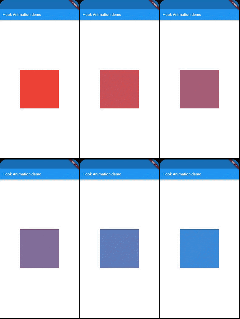
The above snippet is a widget that animates the color of a container from red to blue. TheTween object is passed to the [AnimatedWidget] superclass alongside a controller that we’ll provide when we instantiate the widget.
class HookAnimation extends HookWidget {
  final duration = Duration(seconds: 5);

  @override
  Widget build(BuildContext context) {
    final controller = useAnimationController(duration: duration);
    controller.forward();
    return ColourContainer(controller: controller);
  }
}
The HookWidget provides the useAnimationController to manage the lifecycle of the animation. This controller behaves in a similar way to adding a listener, invoking the setState method and disposing of the controller, just like you would have done when using the StatefulWidget approach.
class HookAnimation extends HookWidget {
  final duration = Duration(seconds: 5);

  @override
  Widget build(BuildContext context) {
    final controller = useAnimationController(duration: duration);
    controller.forward();
    return ColourContainer(controller: controller);
  }
}
Below is the output of these snippets:
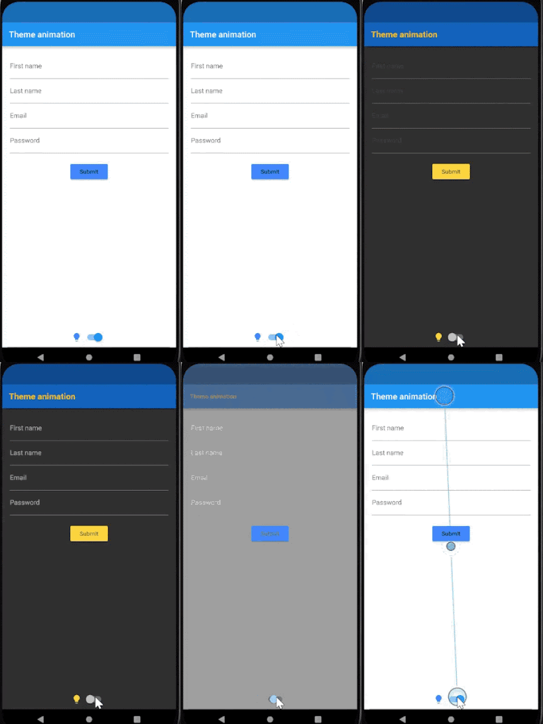
Users tend to have varying preferences for themes on applications, such as light mode vs. dark mode. To satisfy these preferences, providing users the ability to switch between different themes is a common feature in many applications today.
You can achieve this with Flutter in either of two ways:
This section will demonstrate how to build transitions between your app’s available themes using Flutter’s ThemeData class. The code snippet below defines two themes configured with different values that will render on the assigned widgets each time you switch the toggle.
ThemeData _darkTheme = ThemeData(
    brightness: Brightness.dark,
    primaryColor: Colors.amber,
    iconTheme: IconThemeData(
      color: Colors.amberAccent
    ),
    appBarTheme: AppBarTheme(
      backgroundColor: Colors.blue[800],
      titleTextStyle: TextStyle(
          color: Colors.amber,
        fontWeight: FontWeight.bold,
        fontSize: 20
      )
    ),
    accentColor: Colors.brown,
    buttonTheme: ButtonThemeData(
      buttonColor: Colors.amberAccent,
      textTheme: ButtonTextTheme.accent
    )
  );

  ThemeData _lightTheme = ThemeData(
      brightness: Brightness.light,
      iconTheme: IconThemeData(
          color: Colors.blueAccent
      ),
      primaryColor: Colors.blue,
      accentColor: Colors.white,
      buttonTheme: ButtonThemeData(
          buttonColor: Colors.blueAccent,
          textTheme: ButtonTextTheme.normal
      )
  );

bool lightMode = true;
Using the Switch widget in the build method, you can toggle between themes via the theme property of the MaterialApp widget.
@override
  Widget build(BuildContext context) {
    return MaterialApp(
        theme: lightMode ? _lightTheme : _darkTheme,
        title: 'Material App',
        debugShowCheckedModeBanner: false,
        home: Scaffold(
          appBar: AppBar(
            title: Text('Theme animation'),
          ),
          body: Center(
            child:  Column(
              mainAxisAlignment: MainAxisAlignment.spaceBetween,
              children: [
              Form(
              child: Padding(
                padding: const EdgeInsets.all(18.0),
                child: Column(
                  children: <Widget>[
                    TextFormField(
                      decoration: InputDecoration(
                          labelText: 'First name'
                      ),
                      textInputAction: TextInputAction.next,
                    ),
                    TextFormField(
                      decoration: InputDecoration(
                          labelText: 'Last name'
                      ),
                      textInputAction: TextInputAction.next,

                    ),
                    TextFormField(
                      decoration: InputDecoration(
                          labelText: 'Email'
                      ),
                    ),
                    TextFormField(
                      decoration: InputDecoration(
                          labelText: 'Passworda'
                      ),
                    ),
                    SizedBox(height: 20,),
                    RaisedButton(
                      onPressed: (){},
                      child: Text(
                          "Submit",

                      ),
                    )
               ] ),
              ),
          ),

                Row(
                  mainAxisAlignment: MainAxisAlignment.center,
                  children: [
                    Icon(
                        Icons.lightbulb,
                    ),
                    Switch(
                      activeColor: Theme.of(context).accentColor,
                        value: lightMode,
                        onChanged: (toggleTheme){
                          setState(() {
                            lightMode = toggleTheme;
                          });
                        }),
                  ],
                ),
              ],
            ),
        ),
        )
    );

  }
Animations are one of the most notable features you can add to your application to excite and engage your users. Despite their popularity, it is essential to note that implementing an excessive number of animations is not advisable, not only because some users may find them distracting, but because they could also affect your application’s performance.
You can tweak the values used to configure the animations discussed in this article to create different animations and transitions that suit your preferences and the experience you want for your users. If you’d like to learn more about Flutter animations, the documentation is always a good place to get started.
Install LogRocket via npm or script tag. LogRocket.init() must be called client-side, not
server-side
$ npm i --save logrocket

// Code:

import LogRocket from 'logrocket';
LogRocket.init('app/id');
// Add to your HTML:

<script src="https://cdn.lr-ingest.com/LogRocket.min.js"></script>
<script>window.LogRocket && window.LogRocket.init('app/id');</script>

AI companies are buying developer tools as coding agents turn runtimes, package managers, and linters into strategic infrastructure.

Learn how AI-assisted development governance uses rules, agents, hooks, and protocols to help AI coding tools produce safer, more consistent code.

A step-by-step guide to building your first MCP server using Node.js, covering core concepts, tool design, and upgrading from file storage to MySQL.

Using security headers in your Next.js apps is a highly effective way to secure websites from common security threats.
Hey there, want to help make our blog better?
Join LogRocket’s Content Advisory Board. You’ll help inform the type of content we create and get access to exclusive meetups, social accreditation, and swag.
Sign up now