Slider is one of the basic Flutter widgets that can be used to select from a range of values by moving the slider thumb. There are few different types of slider widgets in Flutter, and the commonly used ones that are present within the Flutter framework are:

You can have a look at this video to have a quick overview of the various Slider widgets:
In this article, you’ll learn:
Let’s get into it!
The Replay is a weekly newsletter for dev and engineering leaders.
Delivered once a week, it's your curated guide to the most important conversations around frontend dev, emerging AI tools, and the state of modern software.
We will be checking out the various theming options that you can apply to the slider, but in its most basic form, it looks like this:

The code required to achieve this is as follows:
Slider(
  min: 0.0,
  max: 100.0,
  value: _value,
  onChanged: (value) {
    setState(() {
      _value = value;
    });
  },
)
The _value variable is initialized inside the widget class:
double _value = 20;
The properties that I’ve set above are the minimum properties that you have to define in order to build any slider using Flutter, but your properties may vary a bit for a different kind of slider. Let’s take a look at these properties:
min: The minimum value that a user can select by dragging the slider to the left (the values get smaller towards the left of the slider)max: The maximum value that a user can select by dragging the slider to the right (the values get larger towards the right of the slider)value: The current selected value of the slider that a user can change by dragging the slider thumbonChanged: This is a callback function that gets called as the user drags the slider thumb to the right or left on the track and returns the current value of the slider positionInside onChanged, you have to assign the updated value to the _value variable that is stored inside the class using setState:
setState(() {
  _value = value;
});
Here, setState is used to update the UI, so that each time the value updates it is reflected on the Slider widget. Please note that the parent widget inside which the Slider is present should be a StatefulWidget, otherwise you won’t be able to use setState.
This basic slider widget uses the Material Design style, which is appropriate for Android devices, while iOS devices tend to follow the Cupertino style. It’s preferable to use the CupertinoSlider for apps running on the iOS platform.
You can achieve the iOS-style slider by just replacing the Slider widget with the CupertinoSlider widget, and leaving the properties exactly the same.
The slider will look like this:

The following code is used to build this slider:
Container(
  width: double.maxFinite,
  child: CupertinoSlider(
    min: 0.0,
    max: 100.0,
    value: _value,
    onChanged: (value) {
      setState(() {
        _value = value;
      });
    },
  ),
)
By default, the Cupertino Slider doesn’t take up the entire width of the screen, so you have to wrap it with a Container widget and provide a width of double.maxFinite if you want to extend it to the width of the screen.
Both Slider and CupertinoSlider only allow you to select a single value from the specified range, but if you want to select two values you can use the RangeSlider widget.
The RangeSlider widget follows the Material Design style, and it comes with two slider thumbs that you can use to set the start and end values. In this widget, there’s no value property; instead, it comes with a values property, which has a type of RangeValues.
A basic RangeSlider widget looks like this:

To build this, you can use the following code:
RangeSlider(
  min: 0.0,
  max: 100.0,
  values: RangeValues(_startValue, _endValue),
  onChanged: (values) {
    setState(() {
      _startValue = values.start;
      _endValue = values.end;
    });
  },
)
RangeValues takes a pair of two values as input: the start value (provided by _startValue) and the end value (provided by _endValue). You can define these two variables within the widget class, like this:
double _startValue = 20.0;
double _endValue = 90.0;
As you run your app using these values, the slider thumbs will be initialized as per these values. In the Range Slider, the onChanged callback function also returns RangeValues that you can use to update the slider thumb positions using this:
setState(() {
  _startValue = values.start;
  _endValue = values.end;
});
All three of the slider widgets that we have discussed above come with a few properties that can be used to customize the color of the sliders.
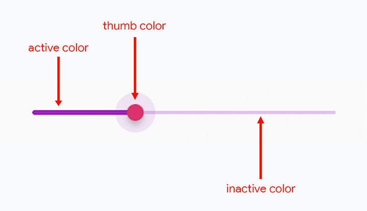
The basic Slider widget gives you access to three properties for setting its color:
activeColor: Applies color to the active portion of the slider trackinactiveColor: Applies color to the inactive portion of the slider trackthumbColor: Applies color to the slider thumb
You can achieve this Slider color combination using the following code:
Slider(
  min: 0.0,
  max: 100.0,
  activeColor: Colors.purple,
  inactiveColor: Colors.purple.shade100,
  thumbColor: Colors.pink,
  value: _value,
  onChanged: (value) {
    setState(() {
      _value = value;
    });
  },
)
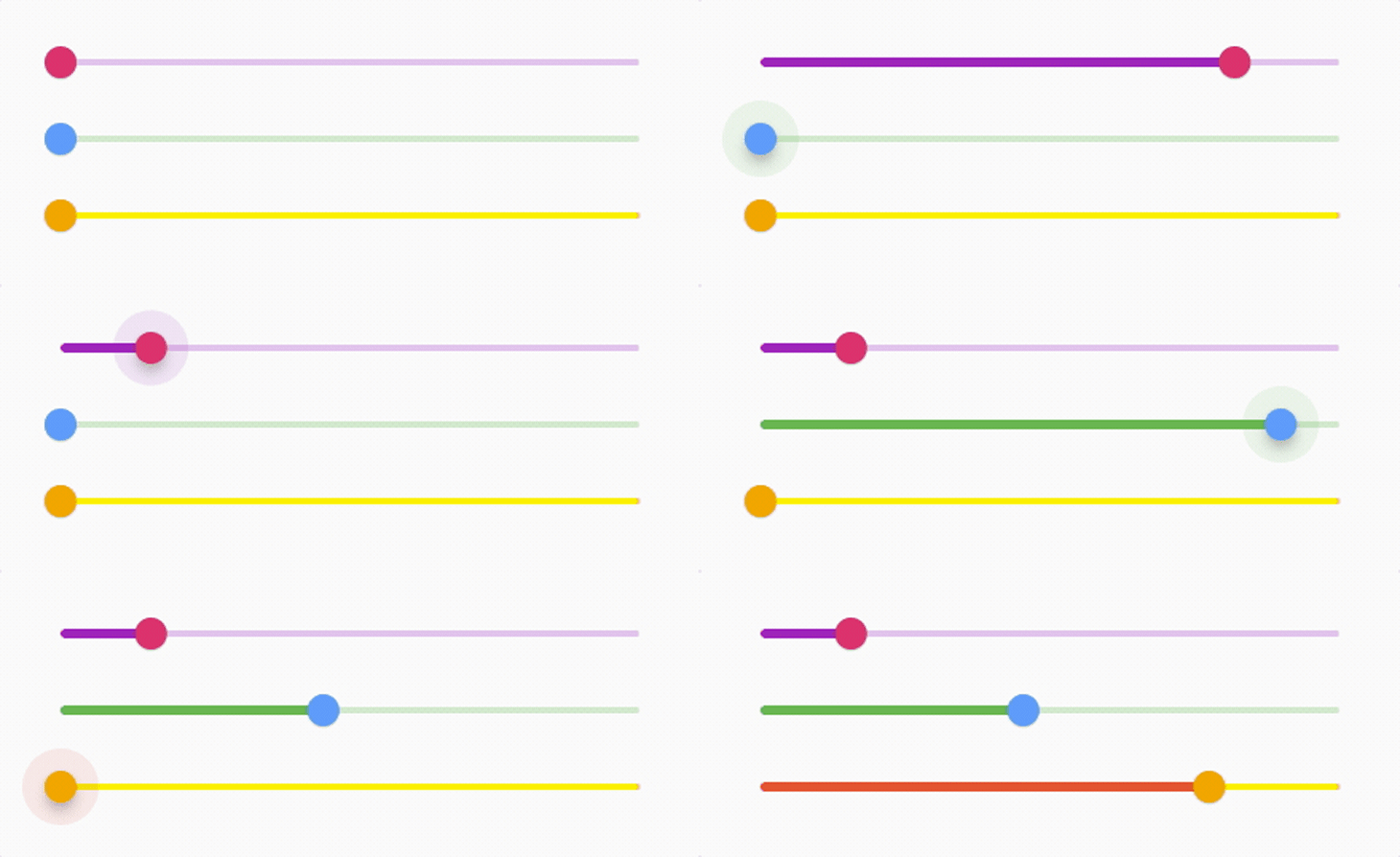
Similarly, you can change these properties and easily customize the Slider colors. Following are a few examples:

If you are using the CupertinoSlider widget, you can just customize two color properties:
activeColorthumbColorBelow is an example of a customized Cupertino Slider:

You can use the following code to build the customized iOS-style slider shown above:
Container(
  width: double.maxFinite,
  child: CupertinoSlider(
    min: 0.0,
    max: 100.0,
    value: _value,
    activeColor: CupertinoColors.activeGreen,
    thumbColor: CupertinoColors.systemPink,
    divisions: 10,
    onChanged: (value) {
      setState(() {
        _value = value;
      });
    },
  ),
)
The RangeSlider widget also allows you to customize just two properties, though they are different from the ones the Cupertino Slider allows:
activeColorinactiveColorBelow is an example of a customized Range Slider:

This slider can be built using the following code:
RangeSlider(
  min: 0.0,
  max: 100.0,
  activeColor: widget.activeColor,
  inactiveColor: widget.inactiveColor,
  values: RangeValues(_startValue, _endValue),
  onChanged: (values) {
    setState(() {
      _startValue = values.start;
      _endValue = values.end;
    });
  },
)
Later in this article, we will discuss more complex customizations and themes that you can apply on the sliders.
Typically, slider widgets return decimal values because they are continuous by default. But if you need just discrete values (i.e., whole integer numbers without any decimal places), you can use the divisions property.
label is a property that is commonly used with discrete values. It is used to show the currently selected discrete value above the slider thumb when it’s active.
The basic Slider widget will look like the below when the divisions and label properties are set:

The code for this slider is as follows:
Slider(
  min: 0.0,
  max: 100.0,
  value: _value,
  divisions: 10,
  label: '${_value.round()}',
  onChanged: (value) {
    setState(() {
      _value = value;
    });
  },
)
In the CupertinoSlider widget, you can set the divisions property, but it doesn’t have support for label.
The RangeSlider widget has similar properties as the Slider widget: the divisions property is used for displaying the discrete values, and the labels property can be used because there are two labels to be displayed on top of the two slider thumbs. The labels prop takes a variable of type RangeLabels.
After applying the divisions and labels, the Range Slider looks like this:

The code for this slider is given below:
RangeSlider(
  min: 0.0,
  max: 100.0,
  divisions: 10,
  labels: RangeLabels(
    _startValue.round().toString(),
    _endValue.round().toString(),
  ),
  values: RangeValues(_startValue, _endValue),
  onChanged: (values) {
    setState(() {
      _startValue = values.start;
      _endValue = values.end;
    });
  },
)
In some situations, you may need to know the current slider status (whether it’s idle, about to be dragged, or is being dragged) in order to update other UI components present on the screen. Fear not — all three types of sliders come with some callbacks that will help you determine the current status of the slider. They are as follows:
onChanged: Gets called as the user drags the slider and its value updatesonChangeStart: Gets called as the user starts dragging the slider. This callback is typically used to indicate that the user has started dragging and can be used for updating any UI components accordinglyonChangeEnd: Gets called as the user stops dragging the slider. This callback is used to indicate that the user has stopped dragging and can be used for updating any UI components accordinglyOf the three callbacks listed above, only onChanged should be used to update the slider value.
Here’s a simple example that uses these callbacks to update a Text widget:

The code used to build this is as follows:
Column(
  crossAxisAlignment: CrossAxisAlignment.start,
  children: [
    Slider(
      min: 0.0,
      max: 100.0,
      value: _value,
      divisions: 10,
      onChanged: (value) {
        setState(() {
          _value = value;
          _status = 'active (${_value.round()})';
          _statusColor = Colors.green;
        });
      },
      onChangeStart: (value) {
        setState(() {
          _status = 'start';
          _statusColor = Colors.lightGreen;
        });
      },
      onChangeEnd: (value) {
        setState(() {
          _status = 'end';
          _statusColor = Colors.red;
        });
      },
    ),
    Text(
      'Status: $_status',
      style: TextStyle(color: _statusColor),
    ),
  ],
)
A few variables are initialized inside the class, like this:
double _value = 20;
String _status = 'idle';
Color _statusColor = Colors.amber;
These variable values are updated according to the callbacks and the Text widget is updated by the setState calls.
Now, we are moving into some deeper customizations that you can apply to the sliders. You can unlock these customizations by wrapping the Slider widget with SliderTheme, which will let you customize each aspect of the slider by specifying various properties.
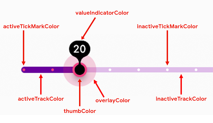
Let’s build the following slider:

SliderTheme comes with a ton of properties, but the ones we’ve used to build the above slider are as follows:

trackHeight: Specifies a height for the entire track and applies to both the inactive and the active parts of the tracktrackShape: Specifies whether the track ends should be rounded and applies to both the inactive and the active parts of the track. Using RoundedRectSliderTrackShape gives it nice rounded edgesactiveTrackColor: Specifies the color applied to the active part of the track; in the above example, it is the leftmost part, starting from the minimum value up to the slider thumb positioninactiveTrackColor: Specifies the color applied on the inactive part of the track; in the above example, it is the rightmost part, starting from the slider thumb position up to the maximum valuethumbShape: Specifies a shape to be applied on the slider thumb. The RoundSliderThumbShape gives it a fully rounded thumb, and the radius of the thumb and its press elevation can also be set inside this propthumbColor: Specifies the color to be applied on the slider thumboverlayColor: Specifies the color to be applied on the overlay that is visible beside the slider thumb when it is in the pressed state; typically, this is a color close to the thumb color but with a lower opacityoverlayShape: Specifies the shape of the overlay to be used along with its radiustickMarkShape: Indicates the divisions on the track and specifies a shape to be used to indicate the tick marks on the slider track. These are only visible if the slider has divisionsactiveTickMarkColor: Specifies the color to be applied to the tick marks present on the active side of the trackinactiveTickMarkColor: Specifies the color to be applied to the tick marks present on the inactive side of the trackvalueIndicatorShape: Specifies the shape of the value indicator, inside which the label (i.e., the value text) is present; this is visible when the slider thumb is in the pressed statevalueIndicatorColor: Specifies the color of the value indicator. Typically, a color closer to the slider thumb is used here, but you can specify any colorvalueIndicatorTextStyle: Specifies the style of the text to be used for displaying the slider value inside the value indicatorThe entire code for applying this theme is as follows:
SliderTheme(
  data: SliderTheme.of(context).copyWith(
    trackHeight: 10.0,
    trackShape: RoundedRectSliderTrackShape(),
    activeTrackColor: Colors.purple.shade800,
    inactiveTrackColor: Colors.purple.shade100,
    thumbShape: RoundSliderThumbShape(
      enabledThumbRadius: 14.0,
      pressedElevation: 8.0,
    ),
    thumbColor: Colors.pinkAccent,
    overlayColor: Colors.pink.withOpacity(0.2),
    overlayShape: RoundSliderOverlayShape(overlayRadius: 32.0),
    tickMarkShape: RoundSliderTickMarkShape(),
    activeTickMarkColor: Colors.pinkAccent,
    inactiveTickMarkColor: Colors.white,
    valueIndicatorShape: PaddleSliderValueIndicatorShape(),
    valueIndicatorColor: Colors.black,
    valueIndicatorTextStyle: TextStyle(
      color: Colors.white,
      fontSize: 20.0,
    ),
  ),
  child: Slider(
    min: 0.0,
    max: 100.0,
    value: _value,
    divisions: 10,
    label: '${_value.round()}',
    onChanged: (value) {
      setState(() {
        _value = value;
      });
    },
  ),
)
There are a lot more properties inside SliderTheme that you can play with, though this level of customization should be enough for most users. But you can go even further!
CustomPainterSliderTheme allows you to modify the slider component shapes only from the pre-existing designs that come with Flutter. If you want to give an out-of-the-box custom look to your slider, CustomPainter) has come to your rescue.
You can create your own designs for the various slider components (like the tick marker, the slider thumb, the slider track, etc.) and assign them as shapes to these components.
We will create a custom shape for the slider thumb and assign it to our Slider widget. It will look like this:

For creating this polygon-shaped slider thumb, you’ll first want to define a class to generate this shape that will extend from the SliderComponentShape class:
class PolygonSliderThumb extends SliderComponentShape {
  @override
  Size getPreferredSize(bool isEnabled, bool isDiscrete) {
    // Define size here
  }

  @override
  void paint(
    PaintingContext context,
    Offset center, {
    required Animation<double> activationAnimation,
    required Animation<double> enableAnimation,
    required bool isDiscrete,
    required TextPainter labelPainter,
    required RenderBox parentBox,
    required SliderThemeData sliderTheme,
    required TextDirection textDirection,
    required double value,
    required double textScaleFactor,
    required Size sizeWithOverflow,
  }) {
    // Define the slider thumb design here
  }
}
While extending the class from SliderComponentShape, you have to define two method overrides:
getPreferredSize(): this method should return the size of the slider thumb shapepaint(): this method generates the design of the slider thumb shapeWe need to pass two values to the PolygonSliderThumb class, the thumb radius value and the current selected value of the slider:
class PolygonSliderThumb extends SliderComponentShape {
  final double thumbRadius;
  final double sliderValue;

  const PolygonSliderThumb({
    required this.thumbRadius,
    required this.sliderValue,
  });

  @override
  Size getPreferredSize(bool isEnabled, bool isDiscrete) {
    return Size.fromRadius(thumbRadius);
  }

  // ...
}
Here, we have used the thumbRadius variable to define the radius of the slider thumb shape.
Now, let’s define the shape inside the paint() method. It’s similar to the one we used with CustomPainter and has the same concept:
canvas: the drawing area where you apply paint and create your desired shapepaint: the brush that you use for drawingYou can access the canvas object from the context passed to the paint() method:
final Canvas canvas = context.canvas;
Define some constants for the number of sides of the polygon, the radius of the inner and outer circles binding the polygons, and finally, calculate the angle according to it:
int sides = 4;
double innerPolygonRadius = thumbRadius * 1.2;
double outerPolygonRadius = thumbRadius * 1.4;
double angle = (math.pi * 2) / sides;
The order of painting operations should be like this:
The first one is painted in the beginning, the second one is painted on top of it, followed by the third.
For painting the outer path, the following can be used:
final outerPathColor = Paint()
  ..color = Colors.pink.shade800
  ..style = PaintingStyle.fill;

var outerPath = Path();

Offset startPoint2 = Offset(
  outerPolygonRadius * math.cos(0.0),
  outerPolygonRadius * math.sin(0.0),
);

outerPath.moveTo(
  startPoint2.dx + center.dx,
  startPoint2.dy + center.dy,
);

for (int i = 1; i <= sides; i++) {
  double x = outerPolygonRadius * math.cos(angle * i) + center.dx;
  double y = outerPolygonRadius * math.sin(angle * i) + center.dy;
  outerPath.lineTo(x, y);
}

outerPath.close();
canvas.drawPath(outerPath, outerPathColor);
The inner path can be painted like this:
final innerPathColor = Paint()
  ..color = sliderTheme.thumbColor ?? Colors.black
  ..style = PaintingStyle.fill;

var innerPath = Path();

Offset startPoint = Offset(
  innerPolygonRadius * math.cos(0.0),
  innerPolygonRadius * math.sin(0.0),
);

innerPath.moveTo(
  startPoint.dx + center.dx,
  startPoint.dy + center.dy,
);

for (int i = 1; i <= sides; i++) {
  double x = innerPolygonRadius * math.cos(angle * i) + center.dx;
  double y = innerPolygonRadius * math.sin(angle * i) + center.dy;
  innerPath.lineTo(x, y);
}

innerPath.close();
canvas.drawPath(innerPath, innerPathColor);
Finally, the value text can be painted like this:
TextSpan span = new TextSpan(
  style: new TextStyle(
    fontSize: thumbRadius,
    fontWeight: FontWeight.w700,
    color: Colors.white,
  ),
  text: sliderValue.round().toString(),
);

TextPainter tp = new TextPainter(
  text: span,
  textAlign: TextAlign.center,
  textDirection: TextDirection.ltr,
);

tp.layout();

Offset textCenter = Offset(
  center.dx - (tp.width / 2),
  center.dy - (tp.height / 2),
);

tp.paint(canvas, textCenter);
You can now apply this custom slider thumb shape to the SliderTheme:
SliderTheme(
  data: SliderTheme.of(context).copyWith(
    thumbShape: PolygonSliderThumb(
      thumbRadius: 16.0,
      sliderValue: _value,
    ),
  ),
  child: Slider(...)
)
We won’t go into the building process for any other slider components, but you can use these concepts that we used to build the polygon slider thumb to create a completely customized slider of your own.
There are a lot of interesting packages available on pub.dev that provide pre-built sliders with various customization options. Some of them include:
If you were able to stick with me till now, you deserve a pat on your back! 😉
This article covered all that you need to know in order to master the concept of slider widgets. Now, it’s time for you to dive in and create your own unique-looking slider using Flutter.
Thank you for reading the article! If you have any suggestions or questions about the article or my examples, feel free to connect with me on Twitter or LinkedIn. You can find the code samples of all the sliders that we built in this article on my GitHub repository.
Install LogRocket via npm or script tag. LogRocket.init() must be called client-side, not
server-side
$ npm i --save logrocket

// Code:

import LogRocket from 'logrocket';
LogRocket.init('app/id');
// Add to your HTML:

<script src="https://cdn.lr-ingest.com/LogRocket.min.js"></script>
<script>window.LogRocket && window.LogRocket.init('app/id');</script>

Write agent-friendly API documentation with OpenAPI, clear schemas, workflow guidance, and llms.txt for safer AI automation.

Local AI proxy tutorial for detecting, masking, and rehydrating PII before prompts reach cloud LLMs.

Learn how Graph RAG uses connected knowledge structures to improve retrieval beyond simple text similarity.

Learn how sibling-index() enables clean, JavaScript-free stagger animations using native CSS.
Hey there, want to help make our blog better?
Join LogRocket’s Content Advisory Board. You’ll help inform the type of content we create and get access to exclusive meetups, social accreditation, and swag.
Sign up now