The UI of a Flutter application is made up of various widgets put together. Some of these widgets are visible, while others are not.
Visible widgets display elements to the user, such as text or images. Invisible widgets, or layout widgets, define how the visible ones are laid out on the screen.
Layout widgets are essential to your app’s success. The composition of your widgets determines how users will interact with your app. Flutter offers several widgets, like Container and Padding, for the purpose of laying out the app’s UI.
In this tutorial, we’ll introduce Flutter’s box model, a concept used when discussing layouts. We’ll also learn how to implement margin and padding to lay out widgets in our Flutter app.
Jump ahead:
Container widgetEdgeInsets classPadding widgetThe box model is a box containing the content, padding, border, and margin of a displayed widget. The goal is to ensure that the developer has a well-modeled UI.
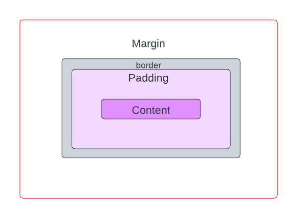
Within the box model, let’s break down the components.
The first is content. Content is the visible element that can be sized using width and height properties.
Next, we have padding. This is the empty space around the content. Its value is included in the width and height of the visible element.
Then, we have the border. A border wraps around the padding and content. Its value is included in the padding of the visible element as well.
Lastly, we have the margin. This is the empty space around the visible element. It’s completely invisible and clears the area outside the border.
Container widgetFlutter offers a Container widget that can be used to implement the box model in our apps. Container is convenient because it can be used to manage multiple widgets’ widths, heights, margins, padding, colors, and more. It does this by combining common painting, positioning, and sizing widgets.
The margin and padding properties of Container are used to set the margin and padding (makes sense, right?) for the visible elements in our UI.
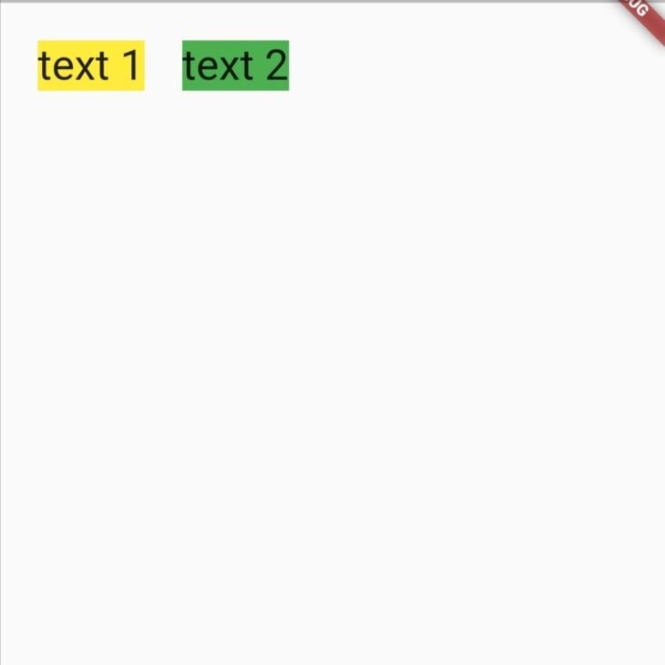
The app below renders two Text widgets inside the Container. The colors of each Container have been set to clearly demonstrate the effects of setting the margin and padding in the example below:
Row(
  mainAxisAlignment: MainAxisAlignment.start,
  crossAxisAlignment: CrossAxisAlignment.start,
  children: [
    Container(
      child: Text(
        "text 1",
        style: TextStyle(fontSize: 32),
      ),
      decoration: BoxDecoration(color: Colors.yellow),
    ),
    Container(
      child: Text(
        "text 2",
        style: TextStyle(fontSize: 32),
      ),
      decoration: BoxDecoration(color: Colors.green),
    ),
  ],
),
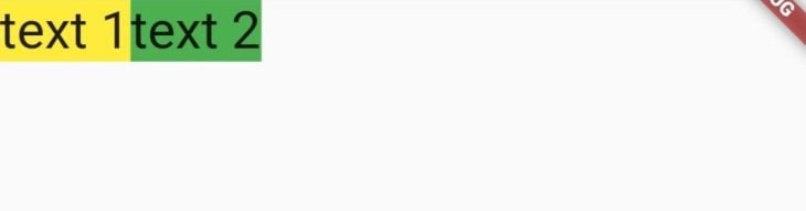
The code snippet above paints two Containers side by side without any whitespace. We’ll need to set the margin and padding for the visible Textwidget. But before we do that, it’s important that we have an understanding of the EdgeInsets class.
EdgeInsets classThe margin and padding properties of a Container widget expect a value of the type EdgeInsetsGeometry, an abstract class. This means that that EdgeInsetsGeometry can’t be used directly so we have to make use of its subclasses, EdgeInsets and EdgeInsetsDirectional, to set the margin and padding.
EdgeInsets sets margin and padding based on the left, top, right, and bottom direction parameters. EdgeInsetsDirectional, on the other hand, sets margin and padding based on the start, top, end, and bottom direction parameters.
The main difference between the two is that EdgeInsetsDirectional is a locale direction-aware widget, unlike EdgeInsets.
We can set the insets of theEdgeInsets class using the following properties:
EdgeInsets.zero: Sets a zero offset in all directionsEdgeInsets.all: Sets one common offset in all directionsEdgeInsets.only: Sets an offset only in the specified directions. The left, top, right, and bottom directions can be specified in any orderEdgeInsets.fromLTRB: Sets an offset in all directions based on the value passed for each. The directions have to be specified in the left, top, right, and bottom orderEdgeInsets.symmetric: Sets a vertical and horizontal offsetEdgeInsets.fromWindowPadding: Sets an offset that matches the given window padding. The padding and devicePixelRatio values are expected; you can use a value from dart:ui.window or make use of MediaQuery.ofWe can set the insets of the EdgeInsetsDirectional class using the following properties:
EdgeInsets.zero: Sets a zero offset in all directionsEdgeInsets.all: Sets one common offset in all directionsEdgeInsets.only: Sets an offset only in the specified directions. The start, top, end, and bottom directions can be specified in any orderEdgeInsets.fromSTEB: Sets an offset in all directions based on the value passed for each. The directions have to be specified in the start, top, end, and bottom orderIn this tutorial, we’ll use the EdgeInsets class.
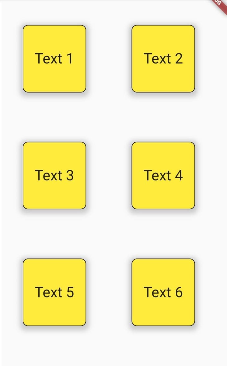
The margin property of Container is used to set the margin. It adds an empty space around the Container.
First, we’ll add a margin around the first Container as shown below:
Container(
  margin: EdgeInsets.all(24),
  child: Text(
    "text 1",
    style: TextStyle(fontSize: 32),
  ),
  decoration: BoxDecoration(color: Colors.yellow),
)
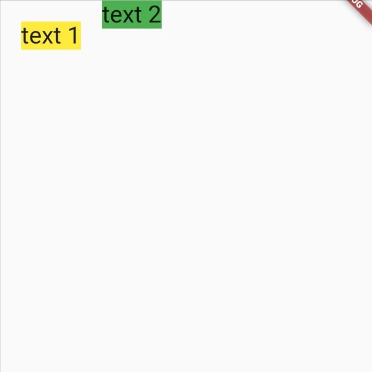
Next, we’ll add a top margin to the second Container only:
Container(
  margin: EdgeInsets.only(top: 24),
  child: Text(
    "text 2",
    style: TextStyle(fontSize: 32),
  ),
  decoration: BoxDecoration(color: Colors.green),
)
Our widgets are now separated with an empty space.
The padding property of Container is used to add empty space inside the decorated Container. We’ll add horizontal and vertical padding to our widgets, as shown in the code below:
padding: EdgeInsets.symmetric(horizontal: 20, vertical: 12)
This code snippet adds horizontal and vertical padding to our widgets. It sets an offset of 20 to the left and right and an offset of 12 to the top and bottom.
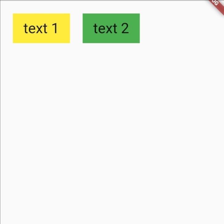
Our content is now padded and looks better!
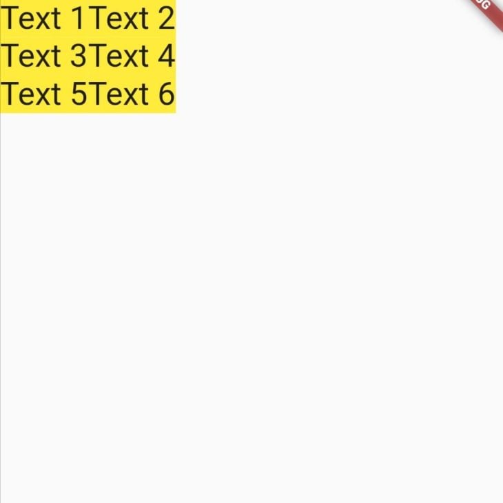
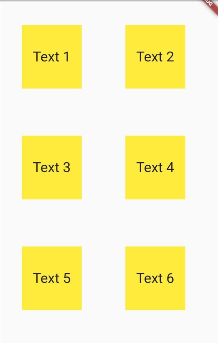
Setting a hardcoded value for our margin and padding will likely only look good on our testing device. On different screen sizes, the intended layout might not be what the user actually sees. Therefore, it is important to set the margin and padding dynamically based on screen size.
We’ll use the MediaQuery class to get the screen size of our app. Then, we’ll be able to dynamically set the margin and padding based on the size of the widgets.
First, we’ll store the device’s width and height values in variables like this:
Widget build(BuildContext context) {
  final height = MediaQuery.of(context).size.height;
  final width = MediaQuery.of(context).size.width;
  return ...
Next, we’ll set the margin and padding properties as a fraction of the device’s width and height:
margin: EdgeInsets.symmetric(horizontal: width *0.1, vertical: height *0.05),
padding: EdgeInsets.symmetric(horizontal: width *0.05,vertical: height*0.05),
This lays out our widgets with margin and padding that adapt to different sized screens.
We can add some decorations to our container using the decoration property. This expects the abstract class for all decorations, called the Decoration class, and applies the styles to our widget.
The code snippet below uses the BoxDecoration class to add a color, border, border radius, and box shadow to the Container.
decoration: BoxDecoration(
  color: Colors.yellow,
  borderRadius: BorderRadius.circular(10),
  border: Border.all(),
  boxShadow: [
    BoxShadow(
      color: Colors.grey.withOpacity(0.5),
      spreadRadius: 5,
      blurRadius: 7,
      offset: const Offset(0, 3),
    ),
  ],
),
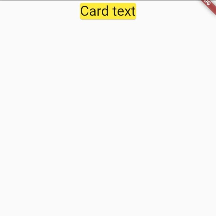
Padding widgetWe may need to add padding to a widget that does not implement the Padding class in its properties. For instance, the Card widget below draws a card with text inside.
Center(
  child: Card(
    color: Colors.yellow,
    child: Text(
      "Card text",
      style: TextStyle(fontSize: 32),
    ),
  ),
)
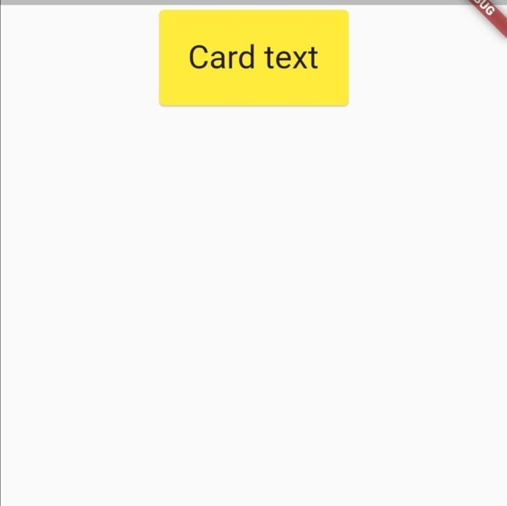
To add some space around the text, we can wrap the Text widget with a Paddingwidget. The Padding widget requires a padding property. The property is set to add empty space around the desired widget via the EdgeInsetsGeometry class.
child: Center(
  child: Card(
    color: Colors.yellow,
    child: Padding(
      padding: EdgeInsets.all(24.0),
      child: Text(
        "Card text",
        style: TextStyle(fontSize: 32),
      ),
    ),
  ),
)
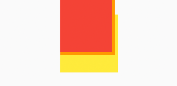
The CSS block layout model allows negative margins, permitting elements to overlap. Flutter does not support negative margins. Adding a negative margin to your Flutter widget will throw an error.
To achieve an overlapping effect, you can make use of the Stack and Position widgets. The Stack widget positions its children relative to the edges of its box, the first child being at the bottom.
The below code snippet uses the Stack widget to create an overlapping feature on three containers. The first container is then positioned 50 units from the top using the Positioned widget.
 SizedBox(
  width: 500,
  height: 500,
  child: Stack(
    children: <Widget>[
      Positioned(
        top: 50,
        child: Container(
          width: 200,
          height: 200,
          color: Colors.yellow,
        ),
      ),
      Container(
        width: 190,
        height: 190,
        color: Colors.orange,
      ),
      Container(
        width: 180,
        height: 180,
        color: Colors.red,
      ),
    ],
  ),
)
Unlike CSS, Flutter does not combine or collapse margins into a single margin when drawing elements in the UI. To demonstrate this, we’ll make use of Flutter DevTools which allows us to inspect our app’s user interface layout.
First, we’ll nest two containers inside a parent container and give them vertical margins as shown below.
Container(
  color: Colors.red,
  margin: EdgeInsets.symmetric(vertical: 30),
  child: Column(
    children: [
      Container(
        color: Colors.red,
        margin: EdgeInsets.symmetric(vertical: 10),
        child: Text(
          "Text nest1",
          style: TextStyle(fontSize: 32),
        ),
      ),
      Container(
        color: Colors.orange,
        margin: EdgeInsets.symmetric(vertical: 10),
        child: Text(
          "Text nest2",
          style: TextStyle(fontSize: 32),
        ),
      )
    ],
  ),
)
Then we’ll launch Flutter DevTools and enable Show Guidelines. This will display an outline around the UI’s layout components.
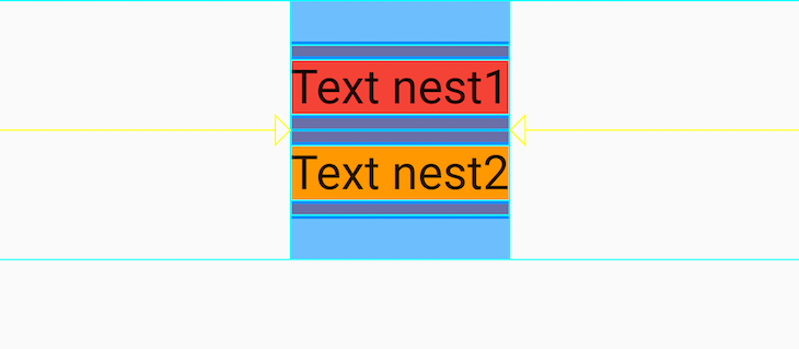
All margins included in the layout are drawn to the user interface. The margins of the nested children are not collapsed into the parent’s margin.
In this tutorial, we discussed the box model and looked into how margins and paddings can be used to build layouts in Flutter. We also looked into the Container widget and how to set its margin, padding, and decorations. We then used the Padding widget to add padding. Finally, we discussed negative margins and collapsing margins in Flutter.
With that, you should now be able to carefully lay out widgets in your app’s UI to enhance your user interactions. All the code in this article is available on GitHub.
I hope you enjoyed this tutorial!
Install LogRocket via npm or script tag. LogRocket.init() must be called client-side, not
server-side
$ npm i --save logrocket

// Code:

import LogRocket from 'logrocket';
LogRocket.init('app/id');
// Add to your HTML:

<script src="https://cdn.lr-ingest.com/LogRocket.min.js"></script>
<script>window.LogRocket && window.LogRocket.init('app/id');</script>

A guide for using JWT authentication to prevent basic security issues while understanding the shortcomings of JWTs.

Discover how to build, render, and automate product demo videos with Remotion, replacing traditional screen recordings with reusable React code.

Chrome’s Modern Web Guidance embeds modern web platform skills into AI coding agents, helping them choose native HTML, CSS, and browser APIs over legacy patterns.

Learn how to use Fallow to analyze AI-generated code, detect dead code, duplicate logic, and complexity issues, and integrate automated code quality checks into your AI-assisted development workflow.
Would you be interested in joining LogRocket's developer community?
Join LogRocket’s Content Advisory Board. You’ll help inform the type of content we create and get access to exclusive meetups, social accreditation, and swag.
Sign up now

 Learn more →
