Whenever discussing user interfaces, it’s always important to consider theming. Theming is a way to apply similar visual and behavioral properties across applications, making them unique and uniform.
This article focuses on how theming works in Jetpack Compose, the modern user interface toolkit for Android, and explores its internal implementation of Material Theming. In addition, we’ll explore its interoperability with the Android View XML theming style.
The Replay is a weekly newsletter for dev and engineering leaders.
Delivered once a week, it's your curated guide to the most important conversations around frontend dev, emerging AI tools, and the state of modern software.
In general, themes are made of systems that define common visual and behavioral concepts. These systems can consist of things like color or typography.
In Compose, the provided theming, or Material Theming (as it is built on the concept of Material Design), consists of three main systems—color, typography, and shape—provided by a simple composable function, MaterialTheme.
This wraps all user interface components (like text fields and buttons) in an app to provide similar visuals and behavior. MaterialTheme is simply defined as the following:
MaterialTheme(
colors: Colors = …,
typography: Typography = …,
shapes: Shapes = …,
content: @Composable () -> Unit
) {
// app content
}
Material Theme’s color system is built on the Material Design color system. This system is simply made of color properties that represent specified brand colors as well as other colors that blend with both light and dark modes.
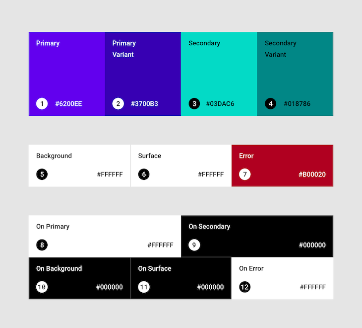
The image above shows all the color properties available. In code, they are declared like this:
class Colors(
    primary: Color,
    secondary: Color,
    background: Color,
    surface: Color,
    error: Color,
    /* ... */
) {
    /* ... */
}
To declare color values for each property, consider the system theme (that is, a light or dark theme) in your Android OS (note that the dark theme was introduced in Android 10 (API level 29)). Choosing the light and dark themes are written below:
fun lightColors(
    primary: Color = Color(0xFF6200EE),
    primaryVariant: Color = Color(0xFF3700B3),
    background: Color = Color.White,
    /* ... */
): Colors = Colors(
    primary,
    primaryVariant,
    background,
    /* ... */
)

fun darkColors(
    primary: Color = Color(0xFFBB86FC),
    primaryVariant: Color = Color(0xFF3700B3),
    background: Color = Color(0xFF121212),
    /* ... */
): Colors = Colors(
    primary,
    primaryVariant,
    background,
    /* ... */
)
As you can see, lightColors and darkColors have default values that you can choose to override or not based on your design specification.
To decide which to use in your theme, you can provide an if...else statement to correlate the theme to the system the app runs on:
colors = if (isSystemInDarkTheme()) darkColors else lightColors
Note that isSystemInDarkTheme() is a utility method provided by the Compose library to detect whether a user’s device is using a dark theme or not.
The typography system is built on the Material Design type system.
The type system is essentially a type scale with a combination of 13 different styles like H1, Subtitle2, or Caption. These different styles (or text styles) are defined by font properties like the typeface, weight, or size, which provide distinctions in your app and its content.
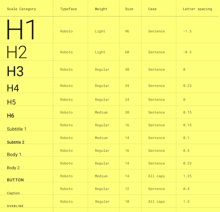
In code, a typography system is provided using the Typography class, which contains these text styles, each defined as a TextSytle. Each text style defines its font properties using font-related classes.
The Typography class then looks like the following:
@Immutable
class Typography constructor(
    val h1: TextStyle = TextStyle(...),
    val h2: TextStyle = TextStyle(...),
    val h3: TextStyle = TextStyle(...),
    val h4: TextStyle = TextStyle(...),
    val h5: TextStyle = TextStyle(...),
    val h6: TextStyle = TextStyle(...),
    val subtitle1: TextStyle = TextStyle(...),
    val subtitle2: TextStyle = TextStyle(...),
    val body1: TextStyle = TextStyle(...),
    val body2: TextStyle = TextStyle(...),
    val button: TextStyle = TextStyle(...),
    val caption: TextStyle = TextStyle(...),
    val overline: TextStyle = TextStyle(...)
) {
  /* ... */
}
As you can see, it provides default text styles so you can decide not to override any or override the ones you want. An example of overriding particular text styles can be like the following:
val Outfit = FontFamily(
    Font(R.font.outfit_regular),
    Font(R.font.outfit_medium, FontWeight.W500),
    Font(R.font.outfit_bold, FontWeight.Bold)
)

val AppTypography = Typography(
    h1 = TextStyle(
        fontFamily = Outfit,
        fontWeight = FontWeight.W300,
        fontSize = 96.sp
    ),
    body1 = TextStyle(
        fontFamily = Outfit,
        fontWeight = FontWeight.W600,
        fontSize = 16.sp
    )
    /* ... */
)
The shape system is built on the Material Design shape system, which comprises a finite set of customizations that can be made into surfaces, such as surfaces with rounded or cut corners.
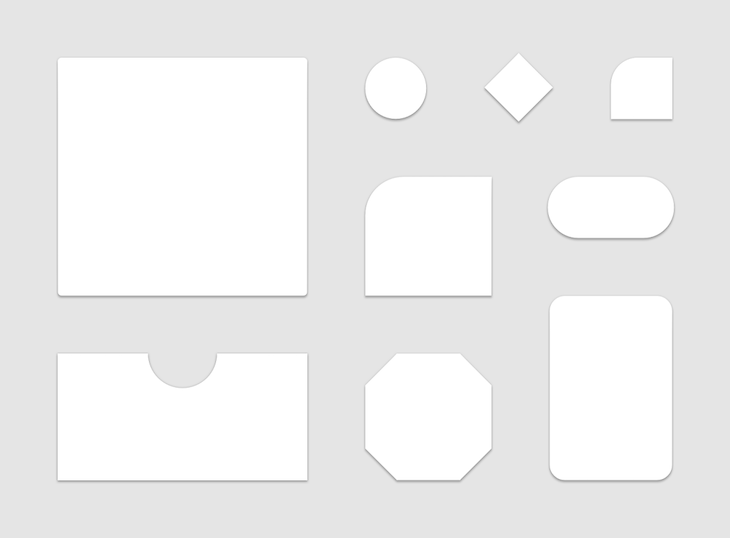
In code, shapes are declared like the following using small, medium, and large to refer to the size categories of components that can be shaped:
@Immutable
class Shapes(
    val small: CornerBasedShape = RoundedCornerShape(4.dp),
    val medium: CornerBasedShape = RoundedCornerShape(4.dp),
    val large: CornerBasedShape  = RoundedCornerShape(0.dp),
) {
  /* ... */
}
To know what components fall under which category, check out the shape scheme.
Note that CornerBasedShape classes like RoundedCornerShape and CutCornerShape are already provided to set a shape style for each category, making it easy to implement if you choose to override the default values provided.
Also, CornerBasedShape has two extra subclasses compared to the other two mentioned above, namely AbsoluteRoundedCornerShape and AbsoluteCutCornerShape.
The difference between these and their nonabsolute counterparts is that these shapes will not automatically mirror the corner sizes in a right-to-left layout direction.
To get these theme system values down to each part of a composition (each child in the tree), we must explicitly pass each value as a parameter. This is quite cumbersome, which is why we will use CompositionLocal to help in this process.
CompositionLocal can pass any value down the UI tree implicitly, although it is advised not to use it in all cases, as it can make composables’ behavior harder to understand and present an unclear source of truth since it can change in any part of the composition.
But, for our scenario where the entire composition relies on the theme system values which won’t change with the composition, it is adequate to use it.
CompositionLocal is defined using the ProvidableCompositionLocal class and provided with a default value of the same type that it provides to use in cases when there is no provided value.
Alternatively, ProvidableCompositionLocal has two implementations: DynamicProvidableCompositionLocal and StaticProvidableCompositionLocal.
We can use DynamicProvidableCompositionLocal when its value is expected to change often. Since it’s an internal class, it can only be created using the compositionLocalOf() function.
StaticProvidableCompositionLocal, on the other hand, is used when its value is rarely expected to change. Since it is an internal class, it can only be created using the staticCompositionLocalOf() function.
Since our theme system values are not likely to change often, let’s use the static implementation:
internal val LocalColors = staticCompositionLocalOf { lightColors() }

internal val LocalTypography = staticCompositionLocalOf { Typography() }

internal val LocalShapes = staticCompositionLocalOf { Shapes() }
To provide values to a CompostionLocal, there are two things that should happen:
First, we must create an instance of ProvidedValue, an object that holds CompositionLocal and its value.
Then, we can use the CompositionLocalProvider composable, which accepts one or more ProvidedValue objects and internally creates a map that links each CompositionLocal to its value.
A faster way to create a ProvidedValue is to use the provides infix function as shown below:
CompositionLocalProvider(
    LocalColors provides colors,
    LocalTypography provides typography,
    LocalShapes provides shapes,
) {
  // Content goes here.
}
While the theme is ready to use, you may want to access some system properties to apply to your UI components, say a color property for the background view, or a particular text style for your text view.
This is mostly the case when you customize your Material components or create your own component. In this case, you want to get the value of a system and/or the properties of a system in the theme.
You can do this by creating an object with properties that point to the current value of each system. As each system’s value is provided as a CompostionLocal, accessing the current value of the respective CompositionLocal returns their value.
This then looks up the key in the Map created internally and returns its value if the key is found, else it returns the default value set when defining CompoitionLocal:
object MaterialTheme {
    val colors: Colors
        @Composable
        @ReadOnlyComposable
        get() = LocalColors.current

    val typography: Typography
        @Composable
        @ReadOnlyComposable
        get() = LocalTypography.current

    val shapes: Shapes
        @Composable
        @ReadOnlyComposable
        get() = LocalShapes.current
}
Note that this object is named similarly to the theme composable for consistency purposes. However, it’s not required to have a similar name.
Putting everything together, the final code looks like the following:
MaterialTheme(
    colors = if (isSystemInDarkTheme()) darkColors else lightColors,
    typography = AppTypography,
    shapes = Shapes(),
    content: @Composable () -> Unit
) {
    CompositionLocalProvider(
        LocalColors provides colors,
        LocalTypography provides typography,
        LocalShapes provides shapes
    ) {
      content()
    }
}

object MaterialTheme {
    val colors: Colors
        @Composable
        @ReadOnlyComposable
        get() = LocalColors.current

    val typography: Typography
        @Composable
        @ReadOnlyComposable
        get() = LocalTypography.current

    val shapes: Shapes
        @Composable
        @ReadOnlyComposable
        get() = LocalShapes.current
}

internal val LocalColors = staticCompositionLocalOf { lightColors() }

internal val LocalTypography = staticCompositionLocalOf { Typography() }

internal val LocalShapes = staticCompositionLocalOf { Shapes() }
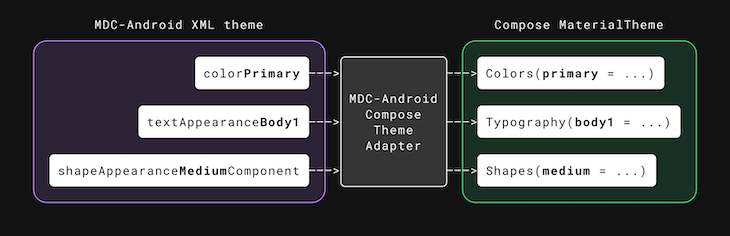
If you plan on migrating to Jetpack Compose from the previous Android View system in bits, there are tools that can help you quickly implement some of your theme systems.
Use the MDC-Android Compose Theme Adapter if you want to migrate from Material Components M2 XML themes. It helps map colors, text styles, and shape categories into the theme systems in Compose.
This can be used as easy as implementing the following:
MdcTheme {
   // app content
}
Internally, the adapter already wraps the MaterialTheme composable and provides the necessary theme systems created using the current context’s theme. All you need to do is to provide your app content.
Also, if you’d like to customize some of the theme system values provided, there is the createMdcTheme() function, used internally to read typography values from the XML themes and provides some parameters to determine the logic used in creating the theme systems:
var (colors, typography, shapes) = createMdcTheme(
    /* ... */
    setTextColors = true,
    setDefaultFontFamily = true
)

MaterialTheme(
    colors = colors,
    typography = typography,
    shapes = shapes
) {
  // app content
}
Note that there are some limitations with this approach to consider.
The AppCompat Compose Theme Adapter is similar to the first adapter but instead migrates from AppCompat XML themes:
AppCompatTheme {
   // app content
}
To customize the read values, you can use the createAppCompatTheme() function like so:
val context = LocalContext.current
var (colors, type) = context.createAppCompatTheme()

MaterialTheme(
    colors = colors,
    typography = type
) {
    // app content
}
Notice there is no shape system, and if you go into the implementation, you will also notice the color and type systems provided are not perfect.
This is because the AppCompat theme does not contain the new properties introduced in the Material Components theme, and hence it is not possible to create a perfect theme from this approach due to these limitations.
You can read more on these limitations here or check out the code to see how these situations are handled. Note that there are also some other limitations, similar to that of the first approach, to consider.
Right now, you should have an adequate understanding of some Jetpack Compose building blocks and how to create its theming foundations.
Following a similar approach, you can easily create your own theme from scratch. Do note that what was mainly explained is the core of theming in Compose, so feel free to check out other variables involved from the source.
LogRocket is an Android monitoring solution that helps you reproduce issues instantly, prioritize bugs, and understand performance in your Android apps.
LogRocket's Galileo AI watches sessions for you, instantly identifying and explaining user struggles with automated monitoring of your entire product experience.
LogRocket also helps you increase conversion rates and product usage by showing you exactly how users are interacting with your app. LogRocket's product analytics features surface the reasons why users don't complete a particular flow or don't adopt a new feature.
Start proactively monitoring your Android apps — try LogRocket for free.
Install LogRocket via npm or script tag. LogRocket.init() must be called client-side, not
server-side
$ npm i --save logrocket

// Code:

import LogRocket from 'logrocket';
LogRocket.init('app/id');
// Add to your HTML:

<script src="https://cdn.lr-ingest.com/LogRocket.min.js"></script>
<script>window.LogRocket && window.LogRocket.init('app/id');</script>

Local AI proxy tutorial for detecting, masking, and rehydrating PII before prompts reach cloud LLMs.

Learn how Graph RAG uses connected knowledge structures to improve retrieval beyond simple text similarity.
Learn how sibling-index() enables clean, JavaScript-free stagger animations using native CSS.

useEffect breaks AI streaming responses in ReactSee why useEffect breaks AI streaming in React, and how moving stream state outside React fixes flicker and stale updates.
Would you be interested in joining LogRocket's developer community?
Join LogRocket’s Content Advisory Board. You’ll help inform the type of content we create and get access to exclusive meetups, social accreditation, and swag.
Sign up now

 Learn more →
