Jetpack Compose is Google’s new, modern, declarative UI framework for Android application development. Compose combines over a decade of learnings from the previous UI toolkit with the power of the Kotlin programming language to provide a UI development experience that is as powerful as it is refreshing for Android developers.

This article will jumpstart your learning of Jetpack Compose by:
The most obvious difference between Jetpack Compose and the traditional Android view system is that a Compose UI is written entirely in Kotlin. There is no longer a need to use XML for layout, style, typography, color, or other UI-related elements.
@Composable
fun Composable() {
    Text("Hello World!")
}
Gone are the views, TextViews, buttons, LinearLayouts, etc., that you are familiar with. Compose apps are built using Composable functions instead of view functions. Composable functions are annotated with @Composable and represent individual UI elements. We can use pre-defined Composables or define our own.
Jetpack Compose leverages patterns from other declarative frameworks such as React and Flutter to provide an experience that is intuitive and familiar for those used to declarative programming. Because Compose apps are written in Kotlin, it’s easy to describe your UI using all the same control flow constructs and language features you’re accustomed to using.
@Composable
fun Title(message: String?) {
  if(message == null) {
    Text("error")
  } else {
    Text(message)
  }
}
Compose promises to simplify and accelerate UI development and has great potential to be the future of Android development with Kotlin. So, how do you get started building Jetpack Compose applications?
To start using Jetpack Compose, you’ll need to do several things to set up your project.
build.gradle file// build.gradle.kts
implementation("androidx.compose.ui:ui:1.0.1")
implementation("androidx.compose.ui:ui-tooling:1.0.1")
implementation("androidx.compose.foundation:foundation:1.0.1")
implementation("androidx.compose.material:material:1.0.1")
Once you’ve created your project and added these dependencies, you should be able to sync your project and start using Compose APIs. First, let’s show a “Hello World” message within a created default Activity.
class MainActivity : ComponentActivity() {
    override fun onCreate(savedInstanceState: Bundle?) {
        super.onCreate(savedInstanceState)
        setContent {
            Text("Hello world!")
        }
    }
}
Notice there is no call tosetContentView(). Rather than inflating an XML-based layout, we can define a Compose-based UI for Activity using the setContent{} function. Within the lambda passed to setContent(), we can add Composables to define our user interface.
Let’s look at some of the most common building blocks you’ll need to start building interactive applications with Jetpack Compose
Need to add some text to your application? You’ll likely want to use the Text Composable.
setContent {
 Text(text = "Hello World")
}
The Text Composable is a Kotlin function that includes a number of optional parameters that enable you to configure how your text should look.
setContent {
 Text(
   text = "Hello World",
   fontWeight = FontWeight.Bold,
   maxLines = 1,
   overflow = TextOverflow.Ellipsis
 )
}
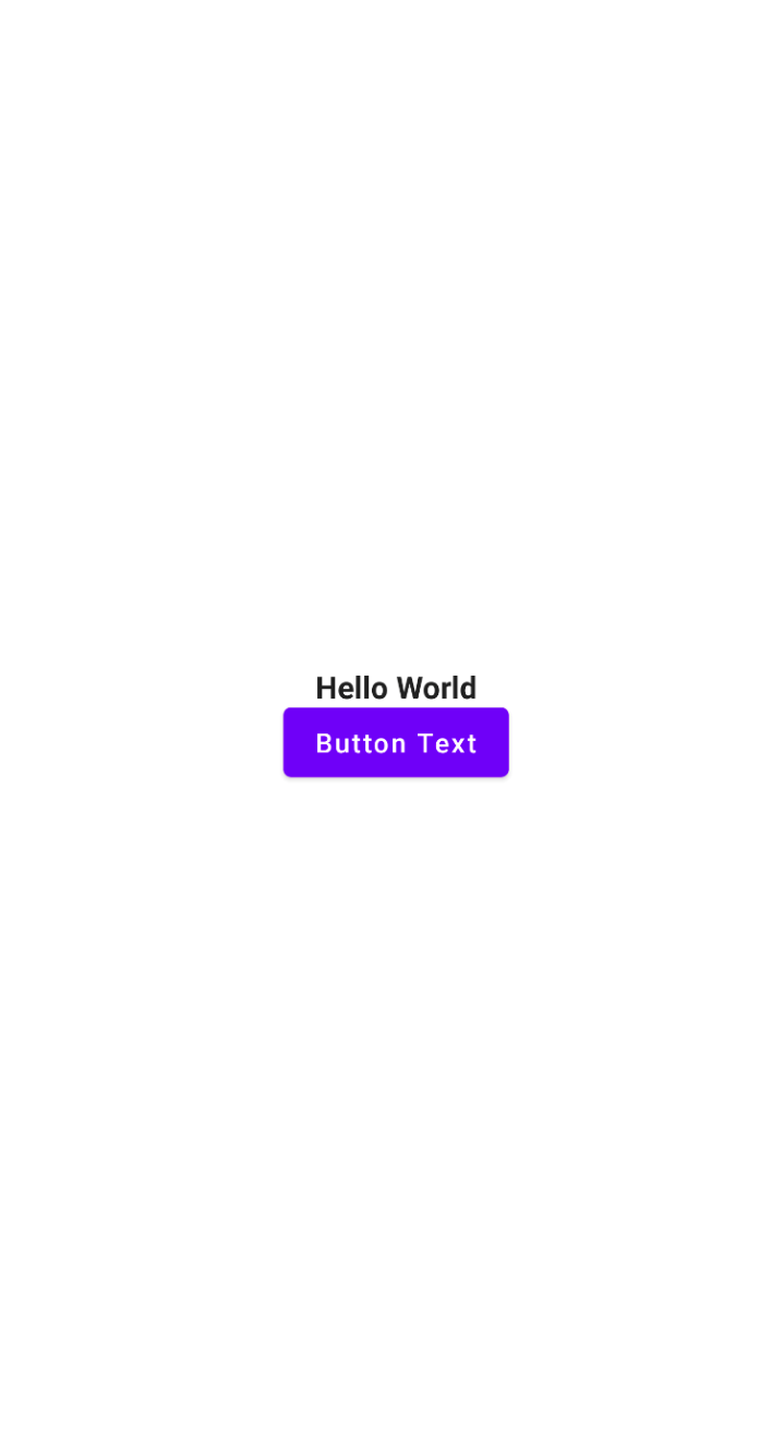
To display a simple button in your UI, you can use the Button Composable.
Button(onClick = {}) {
 Text("Button Text")
}
Button is a great example of how Compose favors composition over strict inheritance. Notice that we pass a lambda to the Button function. That lambda defines the content of Button. In this case, our button’s content is a simple text element.
This is a common pattern in Compose. Composables will often take a trailing lambda to define their content, making them more flexible and easier to work with.
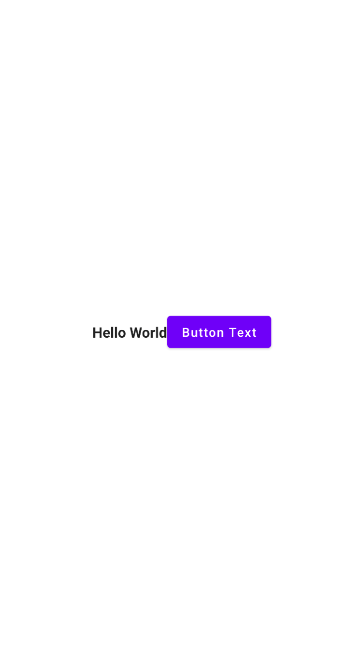
Column and Row ComposablesTo help align elements such as Text or Button, we need containers to help us arrange these elements. The first two such containers you’re likely to encounter are Column and Row.
Column will lay out children vertically, one after the other.
Column(
 modifier = Modifier.fillMaxSize(1f),
 verticalArrangement = Arrangement.Center,
 horizontalAlignment = Alignment.CenterHorizontally
) {
 Text(
   text = "Hello World",
   fontWeight = FontWeight.Bold,
   maxLines = 1,
   overflow = TextOverflow.Ellipsis
 )

 Button(onClick = {}) {
   Text("Button Text")
 }
}
If you need horizontal content, you can use Row instead of Column.
Row(
 modifier = Modifier.fillMaxSize(1f),
 verticalAlignment = Alignment.CenterVertically,
 horizontalArrangement = Arrangement.Center
) {
 Text(
   text = "Hello World",
   fontWeight = FontWeight.Bold,
   maxLines = 1,
   overflow = TextOverflow.Ellipsis
 )

 Button(onClick = {}) {
   Text("Button Text")
 }
}
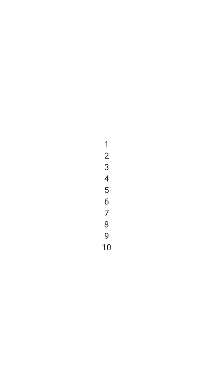
LazyColumn and LazyRow for large datasetsWorking with large sets of data and need a highly performant container? Rather than using Column and Row, we can use LazyColumn, and LazyRow, which provide more efficient recycling of resources and faster drawing performance. These two Composables are very similar, in concept, to RecyclerView.
To create a LazyColumn, we can change Column to LazyColumn, then define each UI element within an item{} Composable, which defines individual items in the list so we can define different item types without the need for an adapter.
LazyColumn(
 verticalArrangement = Arrangement.Center,
 horizontalAlignment = Alignment.CenterHorizontally,
 modifier = Modifier.fillMaxSize(1f),
) {
 item { Text("1") }
 item { Text("2") }
 item { Text("3") }
 item { Text("4") }
 item { Text("5") }
 item { Text("6") }
 item { Text("7") }
 item { Text("8") }
 item { Text("9") }
 item { Text("10") }
}
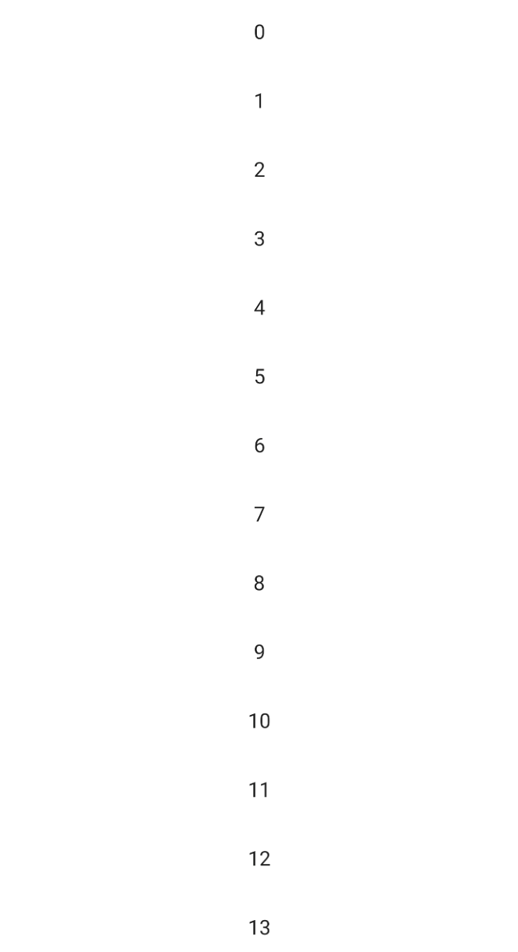
Need to create a bunch of items based on a static count, or a collection of data? We can use the items() function to repeatedly create items within our LazyColumn.
LazyColumn(
 verticalArrangement = Arrangement.Center,
 horizontalAlignment = Alignment.CenterHorizontally,
 modifier = Modifier.fillMaxSize(1f),
) {
 items(100) { index ->
   Text("$index")
 }
}
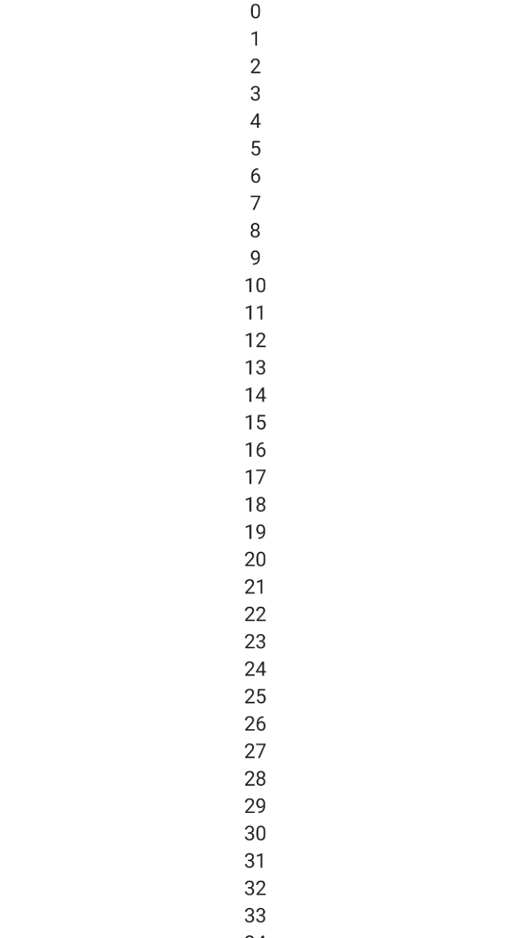
Items within a LazyColumn or LazyRow do not have to be the same. You’re free to mix UI elements however you want — all without the need for separate adapters or layouts. This highlights the power and flexibility of Jetpack Compose over the existing UI system.
How do we work with padding and margin within Compose? Well, Compose simplifies it by providing one concept — padding.
We can define the padding for any element by applying Modifier. Modifiers allow us to configure a Composable to control things like size, padding, focus state, click handlers, etc.
To add padding to the list of items from the previous example, we can update our code as follows:
LazyColumn(
 verticalArrangement = Arrangement.Center,
 horizontalAlignment = Alignment.CenterHorizontally,
 modifier = Modifier.fillMaxSize(1f),
) {
 items(100) { index ->
   Text(
     text = "$index",
     modifier = Modifier.padding(16.dp)
   )
 }
}
There are a few interesting things going on here. First, the use of named arguments is quite common in Compose code. Second, we can start building a modifier by referencing Modifier directly and calling methods on it.
To add padding, we can call padding() and pass in a dimension value. Here, we use an extension property called dp to conveniently convert the raw value 16 into a dimension value.
We’ve now covered the most common Composables, as well as some common usage patterns. As the Android community continues to work with Compose, new patterns, and conventions, best practices will emerge.
When you’re working with Jetpack Compose, here are a few tips to help you write more flexible, scalable Compose applications.
One of the big advantages of using Kotlin for Compose over Java is that we can take advantage of Kotlin language features, such as named arguments and default parameter values.
Named arguments allow us to mix the order of parameters when we call functions. This makes our Composable functions easier to work with and can help make code very readable.
Default parameters allow us to write a single Composable that can be used in many different ways. Rather than having to define many overloaded functions, we can use a single function that defines sensible defaults.
Observe the Text function that we’ve been using:
@Composable
fun Text(
   text: String,
   modifier: Modifier = Modifier,
   color: Color = Color.Unspecified,
   fontSize: TextUnit = TextUnit.Unspecified,
   fontStyle: FontStyle? = null,
   fontWeight: FontWeight? = null,
   fontFamily: FontFamily? = null,
   letterSpacing: TextUnit = TextUnit.Unspecified,
   textDecoration: TextDecoration? = null,
   textAlign: TextAlign? = null,
   lineHeight: TextUnit = TextUnit.Unspecified,
   overflow: TextOverflow = TextOverflow.Clip,
   softWrap: Boolean = true,
   maxLines: Int = Int.MAX_VALUE,
   onTextLayout: (TextLayoutResult) -> Unit = {},
   style: TextStyle = LocalTextStyle.current
) { ... }
This function provides multiple ways of controlling how the text will look when it’s drawn. However, because the only required parameter is the text, basic usages of this Composable can avoid the complexity of the full set of parameters.
As you build your screens and Composables, try to keep your individual Composables small and focused. Refactor pieces of the UI into smaller functions to limit their scope, and to make your code easier to read and follow.
You can also leverage visibility modifiers to help keep your code organized. Imagine you’re building the UI for a specific screen and you’re putting all your Composables within a single file.
If that file exposes only a single public or internal Composable, then you can use as many small, focused, private Composables within that file as you want without polluting your project’s global namespace.
As you build your custom Composables, take inspiration from the Composables provider by the core and material libraries. These functions leverage a slot-based approach to API design.
Rather than rigidly enforcing how things must be composed or used, many Compose APIs allow callers to customize how content should be drawn so it can be customized based on specific feeds.
For example, let’s revisit our button example from earlier.
Button(onClick = {}) {
 Text("Button Text")
}
Button doesn’t take a string to display the text. It lets the caller decide how the text should be shown. Or maybe we don’t want text in our button at all. With this slot-based approach, we could use an icon for our button, or a complex layout of icons, text, etc.
This approach pays dividends when creating low-level Composables that get reused across your application. A good example is a “base card”.
@Composable
fun BaseCard(content: @Composable ColumnScope.() -> Unit) {
 Card(elevation = 4.dp) {
   Column(content = content)
 }
}
You could define how the root card should look but leave the content up to the caller to pass in. This pattern is extremely useful for building a set of reusable components for your team.
One of the primary goals for Jetpack Compose is to make Android development faster and more enjoyable. With that in mind, there are a couple of helpful things to be aware of.
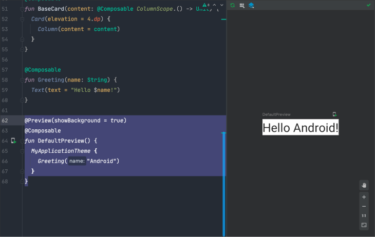
Jetpack Compose supports previews, which allow us to preview what our Composable will look like without having to deploy to a device. Small changes, such as updating a padding constant, can update the preview immediately without any kind of refresh or rebuild.
To define a preview, we can write a new Composable and add the @Preview annotation.
@Preview(showBackground = true)
@Composable
fun DefaultPreview() {
 MyApplicationTheme {
   Greeting("Android")
 }
}
These previews are then visible right within Android Studio as we build our apps.
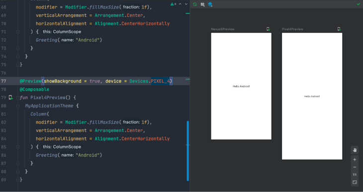
Previews can be customized in a number of interesting ways as well.
For example, it’s possible to configure the preview to do things like show a default background, change the preview device size, or change the dark theme:
@Preview(showBackground = true, device = Devices.PIXEL_4)
@Composable
fun Pixel4Preview() {
 MyApplicationTheme {
   Column(
     modifier = Modifier.fillMaxSize(1f),
     verticalArrangement = Arrangement.Center,
     horizontalAlignment = Alignment.CenterHorizontally
   ) {
     Greeting("Android")
   }
 }
}
We can even define multiple previews in the same file to see those previews side-by-side and see multiple examples of how our Composable will look across various configurations.
By leveraging these previews, we can achieve a much faster iteration cycle because we can easily visualize changes to our UI without deploying our application.
One potential issue with Composable previews is that they do require some rebuilding of your app for larger code changes. For apps with slow build times, this can make previews much less useful.
To help with this, there are two things you can do.
The first is to enable your local Gradle build cache by adding org.gradle.caching=true to your gradle.properties file. With the local build cache enabled, your builds will have to rebuild less code each time you refresh your preview, which should lead to faster previews.
In addition to enabling your local Gradle build cache, you might also consider modularizing your app. If you can isolate your Composable previews to smaller modules with fewer dependencies, you can reduce the amount of code that must be recompiled when refreshing previews.
We’ve only scratched the surface of Jetpack Compose in this post. Hopefully, this has helped shed some light on how Compose is different from how we’ve been building Android apps for the last 10 years and has maybe made you excited about what the next 10 years could look like.
If you want to keep learning about Compose, here are a few helpful resources for you:
LogRocket is an Android monitoring solution that helps you reproduce issues instantly, prioritize bugs, and understand performance in your Android apps.
LogRocket's Galileo AI watches sessions for you, instantly identifying and explaining user struggles with automated monitoring of your entire product experience.
LogRocket also helps you increase conversion rates and product usage by showing you exactly how users are interacting with your app. LogRocket's product analytics features surface the reasons why users don't complete a particular flow or don't adopt a new feature.
Start proactively monitoring your Android apps — try LogRocket for free.
Install LogRocket via npm or script tag. LogRocket.init() must be called client-side, not
server-side
$ npm i --save logrocket

// Code:

import LogRocket from 'logrocket';
LogRocket.init('app/id');
// Add to your HTML:

<script src="https://cdn.lr-ingest.com/LogRocket.min.js"></script>
<script>window.LogRocket && window.LogRocket.init('app/id');</script>
Would you be interested in joining LogRocket's developer community?
Join LogRocket’s Content Advisory Board. You’ll help inform the type of content we create and get access to exclusive meetups, social accreditation, and swag.
Sign up now
Learn how OpenAPI can automate API client generation to save time, reduce bugs, and streamline how your frontend app talks to backend APIs.

Discover how the Interface Segregation Principle (ISP) keeps your code lean, modular, and maintainable using real-world analogies and practical examples.

<selectedcontent> element improves dropdowns

Learn how to implement an advanced caching layer in a Node.js app using Valkey, a high-performance, Redis-compatible in-memory datastore.

 Learn more →
