Editor’s Note: This post was updated by Will Soares on 18 April 2023 to reflect relevant information and updated code blocks.
Material Design is a design language that was first introduced by Google in 2014. It’s a visual language that makes use of grid-based layouts, responsive animations and transitions, padding, and depth effects such as lighting and shadows.
The goal for Material Design comes down to three things: create, unify, and customize. Material Design aims to provide a visual language that synthesizes the classic principles of good design. With its approach focused on component reusability and consistency, it creates an underlying system that unifies the user experience across platforms, devices, and input methods, while offering a flexible foundation that allows for innovation and brand expression.
In this article, we’ll explore how to create React apps based on the guidelines established by Material Design. There are various libraries that can help with this, such as react-md and React Toolbox, or libraries that do not have React as a dependency such as Material Components for the web and Materialize. For this article, we’ll use the most popular of those: MUI.
Jump ahead:
MUI is a collection of React components built to enhance and offer improvements upon Google’s Material Design. These components work in isolation, which means they are self-supporting and will inject only the styles they need to display.
To get started with MUI, all you need to do is run either of these commands in your terminal:
npm install @mui/material @emotion/react @emotion/styled
yarn add @mui/material @emotion/react @emotion/styled
By default, MUI v5 uses Emotion to style components. Thus, in order to work with MUI components, we need to install those two extra libraries that are not maintained by the MUI organization.
Next, let’s look at some of the fundamentals of MUI, how it relates to Material Design guidelines, and some of their most commonly used components.
Keep in mind that officially MUI refers to the organization that is responsible for the MUI library, however, for the rest of the post, we’ll use MUI to refer to the MUI library instead of the organization, for simplicity.
When it comes to Material Design, the font choice defaults to Roboto. However, MUI doesn’t ship with the Roboto font as default. The font can be imported into a React project using one of the two methods below.
This is what it would look like to install from a CDN:
<link
  rel="stylesheet"
  href="https://fonts.googleapis.com/css?family=Roboto:300,400,500,700&display=swap"
/>
You can also install it as an npm package by typing either of the following commands in your terminal:
npm install @fontsource/roboto
yarn add @fontsource/roboto
Then, you can import it into your project like this:
import '@fontsource/roboto/300.css';
import '@fontsource/roboto/400.css';
import '@fontsource/roboto/500.css';
import '@fontsource/roboto/700.css';
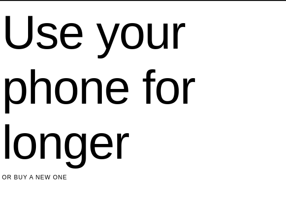
MUI provides a component called Typography, which allows you to display text in the app styled based on a defined set of variants. This helps create a more consistent look for text elements throughout your website. Here’s an example:
import Typography from "@mui/material/Typography";

export default function App() {
  return (
    <div className="App">
      {/* create h1(title) */}
      <Typography variant="h1">Use your phone for longer </Typography>
      {/* create overline */}
      <Typography variant="overline">Or buy a new one</Typography>
    </div>
  );
}
If you’ve been writing frontend code, you probably already know about normalize.css. If not, it’s a collection of HTML element- and attribute-style normalizations. MUI provides its own version of normalize.css: CssBaseline. CssBaseline provides an elegant, consistent, and simple baseline to build upon.
CSSBaseline does the following:
<html>, but 16px is assumed (browser default)color-scheme CSS propertyborder-box as the default value for box-sizing globally, so padding and border do not affect the element’s defined width:
import CssBaseline from "@mui/material/CssBaseline";

export default function App() {
  return (
    <div>
      <CssBaseline /> {/* apply normalize.css */}
      {/* Application code.. */}
    </div>
  );
}
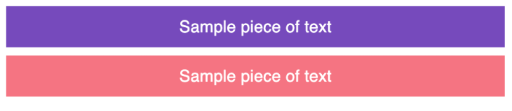
Material Design’s responsive UI is based on a 12-column grid layout. This grid creates visual consistency between layouts. The grid system features the following:
Here’s an example that uses MUI’s Grid component:
import Grid from "@mui/material/Grid";
import Typography from "@mui/material/Typography";

// First, create a custom component.
// It will return a div element with a chosen color.
function ColoredComponent({ color }) {
  return (
    <div
      style={{
        backgroundColor: color,
        color: "white",
        paddingTop: "8px",
        paddingBottom: "8px",
        textAlign: "center"
      }}
    >
      <Typography variant="body1">Sample piece of text</Typography>
    </div>
  );
}
export default function App() {
  return (
    <div className="App">
      <Grid container spacing={1}>
        <Grid item xs={12} sm={8} md={6}>
          <ColoredComponent color="#764abc" />
        </Grid>
        <Grid item xs={12} sm={4} md={6}>
          <ColoredComponent color="#f57482" />
        </Grid>
      </Grid>
    </div>
  );
}

Icons are an important part of Material Design. They are used in buttons to convey action and information. Icons are used to symbolize a command, file, device, or directory.
They are also used to represent actions like trash, print, and save, and are commonly found in app bars, toolbars, buttons, and lists.
Icons in MUI can be rendered using three methods:
SvgIcon component for rendering SVG pathsIcon component for rendering font iconsThe SvgIcon component takes an SVG path element as its child and converts it to a React component that displays the path, allowing the icon to be styled and respond to mouse events.
The Icon component works with fonts that support ligature icons, so you’ll need to add something like the Material Icons font to your project. With this, you can wrap the name of an icon with the MUI’s Icon component and it will replace the string with the icon.
The last method is by using MUI’s own package that ships with preset icons to be used in your React app. If you want to work with icons via that package, these are the commands for adding it to your project:
npm install @mui/icons-material
yarn add @mui/icons-material
This piece of code will render a filled icon and an outlined one from the Material Icons package:
import FavoriteIcon from "@mui/icons-material/Favorite";
import FavoriteBorderOutlinedIcon from "@mui/icons-material/FavoriteBorderOutlined";

export default function App() {
  return (
    <div>
      <FavoriteIcon style={{ width: "100%", height: "20px" }} />
      <FavoriteBorderOutlinedIcon style={{ width: "100%", height: "20px" }} />
    </div>
  );
}
Buttons allow users to take action and make choices with a single tap. They help communicate an action a user can take. Because MUI components are in isolation, you’ll need to import the Button component:
import Button from '@mui/material/Button';

export default function App() {
  return (
    <Button color="success" variant="contained">
      Hello World
    </Button>
  );
}
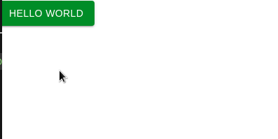
The Button component can take on many props, such as color, variant, size, etc. You can check out the full list of button props here. Buttons in MUI and Material Design can take on any of the following forms:
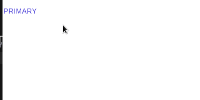
Flat buttons are buttons with only text. They have no background color and no border. They may be used in dialogs, toolbars, or inline. They do not lift but fill with color when clicked:
<Button variant="text">Primary</Button>
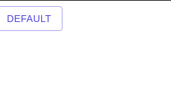
Outlined buttons are text-only buttons with medium emphasis. They behave like flat buttons but have an outline and are typically used for actions that are important but aren’t the primary action in an app. Their appearance is usually characterized by a border and a background color on hover:
<Button variant="outlined">Default</Button>
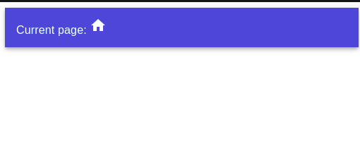
The App Bar, formerly known as the action bar in Android, acts as a header navigation menu. It is a toolbar that’s used for branding, navigation, search, and actions. To render a simple App Bar, write this code:
import AppBar from "@mui/material/AppBar";
import Toolbar from "@mui/material/Toolbar";
import Typography from "@mui/material/Typography";
import HomeIcon from "@mui/icons-material/Home";

<div>
  <AppBar position="static">
        <Toolbar> {/* Display a Toolbar at the top */}
          <Typography>
            Current page: <HomeIcon />
          </Typography>
        </Toolbar>
  </AppBar>
</div>;
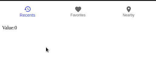
Bottom navigation menus are placed at the bottom and they make it easy to switch between top-level views in a single tap.
The navigation menu is characterized by three to five actions, each containing an icon and a label. It’s important to note that only navigation bars with three actions should contain both an icon and a label:
import { useState } from "react";
import BottomNavigation from "@mui/material/BottomNavigation";
import BottomNavigationAction from "@mui/material/BottomNavigationAction";
import RestoreIcon from "@mui/icons-material/Restore";
import FavoriteIcon from "@mui/icons-material/Favorite";
import LocationOnIcon from "@mui/icons-material/LocationOn";

const [value, setValue] = useState(0);

export default function App() {
  return (
    <div>
      { /* create the bar */ }
      <BottomNavigation
        showLabels
        value={value}
        onChange={(event, newValue) => {
          setValue(newValue); //or change current view
        }}
      >
        { /*Create an action button with an icon  */}
        <BottomNavigationAction label="Recents" icon={<RestoreIcon />} />
        <BottomNavigationAction label="Favorites" icon={<FavoriteIcon />} />
        <BottomNavigationAction label="Nearby" icon={<LocationOnIcon />} />
      </BottomNavigation>
      {/* displays the current user selection index */ }
      <p> Value:{value}</p>
    </div>
  );
}
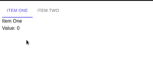
Tabs make it easy to explore and switch between different views. A tab component can be a simple tab with no additions, as seen in the first example below, or a scrollable tab with multiple tabs. A tab can also just consist of icons as titles/labels.
To create a simple tab view, first create a custom component called TabPanel, like so:
import Typography from "@mui/material/Typography";

export default function TabPanel(props) {
  const { children, value, index } = props;

  // if 'value'(current user selection) and 'index' (the corresponding
  // index of the tab) is equal, then display the component
  return (
    <div>
      {value === index && (
        <div>
          <Typography>{children}</Typography>
        </div>
      )}
    </div>
  );
}
Next, render your tabs by writing this code:
import Tabs from "@mui/material/Tabs";
import Tab from "@mui/material/Tab";
import { useState } from "react";

export default function App() {
  const [value, setValue] = useState(0);
  const handleChange = (event, newValue) => {
        setValue(newValue);
  };

  return (
    <div>
      <div>
        <Tabs
          value={value}
          // the handleChange method will run when the user clicks on a tab
          onChange={handleChange}
        >
          <Tab label="Item One" /> {/* Create our tabs */}
          <Tab label="Item Two" />
        </Tabs>
      </div>
      <TabPanel value={value} index={0}>
        Item One
      </TabPanel>
      <TabPanel value={value} index={1}>
        Item Two
      </TabPanel>
      <Typography>Value: {value} </Typography>
    </div>
  );
}
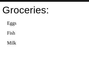
Lists present multiple line items vertically as a single continuous element. They are made up of a continuous column of rows, and each row contains a tile. Primary actions fill the tile, and supplemental actions are represented by icons and text. This piece of code renders a simple list:
import List from "@mui/material/List";
import ListItem from "@mui/material/ListItem";
import Typography from "@mui/material/Typography";

export default function App() {
  return (
    <div>
      <Typography variant="h4"> Groceries:</Typography>
      <List>
        <ListItem> Eggs</ListItem>
        <ListItem> Fish</ListItem>
        <ListItem> Milk</ListItem>
      </List>
    </div>
  );
}
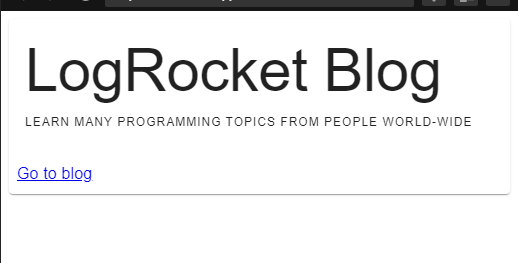
A card is a sheet of material that serves as an entry point to more detailed information. Cards are a convenient means of displaying content composed of different elements. They are used to display information that can be easily glanced at and usually has a call to action (CTA):
import Typography from "@mui/material/Typography";
import CardContent from "@mui/material/CardContent";
import CardActions from "@mui/material/CardActions";
import Card from "@mui/material/Card";

export default function App() {
  return (
    <div>
      <Card>
        {/* define the main content of the card */}
        <CardContent>
          <Typography variant="h2"> LogRocket Blog</Typography>
          <Typography variant="overline">
            Learn many programming topics from people world-wide
          </Typography>
        </CardContent>
        {/* interact with the card here */}
        <CardActions>
          <Typography>
            <a href="https://blog.logrocket.com/"> Go to blog</a>
          </Typography>
        </CardActions>
      </Card>
    </div>
  );
}
The Modal component provides a solid foundation for creating dialogs, popovers, lightboxes, etc. Whenever a modal button is clicked, it does the following:
Let’s use MUI’s Modal component in action. To do so, start by creating a custom dialog box:
import Typography from "@mui/material/Typography";

//Build our custom dialog box:
function CustomDialog() {
  return (
    <div>
      <Typography
        variant="h2"
        style={{ backgroundColor: "blue", padding: "20px" }}
      >
        This is text is in a dialog box
      </Typography>
    </div>
  );
}
Next, write this code to use the Modal component:
import Modal from "@mui/material/Modal";
import Button from "@mui/material/Button";
import { useState } from "react";

export default function App() {
  // will control whether the dialog box is open.
  const [open, setOpen] = useState(false);

  return (
    <div>
      {/* Set the 'open' Hook to true*/}
      <Button onClick={() => setOpen(true)}>Open box</Button>
      {/* The 'open' prop tells whether the dialog box should be rendered */}
      {/* The onClose handler will run when the user clicks away from the dialog  box*/}
      <Modal open={open} onClose={() => setOpen(false)}>
        {/* if 'open' is true, then render the CustomDialog component */}
        <CustomDialog />
      </Modal>
    </div>
  );
}
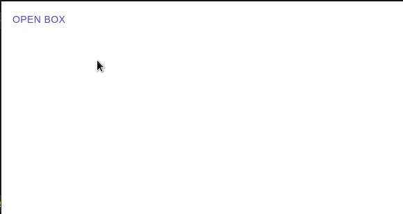
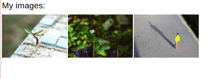
Image lists are an alternative to the standard list views seen above. An image list consists of a repeated pattern of cells arrayed in a vertical and horizontal layout and it usually features images. To create an image list, we use an ImageList component:
import Typography from "@mui/material/Typography";
import ImageList from "@mui/material/ImageList";
import ImageListItem from "@mui/material/ImageListItem";

const images = [
  {
    src: "https://images.pexels.com/photos/1438404/pexels-photo-1438404.jpeg?cs=srgb&dl=pexels-engin-akyurt-1438404.jpg&fm=jpg",
    alt: "landscape",
  },
  {
    src: "https://images.pexels.com/photos/7931183/pexels-photo-7931183.jpeg?auto=compress&cs=tinysrgb&dpr=1&w=500",
    alt: "second image",
  },
  {
    src: "https://images.pexels.com/photos/1000498/pexels-photo-1000498.jpeg?auto=compress&cs=tinysrgb&dpr=1&w=500",
    alt: "third image",
  },
];

export default function App() {
  return (
    <div>
      <Typography variant="h4"> My images:</Typography>
      {/* Now render our images list. It will have 3 columns */}
      <ImageList sx={{ width: 800, height: 450 }} cols={3} rowHeight={164}>
      {/* Navigate through the images array. Each item corresponds to an ImageListItem component */}
        {images.map((item) => (
          <ImageListItem>
            <img src={item.src} alt={item.alt} />
          </ImageListItem>
        ))}
      </ImageList>
    </div>
  );
}
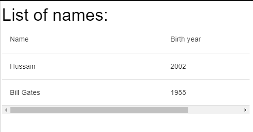
Data tables display sets of raw data. They usually appear in desktop enterprise products. A data table contains a header row at the top that lists column names, followed by rows for data.
For accessibility, the first column is set to an <th> element, with a scope of "row". This enables screen readers to identify a cell’s value by its row and column name. A simple usage of tables can be seen in the example below:
import Typography from "@mui/material/Typography";
import Table from "@mui/material/Table";
import TableBody from "@mui/material/TableBody";
import TableCell from "@mui/material/TableCell";
import TableHead from "@mui/material/TableHead";
import TableRow from "@mui/material/TableRow";
import TableContainer from "@mui/material/TableContainer";

export default function App() {
  return (
    <div>
      <Typography variant="h4"> List of names:</Typography>
      {/* First, create a container. */}
      <TableContainer>
        <Table>
          {/* Now a Table head. (thead) */}
          <TableHead>
            {/*create row */}
            <TableRow>
              {/* create cells */}
              <TableCell>Name</TableCell>
              <TableCell>Birth year</TableCell>
            </TableRow>
          </TableHead>
          {/* next, create body (tbody) */}
          <TableBody>
            <TableRow>
              <TableCell>Hussain </TableCell>
              <TableCell> 2002</TableCell>
            </TableRow>
            <TableRow>
              <TableCell> Bill Gates </TableCell>
              <TableCell>1955 </TableCell>
            </TableRow>
          </TableBody>
        </Table>
      </TableContainer>
    </div>
  );
}
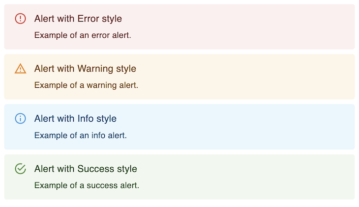
In the realm of feedback components, MUI provides a useful way of surfacing messages to users in the form of alerts.
When it comes to alert messages, we can think about different levels of severity. With the Alert component, this is translated into a prop called severity, which accepts four distinct values: error, warning, info, and success. Each of those represents a style, icon, and color scheme based on the purpose of the alert:
import Alert from '@mui/material/Alert';
import AlertTitle from '@mui/material/AlertTitle';

export default function AlertGroup() {
  return (
    <>
      <Alert severity="error">
        <AlertTitle>Alert with Error style</AlertTitle>
        Example of an error alert.
      </Alert>
      <Alert severity="warning">
        <AlertTitle>Alert with Warning style</AlertTitle>
        Example of a warning alert.
      </Alert>
      <Alert severity="info">
        <AlertTitle>Alert with Info style</AlertTitle>
        Example of an info alert.
      </Alert>
      <Alert severity="success">
        <AlertTitle>Alert with Success style</AlertTitle>
        Example of a success alert.
      </Alert>
    </>
  );
}
MUI provides many other components for a wide variety of scenarios when building UIs. You can check the list of all components here.
There are a few cases where you might choose not to work with MUI. As with everything, it will always depend on the variables and limitations you have on your project.
As stated on MUI’s org website, the Material Design guidelines implemented in MUI components might diverge from the original guidelines defined by Google, so if following the original guidelines is required, then you might want to avoid the dependency of applying Material Design via MUI’s components.
You will be depending on MUI package releases in order to use the latest guidelines defined for Material Design. For example, as of May 2023, the current version of the MUI library is v5, which supports Material Design v2. If using Material Design v3 guidelines, you’ll have to wait for MUI v6.
For scenarios where you want to render a large number of MUI components on a page, you might take some performance hits. If performance is crucial, then MUI might not be the best choice compared to other lighter libraries that would offer the same components and can be customized to have the look and feel of Material Design components. Though you should take this with a grain of salt, considering the latest performance improvements that were shipped in MUI v5.
So, should you use Material Design and MUI in your React project? As usual, the answer depends on your project’s use case and what you’re trying to achieve. Material Design can give you guidelines to make better user interfaces for your applications, and it can inspire your designers to think about the hierarchy of information based on the guidelines.
At the same time, if you’re trying to carry out a brand redesign, Material Design might not be what you’re looking for. Do you want your brand to look like hundreds of other websites on the internet?
Don’t forget to explore other Material Design libraries, such as react-md or materialize (a CSS framework). Thanks for reading!
Install LogRocket via npm or script tag. LogRocket.init() must be called client-side, not
server-side
$ npm i --save logrocket

// Code:

import LogRocket from 'logrocket';
LogRocket.init('app/id');
// Add to your HTML:

<script src="https://cdn.lr-ingest.com/LogRocket.min.js"></script>
<script>window.LogRocket && window.LogRocket.init('app/id');</script>
Explore why npm dependencies are a major supply chain security risk and how to protect JavaScript apps from compromised packages and transitive threats.
Enabled React Compiler v1.0 on a production Next.js app. Here’s every warning, breakage, and silent opt-out I documented — and what actually worked.

We built the same app in TanStack Start RSC and Next.js RSC. TanStack shipped 40% less JS and built 4x faster — but Next.js is still the safer production bet.

From RSC vulnerabilities and the Vercel breach to TypeScript 7.0 Beta and AI agents — the nine frontend storylines that defined H1 2026, ranked.
Would you be interested in joining LogRocket's developer community?
Join LogRocket’s Content Advisory Board. You’ll help inform the type of content we create and get access to exclusive meetups, social accreditation, and swag.
Sign up now

 Learn more →
