
In the vast and dynamic world of web development, being ahead of the curve isn’t just an advantage —it’s essential. Over the years, CSS has evolved and continues to shape the visual landscape of the web. However, just like every technology, as CSS evolves, so do the tools at our disposal.

In this guide, we’ll venture into the realm of styling libraries with a special focus on StyleX. We’ll cover what you need to know about StyleX, including its benefits and drawbacks, so you can decide if it is the right solution for you.
You can check out the project code in this GitHub repo to see the code examples we’ll explore in this tutorial. Let’s get started.
The Replay is a weekly newsletter for dev and engineering leaders.
Delivered once a week, it's your curated guide to the most important conversations around frontend dev, emerging AI tools, and the state of modern software.
In response to the ever-evolving state of CSS, it’s crucial to know when to use a simplified solution versus embracing complex frameworks.
For example, when a project demands a high level of organization and scalability, developers frequently turn to complex frameworks. However, for quicker development, particularly in the context of smaller projects, developers tend to favor a more decentralized approach.
We should be able to access and adjust our preferred solutions based on the project requirements we are working on. Navigating this cyclical nature is crucial to stay current and effective.
Before we explore StyleX, let’s discuss the challenges of plain CSS and the issues it presents, and also those associated with existing libraries.
While native CSS has grown to include features like nesting, it still presents challenges that hinder ease in styling.
Consider the following example. Which color do you think will apply to the heading text? Take a look at the HTML first:
<h1 class="red blue">Text</h1>
Then the CSS:
.blue {
  color: blue;
}

.red {
  color: red
}
In the code, the styles for the red and blue classes conflict, potentially leading to the element rendering in ways we don’t intend.
Since both selectors have the same specificity, the order of classes in the CSS file takes precedence over their appearance in the HTML class attribute. This behavior might seem unintuitive, resulting in the application of the red color when we really want blue.
If the classes were to be split across two stylesheets, the precedence now depends on the order in which they are inserted into the page. This lack of predictability can lead to unexpected results which can make it harder to manage styles, especially in larger projects.
Other issues that may arise with plain CSS include naming conflicts with global scoping, specificity problems, and more. While we can address these issues by following a more structured approach like BEM, it can lead to bloated CSS.
CSS Module solves the naming conflicts and helps avoid global scope issues associated with the plain CSS. It allows developers to create self-contained components with their styling to enhance code organization.
However, one of the drawbacks of CSS Modules is that they don’t prevent duplicate CSS definitions across different files, which may lead to redundant styles.
Tailwind CSS, known for its utility-first approach, has been the go-to styling solution for many developers. It helps address the cons of the previous solution — for example, it mitigates issues with redundant styles by automatically purging unused styles.
In addition, Tailwind CSS allows for rapid prototyping by leveraging ready-made utility classes. Likewise, it promotes the collocation of styles with HTML components — which helps with code reviews — and the styling of individual components without navigating between CSS files.
While this approach tends to improve the developer experience, it can however lead to bloated HTML and JSX code if not careful. Another minor drawback of this approach is the steep learning curve — you have to learn an abstraction of CSS.
CSS-in-JS is popular when building component-based projects like React. This approach offers various advantages, such as improved component encapsulation and allowing the app’s CSS to exploit the full expressive power of JavaScript.
CSS-in-JS solutions can be categorized into runtime and build-time solutions:
While these libraries have similar principles, their approaches are different. For example, vanilla-extract leverages TypeScript to provide type-safe styles, but Linaria lacks type-checking for CSS properties.
Conversely, vanilla-extract — unlike Linaria — forces CSS styles to stay inside a separate .css.ts file. This removes the benefits of collocation, as we tend to navigate between CSS and the component file.
As we’ve briefly explored, each of the solutions mentioned above comes with its distinct features, advantages, and trade-offs. Now, the question: what does StyleX have to offer?
StyleX is a build-time, type-safe CSS-in-JS library that was recently open sourced by Meta. The Meta team developed this library to address some of the major challenges faced by large-scale enterprise projects.
Earlier, we mentioned how CSS-in-JS helps improve component encapsulation. This pattern also allows modularity and composability of components. In turn, it allows for the reusability of UI code across projects. While that’s fine, it can be challenging to customize predefined styles.
That’s where StyleX comes in. It shines in being able to predictably merge and compose styles across packages.
We’ll use Vite for this practical walkthrough. So, go ahead and install Vite first. Then, install the StyleX runtime package:
npm install --save @stylexjs/stylex
Depending on the bundler you’re using, we need to install a plugin for integrating StyleX. For Vite, let’s install the following plugin:
npm install --save-dev vite-plugin-stylex
Then add the plugin to your Vite config file (vite.config.ts):
// ... other imports

import styleX from "vite-plugin-stylex";

export default defineConfig({
  plugins: [react(), styleX()],
});
Let’s begin by using two StyleX APIs: stylex.create() to establish style rules and stylex.props() to apply those styles to elements.
We’ll import stylex and use it like so:
import * as stylex from '@stylexjs/stylex';

const styles = stylex.create({
  base: {
    color: 'blue',
    fontSize: 30,
  },
});

export function SimpleText() {
  return <h1 {...stylex.props(styles.base)}>I am a heading text</h1>;
}
The result should look like so:
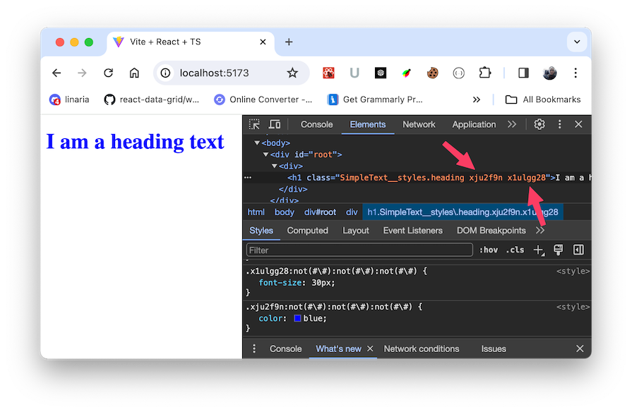
The stylex.create() generates collision-free atomic CSS whose style rules are extracted into a static file at build time. Then, all we have left is the optimized component and the generated atomic CSS in a separate file. We’ve eliminated the runtime costs of CSS-in-JS and retained compatibility with SSR.
If we run the npm run build command, we’ll generate a build folder containing production-ready files, including the static CSS file:

This implementation ensures that CSS and JavaScript resources load in parallel, providing a performance boost. With the atomic CSS approach, StyleX can gain additional performance benefits by minimizing the overall size of the CSS bundle.
If we include additional keys in the stylex.create(), StyleX will take into consideration the order in which styles are applied to the element and not how styles are defined:
import * as stylex from '@stylexjs/stylex';

const styles = stylex.create({
  colorRed: {
    color: 'red',
  },
  base: {
    color: 'blue',
    fontSize: 30,
  },
});

export function SimpleText() {
  return (
    <h1 {...stylex.props(styles.base, styles.colorRed)}>
      I am a heading text
    </h1>
  );
}
This makes StyleX predictable and intuitive. So, in the above code, the last style applied wins! Take a look:
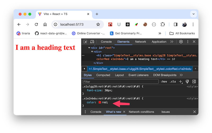
No more worries about conflicting style rules.
One thing that comes to mind — especially if you have used some other libraries like Tailwind CSS — is that StyleX seems more complicated than other styling solutions. However, the benefits are obvious when used alongside reusable UI components or when you work on a more complex design system and style variants.
Let’s see how we can write some more complicated code by styling a reusable UI component.
Button componentThe following code defines a reusable Button component:
import { ComponentProps } from 'react';

type CustomButtonProps = {} & ComponentProps<'button'>;

export function Button({ ...props }: CustomButtonProps) {
  return <button {...props} />;
}
For type safety, we’ve leveraged the ComponentProps type to inherit the standard button element props — like onCLick and className — while also allowing for additional custom props if needed. We can then render the component like so:
<Button>Button</Button>
Note that we haven’t used StyleX yet! We’ll address that next.
Let’s apply default StyleX styles to the button:
// ... other imports
import * as stylex from '@stylexjs/stylex';

type CustomButtonProps = {} & ComponentProps<'button'>;

const btnStyles = stylex.create({
  default: {
    color: '#fff',
    border: 'none',
    backgroundColor: '#0f172a',
    borderRadius: '.25rem',
    height: '2.5rem',
    padding: '0.5rem 1rem',
    cursor: 'pointer',
  },
});

export function Button({ ...props }: CustomButtonProps) {
  return <button {...stylex.props(btnStyles.default)} {...props} />;
}
The button should now look like so:
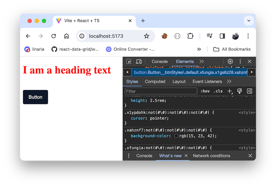
Variants offer a means to adjust the appearance of our button dynamically depending on specific conditions. In our example, we will define variants such as outline, destructive, and ghost. This flexibility ensures a dynamic and personalized user interface.
Let’s define each variant alongside the default namespace:
const btnStyles = stylex.create({
  // ...default style here

  outline: {
    color: '#000',
    backgroundColor: '#feffff',
    border: '1px solid #dbdbdb',
  },
  destructive: {
    backgroundColor: '#f15756',
  },
  ghost: {
    color: '#000',
    backgroundColor: 'transparent',
  },
});
Next, we can apply the relevant styles by using a variant prop as a key within the btnStyles object. If variant is not provided, we retain the default styles:
type CustomButtonProps = {
  variant?: 'outline' | 'destructive' | 'ghost';
} & ComponentProps<'button'>;

const btnStyles = stylex.create({
  // styles...
});

export function Button({ variant, ...props }: CustomButtonProps) {
  return (
    <button
      {...stylex.props(
        btnStyles.default,
        variant && btnStyles[variant]
      )}
      {...props}
    />
  );
}
In stylex.props(), we utilize the && operator to conditionally apply styles when the variant prop is provided. These styles will merge with the default ones, resulting in the intended visual output.
This is a common challenge for many libraries. Tailwind CSS, for example, struggles to effectively merge classes, leading to unintended behavior. However, Tailwind developers often turn to third-party solutions such as tailwind-merge to overcome the obstacle.
If we add the variant prop to our component elements:
<Button>Default</Button>
<Button variant="destructive">Destructive</Button>
<Button variant="ghost">Ghost</Button>
<Button variant="outline">Outline</Button>
The result should look like so:
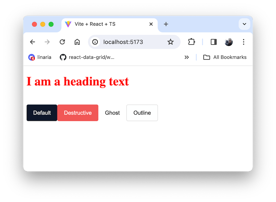
Unlike the majority of libraries, StyleX simplifies the process for end users to override predefined component styles. It can intelligently merge styles across component boundaries.
In the Button component, we will pass a styles prop and append it after the local styles in the stylex.props() function:
type CustomButtonProps = {
  variant?: 'outline' | 'destructive' | 'ghost';
  styles?: stylex.StyleXStyles;
} & ComponentProps<'button'>;

const btnStyles = stylex.create({
  // ...
});

export function Button({
  variant,
  styles,
  ...props
}: CustomButtonProps) {
  return (
    <button
      {...stylex.props(
        btnStyles.default,
        variant && btnStyles[variant],
        styles
      )}
      {...props}
    />
  );
}
We’ve named the prop styles, but you can name whatever you’d like. Notice how we also utilized the StyleXStyles to accept any arbitrary StyleX styles.
Now, we can pass a custom style to the Button component:
const styles = stylex.create({
  button: {
    backgroundColor: 'red',
  },
});

export default function App() {
  return (
    <Button variant="destructive" styles={styles.button}>
      Destructive
    </Button>
  );
}
StyleX simplifies the process of limiting the styles that can be passed to a component. If we specifically want only certain styles to be allowed, we can pass an object type containing the desired properties to StyleXStyles<{...}>:
styles?: stylex.StyleXStyles<{
  color?: string;
  backgroundColor?: string;
}>;
In this instance, we can only supply the color and backgroundColor to the component as follows:
const styles = stylex.create({
  button: {
    color: 'blue',
    backgroundColor: 'red',
  },
});
Trying to pass other styles like fontSize as seen in the code below will result in a type error:
const styles = stylex.create({
  button: {
    // ...
    fontSize: 30
  },
});
Conversely, rather than allowing certain styles with StyleXStyles, we may want to disallow specific properties with StyleXStylesWithout:
styles?: stylex.StyleXStylesWithout<{
  backgroundColor: unknown;
}>;
In this case, we can pass any StyleX properties except the backgroundColor. Otherwise, we’ll get a type error:
const styles = stylex.create({
  button: {
    color: 'blue',
    // backgroundColor: 'red',
  },
});
This extra level of type safety is extremely nice!
To handle pseudo-selectors with StyleX, we can nest the selector within StyleX style properties. For instance, we can handle the hover state pseudo-class for our reusable Button component like so:
const btnStyles = stylex.create({
  default: {
    // ...
    opacity: {
      default: 1,
      ':hover': 0.8,
    },
  },
  outline: {
    color: '#000',
    backgroundColor: {
      default: '#feffff',
      ':hover': '#f3f3f3',
    },
    border: '1px solid #dbdbdb',
  },
  destructive: {
    backgroundColor: '#f15756',
  },
  ghost: {
    color: '#000',
    backgroundColor: {
      default: 'transparent',
      ':hover': '#f3f3f3',
    },
  },
});
In the default namespace, we added a pseudo-class to change the opacity on hover. This applies to the button across various scenarios. We also targeted outline and ghost namespaces and applied pseudo-classes to change the background color on hover.
In the same way, we can apply pseudo-elements and media queries:
const styles = stylex.create({
  button: {
    width: {
      default: 200,
      '@media (max-width: 400px)': '100%',
    },
  },
});
StyleX lets us define custom properties using stylex.defineVars API in a specialized .stylex.ts or .stylex.js file. For instance, we can create a tokens.stylex.ts file and define our variables:
import * as stylex from '@stylexjs/stylex';

const DARK = '@media (prefers-color-scheme: dark)';

export const colors = stylex.defineVars({
  primaryColor: { default: 'white', [DARK]: 'black' },
  primaryDarkColor: { default: 'black', [DARK]: 'white' },
  lightGreyColor: { default: '#f3f3f3', [DARK]: '#605e5e' },
});

export const spacing = stylex.defineVars({
  sizeSm: '.25rem',
  sizeXl: '2.5rem',
});
We’ve defined different values for the variables based on the user’s or device’s preferred color scheme. StyleX will handle the stylex.defineVars at compile time, generating CSS variable names for the corresponding tokens automatically.
To use the variables, we can import them and use them within stylex.create:
import { colors, spacing } from '../../tokens.stylex';
// ...
const btnStyles = stylex.create({
  default: {
    color: colors.primaryColor,
    border: 'none',
    backgroundColor: colors.primaryDarkColor,
    borderRadius: spacing.sizeSm,
    height: spacing.sizeXl,
    // ...
  },
  outline: {
    color: colors.primaryDarkColor,
    backgroundColor: {
      default: colors.primaryColor,
      ':hover': colors.lightGreyColor,
    },
    border: '1px solid #dbdbdb',
  },
  destructive: {
    backgroundColor: '#f15756',
  },
  ghost: {
    color: colors.primaryDarkColor,
    // ...
  },
});
StyleX also supports dynamic styling at runtime, drawing inspiration from Linaria’s approach to generating CSS custom properties.
To implement dynamic styling, we define styles as a function and pass in the dynamic value. In the following code, we utilize the component state to determine the Button’s opacity, simulating asynchronous form submission:
const styles = stylex.create({
  // ...
  dynamicStyle: (value) => ({
    opacity: value,
  }),
});

export default function App() {
  const [isSubmitting, setIsSubmitting] = useState(false);

  const handleButtonClick = async () => {
    // Simulate an asynchronous form submission
    setIsSubmitting(true);
    await new Promise((resolve) => setTimeout(resolve, 2000)); // Simulating a delay
    setIsSubmitting(false);
  };

  return (
    <div>
      {/* ... */}
      <Button
        onClick={handleButtonClick}
        styles={styles.dynamicStyle(isSubmitting ? 0.5 : 1)}
      >
        {isSubmitting ? 'Submitting...' : 'Submit'}
      </Button>
    </div>
  );
}
See the result below:
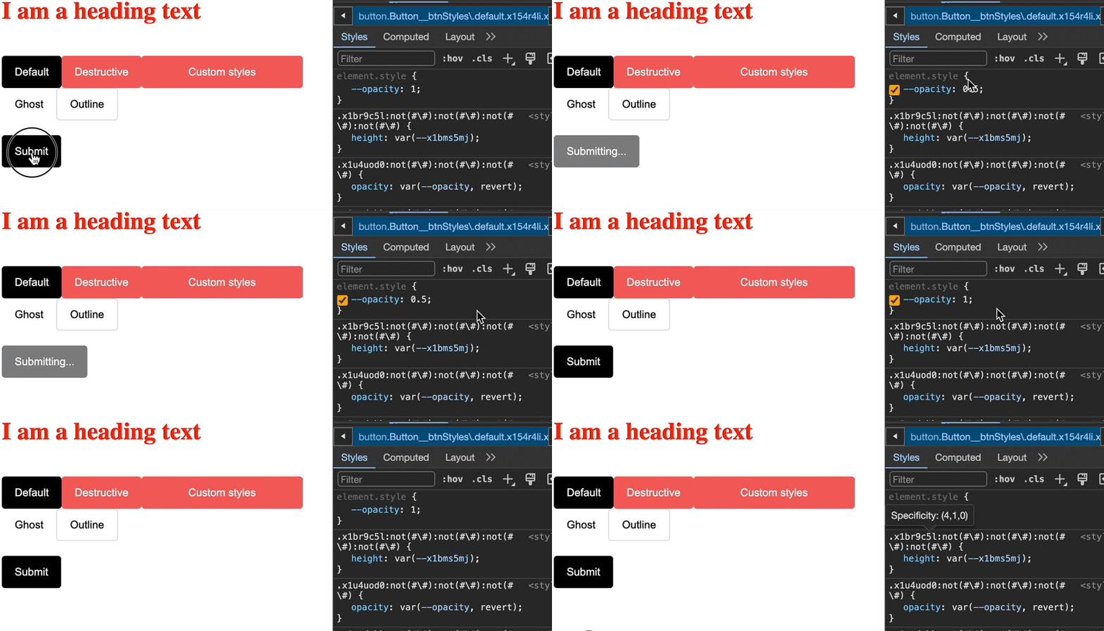
As expected, StyleX will generate static styles, but will now depend on a CSS variable. This variable is dynamically updated at runtime, as seen in the GIF above.
There is a misconception in some quarters that StyleX is positioned as a Tailwind killer. However, this assertion is inaccurate. StyleX does not aim to replace Tailwind — rather, it serves a different purpose in the realm of styling.
While Tailwind excels in facilitating quickstarts and works well for standalone projects, StyleX addresses significant challenges commonly encountered in large-scale enterprise projects. Specifically, StyleX deals with the ability to seamlessly predict, merge, and compose styles across packages.
StyleX accommodates individuals who may not align with Tailwind’s approach but are looking for a type-safe CSS-in-JS solution without incurring runtime overhead.
As CSS undergoes continual transformation, our tools also keep getting updated. This guide delved into styling libraries, placing a spotlight on StyleX.
Throughout this tutorial, we discussed the nuances of StyleX, examining its advantages and drawbacks. With this understanding, you are now equipped to make an informed decision on whether StyleX is the right solution for your needs in the ever-changing world of web styling.
If you have questions or contributions, share your thoughts in the comment section. And if you enjoyed the article, share it with the world.
See the project code on GitHub.
LogRocket lets you replay user sessions, eliminating guesswork by showing exactly what users experienced. It captures console logs, errors, network requests, and pixel-perfect DOM recordings — compatible with all frameworks, and with plugins to log additional context from Redux, Vuex, and @ngrx/store.
With Galileo AI, you can instantly identify and explain user struggles with automated monitoring of your entire product experience.
Modernize how you understand your web and mobile apps — start monitoring for free.

A step-by-step guide to building your first MCP server using Node.js, covering core concepts, tool design, and upgrading from file storage to MySQL.

Using security headers in your Next.js apps is a highly effective way to secure websites from common security threats.

A deep dive into April 2026’s AI model and tool rankings. We break down performance, usability, pricing, and real-world capabilities across 50+ features to help you pick the right tools for your development workflow.

A practical guide to Agent Browser CLI. Learn how AI agents navigate, snapshot, and interact with web pages using stable references, enabling efficient automation and exploratory testing.
Would you be interested in joining LogRocket's developer community?
Join LogRocket’s Content Advisory Board. You’ll help inform the type of content we create and get access to exclusive meetups, social accreditation, and swag.
Sign up now