Draggable and DragTarget
Drag-and-drop has been around since most of us started using computers. We use the drag-and-drop feature in the Gmail app to move addresses between the To and CC fields. Most image hosting services provide a similar feature to upload images. Some meal delivery apps allow you to customize your order using drag-and-drop. And so on.

In simple terms, a drag-and-drop interaction occurs when the user selects an item, drags it to another point on the screen, and then releases it. It’s designed to mimic the way we pick up and move things in the real world.
In this tutorial, we’ll demonstrate how to build drag-and-drop interactions in a Flutter app using Draggable, DragTarget, and LongPressDraggable. We’ll also walk through some practical examples to show you how these widgets work together to produce engaging drag-and-drop experiences for your users.
We’ll cover the following in detail:
If you’re a visual learner, check out this quick video tutorial:
Draggable (Flutter Widget of the Week)
Use Draggable to move and drag your widgets around. You can use it to build UIs for swapping around email addresses in an email or documents to a new folder. Learn more about Draggable → http://bit.ly/2IJ8pqt Learn everything about Flutter at → https://bit.ly/2GoxCCS Get more tips! → https://bit.ly/2Njce4W Subscribe!
The Replay is a weekly newsletter for dev and engineering leaders.
Delivered once a week, it's your curated guide to the most important conversations around frontend dev, emerging AI tools, and the state of modern software.
Draggable widgetDraggable is a Flutter widget that you can drag or move around. As soon as the user click and starts dragging the Draggable widget, a new feedback widget appears and follows the user’s finger or mouse pointer. When the user lifts the finger or mouse pointer, the feedback widget disappears.
Let’s walk through how to create a Draggable widget. The finished product will look like this:
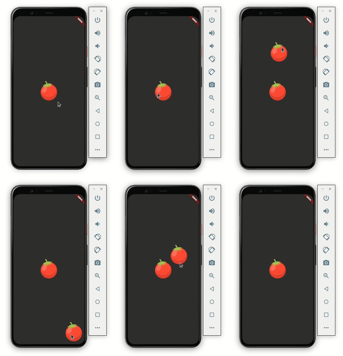
Here’s the code to get it working:
Scaffold(
    body: Container(
  child: Center(
    child: Column(
      mainAxisAlignment: MainAxisAlignment.center,
      children: [
        Draggable<String>(
          // Data is the value this Draggable stores.
          data: 'red',
          child: Container(
            height: 120.0,
            width: 120.0,
            child: Center(
              child: Image.asset('assets/images/tomato.png'),
            ),
          ),
          feedback: Container(
            height: 120.0,
            width: 120.0,
            child: Center(
              child: Image.asset('assets/images/tomato.png'),
            ),
          ),
        ),
      ],
    ),
  ),
))
Let’s dive a bit deeper into the code.
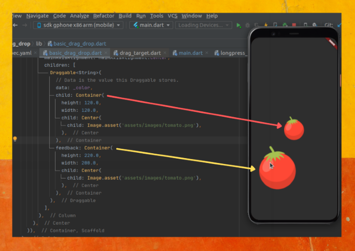
child: Wrap your widget inside the Draggable widget and place it in the child parameter. Here we have the Container with a tomato imagedata: Each Draggable should hold some data. This data will be used by DragTarget (as we’ll see later). In the code above, we are giving the string data as redfeedback: You can write any widget here that you would like to appear below the user’s finger or mouse pointer. For a better user experience, you should keep the same widget as a child. This gives the user a feeling of actually dragging the item. You may change the size or shape of this widget a bit to enhance the dragging experience, like this: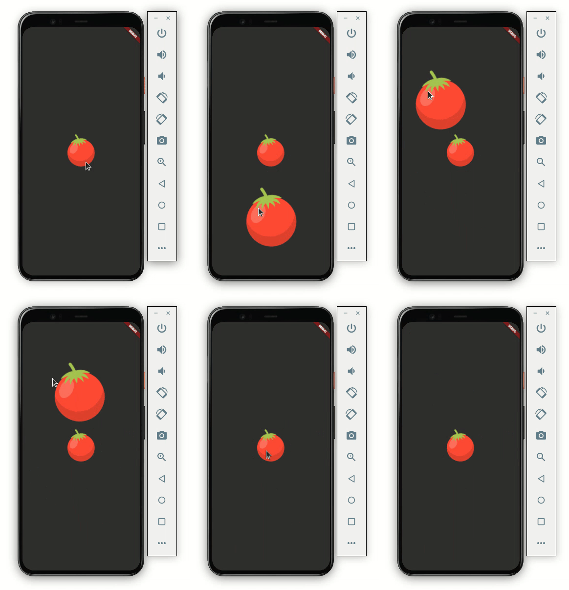
Here’s how the code is translated into the design:
At this point, we are able to drag the image. But if you notice, you’ll see that when the image is being dragged, the actual image stays as-is. Users may get confused if we don’t change or remove it.
Let’s change the image:
Draggable<String>(
  // Data is the value this Draggable stores.
  data: _color,
  child: Container(
    height: 120.0,
    width: 120.0,
    child: Center(
      child: Image.asset('assets/images/tomato.png'),
    ),
  ),
  feedback: Container(
    height: 120.0,
    width: 120.0,
    child: Center(
      child: Image.asset('assets/images/tomato.png'),
    ),
  ),
  //New
  childWhenDragging: Container(
    height: 120.0,
    width: 120.0,
    child: Center(
      child: Image.asset('assets/images/tomato_greyed.png'),
    ),
  ),
)
Adding a widget to the childWhenDragging property will fix the issue. In the code above, we’re showing the tomato image with a grey background. It looks like this:
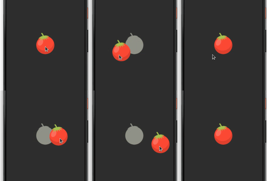
You can also completely remove the image by writing the empty container, which looks like this:
childWhenDragging: Container(),
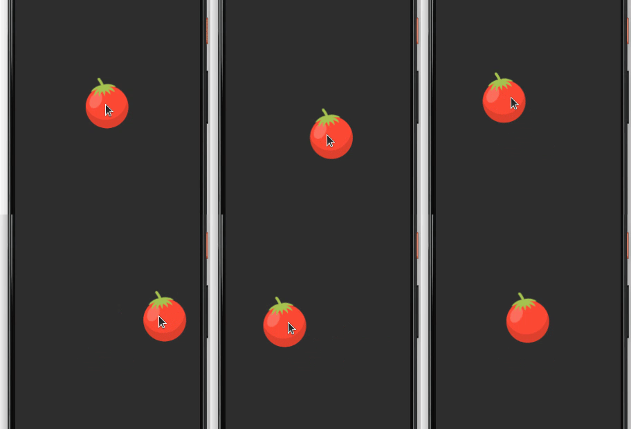
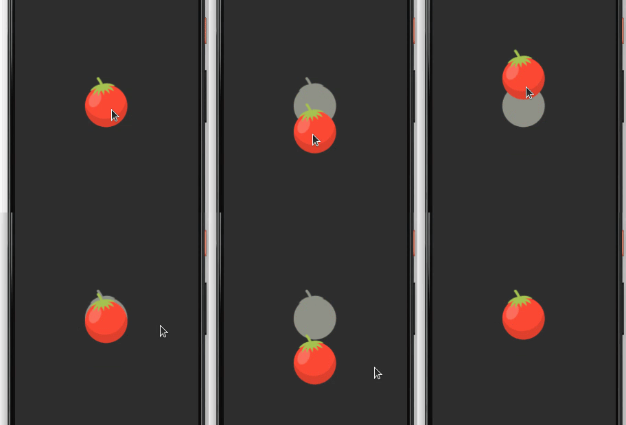
You may want to drag the item in a fixed direction, either vertically or horizontally. Setting the axis parameter will allow the item to be dragged in the axis of your choice.
axis: Axis.vertical
The above code will result in the following output:
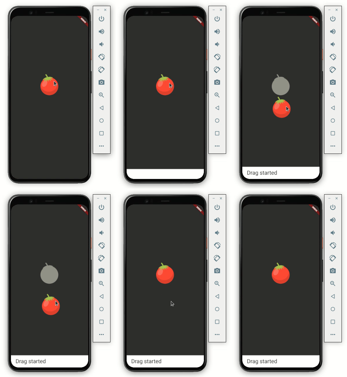
The Draggable widget enables you to listen to drag events. You can use these events to trigger some action, such as removing the item itself or notifying the user.
Below are the events you can listen to.
onDragStarted: You will get a callback as soon as the user starts moving the itemonDragEnd: This is called immediately when the item is dropped anywhere on the screen It gives the additional details for the item whether it was successfully dropped in the dropping area or not.onDraggableCanceled: This is called when the item does not drop successfully or the user lifts their finger or mouse pointeronDragCompleted: You’ll get a callback when the item is successfully dropped in the dropping regionHere’s how you add onDragStarted:
onDragStarted: () {
  showSnackBarGlobal(context, 'Drag started');
},
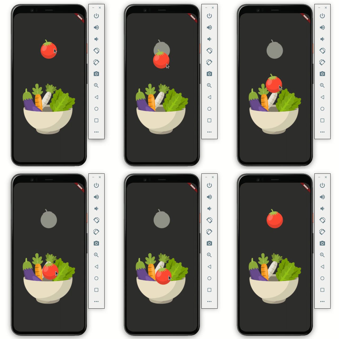
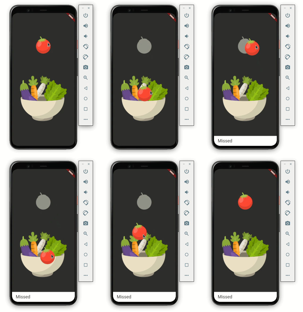
DragTarget widgetDragging an item is cool, but it’s of no use if we can’t drop it somewhere. Let’s try to drop our item on the DragTarget widget.
DragTarget receives the Draggable widget; more specifically, it takes the data that is carried by the Draggable widget. DragTarget has methods to decide whether to accept the Draggable widget based on the data.
Let’s design a Draggable widget that looks like this:
Here’s how you do it:
Scaffold(
    body: Container(
  child: Center(
    child: Column(
      mainAxisAlignment: MainAxisAlignment.center,
      children: [
        Draggable<String>(
          ...
         ),

        DragTarget<String>(
          builder: (
            BuildContext context,
            List<dynamic> accepted,
            List<dynamic> rejected,
          ) {
            return Container(
              height: 300,
              width: 300,
              child: Center(
                child: Image.asset(_isDropped
                    ? 'assets/images/bowl_full.png'
                    : 'assets/images/bowl.png'),
              ),
            );
          },
        ),
      ],
    ),
  ),
))
Simply wrap your widget inside the DragTarget . Here we’re showing a bowl image as the drag target for the tomato image.
At this point, we are still not able to drop the item in the DragTarget. So let’s see how we can allow the item to drop:
DragTarget<String>(
  builder: (
    BuildContext context,
    List<dynamic> accepted,
    List<dynamic> rejected,
  ) {
    ...
  },
  onWillAccept: (data) {
    return data == 'red';
  },
  onAccept: (data) {
    setState(() {
      showSnackBarGlobal(context, 'Dropped successfully!');
      _isDropped = true;
    });
  },
),
Add two methods called onWillAccept and onAccept.
onWillAccept is called whenever the item is dropped over the DragTarget. We can use this method to retrieve the data carried by the Draggable widget and decide whether to accept the item or not. In the code above, we accept the tomato image if it carries that string as redonAccept is a callback that we should receive once the item is accepted by the DragTarget. We are showing the success message and updating the _isDropped variable. _isDropped is used to change the image of the bowl to show the tomato inside the bowl imageHere’s how it looks now:

If you want to notify the user when the item is left without being dropped into a droppable area, just add one more method called onLeave:
onLeave: (data) {
  showSnackBarGlobal(context, 'Missed');
},
LongPressDraggableLongPressDraggable is another draggable widget. The only difference between LongPressDraggable and Draggable is that LongPressDraggable allows you to drag the item on long-pressing over it while the Draggable can be dragged instantly.
LongPressDraggable is useful when the item you want to drag is inside a list. For example, you should use LongPressDraggable over Draggable when you want to move a photo from the gallery to somewhere else, like so:
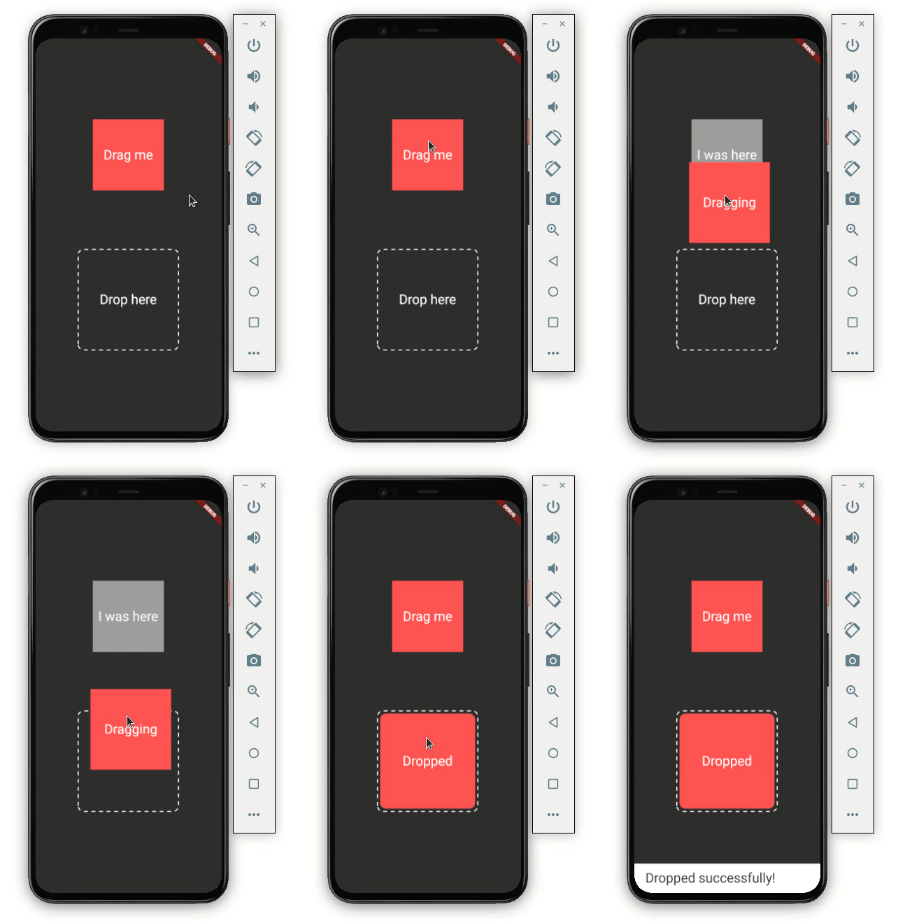
As you can see in the GIF above, the red, square-shaped item is ready to be dragged, but only if the user does a long-press over it.
Here’s the code:
Scaffold(
    body: Container(
  child: Center(
    child: Column(
      mainAxisAlignment: MainAxisAlignment.center,
      children: [
        LongPressDraggable<String>(
          // Data is the value this Draggable stores.
          data: _color,
          child: Container(
            height: 150.0,
            width: 150.0,
            color: Colors.redAccent,
            child: const Center(
              child: Text(
                'Drag me',
                textScaleFactor: 2,
              ),
            ),
          ),
          feedback: Material(
            child: Container(
              height: 170.0,
              width: 170.0,
              decoration: BoxDecoration(
                color: Colors.redAccent,
              ),
              child: const Center(
                child: Text(
                  'Dragging',
                  textScaleFactor: 2,
                ),
              ),
            ),
          ),
          childWhenDragging: Container(
            height: 150.0,
            width: 150.0,
            color: Colors.grey,
            child: const Center(
              child: Text(
                'I was here',
                textScaleFactor: 2,
              ),
            ),
          ),
        ),
        SizedBox(
          height: MediaQuery.of(context).size.height * 0.15,
        ),
        DragTarget<String>(
          builder: (
            BuildContext context,
            List<dynamic> accepted,
            List<dynamic> rejected,
          ) {
            return DottedBorder(
              borderType: BorderType.RRect,
              radius: Radius.circular(12),
              padding: EdgeInsets.all(6),
              color: Colors.white,
              strokeWidth: 2,
              dashPattern: [8],
              child: ClipRRect(
                borderRadius: BorderRadius.all(Radius.circular(12)),
                child: Container(
                  height: 200,
                  width: 200,
                  color: _isDropped ? Colors.redAccent : null,
                  child: Center(
                      child: Text(
                    !_isDropped ? 'Drop here' : 'Dropped',
                    textScaleFactor: 2,
                  )),
                ),
              ),
            );
          },
          onAccept: (data) {
            debugPrint('hi $data');
            setState(() {
              showSnackBarGlobal(context, 'Dropped successfully!');
              _isDropped = true;
            });
          },
          onWillAccept: (data) {
            return data == _color;
          },
          onLeave: (data) {
            showSnackBarGlobal(context, 'Missed');
          },
        ),
      ],
    ),
  ),
))
Most of the code is the same as we discussed previously; just replace the Draggable widget with LongPressDraggable.
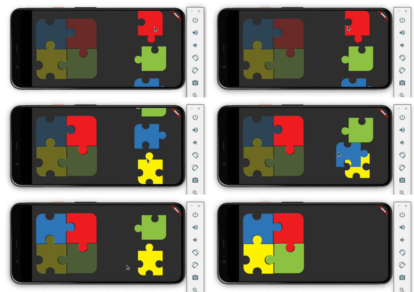
Now that you know how to implement a drag-and-drop interaction in Flutter, you should be able to build anything on your own. To test our skills, let’s try to build a very basic jigsaw puzzle.
Here’s what we’ll build:
First, force the app to open only in landscape mode:
void main() {
  WidgetsFlutterBinding.ensureInitialized();
  SystemChrome.setPreferredOrientations(
      [DeviceOrientation.landscapeRight, DeviceOrientation.landscapeLeft]).then(
    (_) => runApp(MyApp()),
  );
}
Next, define the variable that holds the status of puzzle pieces (whether they’re placed successfully or not):
bool _isBlueDropped = false;
bool _isRedDropped = false;
bool _isYelloDropped = false;
bool _isGreenDropped = false;
String _blue = 'blue';
String _red = 'red';
String _yellow = 'yellow';
String _green = 'green';
Create the Stack of four DragTarget widgets. Arrange it with the help of the Position widget so that it looks like a 2×2 puzzle:
Stack(
  children: [
    Positioned(
      top: 0,
      left: 0,
      child: DragTarget<String>(),
    ),
    Positioned(
      top: 0,
      right: 0,
      child: DragTarget<String>(),
    ),
    Positioned(
      bottom: 0,
      left: 0,
      child: DragTarget<String>(),
    ),
    Positioned(
      bottom: 0,
      right: 0,
      child: DragTarget<String>(),
    ),
  ],
)
Now create a list of puzzle pieces. Each puzzle piece is a Draggable widget.
SingleChildScrollView(
  child: Column(
    children: [
      Visibility(
        visible: !_isRedDropped,
        child: Draggable<String>(),
      ),
      Visibility(
        visible: !_isGreenDropped,
        child: Draggable<String>(),
      ),
      Visibility(
        visible: !_isBlueDropped,
        child: Draggable<String>(),
      ),
      Visibility(
        visible: !_isYelloDropped,
        child: Draggable<String>(),
      ),
    ],
  ),
),
The puzzle piece in the list is hidden as soon as it is placed correctly. The visibility is managed using the variables we defined earlier.
That’s it! The full source code is available on GitHub.
In this tutorial, we learned how to build a drag-and-drop interaction in Flutter. We learned how to use various widgets such as Draggable, DragTarget, and LongPressDraggable with practical examples. Finally, we demonstrated how to develop a simple jigsaw puzzle using the widgets and skills described in this tutorial.
Install LogRocket via npm or script tag. LogRocket.init() must be called client-side, not
server-side
$ npm i --save logrocket

// Code:

import LogRocket from 'logrocket';
LogRocket.init('app/id');
// Add to your HTML:

<script src="https://cdn.lr-ingest.com/LogRocket.min.js"></script>
<script>window.LogRocket && window.LogRocket.init('app/id');</script>

useEffect breaks AI streaming responses in ReactSee why useEffect breaks AI streaming in React, and how moving stream state outside React fixes flicker and stale updates.

A real-world debugging session using Claude to solve a tricky Next.js UI bug, exploring how AI helps, where it struggles, and what actually fixed the issue.

CSS wasn’t built for dynamic UIs. Pretext flips the model by measuring text before rendering, enabling accurate layouts, faster performance, and better control in React apps.

Why do real-time frontends break at scale? Learn how event-driven patterns reduce drift, race conditions, and inconsistent UI state.
Hey there, want to help make our blog better?
Join LogRocket’s Content Advisory Board. You’ll help inform the type of content we create and get access to exclusive meetups, social accreditation, and swag.
Sign up now