Mega menus are popular when designing feature-rich navigation systems on websites. They differ from conventional dropdown menus in that they can more quickly reveal deeply nested website menus, offering an efficient way to navigate through a large amount of content.

Common use cases for mega menus include ecommerce websites, real estate websites, or any other large websites that require hierarchical organization of information. In this guide, we will explore how to create a responsive and accessible mega menu from scratch using React.
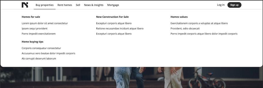
By the end of this tutorial, we will have constructed a menu resembling the one below:
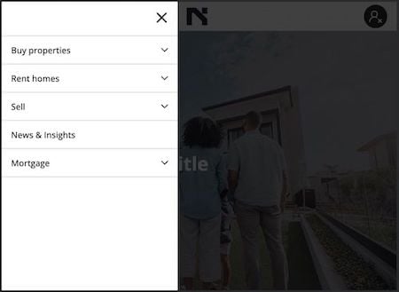
This mega menu is responsive for display on smaller screens as well, like so:
You can interact with the final project here and check out the source code here. Now, let’s get started!
Despite the many advantages offered by UI libraries, they do pose some challenges, such as the learning curve and bloated code that may accompany them. Additionally, their predefined styles can limit our ability to fully customize the appearance and behavior of the mega menu.
Choosing to build a component from scratch empowers us with complete control over its design, behavior, and functionality.
Before diving into the code, it’s essential to plan the structure of our mega menu. As we’ve seen in the preview images above and the live project, the web application also showcases other components, like the hero banner.
To focus on the mega menu feature, we have provided a starter React project in which we can integrate a mega menu component. In the next section, we’ll clone the project and get started with the code.
Let’s clone and run a React starter project created with Vite. Open the terminal and run the following commands:
git clone [email protected]:Ibaslogic/mega-menu-starter.git
cd mega-menu-starter
npm install
npm run dev
The frontend should display without the navigation menus:

The structure for the starter project looks like this:
mega-menu-starter/
|-- src/
|   |-- components/
|   |    |-- ...
|   |    |-- Navigation.jsx
|   |-- routes/
|   |-- index.css
|   |-- main.jsx
We’ve implemented routing with react-router-dom, and the icons used in the project come from Lucide React. This lets us focus on implementing a mega menu.
You can find the route components in the src/routes folder. The index.css file contains the entire project style rules, while the components/Navigation.jsx file renders what we currently see at the top bar — i.e., the logo and two buttons labeled Log in and Sign up, respectively.
The Navigation.jsx file will also contain the code for the mega menu.
MegaMenu componentLet’s create a components/MegaMenu.jsx file and add a simple MegaMenu component:
const MegaMenu = () => {
  return (
    <div className="nav__container">
      <nav>mega menu items</nav>
    </div>
  );
};

export default MegaMenu;
Next, we need to set up the code to implement the mega menu on larger screens and smaller screens. Let’s start with the code for larger screens.
Inside the Navigation.jsx file, add the MegaMenu between the logo and the user profile:
// ...
import MegaMenu from './MegaMenu';

const Navigation = () => {
  return (
    <header className="nav__header">
      {/* logo here */}
      <div className="hidden md:block">
        <MegaMenu />
      </div>
      {/* UserProfile */}
    </header>
  );
};

export default Navigation;
We’ve wrapped the MegaMenu component inside a div with hidden and md:block classes. These classes ensure the MegaMenu only shows on larger screens. We’ve defined the style rules in the src/index.css file:
.hidden {
  display: none;
}

@media (min-width: 996px) {
  .md\:block {
    display: block;
  }
}
Later, we will reuse the MegaMenu component inside a navigation drawer for smaller screens.
To ensure our mega menu can scale as we like, we must carefully structure the menu data using an array of objects. Let’s create a src/menuData.js file and copy the menu data from the project into the newly created file. The structure should look like so:
export const menuData = [
  {
    label: 'Buy properties',
    href: '/buy',
    children: [
      {
        heading: 'Homes for sale',
        submenu: [
          {
            label: 'Lorem ipsum dolor sit amet consectetur',
            href: '#',
          },
          { label: 'Ipsam sequi provident', href: '#' },
          { label: 'Porro impedit exercitationem', href: '#' },
        ],
      },
      // ...
    ],
  },
  // ...
  { label: 'News & Insights', href: '/news' },
]
Each object represents a menu item node in the navigation. A mega menu item has a children property with a value representing the nested levels of content in the mega dropdown.
In the MegaMenu.jsx file, let’s import the menuData array and loop through it to render each menu item:
import { menuData } from '../menuData';
import MenuItem from './MenuItem';

const MegaMenu = () => {
  return (
    <div className="nav__container">
      <nav>
        <ul>
          {menuData.map(({ label, href, children }, index) => {
            return (
              <MenuItem key={index} {...{ label, href, children }} />
            );
          })}
        </ul>
      </nav>
    </div>
  );
};

export default MegaMenu;
In this code, we render a MenuItem component to handle each of the menu items. Let’s create a components/MenuItem.jsx file and add the following code:
import { NavLink } from 'react-router-dom';

const MenuItem = ({ label, href, children }) => {
  return (
    <li>
      <div className="nav_item_content">
        <NavLink
          to={href}
          className={({ isActive }) => (isActive ? 'active' : '')}
        >
          {label}
        </NavLink>
      </div>
      {children && <div className="dropdown">dropdown content</div>}
    </li>
  );
};

export default MenuItem;
For every li item, the code checks if a children property exists to render a mega dropdown.
With the .dropdown class, we set the mega menu to be initially hidden and then displayed on hover. Also, we’ve positioned the dropdown absolutely below the menu item:
.dropdown {
  position: absolute;
  /* ... */
  visibility: hidden;
}

.nav__container ul li:hover .dropdown {
  visibility: visible;
}
See the expected result below:

Presently, the dropdown only displays some placeholder text reading dropdown content. We will render some dummy content that more closely resembles real content next.
First, update the MenuItem.jsx file to render a DropdownContent component and pass along the children array via the submenuscontent prop:
// ...
import Container from './Container';
import DropdownContent from './DropdownContent';

const MenuItem = ({ label, href, children }) => {
  return (
    <li>
      {/* ... */}
      {children && (
        <div className="dropdown">
          <Container>
            <DropdownContent submenuscontent={children} />
          </Container>
        </div>
      )}
    </li>
  );
};

export default MenuItem;
Next, let’s create a DropdownContent.jsx file and grab the submenuscontent prop, loop through it, and render the mega menu content block:
import React from 'react';
import { Link } from 'react-router-dom';

const DropdownContent = ({ submenuscontent }) => {
  return (
    <div className="dropdown_content">
      {submenuscontent.map((item, index) => (
        <React.Fragment key={index}>
          <section>
            <h4>{item.heading}</h4>
            <ul>
              {item.submenu.map(({ label, href }, index) => (
                <li key={index}>
                  <Link to={href}>{label}</Link>
                </li>
              ))}
            </ul>
          </section>
        </React.Fragment>
      ))}
    </div>
  );
};

export default DropdownContent;
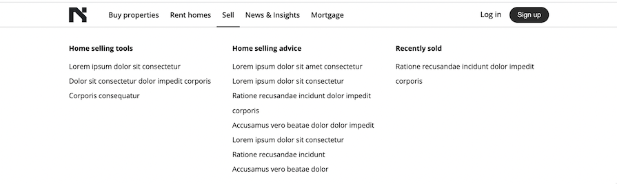
The expected mega menu dropdown content should now render under each menu item on hover:
To handle mobile navigation, we will trigger a sidebar drawer when we click the hamburger button. Inside this drawer, we will reuse the MegaMenu component.
In the components/Navigation.jsx file, let’s add the <MobileNavigationDrawer /> component after the <UserProfile /> component:
import { useState } from 'react';
// ...

const Navigation = () => {
  const [isDrawerOpen, setIsDrawerOpen] = useState(false);

  return (
    <header className="nav__header">
      <Container>
        <div className="toolbar">
          <button
            //...
            onClick={() => setIsDrawerOpen(true)}
          >
            {/* Mobile Hamburger menu */}
            <AlignJustify />
          </button>
          {/* Userprofile */}
          <div className="md:hidden absolute">
            <MobileNavigationDrawer
              {...{ isDrawerOpen, setIsDrawerOpen }}
            />
          </div>
        </div>
      </Container>
    </header>
  );
};

export default Navigation;
In this code, we wrapped the MobileNavigationDrawer in a div that hides the component on large screens.
We added an onClick event on the hamburger button to update the isDrawerOpen state value to true when the button is clicked. We then passed the isDrawerOpen state and setIsDrawerOpen setter to MobileNavigationDrawer so we can conditionally render the drawer and control the state, respectively.
Let’s create the MobileNavigationDrawer component and use the isDrawerOpen and setIsDrawerOpen props:
import { X } from 'lucide-react';
import MegaMenu from './MegaMenu';

const MobileNavigationDrawer = ({
  isDrawerOpen,
  setIsDrawerOpen,
}) => {
  return (
    <div className="mobile_navigation">
      {isDrawerOpen && (
        <div
          className="backdrop"
          onClick={() => setIsDrawerOpen(false)}
        ></div>
      )}

      <div
        className={`drawer_content ${isDrawerOpen ? 'active' : ''}`}
      >
        <div className="close_drawer">
          <button onClick={() => setIsDrawerOpen(false)}>
            <X size={30} />
          </button>
        </div>
        <div>
          <MegaMenu />
        </div>
      </div>
    </div>
  );
};

export default MobileNavigationDrawer;
We’ve used the isDrawerOpen state to dynamically render a backdrop and to apply the .active class to toggle the navigation drawer. We’ve also added a click event to reset the state and close the drawer when the user clicks the backdrop or the close button.
With the .drawer_content class, we’ve created a sliding drawer effect using the following CSS:
.drawer_content {
  /* ... */
  transition: 0.5s;
  transform: translateX(-100%);
}

.drawer_content.active {
  transform: translateX(0);
}
By default, the drawer is positioned off-screen to the left. When the .active class is added, it smoothly transitions to its original position, making it visible on the screen.
See the expected result below:

We’ll add caret icons, or up and down arrows, for users to toggle the mobile submenus. We’ll also implement logic that allows one expansion at a time. If you read our previous lesson on building an accordion widget, you may recall that we covered this functionality.
By utilizing the index of the menu item, we can detect which of the items is active and only expand or collapse the active item’s dropdown.
Let’s open the MobileNavigationDrawer component file and add a state to handle the clicked item:
import { useState } from 'react';
// ...
const MobileNavigationDrawer = ({...}) => {
  const [clicked, setClicked] = useState(null);

  const handleToggle = (index) => {
    if (clicked === index) {
      return setClicked(null);
    }

    setClicked(index);
  };

  return (
    // ...
      <MegaMenu
        handleToggle={handleToggle}
        clicked={clicked}
      />
    //   ...
  );
};

export default MobileNavigationDrawer;
We’ll hook the handleToggle handler to the caret icon’s button — which we’ll create in a moment — so it can trigger a state update when the button is clicked. This handleToggle handler expects the item index to update the state.
Since we have passed the handler and the state to the MegaMenu component, let’s grab and utilize them:
const MegaMenu = ({ handleToggle, clicked }) => {
  return (
    <div className="nav__container">
      <nav>
        <ul>
          {menuData.map(({ label, href, children }, index) => {
            return (
              <MenuItem
                // ...
                onToggle={() => handleToggle && handleToggle(index)}
                active={clicked === index}
              />
            );
          })}
        </ul>
      </nav>
    </div>
  );
};

export default MegaMenu;
We can now use the Boolean value returned by the active prop to conditionally expand or collapse the submenus. We’ll also use the prop to render caret icons.
Now, in the MenuItem component file, grab the props, and render the caret button after the item link:
// ...
import { ChevronDown, ChevronUp } from 'lucide-react';

const MenuItem = ({ label, href, children, onToggle, active }) => {
  return (
    <li>
      <div className="nav_item_content">
        <NavLink ...>{label}</NavLink>
        {children && (
          <button
            className="md:hidden"
            onClick={onToggle}
          >
            {active ? (
              <ChevronUp size={20} />
            ) : (
              <ChevronDown size={20} />
            )}
          </button>
        )}
      </div>
      {/* ... */}
    </li>
  );
};

export default MenuItem;
Next, in the same file, find the following code:
{children && (
  <div className="dropdown">
    <Container>
      <DropdownContent submenuscontent={children} />
    </Container>
  </div>
)}
Replace the code above with the following:
{children && (
  <div
    className={`dropdown ${
      active ? 'h-auto' : 'h-0 overflow-hidden md:h-auto'
    }`}
  >
    <Container>
      <DropdownContent submenuscontent={children} />
    </Container>
  </div>
)}
This code conditionally checks if the active prop is true and then applies a specific class that expands the submenu dropdown. Otherwise, it applies classes that collapse the dropdown. You can open the CSS file to see the style rules.
In traditional websites, any page reloads due to navigation will automatically close drawers. However, in a single-page application like React, we’ll have to take care of this functionality manually.
To do so, we’ll add a click event on the menu items and call the setIsDrawerOpen function when any of the items is clicked. When called, this function will reset the state and close the drawer.
Let’s pass setIsDrawerOpen from the MobileNavigationDrawer component down to the MegaMenu:
<MegaMenu
  // ...
  setIsDrawerOpen={setIsDrawerOpen}
/>
Next, grab the prop from the MegaMenu and further pass it to MenuItem:
const MegaMenu = ({ handleToggle, clicked, setIsDrawerOpen }) => {
  return (
    <div className="nav__container">
      <nav>
        <ul>
          {menuData.map(({ ... }, index) => {
            return (
              <MenuItem
                key={index}
                {...{
                  // ...
                  setIsDrawerOpen,
                }}
              />
            );
          })}
  {/* ... */}
Inside the MenuItem, let’s now add the onClick event and reset the isDrawerOpen state to false. This will close the mobile drawer whenever the primary navigation link is clicked:
const MenuItem = ({
  // ...
  setIsDrawerOpen,
}) => {
  return (
    // ...
    <NavLink
      // ...
      onClick={() => {
        setIsDrawerOpen && setIsDrawerOpen(false);
      }}
    >
      {label}
    </NavLink>
    // ...
  );
};

export default MenuItem;
To ensure the drawer also closes for the children dropdown links, we will pass the setIsDrawerOpen to the DropdownContent:
const MenuItem = ({
  // ...
}) => {
  return (
    <li>
      {/* ... */}
      <Container>
        <DropdownContent
          submenuscontent={children}
          setIsDrawerOpen={setIsDrawerOpen}
        />
      </Container>
      {/* ... */}
    </li>
  );
};
We’ll then access the prop and add the onClick event:
const DropdownContent = ({ submenuscontent, setIsDrawerOpen }) => {
  return (
    // ...
    <li
      key={index}
      onClick={() => {
        setIsDrawerOpen && setIsDrawerOpen(false);
      }}
    >
      ...
    </li>
    // ...
  );
};

export default DropdownContent;
Now we should be able to close the drawer when an item is clicked:

As always, it’s important to ensure the feature we’re creating is accessible. Two ways we can do this for our mega menu include leveraging ARIA roles and attributes and making the menu navigable by keyboard.
Let’s see how to utilize ARIA roles and attributes to convey the intended behavior of our mega dropdown to assistive technology users. Simply update the MenuItem component to include ARIA attributes:
const MenuItem = ({...}) => {
  return (
    <li>
      <div className="nav_item_content">
        {/* item link */}
        {children && (
          <button
            // ...
            aria-label="Toggle dropdown"
            aria-haspopup="menu"
            aria-expanded={active ? 'true' : 'false'}
          >
            {/* caret icon */}
          </button>
        )}
      </div>
      {children && (
        <div
          role="menu"
          // ...
        >
          {/* dropdown content */}
        </div>
      )}
    </li>
  );
};

export default MenuItem;
Here, we’ve added ARIA attributes to the button that opens a menu to indicate the availability and type of popup, along with whether the popup is expanded or collapsed.
We can enable users to navigate our mega menu using desktop and mobile keyboards. Let’s start by implementing desktop keyboard navigation.
Presently, on larger screens, we can open the mega menu on item hover with the following CSS:
.nav__container ul li:hover .dropdown {
  visibility: visible;
}
Let’s ensure keyboard accessibility by also applying a :focus-within CSS pseudo-class to the li:
.nav__container ul li:focus-within .dropdown,
.nav__container ul li:hover .dropdown {
  visibility: visible;
}
This way, if a user focuses on the menu item or any of its descendants via either the tab key or a mouse click, the mega dropdown will open.
Upon clicking a menu item, the mega dropdown will persistently stay open until we click outside of it to remove focus. This unintended consequence results in the dropdown of a hovered item overlapping any previous dropdown.
To address this issue, we will implement a function that ensures the focused element loses its focus when a menu link is clicked. In the MenuItem component, let’s add the handleClick function and invoke it in the onClick:
const MenuItem = ({...}) => {

  const handleClick = () => {
    // Blur the active element to lose focus
    const activeElement = document.activeElement;
    activeElement.blur();
  };

  return (
    <li>
      <div className="nav_item_content">
        <NavLink
          // ...
          onClick={() => {
            setIsDrawerOpen && setIsDrawerOpen(false);
            handleClick();
          }}
        >
          {label}
        </NavLink>
        {/* ... */}
    </li>
  );
};
The handleClick function obtains a reference to the currently active element on the page and calls the blur method to remove focus from the element.
Let’s ensure we do the same for the mega menu items. In the same file, let’s pass the function to the DropdownContent component:
<Container>
  <DropdownContent
    // ...
    handleClick={handleClick}
  />
</Container>
We will grab the handleClick and invoke it in the onClick:
const DropdownContent = ({
  // ...
  handleClick,
}) => {
  return (
    // ...
    <ul>
      {item.submenu.map(({ label, href }, index) => (
        <li
          key={index}
          onClick={() => {
            setIsDrawerOpen && setIsDrawerOpen(false);
            handleClick();
          }}
        >
          {/* ... */}
        </li>
      ))}
    </ul>
    //       ...
  );
};

export default DropdownContent;
Now that we’ve seen how to implement and optimize keyboard navigation for desktop users, let’s turn our attention to mobile keyboard navigation.
Presently, navigating with the tab key works until we open the drawer. As we can see below, the normal tab order is being respected even while the drawer is opened:

However, we want to enable keyboard users to immediately interact with the contents of the drawer once it is opened.
First, when the drawer is opened, we’ll get it to receive focus without having to manually focus on it. In the MobileNavigationDrawer, we’ll obtain a reference to the drawer and apply the focus logic in a useEffect Hook:
import { useState, useRef, useEffect } from 'react';
// ...
const MobileNavigationDrawer = ({}) => {
  const drawerRef = useRef(null);

  useEffect(() => {
    if (isDrawerOpen && drawerRef.current) {
      // Focus the drawer when it opens
      drawerRef.current.focus();
    }
  }, [isDrawerOpen]);

  // ...
  return (
    <div className="mobile_navigation" ref={drawerRef}>
      {/* ... */}
    </div>
  );
};

export default MobileNavigationDrawer;
Next, we’ll use the tabIndex attribute to control the focus behavior of the drawer and its order in the focus navigation. Let’s update the drawer’s div container element in the MobileNavigationDrawer to include the tabIndex:
return (
  <div
    className="mobile_navigation"
    ref={drawerRef}
    tabIndex={isDrawerOpen ? 0 : -1}
  >
    {/* ... */}
  </div>
);
When the drawer opens, the tabIndex is set to 0. This means that the drawer’s container element is focusable, and it will be included in the normal tab order of the document. When the drawer is closed, tabIndex is set to -1, and the drawer’s div is not focusable and removed from the tab order.
See the expected behavior below:

In the GIF above, notice that the hamburger button is not receiving focus when the drawer closes. The expected behavior is for it to receive focus, so let’s fix this now.
In the Navigation component, let’s obtain a reference to the hamburger button and pass it to the MobileNavigationDrawer component:
import { useState, useRef } from 'react';
// ...

const Navigation = () => {
  const drawerButtonRef = useRef(null);
  // ...
  return (
    <header className="nav__header">
      <Container>
        <div className="toolbar">
          <button
            ref={drawerButtonRef}
            // ...
          >
            {/* ... */}
          </button>
          {/* ... */}
          <div className="md:hidden absolute">
            <MobileNavigationDrawer
              {...{ isDrawerOpen, setIsDrawerOpen, drawerButtonRef }}
            />
          </div>
        </div>
      </Container>
    </header>
  );
};

export default Navigation;
Next, in the MobileNavigationDrawer, let’s grab the drawerButtonRef variable:
const MobileNavigationDrawer = ({
  // ...
  drawerButtonRef,
}) => {
  // ...
};

export default MobileNavigationDrawer;
Then, look for the onClick handler that closes the drawer for both the backdrop and the close button:
onClick={() => setIsDrawerOpen(false)}
Update the onClick handler to include the logic that applies focus on the hamburger menu:
onClick={() => {
  setIsDrawerOpen(false);
  // Focus the drawer button when it closes
  if (drawerButtonRef.current) {
    drawerButtonRef.current.focus();
  }
}}
If you test this out now, you should see the expected behavior working correctly.
Esc buttonIn the MobileNavigationDrawer, let’s apply the onKeyDown event to the drawer, listen for when the user clicks the Esc key, and close the mega menu:
const MobileNavigationDrawer = ({...}) => {
  // ...
  const handleKeyDown = (event) => {
    if (event.key === 'Escape') {
      setIsDrawerOpen(false);
    }
  };

  return (
    <div
      // ...
      onKeyDown={handleKeyDown}
    >
      {/* ... */}
    </div>
  );
};

export default MobileNavigationDrawer;
Let’s also ensure we apply focus on the hamburger after the drawer closes. Update the handleKeyDown function to the following:
const handleKeyDown = (event) => {
  if (event.key === 'Escape') {
    setIsDrawerOpen(false);
    // Focus the drawer button when it closes
    if (drawerButtonRef.current) {
      drawerButtonRef.current.focus();
    }
  }
};
The project should now work as expected.
In this comprehensive guide, we’ve covered the step-by-step process of developing a robust, accessible, and responsive mega menu in React. If you enjoyed this lesson, endeavor to share this guide around the web.
See the demo project here and the source code here.
Install LogRocket via npm or script tag. LogRocket.init() must be called client-side, not
server-side
$ npm i --save logrocket

// Code:

import LogRocket from 'logrocket';
LogRocket.init('app/id');
// Add to your HTML:

<script src="https://cdn.lr-ingest.com/LogRocket.min.js"></script>
<script>window.LogRocket && window.LogRocket.init('app/id');</script>

Explore why npm dependencies are a major supply chain security risk and how to protect JavaScript apps from compromised packages and transitive threats.

Enabled React Compiler v1.0 on a production Next.js app. Here’s every warning, breakage, and silent opt-out I documented — and what actually worked.

We built the same app in TanStack Start RSC and Next.js RSC. TanStack shipped 40% less JS and built 4x faster — but Next.js is still the safer production bet.

From RSC vulnerabilities and the Vercel breach to TypeScript 7.0 Beta and AI agents — the nine frontend storylines that defined H1 2026, ranked.
Hey there, want to help make our blog better?
Join LogRocket’s Content Advisory Board. You’ll help inform the type of content we create and get access to exclusive meetups, social accreditation, and swag.
Sign up now

 Learn more →
