Editor’s Note: This blog post was reviewed for accuracy on 4 April 2023. You can also read our blog post on creating multi-level dropdown menus in React.

When it comes to adding styling and other specific requirements to your application, adapting an existing component into your project might not always go as smoothly as you’d like. Considering the time you might spend on the adaptation process, building your own component may be in your best interest.
A dropdown component, which is a custom version of the dropdown select option with extended styles, sorts and filters content on webpages. In this tutorial, we’ll walk through an approach that I’ve followed in my personal projects to create a custom dropdown menu component in React.
For the complete source code and the styling files, you can refer to the GitHub repo. Let’s get started!
Before diving into the technical stuff, let’s quickly understand the visual structure of the dropdown menu component to decide on the requirements:
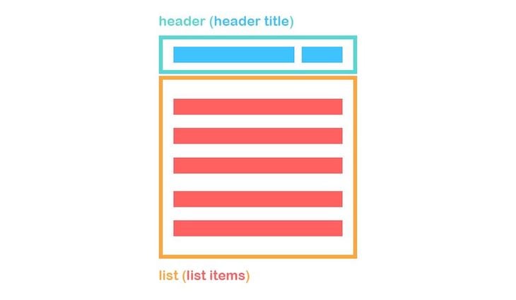
A dropdown menu consists of four basic components: the header wrapping, header title, list wrapping, and list items.
The corresponding HTML would look like the following code:
<div className="dd-wrapper">
  <div className="dd-header">
    <div className="dd-header-title"></div>
  </div>
  <div className="dd-list">
    <button className="dd-list-item"></button>
    <button className="dd-list-item"></button>
    <button className="dd-list-item"></button>
  </div>
</div>
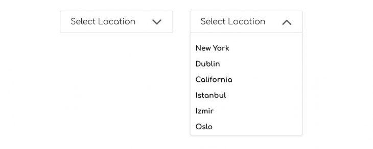
We need to be able to toggle the dd-list upon clicking dd-header and close it when the user clicks outside of the dd-wrapper. We also need to populate the <button> tags automatically based on the data, and we need to be able to dynamically control the header title.
Keep in mind that you should not use a dropdown component if you are looking to display and compare nested items, or if you only have two options to choose from. In that case, a radio button would be a better option.
A parent component holds a single or multiple dropdown menus. Since each dropdown menu has unique content, we need to parameterize it by passing information as props. Let’s imagine that we have a dropdown menu where we can select multiple locations.
Consider the following state variable inside the parent component:
constructor(){
  super()
  this.state = {
    location: [
      {
          id: 0,
          title: 'New York',
          selected: false,
          key: 'location'
      },
      {
          id: 1,
          title: 'Dublin',
          selected: false,
          key: 'location'
      },
      {
          id: 2,
          title: 'California',
          selected: false,
          key: 'location'
      },
      {
          id: 3,
          title: 'Istanbul',
          selected: false,
          key: 'location'
      },
      {
          id: 4,
          title: 'Izmir',
          selected: false,
          key: 'location'
      },
      {
          id: 5,
          title: 'Oslo',
          selected: false,
          key: 'location'
      }
    ]
   }
  }
In the code above, when populating the location array, we have a unique id to use with a key prop of map method. We have a title for each item in the list, a boolean variable called selected to toggle the selected items in the list in case of multiple selections in a dropdown menu, and finally, a key variable, which comes in handy for using with the setState function. We’ll cover that later.
Let’s take a look at what we’ve passed to the Dropdown component as props so far. Below, you’ll see the Dropdown component used in a parent component where we have passed a title and an array of data to populate the dropdown list:
<Dropdown
  title="Select location"
  list={this.state.location}
/>
Before editing the render() method, we need to include the following state variables in our Dropdown component:
<constructor(props){
  super(props)
  this.state = {
    isListOpen: false,
    headerTitle: this.props.title
  }
}
We have a boolean variable called isListOpen for toggling the menu list and a headerTitle, which is equal to the title prop by default.
Now, take a look at the render() method of our component. Note that the Font Awesome package used in the render JSX markup is an external npm package. You should install it and import it inside the Dropdown component as follows:
import FontAwesome from 'react-fontawesome';
You also need to include the following <link> tag in the index.html of your project, which is required for Font Awesome to work properly:
<link href="https://maxcdn.bootstrapcdn.com/font-awesome/4.7.0/css/font-awesome.min.css" rel="stylesheet" />
In the render() method, we have the aforementioned structure with the header and the list containing the list items. You’ll notice that we have toggleList() and selectItem() functions used in the render method. Let’s create those functions now:
render() {
  const { isListOpen, headerTitle } = this.state;
  const { list } = this.props;

  return (
    <div className="dd-wrapper">
      <button
        type="button"
        className="dd-header"
        onClick={this.toggleList}
      >
        <div className="dd-header-title">{headerTitle}</div>
        {isListOpen
          ? <FontAwesome name="angle-up" size="2x" />
          : <FontAwesome name="angle-down" size="2x" />}
      </button>
      {isListOpen && (
        <div
          role="list"
          className="dd-list"
        >
          {list.map((item) => (
            <button
              type="button"
              className="dd-list-item"
              key={item.id}
              onClick={() => this.selectItem(item)}
            >
              {item.title}
              {' '}
              {item.selected && <FontAwesome name="check" />}
            </button>
          ))}
        </div>
      )}
    </div>
  )
}
The toggleList() function simply toggles the isListOpen state variable, showing or hiding the items list:
toggleList = () => {
   this.setState(prevState => ({
     isListOpen: !prevState.isListOpen
  }))
}
The selectItem() function, on the other hand, sets the headerTitle state to a selected item’s title and sets the isListOpen state to false to close the list upon selection.
After setting these states, it calls the resetThenSet() callback function, which is a prop we need to pass to Dropdown /. Calling this callback function updates the location state in the parent component, marking the clicked list item as selected:
selectItem = (item) => {
  const { resetThenSet } = this.props;
  const { title, id, key } = item;

  this.setState({
    headerTitle: title,
    isListOpen: false,
  }, () => resetThenSet(id, key));
}
When you pass something as a prop to a child component, you can only use that data, and you cannot change it unless you deploy additional props. If you define a function in the parent component, which controls the state, and then pass this function as a prop to child component, then you can call this function from the child component and set the parent component’s state.
In the case of the dropdown menu, when a list element is clicked, we need to be able to toggle the selected key for the corresponding object in the location state of the parent component. We do so by passing the resetThenSet() function as a prop to Dropdown component.
The resetThenSet() function clones the location state, then sets the selected key of each object in the array to false. Then, it only sets the clicked item’s selected key to true, hence the name resetThenSet.
We define this function in the parent component:
resetThenSet = (id, key) => {
  const temp = [...this.state[key]];

  temp.forEach((item) => item.selected = false);
  temp[id].selected = true;

  this.setState({
    [key]: temp,
  });
}
We then pass the function to the <Dropdown /> component as a prop:
<Dropdown
  title="Select location"
  list={this.state.location}
  resetThenSet={this.resetThenSet}
/>
So far, the setup we’ve used is required for a single-select dropdown. However, if we want to be able to select multiple items in the dropdown menu, we need a different function in place of resetThenSet().
We’ll name that function toggleItem() because it only toggles the selected key of the items in the location array:
toggleItem = (id, key) => {
  const temp = [...this.state[key]];

  temp[id].selected = !temp[id].selected;

  this.setState({
    [key]: temp,
  });
}
Then, we pass this function as a prop like we did before:
<Dropdown
  title="Select location"
  list={this.state.location}
  toggleItem={this.toggleItem}
/>
When using the function in the <Dropdown/> component, we can directly call it without an intermediate function. This approach is different than the one we followed for a single select dropdown, given that we don’t need to set the headerTitle or close the list.
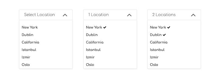
However, we still need to handle the headerTitle so that we can show how many locations are selected:
render() {
  const { list, toggleItem } = this.props;

  return (
    //
    //
      <button
        type="button"
        className="dd-list-item"
        key={item.id}
        onClick={() => toggleItem(item.id, item.key)}
      >
    //
    //
  )
}
As previously mentioned, we didn’t set the headerTitle in the case of a multi-select dropdown. However, regardless of whether it’s a single or multi-select dropdown, we need to handle the headerTitle separately due to the fact that the list array passed might contain items with the selected key set to true by default. The component should be able to detect this and set the headerTitle accordingly.
To handle this, we’ll use the static getDerivedStateFromProps lifecycle Hook.
The purpose of getDerivedStateFromProps is to enable a component to update its internal state as a result of changes in props. It should return an object to update the state or return null if nothing needs to be updated.
First, filter the list prop to see if there is any object with the selected key set to true. If there is one, that will be returned and will be made available in selectedItem. Then, we use this object’s title key to set the headerTitle. If selectedItem is empty, then we simply return an object where we set the title prop to headerTitle:
static getDerivedStateFromProps(nextProps) {
  const { list, title } = nextProps;
  const selectedItem = list.filter((item) => item.selected);

  if (selectedItem.length) {
    return {
      headerTitle: selectedItem[0].title,
    };
  }
  return { headerTitle: title };
}
When dealing with a multi-selection dropdown menu, we check the length of the items with the selected key set to true. If this count is equal to 0, then we simply set headerTitle to the default title prop.
If the count is equal to 1, then we use a prop called titleHelper. In our case, this is a string value equal to "Location", allowing us to display 1 location on the title.
If the count is greater than 1, then we use the plural form of location, which we provide to our component through the titleHelperPlural prop. In our case, this prop is equal to "Locations":
static getDerivedStateFromProps(nextProps) {
  const {
    list,
    title,
    titleHelper,
    titleHelperPlural
  } = nextProps;

  const count = list.filter((item) => item.selected).length;

  if (count === 0) {
    return { headerTitle: title };
  }
  if (count === 1) {
    return { headerTitle: `${count} ${titleHelper}` };
  }
  if (count > 1) {
    return { headerTitle: `${count} ${titleHelperPlural}` };
  }
  return null;
}
So, our component will have the following props if it’s a multi-select dropdown:
<Dropdown
  titleHelper="Location"
  titleHelperPlural="Locations"
  title="Select location"
  list={this.state.location}
  toggleItem={this.toggleItem}
/>
The last thing we need to handle is closing the dropdown menu when a user clicks outside of it. It is quite straightforward to listen to click events on the window object and toggle the isListOpen state variable. However, this approach requires some small tricks to make it work properly.
Consider the following code snippet where we add an event listener to the window object that depends on the isListOpen state variable. However, this attempt results in a tooltip opening and closing almost simultaneously:
close = () => {
  this.setState({
    isListOpen: false,
  });
}

componentDidUpdate(){
  const { isListOpen } = this.state;

  if(isListOpen){
    window.addEventListener('click', this.close)
  }
  else{
    window.removeEventListener('click', this.close)
  }
}
The solution is to use the setTimeout method with either a 0 millisecond delay or without any time delay defined. Therefore, it queues a new task to be executed by the next event loop. Although using 0 milliseconds usually describes a task that should be executed immediately, this is not the case with the single-thread synchronous nature of JavaScript. When the setTimeout is used, it simply creates an asynchronous callback. You can refer to the specific MDN web docs for a detailed explanation on the topic:
componentDidUpdate(){
  const { isListOpen } = this.state;

  setTimeout(() => {
    if(isListOpen){
      window.addEventListener('click', this.close)
    }
    else{
      window.removeEventListener('click', this.close)
    }
  }, 0)
}
There is one more thing we need to take into account. When using the dropdown menu in multi-select mode, it is likely that we don’t want to close the list when an item is selected, unlike in single select mode. To fix this issue, we need to call the stopPropagation() method on the onClick event of the list items.
Doing so prevents propagation of the same event bubbling up to the parent elements and therefore keeps the item list open when items are being clicked:
<button
  type="button"
  className="dd-list-item"
  key={item.id}
  onClick={(e) => {
    e.stopPropagation();
    this.selectItem(item);
  }}
>
Although though this tutorial covered all the steps involved in building a reusable dropdown component from scratch, there are some popular dropdown component libraries based on React that you can leverage to achieve the same goal. The list below includes some libraries and their corresponding weekly downloads on the npm registry at the time of writing:
In this tutorial, we structured a dropdown menu component that supports both single and multi-select functionalities. We learned how to control the parent component’s state from a child component by passing functions as props to child component and calling them inside the child component.
In addition, we used the static getDerivedStateFromProps method to update the state variables upon prop changes.
Note that this tutorial just gives an introductory approach on how to create a custom dropdown menu. To create a fully fledged dropdown component, you need to bear accessibility in mind as well. I hope you enjoyed this article, and happy coding!
Install LogRocket via npm or script tag. LogRocket.init() must be called client-side, not
server-side
$ npm i --save logrocket

// Code:

import LogRocket from 'logrocket';
LogRocket.init('app/id');
// Add to your HTML:

<script src="https://cdn.lr-ingest.com/LogRocket.min.js"></script>
<script>window.LogRocket && window.LogRocket.init('app/id');</script>
Would you be interested in joining LogRocket's developer community?
Join LogRocket’s Content Advisory Board. You’ll help inform the type of content we create and get access to exclusive meetups, social accreditation, and swag.
Sign up now
This guide walks you through creating a web UI for an AI agent that browses, clicks, and extracts info from websites powered by Stagehand and Gemini.

This guide explores how to use Anthropic’s Claude 4 models, including Opus 4 and Sonnet 4, to build AI-powered applications.

Which AI frontend dev tool reigns supreme in July 2025? Check out our power rankings and use our interactive comparison tool to find out.

Learn how OpenAPI can automate API client generation to save time, reduce bugs, and streamline how your frontend app talks to backend APIs.

 Learn more →

11 Replies to "Customize a reusable React dropdown menu component"
The code snippets are not accurate. I tried following along but your syntax errors were too confusing to try to fix. Look at the portion where you introduce FontAwesome for random angle brackets and closing divs with no opens.
Hi, Alex. Should be all set now. This isn’t Doğacan’s mistake. The formatting got borked when we migrated the blog to wordpress. Thanks for pointing it out (and sorry for the hassle).
This tutorial is not bad (you can actually use functions with hooks and avoid using classes), but without the styles for the components I can’t really see the example that you produce here. So I would add a codepen or something with the whole component.
Hey Dani,
That’s true that now you can do that with hooks, but that was not an option back then when this tutorial was written.
As for the styling, you can actually find the complete source code in the GitHub repo which I linked at the very beginning of this article.
Hi,
Can we have this example with react hooks/ Functional Component if possible
this is not working
Im not sure how useful this tutorial is as I did not try it 🙂 But just by looking the code, I saw that it is not working as it should. A custom select should be accessible through a keyboard, like html select is, for accessibility reasons and for you to be able to select an option from your keyboard.
So this tutorial has these things wrong:
– No `role=”option”` and `role=”listbox”` attributes were set
– There are no handlers for simulating a default’s “select” behavior, like navigating with the arrows.
– It’s inaccessible
I was about to start reading the tutorial, when I come across your review I changed my mind. thank you Mr. You are a time saver 😉
I got an error “toggleItem is not defined” when I passed the toggle item to the list item.
Please I need and urgent help.
One instance of incorrect code: isOpen should be isListOpen in the componentDidUpdate snippet!
Hey man just wanna say thank you and keep up the good work!
Found myself creating a custom select and was missing the setTimeout bit for “handling outside clicks”, funny you stuck that at the end of the post lol