CSS text-wrap: balance vs. text-wrap: pretty
The text-wrap CSS property reached “Newly available” Baseline status in 2024. This means that it’s supported by the latest stable versions of the most popular web browsers, but not older versions. This hasn’t stopped it from becoming extremely popular though, especially with the balance and pretty values.

But what does text-wrap do, exactly? And does it live up to the hype? In this article you’ll learn about the text-wrap CSS property, its different values, what they do, and their impact on UI design.
The Replay is a weekly newsletter for dev and engineering leaders.
Delivered once a week, it's your curated guide to the most important conversations around frontend dev, emerging AI tools, and the state of modern software.
text-wrap CSS property do?When there isn’t enough space to display text, it gets wrapped onto the next line, preventing overflow. This is the default behavior, so you don’t need to do anything to enable text wrapping. You can see it in action in this very paragraph. However, the text-wrap CSS property defines how it gets wrapped, although we can also use it to turn text wrapping off. The property accepts five values:
wrapnowrapbalanceprettystabletext-wrap: wrapwrap is the default value. Whenever this value is the computed value (again, as it is right now in this very paragraph), text will be wrapped whenever there’s no more space on the line, although only at sensible points so as not to disrupt readability. For example, text wrapping won’t occur in the middle of a word (look into the overflow-wrap and word-break properties if you do need this to happen, though):
See the Pen
text-wrap: wrap demo by Daniel Schwarz (@mrdanielschwarz)
on CodePen.
text-wrap: nowrapnowrap basically disables text wrapping, causing overflow if the text exceeds its container:
See the Pen
text-wrap: nowrap demo by Daniel Schwarz (@mrdanielschwarz)
on CodePen.
text-wrap: balanceTo avoid what’s called “bad rag,” balance tries to ensure that all lines of text are of similar length, resulting in text that looks more symmetrical and therefore more visually appealing.
In any case, the size of the text box doesn’t change — only the line sizes change:
See the Pen
text-wrap: balance demo by Daniel Schwarz (@mrdanielschwarz)
on CodePen.
text-wrap: pretty (and text-wrap: avoid-short-last-lines)pretty tries to ensure that text wrapping leaves no orphans (i.e., words that are alone on the last line of a text box). Orphans are easy to miss and therefore hurt readability, not to mention that they make the spacing between adjacent elements seem larger than it actually is.
text-wrap: pretty fixes all of that by ensuring that the last line has at least two words:
See the Pen
text-wrap: pretty demo by Daniel Schwarz (@mrdanielschwarz)
on CodePen.
This behavior is not to be confused with that of the orphans CSS property, which can be used to ensure that entire lines don’t get orphaned as text gets pushed onto a new page, region, or column.
Note that text-wrap: pretty has no effect on widows (words that are alone on the first line of a text box).
User agents have been instructed to optimize text-wrap: pretty for good typography in other ways, too. This includes line balancing (as or like text-wrap: balance does) and preventing word breaks (especially if they would occur on consecutive lines, and in the case of Chrome, occur at the end of a paragraph).
Chrome also factors text justification into its algorithm. In the future, user agents may make improvements to their text-wrap: pretty algorithm. For example, Safari would like to avoid typographic rivers, which could be interesting. All in all, beyond preventing orphans, user agents are free to “prettify” however they want.
It’s important to keep in mind that there’s no way to avoid an imperfect outcome. The algorithms are score-based and will ultimately choose the best outcome possible, considering all factors.
If you don’t care about the secondary adjustments and only want to avoid orphans, text-wrap: avoid-short-last-lines (formerly text-wrap: avoid-orphans) is what you’re looking for. However, as of September 2025, it’s not supported by any web browser. It’s also subject to change, and as the value suggests, it would avoid short last lines rather than just orphans (i.e., single words).
The following code snippet, which uses the @supports at-rule to detect web browser support for text-wrap: avoid-short-last-lines, declares text-wrap: avoid-short-last-lines if supported and text-wrap: pretty otherwise. This means that you can start using text-wrap: avoid-short-last-lines as soon as it’s available:
article {
  @supports (text-wrap: avoid-short-last-lines) {
    text-wrap: avoid-short-last-lines;
  }
  @supports not (text-wrap: avoid-short-last-lines) {
    text-wrap: pretty;
  }
}
On that note, the pretty value also isn’t supported in Firefox as of September 2025. However, since it works as a progressive enhancement, there’s no harm in implementing it regardless.
text-wrap: stablestable is for multi-line text that users can edit (for example, <textarea>s and elements with the contenteditable attribute).
Basically, as the user is editing the text content, text-wrap: stable is supposed to ensure that text wrapping doesn’t get recalculated on lines prior to the one that’s currently being edited. This will prevent the text from shifting while typing. Theoretically speaking, this could also come in handy when animating text, which could also cause shifting.
However, the web development community has agreed that the stable value simply doesn’t work. For now, at least, it behaves exactly like wrap, so the jury’s still out on that one.
text-wrap: balance or text-wrap: pretty?For now, at least, the main talking points are text-wrap: balance and text-wrap: pretty. While it might seem as if they improve typography with no downsides, both actually have significant downsides, so let’s start with those.
text-wrap: balance is computationally expensive, so performance takes a hit. For this reason, the declaration has no effect on elements with more than ten lines of text in Firefox and six lines of text in Chrome.
Safari doesn’t impose any limits, which makes more sense given that text-wrap: pretty doesn’t have any limits (in any browser) despite doing more. Nonetheless, these limits exist, and we have to respect the strictest of them, which is Chrome’s six-line limit. That being said, this limit is per-element and text-wrap inherits, so that does give us some leeway:
article {
  text-wrap: balance;
}


<article>
  <!-- We’re allowed six lines of text-wrap: balance here -->
  <p><!-- Another six lines of text-wrap: balance here --></p>
  <p><!-- And another six lines of text-wrap: balance here --></p>
</article>
However, if an element contains seven or more lines, it goes without saying that text-wrap: balance won’t be able to function, and it’ll default back to text-wrap: wrap. This is why it’s better to use…
text-wrap: balance for short snippets of text (e.g., headings) and…text-wrap: pretty for paragraphs (since they have no limits)But remember, text-wrap: pretty is still pretty heavy (pun intended, unfortunately) and will impact performance. How much and what should be considered “overuse” isn’t fully understood yet. Hopefully, user agents provide some clarity or refine the limitations at some point.
text-wrap: balance and text-wrap: pretty?I’ve alluded to the UX benefits of text-wrap: balance and text-wrap: pretty already, but let’s recap and clarify:
Line balancing, which is the primary function of text-wrap: balance (and also what text-wrap: pretty does to an unknown extent), provides users with a more predictable line length, improving readability. It’s also visually appealing.
Avoiding orphans/short last lines (a text-wrap: pretty feature) also improves readability because they’re harder to notice than full lines. They’re also visually unappealing because they make the spacing between adjacent elements seem larger than it actually is.
Preventing word breaks (also a text-wrap: pretty feature) improves readability as well, as broken words are obviously harder to read. This is especially true when the first fragment is at the end of the inline axis and the second fragment is at the start — literally as distanced as they can possibly be — despite a hyphen indicating their relationship.
Typographic rivers are visually distracting, which is why Safari (at least) wants to eliminate them with text-wrap: pretty. It’s difficult to describe what a typographic river actually is, but the image below (from the WebKit article where they talk about text-wrap: pretty) demonstrates it pretty (sorry) well: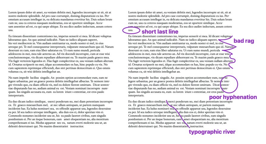
In a nutshell, text-wrap: balance and text-wrap: pretty improve readability, a crucial ingredient of good usability, accessibility, and UX overall.
ch units impact text-wrap?1ch is equal to the width of the 0 glyph rendered with the computed font family at the computed font size, so if the rendered width of 0 is 12px then width: 63ch will actually compute to width: 756px. This could limit the line to 63 characters, but it isn’t guaranteed to.
In short, ch units don’t do what you might think they do. ch units are applied to elements (to, for example, their inline size), whereas text-wrap affects the lines within them. You can use them together, but they aren’t particularly related.
The text-wrap CSS property improves typography, particularly with its balance and pretty values, and maybe its avoid-short-last-lines value at some point. Specifically, they improve readability by line balancing, avoiding orphans/short last lines, and preventing word breaks and typographic rivers.
However, these optimizations do require more computing power than the average CSS property, which could impact performance in a number of ways. To soften the blow, though, user agents impose some limitations, although these are inconsistent across web browsers and don’t make a whole lot of sense. For example, text-wrap: pretty appears to optimize text wrapping quite heavily, but doesn’t have any limitations. Very odd, but that’s perhaps not for us developers to worry about.
Got an insight or a question? Drop it in the comment section below, and thanks for reading!
As web frontends get increasingly complex, resource-greedy features demand more and more from the browser. If you’re interested in monitoring and tracking client-side CPU usage, memory usage, and more for all of your users in production, try LogRocket.

LogRocket lets you replay user sessions, eliminating guesswork around why bugs happen by showing exactly what users experienced. It captures console logs, errors, network requests, and pixel-perfect DOM recordings — compatible with all frameworks.
LogRocket's Galileo AI watches sessions for you, instantly identifying and explaining user struggles with automated monitoring of your entire product experience.
Modernize how you debug web and mobile apps — start monitoring for free.

Build a CRUD REST API with Node.js, Express, and PostgreSQL, then modernize it with ES modules, async/await, built-in Express middleware, and safer config handling.

Discover what’s new in The Replay, LogRocket’s newsletter for dev and engineering leaders, in the March 25th issue.

Discover a practical framework for redesigning your senior developer hiring process to screen for real diagnostic skill.

I tested the Speculation Rules API in a real project to see if it actually improves navigation speed. Here’s what worked, what didn’t, and where it’s worth using.
Would you be interested in joining LogRocket's developer community?
Join LogRocket’s Content Advisory Board. You’ll help inform the type of content we create and get access to exclusive meetups, social accreditation, and swag.
Sign up now

 Learn more →
