
One of the most common and challenging things that frontend engineers run across is CSS naming conventions. With the popularity of the Block Element Modifier (BEM) method, many became used to organizing their styles in a maintainable pattern.

The upcoming implementation of @scope in Chrome may take the gains of BEM further by allowing block-level scoping of styles within a stylesheet. This may make styling easier to maintain, while providing tighter control of the CSS cascade that impacts any frontend application.
In this post, we will demonstrate how to use the @scope feature in Chrome and how to use it to replace BEM in frontend projects. We’ll walk through several examples, all of which you can check out in the sample project on GitHub to follow along.
Jump ahead:
@scope?
@scope@scope vs. BEMThe Replay is a weekly newsletter for dev and engineering leaders.
Delivered once a week, it's your curated guide to the most important conversations around frontend dev, emerging AI tools, and the state of modern software.
@scope?In the upcoming Chrome 118 release, the @scope feature creates block-level scoping of CSS styles. This gives developers more control over CSS styles, as we can now specifically define the scope for sections of a view directly in CSS files.
Consider the following example HTML:
<main className="sample-page">
    <h1>With Scope</h1>
    <section className="first-section">
        <p>some text</p>
        <p>
            some text and then a <a href="/">back link</a>
        </p>
    </section>
    <section className="second-section">
        <h2>Dog Picture</h2>
        <div>
            <p>second section paragraph text</p>
        </div>
        <img src={'./DOG_1.jpg'} alt="dog" />
    </section>
</main>
Within this HTML, we can style the elements within the second-section styled area with the following:
.second-section {
    display: flex;
    flex-direction: column;
    border: solid;
    padding: 40px;
    margin: 20px;
}
@scope (.second-section) {
    h2 {
        text-align: center;
    }
    img {
        max-width: 400px;
        max-height: 100%;
    }
    div {
        display: flex;
        justify-content: center;
        margin: 20px;
    }
    p {
        max-width: 200px;
        text-align: center;
        background-color: pink;
        color: forestgreen;
        padding: 10px;
        border-radius: 20px;
        font-size: 24px;
    }
}
With @scope, there is also the ability to create a “donut” scope, where the start and end sections are defined for a set of styles and the elements within them. With the same HTML above, a donut scope can define styles from the start area of sample-page up to where the second-section styled area occurs:
/* donut scope */
@scope (.sample-page) to (.second-section) {
    p {
        font-size: 24px;
        background-color: forestgreen;
        color: pink;
        text-align: center;
        padding: 10px;
    }
    a {
        color: red;
        font-size: 28px;
        text-transform: uppercase;
    }
}
The great part about this is that it functions very similarly to what one would do with BEM styling — but with less code.
The CSS @scope has still yet to be released as of 2 October 2023, so you’ll have to turn on the experimental web features flag to use it. To do this, first open a tab in Chrome and go to chrome://flags/, then search and enable the Experimental Web Platform features flag:
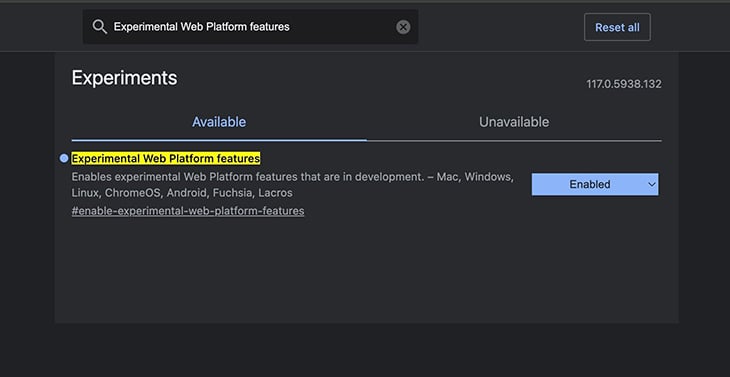
Once the experimental flag is set on Chrome, adding @scope to stylesheets should work in any Chrome session.
The Block Element Modifier (BEM) method of styling is a way to group styles within an HTML view that can be easily navigated.
Consider a large HTML page that has many elements with different styles. After setting a few initial style names, it can become difficult to maintain the styling as the page scales. BEM attempts to alleviate that by structuring your style names around what is actually being styled.
A block would be a containing HTML element. Consider something like this HTML:
<main className="sample-page">
    <h1 className="sample-page__title">With BEM</h1>
    <section className="sample-page__first-section">
        <p className="sample-page__first-section--first_line">
            some text
        </p>
        <p className="sample-page__first-section--second-line">
            some text and then a{' '}
            <a
                className="sample-page__first-section--second-line-link"
                href="/"
            >
                back link
            </a>
        </p>
    </section>
</main>
In this HTML:
sample-page style is the block as it wraps a group of elements<h1> element that is considered an element and as such an additional __ is added to the style name, creating sample-page__title. The same can be said for the sample-page__first-section<p> element within the <section> element, the style name has an additional --first-line, creating sample-page__first-section--first-line, so:
sample-pagefirst-section andfirst-lineBEM scales well, especially if you use SASS to wrap your styles in groups with an & operator to create something like:
.sample-page {
    display: flex;
    flex-direction: column;
    margin-top: 10px;

    &__title {
        font-size: 48px;
        color: forestgreen;
    }

    &__first-section {
      font-size: 24px;
      border: solid;
      padding: 40px;
      margin: 20px;

      &--first-line{
        font-size: 24px;
        background-color: forestgreen;
        color: pink;
        text-align: center;
        padding: 10px;
      }
    }
}
The challenge is that in a very large project, this produce very large CSS or SASS files that can still be difficult to manage at scale. You can replace BEM styling with @scope and make style definitions smaller and more manageable. We’ll demonstrate how this works in the next section.
@scopeThe best way to showcase the advantages of using @scope would be in an application with one of the leading frameworks or libraries, like React. In the sample application on GitHub, there is a project in the react-example folder that has a page styled first with BEM and then refactored version using @scope.
You can run the application and click the WithBEM or WithScope buttons to see the implementations specifically. The components and stylesheets are named accordingly, with the prefixes WithBEM or WithScope in the pages and styles folders, respectively.
Starting with the BEM styled component WithBEMPage.tsx, we first see HTML styled in the BEM method:
<main className="sample-page">
    <h1 className="sample-page__title">With BEM</h1>
    <section className="sample-page__first-section">
        <p className="sample-page__first-section--first_line">
            some text
        </p>
        <p className="sample-page__first-section--second-line">
            some text and then a{' '}
            <a
                className="sample-page__first-section--second-line-link"
                href="/"
            >
                back link
            </a>
        </p>
    </section>
    <section className="sample-page__second-section">
        <h2 className="sample-page__second-section--title">
            Dog Picture
        </h2>
        <div className="sample-page__second-section--div">
            <p className="sample-page__second-section--div-paragraph">
                second section paragraph text
            </p>
        </div>
        <img
            className="sample-page__second-section--image"
            src={'./DOG_1.jpg'}
            alt="dog"
        />
    </section>
</main>
In the component WithScopePage.tsx, we see how clean the refactor is with the following:
<main className="sample-page">
    <h1>With Scope</h1>
    <section className="first-section">
        <p>some text</p>
        <p>
            some text and then a <a href="/">back link</a>
        </p>
    </section>
    <section className="second-section">
        <h2>Dog Picture</h2>
        <div>
            <p>second section paragraph text</p>
        </div>
        <img src={'./DOG_1.jpg'} alt="dog" />
    </section>
</main>
To refactor from BEM into @scope, you only have to find the groups of styles and then appropriately add your scoped styles. Let’s first consider the title section. In the original WithBEMPage.tsx file, there were different styles defined for each section. In the @scope version, there is a more succinct style definition for the specific elements:
.sample-page {
    display: flex;
    flex-direction: column;
    margin-top: 10px;
}
/* replaced */
/* .sample-page__title {
    font-size: 48px;
    color: forestgreen;
} */
/* donut scope */
@scope (.sample-page) to (.first-section) {
    h1 {
        font-size: 48px;
        color: forestgreen;
    }
}
Similarly, within the first section of content, the original BEM styles are as follows:
.sample-page__first-section {
    font-size: 24px;
    border: solid;
    padding: 40px;
    margin: 20px;
}
.sample-page__first-section--first_line {
    font-size: 24px;
    background-color: forestgreen;
    color: pink;
    text-align: center;
    padding: 10px;
}
.sample-page__first-section--second-line {
    font-size: 24px;
    background-color: forestgreen;
    color: pink;
    text-align: center;
    padding: 10px;
}
.sample-page__first-section--second-line-link {
    color: red;
    font-size: 28px;
    text-transform: uppercase;
}
Refactoring this first section with @scope, we now have a more concise style definition:
.first-section {
    font-size: 24px;
    border: solid;
    padding: 40px;
    margin: 20px;
}
/* donut scope */
@scope (.sample-page) to (.second-section) {
    p {
        font-size: 24px;
        background-color: forestgreen;
        color: pink;
        text-align: center;
        padding: 10px;
    }
    a {
        color: red;
        font-size: 28px;
        text-transform: uppercase;
    }
}
The other nice side effect of this is that the HTML view is smaller and easier to read. Considering before:
<section className="sample-page__first-section">
    <p className="sample-page__first-section--first_line">
        some text
    </p>
    <p className="sample-page__first-section--second-line">
        some text and then a{' '}
        <a
            className="sample-page__first-section--second-line-link"
            href="/"
        >
            back link
        </a>
    </p>
</section>
Then after:
<section className="first-section">
    <p>some text</p>
    <p>
        some text and then a <a href="/">back link</a>
    </p>
</section>
Walking through the two sample components, one can apply the refactor to each section. Ultimately noting how it makes the styling cleaner and easier to read.
@scope vs. BEMIn addition to the advantages of refactoring BEM into @scope, the use of @scope also allows for better control of the CSS cascade. The CSS cascade is an algorithm that defines how web browsers handle styling conditions from elements on a composed HTML page.
When working with any frontend project, developers may have to accommodate side effects from the cascade when styles produce odd results. Using @scope, one can potentially control the side effects of the cascade by tightly scoping the elements.
In the sample GitHub project, the folder html-css has two basic HTML files that have an example of a page impacted by the cascade. These examples were modified from those found in the Bram.us post, A Quick Introduction to CSS Scope.
The file no_scope.html has styles and a few elements defined as follows:
<!DOCTYPE html>
<html>
    <head>
        <title>Plain HTML</title>
        <style>
            .light {
                background: #ccc;
            }
            .dark {
                background: #333;
            }
            .light a {
                color: red;
            }
            .dark a {
                color: yellow;
            }
            div {
                padding: 2rem;
            }
            div > div {
                margin: 0 0 0 2rem;
            }
            p {
                margin: 0 0 2rem 0;
            }
        </style>
    </head>
    <body>
        <div class="light">
            <p><a href="#">First Level</a></p>
            <div class="dark">
                <p><a href="#">Second Level</a></p>
                <div class="light">
                    <p><a href="#">Third Level</a></p>
                </div>
            </div>
        </div>
    </body>
</html>
The result is the following:
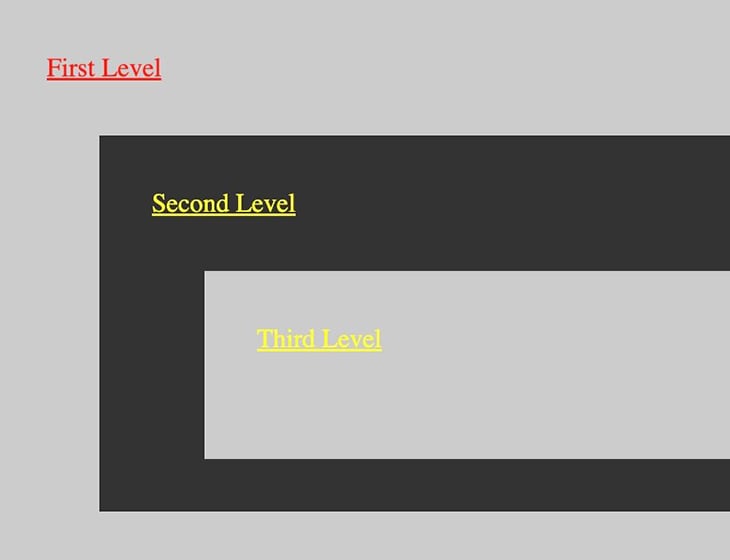
The issue here is that, with the CSS that was defined, one would expect Third Level to be in red text — not yellow. This is a side effect of the CSS cascade, as the page styling is interpreted based on the appearance order, and thus the Third Level is taken to be yellow, instead of red. Taking a diagram from the original Bram.us post, one can see the order that the CSS cascade evaluates selectors and styles:
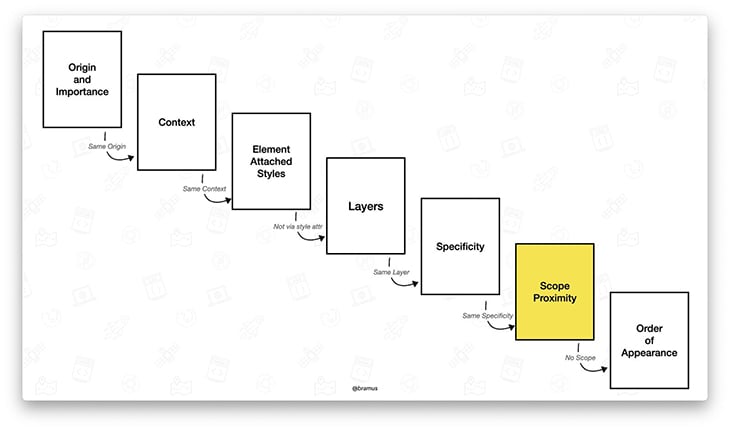
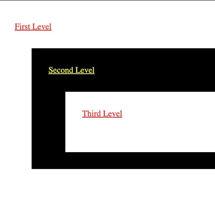
Without use of the @scope, the CSS cascade would go from Specificity directly to Order of Appearance. With the @scope, the CSS cascade takes the @scope elements into account first. You can see this in effect by adding @scope specifically for the .light and .dark styles in the example.
First, modify the original HTML and CSS to be the following:
<!DOCTYPE html>
<html>
    <head>
        <title>Plain HTML</title>
        <style>
            .light {
                background: #ccc;
            }
            .dark {
                background: #333;
            }
            div {
                padding: 2rem;
            }
            div > div {
                margin: 0 0 0 2rem;
            }
            p {
                margin: 0 0 2rem 0;
            }
            @scope (.light) {
                :scope {
                    background: white;
                }
                a {
                    color: red;
                }
            }
            @scope (.dark) {
                :scope {
                    background: black;
                }
                a {
                    color: yellow;
                }
            }
        </style>
    </head>
    <body>
        <div class="light">
            <p><a href="#">First Level</a></p>
            <div class="dark">
                <p><a href="#">Second Level</a></p>
                <div class="light">
                    <p><a href="#">Third Level</a></p>
                </div>
            </div>
        </div>
    </body>
</html>
The result is output that looks like this:
In this post, we explored ways that you can refactor BEM-styled applications into using the new @scope feature coming out with Chrome. We walked through how @scope works and then refactored a simple page from BEM to @scope.
The new @scope feature could potentially be a big win for frontend developers. However, other browsers will also have to implement support, which may take time. Until then, it is definitely an interesting feature and could be very helpful for styling frontend projects.
As web frontends get increasingly complex, resource-greedy features demand more and more from the browser. If you’re interested in monitoring and tracking client-side CPU usage, memory usage, and more for all of your users in production, try LogRocket.

LogRocket lets you replay user sessions, eliminating guesswork around why bugs happen by showing exactly what users experienced. It captures console logs, errors, network requests, and pixel-perfect DOM recordings — compatible with all frameworks.
LogRocket's Galileo AI watches sessions for you, instantly identifying and explaining user struggles with automated monitoring of your entire product experience.
Modernize how you debug web and mobile apps — start monitoring for free.

Learn about TypeScript v6’s breaking changes, new ES2025 features, and deprecated options. A complete migration guide from v5 to prepare for v7.

Learn how Vite+ unifies Vite, Vitest, Oxlint, Oxfmt, Rolldown, and Node.js management in one CLI.

AI companies are buying developer tools as coding agents turn runtimes, package managers, and linters into strategic infrastructure.

Learn how AI-assisted development governance uses rules, agents, hooks, and protocols to help AI coding tools produce safer, more consistent code.
Would you be interested in joining LogRocket's developer community?
Join LogRocket’s Content Advisory Board. You’ll help inform the type of content we create and get access to exclusive meetups, social accreditation, and swag.
Sign up now