The lobotomized owl selector in CSS and its usage have been relatively established since the term was originally coined by Heydon Pickering in 2014. Even with recent CSS innovations, like CSS Grid, we will see in this post that the owl selector is still relevant despite modern advances.

At its core, the owl selector is a primitive to solve spacing and layout challenges with little code. It applies contextual styles between two siblings.
This article’s goal is to cover the owl selector from a modern angle by including new perspectives based on anything that has been learned or changed in the past decade.
This is what we’ll cover in this blog post:
This article provides a couple of examples, which are combined in one CodePen. However, the different examples are also part of separate CodePens that are used throughout this text to emphasize the described concepts:
See the Pen
lobotomized owl selector use cases by Sebastian Weber (@doppelmutzi)
on CodePen.
Let’s start with the foundations that underlie the lobotomized owl selector. The next section also serves as a refresher on basic CSS concepts.
Let’s first clarify why this dubious name exists in the first place. Look at the following snippet:
* + * { /* some styles */ }
It’s now obvious: the owl (* + *) is clearly staring blankly at you.
Let’s look at the different pieces of this selector in order to understand its overall power. We have the universal selector (*) and its adjacent sibling combinator (+). * matches any element in the DOM.
With +, you separate two selectors (in our case, two universal selectors) and match the second element in case it follows immediately the first element. However, these two elements need to be on the same child’s tree level, so we refer to them as “siblings” in the selector.
Here’s a concrete example, which is probably easier to follow:
<article>
  <p>
  Lorem ipsum dolor sit amet...
  </p>
  <section>
    <blockquote>Lorem Ipsum</blockquote>
    <blockquote>Lorem Ipsum</blockquote>
  </section>
  <p>
Est lorem ipsum dolor...
 </p>
  <blockquote cite="https://alistapart.com/article/axiomatic-css-and-lobotomized-owls/">
The owl selector allows you to control flow content, but it is also a way of relinquishing control.
  </blockquote>
  <p>
Mauris sit amet massa...
 </p>
With the following selector, you only add a background color to the blockquote element containing the cite attribute:
p + blockquote { background: silver; }
We do this by separating the + combinator with two element selectors to target the p and blockquote elements, respectively. It is the only blockquote element that follows a sibling element of type p.
Consequently, with the very generic owl selector (* + *), we can style every successive element of any type. Consider the following markup:
<article>
  <p>
  Lorem ipsum dolor sit amet
  </p>
    <p>
  Lorem ipsum dolor sit amet
  </p>
    <p>
  Lorem ipsum dolor sit amet
  </p>
With the following style, we should add background colors to every paragraph except the first one, right? Let’s see:
* + * { background: silver; }
Not really! What the heck, why is everything silver?
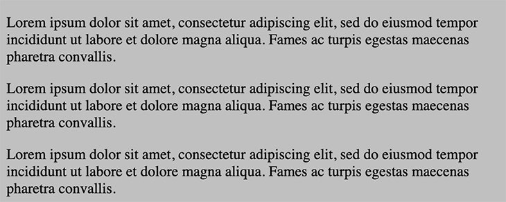
This is because * also selects head and body, and since body is the preceding sibling of head, the body element gets a background color, too.
Consequently, you’ll most likely want to provide some context to the owl selector. The following selector restricts the owl selector to the children of article elements:
article * + * {
  border: 1px dashed black;
}
With the following markup, you can see that a border is not applied to the first child of every parent element:
<article>
    <p>
  Lorem ipsum dolor...
  </p>
    <p>
  Lorem ipsum dolor...
  </p>
    <p>
  Lorem ipsum dolor...
  </p>
  <section>
    <blockquote>Lorem Ipsum</blockquote>
    <blockquote>Lorem Ipsum</blockquote>
  </section>
  <p>
Est lorem ipsum...
 </p>
</article>
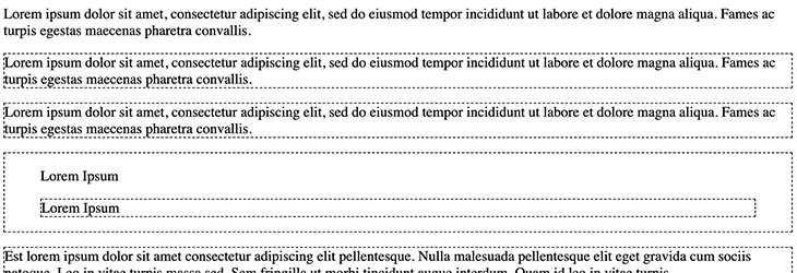
This example also shows that styles are not restricted to the immediate children of the article element. To resolve this, you need to use the child combinator (>). This approach prevents the recursive mode’s unwanted elements:
article > * + * {
  border: 1px dashed black;
}
With a small adjustment, we only add borders to the immediate children of article, except the first child. It doesn’t matter that we use different element types (p and section) because we are using the universal selector:

Adding local context (article selector) and restricting to direct children (>) help to prevent elements from growing margins and becoming unexpectedly spread out.
The owl selector fosters semantic markup design choices and avoids excessive use of unnecessary “wrapper divs” or the introduction of nonsemantic CSS classes. It also reinforces patterns that separate concerns because the actual UI components are layout-agnostic and don’t have to care where they are used. This is the job of the container element (e.g., stack) with its specific simple responsibility (e.g., add spacing to the top of direct children).
The last example in the previous section reveals that the owl selector is helpful when implementing a robust design because you can interchange elements and maintain your spacing concept.
If you want to add spacing between components, this concept scales because the owl selector prevents margin collapse. You can add as many children to a parent as you like — you don’t have to think about margins again!
If you choose to leave external spacing out of components by design and instead use the owl selector, you’ll never encounter a situation where you break your design by adding some margins. In addition, you won’t end up with redundant margins before the first or after the last child elements that combine with the parent element’s padding and produce double the intended gap.
In the end, the owl selector is about styling the context, i.e., the relationship between a parent element’s child elements. The “stack” pattern we’ll describe below demonstrates this.
There are more verbose ways to do this, with other approaches to define spacing en masse, such as using separators between your UI components (e.g., with border-top for vertically aligned components):
ul >  * + * { border-top: 1px solid orange; }
/* instead of */
ul > li:not(:first-child) { /* ... */ }
/* or */
li:nth-child(n+2) { /* ... */ }
There are a few limitations of the owl selector. You can’t use the owl selector to add vertical margins with inline elements because it only respects horizontal margins. If your goal is to add vertical spacing, you have to opt for block elements, inline-block elements, or child elements in a Flexbox context.
Speaking of Flexbox, you can use the owl selector to add horizontal margins between flex items, as long as you don’t let them wrap in the next row:

However, if you use flex-wrap: wrap to let elements wrap into new rows, things go wrong:
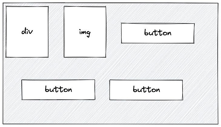
The spacing to the left of the second button is not what we want.
The following CodePen shows an example of the wrapping issue with the owl selector (use case 2a) and a solution to fix this (use case 2b):
See the Pen
use case 2 – horizontal list with wrapping (issue with owl selector + fix with flex gap) by Sebastian Weber (@doppelmutzi)
on CodePen.
The following snippet shows the relevant code with respect to the owl selector. The problem is flex-wrap: wrap:
.use-case-2a {
  display: flex;
  flex-wrap: wrap;
  --gap: 10px;

 /* ... */

  > * + * {
    margin-left: var(--gap);
  }
}
If you don’t have to support Internet Explorer in your project (and I guess, in 2023, we don’t need to anymore), you can use the gap property and you’re good:
See the Pen
use case 2 – horizontal list with wrapping (issue with owl selector + fix with flex gap) by Sebastian Weber (@doppelmutzi)
on CodePen.
We can also manage everything at the container level, without need for the owl selector:
.use-case-2b {
  display: flex;
  flex-wrap: wrap;
  gap: 10px;

  /* ... */
}
This is a common use case where the owl selector comes up short.
A common criticism of CSS is that its global scope leaves it vulnerable to side effects. However, the global nature of the cascade is a feature, not a bug, and we can make use of it in terms of the owl selector.
What does this mean? The universal selector (*) has the lowest possible CSS specificity (0-0-0). The owl selector combines two * selectors, so its overall specificity is still 0-0-0. The adjacent (+) or child (>) combinator does not add to the specificity. This means, in turn, that every other selector “beats” our owl selector.
With that knowledge, we can make use of exception-based styling. With little code, you can lay a foundation of scalable spacing architecture between all your components.
As an example, you can specify the default spacing between vertically aligned components with the unscoped owl selector. Then you can add an exception, such as to reduce the vertical gaps between components inside of articles. And, of course, due to their low specificity values, you can add even more component-specific exceptions without the need for long selectors:
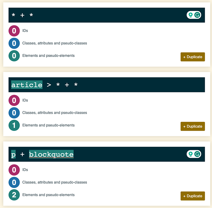
The above picture shows the specificity scores for a variety of different CSS selectors. The first one is our owl selector, with a specificity of zero, which could specify default vertical spacing between elements in your project:
* + * { margin-top: 1.25rem; }
However, we could add an exception that the vertical gaps between direct children of articles are smaller:
article > * + * { margin-top: 1rem; }
We could also add another exception on top of it between paragraphs and blockquotes:
p + blockquote { margin-top: 1.5rem; }
The key takeaway here is that the owl selector virtually does not create specificity problems in large projects because every other selector will take precedence over it.
Let’s apply what we’ve learned about the owl selector to create powerful architectural UI patterns and layout primitives. These patterns based on the owl selector can be used to define styling relationships between components — mostly to add distance between elements.
Components in design systems are normally developed in isolation, but their spacing arrangements within the actual project are not clear at design time. With the help of the owl selector, you can implement layout-agnostic UI components that only specify spacing within components (i.e., paddings), but not spacing that is external to them (i.e., margins).
We’ve already discussed how to add horizontal gaps between child elements part of a list in a previous section:
See the Pen
use case 1 – horizontal list with owl selector by Sebastian Weber (@doppelmutzi)
on CodePen.
Let’s take a look at how to add horizontal gaps between the elements:
* + * {
  margin-left: var(--gap);
}
We used margin-left to add a horizontal separation to the left of every element except the first one. However, we should use it like this:
* + * {
  margin-inline-start: var(--gap);
}
With modern CSS, we can leverage a more robust approach with such a logical property as margin-inline-start, which maps to the physical properties margin-left or margin-right depending on your writing mode.
You can change the writing direction to rtl (with the HTML attribute dir) and the CSS properties will stay meaningful in contrast to, e.g., adding spacing to the left with margin-right.
The diagram below shows how you can run into unintended scenarios when you change the writing direction to rtl, but use the physical property margin-left:

Using the logical property margin-inline-start solves our problem:
See the Pen
use case 1b + 1c – horizontal list with owl selector (changed writing dir) by Sebastian Weber (@doppelmutzi)
on CodePen.
The logical properties for margin, padding, and border are most useful for using with owl selector. Here are examples of how physical properties relate to logical properties for margin and padding:
margin-block-start maps to margin-topmargin-inline-start maps to margin-leftmargin-inline-start maps to margin-bottommargin-inline-end maps to margin-rightpadding-block-start maps to padding-toppadding-inline-start maps to padding-rightpadding-inline-start maps to padding-bottompadding-inline-end maps to padding-leftEvery frontend developer has created hundreds of vertical containers with uniform spacing between child elements. This very common pattern is called the stack:
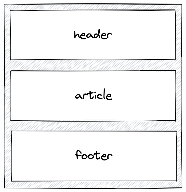
The rationale of this design pattern is to add vertical separation between child elements. Children need to be block-level elements in order to add top or bottom margins:
/* variant 1 */
.stack > * {
    display: block;
}
/* variant 2 */
.stack {
    display: flex;
}
/* variant 3 */
.stack > * {
    display: inline-block;
}
However, its usefulness depends on your use case. Most likely, you’d use Flexbox or child elements with the display type block. inline-block elements allow for vertical margins but behave like inline elements, as described above.
Again, the trick is not to style the individual child element but its context, where these elements are arranged. Use cases 3-5 in our CodePen showcase different variants of the stack; the first example makes use of recursion or nesting, respectively:
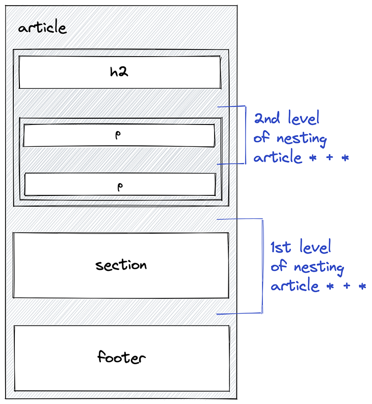
In this scenario, no boundary is added to the owl selector, so every element in the nested element tree is affected. Take a look:
See the Pen
use case 3 – stack with owl selector (recursion) by Sebastian Weber (@doppelmutzi)
on CodePen.
The relevant CSS code once more makes use of the owl selector to add margins to the top. We use margin-block-start to accomplish our goal independent of the writing direction:
.use-case-3 {
  /* ... */
  * + * {
    margin-block-start: 20px;
  }
}
Let’s see what happens when we restrict the owl selector to add only vertical gaps to direct children of the stack:
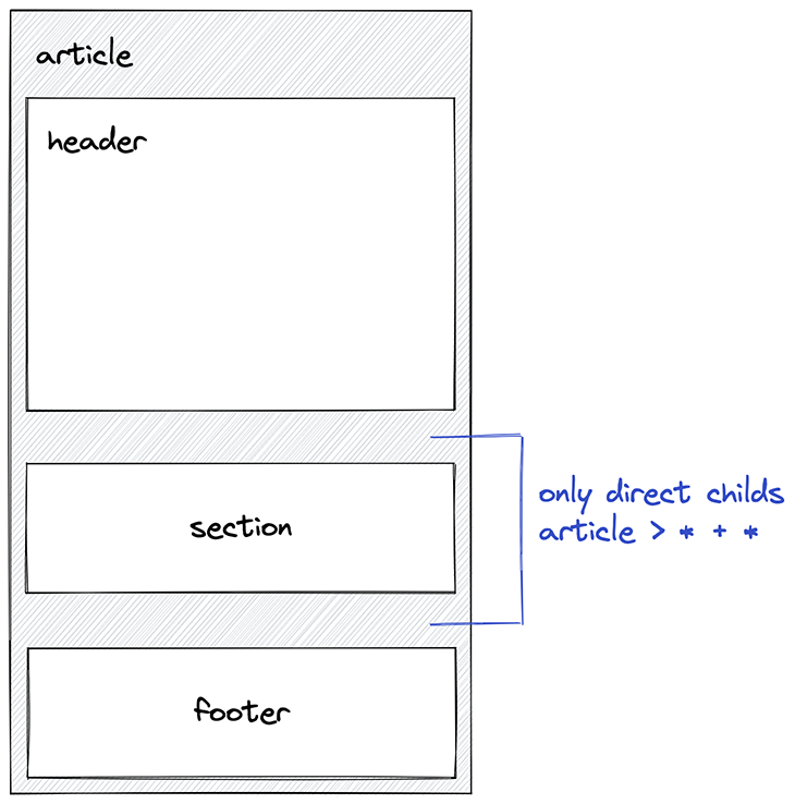
We only need to add the children combinator > and we’re good:
See the Pen
use case 4 – stack with owl selector (direct children) by Sebastian Weber (@doppelmutzi)
on CodePen.
Another option is to add context to the owl selector to restrict it further:
.use-case-4 {

  /* ... */
  > * + * {
    margin-block-start: 20px;
  }
}
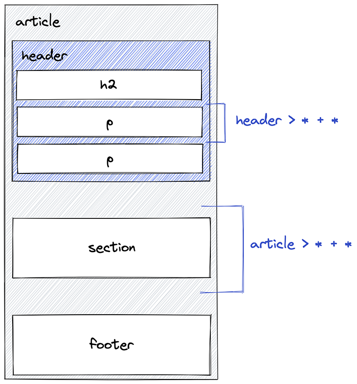
In the diagram, two selectors target either the direct children of the header element or the article element:
See the Pen
use case 5 – stack with owl selector (context) by Sebastian Weber (@doppelmutzi)
on CodePen.
In the previous example, we added vertical margins of different sizes by using an exception-based approach. The default vertical gap set by the unrestricted owl selector is smaller than the gaps set for the children of the header element:
.use-case-5 {
  * + * {
    margin-top: 5px;
  }
  header > * + * {
    margin-top: 20px;
  }
  /* ... */
}
Finally, splitting the stack is a nice pattern that makes use of Flexbox:
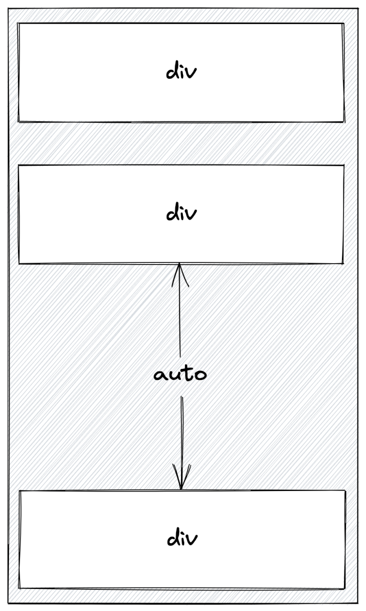
This example shows that, starting from the third element, these flex items align with the bottom of the flex container:
See the Pen
use case 6 – stack with owl selector (splitting) by Sebastian Weber (@doppelmutzi)
on CodePen.
The relevant code shows that we need a flex container for this to work. Since we want a stack, we need to use flex-direction on column.
With flex-direction: flex-start, we align all flex items to the top of the container. Beginning with the third child, we add an exception. margin-block-end: auto makes sure that all elements are placed at the very bottom of the container:
.use-case-6 {
  --space: 2rem;
  display: flex;
  flex-direction: column;
  justify-content: flex-start;
  height: 300px;

  /* ... */
  > * + * {
    --space: 1rem;
    margin-block-start: var(--space);
  }

  > *:nth-child(2) {
    margin-block-end: auto;
  }
}
The above code snippet shows you how to use custom properties.
When combined with custom properties, the owl selector is perfect for implementing layout primitives such as the stack. This approach adds to exception-based CSS design, where general owl selectors are “overridden” by more concrete owl selectors with a narrower context. The same can be done with custom properties that can be inherited and overridden, just like everything in CSS.
In the example above, the container defines a --space variable with a value of 2rem. The owl selector overrides this variable by assigning a smaller spacing value (1rem). These aspects make our layout primitives bulletproof in terms of scalability and robustness.
Additionally, it helps to manage flow and rhythm. Using margin-block-start instead of margin-top adds to this development mindset.
A box is literally a box-shaped container, i.e., one that has a visual border or background. A common pattern here is to have direct child elements of the box container span the available space horizontally and/or vertically, and render a background or border themselves:
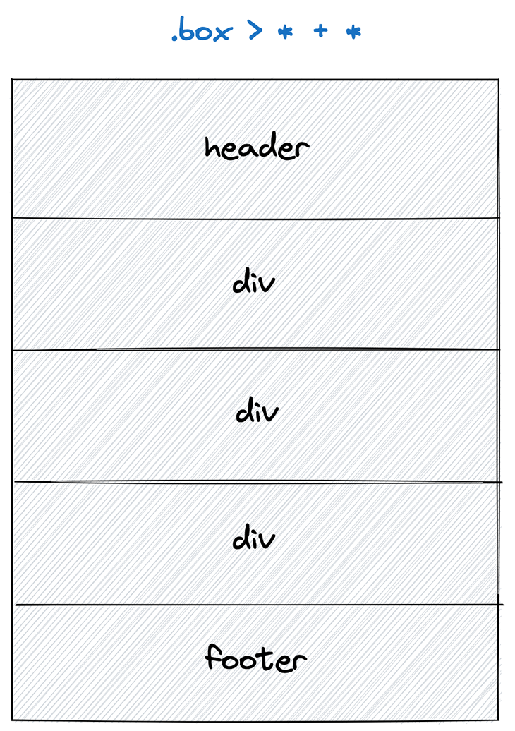
In this diagram, the border and background of the box container are visible, and its direct child elements render a single border spanning 100 percent of the available horizontal space.
Let’s look at an example where the box container only shows the surrounding border, and the child elements render a white background with a single border:
See the Pen
use case 7 – the box with owl selector by Sebastian Weber (@doppelmutzi)
on CodePen.
The relevant CSS code looks like this:
.use-case-7 {
  border: 1px solid black;
  padding: 0;

  > * {
    height: 20px;
    background: white;
  }

  > * + * {
    border-top: 1px solid black;
  }
}
In this case, the actual size of the box is determined by the heights of its direct child elements. The owl selector is used to add a border to the top of every child element except the first one. The bottom border and the top borders are rendered by the parent element.
These layout primitives can be used as a foundation to create even more UI patterns. For example, you can use the horizontal list pattern internally, with overflow: hidden to create a carousel component. You can also use the stack primitive to create an accordion with separate items.
Frontend development has changed a lot since the lobotomized owl selector was invented. Chances are that you have worked with JavaScript frameworks like React or Vue and have encountered CSS-in-JS approaches. We’ll discuss both in this section.
The owl selector can be used in most scenarios without any problems. The next code example shows how to use it with Vue 3 and scoped styles:
<!-- FilterButton.vue -->
<template>
  <div class="filter-buttons">
    <FilterButton
      label="All"
      :active="filterIndex === FilterIndex.ALL"
      :on-click="handleAllClick"
    />
   <!-- ... -->
  </div>
</template>
<script>
  // ...
</script>
<style scoped lang="scss">
.filter-buttons {
  display: flex;
  > * + * {
    margin-left: 16px;
  }
}
</style>
In a Vue component, child components, i.e., FilterButton, get some spacing in a horizontal list. Using the owl selector is a wise choice because it adds to a robust pre-existing design, and refactoring the FilterButton to use a button element or a div doesn’t require adjusting the parent component at all.
The above is still a more “traditional” way to use CSS. Let’s look at a CSS-in-JS example that makes use of styled-components:
// FilterButtons.jsx
import styled from "styled-components";
import FilterButton from "./FilterButton";
const Container = styled.div`
  display: flex;
  > * + * {
    margin-left: 16px;
  }
`;
const FilterButtons = () => {
  // ...
  return (
    <Container>
      <FilterButton
        onClick={() => {
          setIndex(0);
          setFilterIndex(0);
        }}
        active={index === 0}
        label="All"
      />
      {/* ... */}
    </Container>
  );
};
This is the exact use case of the Vue example above. Again, we leverage the owl selector to horizontally align React components as “black boxes.”
We don’t care what the concrete implementation of the root element looks like. With both examples, we style the context and not the actual components (FilterButton) to add spacing between the list items.
Tailwind is a very popular and widespread CSS framework. Due to the nature of Tailwind’s design principles, where you style individual elements with utility classes, the owl selector cannot be used — at least not without workarounds, since the owl selector’s goal is to add inter-component styles with a combinator selector.
You need a library to extend the functionality of Tailwind to use the owl selector, such as tailwindcss-owl. You can then use utility classes (o-{marginKey}) with stack elements to add the following direct child owl selectors with vertical margins:
.o-0 > * + * { margin-top: 0; }
.o-1 > * + * { margin-top: 0.25rem; }
.o-2 > * + * { margin-top: 0.5rem; }
.o-3 > * + * { margin-top: 0.75rem; }
.o-4 > * + * { margin-top: 1rem; }
/* ... */
Similarly, the owl selector does not work when used in a particular SSR flavor with the CSS-in-JS library Emotion due to its design concepts. In default SSR mode, the adjacent sibling combinator required for the owl selector does not work because Emotion injects style tags into the markup. This interferes with our owl selector because unwanted style tags get sprinkled into the DOM tree. In this mode, it is not possible to use the owl selector and you have to use another approach.
There are even more frameworks that do not work well with the owl selector due to their implementation concepts. As an example, Astro Islands uses elements with display: contents, which causes problems with the owl selector since no styles are applied.
By the time you read this article, the issues of above-described frameworks might be solved. However, the remarks are only intended as examples to show that modern libraries and frameworks often use concepts that are incompatible with the requirements of the owl selector. It is pretty obvious that styling frameworks building on inline styles will naturally not work with the owl selector.
The requirements are clear. Your tech stack needs to support vanilla CSS concepts. Concretely, the tooling you use needs to allow you to use combinator selectors and elements with adequate display properties.
The owl selector (* + *) is a generic architectural primitive. Its goal is to style the context between elements on the same DOM tree level, mainly to add horizontal or vertical space between them.
It is well supported and flexible due to its low specificity score and, therefore, it’s easy to add different layers of inter-component context styles to define the general spacing between elements, which can be fine-tuned for modules simply by adding a context parameter to your selector.
Since its introduction in 2014, the owl selector remains powerful even in today’s development projects. We can even use it with modern CSS features like logical properties, custom properties, relative CSS units, or writing directions. However, with modern CSS-in-JS frameworks, there might be compatibility issues when they rely on inline styles or other design decisions that do not align with the requirements of the owl selector, as we described in great detail in this article.
Over the years I have used the owl selector successfully in my projects and I’m pretty sure I will use it for many years!
As web frontends get increasingly complex, resource-greedy features demand more and more from the browser. If you’re interested in monitoring and tracking client-side CPU usage, memory usage, and more for all of your users in production, try LogRocket.

LogRocket lets you replay user sessions, eliminating guesswork around why bugs happen by showing exactly what users experienced. It captures console logs, errors, network requests, and pixel-perfect DOM recordings — compatible with all frameworks.
LogRocket's Galileo AI watches sessions for you, instantly identifying and explaining user struggles with automated monitoring of your entire product experience.
Modernize how you debug web and mobile apps — start monitoring for free.
Hey there, want to help make our blog better?
Join LogRocket’s Content Advisory Board. You’ll help inform the type of content we create and get access to exclusive meetups, social accreditation, and swag.
Sign up now
This guide walks you through creating a web UI for an AI agent that browses, clicks, and extracts info from websites powered by Stagehand and Gemini.

This guide explores how to use Anthropic’s Claude 4 models, including Opus 4 and Sonnet 4, to build AI-powered applications.

Which AI frontend dev tool reigns supreme in July 2025? Check out our power rankings and use our interactive comparison tool to find out.

Learn how OpenAPI can automate API client generation to save time, reduce bugs, and streamline how your frontend app talks to backend APIs.