Disclaimer (updated as of 17 July 2024): There have been recent reports that Polyfill.io has been compromised and is being used to spread malware. This article, which was last reviewed on 9 May 2022, mentions the use of Polyfill.io to load a polyfill asynchronously inside a script tag. We advise reviewing your usage of this service and considering alternatives or updates to ensure your application’s security.

Lazy loading is a website optimization technique in which elements of a page, such as images, are loaded only when they reach a calculated distance from the viewport.
On the other hand, elements that fit into the viewport at the start are instantly loaded. This allows the user to begin interacting with the page as soon as possible.
The GIF above shows the implementation of lazy loading on images. The images visible in the viewport (or within close range) are loaded instantly, while images far below the viewport are only fetched when the user scrolls near them.
In this tutorial, we will cover:
Let’s get started learning how to implement native lazy loading in JavaScript websites across all browsers.
Though most modern browsers natively support lazy loading on images with the <img loading=lazy> attribute, older browsers may fall short in supporting the feature. In such cases, the browser would simply ignore the attribute without side effects.
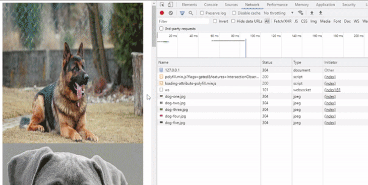
To handle browsers that don’t natively support lazy loading, you can either use a third-party library or a polyfill. In this tutorial, we’ll go with the polyfill approach to build the page shown above.
There are many polyfill options available to help with lazy loading implementation on older browsers. We’ll use a lightweight and highly efficient package called loading-attribute-polyfill to natively implement lazy loading on images and iframes.
The loading-attribute-polyfill package uses JavaScript with graceful degradation to solve the compatibility issue of <img loading=lazy>. It also boosts the SEO performance of the page by loading the image and iframe contents for search engine crawlers in a timely manner.
We’ll use another polyfill to ensure compatibility all the way down to Microsoft Internet Explorer 9.
The directory structure for this project is going to be very simple.
We’ll start by creating an empty folder for our project. Within it, we’ll create a subfolder named /images. Then we’ll move in a couple of dog photos that we’ll lazy load on our page.
In addition to the folder /images, we’ll create the file index.html for the markup:
project-folder/
├── images/
│   ├── dog-one.jpg
│   ├── dog-two.jpg
│   ├── dog-three.jpg
│   ├── dog-four.jpg
│   ├── dog-five.jpg
│   ├── dog-six.jpg
│   ├── dog-seven.jpg
│   ├── dog-eight.jpg
│   ├── dog-nine.jpg
│   └── dog-ten.jpg
└── index.html
You can use the loading-attribute-polyfill package in two ways. The first option is to install the package via either npm or Bower. Alternatively, you can load the polyfill asynchronously via CDN, a method that is very easy to set up.
For this tutorial, we’ll load the polyfill asynchronously inside the script tag. Go into your project’s index.html file and include the following base markup:
<!DOCTYPE html>
<html>
<head>
<meta charset="utf-8">
<meta name="viewport" content="width=device-width">
<title>JS Bin</title>
<!-- Including other optional polyfills depending on expected browser support -->
<script
src="https://polyfill.io/v3/polyfill.min.js?flags=gated&features=IntersectionObserver"
crossorigin="anonymous"
></script>
<script async src="https://cdn.jsdelivr.net/npm/[email protected]/loading-attribute-polyfill.min.js" integrity="sha256-kX73NqVUoUbV0K44kgoqP8P8IZfU0OEjr/afCnK2Mrg=" crossorigin="anonymous"></script>
<!-- Ensures that all images appear as block element -->
<style>
img {
display: block;
}
</style>
</head>
<body>
<!-- Include images here-->
</body>
</html>
This code contains links to two polyfills. Here’s why:
First, we downloaded the Intersection Observer API polyfill to enable lazy loading on older versions of Microsoft Edge, Microsoft Internet Explorer 11, or Apple Safari up to 12.0 that don’t natively support this capability.
Afterward, we downloaded loading-attribute-polyfill in parallel with parsing the page. This step supports native lazy loading.
We also defined a style rule that will make each image on the page appear on a new line.
The way you implement lazy loading in JavaScript depends on if you are using a simple image, a responsive image, or an image wrapped in a picture tag.
To lazy load simple images, you need to wrap all of the <img> HTML tags that you’d like to lazy load with a noscript HTML tag. You also need to set the class attribute as lazy-loading.
Within your <body> HTML tag, use the following markup. Remember to point the src attributes to your own image paths:
  <img src="./images/dog-one.jpg" loading="lazy" alt="Dog" width="450" height="450" />

  <noscript class="loading-lazy">
      <img src="./images/dog-two.jpg" loading="lazy" alt="Dog" width="450" height="450" />
  </noscript>

  <noscript class="loading-lazy">
      <img src="./images/dog-three.jpg" loading="lazy" alt="Dog" width="450" height="450" />
  </noscript>

  <noscript class="loading-lazy">
      <img src="./images/dog-four.jpg" loading="lazy" alt="Dog" width="450" height="450" />
  </noscript>

  <noscript class="loading-lazy">
      <img src="./images/dog-five.jpg" loading="lazy" alt="Dog" width="450" height="450" />
  </noscript>
Only apply lazy loading to images that fall below the viewport. In our markup, the first <img> tag will definitely appear on the viewport, so it shouldn’t have the loading-lazy attribute. The remaining off-screen images are all loaded as the user scrolls close to them.
Furthermore, note that the images should include both height and width attributes. If an image’s dimensions are not explicitly set with height and width attributes, the browser will not know the size of the image.
Without knowing the image’s dimensions, the browser cannot reserve the appropriate space for it. As a result, the browser may default to 0x0px for any images without set dimensions. This can cause layout shifts as the images load.
In addition, because such images do not take up any space on the screen, the browser may assume that the images all fit into the viewport at the start. In this case, the browser might decide to load everything at once.
By setting the height and width, you essentially push some images off-screen, thus forcing the browser to recognize them as being eligible for lazy loading.
srcsetFor responsive images, use the srcset attribute and add three versions of the same image to be displayed on different screen sizes.
<noscript class="loading-lazy">
      <img
          src="./images/dog-one.jpg"
          srcset="
              ./images/dog-one-sm.jpg 140w,
              ./images/dog-one.jpg   200w,
              ./images/dog-one-lg.jpg 320w
          "
          sizes="
        (max-width: 710px) 140px,
        (max-width: 991px) 200px,
          320px"
          alt="Responsive dog image"
          loading="lazy"
      />
</noscript>
Again, make sure to set dimensions to help the browser allocate enough space for the image. This will also ensure the browser displays the correct image version depending on the screen size. In our case, we are using:
dog-one-sm.jpg) when the screen width is less than 710pxIn the case of <picture>, use the complementary <source> HTML tags:
<noscript class="loading-lazy">
    <picture>
        <source
            media="(min-width: 900px)"
            srcset="./images/dog-one-lg.jpg 1x,
             ./images/dog-one-lg.2x.jpg 2x"
        />
        <source srcset="./images/dog-one.jpg 1x
                    ./images/dog-one.2x.jpg 2x" />
        <img
            src="./images/dog-one.jpg"
            loading="lazy"
            alt="Dog image"
            width="250"
            height="150"
        />
    </picture>
</noscript>
For viewports wider than 900px, the browser will load the images specified in the srcset attribute of the first <source> tag. If the screen width is smaller than 900px, the browser will use the normal image size from the second <source>.
For inline frames, use the <iframe> tag. The src attribute should be pointed to the document you want to lazy load, and the loading attribute should be set to lazy:
<noscript class="loading-lazy">
  <iframe
      src="https://codepen.io/ubahthebuilder/embed/rNYbaMQ"
      width="400"
      height="400"
      loading="lazy"
  ></iframe>
</noscript>
As with images, you should set the dimensions.
To recap, we built a simple HTML page with a couple of dog photos, loaded the loading attribute JS polyfill from the CDN, and wrapped our off-screen dog photos with this polyfill to enable the lazy loading feature on them.
We also went over how we can use the polyfill along with other attributes such as the srcset attribute, <img> tags, and iframes.
Now you should know how to lazy load your images, even in older browsers that do not support lazy loading natively.
Have a great week.
Debugging code is always a tedious task. But the more you understand your errors, the easier it is to fix them.
LogRocket allows you to understand these errors in new and unique ways. Our frontend monitoring solution tracks user engagement with your JavaScript frontends to give you the ability to see exactly what the user did that led to an error.
LogRocket records console logs, page load times, stack traces, slow network requests/responses with headers + bodies, browser metadata, and custom logs. Understanding the impact of your JavaScript code will never be easier!

Learn how contrast-color() automatically picks accessible text colors using native CSS, without JavaScript.

Learn how to build smooth staggered animations in CSS using modern features like sibling-index(), complete with practical examples, fallbacks, and accessibility tips.

Compare the top AI development tools and models of July 2026. View updated rankings, feature breakdowns, and find the best fit for you.

Learn how to detect unused and ghost dependencies in JavaScript projects using Knip, a project-level linter that keeps your dependency graph accurate.
Would you be interested in joining LogRocket's developer community?
Join LogRocket’s Content Advisory Board. You’ll help inform the type of content we create and get access to exclusive meetups, social accreditation, and swag.
Sign up now

 Learn more →
