The Replay is a weekly newsletter for dev and engineering leaders.
Delivered once a week, it's your curated guide to the most important conversations around frontend dev, emerging AI tools, and the state of modern software.
Let’s say you’re working on a project and need to crop an image for display, but realize that you don’t have access to your favorite image editor. Don’t fret. CSS has got you covered with a suite of properties that make image cropping possible right there in your browser.
This article explains how to use these properties through eight different examples. In the end, a cropped image is displayed in your browser, and you are armed with the following eight techniques for cropping images with CSS.
object-fit and object-positioncalc() and padding-topborder-radiusoverflow and widthmargin-top and margin-bottommargin-left, margin-right, and widthclip-path() functionBefore we start slicing and chopping images, let’s review the recommended, modern HTML markup for images.
In HTML, images are considered replaced elements defined by the <img> tag. Like most HTML tags, the <img> tag accepts attributes. These attributes determine how the image is rendered. Two of these attributes are width and height, which define the width and height of the image.
Before modern web development, you did not need to specify the image’s width and height in the HTML — instead, you did so in the CSS. As time went on, things changed. Browsers evolved, and of course, recommendations changed. Now, these recommendations are:
width and height attributes in the HTML <img> tagloading attribute with a value of lazyBoth of these recommendations are depicted in the next code block, followed by the explanation for why this is necessary.
<img
    src="your-image-location"
    alt="The image alternate text"
    width="The image width"
    height="The image height"
    loading="lazy"
/>
When you specify the width and height in the HTML, the browser will reserve a space for the image before it downloads during web page rendering.
This is evident in the next GIF. It’s obvious that the image has yet to download, but the browser has already reserved its space on the page.
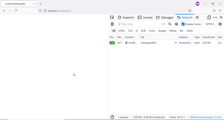
If your CSS files contain code that further modifies your image’s width and height, the browser will make these modifications without causing a shift in the page layout.
On the other hand, if you don’t specify the width and height in the HTML, the browser will not reserve a space for the image during webpage rendering. Therefore, when the image downloads, the browser will have to calculate its dimensions before it’s displayed at its specified position. Eventually, due to your document hierarchy, this causes a layout shift and other elements on the page will suddenly move.
This is evident in the next GIF. Observe as the text below the image is pushed down suddenly when the image downloads.
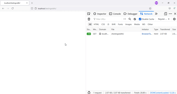
This is considered bad for user experience.
There is one more thing you’ll need to do before you start slicing and chopping, and that is: get rid of the space underneath an image.
The question is: What space?
Let’s find out.
In HTML, images are inline by default, which can cause some quirks. When you place an image inside another container, you’ll notice a space beneath the image.
This is shown in the next image. The image is placed within a paragraph, as highlighted in the browser DevTools. The bottom of the image aligns with the text in the paragraph unless the letters have extra glyphs, like q, y, p, or g.
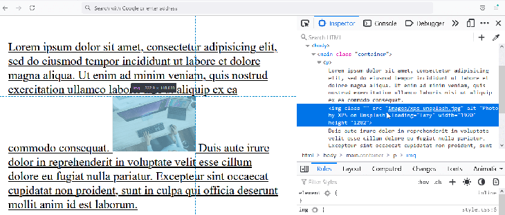
Neither padding nor margin will get rid of this space.
The fix is to change the image display property value to block — or any other value other than inline — and the space will be taken care of.
img {
   display: block; /* This gets rid of the space beneath an image */
   width: 100%;
   height: auto;
}
This previous code block is used in all subsequent examples in this article.
Now, let’s start some slicing and chopping.
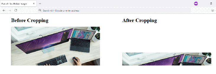
object-fit and object-positionThe names of the properties used in this technique say exactly what they’ll do. object-fit allows you to fit an object like an image inside a given container. It accepts the following values:
containcoverfillinheritinitialnonerevertscale-downunsetOn the other hand, object-position allows you to move this object within that container by specifying its position along the horizontal and vertical planes, or better still, the X- and Y-axes.
This allows you to dictate the section of the image that is shown on screen, effectively cropping the image.
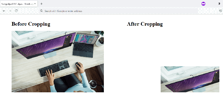
The essential code that crops the image is depicted in the next code block.
.cropped-image {
   width: 100%;
   object-fit: cover;
   object-position: 200px 211px;
}
Check the CodePen below for the full code.
See the Pen
using-object-fit-object-fit-with-object-position by Habdul Hazeez (@ziizium)
on CodePen.
object-position, the cropped image can disappear from view on smaller viewports. You can adjust the values of object-position using a media query to avoid thiscalc() and padding-topYou can crop an image to your desired aspect ratio, but it requires a bit of extra effort.
First, you’ll need what is called the perfect square hack. This hack allows you to create a square image by placing it within an image container that has the following characteristics:
height is set to 0padding-top value is the same as the width of the containerposition property value is set to relativeAfterward, you do the following for the image:
width and height to 100%position property value to absolute with a top value of 0Now, specify your desired aspect ratio as the padding-top value of the image container using the calc() function.
.aspect-ratio-box {
position: relative;
width: 100%;
height: 0;
padding-top: calc(100% * (100 / 300));
}
.cropped-image {
position: absolute;
top: 0;
width: 100%;
height: 100%;
object-fit: cover;
}
You’ll find the full implementation in CodePen linked below.
See the Pen
Aspect-ratio cropping with calc() and padding-top by Habdul Hazeez (@ziizium)
on CodePen.
object-fit, you’ll notice that this method creates a responsive imageobject-fitCropping with CSS transforms builds on the previously discussed aspect ratio cropping technique. The major difference here is that we’ll use the CSS transform property to scale, move, and rotate the image.
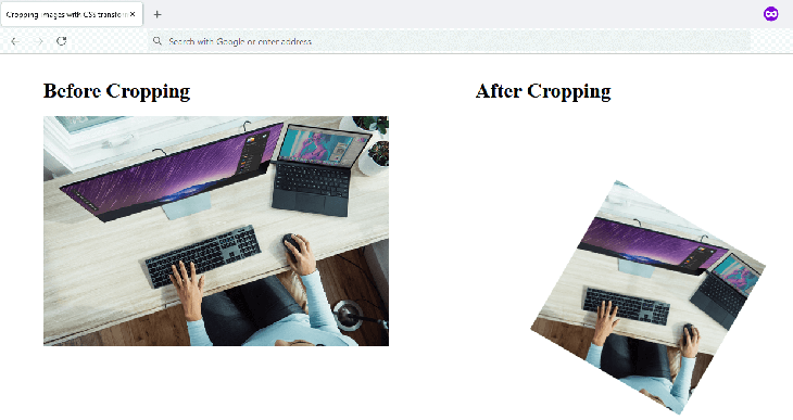
The following code block is responsible for cropping the image.
.cropped-image {
    position: absolute;
    top: 0;
    width: 100%;
    height: 100%;
    object-fit: cover;
    object-position: 55%;
    transform: scale(0.5) translate(0, 5%) rotate(30deg);
}
You can also check the CodePen for the full implementation.
See the Pen
Crop image using CSS Transforms by Habdul Hazeez (@ziizium)
on CodePen.
border-radiusWhen you need to crop an image to a circle, this technique is among your options, the other being clip-path(), which we’ll discuss later in the article.
Its major ingredient is the border-radius property with a value of 50%.
Before you rush and add this border-radius value to your would-be rounded images, observe the code in the CodePen linked below. You’ll notice that to get the circle we need, we have to use the perfect-square technique we discussed in the previous section.
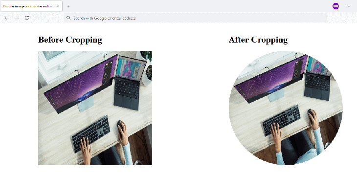
.cropped-image {
    position: absolute;
    height: 100%;
    width: 100%;
    top: 0;
    border-radius: 50%; /* This results in the circle */
}
Full implementation:
See the Pen
Crop-image-to-circle-with-border-radius by Habdul Hazeez (@ziizium)
on CodePen.
Without this hack, you’ll get an oval-shaped egg-like structure, as shown in the image below.

clip-path() function with the circle() value, which is essentially a single line of codeoverflow and widthThis technique employs the width, height, and margin properties to effectively crop the image.
You specify a width and height in the image container, as well as on the image itself.
For the image container, the values of these properties are designed to slice the bottom and rightmost parts of the image. The width and height values applied to the image itself are used to scale the image. Finally, you add margin values, which will pan the image.
As a result, the image is cropped.
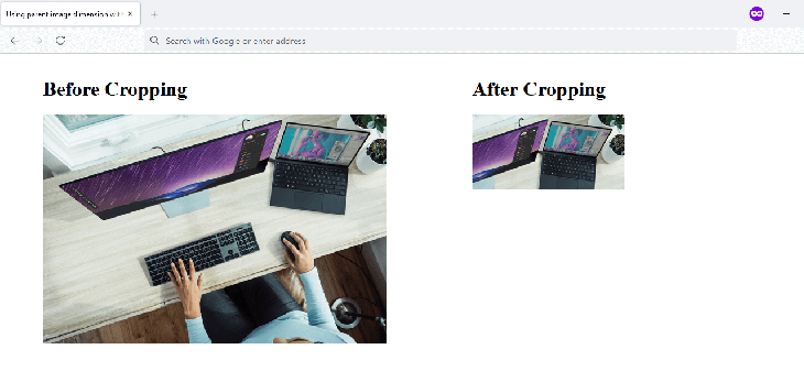
Here is the code responsible:
.cropped {
height: 200px;
}
.cropped-image {
width: 400px;
height: 300px;
margin: 21px 0 0 -158px;
}
The CodePen contains the full implementation.
See the Pen
Crop-image-using-parent-image-dimension-with-overflow-and-margin by Habdul Hazeez (@ziizium)
on CodePen.
width and height of the image as 100%, the cropped image gets hidden on smaller viewportsmargin-top and margin-bottomThis technique makes use of both the top and bottom margins and applies them to the image itself. These can also be used with the overflow property with a value set to hidden on the parent container.
.cropped-image {
    width: 100%;
    height: 100%;
    margin: 33.12% 0; /* This is responsible for the cropping */
}
See the Pen
Pan-to-Crop-image-using-Top-Bottom-margin by Habdul Hazeez (@ziizium)
on CodePen.
margin-left, margin-right, and widthThis is similar to the previously discussed technique, but here, you make use of the right and left margins to crop the image. This gives you the ability to specify the width of the cropped image.
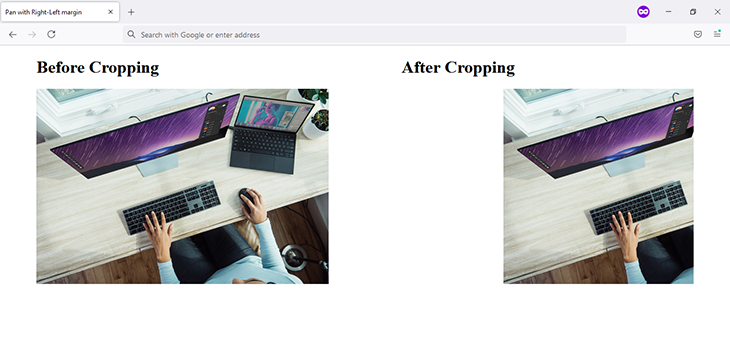
Here is the code responsible:
.cropped-image {
    width: 100%;
    margin: 0 34.88%;
}
The CodePen contains the full implementation.
See the Pen
Pan-to-crop-with-Right-Left-margin-and-width by Habdul Hazeez (@ziizium)
on CodePen.
clip-path() functionI saved the classiest for the last! With the combination of the clip-path() function and its polygon() value, your cropping abilities are only limited by your imagination.
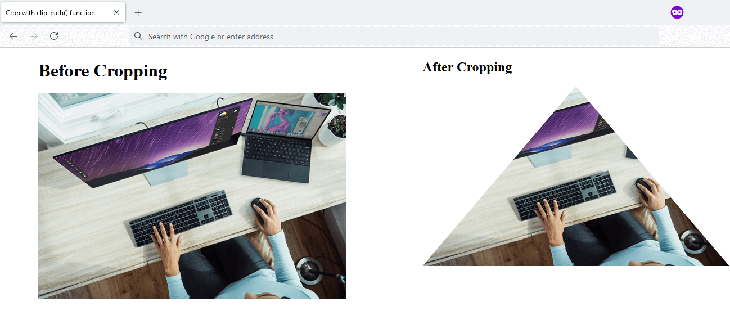
The next code block is the clip-path() code responsible for the cropping in the previous image.
.cropped-image {
    height: 100%;
    clip-path: polygon(50% 0%, 0% 100%, 100% 100%);
}
If you have a hard time understanding the clip-path() code above, this article about CSS animations using clip-path() goes into great detail on how to read, understand, and plot your own clip-path() code.
The CodePen below also contains the full implementation.
See the Pen
Crop-image-with-CSS-clip-path() by Habdul Hazeez (@ziizium)
on CodePen.
If an image contains information that will be lost when you crop it, irrespective of the browser viewport, you are better off not cropping the image at all.
It is recommended that you check for browser support before you use some CSS properties covered in this article. Most of the techniques are supported by modern web browsers, but you should note that object-fit and clip-path() are not supported by Microsoft’s Internet Explorer.
If you’re unsure whether or not something is supported, you can employ an online tool like Can I Use to review the latest.
The image I used in this article’s CodePen demos is quite large, 1920 x 1282 at 459 kB. When using images in your projects, you should ensure that you don’t ship large files to your users and waste their bandwidth.
If you are using PNG image files, you can use a tool like TinyPNG to compress them.
This article explains how to crop images with CSS using eight different examples, and quickly discusses each method’s advantages and disadvantages. Most of these examples are supported in most modern browsers, with Internet Explorer 11 being a notable exception.
As web frontends get increasingly complex, resource-greedy features demand more and more from the browser. If you’re interested in monitoring and tracking client-side CPU usage, memory usage, and more for all of your users in production, try LogRocket.

LogRocket lets you replay user sessions, eliminating guesswork around why bugs happen by showing exactly what users experienced. It captures console logs, errors, network requests, and pixel-perfect DOM recordings — compatible with all frameworks.
LogRocket's Galileo AI watches sessions for you, instantly identifying and explaining user struggles with automated monitoring of your entire product experience.
Modernize how you debug web and mobile apps — start monitoring for free.
Learn how to test Nuxt apps with Vitest, @nuxt/test-utils, runtime mocks, server route mocks, and Playwright e2e tests.

I had four weeks to build a complete app from scratch using AI tools like OpenCode and Claude Opus: here’s how it went.
Learn how to build a reusable Vue 3 table engine that powers tables, cards, and lists with shared sorting and pagination logic.

Compare the best React chart libraries for 2026, including Recharts, Nivo, visx, Apache ECharts, MUI X Charts, and more.
Would you be interested in joining LogRocket's developer community?
Join LogRocket’s Content Advisory Board. You’ll help inform the type of content we create and get access to exclusive meetups, social accreditation, and swag.
Sign up now

 Learn more →
