Dropdowns allow users to select a single value from a list of available values, and they are a common widget in any modern application.

As an example, if you have a form with country selection, there are two widgets that you can use to show those country details. One is the radio button, which allows for selecting a single value. The other option is a dropdown.
In this scenario, a dropdown will be the best widget because you can add a large list of countries, and when the user selects a particular country it shows only that selected country. So, it will give a better user experience to the end user.
In this article, we’ll cover these topics and to give you a better idea about how to create and customize a dropdown in Flutter.
There are mainly two types of widgets that you need to create a dropdown in Flutter.
DropdownButtonDropdownMenuItemThe DropdownButton widget contains several required properties we need to make dropdown functional. The main required property is the item property. The item property accepts a list of DropdownMenuItem widgets, which need to show possible options that can be selected.
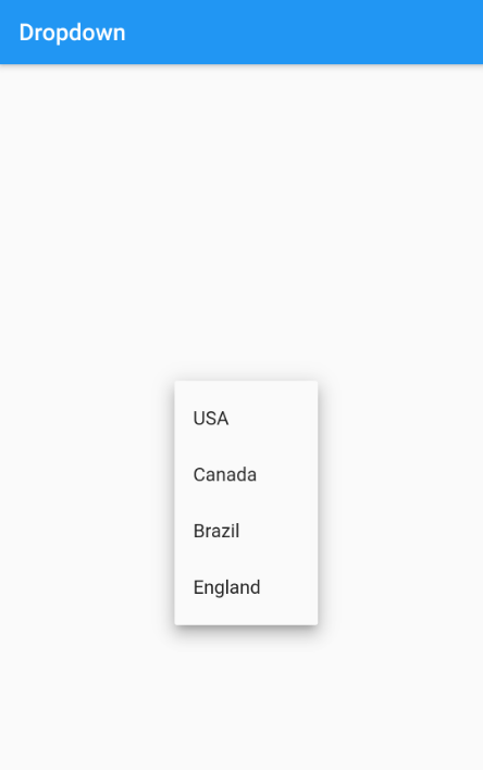
In this example, let’s create a dropdown that contains a list of country names. I will create a separate method that will return a list of DropdownMenuItem widgets that contain country names:
List<DropdownMenuItem<String>> get dropdownItems{
  List<DropdownMenuItem<String>> menuItems = [
    DropdownMenuItem(child: Text("USA"),value: "USA"),
    DropdownMenuItem(child: Text("Canada"),value: "Canada"),
    DropdownMenuItem(child: Text("Brazil"),value: "Brazil"),
    DropdownMenuItem(child: Text("England"),value: "England"),
  ];
  return menuItems;
}
Next, create a DropdownButton widget along with an items property and set the method we just created to feed the values to the dropdown. Make sure to create this as a separate stateful widget because we need to change the state of the dropdown in the later stage.
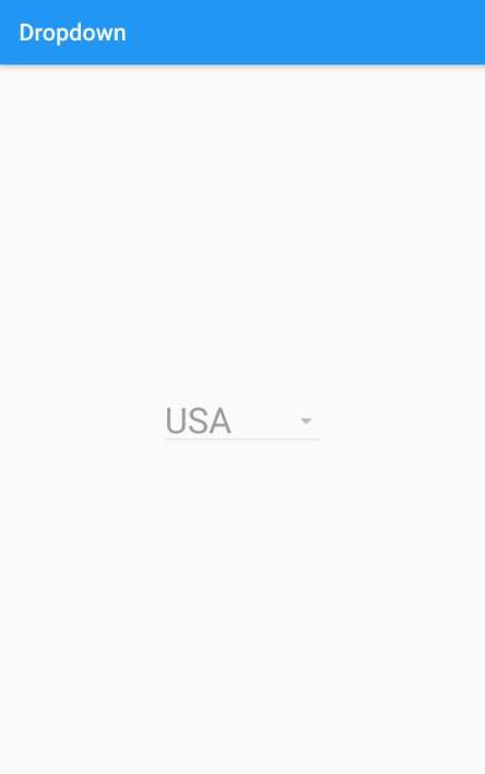
Run the application and you will see a dropdown widget but cannot do any interaction with it.
Now let’s set an initially selected value to the dropdown. The value property of the DropdownButton widget can be used to set the currently selected item, and we can set "USA" as a first selected item:
class _DropdownItemState extends State<DropdownItem> {
  String selectedValue = "USA";
  @override
  Widget build(BuildContext context) {
    return DropdownButton(
      value: selectedValue,
      items: dropdownItems
      );
  }
}
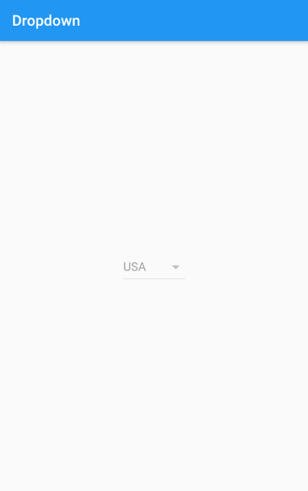
Now you can see that "USA" shows as a selected value. But still, you cannot do any interaction with the dropdown. That’s because we have not yet implemented how the dropdown should behave when changing the value. The next section will explain how to handle those value changes.
The onChange callback can be used to identify the value changes. It will return the selected value, and you can change the state of the dropdown by setting the new value to the dropdown like below:
DropdownButton(
      value: selectedValue,
      onChanged: (String? newValue){
        setState(() {
          selectedValue = newValue!;
        });
      },
      items: dropdownItems
      )
Now you can see the dropdown is working as expected, and you can select a new value from the dropdown.
Setting the onChange to null will disable the dropdown item. If you have set a value property, it shows that value as a selected one even though the dropdown is disabled:
     DropdownButton(
        value: selectedValue,
        style: TextStyle(color: Colors.red,fontSize: 30),
        onChanged: null,
        items: dropdownItems
      )
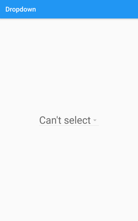
If you want to show a placeholder text when the dropdown is disabled, use the disabledHint property. When using this property, make sure the value property is not set:
DropdownButton(
      disabledHint: Text("Can't select"),
      style: TextStyle(color: Colors.red,fontSize: 30),
      onChanged: null,
      value:null.
      items: dropdownItems
      )
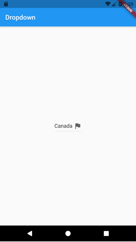
Icons can be applied to a dropdown by setting the icon property of the DropdownButton:
Widget build(BuildContext context) {
    return DropdownButton(
      value: selectedValue,
      icon: Icon(Icons.flag),
      onChanged: (String? newValue){
        setState(() {
          selectedValue = newValue!;
        });
      },
      items: dropdownItems
      );
  }
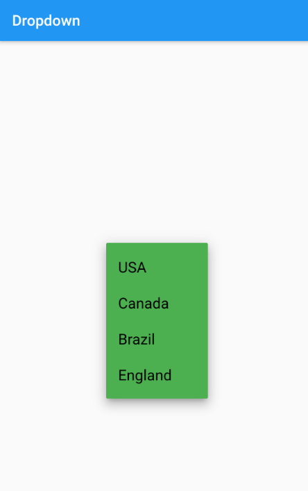
The dropdownColor property will allow you to set a background color for the dropdown items. This will change only the dropdown item’s background color, not the selection button color:
DropdownButton(
      value: selectedValue,
      dropdownColor: Colors.green,
      onChanged: (String? newValue){
        setState(() {
          selectedValue = newValue!;
        });
      },
      items: dropdownItems
      )
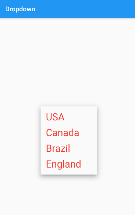
The style property will allow you to change the text-related styling, including color and size. You can use the TextStyle widget to set the text-related styling for dropdown items:
DropdownButton(
      value: selectedValue,
      style: TextStyle(color: Colors.red,fontSize: 30),
      onChanged: (String? newValue){
        setState(() {
          selectedValue = newValue!;
        });
      },
      items: dropdownItems
      )
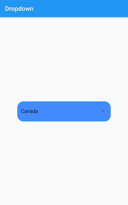
DropdownButtonFormField and DropdownButtonDropdownButtonFormField provides more functionalities than the normal DropdownButton widget.
First, if you need to customize the dropdown look and feel, you can set a custom decoration by setting the decoration property of the DropdownButtonFormField widget:
              DropdownButtonFormField(
                decoration: InputDecoration(
                  enabledBorder: OutlineInputBorder(
                    borderSide: BorderSide(color: Colors.blue, width: 2),
                    borderRadius: BorderRadius.circular(20),
                  ),
                  border: OutlineInputBorder(
                    borderSide: BorderSide(color: Colors.blue, width: 2),
                    borderRadius: BorderRadius.circular(20),
                  ),
                  filled: true,
                  fillColor: Colors.blueAccent,
                ),
                dropdownColor: Colors.blueAccent,
                value: selectedValue,
                onChanged: (String? newValue) {
                  setState(() {
                    selectedValue = newValue!;
                  });
                },
                items: dropdownItems)
In this example, if you want to set a background color, you must first set the filled property of the InputDecoration and set a color to fillColor. Otherwise, it will not show the proper result.
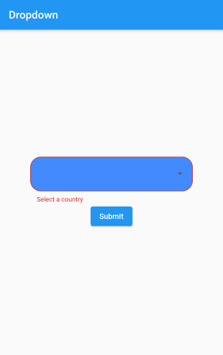
Another useful feature in DropdownButtonFormField is inbuilt validation support.
To make this work, you must use this widget inside a Form widget. In this example, it will check whether the dropdown has a value, and if not it, it will show the specified message under the dropdown.
This validation will trigger when the button calls validation like _dropdownFormKey.currentState!.validate():
 class _DropdownItemState extends State<DropdownItem> {
  String? selectedValue = null;
  final _dropdownFormKey = GlobalKey<FormState>();

  @override
  Widget build(BuildContext context) {
    return Form(
        key: _dropdownFormKey,
        child: Column(
          mainAxisAlignment: MainAxisAlignment.center,
          children: [
            DropdownButtonFormField(
                decoration: InputDecoration(
                  enabledBorder: OutlineInputBorder(
                    borderSide: BorderSide(color: Colors.blue, width: 2),
                    borderRadius: BorderRadius.circular(20),
                  ),
                  border: OutlineInputBorder(
                    borderSide: BorderSide(color: Colors.blue, width: 2),
                    borderRadius: BorderRadius.circular(20),
                  ),
                  filled: true,
                  fillColor: Colors.blueAccent,
                ),
                validator: (value) => value == null ? "Select a country" : null,
                dropdownColor: Colors.blueAccent,
                value: selectedValue,
                onChanged: (String? newValue) {
                  setState(() {
                    selectedValue = newValue!;
                  });
                },
                items: dropdownItems),
            ElevatedButton(
                onPressed: () {
                  if (_dropdownFormKey.currentState!.validate()) {
                    //valid flow
                  }
                },
                child: Text("Submit"))
          ],
        ));
  }
}
The Dropdown widget can be used in your Flutter app to show and select a single value from a large set of options.
If you are using a single dropdown, which does not require validation, you can use DropdownButton.
If you are required to apply validation and if the dropdown comes under the Form widget, it is better to use DropdownButtonFormField because it has more customization along with inbuilt validation support.
Install LogRocket via npm or script tag. LogRocket.init() must be called client-side, not
server-side
$ npm i --save logrocket

// Code:

import LogRocket from 'logrocket';
LogRocket.init('app/id');
// Add to your HTML:

<script src="https://cdn.lr-ingest.com/LogRocket.min.js"></script>
<script>window.LogRocket && window.LogRocket.init('app/id');</script>

Learn how to use Fallow to analyze AI-generated code, detect dead code, duplicate logic, and complexity issues, and integrate automated code quality checks into your AI-assisted development workflow.

Learn how to protect full-stack projects from NPM supply chain attacks with a practical security checklist.

Explore 15 essential MCP servers for web developers to enhance AI workflows with tools, data, and automation.

Learn how contrast-color() automatically picks accessible text colors using native CSS, without JavaScript.
Hey there, want to help make our blog better?
Join LogRocket’s Content Advisory Board. You’ll help inform the type of content we create and get access to exclusive meetups, social accreditation, and swag.
Sign up now

 Learn more →
