Editor’s note: This post was updated by Emmanuel Odioko on 25 June 2024 to cover the use of CSS variables to dynamically change slider properties.

Range sliders are awesome tools that let users select a value or filter items based on numeric ranges. They’re often used by developers to create progress bars, volume controls in audio and video players, product filters on ecommerce websites, and even for zooming features.
But adding a slider widget to a webpage can be trickier than you might think. Sure, you can simply use an <input /> element of type range, but styling it consistently across different browsers can be a real headache.
That’s why we’ve put together this guide to show you how to create a custom range slider using only CSS. And if you’re feeling adventurous, we’ll show you how to take it to the next level with JavaScript.
Here is the final project:
See the Pen
Custom CSS Range slider_v2.0 by Ibaslogic (@ibaslogic)
on CodePen.
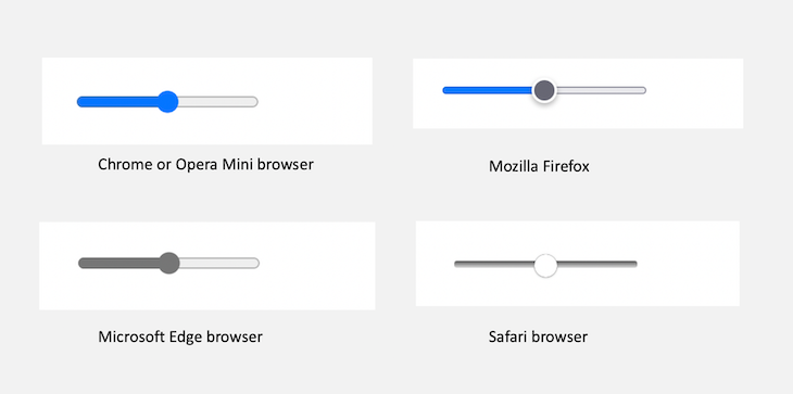
range input typeIn its simplest form, an input element of type range will look like this:
<input type="range"/>
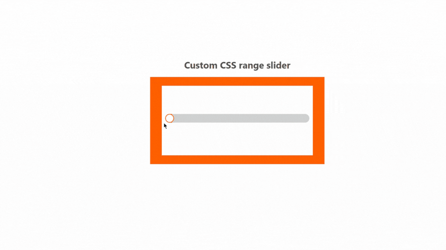
This code will result in a widget that is inconsistent across browsers, as we can see below:
If we want to fit our slider widget to a particular theme or brand, we need to customize these irregularities.
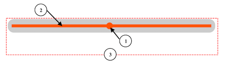
As you can see in the image below, a range slider widget consists of certain key elements — a thumb (label 1) and a slider track (label 2) contained within a container input element (label 3, shown in gray):
To customize this slider widget, we only need to target the different components. However, inspecting the widget from the browser’s dev tools shows that the components are not exposed to us:
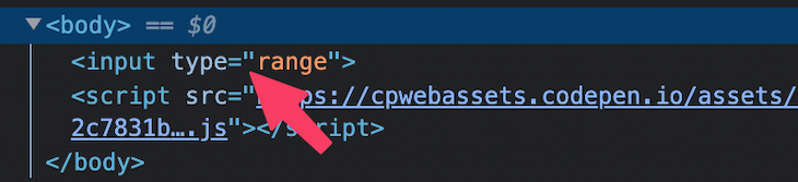
In the image above, we see only the rendered <input /> and not the elements responsible for the slider track and thumb.
This is because the range element is implemented as a web component. Browsers internally encapsulate and hide elements and styles that make up the input slider inside a shadow DOM.
If you’re on Chrome, you can enable the Show user agent shadow DOM option from Settings to see the shadow DOM:
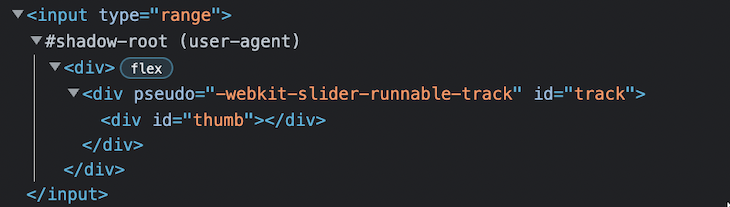
In the shadow DOM, as seen above, we can see the sub-component elements in a structured manner.
This shadow DOM helps isolate components — in our case, the input range — from the actual DOM, including their styles. Doing so prevents those isolated components from conflicting with the styles of other elements in the real DOM.
For instance, targeting the thumb component using its ID from our CSS file will not affect the thumb appearance:
#thumb {
  color: red;
}
This implementation is beneficial because we can use web components without worrying about style conflicts from the hosting document. However, the inconsistencies between how the different browsers implement those web components make them difficult to style.
Let’s create a range slider that looks like the one below with a CSS-only solution:
See the Pen
Custom input range: CSS by Ibaslogic (@ibaslogic)
on CodePen.
As we mentioned earlier, we’ll target the different slider parts to add a custom style. As we don’t have access to the parts directly, we’ll capitalize on the various browser vendor prefixes.
For example, to customize the range slider for the WebKit and Blink-based browsers — like Safari, Chrome, Opera, and Edge — we’ll use the ::-webkit-slider-runnable-track pseudo-element to target the slider track and the ::-webkit-slider-thumb pseudo-element to target the thumb.
For Mozilla Firefox, we’ll use the ::-moz-range-track pseudo-element to target the track and ::-moz-range-thumb for the thumb.
Now that we know which CSS pseudo-elements to use, let’s start by adding the base styles.
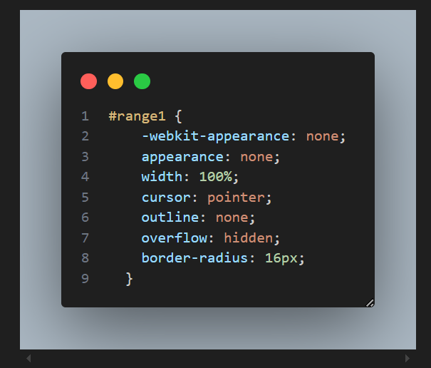
We’ll start by removing the default styles of the native range input and then adding custom styles:
input[type="range"] {
  /* removing default appearance */
  -webkit-appearance: none;
  appearance: none;
  /* creating a custom design */
  width: 100%;
  cursor: pointer;
  outline: none;
}
The range input’s appearance property tells the browser to remove the default appearance styles so that we can apply a custom style.
Setting the -webkit-appearance property to none; on the container element only removes the track and not the thumb:
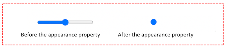
The above is what it looks like in Chrome. The other WebKit-based browsers will also remove only the track bar.
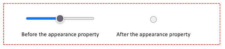
However, Mozilla does not only remove the track; it also eliminates some default appearances from the thumb:
Now, let’s move on to customizing the track and slider thumb.
We can style the slider track in two ways. The first method is applying the custom styles directly in the input[type="range"] selector:
input[type="range"] {
  /* ... */

  /*  styling the track  */
  height: 15px;
  background: #ccc;
  border-radius: 16px;
}
With this method, we don’t have to target the track component specifically. The input container element takes the slider role.
However, for this project, we’ll go with the next approach — using the browser’s vendor prefixes to specifically target the slider track. So, let’s remove the newly added style declarations.
As we mentioned above, the ::-webkit-slider-runnable-track pseudo-element will target the slider track for WebKit-based browsers. Meanwhile, the ::-moz-range-track pseudo-element will target the track for Mozilla Firefox:
/* Track: webkit browsers */
input[type="range"]::-webkit-slider-runnable-track {
  height: 15px;
  background: #ccc;
  border-radius: 16px;
}

/* Track: Mozilla Firefox */
input[type="range"]::-moz-range-track {
  height: 15px;
  background: #ccc;
  border-radius: 16px;
}
The range slider should now look like this:
For WebKit-based browsers, we’ll start by removing the default styles of the native slider thumb and then adding custom styles:
/* Thumb: webkit */
input[type="range"]::-webkit-slider-thumb {
  /* removing default appearance */
  -webkit-appearance: none;
  appearance: none;
  /* creating a custom design */
  height: 15px;
  width: 15px;
  background-color: #fff;
  border-radius: 50%;
  border: 2px solid #f50;
}
For Mozilla Firefox, we’ll only apply the custom styles:
/* Thumb: Firefox */
input[type="range"]::-moz-range-thumb {
  height: 15px;
  width: 15px;
  background-color: #fff;
  border-radius: 50%;
  border: 1px solid #f50;
}
Due to how Mozilla handles the thumb, we reduced the border from the 2px applied for WebKit browsers to 1px so the thumb can fit appropriately in the range slider.
Keep in mind that Mozilla applies a gray border to the thumb by default. You can add a border: none; property if you don’t want to apply a border.
The slider should now look like this:

As we can see, both the slider track and thumb have rounded shapes. If you want to make the shape rectangular, you can remove the border-radius CSS property from the components:
input[type="range"]::-webkit-slider-runnable-track {
 /* border-radius: 16px; */
}

/* Track: Mozilla Firefox */
input[type="range"]::-moz-range-track {
 /* border-radius: 16px; */
}

input[type="range"]::-webkit-slider-thumb {
 /* border-radius: 50%; */
}

input[type="range"]::-moz-range-thumb {
 /* border-radius: 50%; */
}
Using only CSS, we can style the range slider to show track progress by filling the space to the left of the thumb with box-shadow and then hiding the overflow from the input[type="range"] selector.
Let’s locate the ::-webkit-slider-thumb and ::-moz-range-thumb pseudo-elements and then add the following box-shadow declaration:
/* Thumb: webkit */
input[type="range"]::-webkit-slider-thumb {
  /*  ...  */
  /*  slider progress trick  */
  box-shadow: -407px 0 0 400px #f50;
}

/* Thumb: Firefox */
input[type="range"]::-moz-range-thumb {
  /*  ...  */
  /*  slider progress trick  */
  box-shadow: -407px 0 0 400px #f50;
}
After that, in the input[type="range"] selector, let’s add the following declarations:
input[type="range"] {
  /*  ...  */
  /*  slider progress trick  */
  overflow: hidden;
  border-radius: 16px;
}
The styled slider should now behave like the first example in the GIF below:
With the addition of JavaScript, we’ll create a range slider that looks like this:
See the Pen
Custom input range: CSS & JS by Ibaslogic (@ibaslogic)
on CodePen.
Due to the overflow: hidden and box-shadow tricks we used to customize the slider progress with the CSS-only solution, the slider thumb cannot be larger than the track — the way it’s shown below:
To achieve the above design, we’ll modify the CSS style rules and apply a bit of JavaScript. On the input[type="range"] selector, let’s remove the overflow: hidden declaration and then set the height and background color properties:
input[type="range"] {
  /* removing default appearance */
  -webkit-appearance: none;
  appearance: none;
  /* creating a custom design */
  width: 100%;
  cursor: pointer;
  outline: none;
  border-radius: 15px;
  /*  overflow: hidden;  remove this line*/

  /* New additions */
  height: 6px;
  background: #ccc;
}
With the height and background color on the input element, we don’t need to specifically target the track component.
So, we can remove the pseudo-elements that we used earlier to target the track lines for each browser’s vendors:
// input[type="range"]::-webkit-slider-runnable-track {}
// input[type="range"]::-moz-range-track {}
For the slider thumb, we’ll remove the box-shadow declaration that we added in the CSS-only solution:
/* Thumb: webkit */
input[type="range"]::-webkit-slider-thumb {
  /* removing default appearance */
  -webkit-appearance: none;
  appearance: none;
  /* creating a custom design */
  height: 15px;
  width: 15px;
  background-color: #f50;
  border-radius: 50%;
  border: none;

  /* box-shadow: -407px 0 0 400px #f50; emove this line */
  transition: .2s ease-in-out;
}

/* Thumb: Firefox */
input[type="range"]::-moz-range-thumb {
  height: 15px;
  width: 15px;
  background-color: #f50;
  border-radius: 50%;
  border: none;

  /* box-shadow: -407px 0 0 400px #f50; emove this line */
  transition: .2s ease-in-out;
}
Notice we added a CSS transition property for a smooth transition effect. We’ll see the effect when we implement the hover, active, and focus states for the slider thumb.
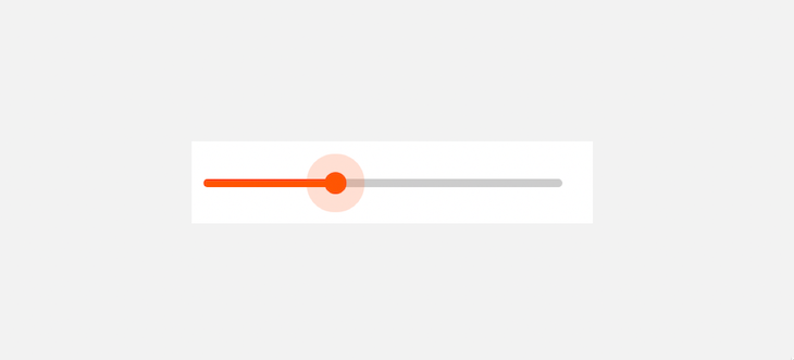
For the sake of accessibility and a positive UX, we’ll add styles for focus, hover, and active states to provide a visual effect while interacting with the slider.
If you take a look at the input[type="range"] selector, we applied the CSS outline: none; property to remove the default focus styles. We can now target the slider thumb using the pseudo-elements, then use the :focus, :hover, and :active pseudo-classes on them to provide a custom style:
/* Hover, active & focus Thumb: Webkit */

input[type="range"]::-webkit-slider-thumb:hover {
  box-shadow: 0 0 0 10px rgba(255,85,0, .1)
}
input[type="range"]:active::-webkit-slider-thumb {
  box-shadow: 0 0 0 13px rgba(255,85,0, .2)
}
input[type="range"]:focus::-webkit-slider-thumb {
  box-shadow: 0 0 0 13px rgba(255,85,0, .2)
}

/* Hover, active & focus Thumb: Firfox */

input[type="range"]::-moz-range-thumb:hover {
  box-shadow: 0 0 0 10px rgba(255,85,0, .1)
}
input[type="range"]:active::-moz-range-thumb {
  box-shadow: 0 0 0 13px rgba(255,85,0, .2)
}
input[type="range"]:focus::-moz-range-thumb {
  box-shadow: 0 0 0 13px rgba(255,85,0, .2)
}
The second example in the GIF below demonstrates how the slider should behave with the custom styling we just added:
We’ll start with a quick way of adding the slider progress. Let’s add an id attribute to the input element so that we can reference it with JavaScript:
<input type="range" id="range" oninput="progressScript()" />
We also added an oninput attribute in the HTML that will trigger an event when the user drags the range slider.
In JavaScript, we’ll create the progressScript() function to handle the input event:
const sliderEl = document.querySelector("#range")

function progressScript() {
  const sliderValue = sliderEl.value;
  sliderEl.style.background = `linear-gradient(to right, #f50 ${sliderValue}%, #ccc ${sliderValue}%)`;
}

progressScript()
We achieved the progress style effect with the code by applying a linear-gradient to the background of the runnable track.
The result now looks like so:
By default, the range input has a minimum and maximum value of 0 and 100, respectively. We can specify min and max attributes to change the default.
Let’s change the default while also displaying the input value as we interact with the widget. We’ll update the HTML to include the min, max, and value attributes:
<input type="range" min="0" max="50" value="0" id="range" />
<div class="value">0</div>
Then, we’ll target these elements in JavaScript and dynamically update the display value and slider progress when the user drags the range slider:
const sliderEl = document.querySelector("#range")
const sliderValue = document.querySelector(".value")

sliderEl.addEventListener("input", (event) => {
  const tempSliderValue = event.target.value;
  sliderValue.textContent = tempSliderValue;

  const progress = (tempSliderValue / sliderEl.max) * 100;

  sliderEl.style.background = `linear-gradient(to right, #f50 ${progress}%, #ccc ${progress}%)`;
})
We used the addEventListener() method in the code to handle the input event. The result now looks like so:
As we can see, the progress bar is always in sync with the max attribute of the input range. We can also customize the thumb to have a rectangular shape by removing the border-radius property:
input[type="range"]::-webkit-slider-thumb {
  /* ... */
  height: 30px;
  width: 15px;
  /* border-radius: 50%; */
}
The above style rule also modifies the height property to achieve the following result:
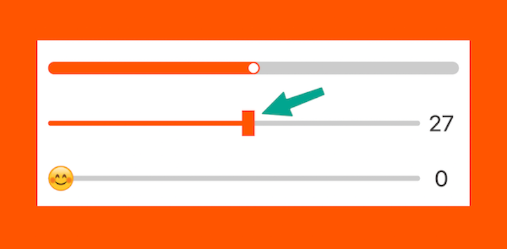
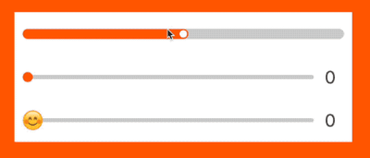
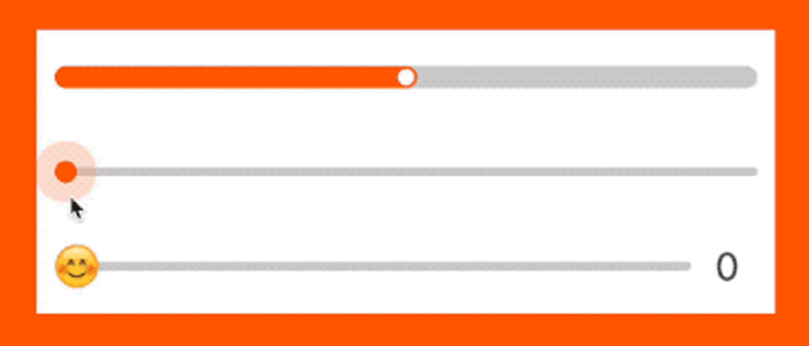
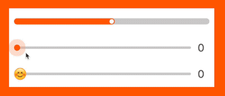
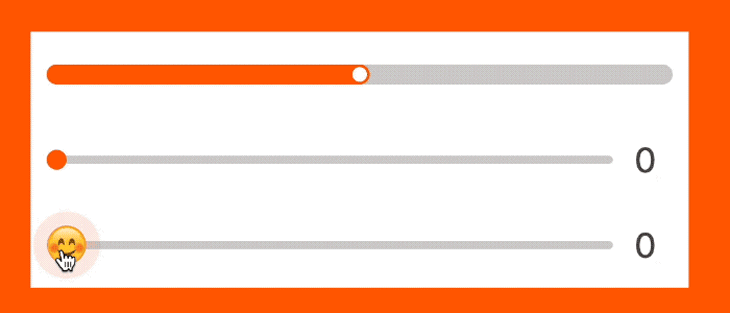
Let’s get more creative and create a slider control using emojis or a custom image as the thumb, like so:
See the Pen
Slider control with emojis: CSS & JS by Ibaslogic (@ibaslogic)
on CodePen.
On top of the last slider example, we’ll replace the background color that we applied on the thumb with a background image so that the thumb becomes an image rather than a colored circle:
/* Thumb: webkit */
input[type="range"]::-webkit-slider-thumb {
  /* ... */
  height: 30px;
  width: 30px;
  /* background-color: #f50; remove this*/
  background-image: url("https://ibaslogic.github.io/hosted-assets/smile.png");
  background-size: cover;
}

/* Thumb: Firefox */
input[type="range"]::-moz-range-thumb {
  /* ... */
  height: 30px;
  width: 30px;
  /* background-color: #f50; */
  background-image: url("https://ibaslogic.github.io/hosted-assets/smile.png");
  background-size: cover;
}
We used the height and width properties to increase the thumb size. Also, notice that we included a background-size property. Without this property, we won’t be able to see the thumb image.
To make the thumb rotate when we drag it, we will apply a transform property on it like so:
/* Thumb: webkit */
input[type="range"]::-webkit-slider-thumb {
  /* ... */
  /* rotate thumb */
  transform: rotateZ(var(--thumb-rotate, 0deg));
}

/* Thumb: Firefox */
input[type="range"]::-moz-range-thumb {
  /* ... */
  /* rotate thumb */
  transform: rotateZ(var(--thumb-rotate, 0deg));
}
In the style rule, we use a CSS variable to dynamically update the amount of rotation. Let’s grab the CSS variable in our JavaScript file and update it based on the slider progress to get the angle of rotation:
sliderEl.addEventListener("input", (event) => {
  // ...
  sliderEl.style.setProperty("--thumb-rotate", `${(tempSliderValue/100) * 2160}deg`)
})
The widget should now behave like so:
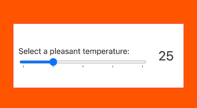
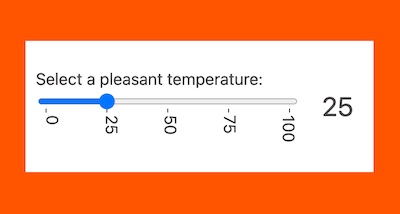
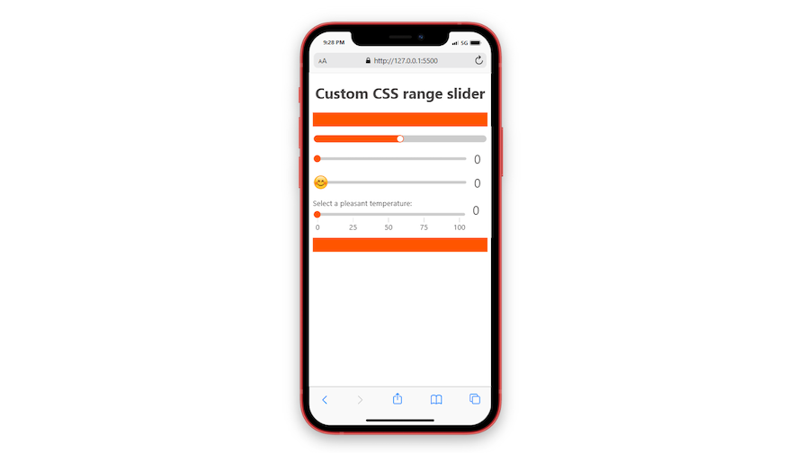
We can enhance the slider experience by adding tick marks for a more precise metric system. We can achieve that using the <datalist> and <option> elements.
Using one of our examples from above, we have the following code:
<label for="range">Select a pleasant temperature:</label><br />
<input
  type="range"
  min="0"
  max="100"
  value="0"
  id="range"
  list="temperature"
  step="25"
/>
<datalist id="temperature">
  <option value="0" label="0"></option>
  <option value="25" label="25"></option>
  <option value="50" label="50"></option>
  <option value="75" label="75"></option>
  <option value="100" label="100"></option>
</datalist>
We added new attributes to the code to enhance its functionality. The list attribute lets us link a specific input range to a <datalist> using its ID. The step attribute controls the stepping value. While its default is 1, we’ve set it to 25 to match the value intervals specified in the <option> tags.
Furthermore, the label attribute on the <option> elements enables us to label the tick marks. However, it is important to note that our current style options would hide the ticks. To make them visible, we can temporarily remove the appearance: none; declaration:
input[type="range"] {
  /* -webkit-appearance: none;
    appearance: none;  */

  /* ... */
}
Now we should see the tick marks:
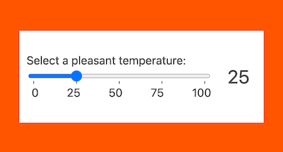
To display the label content, we must ensure the datalist has the same width as the input range. In our case, we’ve set the input’s width to 100%. Additionally, for even spacing of the datalist options, we can use the justify-content property. Here are the CSS rules to achieve this:
datalist {
  display: flex;
  justify-content: space-between;
  width: 100%;
  margin-top: 7px;
  padding: 0 5px;
}
With these CSS rules, the labels within the datalist will align perfectly with the corresponding tick marks on the input range:
To enhance the user experience, especially when dealing with longer label texts, we can add slanting effects to make them more visually appealing. Here are the style rules to achieve this:
datalist {
  /* ... */
  flex-direction: column;
  writing-mode: vertical-lr;
}
This code will give us the following output:
The above implementation demonstrates how to add tick marks to the native input range. For a custom range slider, we would adopt a different approach. We’ll manually create the tick marks ourselves as the appearance: none; declaration that we applied to the input element removes the default ones.
Let’s start by returning the appearance: none; declaration that we removed earlier:
input[type="range"] {
  -webkit-appearance: none;
  appearance: none;
  /* ... */
}
Next, we’ll make some changes by replacing the datalist and option elements with generic div and span elements, respectively. This approach offers more flexibility for customizing the range slider:
<input
  type="range"
  min="0"
  max="100"
  value="0"
  id="range"
  step="25"
/>
<div class="sliderticks">
  <span>0</span>
  <span>25</span>
  <span>50</span>
  <span>75</span>
  <span>100</span>
</div>
In this example, we substituted the <option> elements due to their restricted styling capabilities, because they are implemented as web components within a shadow DOM.
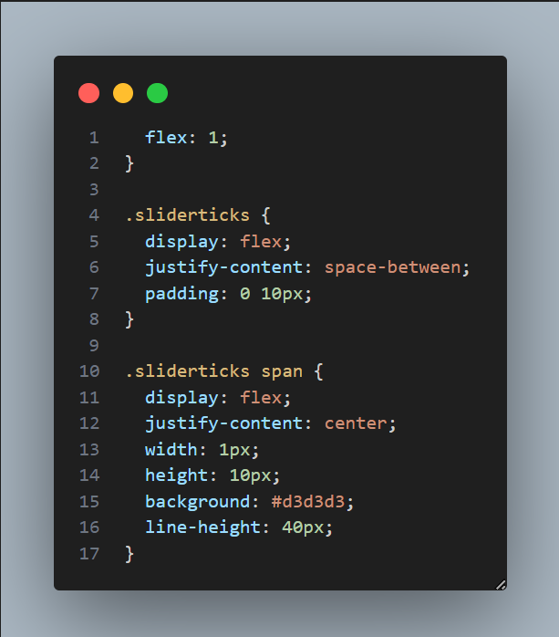
Now, we can add the following style rules to achieve our customized slider tick marks:
.sliderticks {
  display: flex;
  justify-content: space-between;
  padding: 0 10px;
}

.sliderticks span {
  display: flex;
  justify-content: center;
  width: 1px;
  height: 10px;
  background: #d3d3d3;
  line-height: 40px;
}
See the result in the Codepen below:
See the Pen
Custom input range: CSS & JS – tick marks by Ibaslogic (@ibaslogic)
on CodePen.
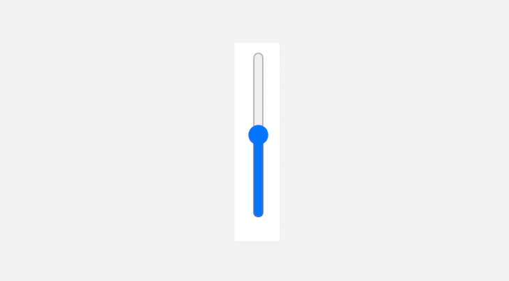
We have various options to create a vertical slider, depending on whether we wish to target the slider alone or both the slider and the surrounding text (e.g., a label).
If our focus is solely on the default native slider and we want to style it independently, we can achieve a vertical slider system by simply setting the appearance property to slider-vertical for most browsers. However, for Firefox, we need to include the orient attribute as well. Here’s an example:
<input type="range" orient="vertical" />
And here’s the CSS:
input[type="range"] {
  appearance: slider-vertical;
  /*  safari  */
  -webkit-appearance: slider-vertical;
}
The result should look like this:
To create a custom vertical slider, apply the appearance: none; declaration to the input element. Then, use the CSS transform property on the container element to rotate it vertically:
.range {
  transform: rotate(-90deg);
}
See the resulting CodePen below:
See the Pen
Vertical input range: CSS & JS – tick marks by Ibaslogic (@ibaslogic)
on CodePen.
For further customization, this section will cover dynamically changing the slider’s thumb color as it progresses, the theme to match the thumb color, and we will sync the slider progress to these changes. We will achieve all of this using CSS variables.
You can see these dynamic changes here:
See the Pen
Dynamically change slider properties by Emmanuel Odioko (@Emmanuel-Odioko)
on CodePen.
We want the thumb color of the slider to change dynamically based on the slider’s value. In our CSS, we will define a CSS variable --thumb-color, which we will use to do everything in this step, at the root level of our file.
Our variable initial state will be white (#fff). This variable will be responsible for setting the background color of the slider’s thumb in the following selector:
#range1::-webkit-slider-thumb, #range1::-moz-range-thumb {
  background-color: var(--thumb-color);
}
In our JavaScript, copy the code below:
function updateUI(value) {
  const min = rangeSlider.min || 0;
  const max = rangeSlider.max || 100;
  const normalizedValue = (value - min) / (max - min);
  const lightness = 100 - normalizedValue * 100;
  const color = `hsl(0, 0%, ${lightness}%)`;
  rangeSlider.style.setProperty('--thumb-color', color);
}
The updateUI() function above calculates a new color based on the slider’s most current value. This is achieved by determining normalizedValue(), which is a fraction representing the slider’s position relative to its minimum and maximum values.
The lightness can then be calculated by inverting this fraction (so it decreases as the slider value increases), and a new HSL color is generated with this lightness, which results in this:

The theme of the webpage was originally white, but for this section, we want to demonstrate the slider functionality. Specifically, as the slider thumb progresses, we want the background theme to change. In other words, we want the slider to control the webpage’s theme.
In the same updateUI() function used for updating the thumb color, after we have calculated the new color based on the slider’s position, we will apply it to the backgroundColor() property of the body:
function updateUI(value) {
  ...
  body.style.backgroundColor = color;
}
This basic sync creates a reasonable visual consistency between the slider thumb and the overall theme of our webpage, thereby improving the user experience by making the UI components feel a bit connected.
Using reusable CSS variables, we can just replace the box shadow in the #range1::-webkit-slider-thumb selector with var(--thumb-color) and this will ensure the progress slide remains in sync with our theme:
#range1::-webkit-slider-thumb {
  box-shadow: -407px 0 0 400px var(--thumb-color);
}
You may have noticed the range slider is responsive, and we didn’t need to use media queries. This is because we employed the use of responsive viewports and flexbox during development. Let’s break this down:
Using percentages and other relative units rather than just throwing fixed pixel widths in our code allowed the elements to adapt when shrunk:
Throughout this article, you may have noticed that we used percentages (e.g., width: 100%;) for the widths of sliders and containers. This approach benefits responsiveness by allowing these elements to stretch and adapt to their parent element, ensuring they work well on various screen sizes.
Flexbox is known for its benefits to responsiveness. In the following example, we employ flexbox for positioning and alignment:
This helps us maintain certain layout structures across different screen sizes:
If the percentages and flexbox weren’t used properly, and instead, a fixed viewport was used, then we would need media queries to fix the layout issues. But in this case, responsiveness was considered during development.
Creating a custom range slider that looks great and works seamlessly on any browser without sacrificing accessibility can be daunting.
This guide walked you through how to customize a range slider using only CSS, ensuring a consistent look and feel across browsers. We also showed how to enhance this slider widget with JavaScript if you want to take it up a notch.
Don’t forget to check out our audio player guide, which demonstrates how you can use this slider to create a progress bar and volume control in your projects.
Have questions or suggestions? Share them in the comments section below. And if you found this guide helpful, don’t forget to spread the word!
As web frontends get increasingly complex, resource-greedy features demand more and more from the browser. If you’re interested in monitoring and tracking client-side CPU usage, memory usage, and more for all of your users in production, try LogRocket.

LogRocket lets you replay user sessions, eliminating guesswork around why bugs happen by showing exactly what users experienced. It captures console logs, errors, network requests, and pixel-perfect DOM recordings — compatible with all frameworks.
LogRocket's Galileo AI watches sessions for you, instantly identifying and explaining user struggles with automated monitoring of your entire product experience.
Modernize how you debug web and mobile apps — start monitoring for free.

A guide for using JWT authentication to prevent basic security issues while understanding the shortcomings of JWTs.

Discover how to build, render, and automate product demo videos with Remotion, replacing traditional screen recordings with reusable React code.

Chrome’s Modern Web Guidance embeds modern web platform skills into AI coding agents, helping them choose native HTML, CSS, and browser APIs over legacy patterns.

Learn how to use Fallow to analyze AI-generated code, detect dead code, duplicate logic, and complexity issues, and integrate automated code quality checks into your AI-assisted development workflow.
Would you be interested in joining LogRocket's developer community?
Join LogRocket’s Content Advisory Board. You’ll help inform the type of content we create and get access to exclusive meetups, social accreditation, and swag.
Sign up now

 Learn more →
