Editor’s note: This article was reviewed and updated by Chinwike Maduabuchi in January 2025 to showcase how to use Tailwind CSS to style the navbar, and to highlight active link styling on the NavLink component. The source code and the live project from the previous version of the post show the use of an alternative CSS module for styling the navbar.

Styling responsive navigation menus for end users is hardly ever an easy process. Frontend developers have to consider certain parameters — like device breakpoints and accessibility — to create a pleasant navigation experience. It can get more challenging in frontend frameworks like React, where CSS-in-JS tends to get tricky.
In this tutorial, we will learn how to create a responsive navigation bar using React.js and CSS. Also, we will look at how we can apply media queries to make our navbar responsive to different screen sizes. The final result will look and behave as shown below:

You can fiddle with the source code and view the live project here.
To follow along with this tutorial, you’ll need:
Now, let’s set up a new React application!
The Replay is a weekly newsletter for dev and engineering leaders.
Delivered once a week, it's your curated guide to the most important conversations around frontend dev, emerging AI tools, and the state of modern software.
Now let’s start moving parts around, shall we? Here’s a summary of the tools we’ll be using to create this application:
You can now begin by running this sequence of commands in your terminal:
#bash
pnpm create vite@latest responsive-react-navbar
# follow prompts (select react & typescript+swc)
cd responsive-react-navbar
pnpm install
pnpm run dev
This will create a new React project with starter files for us to start our implementation. Next up, we will install the necessary dependencies discussed earlier:
pnpm add react-router-dom lucide-react @mantine/hooks
After that’s done, you can open the project in your preferred editor and we’ll proceed to install and configure Tailwind.
Now, install the remaining dependencies:
pnpm add -D tailwindcss postcss autoprefixer tailwind-merge clsx
Now that we have Tailwind installed, run the following command to generate your Tailwind and PostCSS config files:
## bash
npx tailwindcss init -p
## convert tailwind config file to a typescript
mv tailwind.config.js tailwind.config.ts
Replace your Tailwind config content file with the code below to ensure all Tailwind classes apply to your React components. You will also notice global variables (CSS custom properties) being used to configure the font and colors of the application:
// tailwind.config.ts
import type { Config } from 'tailwindcss'
const config: Config = {
  content: ['./index.html', './src/**/*.{js,ts,jsx,tsx}'],
  theme: {
    extend: {
      fontFamily: {
        mono: ['var(--montserrat-font)'],
        sans: ['var(--inter-font)'],
      },
      colors: {
        primary: {
          DEFAULT: 'var(--primary)',
        },
        secondary: {
          DEFAULT: 'var(--secondary)',
        },
      },
    },
  },
  plugins: [],
}
export default config
Modify your index.css file to include the Tailwind directives and CSS custom properties we used earlier:
// src/index.css
@import url('https://fonts.googleapis.com/css2?family=Inter:ital,opsz,wght@0,14..32,100..900;1,14..32,100..900&display=swap');
@import url('https://fonts.googleapis.com/css2?family=DM+Sans:ital,opsz,wght@0,9..40,100..1000;1,9..40,100..1000&family=Inter:ital,opsz,wght@0,14..32,100..900;1,14..32,100..900&display=swap');

@tailwind base;
@tailwind components;
@tailwind utilities;
:root {
  --primary: #242424;
  --secondary: rgba(255, 255, 255, 0.87);
  --font-inter: 'Inter', sans-serif;
  --font-dmsans: 'DM Sans', sans-serif;
  --navbar-height: 80px;
  font-family: var(--font-dmsans);
  line-height: 1.5;
  font-weight: 400;
  color: var(--secondary);
  background-color: var(--primary);
  font-synthesis: none;
  text-rendering: optimizeLegibility;
  -webkit-font-smoothing: antialiased;
  -moz-osx-font-smoothing: grayscale;
}
Here, we’ve imported our fonts from Google Fonts and added the Tailwind directives to our global stylesheet. Now Tailwind is set up across our project. We can also create a utility function that will help us effectively apply conditional styles to any element. This function will make use of the tailwind-merge and clsx libraries installed earlier.
Run this to create the file from your terminal:
#bash
mkdir src/lib && touch src/lilb/utils.ts
And fill with the content below:
// src/lib/utils.ts
import { clsx, type ClassValue } from 'clsx'
import { twMerge } from 'tailwind-merge'

export function cn(...inputs: ClassValue[]) {
  return twMerge(clsx(inputs))
}
You’ll see this in action when we start changing the navigation bar’s appearance based on some React states.
To begin recreating the app you saw in the demo, you will find the internal pages of the app in src/components/pages.tsx. Once you have that copied over, you can start constructing the app routes with React Router Dom.
App.ts is the entry point of our React application. Therefore, we can write the application’s routing structure here.
We use BrowserRouter from React Router DOM to wrap the entire app and use the Routes and Route components to define the routes:
App.js
import { BrowserRouter, Routes, Route } from 'react-router-dom'
import { About, Contact, Home, Pricing } from './components/pages'
import { Navbar } from './components/navbar'

function App() {
  return (
    <main>
      <BrowserRouter>
        <Navbar />
        <div className='min-h-screen w-full flex items-center justify-center'>
          <Routes>
            <Route path='/' element={<Home />} />
            <Route path='/about' element={<About />} />
            <Route path='/pricing' element={<Pricing />} />
            <Route path='/contact' element={<Contact />} />
          </Routes>
        </div>
      </BrowserRouter>
    </main>
  )
}
export default App
Here, we are bootstrapping our app’s routing and navigation using React Router DOM. We also imported the Navbar component and then defined the Routes, which are simple components exported from src/components/pages.tsx:
// src/comoponents/pages.tsx
export const Home = () => {
  return <div>Home Page</div>
}
export const About = () => {
  return <div>About Page</div>
}
export const Contact = () => {
  return <div>Contact Page</div>
}
export const Pricing = () => {
  return <div>Pricing Page</div>
}
Routes is a container for a nested tree of <Route> elements that each renders the branch that best matches the current location. <Route> declares an element that should be rendered at a certain URL path.
Navbar componentOur goal is to create a responsive navbar that initially presents the navigation menu in a horizontal layout for larger screens. As the viewport size reduces to mobile dimensions, the menu smoothly transitions to a sliding panel that enters from the right side. In this mobile view, the menu spans the full height of the screen and covers half its width, ensuring a clean and accessible design across devices.
In advanced cases, however, I personally create two separate menu components — the main and the side menu to avoid complications. But we can proceed with this solution for this simple app.
Now, let’s build the structure of the Navbar component with Tailwind. First, let’s define the links and their TypeScript interface:
<// src/component/navbar.tsx
interface NavLinkType {
  name: string
  path: string
}

const navLinks: NavLinkType[] = [
  { name: 'Home', path: '/' },
  { name: 'About', path: '/about' },
  { name: 'Pricing', path: '/pricing' },
  { name: 'Contact', path: '/contact' }
]
The navigation bar will consist of three main sections: 1.) a header container 2.) the main navigation wrapper (nav element), and 3.) the logo, navigation links and hamburger or menu button:
import { useState } from 'react'
import { NavLink } from 'react-router-dom'
import { MenuIcon, XIcon } from 'lucide-react'

interface NavLinkType {
  name: string
  path: string
}

const navLinks: NavLinkType[] = [
  // ...navLinks
]

export const Navbar = () => {
  const [isMenuOpen, setIsMenuOpen] = useState(false)
  return (
    <header>
      <nav>
        {/* Logo */}
        <NavLink to='/' className='font-bold'>
          NavigationBar
        </NavLink>
        {/* Navigation Links Container */}
        <ul>
          {navLinks.map((link) => (
            <li key={link.name}>
              <NavLink to={link.path}>{link.name}</NavLink>
            </li>
          ))}
          <a href='https://chinwike.space'>Explore Further</a>
        </ul>
        {/* Mobile Menu Button */}
        <button>{isMenuOpen ? <XIcon /> : <MenuIcon />}</button>
      </nav>
    </header>
  )
}
Next, let’s apply some basic Tailwind classes to style the navigation bar.
Update the header and nav tags with Tailwind utility classes:
<header className='fixed w-full px-8 shadow-sm shadow-neutral-500 h-[--navbar-height] flex items-center'>
  <nav className='flex justify-between items-center w-full'>
    <NavLink to='/' className='font-bold'>
      NavigationBar
    </NavLink>
    <ul className='flex items-center gap-8'>
      {navLinks.map((link) => (
        <li key={link.name}>
          <NavLink to={link.path} className='text-secondary'>
            {link.name}
          </NavLink>
        </li>
      ))}
      <a
        href='https://chinwike.space'
        className='rounded-lg py-2 px-4 bg-[#1FABEB]'
      >
        Explore Further
      </a>
    </ul>
  </nav>
</header>
The header is fixed at the top with a shadow for separation. Its height is mapped to the --navbar-height custom property defined earlier
The nav is styled using Flexbox to distribute space between its child elements — currently the logo and links.
We map through the array of links and render them using React Router’s NavLink component, which has extra features we’ll discuss later.
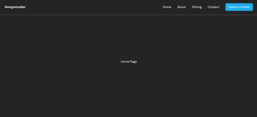
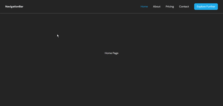
The result is a horizontal navbar with evenly spaced links. At this point, our navbar project’s desktop view should look like this:
Now let’s move on to make this React navbar responsive in the next section.
Now that we have defined the structure of the Navbar component, we can start making it responsive using media queries.
Media queries are a CSS feature that lets you specify how your content layout will respond to different conditions — such as a change in viewport width. Tailwind’s media query classes follow a mobile-first approach, meaning styles apply to smaller screens by default and scale up as screen sizes increase. Tailwind uses breakpoint prefixes like sm:, md:, lg:, and xl: to define styles for larger viewports.
For example:
<p class="text-base sm:text-lg md:text-xl">Hello World</p>
Here, text-base applies to all screens, sm:text-lg kicks in at 640px, and md:text-xl applies from 768px and up. This design ensures that your app is optimized for mobile users first, progressively enhancing for larger devices.
You can also target any breakpoint using Tailwind’s arbitrary syntax [600px]:text-lg or by extending the breakpoints in the config file.
Let’s now create the hamburger button and apply media query classes to hide it on larger screens using the md:hidden class. We’ll also render a MenuIcon or an XIcon depending on the isMenuOpen state:
import { MenuIcon, XIcon } from 'lucide-react'

// navbar return body
<header className='fixed w-full px-8 shadow-sm shadow-neutral-500 h-[--navbar-height] flex items-center'>
  <nav className='flex justify-between items-center w-full'>
    <NavLink to='/' className='font-bold'>
      NavigationBar
    </NavLink>
    <ul className='flex items-center gap-8'>
      {navLinks.map((link) => (
        <li key={link.name}>
          <NavLink to={link.path}>{link.name}</NavLink>
        </li>
      ))}
      <a
        href='https://chinwike.space'
        className='rounded-lg py-2 px-4 bg-[#1FABEB]'
      >
        Explore Further
      </a>
    </ul>
    <button aria-labelledby='Menu Toggle Button' className='block md:hidden'>
      {isMenuOpen ? (
        <XIcon className='size-6 text-secondary' />
      ) : (
        <MenuIcon className='size-6 text-secondary' />
      )}
    </button>
  </nav>
</header>
Next, we’re going to attempt to reposition the menu (ul element) to the right of the screen.
However, to do this accurately we need to be aware of two state values in our environment:
We already have an isMenuOpen state in the component. We can track the width of the viewport using the useViewportSize hook from the Mantine Hooks package installed earlier:
const [isMenuOpen, setIsMenuOpen] = useState(false)
const { width } = useViewportSize()
const isMobile = width < 768 // below md breakpoint
Now, let’s apply some responsive and conditional styling to the menu:
<ul
  className={cn(
            'flex items-center gap-8',
            isMenuOpen &&
              'bg-neutral-700 flex-col fixed top-[--navbar-height] right-0 bottom-0 w-1/2 p-8 transform transition-transform duration-300 ease-in-out translate-x-0',
            !isMenuOpen &&
              isMobile &&
              'bg-neutral-700 flex-col fixed top-[--navbar-height] right-0 bottom-0 w-1/2 p-8 transform transition-transform duration-300 ease-in-out translate-x-full'
          )}
>
 // ....
</ul>
Let’s break down what those responsive classes do:
Base layout:
– flex items-center gap-8 represents horizontal layout with spacing
Mobile menu open state:
– flex-col changes to vertical layout
– fixed top-[--navbar-height] right-0 bottom-0 positions menu as overlay
– w-1/2 takes half the screen width
– translate-x-0 shows the menu
Mobile menu closed state, and the device is mobile:
– Same positioning but with translate-x-full to hide off-screen
Animations:
– transform transition-transform duration-300 ease-in-out displays smooth sliding animation
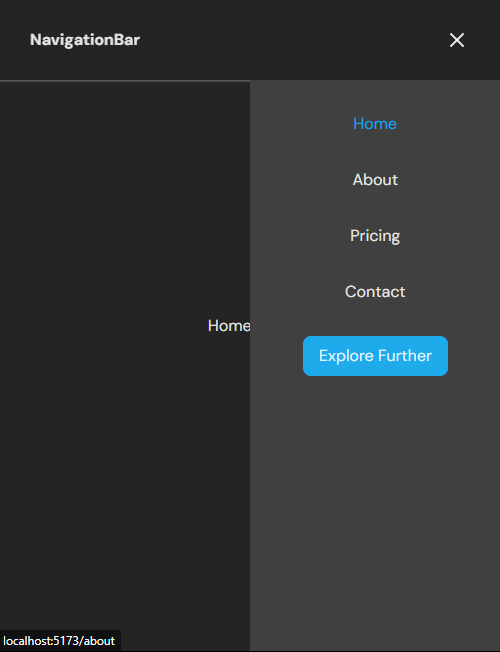
We haven’t yet made this navbar interactive by handling click events on the menu icon. But here is what both the open and closed state of the menu would look like respectively:
NavLink componentThe NavLink component from React Router DOM makes it easy to style active navigation links in a React application. It provides built-in properties like isActive, which allows you to apply dynamic styles based on whether the link matches the current route.
By default, the NavLink component automatically injects an .active class into the rendered element when its corresponding route is active. This class can be directly targeted from your CSS file to style the active state.
NavLink to style active linksBelow is an example of how we used the isActive classes gotten from the className callback function to apply different styles to active and inactive links:
navLinks.map((link) => (
    <li key={link.name}>
      <NavLink
        to={link.path}
        className={({ isActive }) =>
          isActive ? 'text-sky-500' : 'text-secondary'
        }
        onClick={closeMenuOnMobile}
      >
        {link.name}
      </NavLink>
    </li>
))}
to prop — Specifies the path to navigate to
className prop — Uses a callback function to dynamically apply styles based on the isActive property
isActive — A Boolean that tells whether the link matches the current route
.active classYou can also style the active state by targeting the .active class in your CSS file. Since NavLink automatically applies this class to active links, you don’t need to manually handle the isActive property.
Here is a CSS example:
/* Style for active links */
nav a.active {
  color: #38bdf8; /* Sky blue color */
  font-weight: bold;
}

/* Style for inactive links */
nav a {
  color: #737373; /* Neutral gray */
}
Let’s now make the menu hamburger icon interactive.
We’ll start by creating the functions needed to control the navbar’s state. These include a toggleMenu function that toggles the boolean value of isMenuOpen and a closeMenuOnMobile function to close the menu overlay for users after a link has been clicked:
// Toggle menu open/closed
const toggleMenu = () => {
  setIsMenuOpen(!isMenuOpen)
}

// Close menu when clicking a link on mobile
const closeMenuOnMobile = () => {
  if (isMobile) {
    setIsMenuOpen(false)
  }
}
Here is the updated Navbar.ts file that manages the navigation bar’s appearance with the state and nav functions created earlier:
import { useState } from 'react'
import { NavLink } from 'react-router-dom'
import { MenuIcon, XIcon } from 'lucide-react'
import { useViewportSize } from '@mantine/hooks'
import { cn } from '../lib/utils'
interface NavLinkType {
  name: string
  path: string
}
const navLinks: NavLinkType[] = [
  // ..navlinks
]
export const Navbar = () => {
  const [isMenuOpen, setIsMenuOpen] = useState(false)
  const { width } = useViewportSize()
  const isMobile = width < 768 // below md breakpoint
  const toggleMenu = () => {
    setIsMenuOpen(!isMenuOpen)
  }
  const closeMenuOnMobile = () => {
    if (isMobile) {
      setIsMenuOpen(false)
    }
  }
  return (
    <header className='fixed w-full px-8 shadow-sm shadow-neutral-500 h-[--navbar-height] flex items-center'>
      <nav className='flex justify-between items-center w-full'>
        <NavLink to='/' className='font-bold'>
          NavigationBar
        </NavLink>
        <ul
          className={cn(
            'flex items-center gap-8',
            isMenuOpen &&
              'bg-neutral-700 flex-col fixed top-[--navbar-height] right-0 bottom-0 w-1/2 p-8 transform transition-transform duration-300 ease-in-out translate-x-0',
            !isMenuOpen &&
              isMobile &&
              'bg-neutral-700 flex-col fixed top-[--navbar-height] right-0 bottom-0 w-1/2 p-8 transform transition-transform duration-300 ease-in-out translate-x-full'
          )}
        >
          {navLinks.map((link) => (
            <li key={link.name}>
              <NavLink
                to={link.path}
                className={({ isActive }) =>
                  isActive ? 'text-sky-500' : 'text-secondary'
                }
                onClick={closeMenuOnMobile}
              >
                {link.name}
              </NavLink>
            </li>
          ))}
          <a
            href='https://chinwike.space'
            className='rounded-lg py-2 px-4 bg-[#1FABEB]'
          >
            Explore Further
          </a>
        </ul>
        <button
          aria-labelledby='Menu Toggle Button'
          className='block md:hidden'
          onClick={toggleMenu}
        >
          {isMenuOpen ? (
            <XIcon className='size-6 text-secondary' />
          ) : (
            <MenuIcon className='size-6 text-secondary' />
          )}
        </button>
      </nav>
    </header>
  )
}
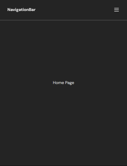
Let’s see what we have now on the UI:
Navigation menus serve an important role in the overall experience of your web application. Making your navbar as organized and accessible as possible can help boost UX and even SEO performance. Hopefully, you found this tutorial for creating a responsive navbar with React and CSS helpful!
You can check out the source code and view the live project here. If you have any questions, feel free to comment below.
Install LogRocket via npm or script tag. LogRocket.init() must be called client-side, not
server-side
$ npm i --save logrocket

// Code:

import LogRocket from 'logrocket';
LogRocket.init('app/id');
// Add to your HTML:

<script src="https://cdn.lr-ingest.com/LogRocket.min.js"></script>
<script>window.LogRocket && window.LogRocket.init('app/id');</script>

TSRX adds first-class control flow, conditional hooks, and scoped styles to React via a TypeScript compiler extension — no new framework required.

Learn how to build a full React Native auth system using Better Auth and Expo — with email/password login, Google OAuth, session persistence, and protected routes.

Compare the top AI development tools and models of June 2026. View updated rankings, feature breakdowns, and find the best fit for you.

Learn how Bloom filters reduce database lookups for username availability checks while preserving correctness at scale.
Hey there, want to help make our blog better?
Join LogRocket’s Content Advisory Board. You’ll help inform the type of content we create and get access to exclusive meetups, social accreditation, and swag.
Sign up now

 Learn more →
