Table of Contents

We use sidebars in mobile apps to provide users with top-level navigation for the most used and important screens of the application. In this article, you’ll learn how to create a custom sidebar using SwiftUI. Let’s get started!
We’ll create a new SwiftUI project from scratch for this tutorial, but you can implement this in your existing projects as well.
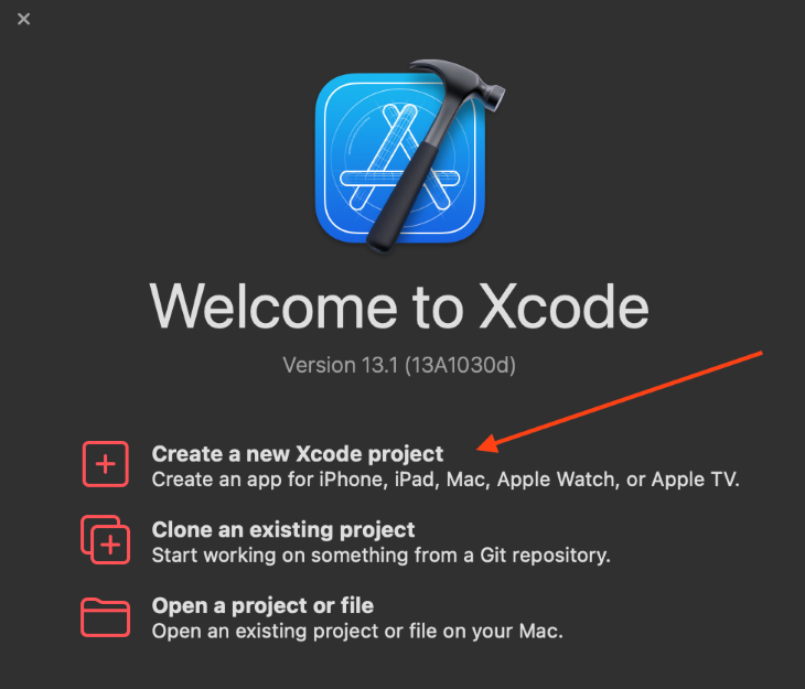
To create a new SwiftUI project, open Xcode and click on Create a new Xcode project.
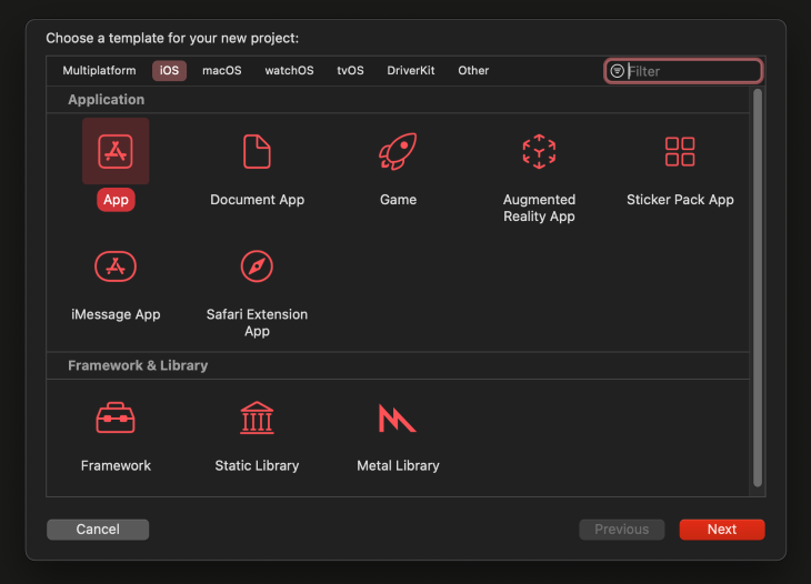
You’ll be prompted to choose a template for your project. Select iOS > App and click Next.
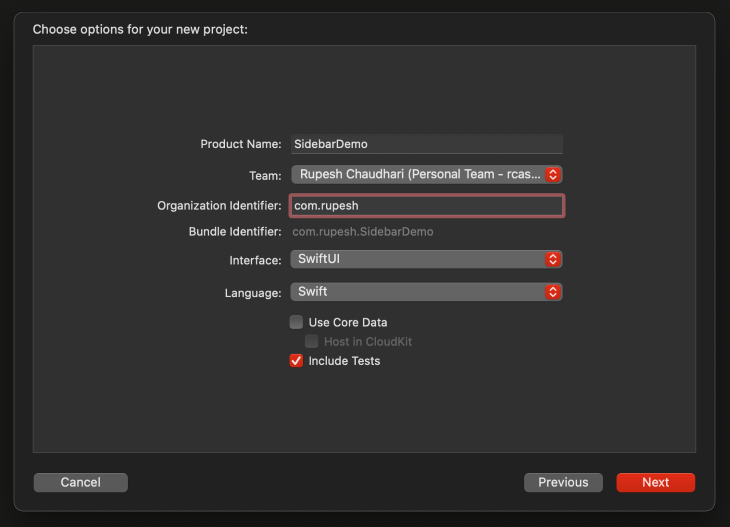
Now, enter the name of your project and the language and framework you want to use. Enter the project name in the Product Name field and select a relevant Team.
Because we will use Swift to create our iOS application, we will select SwiftUI in the interface dropdown.
After clicking Next, Xcode will ask which path to create the project on, so select your preferred location and click Create. Now, let’s create our custom sidebar for our SwiftUI app.
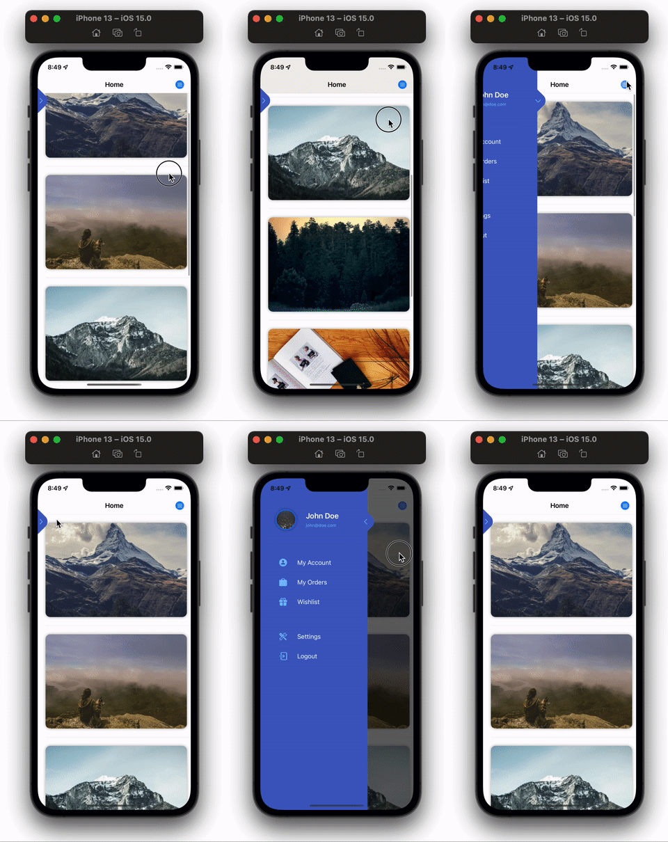
The app we are designing consists of a home screen and a sidebar on the same screen. It has various links for the users to go click on.
The final UI will look like this:
Note: the complete code for this article can be found in this repository.
Let’s focus on building the home screen. We’ll have a list of images that are loaded through the network using AsyncImage.
Add the following code to ContentView.swift :
struct ContentView: View {

    var body: some View {
          NavigationView {
              List {
                  ForEach(0..<8) { _ in
                      AsyncImage(
                              url: URL(
                                string: "https://picsum.photos/600"
                                )) { image in
                          image
                              .resizable()
                              .scaledToFill()
                              .frame(height: 240)
                      } placeholder: {
                          ZStack {
                              RoundedRectangle(cornerRadius: 12)
                                  .fill(.gray.opacity(0.6))
                                  .frame(height: 240)
                              ProgressView()
                          }
                      }
                      .aspectRatio(3 / 2, contentMode: .fill)
                      .cornerRadius(12)
                      .padding(.vertical)
                      .shadow(radius: 4)
                    }
                  }
                  .listStyle(.inset)
                  .navigationTitle("Home")
                  .navigationBarTitleDisplayMode(.inline)
          }
    }
}
Notice we’ve wrapped our entire View, which is returned from the body variable of our ContentView in a NavigationView, then used a List view to create a list of images to display.
Inside this list, we loop through a range of 0 to 8 — (0..<8) — which will iterate eight times starting from 0 to 8.
Inside this loop, we iterate over an AsyncImage view, which is used to load and display images that are on the network. We then used a custom initializer method on the AsyncImage view to give a placeholder value, which will be displayed until the image is downloaded from the network. We’ve also added some modifiers to the views for styling purposes.
Then, we added several modifiers on the List view, listStyle to ListStyle.inset, for an inset style to list rather than the default iOS styled list. We also set navigationTitle("Home") for a navigation title to this screen, which is displayed on the navigation bar.
The last modifier is navigationBarTitleDisplayMode(.inline). It sets the navigation bar display mode to inline, i.e., it will always stay at the top to keep our UI consistent with our sidebar.
Here’s the output from the above code.
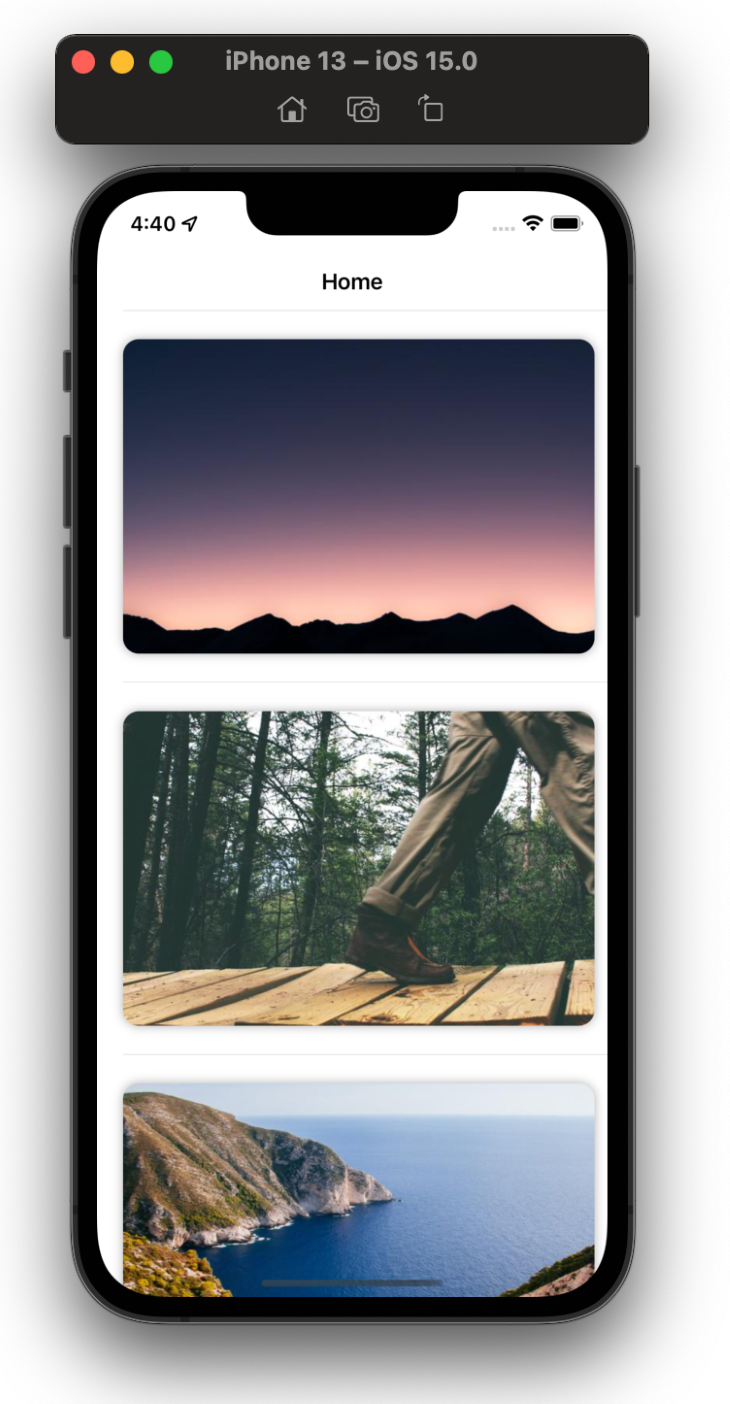
Now that our home screen UI is complete, let’s build the sidebar view. To show and hide the sidebar, we‘ll need a @State variable, which will be the source of truth for our view to know if it should display or hide the sidebar.
Let’s add the @State var to our ContentView.
struct ContentView: View {

    // Add the below line
    @State private var isSidebarOpened = false

    var body: some View {
Now, let’s create the sidebar view by creating a new SwiftUI file. Go to File → New → File or press ⌘ + N to create a new file.
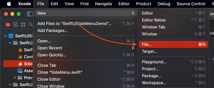
Select the type of file you want to create, select SwiftUI View, and click Next.
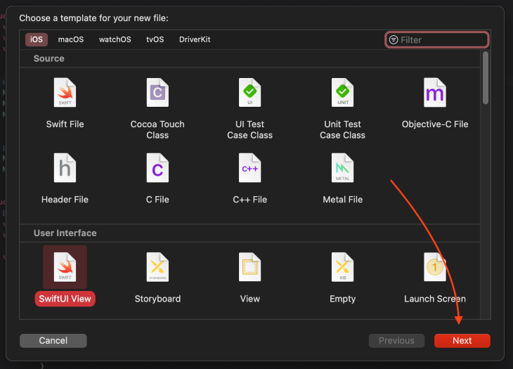
Xcode will ask you for the name of the file you want to create. Enter Sidebar, select your project group in the Group dropdown, and click Create.
Now that we have a blank SwiftUI view, let’s start designing our sidebar.
We will add a @Binding variable to our Sidebar view so that we can update the value of our @State variable, isSidebarOpened, from the Sidebar view itself.
Add the below code to Sidebar.swift:
struct Sidebar: View {
    @Binding var isSidebarVisible: Bool

    var body: some View {
        if isSidebarVisible {
            Text("Sidebar visible")
                .bold()
                .font(.largeTitle)
                .background(.purple)
        }
    }
}
Here, we added a @Binding variable, isSidebarVisible, which will come from the variable isSidebarOpened from the ContentView. We also added a conditional statement saying that if the value of isSidebarVisible is true, then we’ll show the Text view, which contains text saying “Sidebar visible.”
We need to make some changes to our ContentView file. First, wrap NavigationView in a ZStack so that the Sidebar view gets the complete screen bound area. Then, add a Button to our navigation bar to toggle the value of the isSidebarOpened @State variable. We will add the Sidebar view in View and pass the binding value to it.
Make these changes in ContentView.swift:
struct ContentView: View {
    @State private var isSideBarOpened = false

    var body: some View {
        ZStack {
            NavigationView {
                List {
                    ForEach(0..<8) { _ in
                        AsyncImage(
                          url: URL(
                            string: "https://picsum.photos/600"
                          )) { image in
                            image
                                .resizable()
                                .scaledToFill()
                                .frame(height: 240)
                            } placeholder: {
                                ZStack {
                                    RoundedRectangle(cornerRadius: 12)
                                        .fill(.gray.opacity(0.6))
                                        .frame(height: 240)
                                    ProgressView()
                                }
                            }
                        .aspectRatio(3 / 2, contentMode: .fill)
                        .cornerRadius(12)
                        .padding(.vertical)
                        .shadow(radius: 4)
                    }
                    }
                    .toolbar {
                        Button {
                            isSideBarOpened.toggle()
                        } label: {
                            Label("Toggle SideBar",
                          systemImage: "line.3.horizontal.circle.fill")
                        }
                    }
                    .listStyle(.inset)
                    .navigationTitle("Home")
                    .navigationBarTitleDisplayMode(.inline)
            }
            Sidebar(isSidebarVisible: $isSideBarOpened)
        }
    }
}
Here’s what our app currently looks like.
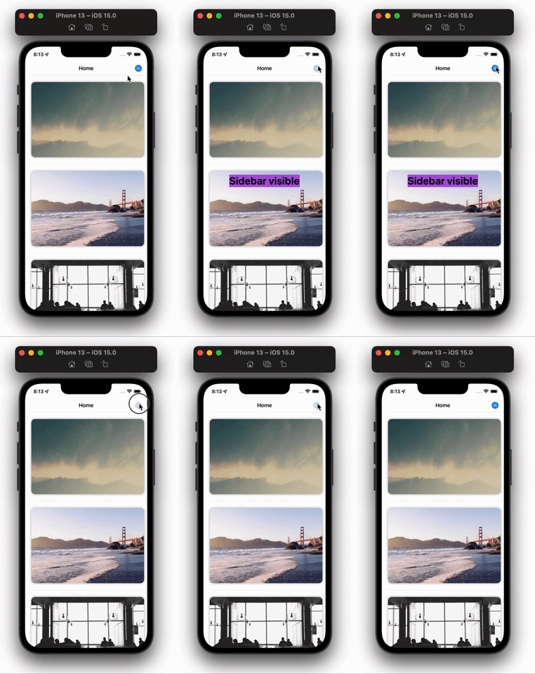
We’re now able to toggle the visibility of our sidebar! Let’s create some UI for it so that it looks like a sidebar.
Let’s first add a dark background that appears after opening the sidebar. Add the following code to Sidebar.swift file:
var body: some View {
    ZStack {
        GeometryReader { _ in
            EmptyView()
        }
        .background(.black.opacity(0.6))
        .opacity(isSidebarVisible ? 1 : 0)
        .animation(.easeInOut.delay(0.2), value: isSidebarVisible)
        .onTapGesture {
            isSidebarVisible.toggle()
        }
    }
    .edgesIgnoringSafeArea(.all)
}
We wrapped our view in a ZStack and added an edgesIgnoringSafeArea modifier to it, then gave it a value of all. This will make our ZStack spread across the available screen, including the area under the notch and bottom corners of the iPhone.
We added a GeometryReader view inside the ZStack so that we can use all the available device screen space for our backdrop view, as well as added the following view modifiers to our GeometryReader view:
background: sets the background of the view. in our case, we have set it to black with an opacity of 60%opacity: sets the opacity of the view itself, and we are computing its value through a ternary expression of 1 if the sidebar is visible and 0 if notanimation: animates the changes we perform on this view. In this case, we are animating the opacity of the view with an easeInOut animation with a delay of 0.2. We have also added a value label in animation that tells Swift we need to animate the view when this value changes (this change was introduced in iOS 15.0)onTapGesture: when users taps on the backdrop, the sidebar should closeThe backdrop for the sidebar will look like this:
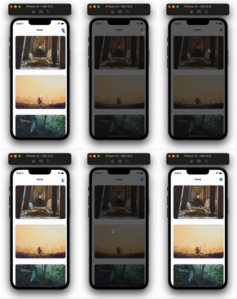
Let’s ensure our sidebar can slide. Make the highlighted changes below in Sidebar.swift file:
struct SideMenu: View {
    @Binding var isSidebarVisible: Bool
    var sideBarWidth = UIScreen.main.bounds.size.width * 0.7
    var bgColor: Color =
          Color(.init(
                  red: 52 / 255,
                  green: 70 / 255,
                  blue: 182 / 255,
                  alpha: 1))

    var body: some View {
        ZStack {
            GeometryReader { _ in
                EmptyView()
            }
            .background(.black.opacity(0.6))
            .opacity(isSidebarVisible ? 1 : 0)
            .animation(.easeInOut.delay(0.2), value: isSidebarVisible)
            .onTapGesture {
                isSidebarVisible.toggle()
            }
            content
        }
        .edgesIgnoringSafeArea(.all)
    }

    var content: some View {
        HStack(alignment: .top) {
            ZStack(alignment: .top) {
                bgColor
            }
            .frame(width: sideBarWidth)
            .offset(x: isSidebarVisible ? 0 : -sideBarWidth)
            .animation(.default, value: isSidebarVisible)

            Spacer()
        }
    }
}
We have introduced two new variables named sideBarWidth and bgColor. As the name suggests, sideBarWidth stores the width of the displayed sidebar. Notice that we have not given any type to this var. This is because Swift takes care of this by using type inference.
The second variable is bgColor, which is a simple Color initialized using RGB values.
To simplify the code in the body and make our code more readable, we have created a new variable named content that returns a View. The content view contains an HStack with two views: the actual sidebar (ZStack), which is displayed on the screen, and a spacer view that takes up maximum space in a view. This makes our blue sidebar move to the left.
In the ZStack, we have one var bgColor for now, which gives the view a background color. We have added important modifiers to the view, too. Using frame, we have set the width of the view to the value of the variable we previously declared, then we used offset, which makes the sidebar slide from left to right onto the screen.
Offset is used to move a particular view with respect to its X and Y coordinates. We move the sidebar negative to its width from the X-axis if the sidebar is not visible, and set it to 0 if the sidebar is visible.
Finally, for a seamless UI, we animate it using animation, give it a default value, and animate it against the isSidebarVisible var.
After making the above adjustments, our Swift sidebar UI will look like this.
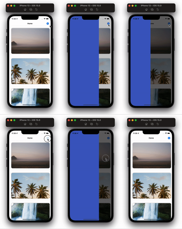
Now, add the below code to Sidebar.swift:
var secondaryColor: Color =
              Color(.init(
                red: 100 / 255,
                green: 174 / 255,
                blue: 255 / 255,
                alpha: 1))

var content: some View {
    HStack(alignment: .top) {
        ZStack(alignment: .top) {
            bgColor
            MenuChevron
        }
        .frame(width: sideBarWidth)
        .offset(x: isSidebarVisible ? 0 : -sideBarWidth)
        .animation(.default, value: isSidebarVisible)

        Spacer()
    }
}

var MenuChevron: some View {
    ZStack {
        RoundedRectangle(cornerRadius: 18)
            .fill(bgColor)
            .frame(width: 60, height: 60)
            .rotationEffect(Angle(degrees: 45))
            .offset(x: isSidebarVisible ? -18 : -10)
            .onTapGesture {
                isSidebarVisible.toggle()
            }

        Image(systemName: "chevron.right")
            .foregroundColor(secondaryColor)
            .rotationEffect(
              isSidebarVisible ?
                Angle(degrees: 180) : Angle(degrees: 0))
            .offset(x: isSidebarVisible ? -4 : 8)
            .foregroundColor(.blue)
    }
    .offset(x: sideBarWidth / 2, y: 80)
    .animation(.default, value: isSidebarVisible)
}
We have created new variable MenuChevron, which contains a ZStack with two views, a RoundedRectangle and an Image.

Tada! We have a working sidebar. Let’s add some content to it!
The final step is to add content to the sidebar.
In our sidebar, there is a user profile with navigation links to different sections of the app. Let’s start with the user profile view.
To create the UI for the user profile section, add the following code to the Sidebar.swift file.
var content: some View {
    HStack(alignment: .top) {
        ZStack(alignment: .top) {
            bgColor
            MenuChevron

            VStack(alignment: .leading, spacing: 20) {
                userProfile
            }
            .padding(.top, 80)
            .padding(.horizontal, 40)
        }
        .frame(width: sideBarWidth)
        .offset(x: isSidebarVisible ? 0 : -sideBarWidth)
        .animation(.default, value: isSidebarVisible)

        Spacer()
    }
}

var userProfile: some View {
    VStack(alignment: .leading) {
        HStack {
            AsyncImage(
              url: URL(
                string: "https://picsum.photos/100")) { image in
                  image
                      .resizable()
                      .frame(width: 50, height: 50, alignment: .center)
                      .clipShape(Circle())
                      .overlay {
                          Circle().stroke(.blue, lineWidth: 2)
                      }
                  } placeholder: {
                      ProgressView()
                  }
                  .aspectRatio(3 / 2, contentMode: .fill)
                  .shadow(radius: 4)
                  .padding(.trailing, 18)

              VStack(alignment: .leading, spacing: 6) {
                  Text("John Doe")
                      .foregroundColor(.white)
                      .bold()
                      .font(.title3)
                  Text(verbatim: "[email protected]")
                      .foregroundColor(secondaryColor)
                      .font(.caption)
              }
          }
          .padding(.bottom, 20)
    }
}
Notice we’ve added a VStack in the sidebar, which has a userProfile view and contains the following:
VStack with leading alignmentHStack that contains two more viewsHStack, we have the user profile image, which is loaded through the network using AsyncImageVStack that displays a user’s name and email. The email text is initialized with verbatim because Swift highlights links with the default accent color, so, to bypass this, we use verbatimLet’s move on to the menu links section. To create the links, we first need to create a struct for a MenuItem that will contain all the information about the item.
struct MenuItem: Identifiable {
    var id: Int
    var icon: String
    var text: String
}
The MenuItem only has three properties: id, icon, and text. Let’s apply this in our UI.
import SwiftUI

var secondaryColor: Color =
              Color(.init(
                red: 100 / 255,
                green: 174 / 255,
                blue: 255 / 255,
                alpha: 1))

struct MenuItem: Identifiable {
    var id: Int
    var icon: String
    var text: String
}

var userActions: [MenuItem] = [
    MenuItem(id: 4001, icon: "person.circle.fill", text: "My Account"),
    MenuItem(id: 4002, icon: "bag.fill", text: "My Orders"),
    MenuItem(id: 4003, icon: "gift.fill", text: "Wishlist"),
]

var profileActions: [MenuItem] = [
    MenuItem(id: 4004,
              icon: "wrench.and.screwdriver.fill",
              text: "Settings"),
    MenuItem(id: 4005,
              icon: "iphone.and.arrow.forward",
              text: "Logout"),
]

struct SideMenu: View {
    @Binding var isSidebarVisible: Bool
    var sideBarWidth = UIScreen.main.bounds.size.width * 0.7
    var bgColor: Color = Color(.init(
                                  red: 52 / 255,
                                  green: 70 / 255,
                                  blue: 182 / 255,
                                  alpha: 1))

    var body: some View {
        ZStack {
            GeometryReader { _ in
                EmptyView()
            }
            .background(.black.opacity(0.6))
            .opacity(isSidebarVisible ? 1 : 0)
            .animation(.easeInOut.delay(0.2), value: isSidebarVisible)
            .onTapGesture {
                isSidebarVisible.toggle()
            }

            content
        }
        .edgesIgnoringSafeArea(.all)
    }

    var content: some View {
        HStack(alignment: .top) {
            ZStack(alignment: .top) {
                menuColor
                MenuChevron

                VStack(alignment: .leading, spacing: 20) {
                    userProfile
                    Divider()
                    MenuLinks(items: userActions)
                    Divider()
                    MenuLinks(items: profileActions)
                }
                .padding(.top, 80)
                .padding(.horizontal, 40)
            }
            .frame(width: sideBarWidth)
            .offset(x: isSidebarVisible ? 0 : -sideBarWidth)
            .animation(.default, value: isSidebarVisible)

            Spacer()
        }
    }

    var MenuChevron: some View {
        ZStack {
            RoundedRectangle(cornerRadius: 18)
                .fill(bgColor)
                .frame(width: 60, height: 60)
                .rotationEffect(Angle(degrees: 45))
                .offset(x: isSidebarVisible ? -18 : -10)
                .onTapGesture {
                    isSidebarVisible.toggle()
                }

            Image(systemName: "chevron.right")
                .foregroundColor(secondaryColor)
                .rotationEffect(isSidebarVisible ?
                    Angle(degrees: 180) : Angle(degrees: 0))
                .offset(x: isSidebarVisible ? -4 : 8)
                .foregroundColor(.blue)
        }
        .offset(x: sideBarWidth / 2, y: 80)
        .animation(.default, value: isSidebarVisible)
    }

    var userProfile: some View {
        VStack(alignment: .leading) {
            HStack {
                AsyncImage(
                  url: URL(
                      string: "https://picsum.photos/100")) { image in
                    image
                        .resizable()
                        .frame(width: 50,
                                height: 50,
                                alignment: .center)
                        .clipShape(Circle())
                        .overlay {
                            Circle().stroke(.blue, lineWidth: 2)
                        }
                } placeholder: {
                    ProgressView()
                }
                .aspectRatio(3 / 2, contentMode: .fill)
                .shadow(radius: 4)
                .padding(.trailing, 18)

                VStack(alignment: .leading, spacing: 6) {
                    Text("John Doe")
                        .foregroundColor(.white)
                        .bold()
                        .font(.title3)
                    Text(verbatim: "[email protected]")
                        .foregroundColor(secondaryColor)
                        .font(.caption)
                }
            }
            .padding(.bottom, 20)
        }
    }
}

struct MenuLinks: View {
    var items: [MenuItem]
    var body: some View {
        VStack(alignment: .leading, spacing: 30) {
            ForEach(items) { item in
                menuLink(icon: item.icon, text: item.text)
            }
        }
        .padding(.vertical, 14)
        .padding(.leading, 8)
    }
}

struct menuLink: View {
    var icon: String
    var text: String
    var body: some View {
        HStack {
            Image(systemName: icon)
                .resizable()
                .frame(width: 20, height: 20)
                .foregroundColor(secondaryColor)
                .padding(.trailing, 18)
            Text(text)
                .foregroundColor(.white)
                .font(.body)
        }
        .onTapGesture {
            print("Tapped on \(text)")
        }
    }
}
Here, we introduced two new views, MenuLinks and menuLink. MenuLinks has items, which are assigned a value when the MenuLinks view is initialized. The view iterates over each instance of items and returns a new view menuLink for each item.
menuLink has two variables that are initialized with the view creation: icon and text, which are wrapped in an HStack and displayed. We also capture tap gestures on the menuLink view. Currently, we are printing the item value to the console, but you can add a NavigationLink and navigate users to the inner screens.
That’s it! We now have a working sidebar.

In this tutorial, you saw how easy it is to create a custom sidebar in SwiftUI. There are, of course, many changes you can make to further customize your sidebar. Thank you for reading!
Install LogRocket via npm or script tag. LogRocket.init() must be called client-side, not
server-side
$ npm i --save logrocket

// Code:

import LogRocket from 'logrocket';
LogRocket.init('app/id');
// Add to your HTML:

<script src="https://cdn.lr-ingest.com/LogRocket.min.js"></script>
<script>window.LogRocket && window.LogRocket.init('app/id');</script>
Would you be interested in joining LogRocket's developer community?
Join LogRocket’s Content Advisory Board. You’ll help inform the type of content we create and get access to exclusive meetups, social accreditation, and swag.
Sign up now
Learn how OpenAPI can automate API client generation to save time, reduce bugs, and streamline how your frontend app talks to backend APIs.

Discover how the Interface Segregation Principle (ISP) keeps your code lean, modular, and maintainable using real-world analogies and practical examples.

<selectedcontent> element improves dropdowns

Learn how to implement an advanced caching layer in a Node.js app using Valkey, a high-performance, Redis-compatible in-memory datastore.
6 Replies to "How to create a custom, collapsible sidebar in SwiftUI"
This is a really complete and attentive tutorial. Thank you very much. Better than any other tutorial. I hope to translate in my native. But in the last step, explaining of MenuLinks tells to create a new swift-view file? If not, where do I put the code?
P.s. Pointing out there is something wrong in your tutorial code. Line “…struct SideMenu: View {@Binding var isSidebarVisible: Bool…” and line “struct Sidebar: View {@Binding var isSidebarVisible: Bool” are the same thing. Unless you describe this as the same, the menu column is not visible. SideMenu should be written as Sidebar.
please demonstrate how to add navigation link.wonderful tutorial
Hey, are you able to add navigation links ?? if yes please help me
Thnx a lot this is best blog on how to make a side menu
Would be nice to include code on going to a View instead of print()