Modern React web applications consist of tabs, progress bars, charts, draggable elements, collapsible components, etc. — all of which are built from components. We’ll be focusing on collapsible components, which have two states: collapsed and expanded.

A collapsible component typically doesn’t show its full content when it’s in the collapsed state, but users can see the full content by expanding it with a mouse click or screen tap. Frontend developers use collapsible components to create action flows, editable forms, and preferences sections.
The collapsible design helps us to hide content that is not immediately relevant. For example, you may use a collapsible component to show more advanced settings right after a list of basic settings on a specific, settings-focused page.
In this tutorial, I will explain how you can create collapsible components with the react-collapsed library, which offers you all the required APIs to turn React components into collapsible components. Also, we will build a preferences page by using this library as the foundation.
Many UI toolkits like MUI, Bootstrap, and other libraries offer pre-built collapsible components, but those components come with hard-to-customize styles and inner elements. On the other hand, react-collapsed offers only the required props and lets you implement your own UI.
This library uses neither an animation framework nor JavaScript for animations. It uses native CSS-based animations. You have the freedom to build and use custom animations with cubic-bezier.
You can indeed turn or extend any React component into a collapsible component with minimal effort. Also, react-collapsed exposes every customization option you need, such as animation speed, animation type, event handlers, etc.
Create a new React project or open your existing React project to get started with the tutorial. If you are going to experiment with a new project, create one with the following command.
npx create-react-app react-collapsed-example
cd react-collapsed-example
Now, add the react-collapsed library into your project.
yarn add react-collapsed
# or
npm i react-collapsed
Add the following code to your App.js
import React from 'react';
import useCollapse from 'react-collapsed';
import './App.css';
function Collapsible() {
    const { getCollapseProps, getToggleProps, isExpanded } = useCollapse();
return (
    <div className="collapsible">
        <div className="header" {...getToggleProps()}>
            {isExpanded ? 'Collapse' : 'Expand'}
        </div>
        <div {...getCollapseProps()}>
            <div className="content">
                Now you can see the hidden content. <br/><br/>
                Click again to hide...
            </div>
        </div>
    </div>
    );
}
function App() {
    return (
    <Collapsible/>
    );
}
export default App;
The above code defines the Collapsible component that uses the react-collapsed props to implement collapsible animations. Here, we used the getToggleProps function to append the required props to the clickable area. Also, we need to use the getCollapseProps function to append the required props to the collapsed panel.
Now, add the following CSS to App.css
.collapsible .content {
    padding: 6px;
    background-color: #eeeeee;
}
.collapsible .header {
    background-color: #dddddd;
    padding: 6px;
    cursor: pointer;
}
Make sure not to add any CSS padding to the element where you add getCollapseProps because it breaks smooth animations.
Now, run your app with the yarn start command. You will see the following result.
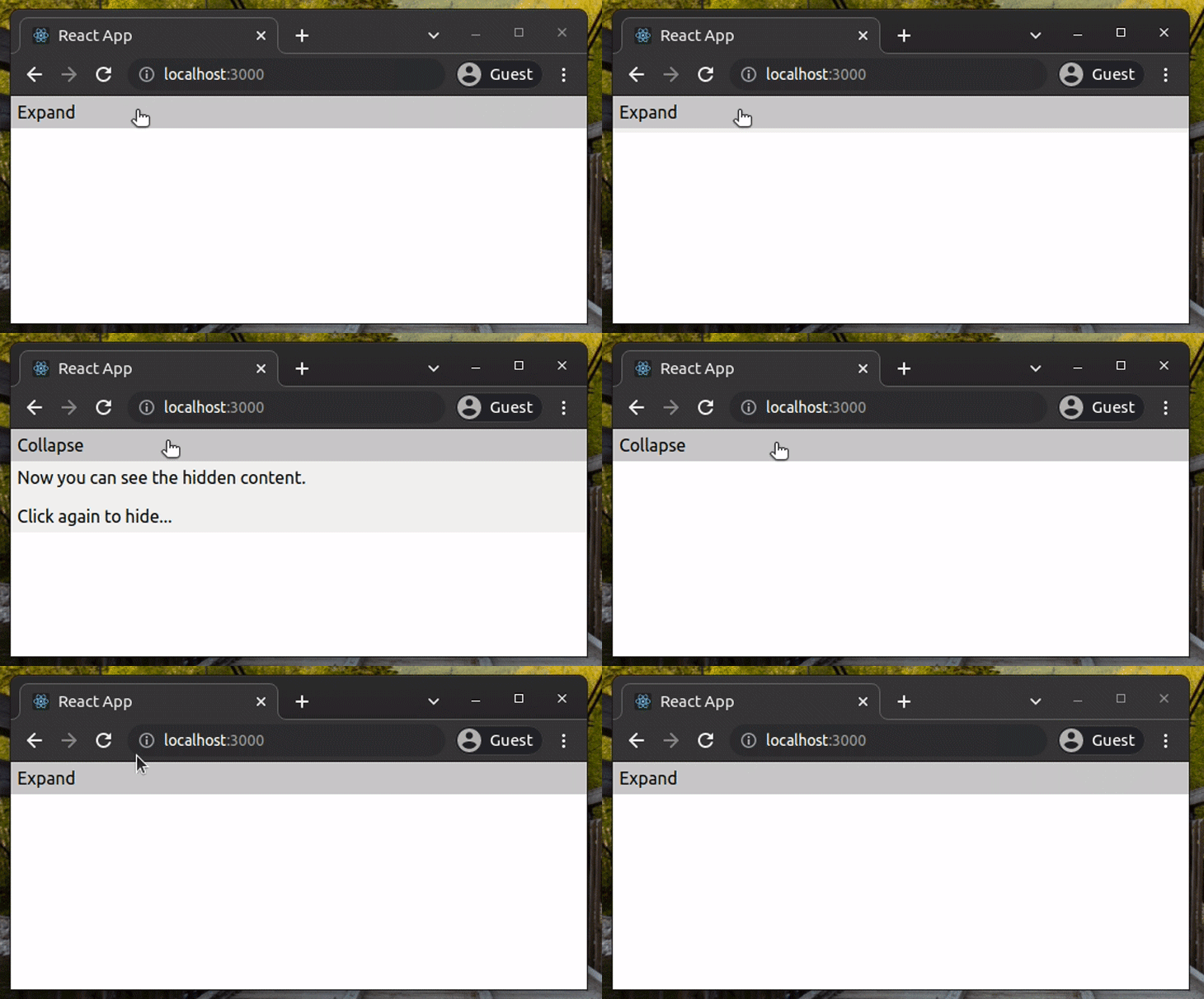
In the above example, the getToggleProps function call automatically binds the on-click event handler to toggle the collapsible panel. But, if you need more control with the on-click event, such as preventing an expand or collapse based on custom logic, you can toggle the panel manually with the following code.
import React, { useState } from 'react';
import useCollapse from 'react-collapsed';
import './App.css';
function Collapsible() {
    const [ isExpanded, setExpanded ] = useState(false);
    const { getCollapseProps, getToggleProps } = useCollapse({ isExpanded });
function handleOnClick() {
        // Do more stuff with the click event!
        // Or, set isExpanded conditionally
        setExpanded(!isExpanded);
    }
return (
        <div className="collapsible">
            <div className="header" {...getToggleProps({onClick: handleOnClick})}>
                {isExpanded ? 'Collapse' : 'Expand'}
            </div>
            <div {...getCollapseProps()}>
                <div className="content">
                    Now you can see the hidden content. <br/><br/>
                    Click again to hide...
                </div>
            </div>
        </div>
    );
}
function App() {
    return (
    <Collapsible/>
    );
}
export default App;
As mentioned before, react-collapsed is a very flexible library — it accepts various configuration parameters via the useCollapse Hook. So, let’s change the animation speed. Add the following code to App.js:
import React from 'react';
import useCollapse from 'react-collapsed';
import './App.css';
function Collapsible() {
    const config = {
        duration: 2000
    };
    const { getCollapseProps, getToggleProps, isExpanded } = useCollapse(config);
return (
    <div className="collapsible">
        <div className="header" {...getToggleProps()}>
            {isExpanded ? 'Collapse' : 'Expand'}
        </div>
        <div {...getCollapseProps()}>
            <div className="content">
                Now you can see the hidden content. <br/><br/>
                Click again to hide...
            </div>
        </div>
    </div>
    );
}
function App() {
    return (
    <Collapsible/>
    );
}
export default App;
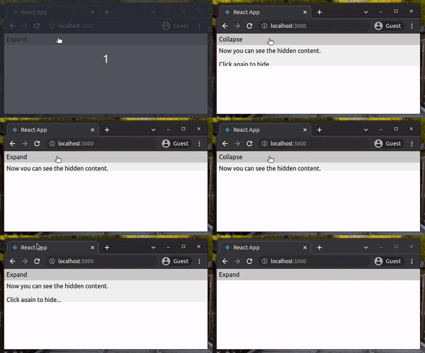
The library calculates animation duration based on the content height by default. But now, we made the animation slow, as shown below.
We can also customize the default animation type. The following config uses a custom CSS animation built with cubic-bezier. Update the previous react-collapsed configuration with the following object.
{
    duration: 1000,
    easing: 'cubic-bezier(.93,.12,.42,.25)'
}
Now we can see a bit different animation, as shown below.
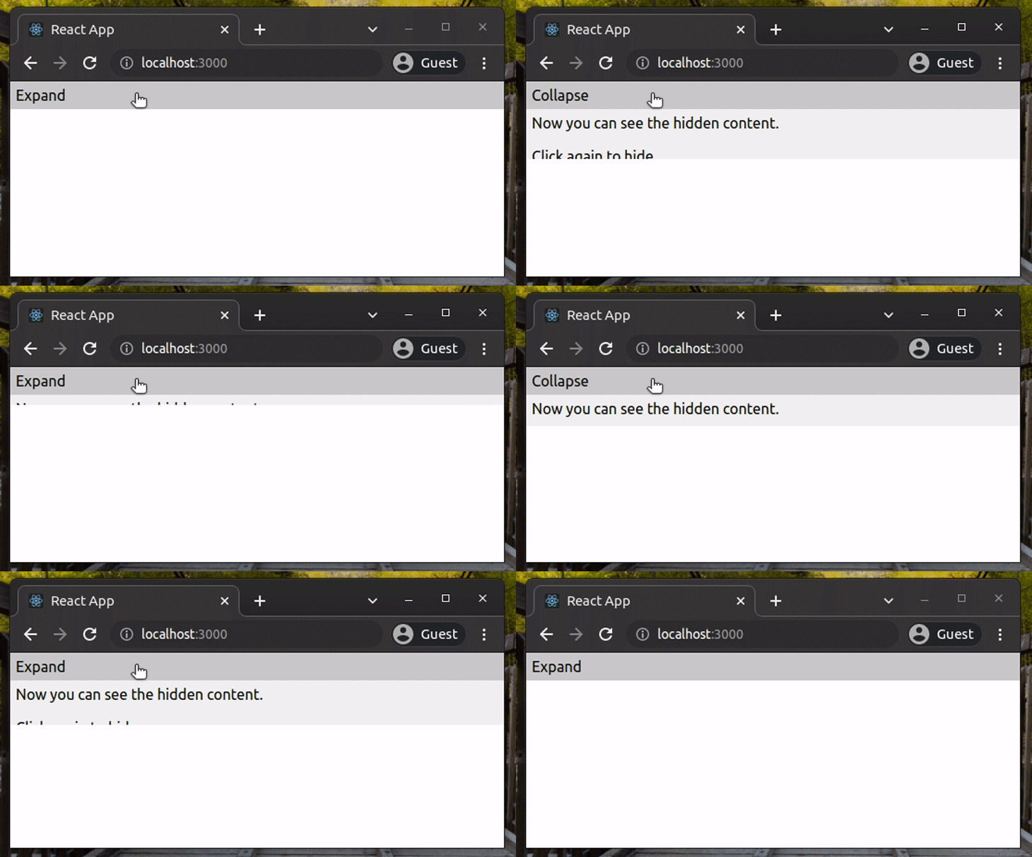
It might be difficult to notice the difference in height vs. time movement between these two GIFs, but especially if you compare them side-by-side and look at the end of the expanding phase, you can see it’s different. Also, the difference may be easier to see if you run the code locally.
The previous collapsible components displayed the hidden content when we clicked on the header. In some scenarios, we need to show the hidden content by default and let users collapse it if they want to. Look at the following example configuration object.
{
    defaultExpanded: true
}
Here, we set the defaultExpanded option to true to initially display the expanded component.
It is possible to add a collapsible component inside another collapsible component. Update your React application with the following code to see nested collapsible components in action.
import React from 'react';
import useCollapse from 'react-collapsed';
import './App.css';
function InnerCollapsible() {
    const { getCollapseProps, getToggleProps, isExpanded } = useCollapse();
return (
    <div className="collapsible">
        <div className="header" {...getToggleProps()}>
            {isExpanded ? 'Collapse' : 'Expand'}
        </div>
        <div {...getCollapseProps()}>
            <div className="content">
                Now you can see the hidden content. <br/><br/>
                Click <i>Collapse</i> to hide this content...
            </div>
        </div>
    </div>
    );
}
function Collapsible() {
    const { getCollapseProps, getToggleProps, isExpanded } = useCollapse();
return (
    <div className="collapsible">
        <div className="header" {...getToggleProps()}>
            {isExpanded ? 'Close' : 'Open'}
        </div>
        <div {...getCollapseProps()}>
            <div className="content">
                Now you can see the hidden content. <br/><br/>
                Click <i>Close</i> to hide everything... <br/><br/>
                <InnerCollapsible/>
            </div>
        </div>
    </div>
    );
}
function App() {
    return (
    <Collapsible/>
    );
}
export default App;
Here, we created a nested collapsible component called InnerCollapsible inside the Collapsible component and used the same API functions from the react-collapsed Hook. The child component automatically saves the collapsible state when the parent component is collapsed.
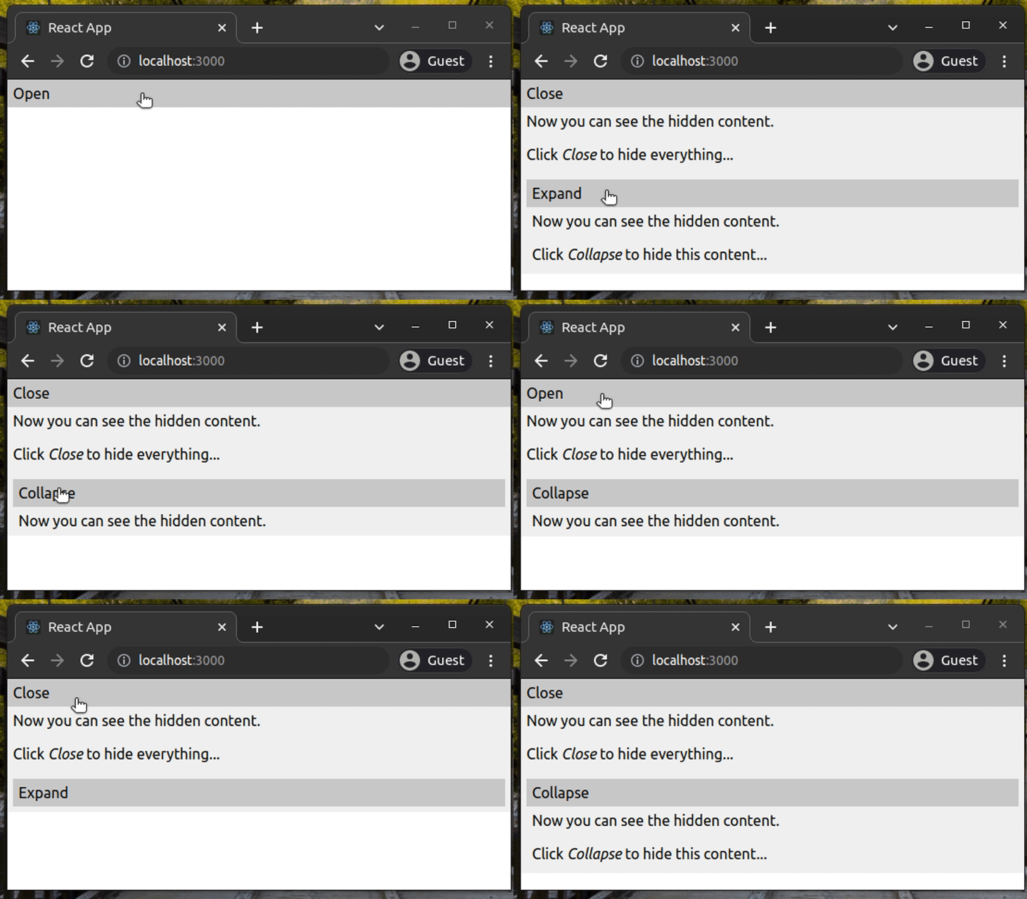
You can implement collapsible features up to any nested level. Also, you can create your own reusable collapsible component to simplify the above code, as shown below.
import React from 'react';
import useCollapse from 'react-collapsed';
import './App.css';
function Collapsible(props) {
    const { getCollapseProps, getToggleProps, isExpanded } = useCollapse();
return (
    <div className="collapsible">
        <div className="header" {...getToggleProps()}>
            {isExpanded ? 'Collapse' : 'Expand'}
        </div>
        <div {...getCollapseProps()}>
            <div className="content">
                {props.children}
            </div>
        </div>
    </div>
    );
}
function App() {
    return (
    <Collapsible>
        Now you can see the hidden content. <br/><br/>
        Click <i>Collapse</i> to hide everything... <br/><br/>
        <Collapsible>
            Now you can see the hidden content. <br/><br/>
            Click <i>Collapse</i> to hide this content...
        </Collapsible>
    </Collapsible>
    );
}
export default App;
Now we can pass any child element into the Collapsible component because it renders props.children. The above code creates a nested collapsible component by rendering a Collapsible component inside another Collapsible component instance.
Try to add more nested components to the above source code and see what happens!
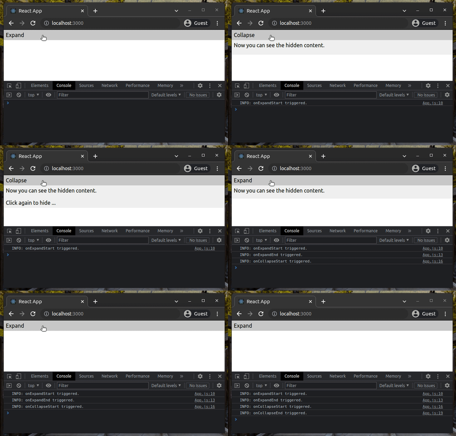
The react-collapsed library provides event handlers support for the animation. The animation consists of four steps: start expanding, end expanding, start collapsing, and end collapsing. We can bind callbacks to these steps, as shown below.
import React from 'react';
import useCollapse from 'react-collapsed';
import './App.css';
function Collapsible(props) {
    const config = {
        duration: 2000,
        onExpandStart: () => {
            console.log('INFO: onExpandStart triggered.');
        },
        onExpandEnd: () => {
            console.log('INFO: onExpandEnd triggered.');
        },
        onCollapseStart: () => {
            console.log('INFO: onCollapseStart triggered.');
        },
        onCollapseEnd: () => {
            console.log('INFO: onCollapseEnd triggered.');
        }
    };
    const { getCollapseProps, getToggleProps, isExpanded } = useCollapse(config);
return (
    <div className="collapsible">
        <div className="header" {...getToggleProps()}>
            {isExpanded ? 'Collapse' : 'Expand'}
        </div>
        <div {...getCollapseProps()}>
            <div className="content">
                {props.children}
            </div>
        </div>
    </div>
    );
}
function App() {
    return (
    <Collapsible>
        Now you can see the hidden content. <br/><br/>
        Click again to hide ...
    </Collapsible>
    );
}
export default App;
The above code logs text to the browser console at each animation step. Look at the following preview.
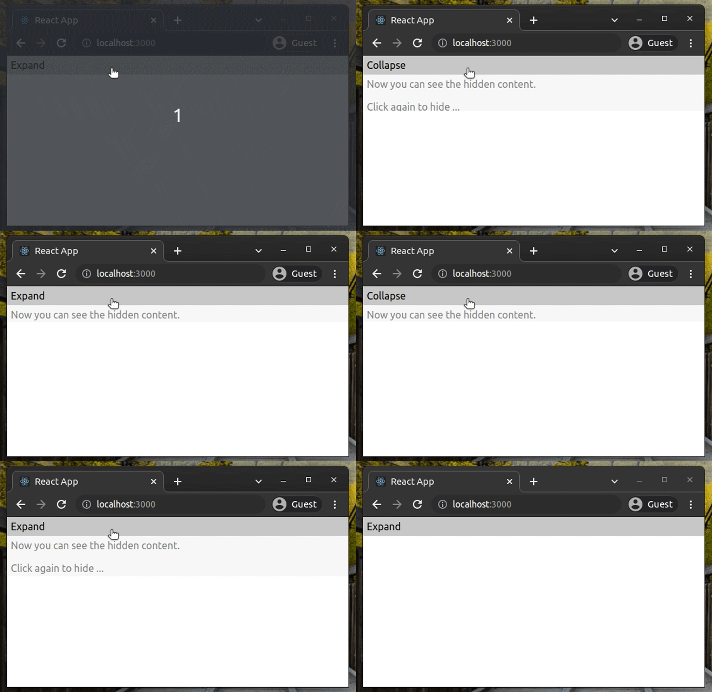
What if you need to apply some styles to the collapsible panel during the animation? You can send some CSS via the configuration object. Update the previous source code’s configuration with the following.
{
    duration: 2000,
    expandStyles: {
        opacity: 0.5
    },
    collapseStyles: {
        opacity: 0.5
    }
};
As you may have already noticed, the collapsible panel’s opacity gets reduced during the animation. Look at the following preview.
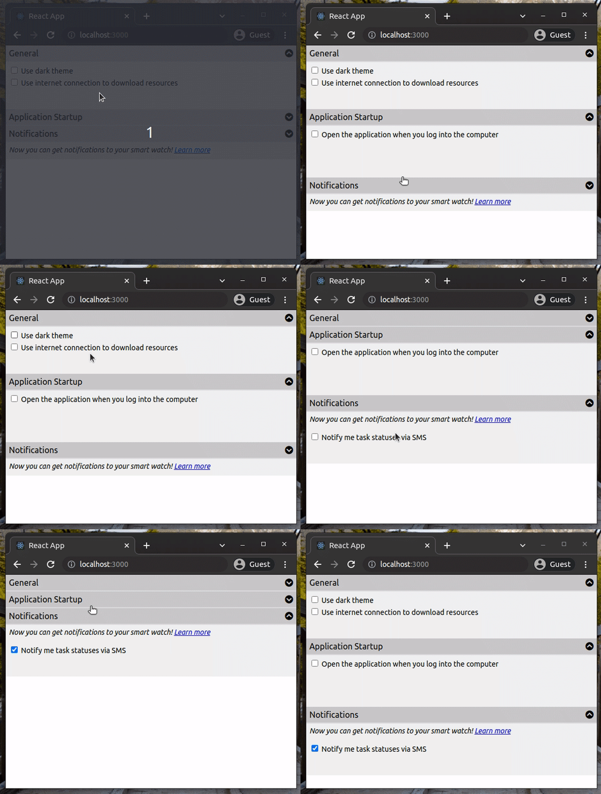
Now that we’ve checked almost all features of react-collapsed with the above example codes, let’s write some code for a bit more of an advanced scenario. We are going to implement a preferences page with several collapsible components.
The preferences section has three sections: general settings, startup configuration, and notification settings.
First, add the following Font Awesome stylesheet reference to the index.html file ; we need to use some icons to indicate a collapsible component’s status.
<link rel="stylesheet" href="https://cdnjs.cloudflare.com/ajax/libs/font-awesome/6.0.0-beta3/css/all.min.css" integrity="sha512-Fo3rlrZj/k7ujTnHg4CGR2D7kSs0v4LLanw2qksYuRlEzO+tcaEPQogQ0KaoGN26/zrn20ImR1DfuLWnOo7aBA==" crossorigin="anonymous" referrerpolicy="no-referrer" />
Add the following code to your App.js file.
import React from 'react';
import useCollapse from 'react-collapsed';
import './App.css';
function Section(props) {
const config = {
defaultExpanded: props.defaultExpanded || false,
collapsedHeight: props.collapsedHeight || 0
};
const { getCollapseProps, getToggleProps, isExpanded } = useCollapse(config);
return (
<div className="collapsible">
<div className="header" {...getToggleProps()}>
<div className="title">{props.title}</div>
<div className="icon">
<i className={'fas fa-chevron-circle-' + (isExpanded ? 'up' : 'down')}></i>
</div>
</div>
<div {...getCollapseProps()}>
<div className="content">
{props.children}
</div>
</div>
</div>
);
}
function App() {
return (
<div className="preferences">
<Section title="General" defaultExpanded="true">
<label>
<input type="checkbox"/> Use dark theme
</label>
<label>
<input type="checkbox"/> Use internet connection to download resources
</label>
<br/><br/>
</Section>
<Section title="Application Startup">
<label>
<input type="checkbox"/> Open the application when you log into the computer
</label>
<br/><br/><br/><br/>
</Section>
<Section title="Notifications" collapsedHeight="32">
<i>Now you can get notifications to your smart watch!
<a href="#">Learn more</a>
</i>
<br/><br/>
<label>
<input type="checkbox"/> Notify me task statuses via SMS
</label>
<br/><br/>
</Section>
</div>
);
}
export default App;
Here, we created a reusable collapsible component called Section. The component accepts three key props: defaultExpanded to set the initial status, collapsedHeight to set the collapsed height, and title to set the header title. The component header displays a Font Awesome icon based on the current component state.
Now we need to add CSS styles to properly style the preferences section. Add the following CSS into your App.css file.
.collapsible .content {
    padding: 6px;
    background-color: rgb(240, 240, 240);
    font-size: 14px;
}
.collapsible .header {
    background-color: rgb(200, 200, 200);
    padding: 6px;
    cursor: pointer;
    display: flex;
    justify-content: space-between;
    border-bottom: 2px solid rgb(220, 220, 220);
}
.collapsible .header .title {
    font-weight: 400;
}
.preferences label {
    display: block;
    padding-bottom: 4px;
}
See the following preferences page, which looks somewhat similar to Bootstrap’s accordion.
The full source code is available at my GitHub repository.
Every popular web UI library offers collapsible components. Bootstrap has Collapse, MUI has expansion panels, and Semantic UI has Accordion. Also, many popular React libraries out there provide pre-built collapsible components. For example, react-animate-height provides CSS animation-based collapsible features.
But none of these solutions offers a flexible way to make our own React components collapsible.
The react-collapsed library gives us a React Hook that we can use inside any component. You can design the UI as you wish because the library doesn’t offer a pre-built, less-customizable component.
In this tutorial, we learned about react-collapsed with several example source codes. The library doesn’t offer us a pre-built collapsible component — and you have to build your own eye-candy around it — but it gives us everything we need to make our own React components collapsible.
Moreover, you can integrate react-collapsed with your favorite UI library’s atomic elements. If you already use a fully-featured UI library and need a simple collapsible component, you don’t probably need to implement one from scratch with this library. But, if you need to build a collapsible component according to a specific design, react-collapsed is the best solution.
Install LogRocket via npm or script tag. LogRocket.init() must be called client-side, not
server-side
$ npm i --save logrocket

// Code:

import LogRocket from 'logrocket';
LogRocket.init('app/id');
// Add to your HTML:

<script src="https://cdn.lr-ingest.com/LogRocket.min.js"></script>
<script>window.LogRocket && window.LogRocket.init('app/id');</script>
Would you be interested in joining LogRocket's developer community?
Join LogRocket’s Content Advisory Board. You’ll help inform the type of content we create and get access to exclusive meetups, social accreditation, and swag.
Sign up now
Discover how the Interface Segregation Principle (ISP) keeps your code lean, modular, and maintainable using real-world analogies and practical examples.

<selectedcontent> element improves dropdowns

Learn how to implement an advanced caching layer in a Node.js app using Valkey, a high-performance, Redis-compatible in-memory datastore.

Learn how to properly handle rejected promises in TypeScript using Angular, with tips for retry logic, typed results, and avoiding unhandled exceptions.
2 Replies to "Create collapsible React components with react-collapsed"
Thank you so much for this article.
For the advanced section, is there a way to show one collapsible at a time?
Thank you
Hi
How to make single pane open always.
That means, if we have 2 panes, clicking second pane should close 1st pane and viceversa