Imagine you must build a user admin dashboard for activating and deactivating users with a simple UI that includes a table and a button to toggle the active status for each user. However, not all users like tables, so what if we allowed users to dynamically switch between a table and grid layout? While this might add additional code to the app, it can also provide user satisfaction, a primary objective of any product.

In this article, we will build a simple LayoutSwitch component by leveraging the React compound components pattern and a pinch of the Context API’s flavor to make our lives easier.
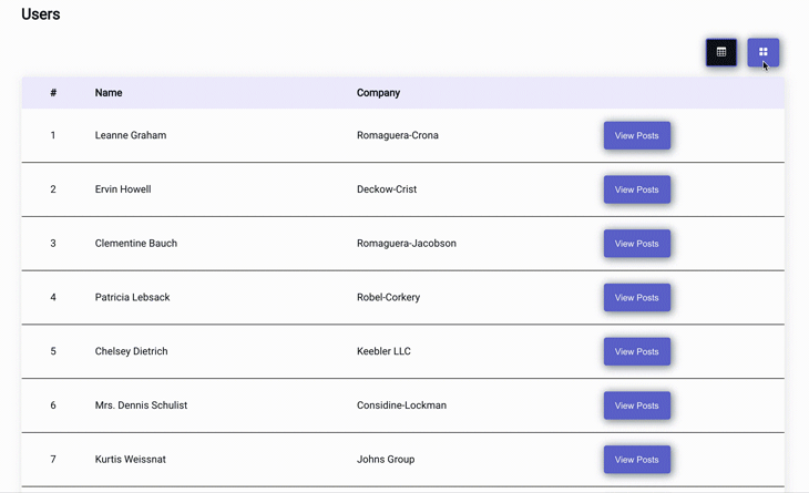
Here is a GIF showing the completed LayoutSwitch component we’ll build by the end of this post.
Ideally, the LayoutSwitch component would be a part of an existing React app. For the sake of this post and experimentation, let’s create a new React app with the Create React App boilerplate.
# using yarn
yarn create react-app react-layout-switch
# using npx
npx create-react-app react-layout-switch
Switch to the app directory and start the React app:
# switch to app directory
cd react-layout-switch
# start using yarn
yarn start
# start using npm
npm run start
This post primarily focuses on building the LayoutSwitch component; we won’t write any styles in this tutorial for the sake of time, so replace the styles in App.css and index.css with the styles from this Gist file.
Below is an overview of the components that we will be building.
App is the root component (in this use case, this would be AdminDashboard or something similar)UsersTable is the JSX for rendering a table layoutUsersGrid is the JSX for generating a grid layoutMore layouts can be added per business logic, such as Trello-like drop boards where users can move between active and inactive states or a complaint management system for open/on-hold/closed status control. A table or grid layout can provide a quick overview of data while a board layout can provide more control. There is no limit to this use case.
LayoutSwitch is the parent component that holds the layout state and controls rendering of childrenOptions is a wrapper component for layout option buttonsButton is an individual button for each layout optionContent is a wrapper component for all layout components including grids, tables, and moreOptions and Content group the respective components together, giving more control over rendering logic and styles.
Set up the App component that displays the Users list fetched from JSON Placeholder API.
Add the below code to App.jsx:
import React from 'react';
import { useFetch } from './hooks/useFetch';
import './App.scss';

function App() {
  const {
    data: users,
    error,
    loading,
  } = useFetch('/users');
  if (error) {
    return <h2 className="error">{error}</h2>;
  }
  return (
    <main className="container app">
      <h1>Users</h1>
      {loading && <h3>Loading Users...</h3>}
      {users !== null ? (
        <React.Fragment>
          {/** Coming Soon... Table, Grid and what not */}
        </React.Fragment>
      ) : (
        <h3>No Users Yet</h3>
      )}
    </main>
  );
}
export default App;
useFetch is a simple custom Hook that takes an endpoint and uses the Fetch API to get and return an object with data, error, and loading values.
Create a new file named useFetch.js under src/hooks and copy the code from this GitHub Gist. Alternatively, you can use React Query, SWR, or any other preference to fetch data.
Now that users’ data is available, let’s add UsersTable and UsersGrid to render the Users list in the respective layouts.
First, add UsersTable.jsx:
import React from 'react';

function UsersTable({ users }) {
  return (
    <div className="users-table-container">
      <table className="users-table">
        <thead className="users-table__head">
          <tr>
            <th>#</th>
            <th>Name</th>
            <th>Company</th>
            <th></th>
          </tr>
        </thead>
        <tbody className="users-table__body">
          {users.map(({ id, name, username, company }) => (
            <tr key={username}>
              <td>{id}</td>
              <td>
                <p>{name}</p>
              </td>
              <td>
                <p>{company.name}</p>
              </td>
              <td>
                <button>View Posts</button>
              </td>
            </tr>
          ))}
          {!users.length && (
            <tr>
              <td colSpan={4}>No users....</td>
            </tr>
          )}
        </tbody>
      </table>
    </div>
  );
}
export default UsersTable;
Then, add UsersGrid.jsx:
import React from 'react';

function UsersGrid({ users }) {
  return (
    <div className="user-grid-container">
      <div className="user-cards__list">
        {users.map(({ id, name, username, company }) => (
          <div key={username} className="user-card card">
            <h3 className="user-name">
              <p>{name}</p>
            </h3>
            <p className="company-name">
              Company: <span>{company.name}</span>
            </p>
            <span className="user-posts-link">
              <button>View Posts</button>
            </span>
          </div>
        ))}
        {!users.length && <h3>No users....</h3>}
      </div>
    </div>
  );
}
export default UsersGrid;
Now, update App.jsx to render both components:
.....
import UsersTable from './UsersTable';
import UsersGrid from './UsersGrid';

    .....
    {users !== null ? (
      <React.Fragment>
        <UsersTable users={users} />
        <UsersGrid users={users} />
      </React.Fragment>
    ) : (
    ......
Both layouts will render one after the other. We will continue and work on LayoutSwitch next to control the layout.
LayoutSwitch and its childrenBy leveraging the compound components pattern, switching logic can be abstracted to the dedicated component, LayoutSwitch.
Let’s start by adding a state for activeLayout that renders children wrapped under this root component. activeLayout is initialized with defaultLayout, which is the only prop alongside children to this component.
import React, { useState } from 'react';

function LayoutSwitch({ children, defaultLayout }) {
  const [activeLayout, setActiveLayout] = useState(defaultLayout);

  return (
    <React.Fragment>
      {children}
    </React.Fragment>
  );
}
To share this state with child components and allow state updates from a child, in this case, the button component, we can use React’s Context API.
Create a LayoutContext, and add activeLayout and setActiveLayout as the value to the provider.
import React, { useState, createContext } from 'react';
const LayoutContext = createContext();

function LayoutSwitch({ children, defaultLayout }) {
  const [activeLayout, setActiveLayout] = useState(defaultLayout);
  const value = {
    activeLayout,
    setActiveLayout,
  };
  return (
    <LayoutContext.Provider value={value}>
      {children}
    </LayoutContext.Provider>
  );
}
Using the React.useContext Hook, we can read the data from the context in other components:
const context = useContext(LayoutContext);
But for components outside LayoutSwitch, this context won’t be available and shouldn’t be allowed. So, let’s add the custom Hook, useLayoutContext, for easy readability and raise an error when it’s used outside the root provider component.
function useLayoutContext() {
  const context = useContext(LayoutContext);
  if (!context) {
    throw new Error(
      `Components that require LayoutContext must be children of LayoutSwitch component`
    );
  }
  return context;
}
For example:
# using useLayoutContext
const context = useLayoutContext();
Now that the base component is set up, let’s add the Content component. This will render the child component, like the Table or Grid, that matches the activeLayout state.
UsersTable and UsersGrid will be children, and each child has a prop layout to let the Content component compare against the state and render a matching one.
The Content renderer decides which layout component, either the Table or Grid, to render for a given active layout state.
function Content({ children }) {
  const { activeLayout } = useLayoutContext();
  return (
    <React.Fragment>
      {children.map(child => {
        if (child.props.activeLayout !== activeLayout) return null;
        return child;
      })}
    </React.Fragment>
  );
}
Now, we have the content and the state to store activeLayout. But how do we actually switch between layouts?
To do this, add in the Button component, which gets the setActiveLayout for the layout from context and updates the state accordingly.
function Button({ children, layoutPreference, title }) {
  const { activeLayout, setActiveLayout } = useLayoutContext();
  return (
    <button
      className={`layout-btn ${
        activeLayout === layoutPreference ? 'active' : ''
      }`}
      onClick={() => setActiveLayout(layoutPreference)}
      title={title}
    >
      {children}
    </button>
  );
}
We can also add the Options component for styling purposes and to get more control over buttons.
function Options({ children }) {
  return (
    <div className="layout-switch-container">
      {children}
    </div>
  );
}
We have added all the necessary components, and everything looks good. But it can be better.
LayoutSwitch should be solely responsible for rendering and controlling layout-related components. Anything unrelated would break the UI or the component itself.
So, let’s use the React isValidElement and child.type.name to ensure the unrelated components and elements are not rendered with the LayoutSwitch and its children.
So to do that, we must iterate over the children and validate each child. If it’s a valid element, render it. Otherwise, ignore it or throw an error saying it’s not allowed.
For LayoutSwitch, only Options and Content components can be allowed as children.
function LayoutSwitch({ children, ... }) {
  ....
  return (
    <LayoutContext.Provider value={value}>
      {children.map(child => {
        if (!React.isValidElement(child)) return null;
        if (![Options.name, Content.name].includes(child.type.name)) {
          throw new Error(
            `${
              child.type.name || child.type
            } cannot be rendered inside LayoutSwitch
            Valid Components are [${Options.name}, ${Content.name}]`
          );
        }
        return child;
      })}
    </LayoutContext.Provider>
  );
  ....
}
Let’s give similar powers to the Options component, too. Only Button is allowed.
function Options({ children }) {
  return (
    <div className="layout-switch-container">
      {children.map(child => {
        if (!React.isValidElement(child)) return null;
        if (child.type.name !== Button.name) {
          throw new Error(
            `${
              child.type.name || child.type
            } cannot be rendered inside LayoutSwitch.Options
            Valid Components are [${Button.name}]`
          );
        }
        return child;
      })}
    </div>
  );
}
Component.nameAs a quick note, do not use the component name as a string for an equality check with child.type.name.
# DO NOT DO THIS
child.type.name === "Options"
When code is minified through uglify/webpack, the component names won’t remain the same in production. Options won’t appear as “Options”; instead, it will appear as any single character, such as y or t in this example.
Now, when we read the component name and compare child.type.name and Component.name, it always results in the same value for the respective child and component.
child.type.name === Options.name
# y === y or t === t or whatever === whatever
LayoutSwitch and compound componentsWe can export all components individually and import each of them.
# export individually
export { LayoutSwitch, Options, Button, Content };

# usage
import { LayoutSwitch, Options, Button, Content } from './LayoutSwitch';
<LayoutSwitch>
  <Options>...</Options>
  <Content>...</Content>
</LayoutSwitch>
Another simple way to do this is to namespace all components under LayoutSwitch and import one component.
# OR, export under single namespace
LayoutSwitch.Button = Button;
LayoutSwitch.Options = Options;
LayoutSwitch.Content = Content;

export default LayoutSwitch;

# usage
import LayoutSwitch from './LayoutSwitch';
<LayoutSwitch>
  <LayoutSwitch.Options>...</LayoutSwitch.Options>
  <LayoutSwitch.Content>...</LayoutSwitch.Content>
</LayoutSwitch>
It’s totally up to you which way you export and import.
With all the components we need written, we can wire up things together.
It’s time to bring the LayoutSwitch and its child compound components together. I recommend having all options as an Object.freeze constant so the child or any external factor can’t mutate the layout options object. The updated App component should look like the code below:
...
import { LayoutSwitch, Options, Button, Content } from './LayoutSwitch';
import { BsTable, BsGridFill } from 'react-icons/bs';

const LAYOUT_OPTIONS = Object.freeze({ table: 'table', grid: 'grid' });

function App() {
  return (
    .....
    {users !== null ? (
      <LayoutSwitch defaultLayout={LAYOUT_OPTIONS.grid}>
        <Options>
          <Button
            layoutPreference={LAYOUT_OPTIONS.table}
            title="Table Layout"
          >
            <BsTable />
          </Button>
          <Button
            layoutPreference={LAYOUT_OPTIONS.grid}
            title="Grid Layout"
          >
            <BsGridFill />
          </Button>
          </Options>
          <Content>
            <UsersTable activeLayout={LAYOUT_OPTIONS.table} users={users} />
            <UsersGrid activeLayout={LAYOUT_OPTIONS.grid} users={users} />
          </Content>
        </LayoutSwitch>
      ) : (
    ......
  )
}
To persist the user-selected option, utilize localStorage. While this is outside the scope of this tutorial, you can explore and persist per your preference.
And that’s all for now! You can find the completed code in my GitHub repo and can access the final layout of this demo to see how users can switch from a table to grid layout.
Thank you for reading. I hope you found this post helpful, and please share it with those who might benefit from it. Ciao!
Install LogRocket via npm or script tag. LogRocket.init() must be called client-side, not
server-side
$ npm i --save logrocket

// Code:

import LogRocket from 'logrocket';
LogRocket.init('app/id');
// Add to your HTML:

<script src="https://cdn.lr-ingest.com/LogRocket.min.js"></script>
<script>window.LogRocket && window.LogRocket.init('app/id');</script>
Hey there, want to help make our blog better?
Join LogRocket’s Content Advisory Board. You’ll help inform the type of content we create and get access to exclusive meetups, social accreditation, and swag.
Sign up now
Get to know RxJS features, benefits, and more to help you understand what it is, how it works, and why you should use it.

Explore how to effectively break down a monolithic application into microservices using feature flags and Flagsmith.

Native dialog and popover elements have their own well-defined roles in modern-day frontend web development. Dialog elements are known to […]

LlamaIndex provides tools for ingesting, processing, and implementing complex query workflows that combine data access with LLM prompting.

 Learn more →
