Editor’s note: This post was updated on 1 February 2021.

Hiding further information behind an interaction with an icon, button, or text is a good way of making your interface clean and tidy. This is where React tooltips and pop-up menus come into play.
This article will introduce you to the approach I followed to implement a tooltip controller component in React. Although I call it tooltip, it can be anything that you want to display when an element inside the DOM is interacted with via a click or hover.
I will only be covering the fundamentals here. However, if you are interested in seeing the detailed functionalities, check out the GitHub repository for the full project.
Let’s start by listing some basic requirements for the tooltip controller component.
Being able to integrate the component into your existing JSX without introducing extra HTML elements such as <span> is important in the sense that it does not affect the JSX output and styling consequently.
It is obvious that the tooltip should not appear under any other elements inside the DOM. Using z-index might not help you in some cases since its use is just not as straightforward as it seems. Therefore the tooltip should appear at the very bottom of the <span> to guarantee its hierarchy at the top of the DOM tree.
A passive tooltip showing just text or an image usually does not require any interaction. It might even be expected to close when clicked. But the example shown above, for instance, requires the tooltip to stay active when clicked on to use the buttons/links inside it.
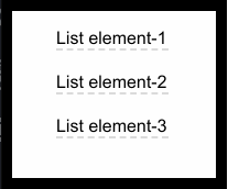
Consider the following code blocks and assume that we want to create an interaction on one of the <li> elements.
// vim: syntax=JSX

render() {
  return (
    <div className="App">
      <div>
        <ul>
          <li>List element-1</li>
          <li>List element-2</li>
          <li>List element-3</li>
        </ul>
      </div>
    </div>
  )
}
Wrapping this specific <li> element along with the tooltip component, which we want to control, is the approach that we will follow.
// vim: syntax=JSX

render() {
  return (
    <div className="App">
      <div>
        <ul>
          <li>List element-1</li>
          <Controller>
            <Select><li>List element-2</li></Select>
            <Tooltip/>
          </Controller>
          <li>List element-3</li>
        </ul>
      </div>
    </div>
  )
}
This will give us the flexibility of having full control of both the selected element and the tooltip component or JSX markup that we included inside the <Controller> component.
We can add event listeners, control styling, fetch position information, etc. When you have one or several components wrapped by another component, this design pattern is usually referred to as compound components.
We will create two components: <Controller> and <Select>.
<Controller> will hold the part of the code that we want to talk to each other: the tooltip and the selected element. <Select> component, on the other hand, will only handle the selected DOM element, which will control the tooltip.
Since the <Controller> component will wrap two children, we will use the following React APIs to deal with these children.
React.ChildrenReact.Children is one of the React APIs used to handle children props of a component, meaning that anything wrapped by a component can be accessed as a prop inside a component. Calling map method on React.Children with this.props.children helps us to iterate over it and create a new array of modified children out of it.
React.cloneElementThis API creates a clone of the input and returns a new react element. Combining this with React.Children gives us the ability to manipulate the child components of the <Controller> component that we are going to implement.
ReactDOM.createPortalSince we aim to mount the tooltip component at the very bottom of the body, we need to somehow prevent React from appending it to the nearest parent node by default. Portal is the native solution provided by React. We can specify where and which element to mount in the DOM.
Controller componentBefore we start to implement detailed functionalities, let’s quickly take a look at the basic structure of the <Controller> component.
// vim: syntax=JSX

import React from 'react'
import ReactDOM from 'react-dom'

class Controller extends React.Component{
  render(){
    const { children } = this.props

    const inputChildren = React.Children.map(children, child => {
      if(child.type.displayName === "Select"){
        return React.cloneElement(child)
      }
      else{
        return ReactDOM.createPortal(React.cloneElement(child), document.body)
      }
    })
    return inputChildren
  }
}

export default Controller
Notice the use of React.Children with map function to iterate over all the children and return a clone of each child with React.cloneElement.
Also, use of React.createPortal is straightforward, it takes the cloned child and renders it to document.body, which returns the <body> element in the DOM.
Note that in order to distinguish between children of the <Controller>, I used displayName property, which will be defined as a static property in the <Select> component later.
The next step is to add the following functionalities.
Start off with creating the state of <Controller>:
// vim: syntax=JSX

state = {
  isOpen: false,
  style: {
    position: "absolute",
    top: 0,
    left: 0,
  }
}
isOpen is for mounting and unmounting the tooltip component/JSX markup and style is for positioning the tooltip relative to the selected element. The tooltip is absolutely positioned relative to body by default. So, by obtaining the position and size information of the selected element, we can position the tooltip relative to it.
Now, create the functions controlling the state of the tooltip:
// vim: syntax=JSX

open = () => {
  this.setState({isOpen: true})
}

close = () => {
  this.setState({isOpen: false})
}
Next, this is using isOpen and style states to show/hide and position the tooltip component respectively. Also, it is required to pass the open() function to <Select> component as a prop so that when the selected element is clicked, we can show the tooltip.
// vim: syntax=JSX

render(){
  const { children } = this.props
  const { isOpen, style } = this.state

  const inputChildren = React.Children.map(children, child => {
    if(child.type.displayName === "Select"){
      return React.cloneElement(child, {open: this.open})
    }
    else{
      return (
        isOpen && ReactDOM.createPortal(
          <span style={style}>{React.cloneElement(child)}</span>, document.body
        )
      )
    }
  })
  return inputChildren
}
The second argument for React.cloneElement is the new props we are passing to <Select> component.
Let’s take a look at the <Select> component and see how we handle the cloned child and props.
// vim: syntax=JSX

import React from 'react'

class Select extends React.Component{
  static displayName = "Select"

  render(){
    const { children, open } = this.props
    return React.cloneElement(children, {onClick: open})
  }
}

export default Select
Notice the static definition of displayName that we previously used in <Controller>.
Although we could simply do return children in the render method of <Select> component, the use of cloneElement API gives us the ability to create a new clone of the children prop with onClick event handler.
And we assign the open prop to this onClick event handler to call the open() function in the <Controller> component, which, as a result, shows the tooltip at the top left corner of the screen.
Now, it’s time to get the position and size information of the cloned child element inside the <Select> component and pass this data back to <Controller> to be used with style state to position the tooltip.

Getting the position of the element inside the <Select> component requires use of ref attribute. ReactJS has its own way of creating refs. Once you define a ref by using React.createRef() and attach it to an element, you can refer to it throughout the component.
// vim: syntax=JSX

constructor(){
  super()
  this.selectedElement = React.createRef()
}

render(){
  const { children, open } = this.props
  return React.cloneElement(children, {ref: this.selectedElement, onClick: open})
}
Calling thegetBoundingClientRect() method on the selectedElement ref returns both the position and size information of the element. We will pass this information from <Select> component to <Controller> component by deploying a function as a prop on <Select>.
// vim: syntax=JSX

getPos = (left, top, height) => {
  this.setState(prevState => ({style: {...prevState.style, left, top: top + height}}))
}

// return React.cloneElement(child, {open: this.open, getPos: this.getPos})
Once the getPos() function is available to <Select> component as a prop, calling it inside the componentDidMount lifecycle hook updates the style state variable of <Component> and positions the tooltip relative to left-bottom of the selected element.
// vim: syntax=JSX

state = {
  isOpen: false,
  style: {
    position: "absolute",
    top: 0,
    left: 0,
  }
}

So far, we controlled the tooltip through a selected element and positioned it relative to this element. Now, the next thing is implementing the mechanism for closing the tooltip when clicked outside of it.
It is quite straightforward to listen to click events on window object and toggle the isOpen state variable. However, this approach requires some small tricks to make it work properly.
Consider the following snippet from <Controller> component.
// vim: syntax=JSX

componentDidUpdate(){
  if(this.state.isOpen){
    window.addEventListener('click', this.close)
  }
  else{
    window.removeEventListener('click', this.close)
  }
}
When the component is updated, we either add or remove an event listener for window object in accordance with the state of the tooltip. However, this attempt results in a tooltip opening and closing virtually simultaneously.
I came up with two different solutions to this problem:
click event both foropen() and close() functions, listening tomousedown and mouseup for close() and open() functions respectively prevents the close() function being called, since it listens to mousedown event which happened before the tooltip was opened. However, this approach fails if you try to close the tooltip by clicking on the selected element.setTimeout method with 0 milliseconds delay or without any time delay defined queues a new task to be executed by the next event loop. Although using 0 milliseconds usually describes a task that should be executed immediately, this is not the case with the single-thread synchronous nature of JavaScript. When the setTimeout is used, it simply creates an asynchronous callback. You can refer to the specific MDN web docs for a detailed explanation on the topic.The snippet below ensures that an event listener will be added or removed after the interaction tasks with selected element are executed.
// vim: syntax=JSX

componentDidUpdate(){
  setTimeout(() => {
    if(this.state.isOpen){
      window.addEventListener('click', this.close)
    }
    else{
      window.removeEventListener('click', this.close)
    }
  }, 0)
}
Although clicking on the selected element calls the open() function, event listener on the window object calls the close() function after and closes the tooltip.

As mentioned earlier, in some specific cases you might need to prevent the tooltip from closing when clicked on it. The reason clicking on the tooltip calls the close() function is the result of the event bubbling.
When an event, such as onClick, happens on an element, it also gets called on the parent and all the other ancestors. In our case, since tooltip is a child of the body and body has a click event attached, clicking on the tooltip calls the function attached to click event on the body eventually.
In order to prevent this phenomenon, we need to explicitly specify on the click handler of the child element that the events should not bubble further up to ancestors.
The event.stopPropagation() method is what we need to use on onClick event handler to stop propagation of onClick events further up in the DOM.
// vim: syntax=JSX

return (
  isOpen && ReactDOM.createPortal(
    <span onClick={e => e.stopPropagation()} style={style}>{React.cloneElement(child)}</span>, document.body
  )
)
After reading through this article, you should get familiar with the mentioned React APIs and have an overall idea on how to utilize and combine them to structure compound components for more specific tasks. Having different components talk to each other internally can make your code more structured and purposeful.
Install LogRocket via npm or script tag. LogRocket.init() must be called client-side, not
server-side
$ npm i --save logrocket

// Code:

import LogRocket from 'logrocket';
LogRocket.init('app/id');
// Add to your HTML:

<script src="https://cdn.lr-ingest.com/LogRocket.min.js"></script>
<script>window.LogRocket && window.LogRocket.init('app/id');</script>

Debug RSC hydration mismatches in production with Next.js instrumentation, Suspense isolation, HTML diffing, and CI smoke tests.

Explore why npm dependencies are a major supply chain security risk and how to protect JavaScript apps from compromised packages and transitive threats.

Enabled React Compiler v1.0 on a production Next.js app. Here’s every warning, breakage, and silent opt-out I documented — and what actually worked.

We built the same app in TanStack Start RSC and Next.js RSC. TanStack shipped 40% less JS and built 4x faster — but Next.js is still the safer production bet.
Would you be interested in joining LogRocket's developer community?
Join LogRocket’s Content Advisory Board. You’ll help inform the type of content we create and get access to exclusive meetups, social accreditation, and swag.
Sign up now

 Learn more →
