A timeline is a visual tool that helps represent data chronologically through lists, tables, or graphics. With several events occurring simultaneously, it becomes important to keep track of the events in the long run. With a timeline, we are able to keep track of key events and highlight them visually.
React provides several timeline libraries that you can use to document events in your web application. In this article, we’ll explore some of the best React timeline libraries, highlighting their features, and how to choose the best one for your use case.
Jump ahead:
You can represent the development of events using different formats of a timeline. Some of the formats include:
The React community has provided several libraries that you can use to implement the different types of timelines based on the needs of your project. Let’s take a look at them now!
React Vertical Timeline is a simple and clean timeline component that allows you to create a vertical timeline for your React project.
The React Vertical Timeline library is easy to install and integrate into your application. Its timeline elements are highly customizable and responsive. The library allows you to add custom icons and animations to your timeline, making it more visually appealing. You can also customize the scroll behavior.
The React Vertical Timeline library only limits you to working with vertical timelines. If your applications require other types of timelines, you might be required to install a different library.
Install React Vertical Timeline using the following command:
yarn add react-vertical-timeline-component
Then, make use of the library as shown:
import { VerticalTimeline, VerticalTimelineElement } from 'react-vertical-timeline-component';

....

const ReactVerticalTimelineComponent = () => {
    return <VerticalTimeline>
        {events.map(data => <VerticalElement data={data} />)}
    </VerticalTimeline>
}
const VerticalElement = ({ data }) => {
    return <VerticalTimelineElement
        className="vertical-timeline-element--work"
        contentStyle={{ background: 'rgb(33, 150, 243)', color: '#fff' }}
        contentArrowStyle={{ borderRight: '7px solid  rgb(33, 150, 243)' }}
        date={`${getYear(data.start)} - ${data.end ? getYear(data.end) : "present"}`}
        iconStyle={{ background: 'rgb(33, 150, 243)', color: '#fff' }}
        icon={<WorkIcon />}
    >
        <h3 className="vertical-timeline-element-title">{data.position}</h3>
        <h4 className="vertical-timeline-element-subtitle">{data.company}</h4>
        <p>{data.description}</p>
    </VerticalTimelineElement>
}
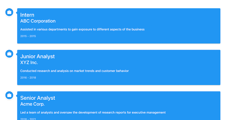
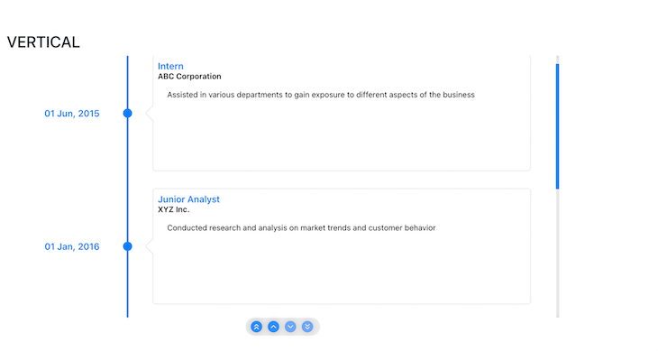
The library provides a VerticalTimeline component that acts as a wrapper for your timeline and a VerticalTimelineElement component that defines the appearance of the elements of your timeline.
The image below shows the implementation of a React Vertical Timeline using the React Vertical Timeline library:
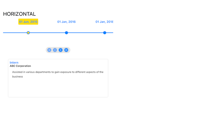
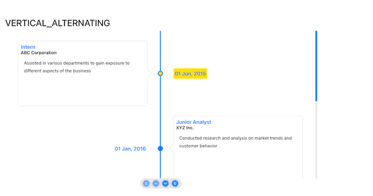
React-Chrono is a flexible, data-driven timeline library that allows developers to render timelines in three different modes: horizontal, vertical, and vertical alternating. It’s straightforward to use and highly customizable. Constant improvements on this library make it one of the best timeline libraries available.
React-Chrono supports the implementation of vertical and horizontal libraries with slideshows that can be auto-played. Nested timelines can also be presented using this library.
React-Chrono also provides several props to customize your visual representation of events. It allows you to add videos and images to your timeline to make it more appealing. The library also supports keyboard accessibility, which provides a better user experience.
However, React-Chrono lacks interactivity; it does not support zooming, drag and drop, and resizing events.
Install React-Chrono using the following:
yarn add react-chrono
Then, use the library as shown:
import { Chrono } from "react-chrono";

....

<Chrono items={mappedEvents} mode="VERTICAL_ALTERNATING"></Chrono>
The items prop expects data in the timeline item model, which can be found on the React-Chrono homepage. The mode expects either VERTICAL, HORIZONTAL, or VERTICAL_ALTERNATING, and the default mode is set to HORIZONTAL.
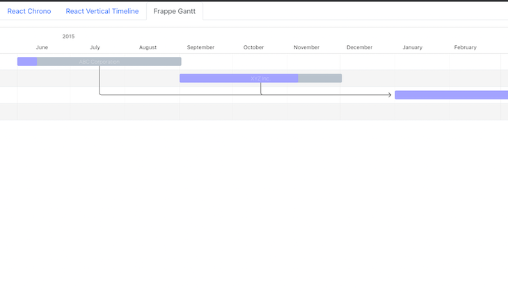
The package provides more props that can be used to customize your timeline. The images below show implementations of the three modes of timelines offered by React-Chrono:
React Suite (rsuite) is a UI library that contains a variety of components that can be used to build a timeline. The library is highly customizable and has a variety of components that can be used to build a timeline. Building a timeline with rsuite is easy and straightforward.
Install rsuite using the following command:
yarn add rsuite
Import the library in your React component:
//React imports
import React from 'react';
//React Suite imports
import { Timeline, TimelineItem } from 'rsuite';
Then, create a React component and add the timeline elements:
// React Component called TimeLineComponent
const TimeLineComponent = ()=> {
    return (
        <Timeline>
            <Timeline.Item>16:27:41 Your order starts processing</Timeline.Item>
            <Timeline.Item>16:28:43 Your order to be ready for delivery</Timeline.Item>
            <Timeline.Item>16:28:45 Your parcel has been out of the library</Timeline.Item>
        </Timeline>
    )
}
This should result in a similar timeline to this:

Pros of rsuite:
Cons:
Frappe Gantt is an open source JavaScript library used to create simple, interactive, and modern Gantt charts.
The Frappe Gantt library is easy to use and integrate. It offers a rich set of features that are customizable, including drag-and-drop functionality, and the ability to zoom and scale displayed events. When displaying events, you can define dependencies to understand their interrelations. You can also add a custom tooltip to each event to provide more information.
Frappe Gant tallows you to hook into some events and callbacks, allowing you to execute custom functions when they occur.
Install the library using the following:
yarn add frappe-gantt
If you experience a sass error, add sass as a dev dependency as shown:
yarn add sass --save-dev
Then, make use of the Chrono library as shown:
import { useEffect } from "react";
import Gantt from 'frappe-gantt'
import { events } from "../helpers/data";
import { FrappeGanttDataMap } from "../helpers/dataMaps";
const FrappeGantt = () => {
    const tasks = FrappeGanttDataMap(events);
    useEffect(() => {
        const gantt = new Gantt("#gantt", tasks);
        gantt.change_view_mode('Month')
    }, [tasks])
    return <svg id="gantt"></svg>
}
export default FrappeGantt;
The code snippet above adds an SVG with the id gantt to the DOM and uses the useEffect Hook to initialize a new Gantt object with the desired events.
You can change the view mode of the chart using the change_view_mode function. The styling and theme of the chart can be customized and custom event handlers can be added.
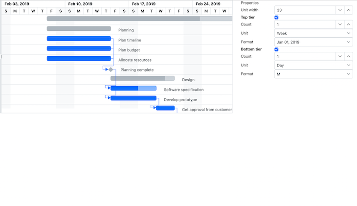
The image below shows a simple implementation of the Frappe Gantt library:
Learn more about the library in “How to build a Gantt Chart in JavaScript with Frappe Gantt.”
Syncfusion is a hub of feature-rich UI components for your application. It provides a Gantt chart component that you can use to build a Gantt timeline. However, this is a paid tool with a 30 day free trial.
The Syncfusion Gantt component is highly performant and works seamlessly with various forms of data. The component’s themes are highly customizable and allow the addition of animations.
The component is responsive and allows interactivity, including editing and zooming. It’s built to support users from different locales. Despite the Syncfusion Gantt component being feature-rich, it might be expensive for developers working on passion projects.
The image below is an illustration of the Syncfusion Gantt component obtained from their home page. It displays occurrences in chronological order and also shows their dependencies using arrows:
There are several timeline libraries that each offer different features. When selecting a React timeline library, you should consider the following:
These are just a few factors to look out for. Choosing a library will depend on the needs of your application.
React timeline libraries are essential tools when displaying a sequence of events in a visually appealing and interactive way.
In this article, we learned what a timeline is and the various types of timelines. We also explored some of the best React timeline libraries, their features, and their usage. Finally, we discussed key points to look at when selecting a React timeline library.
All of the code in this article is available on GitHub. I hope you enjoyed this article!
Install LogRocket via npm or script tag. LogRocket.init() must be called client-side, not
server-side
$ npm i --save logrocket

// Code:

import LogRocket from 'logrocket';
LogRocket.init('app/id');
// Add to your HTML:

<script src="https://cdn.lr-ingest.com/LogRocket.min.js"></script>
<script>window.LogRocket && window.LogRocket.init('app/id');</script>

Learn how to protect full-stack projects from NPM supply chain attacks with a practical security checklist.

Explore 15 essential MCP servers for web developers to enhance AI workflows with tools, data, and automation.

Learn how contrast-color() automatically picks accessible text colors using native CSS, without JavaScript.

Learn how to build a harness-style AI workflow using Claude Code with specialized Dev, QE, and Ops subagents, gated handoffs, MCP telemetry, and LEARNING.md.
Hey there, want to help make our blog better?
Join LogRocket’s Content Advisory Board. You’ll help inform the type of content we create and get access to exclusive meetups, social accreditation, and swag.
Sign up now

 Learn more →
