
The Replay is a weekly newsletter for dev and engineering leaders.
Delivered once a week, it's your curated guide to the most important conversations around frontend dev, emerging AI tools, and the state of modern software.
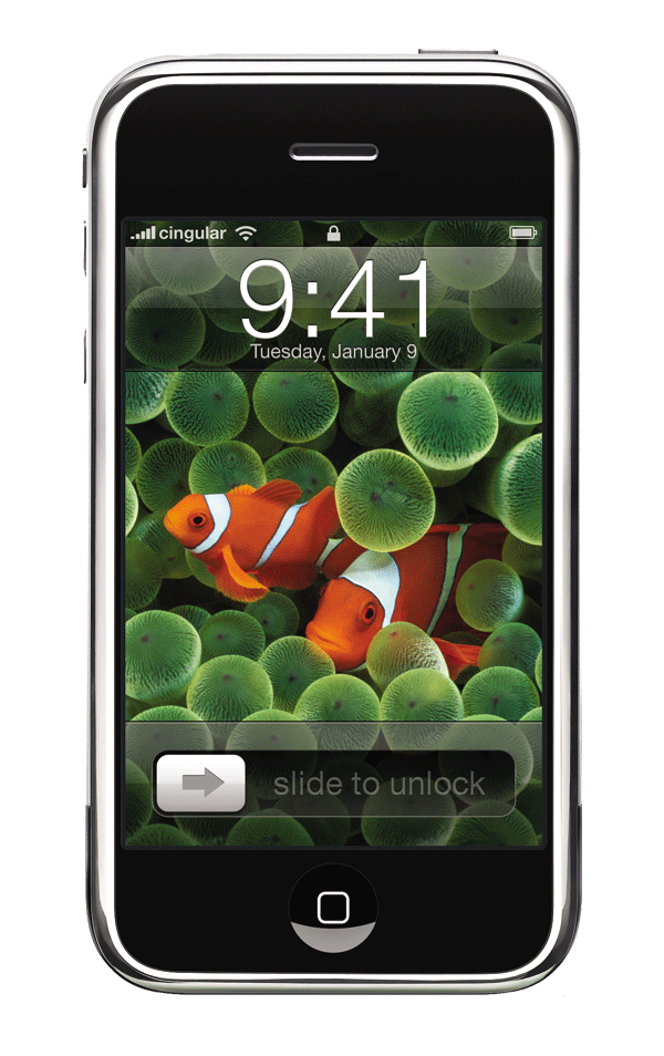
When you see the above image, it makes you feel a little nostalgic. Though Microsoft had a touch screen phone on the market, it paled in contrast to what Apple delivered to the globe: a phone entirely controlled by human touch.

It was incredible to see and experience when you slid the arrow button from left to right and it unlocked your phone, which is known as a gesture.
Gestures are ways for one human being to communicate with another. Similarly, it is now a method of communicating with all devices, whether a mobile phone, a tablet, a laptop, or large touch screen monitors.
Gestures have crossed the physical-digital barrier, allowing us to interact with digital media using our bodies. It makes using devices, digital apps, and software more enjoyable and interactive. In addition, a well-designed app or software always has a shorter learning curve because they feel natural and easy to use.
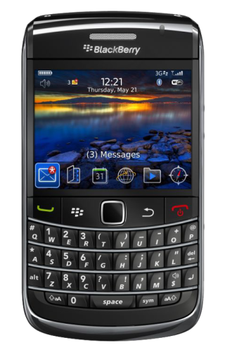
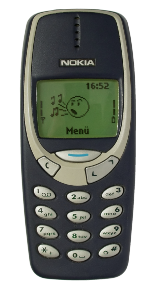
Around ten years ago, we interacted with mobile phones by pushing buttons, dialing numbers, and typing lengthy messages with the help of either a qwerty keyboard or a numerical keypad. Now with a single tap, swipe, or flick, a user can completely control their device.
A gesture feels natural to us because it is associated with the way we interact with real-world objects.
Take an example of a person reading a newspaper. Naturally, a person will use the index finger to turn the page. In a very similar manner, a user can read newspapers, magazines, and novels using swipe gestures with the index finger for flipping the page on their digital device.
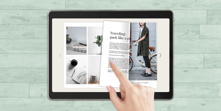
Image courtesy blog.flipsnack.com.
If we summarize the advantages of gestures, we can say that we will have:
Now let us look at the types of gestures the Flutter platform provides and what widgets can be used to perform those gestures. We will also look at a few use cases where ideally, according to the material guidelines, gestures should be used.
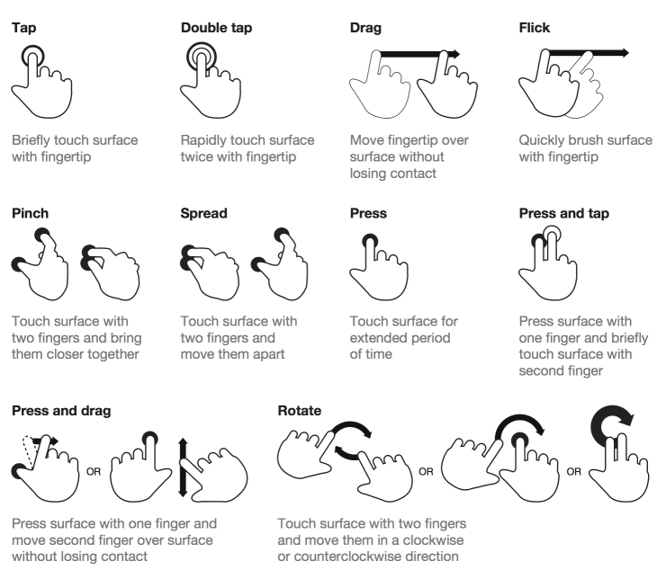
Image courtesy uxplanet.org.
So, according to material guidelines provided by Google here, there are three types of gestures.
A gesture to move between screens quickly and easily, which does not necessarily mean you need a button to switch between screens. It can be anything from text, an icon, or even an image.
Navigational gestures include:
As the name suggests, a prominent button such as a floating action button can perform quick actions on the current screen with a single tap, a long press, or a swipe. Take an example of Gmail, where users can swipe to archive an email or tap on the extended FAB button to compose an email.
Action gestures include:
To transform size, position, and rotation using two or more fingers. A prevalent example is Google Maps. Users can use the pinch to zoom gesture, double-tap to zoom, drag and drop pins, or rotate the map.
Transform gestures include:
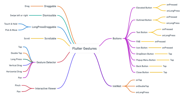
Please look at the mind map below, explaining that Flutter provides all the gestures mentioned earlier in its widgets.
Disclaimer: The examples I will use below are from popular applications that millions of people are currently using. I am not promoting the apps or the company that owns them, nor am I associated with them directly or indirectly. I am using it only as a reference for this article purely for learning purposes.
Let me tell you why I decided to use real-world applications as an example. Every programmer or designer in their learning stage must have tried to clone popular applications, such as Whatsapp, Telegram, Instagram, etc. I know I have tried too.
There is a lot of R&D that goes behind building these types of applications. Also, great minds come together to design and build it. And since millions of people use it, it has been tested thoroughly, making these apps ideal for learning the functionality and UI/UX design.
So let’s inspect Whatsapp closely. Though the apps are not built on the Flutter platform, we can still see where they have implemented gestures, which kind of gestures, when, and why. If we had to build something similar using the Flutter platform, which widgets should we use to exact the implementation?
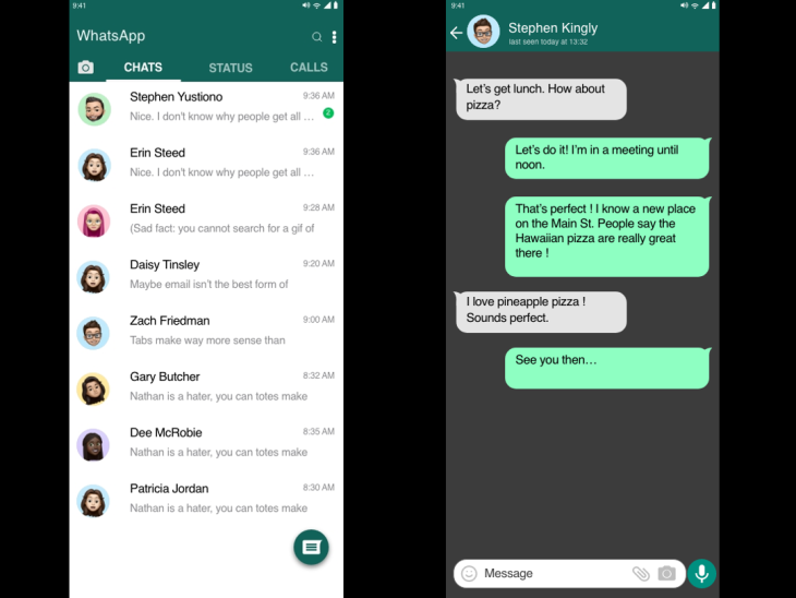
Please take a few moments to consider the images above before continuing. Then, examine the user interface from the perspective of a programmer. How many gestures do you recognize?
You may not have noticed it when using the app, but you will see all of the gestures listed below if you look closely.
LongPress on an individual itemListTile to Tap on a particular list itemSwipe from left to rightPinch and Pan gestures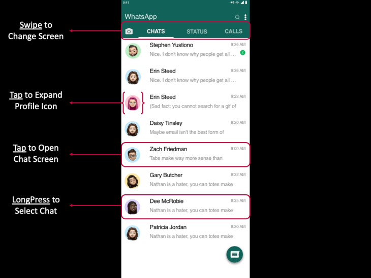
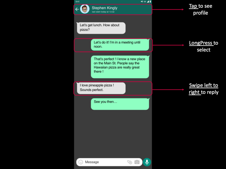
If you look at the UI, it is straightforward. There is no learning curve here because it comes naturally to any user. In addition, gestures are in place on the main screen and chat screen, so users can easily interact with the application. For example, alone, ListView has three different gestures in place.
When a user wants to read the messages, the user taps on the individual item in the list.
When a user wants to delete a chat, the user will long press on it.
When users want to see a profile picture, they will tap on it to make it larger.
Let us imagine an alternative UI. If we did not have gestures in place, how would a user select a chat?
Before, we had phones with physical buttons, where we used four arrow buttons to scroll through the phone messages. To select a message, we had to click on the middle button. Then, we had to click on the options to delete a message and scroll down to choose the delete. It was a lengthy process.
Consider the above in the current scenario in a chat screen. Then, look at the mockup below to imagine how users feel about it and interact with the application.
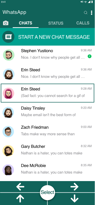
Today, we have mobile phones in different sizes, so there is a thumb area in play here. If a user holds the phone in the right or left palm, how far a thumb will reach to operate the mobile phone is considered by any designer or programmer. Then, designers consider the implementation of gestures to interact with other parts of the application with another hand.
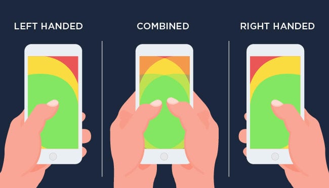
Image courtesy dev.to.
Again, coming back to the main screen of the WhatsApp example, a user can use a thumb to tap, scroll, swipe, and start a new chat by clicking on the floating action button. Only when a user wants to click on top of the screen will they need to use their other hand.
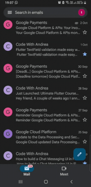
In Gmail, the UI is similar to WhatsApp’s main screen. Users can select the messages by a single tap on the round icon or by long pressing on the message itself. Similar functionality is provided by Flutter using the GestureDetector widget. However, Gmail has an added gesture: Swipe to Archive, or Swipe to Delete, using the Dimissible widget.
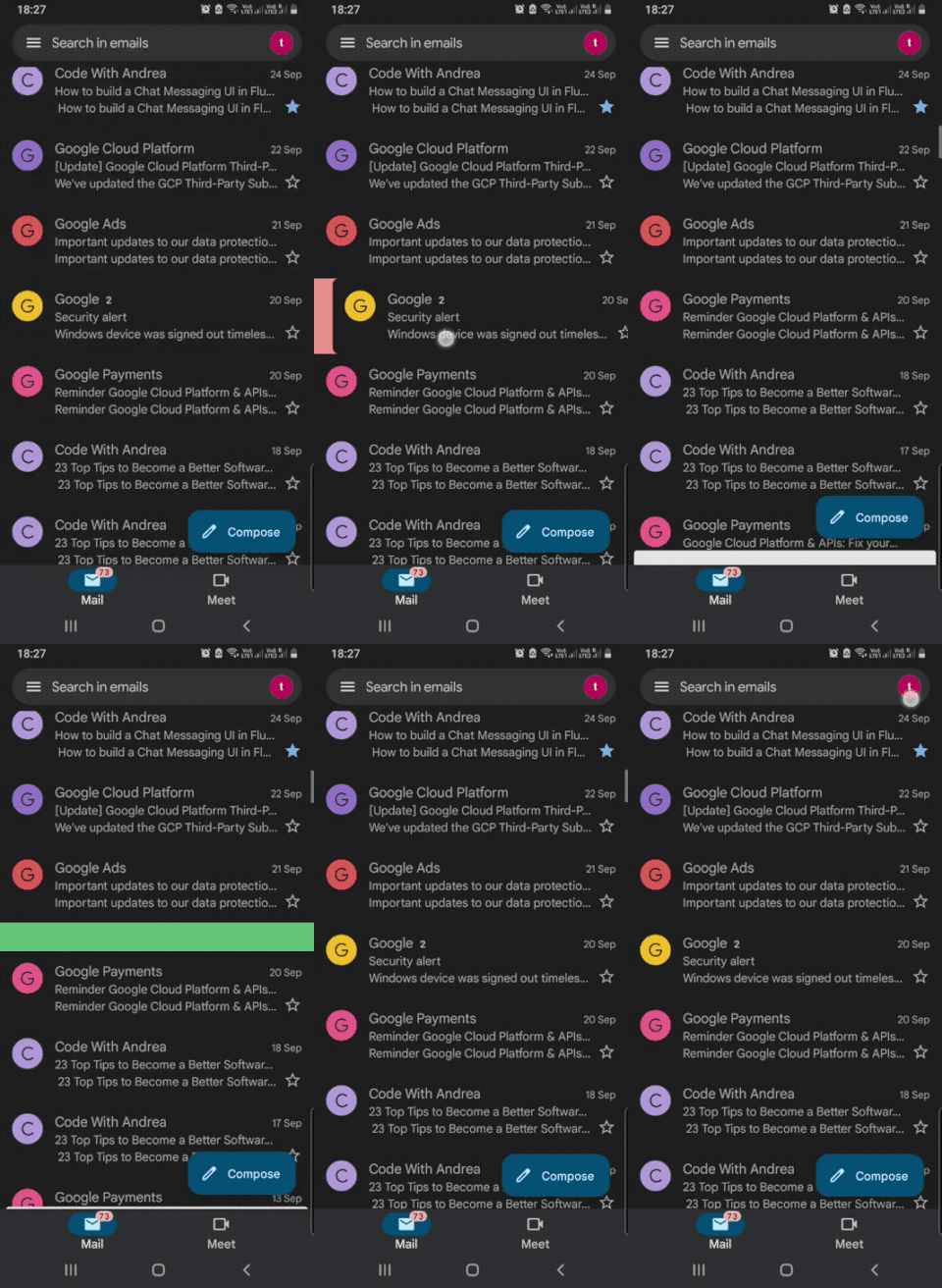
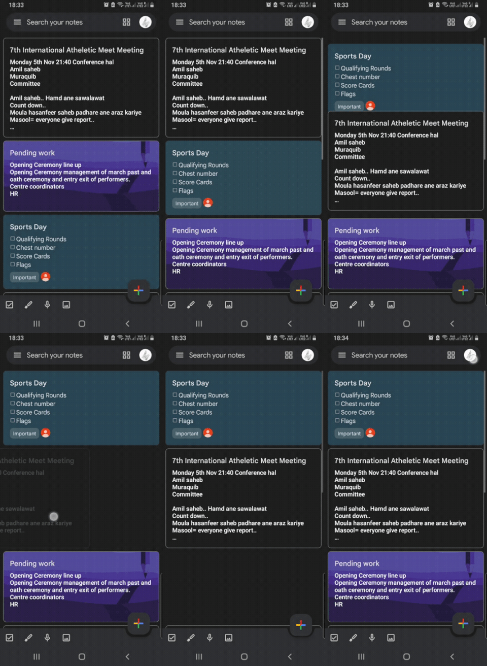
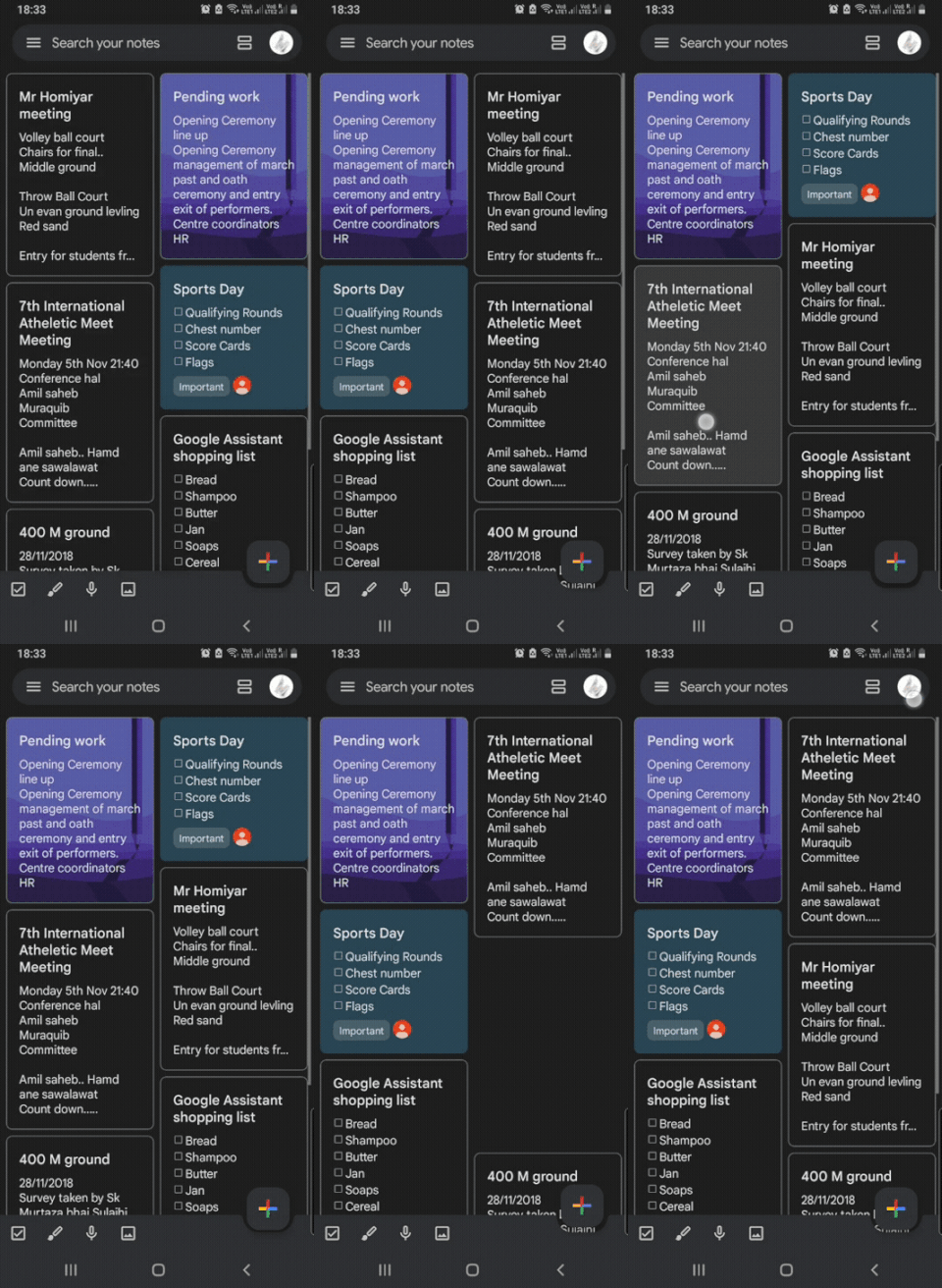
Secondly, in the Keep Notes application, users can reorder notes according to their priority, as seen in the images above. Also, users can swipe to archive a particular note. A Draggable widget and a Dimissible widget provided by Flutter can create a similar UI in your application.
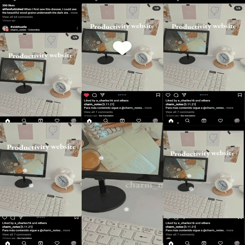
Similarly, Instagram has a double-tap gesture to like a post, a two-finger gesture to zoom on an image, and it also has a heart icon below each post. Though tapping the heart icon requires one less tap, Instagram still implemented a double-tap to like a post. Why? Because it allows the user to scroll faster and have a larger area to tap, and it is intuitive to tap on an image or a video that you like.

A Card widget combined with a GestureDetector or an InkWell widget would do the trick if I build something similar in Flutter.
This is something I’ve learned as I became a developer. First, I started as an Android developer, then as a Flutter developer. Next, I created my UI and built apps around it. Finally, after much reading and research, I thought one should consider asking these questions based on the type of app you are constructing:
There are common categories of mobile apps such as Productivity, Social Media, Educational, Games, etc. If your app falls into one of these categories or any other, you should consider checking out applications that fall into those categories.
Studying applications gives you an insight into how to design the UI/UX. Because no matter what type of application you are programming, few widgets are commonly used. UI is also pretty similar to one another, so implementing gestures according to already tested applications will make your app intuitive and interactive. And Flutter provides all the tools to build a fantastic application.
I want to end on this last note that an effective product is always the most usable one.
Install LogRocket via npm or script tag. LogRocket.init() must be called client-side, not
server-side
$ npm i --save logrocket

// Code:

import LogRocket from 'logrocket';
LogRocket.init('app/id');
// Add to your HTML:

<script src="https://cdn.lr-ingest.com/LogRocket.min.js"></script>
<script>window.LogRocket && window.LogRocket.init('app/id');</script>
useEffect breaks AI streaming responses in ReactSee why useEffect breaks AI streaming in React, and how moving stream state outside React fixes flicker and stale updates.
A real-world debugging session using Claude to solve a tricky Next.js UI bug, exploring how AI helps, where it struggles, and what actually fixed the issue.
CSS wasn’t built for dynamic UIs. Pretext flips the model by measuring text before rendering, enabling accurate layouts, faster performance, and better control in React apps.
Why do real-time frontends break at scale? Learn how event-driven patterns reduce drift, race conditions, and inconsistent UI state.
Would you be interested in joining LogRocket's developer community?
Join LogRocket’s Content Advisory Board. You’ll help inform the type of content we create and get access to exclusive meetups, social accreditation, and swag.
Sign up now