When it comes to creating applications, you have to handle user gestures such as touch and drags. This makes your application interactive.
To effectively handle gestures, you need to listen to the gestures and respond to them. Flutter offers a variety of widgets that help add interactivity to your apps.
In this article, we go through handling gestures with the GestureDetector widget.
Some widgets, like Container and Card widgets, don’t have an inbuilt way of detecting gestures. Such widgets are wrapped in the GestureDetector widget which is purely used for detecting gestures and does not give any visual response like a ripple effect.
The GestureDetector widget works by recognizing gestures that have callbacks defined and responding accordingly to the event. If a gesture is to be disabled, a null value is passed to the callback.
The following are common gestures captured by the GestureDetector widget, their corresponding events, and possible applications (all illustrations are credit to Luke Wroblewski’s Touch Gesture Reference Guide):
The user briefly touched the screen with a fingertip.
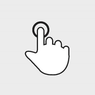
onTapDown — triggered when user makes contact with screen, might be a taponTapUp — triggered when user stops making contact with the screenonTap — triggered when user briefly touches the screenonTapCancel — triggered when the event that fired onTapDown is not a tapPossible applications for the tap gesture include:
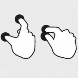
The user tapped the screen at the same location twice in quick succession.
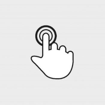
onDoubleTapDown — triggered when user makes contact with screen, might be a double taponDoubleTap — triggered when user taps the screen at the same location twice in quick successiononDoubleTapCancel — triggered when the event that fired onDoubleTapDown is not a double tapPossible applications for the double-tap gesture include:
The user made contact with the screen at the same location for a long period of time.
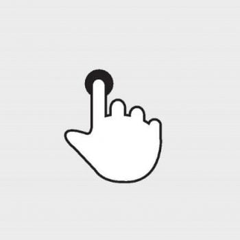
onLongPressDown — triggered when user makes contact with screen, might be a long pressonLongPressStart — triggered when the start of a long press has been detectedonLongPress — triggered when a long press has been detectedonLongPressMoveUpdate — triggered when long press has been detected and user has drag-moved fingeronLongPressEnd — triggered when the end of a long press has been detectedonLongPressUp — triggered when the end of a long press has been detected; contact has been removed after long pressonLongPressCancel — triggered when the event that fired onLongPressDown is not a long pressPossible applications for the long-press gesture include:
The user pinched or spread the screen.
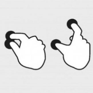
onScaleStart — triggered when contact with the screen has established a focal point and initial scale of 1.0onScaleUpdate — triggered when contact with the screen has indicated a new focal point and/or scaleonScaleEnd — triggered when user is no longer making contact with screenPossible application for the scale gestureUses for scale gestures include:
The user made contact with the screen and moved their fingertip in a steady manner vertically.
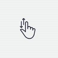
onVerticalDragDown — triggered when user makes contact with screen, might move verticallyonVerticalDragStart — triggered when user has made contact with screen and began to move verticallyonVerticalDragUpdate — triggered when contact that is moving vertically has moved in a vertical direction once againonVerticalDragEnd — triggered when the end of a vertical drag has been detectedonVerticalDragCancel — triggered when the event that fired onVerticalDragDown is not a vertical dragPossible applications for the vertical drag gesture include:
The user made contact with the screen and moved their fingertip in a steady manner horizontally.
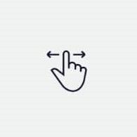
onHorizontalDragDown — triggered when user makes contact with screen, might move horizontallyonHorizontalDragStart — triggered when user has made contact with screen and began to move horizontallyonHorizontalDragUpdate — triggered when contact that is moving horizontally has moved in a horizontal direction once againonHorizontalDragEnd — triggered when the end of a horizontal drag has been detectedonHorizontalDragCancel — triggered when the event that fired onHorizontalDragDown is not a horizontal dragPossible applications for the horizontal drag gesture include:
This is not a complete list of the gestures detected. Check the official documentation for a complete list.
Let’s try it out!
To use the GestureDetector widget:
GestureDetector widget.We will build a simple demo app that handles the tap, double-tap, long press, and scale gestures.
Create a new Flutter application and clear the default code in your main.dart file.
We will create the four files below. You can view the folder structure here.
main.dartimport 'package:flutter/material.dart';
import 'presentation/my_app_widget.dart';
void main() {
runApp(const MyApp());
}
my_app_widget.dartimport 'package:flutter/material.dart';
import 'home_page.dart';
class MyApp extends StatelessWidget {
const MyApp({Key? key}) : super(key: key);
@override
Widget build(BuildContext context) {
return MaterialApp(
title: 'Flutter Gesture Detector Demo',
theme: ThemeData(
primarySwatch: Colors.blue,
),
home: const HomePage(),
);
}
}
home_page.dartimport 'package:flutter/material.dart';
import 'widgets/widgets.dart';
class HomePage extends StatelessWidget {
const HomePage({Key? key}) : super(key: key);
@override
Widget build(BuildContext context) {
final height = MediaQuery.of(context).size.height;
final width = MediaQuery.of(context).size.width;
return Scaffold(
body: Padding(
padding: EdgeInsets.symmetric(
horizontal: width * 0.1, vertical: height * 0.2),
child: Column(
mainAxisAlignment: MainAxisAlignment.spaceBetween,
children: const [
MyCardWidget(),
MyFavoriteIconWidget()
],
),
),
);
}
}
my_card_widget.dartimport 'dart:math';
import 'package:flutter/material.dart';
class MyCardWidget extends StatefulWidget {
const MyCardWidget({
Key? key,
}) : super(key: key);
@override
State<MyCardWidget> createState() => _MyCardWidgetState();
}
class _MyCardWidgetState extends State<MyCardWidget> {
@override
Widget build(BuildContext context) {
return const Card(
child: SizedBox(
height: 300,
width: 300,
),
color: Colors.yellow,
);
}
}
my_favorite_icon_widget.dartimport 'package:flutter/material.dart';
class MyFavoriteIconWidget extends StatefulWidget {
const MyFavoriteIconWidget({
Key? key,
}) : super(key: key);
@override
State<MyFavoriteIconWidget> createState() => _MyFavoriteIconWidgetState();
}
class _MyFavoriteIconWidgetState extends State<MyFavoriteIconWidget> {
@override
Widget build(BuildContext context) {
return const Icon(
Icons.favorite_border,
size: 40,
);
}
}
Your final app should look like this:
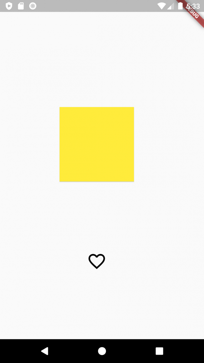
Now that we have our UI ready, let’s handle some gestures.
In your my_favorite_icon_widget.dart file:
StatefulWidgetbool isSelected = false;Icon widget with the GestureDetector widgetonTap propertyclass _MyFavoriteIconWidgetState extends State<MyFavoriteIconWidget> {
bool isSelected = false;
@override
Widget build(BuildContext context) {
return GestureDetector(
onTap: (){
setState(() {
isSelected = !isSelected;
});
},
child: Icon(
isSelected ? Icons.favorite: Icons.favorite_border,
size: 40,
color: isSelected? Colors.red: Colors.black ,
));
}
}
In your my_card_widget.dart file:
Card widget with the GestureDetector widgetonDoubleTap propertyclass _MyCardWidgetState extends State<MyCardWidget> {
Color bgColor = Colors.yellow;
@override
Widget build(BuildContext context) {
return GestureDetector(
onDoubleTap: (){
setState(() {
bgColor = Colors.primaries[Random().nextInt(Colors.primaries.length)];
});
},
child: Card(
child: const SizedBox(
height: 300,
width: 300,
),
color: bgColor,
),
);
}
}
In your my_card_widget.dart file:
1. Add a makeCircular flag property
2. Provide a non-null callback to the onLongPress property
3. Change the shape of the card based on the value of the makeCircular property
class _MyCardWidgetState extends State<MyCardWidget> {
  Color bgColor = Colors.yellow;
  bool makeCircular = false;
  @override
  Widget build(BuildContext context) {
    return GestureDetector(
      onLongPress: (){
        setState(() {
          makeCircular = !makeCircular;
        });
      },
      child:   Card(
        shape: makeCircular? const CircleBorder(): const RoundedRectangleBorder(),
        child: const SizedBox(
          height: 300,
          width: 300,
        ),
        color: bgColor,
      ),
    );
  }
}
In your my_card_widget.dart file:
1. Add a _scaleFactor property
2. Add a _baseFactor property
3. Provide a non-null callback to the onScaleStart property — establish an initial scale
4. Provide a non-null callback to the onScaleUpdate property — establish a new scale
5. Provide a non-null callback to the onScaleEnd property — return to initial scale
6. Wrap the Card widget with Transorm.scale widget
7. Change the scale property based on the value of the _scaleFactor
class _MyCardWidgetState extends State<MyCardWidget> {
  Color bgColor = Colors.yellow;
  bool makeCircular = false;
  double _scaleFactor = 0.5;
  double _baseScaleFactor = 0.5;
  @override
  Widget build(BuildContext context) {
    return GestureDetector(
      onScaleStart: (details){
        _baseScaleFactor = _scaleFactor;
      },
      onScaleUpdate: (details){
        setState(() {
          _scaleFactor = _baseScaleFactor * details.scale;
        });
      },
      onScaleEnd: (details){
        // return to initial scale
        _scaleFactor = _baseScaleFactor;
      },
      child:   Transform.scale(
        scale: _scaleFactor,
        child: Card(
          shape: makeCircular? const CircleBorder(): const RoundedRectangleBorde(),
          child: const SizedBox(
            height: 300,
            width: 300,
          ),
        color: bgColor,
      ),
    );
  }
}
The video below shows the implemented gestures:
So what happens when we provide the onGestureDown event callback for tap and double-tap, and two delayed, brief touch events occur?
Consider the illustration:
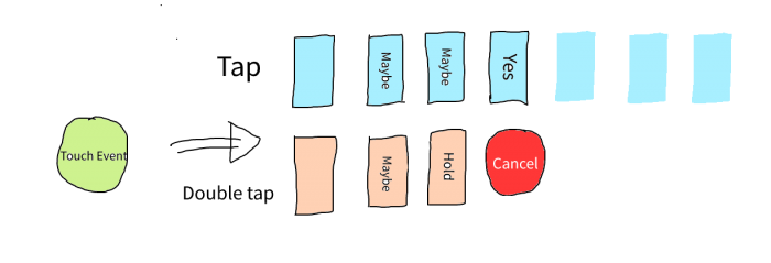
“
The gesture arena takes into account the following factors:
These are the battle states:
For example, say the following occur:
1. onTapDown and onDoubleTapDown are triggered
2. The two gestures compete
3. The tap gesture wins and the callback is executed (the onTap callback)
4. The double-tap gesture loses and gets canceled (onDoubleTapCancel triggered)
For our case, the tap gesture won because:
We have gone through the GestureDetector widget and learned how it works. We have learned how to use it to add interactivity to our application, and we have implemented some of the common gestures, like tap, long press, double-tap, and scale. We finally looked at gesture disambiguation.
With this knowledge, we now have a better understanding of the GestureDetector widget and can comfortably use any of its properties to recognize gestures. Feel free to play around with the different gestures. You can find the demo app on GitHub.
Install LogRocket via npm or script tag. LogRocket.init() must be called client-side, not
server-side
$ npm i --save logrocket

// Code:

import LogRocket from 'logrocket';
LogRocket.init('app/id');
// Add to your HTML:

<script src="https://cdn.lr-ingest.com/LogRocket.min.js"></script>
<script>window.LogRocket && window.LogRocket.init('app/id');</script>
Debug RSC hydration mismatches in production with Next.js instrumentation, Suspense isolation, HTML diffing, and CI smoke tests.

Explore why npm dependencies are a major supply chain security risk and how to protect JavaScript apps from compromised packages and transitive threats.
Enabled React Compiler v1.0 on a production Next.js app. Here’s every warning, breakage, and silent opt-out I documented — and what actually worked.

We built the same app in TanStack Start RSC and Next.js RSC. TanStack shipped 40% less JS and built 4x faster — but Next.js is still the safer production bet.
Would you be interested in joining LogRocket's developer community?
Join LogRocket’s Content Advisory Board. You’ll help inform the type of content we create and get access to exclusive meetups, social accreditation, and swag.
Sign up now

 Learn more →
